
In the fast-paced world of online marketing, where every click and conversion matters, it’s not uncommon for even the best of marketers to make a landing page mistake that costs precious revenue. Landing pages play a necessary role in converting visitors into customers, making them indispensable for successful online marketing campaigns. However, it can be challenging to run effective landing pages all the time. From poor design choices and confusing calls-to-action to slow loading times, these mistakes can have a detrimental impact on your marketing efforts, resulting in lost conversions and a decline in leads.
 As a landing page agency with over eight years of experience. We have encountered our fair share of landing page mistakes. We’ve learned valuable lessons along the way and are here to share our expertise with you.
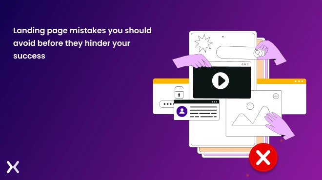
In this article, we will guide you on how to identify and fix these common mistakes on landing pages before they hinder your success.
As a landing page agency with over eight years of experience. We have encountered our fair share of landing page mistakes. We’ve learned valuable lessons along the way and are here to share our expertise with you.
In this article, we will guide you on how to identify and fix these common mistakes on landing pages before they hinder your success.
Just like the ancient Romans believed ostriches buried their heads in the sand to avoid danger, some companies adopt a similar approach when it comes to their landing pages. They assume that creating and launching a landing page is the end of the journey, ignoring the critical need for optimization and continuous improvement. However, just as the myth of ostriches burying their heads is debunked, marketers and businesses don’t have to fall prey to the notion that fixing landing page mistakes is overwhelming. With the right strategies and insights, you can easily protect yourself from the dangers of underperforming landing pages. Achieving success requires ongoing landing page optimization, monitoring, and effective marketing strategies. It’s necessary for businesses to consider user behavior and make data-driven decisions when reviewing landing page performance. Failing to do so can result in the following consequences that directly impact your business’s bottom line.
The global average conversion rate across industries stands at 2.5%, but optimizing your landing pages can help you achieve conversion rates as high as 11.45%. Failing to have effective landing pages not just means missing out on potential conversions but also not being able to capture necessary user data.
Bounce rates refer to the percentage of visitors who leave your landing page without taking any action. High bounce rates indicate a lack of engagement; the user experience is typically poor, leading viewers to perceive the brand as unprofessional or untrustworthy.
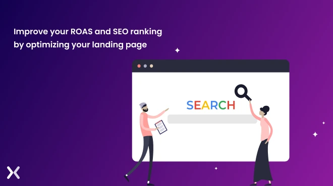
The ultimate consequence of poorly managed landing pages is wasted ad spend, which means a low return on ad spend (ROAS). A well-optimized landing page not just increases conversion rates but also improves search engine ranking. Google recognizes when a landing page offers relevant information and a positive user experience, increasing the likelihood of higher ad positioning.
 While avoiding landing page mistakes may seem challenging, it is entirely possible to do so and reap the benefits that well-crafted landing pages have to offer. One advantage is that landing pages are standalone entities, making it easier to identify and address any errors or areas for improvement.
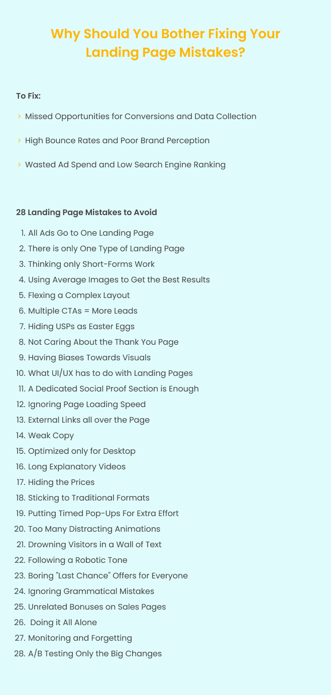
The list of common landing page mistakes to be aware of and avoid at all cost.
Understanding the marketing funnel is necessary to successful campaign execution. The marketing funnel consists of different stages - awareness, consideration, conversion, and retention - and each stage requires a tailored approach to nurture and convert leads effectively.
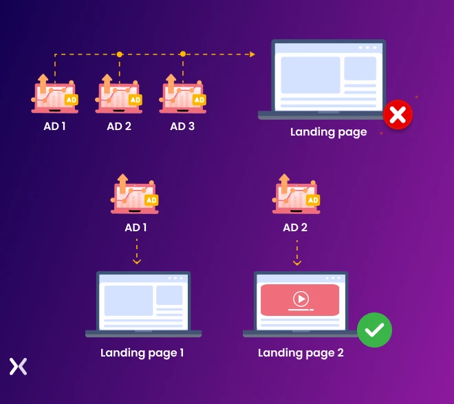 Using a single post-click landing page for all ads can lead to confusion for visitors at different stages of the funnel. It’s important to create specific landing pages that match the intent and needs of each target audience segment, providing a personalized and smooth user experience.
To fix the mistake of directing all ads to one landing page. It’s necessary to create dedicated landing pages for each stage of the marketing funnel. A study conducted by HubSpot found that businesses with 31 to 40 landing pages generated seven times more leads compared to those with only five landing pages. This research demonstrates the importance of having tailored landing pages to serve different funnel stages. By developing dedicated landing pages. You can make sure that audiences are presented with content and offers that match their specific needs and interests at each stage.

Companies may mistakenly think that there’s only one type of landing page, leading them to miss out on valuable opportunities for engagement and conversions. Some common thoughts in this regard may include: “Why bother creating multiple landing pages when one can serve all purposes?” or “A single landing page should be sufficient to capture leads and drive conversions.” Who told you there’s only one type of landing page? The truth is that landing pages can come in various forms and serve different purposes based on your marketing objectives.
To fix the mistake of using only one type of landing page. It’s important to understand the different types of landing pages that can be used based on your conversion goals and target audience. Here are a few examples:
Captures valuable visitor information by offering relevant content or incentives in exchange for contact details.
Carefully crafted to accent the features, benefits, and value proposition of a product or service, persuading visitors to make a purchase or take a specific action.
Acts as a bridge between an ad or promotional content and the final destination, providing additional information and persuading visitors to click through to the next step of the conversion funnel.
Quickly captures visitor information, typically focusing on a single call-to-action, such as subscribing to a newsletter, signing-up for a free trial, booking demos, or sharing subscription packages, accessing exclusive content, with minimal distractions.
Many believe that reducing form fields to the bare minimum is the key to capturing leads quickly. While this advice is widely shared, the reality is that it varies depending on the target audience. Sometimes, eliminating necessary form fields can result in an influx of low-quality leads.
Understanding how long forms work can alleviate any doubt or fear associated with using them. For example, when the goal is to build an email list at the top of the funnel, short forms can be effective in capturing leads. However, it’s important to recognize that different stages of the customer journey may require longer forms to gather more relevant information and qualify leads. However, if your landing page aims to secure high-quality leads, using a long-form is the way to go. Don’t worry about having to display all the fields at once. Consider using a multi-step form that breaks the fields into 2-3 easy-to-complete steps. This strategy uses behavioral psychology to guide prospects through the conversion process.
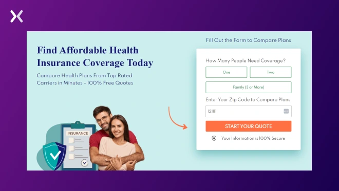 In this example from Affordable Health Coverage Today, you’ll see that the form only starts with low-ask questions that don’t seem complicated. By applying this strategy to your long forms, you’ll increase the likelihood of people finishing the entire process.
You can also take advantage of the fact that we, humans, tend to hate it when we don’t finish what we started. Try to create lead generation forms that encourage people to finish - this can be in the form of pop-up messages when they exit the tab.
In this example from Affordable Health Coverage Today, you’ll see that the form only starts with low-ask questions that don’t seem complicated. By applying this strategy to your long forms, you’ll increase the likelihood of people finishing the entire process.
You can also take advantage of the fact that we, humans, tend to hate it when we don’t finish what we started. Try to create lead generation forms that encourage people to finish - this can be in the form of pop-up messages when they exit the tab.
Overpriced stock images rarely yield optimal conversion rates and can negatively impact the effectiveness of a campaign. Placing generic, small, or distracting images on a landing page can hinder the successful delivery of its message. While design and visuals are essential, finding the balance between too many and too few images is necessary for engaging visitors and maintaining their focus.
Since using real photos can lead to a 35% increase in conversions. It’s essential to consider the following when selecting images for your landing page:
Presenting your product or service being used in context or real-life scenarios
Providing examples or screenshots if you are selling a software tool to give visitors a clear understanding of what they will receive
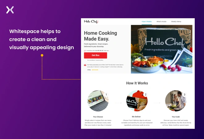
Demonstrating transformations or before-and-after situations to accent the end results Now, let’s talk about whitespace or the empty space between elements on a webpage. This plays a significant role in improving user experience and ease of navigation. For example, take a look at how this sample website deliberately uses whitespace to create a clean and visually appealing design, allowing users to focus on specific information and move through effortlessly.
When it comes to landing pages, the goal should be to provide information that is easy for potential customers to digest. If your page is overloaded with text, an excessive number of images, numerous boxes, and a cluttered layout. It’s no surprise that visitors will land and leave just as quickly. You don’t want your visitors to feel overwhelmed by an ocean of information on your landing page. Not just does this create a poor visual appeal, but it also gives users enough reasons to move through away from your page. This can significantly point toward a low landing page engagement rate.
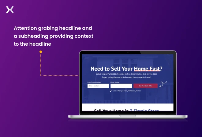
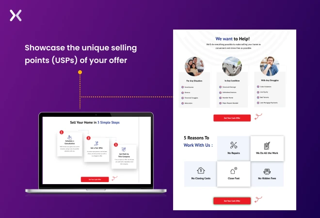
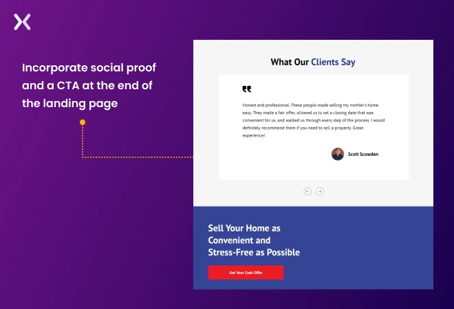
When creating a landing page, follow a natural flow that captures visitors’ attention and leads them toward the desired action. Here are the key steps to achieve an effective landing page:
1. Start with an attention-grabbing headline.
2. Provide context for the headline using a subheader.
3. Present a combination of features and benefits that present the unique selling points (USPs) of your offer. This helps to convince visitors of the value they will receive.
4. Incorporate social proof, such as testimonials or reviews, to support the claims made about your offer.
5. End your landing page with a form where visitors can provide their information and a clear call-to-action (CTA) that instructs them on how to obtain the offer. Make sure the CTA is strong and matched what the visitor desires.
 When it comes to landing pages, achieving a 1:1 attention ratio is necessary. By providing one clear CTA (or putting it in every section) and removing distractions like navigation bars. You can focus your visitors’ attention and increase conversion rates. Custom images and strong CTAs also matter in engaging users effectively.
Simply put, the 1:1 ratio is about allowing the information on a landing page to breathe and creating a scrollable, distraction-free experience for visitors.
When it comes to landing pages, achieving a 1:1 attention ratio is necessary. By providing one clear CTA (or putting it in every section) and removing distractions like navigation bars. You can focus your visitors’ attention and increase conversion rates. Custom images and strong CTAs also matter in engaging users effectively.
Simply put, the 1:1 ratio is about allowing the information on a landing page to breathe and creating a scrollable, distraction-free experience for visitors.
One often overlooked element that can lead to landing page mistakes is the absence of a clear call-to-action (CTA) or, in other cases, a couple of different ones within one landing page.
Design plays a critical role in the effectiveness of your CTAs on landing pages. To make sure they stand out, use contrasting colors and bold elements that catch the eye.
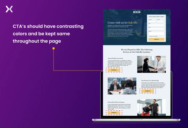 Reinforce the core benefits of your offer and clearly communicate the desired action with your button text. This combination of design and persuasive messaging boosts the chances of conversion. Remember to keep the CTA the same throughout the page.
Without a clear direction, visitors can become confused, resulting in lost conversions as they are unsure of what actions to take on the page. weak USPs can backfire as customers may question their relevance, leading to negative perceptions and potential disinterest in the product or service.
To make your landing page more effective, start by immediately getting to the point. Grab your prospect’s attention by marking your USP. Make it attractive and catchy, positioning it prominently in the hero section. Reinforce its importance throughout the landing page to strengthen engagement and guide visitors toward your CTA.
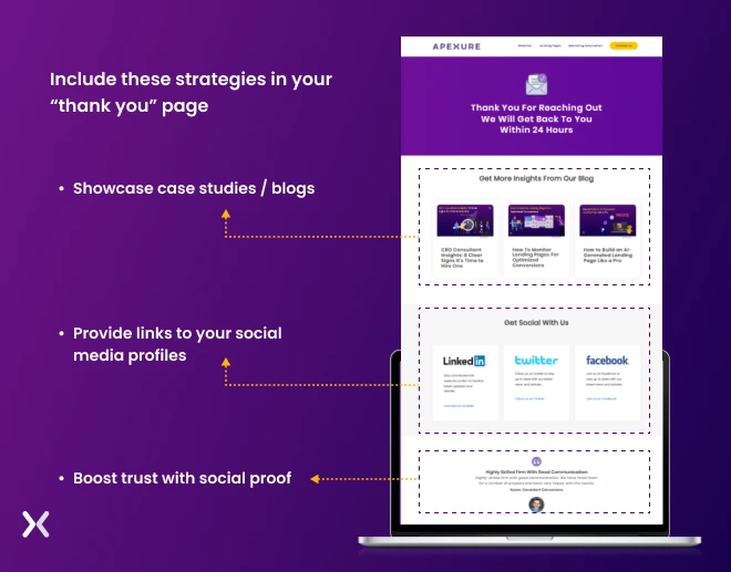
Congratulations on getting visitors to convert via your landing page! But the job doesn’t end there. Avoid leaving your new leads hanging; guide them smoothly to the finish line. A well-crafted thank you page is key. Don’t settle for a run-of-the-mill thank you page. Instead, use this opportunity to build a deeper connection with your brand-new leads.
After successfully converting visitors. Don’t overlook the importance of the “thank you” page. Make it count by implementing these strategies:
Accent social proof, such as testimonials and positive reviews, to establish credibility. This reassures leads that they’ve made a wise decision.
Share engaging case studies that present your expertise. This builds interest and demonstrates your ability to deliver results.
Build ongoing engagement by providing links to your social media profiles. Invite leads to stay connected for exclusive updates and content.
Flashy visuals alone cannot guarantee high conversions, despite popular belief. Including random visuals without purpose may confuse your visitors instead of attracting leads. The goal is to sell your offer - not just the landing page itself.
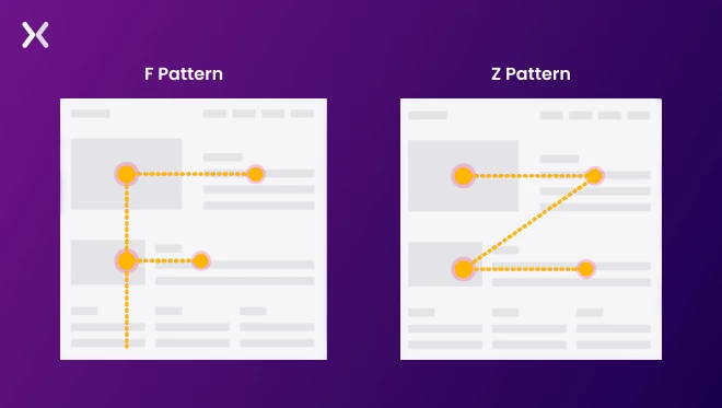
While it may be tempting to go all out with visuals, be mindful of organizing them in a logical order and avoiding excessive competition for attention. Establish a hierarchy of visuals and information that directs your customers’ gaze toward the most important sections of your landing page. Research suggests that readers tend to follow F and Z patterns when scanning a page. Business owners can use these patterns to create more effective landing pages.
Have you ever landed on a page that instantly put you off due to its poor design? When it comes to your webpage, the way it looks, its layout, and how user-friendly it is can greatly impact your visitors’ decisions. If any of these aspects are off-brand, unattractive, or difficult to move through, chances are high that your visitors will quickly abandon your page and continue their search elsewhere. Its visual appeal does not solely determine the user experience of a landing page. It covers a multitude of critical elements that are sometimes overlooked, all in the pursuit of making the page visually pleasing.
To overcome this, focus on creating a balanced and user-friendly design. Make sure that the page’s layout is clean and well-organized, with an emphasis on marking key information. It’s necessary to strike a balance between visual appeal and usability. In addition to visual content, written content plays a significant role in design. Use simple and concise language, avoiding technical jargon that may confuse or alienate potential customers. Try to put yourself in their shoes and create a landing page that is relevant to them.
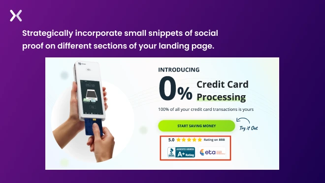
Building trust with your target audience is necessary in online marketing, and social proof plays an instrumental role in achieving this. Whether it’s testimonials, reviews, or company badges, these elements vouch for the quality of your product or service. However, it’s not enough to simply include a dedicated social proof section on your landing page. By limiting social proof to one section, you run the risk of users never coming across it, potentially leading to missed opportunities.
In every section, from the hero section to the bottom, incorporate small snippets of social proof. For instance, place ratings next to your call-to-action button, include a concise testimonial after marking your product’s features and benefits, and conclude with a strong video testimonial. Even if you don’t have an abundance of social proof. You can still be creative in how you display it on your landing page. Stress quality over quantity and deliberately present the social proof you do have to instill confidence in your visitors.
Research indicates that if a webpage takes longer than 3 seconds to load, users are highly likely to bounce, meaning they leave the page without taking any desired action. This phenomenon, known as slow page response, points toward a significant number of page abandonment. All the effort invested in creating effective landing pages will go to waste if visitors leave before the pages fully load. As user expectations for faster loading times increase, many brands find themselves struggling to keep up with these demands.
Fortunately, you can address this by utilizing the Google PageSpeed Insight tool to assess your page’s loading speed and implement necessary improvements. Here are some quick tips to achieve faster page loading:
Compress and resize images to reduce their file size without compromising quality.
Condense your website files, including HTML, CSS, JS, and more, to reduce their overall size.
Simplify your server’s response time to decrease the time it takes to begin loading your landing page and improve overall performance.
Use browser caching to store static elements of your landing page, allowing returning visitors to load the page more quickly by retrieving certain files from their cache.
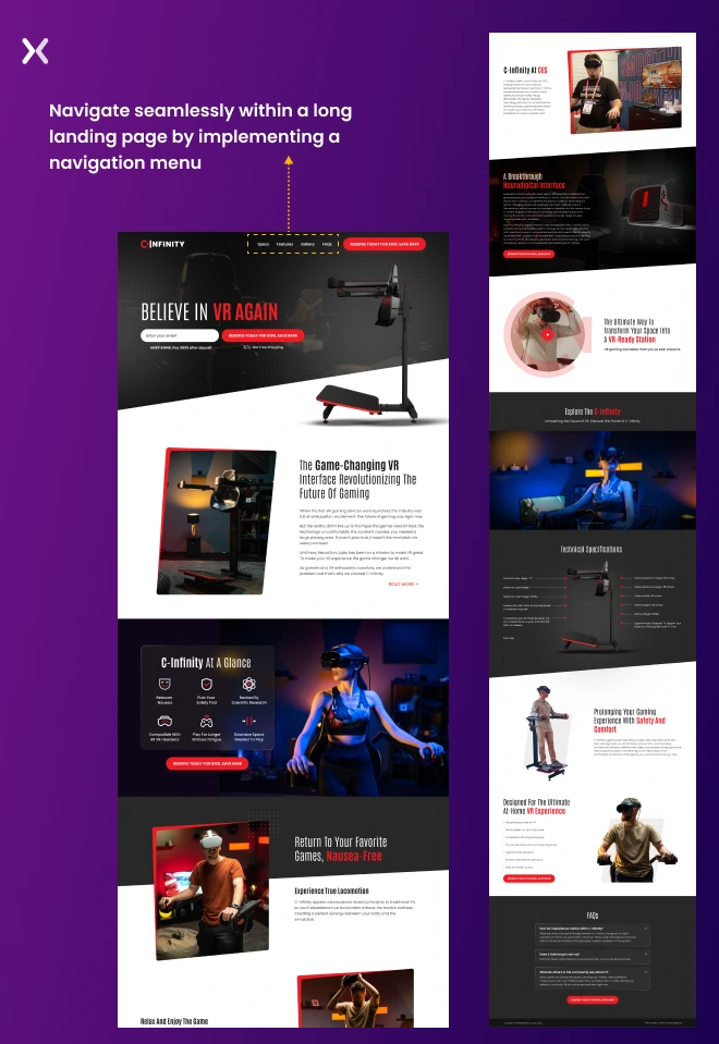
To make sure a smooth sales process and minimize the chances of visitors abandoning your landing page, simply provide a clear call to action. External links scattered throughout the page (such as navigational menus, footers, and social media links) can create unnecessary friction points that divert visitors away from your intended goal.
You should make sure that no external links are present on your landing page. Instead, focus on guiding visitors with only a single goal in mind. However, if you have a long landing page with multiple sections, you can consider implementing a navigation menu with anchor links that allow users to move through smoothly within the page. If you are concerned about promoting your social media platforms, you can always include those links on the thank you page after visitors have completed the desired action. This way, you can maintain their focus and prevent any distractions that could hinder the conversion process.
mobile-dominated environment. It is necessary to make sure a consistent experience across devices rather than optimizing solely for desktops. While loading times play a significant role, overlooking basic design mistakes can hinder user engagement and conversions.
You have two options. Firstly, you can create a dedicated mobile landing page specifically tailored to your marketing campaign. This approach makes sure optimal performance and user experience on mobile devices, mitigating any risks to your ROI. Alternatively, adopting a responsive design for your landing page allows it to adapt and function smoothly across all screen sizes, providing a consistent experience for your visitors. When deciding between the two options, consider your campaign objectives and the channels you will be utilizing. If you primarily run mobile ads, a dedicated mobile landing page is recommended. However, if your campaign spans multiple channels, a responsive landing page design offers a safer and more cost-effective approach.
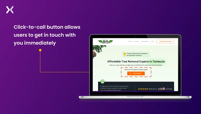
Offering multiple paths for viewers to achieve a goal can greatly benefit your landing page and marketing efforts. For instance, some visitors may prefer the convenience of filling out an online form without the need for direct interaction with sales representatives or customer service. However, others may prefer the option to call directly and speak with a representative. By accommodating these preferences, you can serve a wider audience and increase their satisfaction.
One effective approach is to use storytelling, chatbots, or short quizzes that provide valuable insights into your brand while simultaneously gaining a better understanding of your users. This interactive exchange benefits both parties involved. Another popular interactive element to consider is a click-to-call button that allows users in urgent need of your services to get in direct touch with you immediately.
When it comes to landing page copy, many people focus on marking the offer’s features, benefits, and hero shots. However, this approach is not effective. On a landing page, you only have one chance to convince visitors to convert. If the copy doesn’t match their problems and experiences, they will quickly leave. Too much copy, typography, and long paragraphs look great on pillar pages but are mistakes to avoid when writing landing page copy.
To address visitors’ concerns effectively, consider these two strategies:
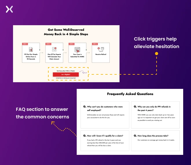
Incorporate click triggers, which are small bits of text placed near or under your call-to-action buttons. These microcopies are designed to overcome objections about your offer or product. By addressing common last-minute doubts in a subtle and non-intrusive way, click triggers can help alleviate hesitation.
Add an FAQ section at the bottom of your landing page to answer the most common concerns of potential leads. To gather these questions, you can survey your past and current customers, making sure you address the specific doubts that might be holding back conversions. Refer to the images below for the sample landing page containing click triggers (shown in an “Am I Eligible?” button) and an FAQ section:
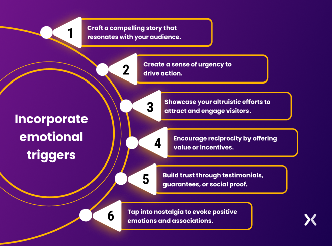
Being overly robotic and detached in your communication can be a common mistake in the competitive world of business. Sometimes, companies become so focused on outperforming their rivals that they forget to inject human elements into their products, services, and designs.
While many people believe their decisions are based on logical analysis of available options, emotions actually play a significant role in the decision-making process. To improve your landing page and boost conversions, consider incorporating these emotional triggers:
While incorporating explanatory videos can be beneficial for promoting complex services or products. It’s important to be cautious about the length of these videos. Lengthy videos can potentially hinder conversions in a few ways - they can significantly slow down the loading speed of your page, which can discourage visitors from staying.
Landing pages should deliver key information quickly and concisely. Users tend to scan content, and long videos may not help easy information retrieval.
If you have a necessary video you want to share with your clients, consider creating dedicated video landing pages. This way, you can maintain the impact of the video while avoiding potential loading speed issues.
Explore alternative visuals and copywriting techniques to communicate your message effectively. Infographics, gifs, storytelling, and other visual elements can help you deliver information efficiently and keep visitors engaged.
When prices for products or services are hidden on a landing page. It can lead to several negative consequences:
Transparency is compromised, which erodes trust.
It causes unnecessary delays for customers and your sales team.
Comparison shopping becomes challenging.
Unqualified leads may be attracted, resulting in misaligned budgets.
Brand perception and credibility are damaged.
To rectify this landing page mistake, it is necessary to prioritize a clear and prominent display of pricing information. Make sure that pricing details are easily accessible, consider offering pricing tiers or packages to serve different customer needs, and consider providing resources such as pricing guides or calculators that can assist potential buyers in understanding the cost.
Offering downloadable pricing resources can further improve transparency. It is also important to provide a clear and convenient contact channel for any inquiries or clarifications regarding pricing.
Making use of timed pop-ups for extra effort on landing pages can prove to be a mistake. This is because these pop-ups disrupt the user experience, leading to frustration and potential abandonment. They divert visitors’ attention away from the main content and call to action, resulting in decreased engagement and conversions.
High bounce rates can occur as visitors perceive the pop-ups as intrusive or irrelevant. Timed pop-ups can give off an impression of desperation, diminishing the credibility and trustworthiness of your brand.
If pop-ups are necessary, it is recommended to use user-initiated pop-ups instead. Rather than triggering the pop-ups automatically, allow visitors to initiate them through a clear and prominent call-to-action button. This approach grants users control over their browsing experience and makes sure that those who are genuinely interested will actively engage with the pop-up content.
Excessive and distracting animations on a landing page can have detrimental effects on its overall effectiveness. These animations can point toward visual clutter, slow down the loading speed of the page, hinder readability, and disrupt the user experience.
It’s essential to simplify and carefully select the use of animations. Prioritize their purpose and make sure they improve the user experience rather than detract from it. For example, it is necessary for SaaS landing pages to have animation as a way to show-off their user interface, but the same is not true for a law firm. Optimize the animations for optimal performance to minimize any negative impact on page load times.
Gathering user feedback can help fine-tune the use of animations, making sure a smooth and engaging experience that effectively guides visitors toward your conversion goals.
Presenting visitors with a dense and lengthy block of text can lead to a loss of interest, difficulty in finding key information, and, ultimately, abandonment of the page. The presence of long paragraphs not just disrupts the aesthetics of the landing page but also overwhelms visitors, making it challenging for them to quickly grasp the information they need.
Incorporating visual elements, such as images or infographics, in a scannable, manageable, and concise format can help make the content more visually appealing and easily digestible. By improving the readability and overall presentation of the content, you can improve user engagement and improve the effectiveness of your landing page.
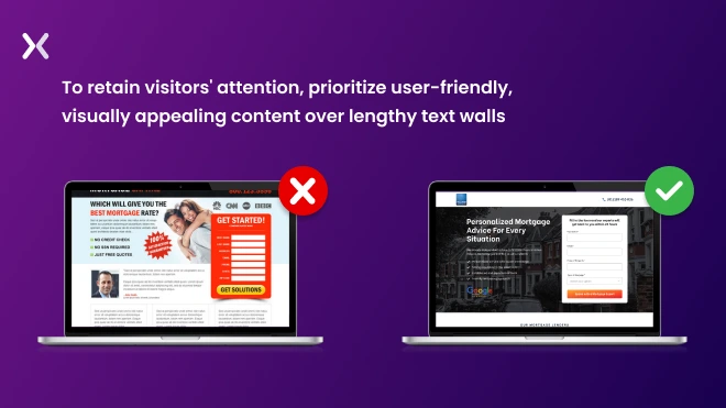 If you want to capture and maintain visitors’ attention, it is important to avoid overwhelming them with walls of text. Instead, embrace a more user-friendly approach that effectively presents information in a clear and visually appealing manner.
This is a common mistake that lacks the ability to create a genuine sense of urgency and personalization. When the offer fails to evoke excitement or create a truly time-sensitive element, visitors may view it as unremarkable and not worthy of immediate action.
To address this mistake, it is important to generate authentic urgency and personalize the offers based on visitor preferences. Consider incorporating exclusive benefits or incentives to improve the value proposition. Continuously testing and optimizing the offers can also help maximize their impact and effectiveness.
These errors not just show a lack of attention to detail but also harm the professionalism and credibility of your brand. Visitors may question the quality of your offerings and be less inclined to trust your business due to these avoidable errors.
Look out for spelling mistakes, incorrect punctuation, and grammatical errors. If needed, seek professional help from editors or proofreaders who can provide fresh eyes and make sure the accuracy of your copy. Since the readability of your landing page is important in the delivery of your message. It’s only wise to make it easy for visitors to scan and comprehend the information. Use clear headings, bullet points, and concise sentences to improve readability.
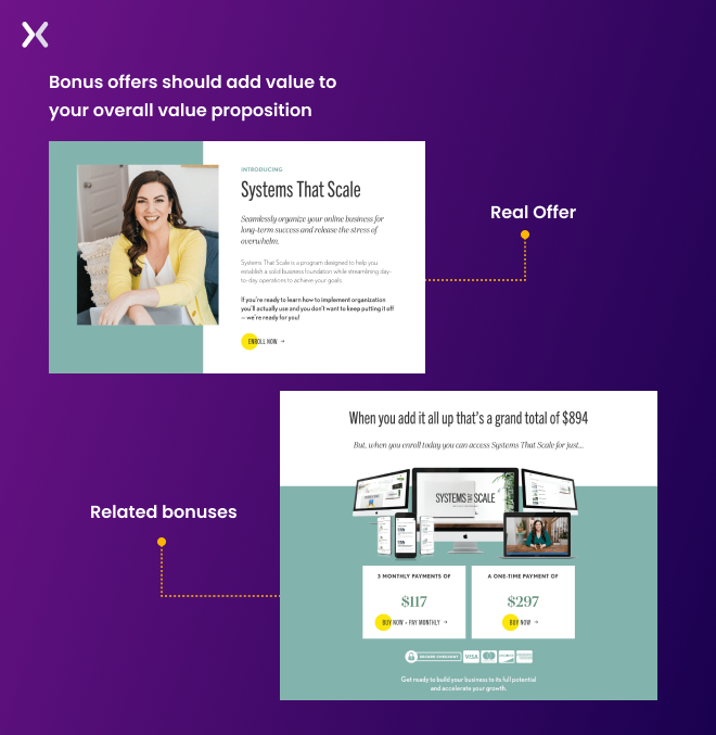
When potential customers come across bonuses that are not directly relevant to the main offer. It creates a sense of discord and can breed skepticism and doubt. This lack of alignment between the bonuses and the primary product or service may give the impression of a disjointed or misleading marketing strategy. Consequently, potential customers may question the overall value proposition and hesitate to proceed with the purchase.
Bonuses you offer on your sales pages should be closely related and genuinely complement the main offer. These bonuses should provide additional value and reinforce the appeal and trustworthiness of the primary product or service.
The other necessary aspect is continuously monitoring and optimizing landing pages for better performance. However, many businesses tend to overlook this essential rule and become complacent after experiencing initial success with their landing pages. While a well-built landing page can indeed deliver impressive results. It’s important to remember that the digital environment is constantly evolving. Over time, your landing page may lose its luster, leaving you confused about the next steps to take.
By keeping a watchful eye, you can gain a clear understanding of which elements on your landing page capture your users’ attention. Start monitoring right from the moment your landing page goes live - it’s not as challenging as it may seem. Begin by setting basic key performance indicators (KPIs) for your landing page and use the power of heatmaps to make the most of every visitor’s journey.
Recommended Read: How to Monitor Your Landing Pages for Optimized Conversions
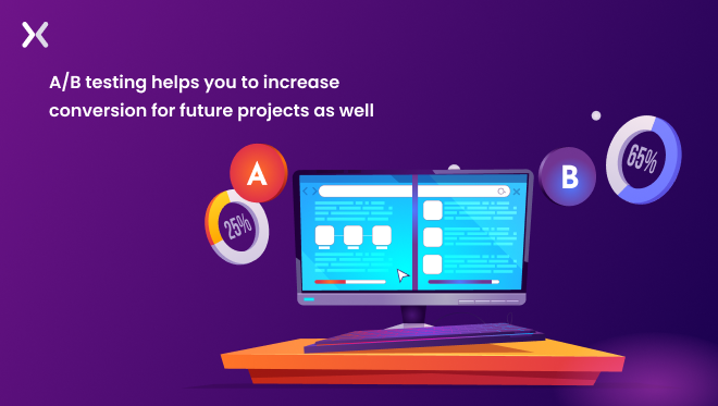
When it comes to A/B testing, the initial thought may seem overwhelming. Building different versions of the same page and waiting for the best result can appear tedious at first glance. However, the perception quickly changes when the desired outcomes are achieved. Businesses must also recognize that testing is not solely about making significant changes. Sometimes (even small tweaks, such as swapping sections, repositioning elements, or adjusting the color of the CTA button) can yield significant responses. It is essential not to rush the process in pursuit of increased conversions, as this can lead to inaccurate test results.
Instead of hastily jumping to conclusions based on A/B test results. It’s necessary to exercise patience. Allow your landing page to accumulate a substantial audience (around 200 or more) and allocate an appropriate amount of time (over a week) to gather reliable results. When executed properly, this approach can uncover conversion gems on your landing pages that can be replicated for future campaigns.
Making any of the above-mentioned mistakes can have a detrimental impact on your conversion rate. However, one of the primary factors that may point toward overlooking these mistakes, even after reading countless articles, is not being an expert in this field. Despite the notion that landing pages are single-page wonders, they require careful attention and expertise to handle effectively. This is especially true when utilizing them for Pay-Per-Click (PPC) ads.
It is highly recommended to collaborate with an experienced landing page design agency. By partnering with experts in the field, you can benefit from their knowledge and skills, making sure the creation of high-performing landing pages that drive conversions. The expertise and guidance offered by a professional agency will enable you to avoid costly mistakes and maximize the potential of your landing pages.
Keep in mind that creating an effective landing page requires more than just throwing together some words and visuals. Mistakes can happen, and they may occur again in the future. But it’s essential not to let these mistakes become ingrained habits. Before launching your next landing page, take the opportunity to learn from these mistakes and make sure you’re on the right track. Consider seeking consultation from an expert in the field. Apexure is here to assist you with your landing pages, as there’s more to it than meets the eye. With our extensive experience of over eight years in the landing page industry, we’ve encountered and rectified numerous landing page mistakes, making us well-equipped to guide you. Contact us today for a consultation, and let us help you achieve landing page success.
Learn how to analyze landing pages better with Apexure’s 100+ blog posts on landing pages. From creation to testing, analysis to optimization, we have shared everything.
Building a landing page for higher conversions and growth, it tough if you’re new. Take help from one of our landing page experts and get the support you need. Book a call today!
Our landing page portfolio can help you discover conversion-friendly landing page elements that might be missing from your campaigns. Know what’s trending and build your landing page for success.
Even a one-second delay can knock off over half of your visitors and significantly reduce conversion rates.
Related Article:
As CEO and Founder of Apexure, Waseem Bashir's decade-old experience in building high-converting landing pages extends to collaborations with Fortune 500 leaders. From free to paid he has tried his hands on all landing page builder tools and knows just the right fit for every business. Read more


Drive More Sales or Leads With Conversion Focused Websites and Landing Pages
Get Started

Eleven percent of Meta ad rejections in 2026 trace back to one problem: the landing page does not...

A B2B SaaS company spends $30,000 per month on Google Ads and Meta Ads. Both campaigns drive traffic...
Get quality posts covering insights into Conversion Rate Optimisation, Landing Pages and great design
