
FAQ page design, inclusive of FAQ sections, is essentially the lifeblood of the e-commerce industry. With the missing element of physical touch, the value of an entire space dedicated to answering the most common doubts in consumers’ minds is nothing short of genius. Therefore, it is not startling to state that FAQ sections are vital to many landing pages. While a FAQ isn’t required for every landing page, if you’re selling something, offering a service, or providing information on a complicated subject. It may make things a lot easier for your visitors.
 There’s no one “right” design method for FAQ design best practices since the format of an FAQ varies considerably from site to site. There are, however, some essential things to remember. To keep it simple, memorize it this way: FAQ. - Focus on information, Assist visitors through interaction, and Question the status quo!
What must finally be remembered is why we need FAQ sections on landing pages. Your FAQ section on a landing page isn’t just there to address common questions about your business. That’s only part of it.
The natural beauty of knowing when to use FAQ on a landing page lies in the fact that it can be a practical addition to your landing page design that serves several functions if done right. For example, here are a few of the benefits to support the argument:
There’s no one “right” design method for FAQ design best practices since the format of an FAQ varies considerably from site to site. There are, however, some essential things to remember. To keep it simple, memorize it this way: FAQ. - Focus on information, Assist visitors through interaction, and Question the status quo!
What must finally be remembered is why we need FAQ sections on landing pages. Your FAQ section on a landing page isn’t just there to address common questions about your business. That’s only part of it.
The natural beauty of knowing when to use FAQ on a landing page lies in the fact that it can be a practical addition to your landing page design that serves several functions if done right. For example, here are a few of the benefits to support the argument:
You are taking care of any concerns about purchasing that your product page copy doesn’t explicitly address.
Considerably improving SEO.
By openly answering common inquiries, we can relieve some of the pressure on customer service.
Customers will be delighted if you respond to their questions in a creative way. It becomes easy to prevent consumer complaints and poor reviews by being proactive.
You can successfully earn your potential consumers ‘ trust by demonstrating product expertise and clarifying your business model. If you feel like you’re not using your FAQ section to its fullest potential, here are some of the questions you should be asking to get the most out of this often-forgotten section of most landing pages.
In this guide, you’ll learn:
 An FAQ page (Frequently Asked Questions page) is a dedicated page on your website where you address the most common questions, concerns, and objections your customers have. It’s the go-to destination for answering specific questions about your product or business operation, be it related to free trials, demo booking, deliverability of services, pricing, returns, or anything else visitors need to know before converting.
While the terms are often used interchangeably. There’s an important distinction. A FAQ page is a standalone page on your website, typically linked from your main navigation or footer, that houses all of your frequently asked questions in one place. It’s ideal for businesses with a large number of questions spanning multiple topics. A FAQ section, on the other hand, is a component embedded within another page, such as a landing page, product page, or homepage. FAQ sections are typically shorter and more focused, addressing the specific questions related to the content on that page. Both serve the same fundamental purpose: reducing friction and helping visitors find answers quickly. The decision between a full FAQ page and an embedded FAQ section depends on the volume and variety of questions you need to address. Many businesses use both, a full FAQ page for general queries and targeted FAQ sections on individual landing pages for conversion-specific objections. When used appropriately, your FAQ page or section can help customers at all stages of the buying process, whether they’re in the research stage and want to know how you source your products or an existing client who wants assistance resolving a problem. Following FAQ design best practices allows you to create something unique. Introducing the FAQ mitigates the overall agitation of acquiring online, and that goes a long way in obtaining on-the-fence clients to get from you.
Creating the best FAQ page design is like playing a very dicey game; it all ultimately depends on the digital marketer’s objective and matching the consumer’s psychology. This can either be a distraction or an asset, relying heavily on how you choose to execute it. Nonetheless, as marketers. It is our vocation to make sure that it’s the latter. Here are several clues that indicate it’s time to include a great FAQ page design as part of your landing page to make the selection much easier:

Consumers email you with identical questions on an ongoing basis, so it’s best to handle them in public and prominently.
You’ve created or intend to build content/landing pages so that you can connect to extend the journey from query to transition.
Your merchandise/service/enterprise raises doubts and concerns best handled straightforwardly.
The previous point is critical as a good FAQ page design introduces an extraordinary opportunity to handle worries immediately and remove obstacles on the pathway to purchase.
Before diving into best practices, it helps to understand the different FAQ layout types available to you. The right FAQ format depends on how many questions you have, how long the answers are, and how your visitors prefer to consume information. Here are the most popular FAQ design ideas and when to use each one.
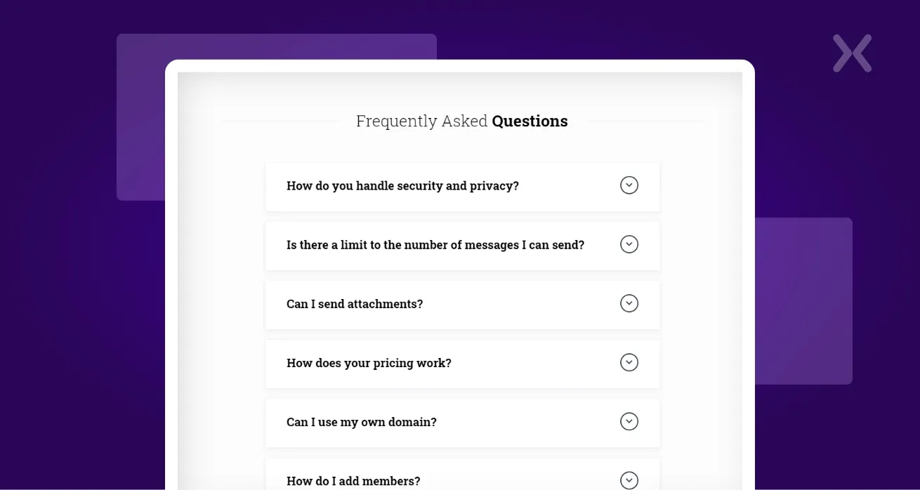
The accordion is the most widely used FAQ format on the web, and for good reason. Questions are listed vertically with a plus icon or arrow, and clicking a question reveals the answer beneath it while collapsing any previously open answer.
When to use it: You have more than five questions, and the answers vary in length. The accordion keeps the page scannable by hiding answer text until the visitor specifically requests it. This is especially effective on landing pages where you want to address objections without adding visual clutter.
Design tip: Make sure only one answer is open at a time (or give users the choice). Animate the open/close transition smoothly, and make the tap/click target large enough for mobile users.
In this format, all questions and answers are displayed in full, no clicking required. The visitor can scan every answer at a glance.
When to use it: You have fewer than five questions with short, concise answers. This works particularly well for high-intent pages (such as pricing or checkout pages) where visitors want quick reassurance before taking action. Our SmartRoof landing page is a great example of this approach, four questions displayed on a bold background, fully visible.
Design tip: Use strong visual separation (alternating backgrounds, dividers, or cards) between each Q&A pair to maintain readability.
This creative FAQ layout places questions on one side and the corresponding answer on the other, or pairs the FAQ with a visual element like a product screenshot or illustration.
When to use it: When you want to reinforce your product or service visually while addressing objections. This layout works well on SaaS product pages and service landing pages. Our Landlord Vision design demonstrates this pattern effectively, FAQ on the left, product screenshot on the right.
Design tip: Keep the two columns balanced. If one side becomes significantly longer than the other, it creates an awkward visual imbalance.
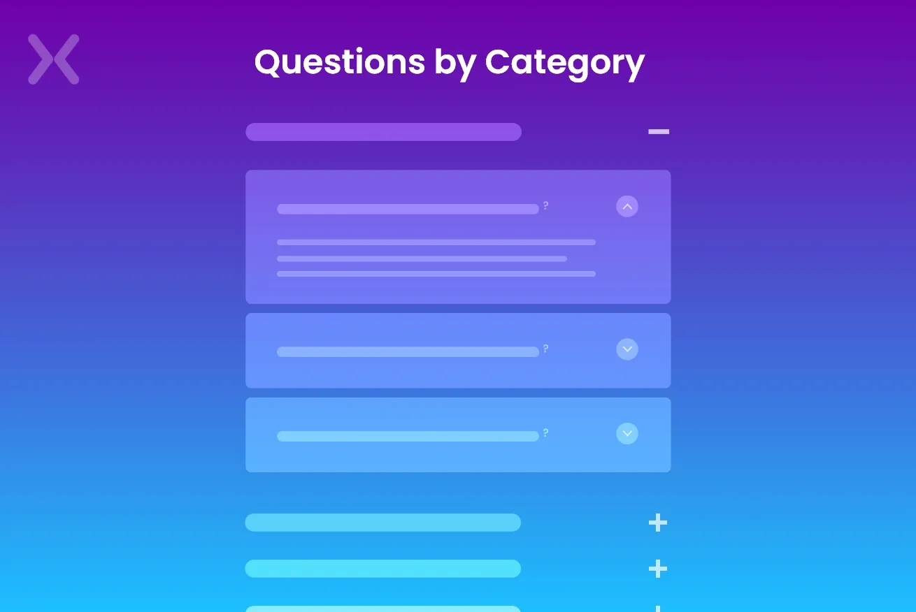
When you have a large number of questions, grouping them into categories (e.g., Billing, Shipping, Product, Account) helps visitors find what they need without scrolling through irrelevant questions. Categories can be presented as tabs, a sidebar navigation, or separate accordion groups with category headings.
When to use it: You have 15+ questions spanning multiple topics. This is the standard approach for dedicated FAQ pages (as opposed to embedded FAQ sections). E-commerce sites with complex product lines, SaaS platforms with multiple features, and service businesses with varied offerings all benefit from categorised FAQs.
Design tip: Follow FAQ categorisation best practices by limiting categories to 4-7 groups. Too many categories defeat the purpose of organisation.
For websites with extensive FAQ content, adding a search bar at the top of the page lets visitors type their question and instantly filter relevant results. This is the gold standard for large-scale FAQ pages.
When to use it: You have 30+ questions or serve multiple customer segments with different needs. The search function dramatically reduces the time to find answers and improves the overall FAQ page experience.
Design tip: Include autocomplete suggestions and handle common misspellings. Show the most popular questions as a default state before the visitor searches.
So, what makes a good FAQ page design? It all relies on the number of questions and extent of the content you plan to have in the first place. We would suggest you consider designing the container with the content in mind. Not unlike most marketing questions - it depends. To follow FAQ pages’ best practices and examples, you must break the problems down into components and solve each issue.
 The foremost way to address this is by thinking about it from a fresh perspective. FAQs are objections you need to overcome, and they could be as simple as “Will this work for me?”
The mundaneness of the questions could range anywhere from questions like “If my business suffers a loss after I’ve hired you, will you compensate me.” or something weird like “Can ladies above 50 attend your workshops?”
Maybe you’ve come across absurd (yet genuine) questions that you are tired of answering repeatedly. This is where FAQ sections on landing pages can be life-changing.
In, this case, list each of the reasonably usual objections you obtain from your perspectives and convert each one into a “Frequently Asked Question” (FAQ). More often than not, the following objections are regularly encountered by business owners and sales staff. Reviewing them and using the protest to formulate your response would benefit you.
You want to take the top 3 things that keep people from giving you money. And put that at the top of your customer FAQ. FAQ design examples will teach you about what and what not to include in your FAQ page design.
The foremost way to address this is by thinking about it from a fresh perspective. FAQs are objections you need to overcome, and they could be as simple as “Will this work for me?”
The mundaneness of the questions could range anywhere from questions like “If my business suffers a loss after I’ve hired you, will you compensate me.” or something weird like “Can ladies above 50 attend your workshops?”
Maybe you’ve come across absurd (yet genuine) questions that you are tired of answering repeatedly. This is where FAQ sections on landing pages can be life-changing.
In, this case, list each of the reasonably usual objections you obtain from your perspectives and convert each one into a “Frequently Asked Question” (FAQ). More often than not, the following objections are regularly encountered by business owners and sales staff. Reviewing them and using the protest to formulate your response would benefit you.
You want to take the top 3 things that keep people from giving you money. And put that at the top of your customer FAQ. FAQ design examples will teach you about what and what not to include in your FAQ page design.
 One of the very primary things to do is to examine how to tactically lift the correct questions to teach customers concerning your products. The main goal is always to create demand. Consider taking a look at some existing FAQ design examples.
If you don’t have emails or consumer help tickets to use as a reference point. You could check out competitors’ FAQs and product reviews for your items or items in your niche. Make clever use of the ubiquitous resources on forums like Reddit or Quora to see what types of questions people ask!
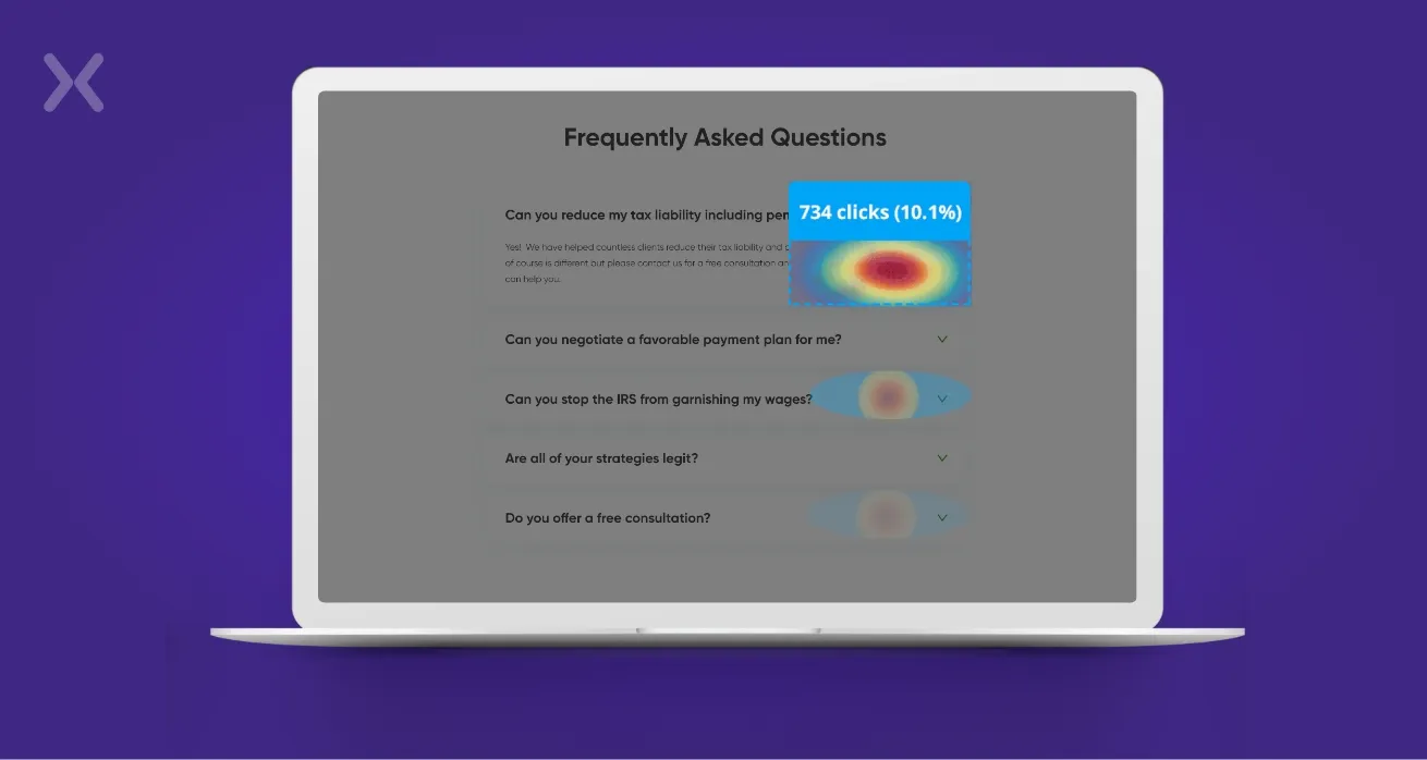
To track clicks and observe which questions are getting the most attention, add Hotjar, Lucky Orange, or Crazy Egg to the page. Even if they don’t leave the website, these tools provide you with “click heatmaps” showing where visitors click. You’ll notice that some queries are asked more frequently than others, and some questions never get asked. Based on the data, do the following:
One of the very primary things to do is to examine how to tactically lift the correct questions to teach customers concerning your products. The main goal is always to create demand. Consider taking a look at some existing FAQ design examples.
If you don’t have emails or consumer help tickets to use as a reference point. You could check out competitors’ FAQs and product reviews for your items or items in your niche. Make clever use of the ubiquitous resources on forums like Reddit or Quora to see what types of questions people ask!
To track clicks and observe which questions are getting the most attention, add Hotjar, Lucky Orange, or Crazy Egg to the page. Even if they don’t leave the website, these tools provide you with “click heatmaps” showing where visitors click. You’ll notice that some queries are asked more frequently than others, and some questions never get asked. Based on the data, do the following:
Try rephrasing questions that aren’t getting any traction.
Move the popular questions to the top of the list.
Get rid of (or move down) the questions that rarely get any attention.
Add additional questions to the mix!
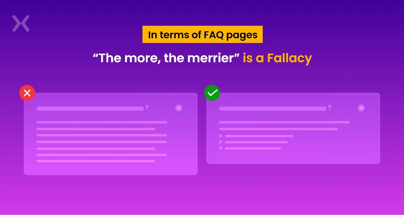 In provisions of FAQ pages, “the more, the merrier” is a delusion. Good FAQ design examples teach us otherwise. The presence of too much text can genuinely conclude to be too bewildering, making readers to have to explore for the solution they need. This is not ideal for landing page optimization since the ultimate goal is to capture the consumer’s interest and not drive it away.
Remember, rather than writing long and eloquent paragraphs. It’s best to be straightforward and brief when providing answers.
In provisions of FAQ pages, “the more, the merrier” is a delusion. Good FAQ design examples teach us otherwise. The presence of too much text can genuinely conclude to be too bewildering, making readers to have to explore for the solution they need. This is not ideal for landing page optimization since the ultimate goal is to capture the consumer’s interest and not drive it away.
Remember, rather than writing long and eloquent paragraphs. It’s best to be straightforward and brief when providing answers.
 With so many FAQ page design best practices, it can also be tedious to list all the questions randomly. This could be frustrating for customers who have more than one related question regarding a single topic.
Thus, it would prove helpful if you divide up questions into overarching topics, such as products, security, and billing. Doing this will make sure a smoother flow of questions and avoid confusion in the long run.
This is one of the most overlooked FAQ categorisation best practices. When you group questions into clear categories, visitors can jump straight to the topic they care about rather than scrolling through irrelevant content. The question and answer format best practices suggest using descriptive category headings that match the language your customers actually use, for example, “Shipping & Delivery” rather than “Logistics”, or “Pricing & Plans” rather than “Commercial Terms”.
If your FAQ spans multiple categories, consider adding a short description beneath each category heading so visitors can confirm they’re in the right section before reading through the questions.
With so many FAQ page design best practices, it can also be tedious to list all the questions randomly. This could be frustrating for customers who have more than one related question regarding a single topic.
Thus, it would prove helpful if you divide up questions into overarching topics, such as products, security, and billing. Doing this will make sure a smoother flow of questions and avoid confusion in the long run.
This is one of the most overlooked FAQ categorisation best practices. When you group questions into clear categories, visitors can jump straight to the topic they care about rather than scrolling through irrelevant content. The question and answer format best practices suggest using descriptive category headings that match the language your customers actually use, for example, “Shipping & Delivery” rather than “Logistics”, or “Pricing & Plans” rather than “Commercial Terms”.
If your FAQ spans multiple categories, consider adding a short description beneath each category heading so visitors can confirm they’re in the right section before reading through the questions.
How your users interact with your FAQs is of importance. A poorly designed or unfriendly interface with FAQs defeats the efficiency of the problems it solves. It would help to think through the way your visitors will use the information you present and make it as easy as possible. Use FAQ pages’ best design practices and examples for further inspiration!
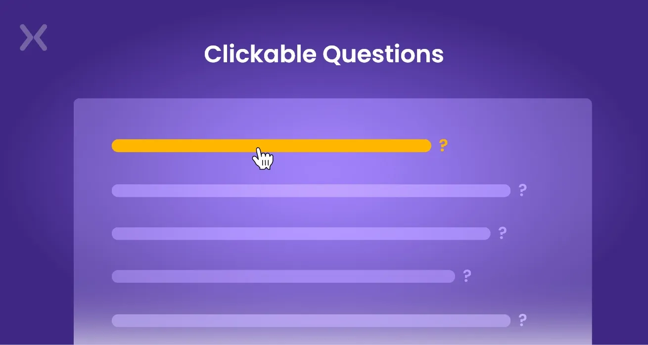 There might be instances where you have furthermore than eight or ten doubts in your FAQ or if the replies to those questions are more than a paragraph each. During such times, it’s indeed a good idea to list your questions instead of showing the responses directly under them. This way, the content will seem much more scannable.
There are two ways to go about making clickable questions. The introductory way is to list your questions right at the top and place your answers separately at the end. It will help if this action is carried out with anchor links to connect the questions to their corresponding answers. This is an excellent method to use if you don’t want to deal with JavaScript. The other trick that businesses can use is using JavaScript to hide the answers. When a visitant click on a question, the answer will appear directly below that question. Some designers animate this (with an accordion or slider effect), while others have the answer appear, making the other questions jump down.
 The downside with FAQ sections is that it is easy to go overboard with the questions. It is necessary to remember that FAQ pages are a primary support choice for buyers looking for an immediate response to a swift question or problem.
Digital marketers should never use it to replace your knowledge base or your complete support crew; instead, B2B companies should improve your existing help channels as a lightweight resource.
The downside with FAQ sections is that it is easy to go overboard with the questions. It is necessary to remember that FAQ pages are a primary support choice for buyers looking for an immediate response to a swift question or problem.
Digital marketers should never use it to replace your knowledge base or your complete support crew; instead, B2B companies should improve your existing help channels as a lightweight resource.
Understanding the best practices is one thing, putting them into action is another. Here’s a step-by-step process for creating an FAQ page that genuinely serves your visitors and supports your business goals.
Start by gathering every question your customers have ever asked. Pull from support tickets, email enquiries, live chat logs, social media DMs, and sales call notes. If you’re starting from scratch, research competitor FAQ pages, industry forums like Reddit and Quora, and Google’s “People Also Ask” boxes for your target keywords.
Sort your collected questions into logical categories (see the categorisation best practices above). Then rank them by frequency, the questions asked most often should appear first. A good rule of thumb: if more than 5% of your customers ask the same question, it belongs in your FAQ.
Each answer should be direct, honest, and jargon-free. Aim for 2-4 sentences for simple questions. For complex topics, start with a one-sentence summary and then expand with supporting details. Always write from the customer’s perspective. They want to know “what does this mean for me?”, not a technical explanation of your internal processes.
Good FAQ answer format:
Based on the number of questions and the context of your page, select the most appropriate FAQ format, accordion for landing pages, categorised layout for dedicated FAQ pages, or open format for short lists. Refer to the layout types section above for guidance.
Build the FAQ using your chosen layout. Pay attention to visual hierarchy, questions should be clearly distinguishable from answers through font weight, size, or colour. Make sure the design is consistent with the rest of your website design and brand identity.
Implement FAQPage structured data to enable rich snippets in Google search results. This is covered in detail later in this guide.
Your FAQ is not a set-and-forget asset. Use heatmaps to see which questions get clicked most, monitor Google Search Console for new question-based queries landing on your page, and review support tickets quarterly to identify new questions that should be added.
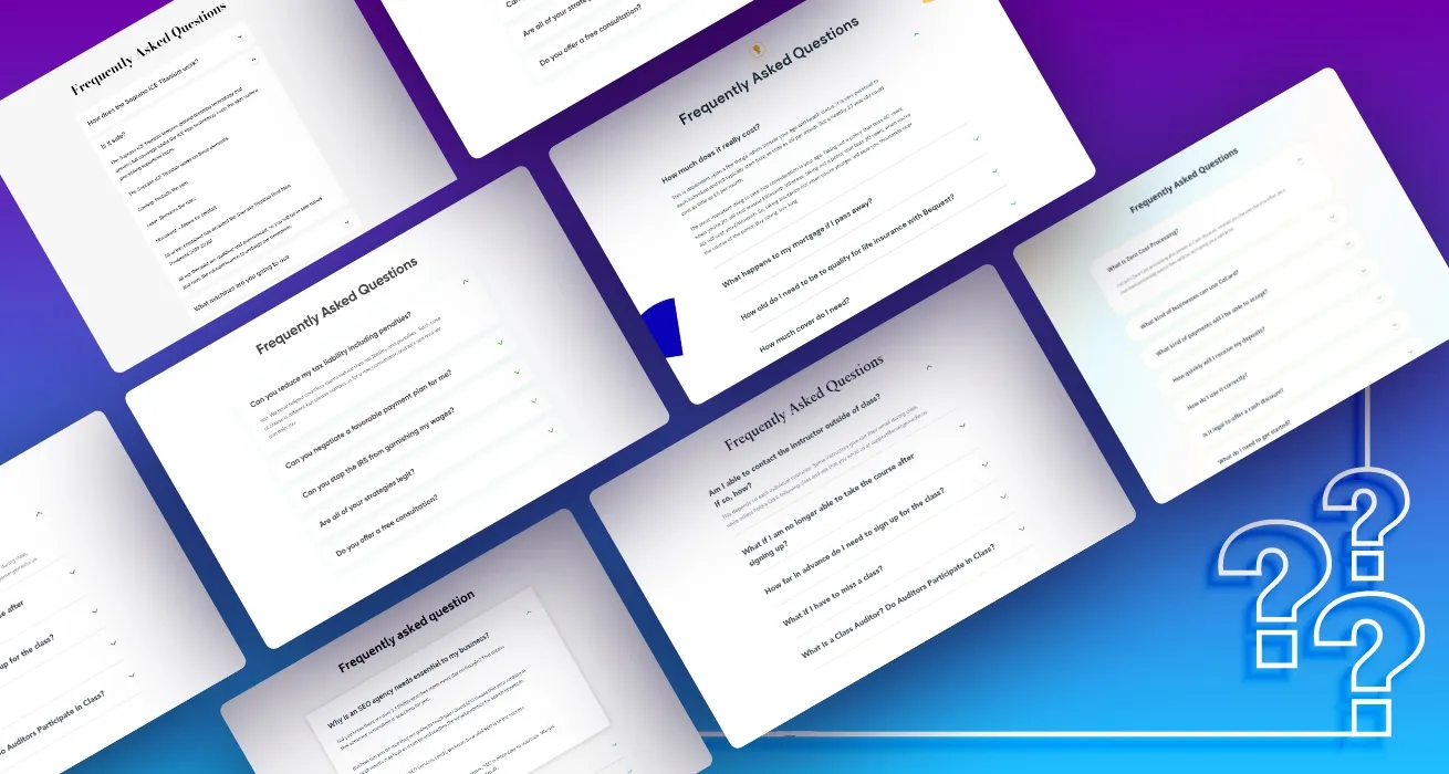
Looking at how leading brands design their FAQ pages is one of the best ways to find inspiration for your own. Here are some standout FAQ page design examples across different industries, along with what makes each one work.
Shopify’s FAQ page is a masterclass in categorised FAQ design. Questions are grouped into clear topics (Getting Started, Account, Payments, Shipping) with a prominent search bar at the top. The layout uses cards for each category, making it easy for merchants to find the right section. The design scales beautifully, despite having hundreds of questions, it never feels overwhelming.
What to learn: If you have a large volume of questions, a category-card layout with search is the gold standard.
Apple takes a product-first approach. Rather than listing questions in a traditional format, their FAQ experience starts with product selection (iPhone, Mac, iPad) and then funnels visitors to relevant questions. The visual design is minimal and clean, staying true to Apple’s brand identity.
What to learn: For businesses with multiple product lines, organising FAQs by product rather than by topic can dramatically reduce friction.
Notion uses a clean, searchable FAQ page with a conversational tone that matches their brand voice. Questions are written in plain language (“How do I share a page?”), and answers include embedded GIFs and screenshots that walk users through the process. The FAQ feels like a conversation with a helpful colleague, not a corporate document.
What to learn: Match your FAQ’s tone to your brand personality. Visual walkthroughs (GIFs, screenshots) can replace paragraphs of explanation.
Stripe’s FAQ page is built for a technical audience. Questions are grouped by use case (Accepting Payments, Managing Account, Reporting) and answers include code snippets alongside plain-language explanations. The two-column layout keeps navigation on the left and content on the right, similar to their API documentation.
What to learn: Know your audience. If your visitors are technical, structure your FAQ like documentation. If they’re consumers, keep it conversational.
Basecamp’s FAQ stands out for its personality. The questions are phrased in the first person (“What if I need to cancel?”), and the answers are warm, direct, and occasionally humorous. This approach changes the FAQ from a corporate obligation into a trust-building tool.
What to learn: First-person question phrasing (“Do I need. .”, “Can I. .”) creates a more relatable, user-focused experience.
Mailchimp combines a traditional FAQ with a searchable knowledge base. The FAQ landing page shows the top questions with short answers, and each question links to a detailed article for visitors who want more depth. This layered approach serves both quick-answer seekers and deep-research visitors.
What to learn: Link FAQ answers to detailed resources. Short answers in the FAQ, long-form articles for those who need more. This also creates strong internal linking for SEO.
One of the best ways to understand how you can incorporate the correct FAQ format in your landing page is by looking at the best FAQ design examples. Here are a few of the FAQ inclusive landing pages designed by us:
1. Debt Guru
 Debt Guru’s FAQ section has a blue color scheme that aligns well with its branding. The landing page features questions. Once you select the drop-down menu, it discloses the answer to the question. Since there are only seven questions in total, the questions are placed on a list.
With such limited space. It’s necessary to be genuine to your brand, which this page does exceedingly well. Among the FAQ Page Design Best Practices, Debt Guru uses a clear and concise presentation of its FAQs, and it helps them avoid confusion and directs customers exactly where they want to be.
Debt Guru’s FAQ section has a blue color scheme that aligns well with its branding. The landing page features questions. Once you select the drop-down menu, it discloses the answer to the question. Since there are only seven questions in total, the questions are placed on a list.
With such limited space. It’s necessary to be genuine to your brand, which this page does exceedingly well. Among the FAQ Page Design Best Practices, Debt Guru uses a clear and concise presentation of its FAQs, and it helps them avoid confusion and directs customers exactly where they want to be.
2. Gaggle Mail
 The landing page design you see above helps visitors become better informed about your brand and the problems you solve. If you pay closer attention, you would note that the questions are specifically related to their product and audience and formatted with drop-downs.
Their FAQ section is so precise that they have identified their customers’ top objections. They have achieved the FAQ Page Design Best Practices epitome by prioritizing and answering these questions and complaints.
The landing page design you see above helps visitors become better informed about your brand and the problems you solve. If you pay closer attention, you would note that the questions are specifically related to their product and audience and formatted with drop-downs.
Their FAQ section is so precise that they have identified their customers’ top objections. They have achieved the FAQ Page Design Best Practices epitome by prioritizing and answering these questions and complaints.
At Apexure, we’ve designed hundreds of landing pages across every industry imaginable, and many of them feature FAQ sections tailored to the specific needs of each business. Below is a hand-picked selection presenting the range of FAQ design patterns we use. Click through to see the full landing page designs.
3. Akusoli, E-Commerce (Accordion) This product landing page places the accordion FAQ section directly above the final call-to-action. The collapsible questions address common purchase objections like shoe compatibility and pain relief expectations, removing the last barrier before conversion. It’s a textbook example of using FAQs as an objection-handler right where it matters most.
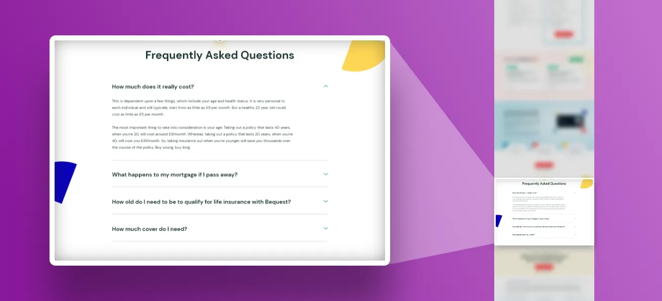
4. KnewHealth, Healthcare (Accordion) The FAQ sits after a detailed comparison table (KnewHealth vs. Traditional Insurance), so by the time visitors reach the questions, they already understand the value proposition. The accordion handles the remaining “but what about…” concerns with clean, minimal styling that matches the calming healthcare aesthetic.
5. Bequest, Fintech (Accordion) A brilliant example of matching your FAQ design to your brand personality. The accordion uses the same warm pastel colours and playful tone found throughout the rest of the page, making the FAQ feel like a natural extension of the experience rather than a tacked-on afterthought.
6. SwissVans, Vehicle Leasing (Accordion) Built on a dark-themed page, the lighter FAQ section creates deliberate visual contrast that draws the eye. Positioned between customer reviews and the final CTA. It is the closing argument after social proof has done its work.
7. Taxfix, Tax Filing (Accordion) A long-form landing page with pricing, security badges, and a step-by-step process. The accordion FAQ at the bottom addresses final doubts about data security and filing deadlines, exactly the concerns that stop people from completing a financial transaction online.
8. SmartRoof, Solar (Open FAQ) Not every FAQ needs an accordion. Here, all four questions and answers are fully visible on a bold yellow background, no clicking required. Visitors can scan every answer in seconds. This open approach works brilliantly for high-intent visitors who want quick reassurance before requesting a quote.
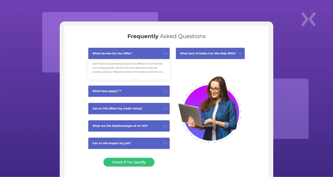
9. Landlord Vision, SaaS (Two-Column FAQ) Uses a two-column layout that pairs the FAQ on the left with a product screenshot on the right. This visual pairing reinforces the product while addressing objections, the visitor reads the answer and simultaneously sees the feature in action. Browse our full landing page portfolio featuring hundreds of designs across SaaS, finance, healthcare, legal, e-commerce, and more. If you’d like a FAQ section (or an entire landing page) designed for your business, get in touch.
E-commerce FAQ design deserves special attention because the stakes are uniquely high. Every unanswered question on a product page is a potential lost sale. Unlike service businesses where the sales cycle is longer, e-commerce purchases often happen in a single session, and the FAQ section is frequently the last thing a shopper reads before clicking “Add to Cart” or leaving.
Most e-commerce sites benefit from FAQs in two places. First, a dedicated FAQ page linked from the footer or help section that covers store-wide policies: shipping, returns, payment methods, account management, and contact information. Second, product-specific FAQ sections embedded directly on product pages that address questions unique to that item. The product page FAQ is where the real conversion magic happens. Placing it below product details and reviews but above the footer keeps it accessible without interfering with the primary purchase flow.
Every online store should address these core topics in their FAQ:
Shipping & Delivery: How long does shipping take? Do you ship internationally? How much does delivery cost? Can I track my order?
Returns & Refunds: What is your return policy? How do I initiate a return? How long do refunds take to process?
Product Information: What sizes are available? What materials are used? How do I choose the right size? Is this product compatible with. .?
Payment & Security: What payment methods do you accept? Is my payment information secure? Do you offer payment plans?
Account & Orders: How do I track my order? Can I modify my order after placing it? How do I create an account?
Use accordion format on product pages to keep the page length manageable. Product pages are already content-heavy with images, descriptions, specifications, and reviews.
Write answers that sell, not just inform. Instead of “We accept returns within 30 days,” try “Yes, you can return any item within 30 days for a full refund, no questions asked. We want you to be completely satisfied.”
Include trust signals in your answers. Mention security certifications, money-back guarantees, and customer satisfaction stats within relevant answers.
Link to your full FAQ page from product page FAQs for visitors who have additional questions. This keeps the product page clean while still providing full support.
One of the most effective yet overlooked FAQ page design best practices is implementing FAQPage structured data (also known as FAQ schema markup). When you add this schema to your FAQ section, Google can display your questions and answers directly in the search results as rich snippets, those expandable dropdowns you see beneath certain search listings. This is a massive win for two reasons. First, it dramatically increases your real estate on the search results page, pushing competitors further down. Second, it gives users immediate answers, which builds trust before they even click through to your site. To implement FAQ schema, you need to add JSON-LD structured data to your page’s HTML. Each question-and-answer pair gets wrapped in a specific format that search engines can parse. If you’re using a CMS or landing page builder, many of them now offer built-in FAQ schema options or plugins that handle the technical side for you. Keep in mind that Google has specific guidelines for FAQ schema. The questions and answers must be visible on the page (no hidden content), and the content should genuinely address user queries rather than being used purely for promotional purposes.
With mobile traffic accounting for over half of all web visits, your FAQ page design must prioritise the mobile experience. A FAQ section that looks brilliant on desktop can quickly become a frustrating wall of text on a smaller screen. The accordion pattern is your best friend here. Collapsible question-and-answer pairs allow mobile users to scan through questions without endless scrolling. Each question acts as a tap target, revealing only the answer the user cares about. This keeps the interface clean and reduces cognitive load. When designing for mobile, pay attention to tap target sizes. Questions should have generous padding so users can easily tap them without accidentally selecting the wrong one. A minimum touch target of 44x44 pixels is recommended for comfortable interaction. Typography matters too. Make sure your FAQ text remains legible on mobile without requiring users to pinch and zoom. A base font size of 16px for answers and slightly larger for questions creates a comfortable reading experience. Avoid long, unbroken paragraphs, break answers into short, scannable chunks with bullet points where appropriate.
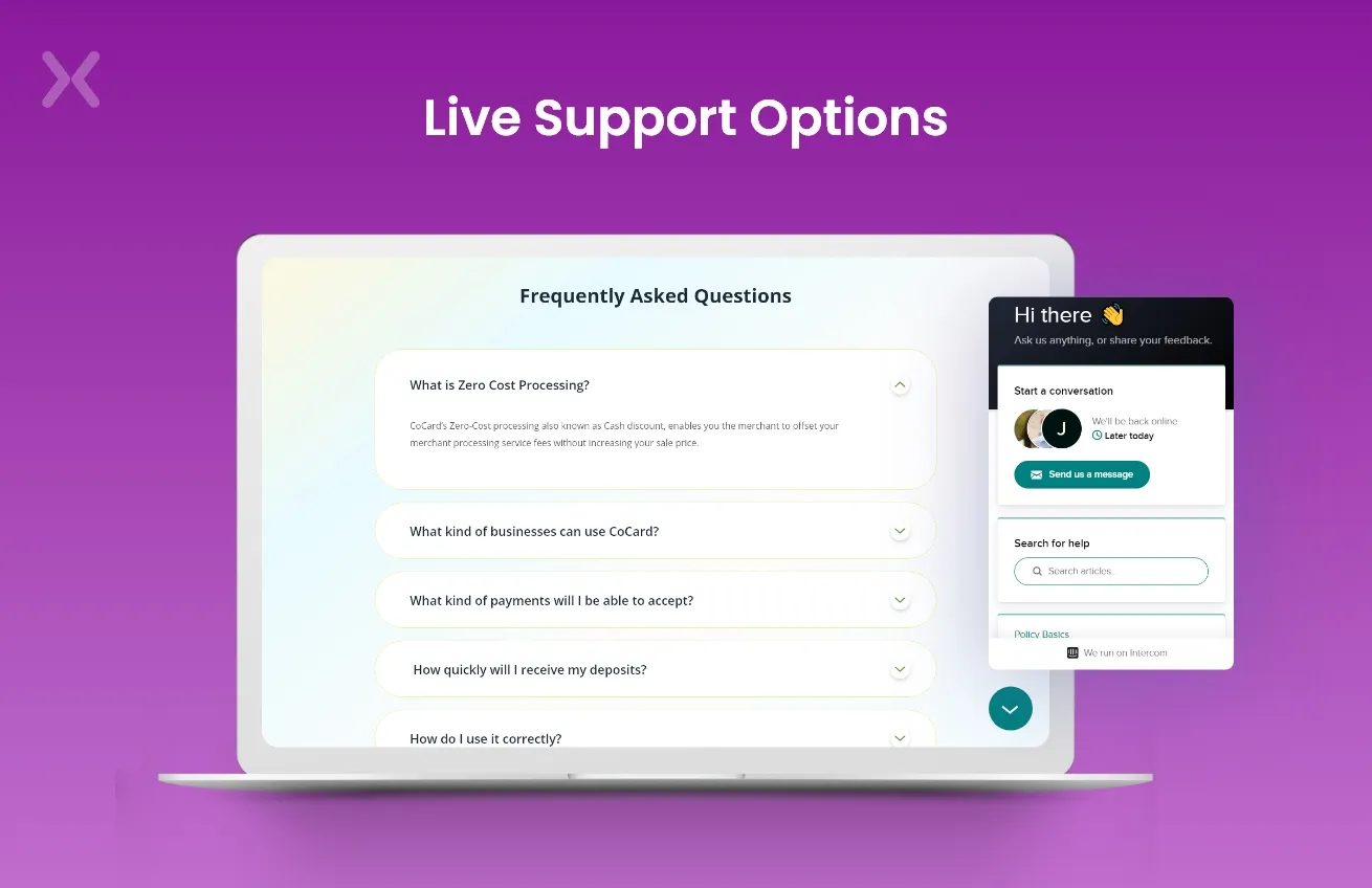
The FAQ section on your landing page doesn’t have to work in isolation. Modern businesses are increasingly pairing their static FAQ sections with AI-powered chatbots that can handle follow-up questions in real time. This creates a layered support system where the FAQ addresses the most common queries, while the chatbot picks up the rest. AI tools can also help you build better FAQ content in the first place. By analysing your customer support tickets, chat logs, and email enquiries, AI can identify patterns and surface the questions your customers ask most frequently. This data-driven approach removes the guesswork from deciding which questions to include. Some businesses are also experimenting with conversational FAQ formats, where the questions are presented in a more natural, dialogue-like structure. Rather than a sterile list of questions, the FAQ feels like a conversation between the brand and the customer. This approach can be particularly effective for conversational landing pages where engagement is the priority. That said, the static FAQ section still holds tremendous value. It’s crawlable by search engines (chatbot conversations are not), it loads instantly (no waiting for AI responses), and it provides a familiar, predictable experience that all users can move through regardless of their technical comfort level.
To wrap up the best practices, here’s a quick checklist you can reference when building or auditing your FAQ sections:
Keep answers concise, aim for 2-3 sentences per answer where possible, with an option to expand for complex topics.
Use accordion/collapsible UI, especially critical for mobile users and pages with more than 5 questions.
Implement FAQPage schema markup, this enables rich snippets in Google search results and increases your click-through rate.
Prioritise by data, use heatmaps, search console queries, and support ticket analysis to order questions by importance.
Match your brand voice, FAQs are an extension of your brand, so maintain the same tone you use across the rest of your landing page design.
Link to deeper resources, if an answer requires more detail, link to a relevant blog post or product page rather than writing a novel in the FAQ.
Test and iterate, your FAQ is not a set-it-and-forget-it section. Review it quarterly, remove outdated questions, and add new ones based on fresh customer data.
Include a fallback, always provide an alternative support channel (live chat, email, phone) for questions not covered by the FAQ.
Finally, the critical thing to remember is that your FAQ shouldn’t be a crutch for lousy design and boring content. Instead, it should be an opportunity for educating your customers and providing them with valuable information. Whether you’re creating a standalone FAQ page or embedding a focused FAQ section within a landing page, the principles remain the same: understand what your customers need to know, present the answers in a clean and accessible format, and continuously improve based on real data. At Apexure, we start with in-depth research on what your customers want to know. Then, organize those questions and answers to make sense for your business structure. We deliberately design FAQs to add value in different ways, from reducing the burden on customer support to alleviating purchasing anxieties. Contact us today!
Related Articles:
Founder & CEO of Apexure, Waseem worked in London's Financial Industry. He has worked on trading floors in BNP Paribas and Trafigura, developing complex business systems. Waseem loves working with Startups and combines data and design to create improved User Experiences. Read more


Drive More Sales or Leads With Conversion Focused Websites and Landing Pages
Get Started.png)

Eleven percent of Meta ad rejections in 2026 trace back to one problem: the landing page does not...

A B2B SaaS company spends $30,000 per month on Google Ads and Meta Ads. Both campaigns drive traffic...
Get quality posts covering insights into Conversion Rate Optimisation, Landing Pages and great design
