
In the current SaaS chaotic environment, competitor comparison landing pages are what can help you convince potential customers that your software is their shining gem.
Ever walked into a bustling market with lots of vendors vying for your attention, each claiming they have the best product? The software-as-a-service (SaaS) industry can feel strikingly similar, customers are constantly bombarded with countless software solutions.
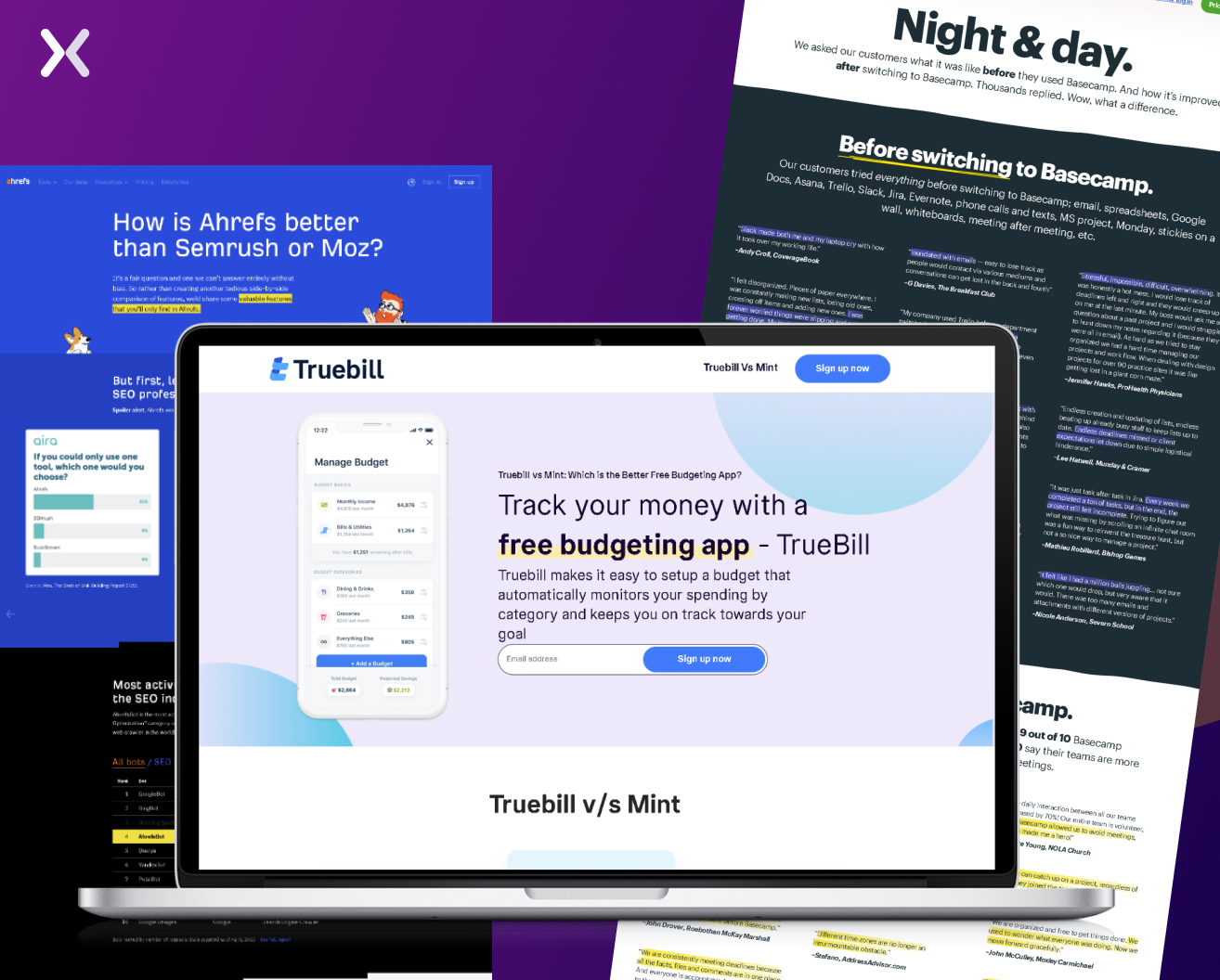 With the help of this article, you’ll find out the secrets behind crafting exceptional competitor comparison landing pages that not just accent your product’s strengths and benefits but also communicate them in a simple, relatable manner.

What exactly are these types of landing pages. You might ask? Think of them as a friendly, knowledgeable salesperson who’s ready to present your SaaS product’s unique advantages over its rivals. These landing pages exist to give potential customers a clear and concise comparison of your software solution and its competitors, marking the reasons why your product is the better choice.
 These competitor comparison landing pages are not about bashing other products or resorting to mudslinging. Instead, they’re focused on helping prospects make an informed decision. They save users the time and effort of researching various software options, addressing the customers’ pain points and creating a strong appeal that’s hard to resist.

Competitor comparison landing pages are a powerful tool for businesses that want to set themselves apart from their competition and captivate a larger customer base. Some strong reasons why your business could benefit from them.
Through well-structured and focused competitor comparison landing pages. You can stress your product’s strengths and unique selling points while addressing potential concerns or misconceptions. It’s a proactive approach that allows you to steer the conversation in your favor, outline your product’s strengths and weaknesses, and give a complete picture of what your product can offer. When prospects see that you’re willing to be transparent about how your product compares to others in the market. It can generate trust and boost your credibility. 60% of customers believe that trustworthiness and transparency were the most important traits of a brand in 2022, up 5% from 2021.
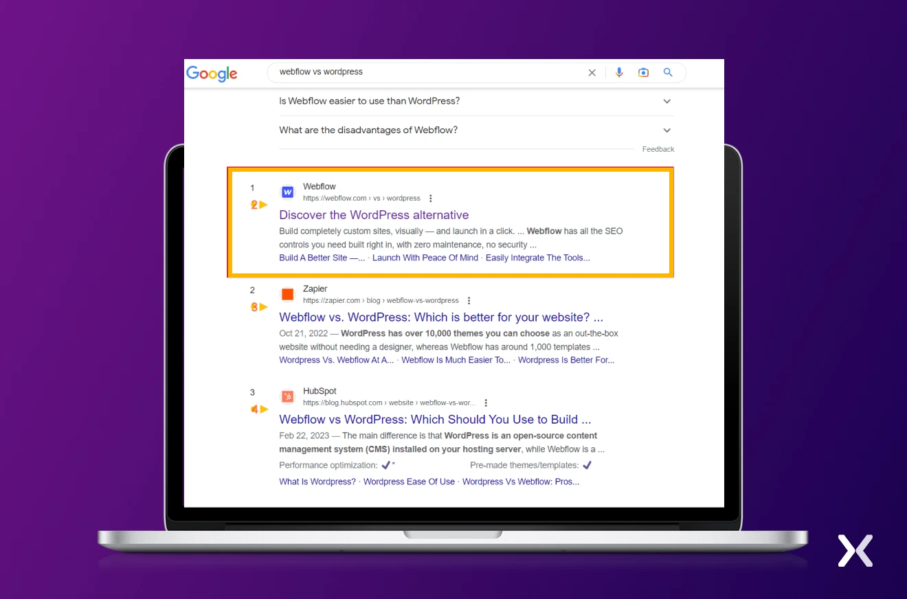
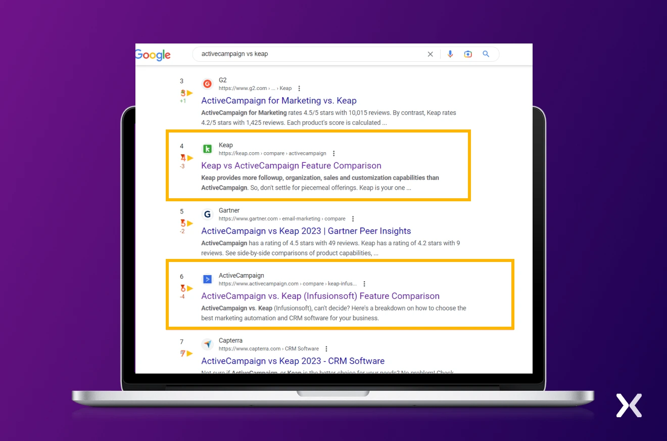
When you create full, high-quality content comparing your offerings to others’. You’re more likely to rank higher in search engine results for relevant keywords. With well-optimized competitor comparison landing pages, potential customers seeking comparisons will find your business easily, driving more targeted traffic to your site. For example, when we searched for Freshworks vs Pipedrive, this is what we got:
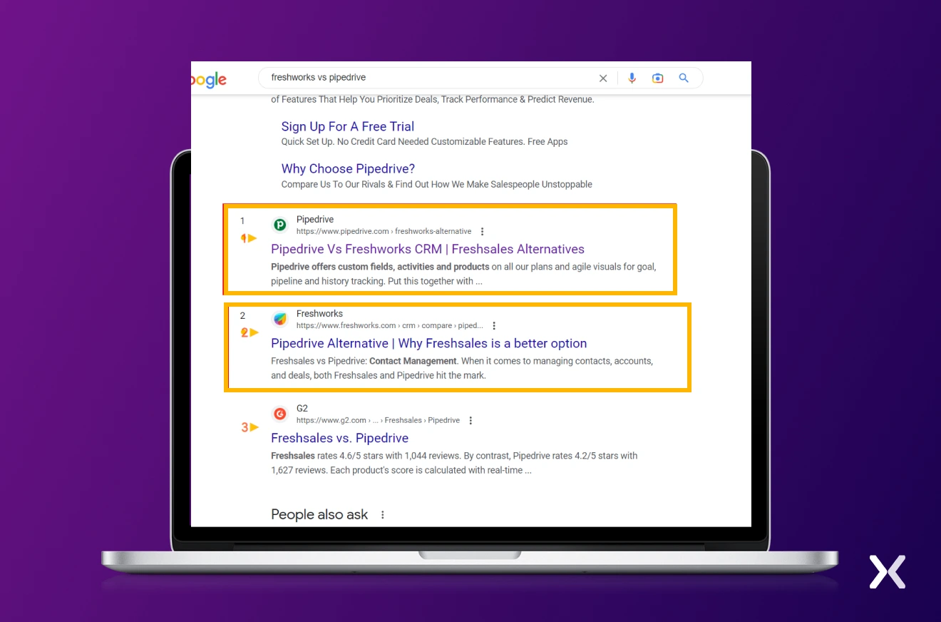 As we can see, two of the leading brands in the CRM industry simplify the decision-making process for prospects straight from the SERPs. In the face of such neck-and-neck competition, crafting effective competitor comparison landing pages becomes a necessity. You want to capture users’ attention and sway their choice the moment they click on your link.
Potential customers often have reservations and doubts when deciding on a product or service. Creating well-thought-out competitor comparison landing pages can serve to tackle those concerns. In doing so, you not just provide valuable insights but also instill confidence in your customers. So, don’t leave them guessing, address their objections head-on and watch your conversion rates soar.
People appreciate unbiased data that helps them grasp what their options are. Competitor comparison landing pages can help them in the research process by providing a transparent, side-by-side comparison of your product and its unique selling points (USPs).
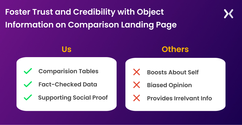 In turn, this transparency builds trust and credibility, positioning your business as an honest, reliable source of information. Let the facts speak for themselves and guide customers towards discovering the best solution to meet their needs.
In a market overflowing with options. It’s essential to distinguish your offering by marking the unique selling points (USPs) that set you apart from the rest. Your competitor comparison landing pages let you show off these distinct advantages, stressing what makes it exceptional and encouraging potential customers to gravitate towards your outstanding solution.
So, who exactly can benefit from competitor comparison landing pages? The answer is quite simple: businesses looking to target potential customers who are further down the sales funnel. When prospects reach the middle or bottom of the funnel. They’re typically more informed, actively researching and comparing their options. At this stage, they’re known as Marketing Qualified Leads (MQLs), which means they’re more likely to convert compared to those at the top of the funnel.
 Competitor comparison landing pages serve these MQLs who are exploring different solutions and weighing their choices. It’s also appropriate to target leads who are looking to switch from a competitor and are already MQLs, something that Webflow does well.
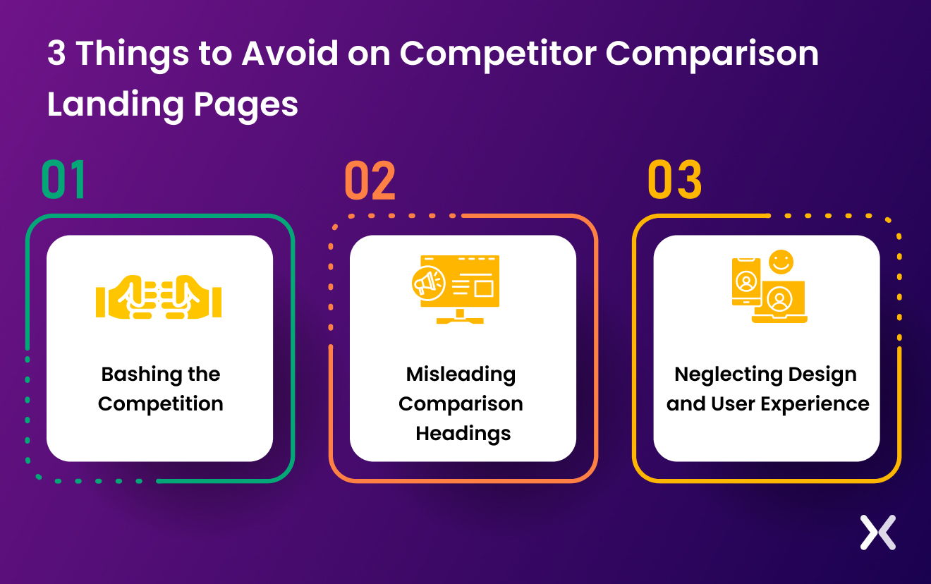
Before we dive into tips for designing your very own comparison page (or pages), let’s first explore some things you should absolutely avoid doing on your landing pages. Knowing what not to do can be just as important as knowing what to do.
While it’s natural to want to accent your product’s superiority, resorting to aggressive or disrespectful language when describing your competitors can backfire. Not just does it come across as unprofessional, but it can also damage your brand’s reputation and credibility. Negative tactics can also lead to increased churn rates. Customers who initially choose your product based on a competitor-bashing approach or a false sell may eventually feel misled or dissatisfied, resulting in them leaving for an alternative solution. It’s smarter to focus on presenting a fair and balanced SaaS comparison page that reviews your product honestly.
When potential customers search for competitor comparison landing pages on Google, for example, they land on your page seeking an honest, transparent comparison between your product and its competitors. If they’re greeted with a thinly veiled sales pitch disguised as a SaaS comparison page. They may feel deceived and lose trust in your brand. Simply taking advantage of the keyword without delivering on your promise can end up hindering your chances of converting visitors into customers.
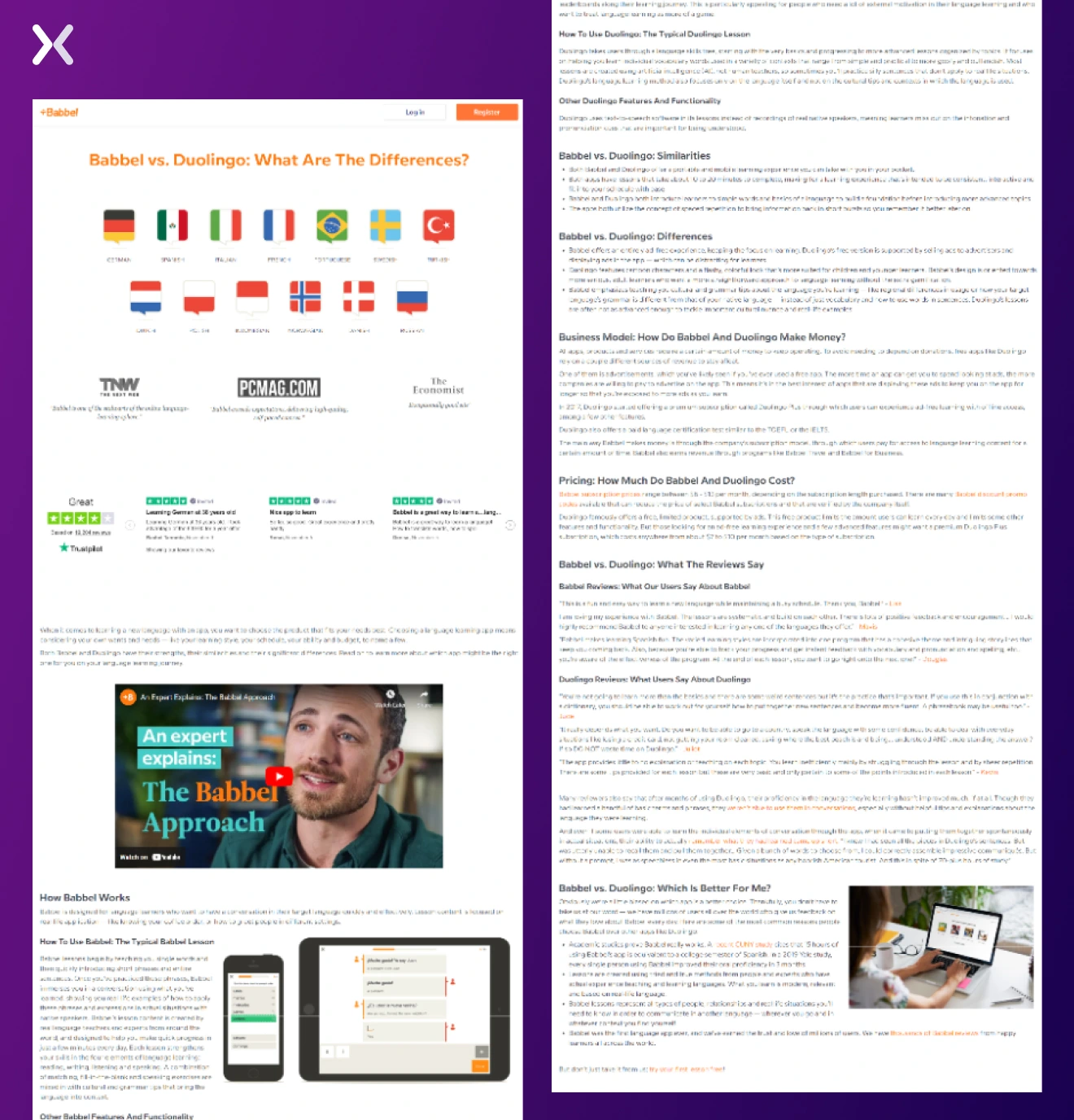
No matter how persuasive your content is, if your SaaS comparison page looks cluttered or confusing, visitors might struggle to move through it, get frustrated, and ultimately leave without converting. A well-designed landing page, on the other hand, is not just visually appealing but also user-friendly. It should guide visitors through the comparison with ease, allowing them to effortlessly find the information they’re looking for. Plus, it’s essential to make sure your landing page is responsive and works smoothly across various devices and screen sizes. After all, 58.33% of all global web traffic comes from mobile devices. For instance, Babbel genuinely strives to present prospects with a comparison between its platform and Duolingo. However, the page’s design and layout detract from the overall experience.

"I think it's really important not to turn it into some software diss battle. If you focus more of your attention on making your competitor look bad rather than making your business look good, then you might just achieve the opposite effect than originally intended. Be realistic, take a step back, and ask yourself: "Why should people use my services rather than my competitors?"
Now that we’ve covered what not to do, some tips for designing a conversion-driven landing page that truly sets your SaaS product apart.
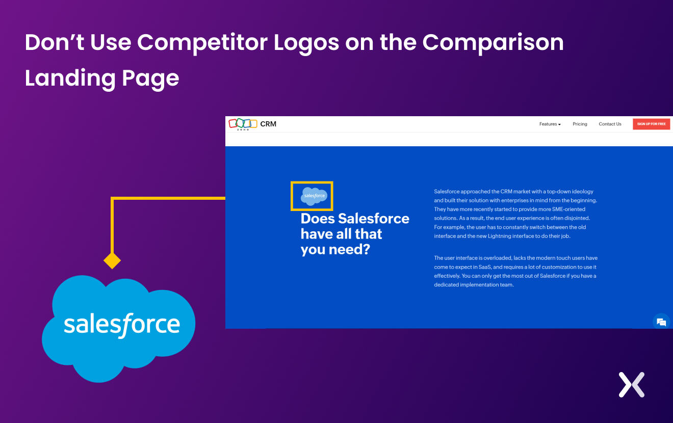
When designing competitor comparison landing pages. It’s necessary to carefully select the comparison content you present. Remember, the goal is to provide a fair, balanced, and informative comparison. You could talk about key details like pricing, features, integrations, usability and customer support - significant factors that are likely to influence a decision. As well, be sure that you state the date when the comparison was made in case your competitor’s product information ever changes. One important aspect to consider is avoiding the use of competitor logos, branding elements, or links to their website. The risk here is making your competitor memorable or bringing attention to a brand the customer hadn’t been interested in otherwise. For example, Zoho’s page repeatedly uses the Salesforce logo in various sections.
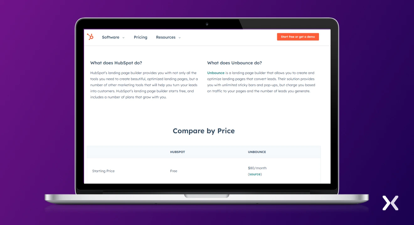
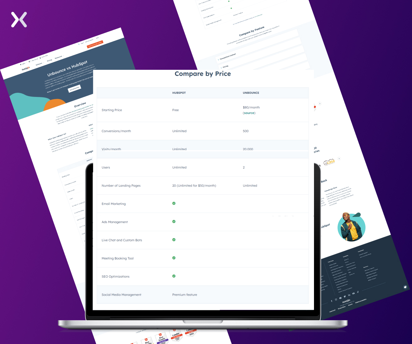
 Hubspot’s approach is a lot more effective on their Hubspot vs Unbounce comparison page. They use minimalist formatting that allows their brand colour to stand out, and they avoid using any logos at all.
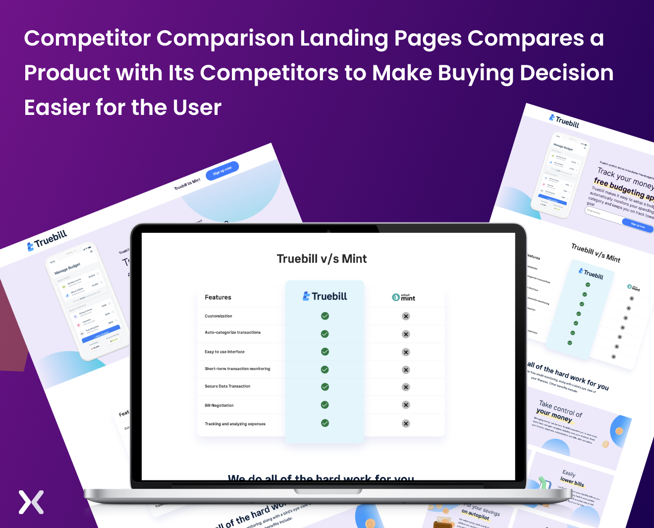
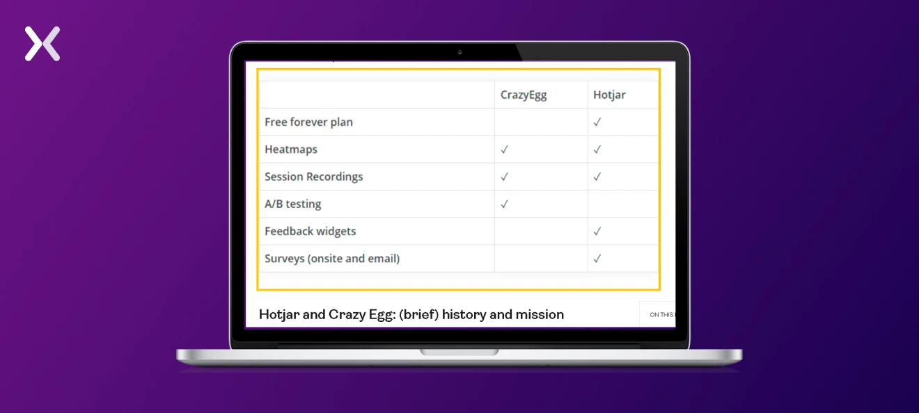
Comparison tables make your competitor comparison landing pages both visually appealing and easy to digest. This simple yet effective visual aid allows potential customers to easily compare key features and benefits across different products. It saves customers time and effort by offering a quick snapshot of how your offering stacks up against the competition. Check out Hotjar’s comparison page with Crazy Egg.
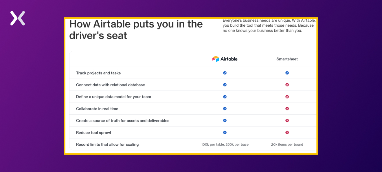
 And you won’t just want to accent the most obvious differences either or immediately opt for a feature-by-feature analysis. Use your best judgment to decide what’s most helpful for the visitor. Airtable’s comparison landing page has an attractive feature comparison table with visually beautiful ticks and crosses.
 If you also want to implement a price comparison table, businesses can go with a simple table like Hubspot:
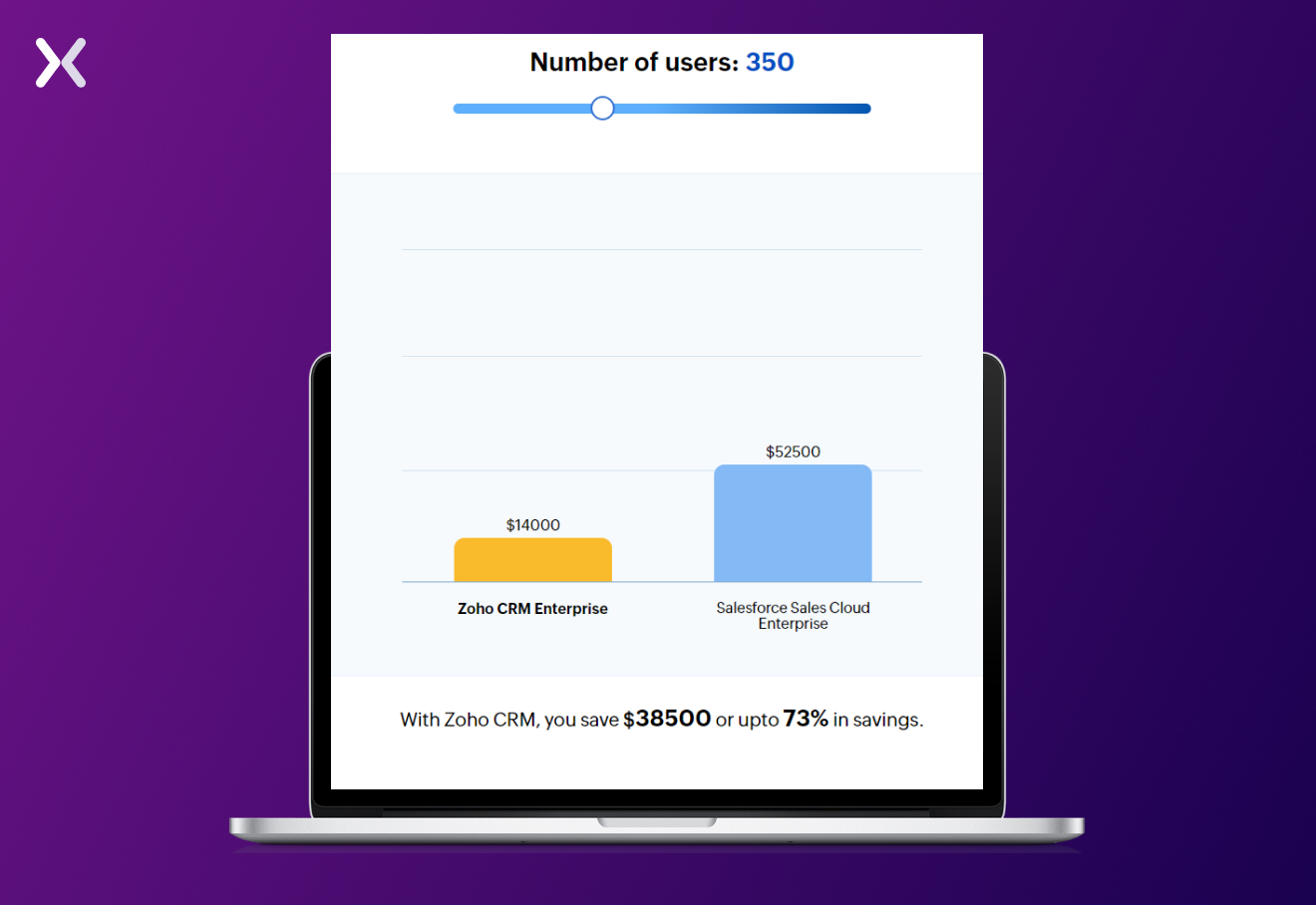
 Or make it a little more interactive, like Zoho. Their calculator helps you understand your annual cost as you increase the number of users on Zoho and their competitors. It makes up for an innovative approach to competitor comparison charts.
Social proof often helps seal the deal for potential customers, especially when they’re on the fence. This trust-building social proof can take the form of customer testimonials, awards, case studies, security seals, and any other type of customer validation. Include these components on your page, and make sure to back up their claims with concrete evidence. However, one of the most powerful forms of social proof is customer testimonials. There are two strategies that businesses can use to attract these targeted audiences: hot leads and users looking to make a switch. The SaaS comparison page of Webflow smoothly serves both sets of prospective buyers. For hot leads, their customer testimonials accent the results they were able to deliver and how the customer used the tool itself.
 For users considering a switch from WordPress, the landing page’s hero section has a prominent heading that accents an alternative solution.
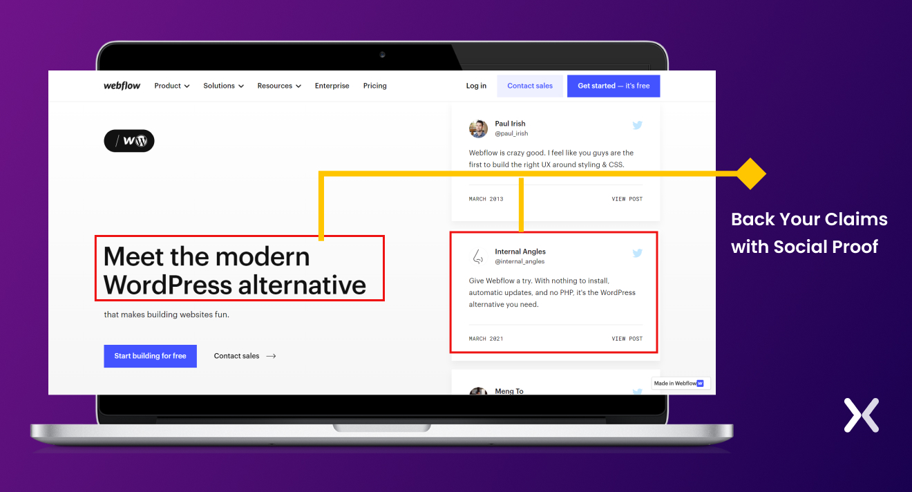 This bold statement is backed up by authentic customer testimonials, which can be further verified on social media platforms.

"Real customer insights. A good comparison page isn’t just about listing features, it’s about helping potential buyers understand how your product feels to use. Use real customer feedback, highlight common pain points, and show why your product makes life easier. People trust other users more than marketing claims, so let your customers do the talking."
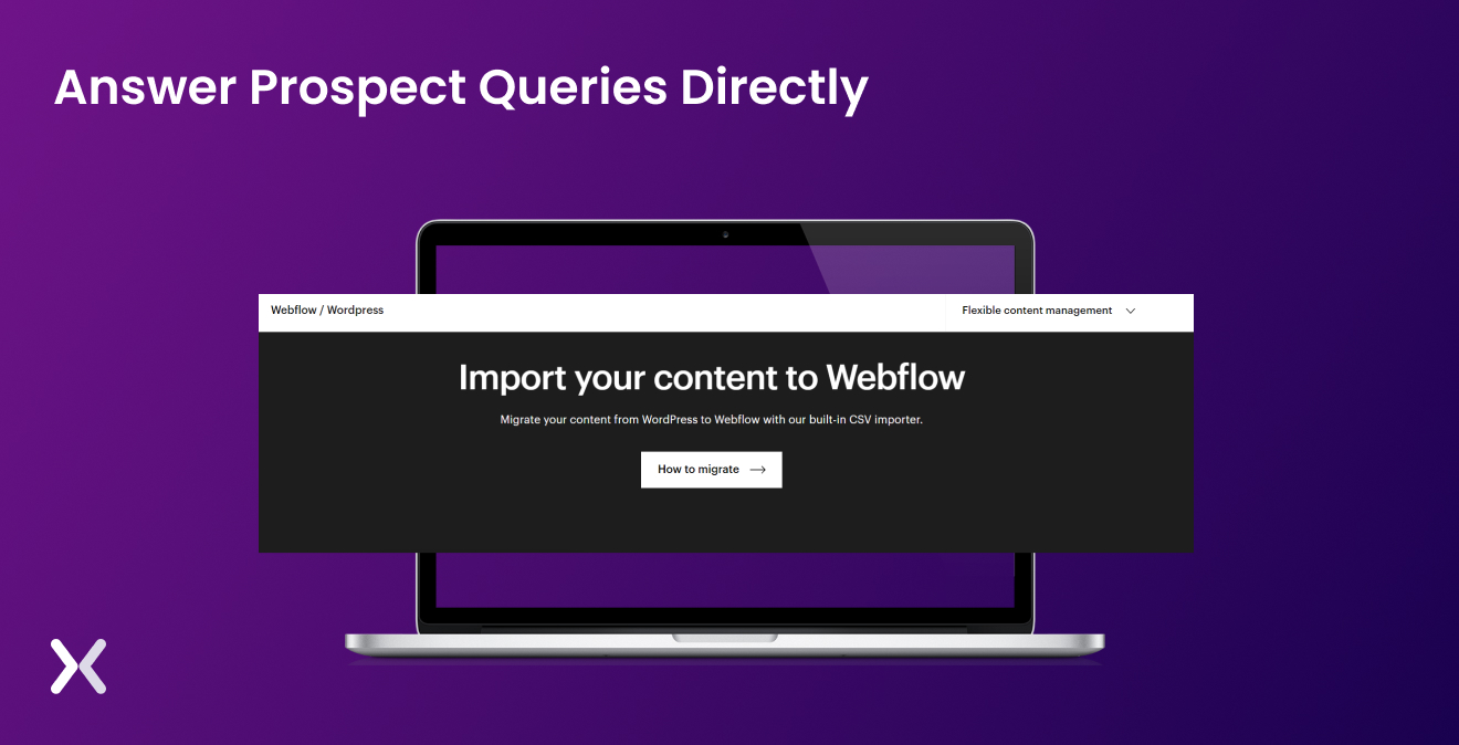
By honing in on the most relevant concerns and addressing them head-on, you convince people further to choose your product over the competitors. If you know that one of the pain points for potential customers is data migration from their current solution to yours, explain how your product simplifies the migration process or offers smooth integration with minimal hassle. Remember, the more you can anticipate and answer your prospects’ questions, the more likely they are to feel confident in choosing your solution. Webflow does this with a special section addressing the WordPress to Webflow migration process.
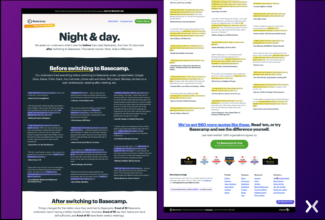
 Incorporating before-and-after scenarios can paint a vivid picture of the challenges prospects face with their current solution (the “before”) and contrast it with the improved situation they’ll experience with your product (the “after”). Here, Basecamp effectively accents the positive impact their solution has on daily operations.
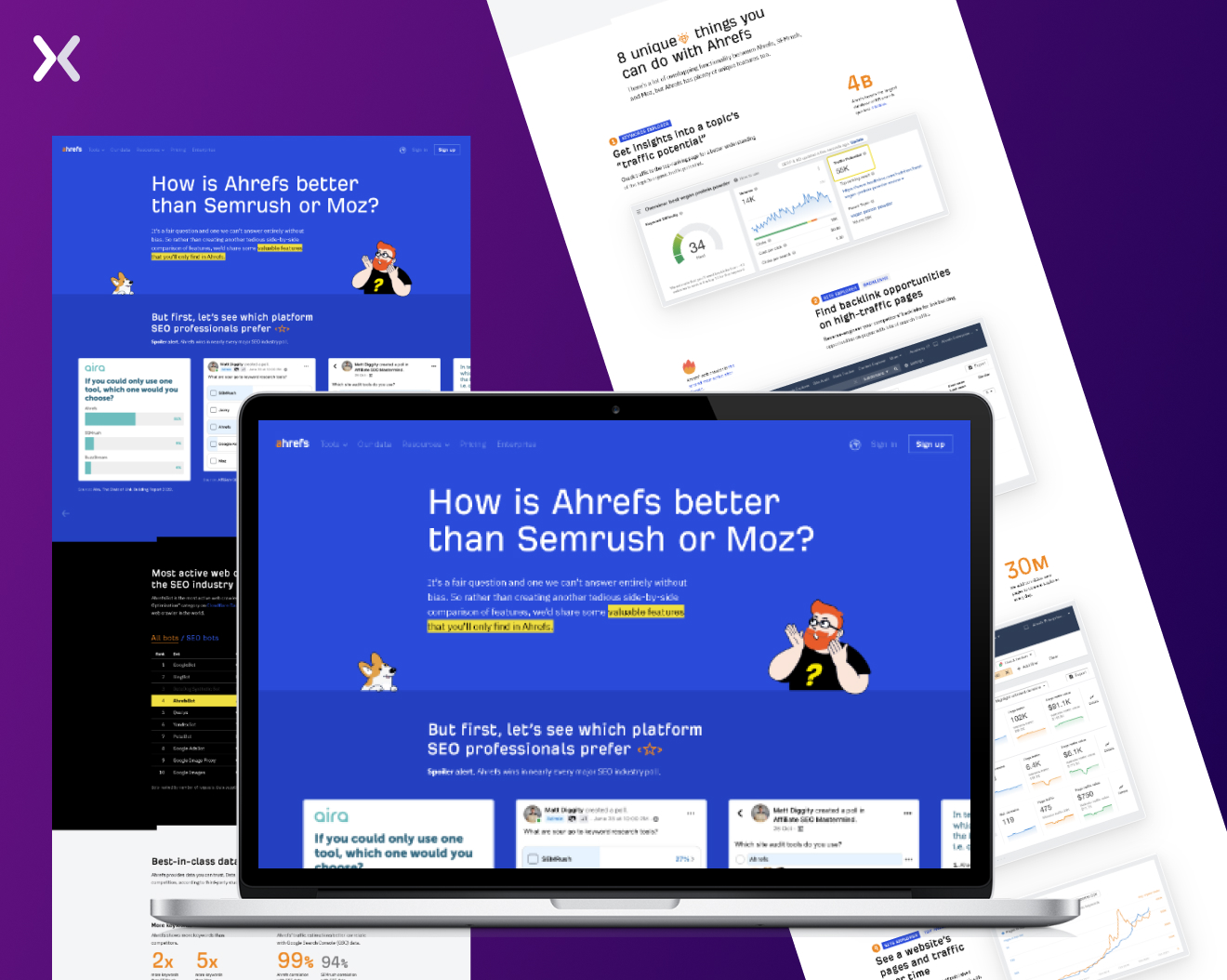
Different prospects will want to compare your product to various competitors, so you can either approach this by making all your comparisons on one landing page or by crafting multiple comparison pages for each one. Personalized competitor comparison landing pages allow you to zero in on the key differences between your product and each competitor and provide you with extra SEO-optimization opportunities.
Zoho created competitor comparison landing pages for each competitor and collated all of them on a central hub of comparison pages. Ahrefs took things a step further by adopting both approaches, creating a combined comparison page featuring all their main competitors.
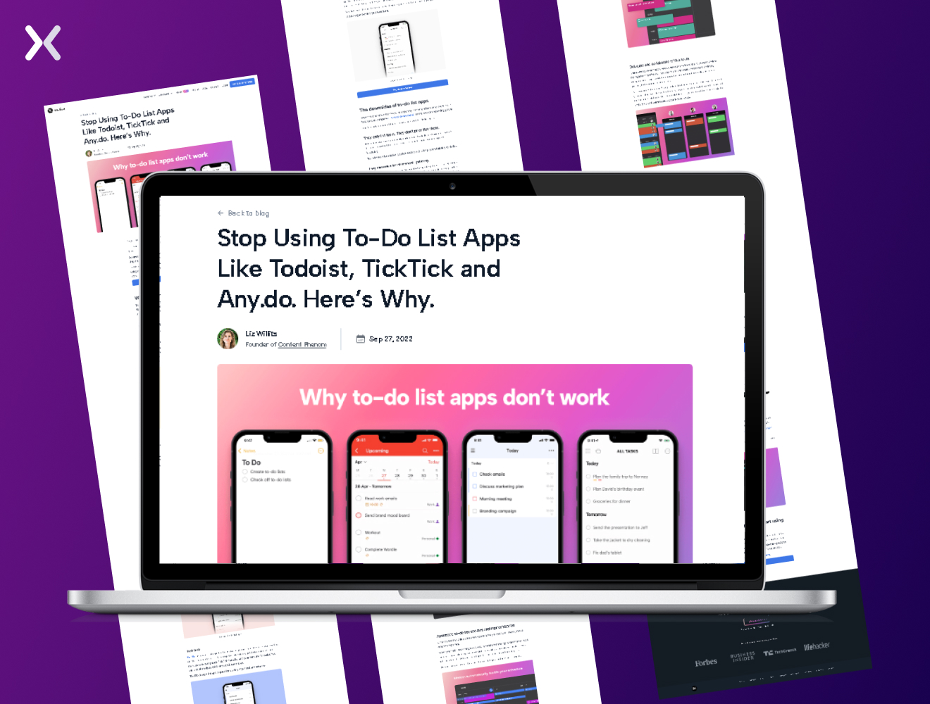
If you’re not a fan of the direct comparison approach and want to do something a little different. You can consider advertorial-style landing pages. These pages combine the persuasive elements of advertising with the informative nature of an editorial piece. This way, you’ll present your product comparison in a more engaging and story-driven format. Instead of just listing features and benefits, you can craft a narrative that accents your product’s advantages over competitors while still providing prospects with valuable information. This approach can be especially strong for audiences that appreciate a more in-depth, immersive experience. For example, searching up “Todo app for teams” gave us one standout ad:
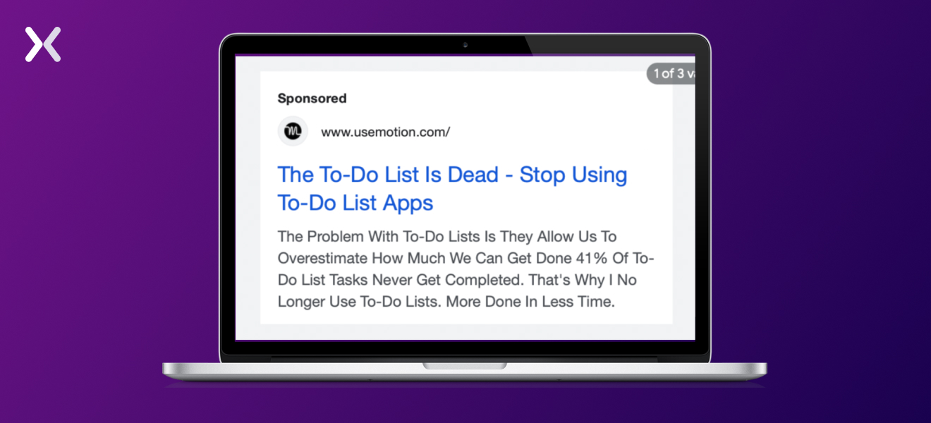 The headline is eye-catching, and you’re instantly welcomed to an advertorial landing page once you click the link. Once there, the page name drops competitors and why Motion outdoes them, and you get to see the product in action. It also ends with a CTA that lets you try Motion with their 7-day free trial.
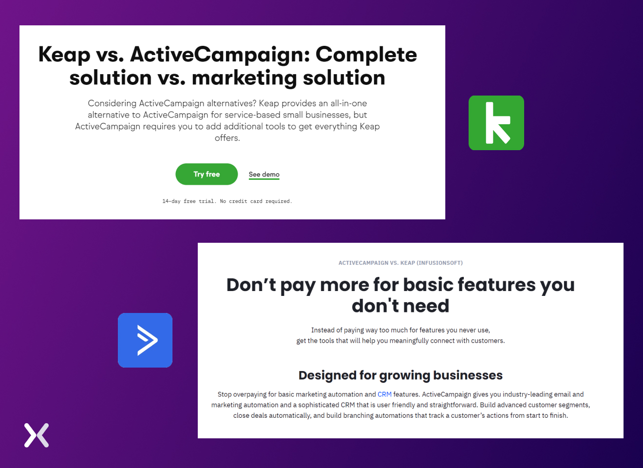
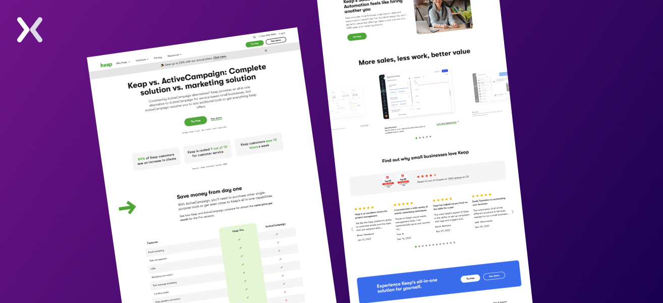
In this section, we’ll dig into the competitor comparison landing pages of Keap and ActiveCampaign, discussing how they present their products in relation to each other.
Upon first glance, Keap’s page has a clear, concise title with a strong subhead, making sure users they’ve arrived at the right place. Conversely, ActiveCampaign’s comparison page starts with an “ActiveCampaign vs Keap” pre-header, followed by a narrative that addresses visitors’ pain points. Though subtle, these title variations can significantly impact user engagement and product visibility, guiding potential customers towards making a purchase decision.
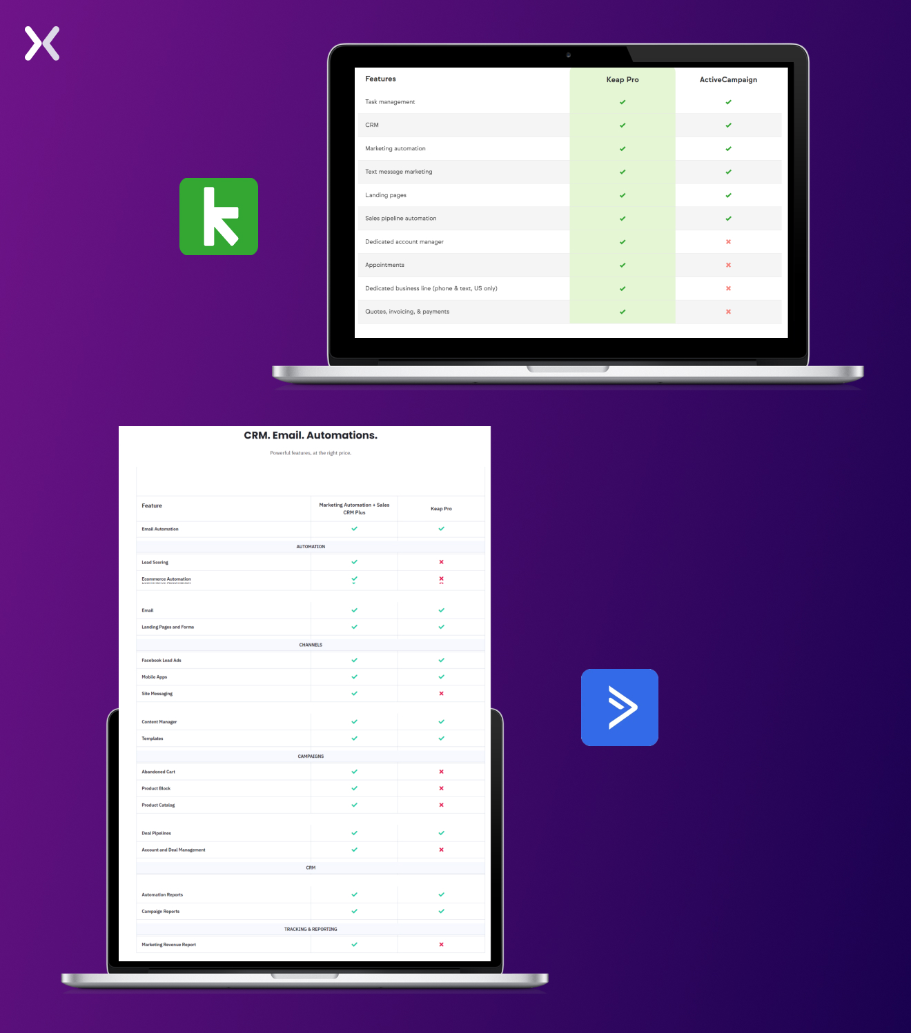
Both companies provide detailed comparison tables. Keap’s approach is surface-level, while ActiveCampaign digs deeper, comparing necessary aspects of each SaaS offering. Through ActiveCampaign’s comparison table, users can easily find desired features to make better buying decisions.
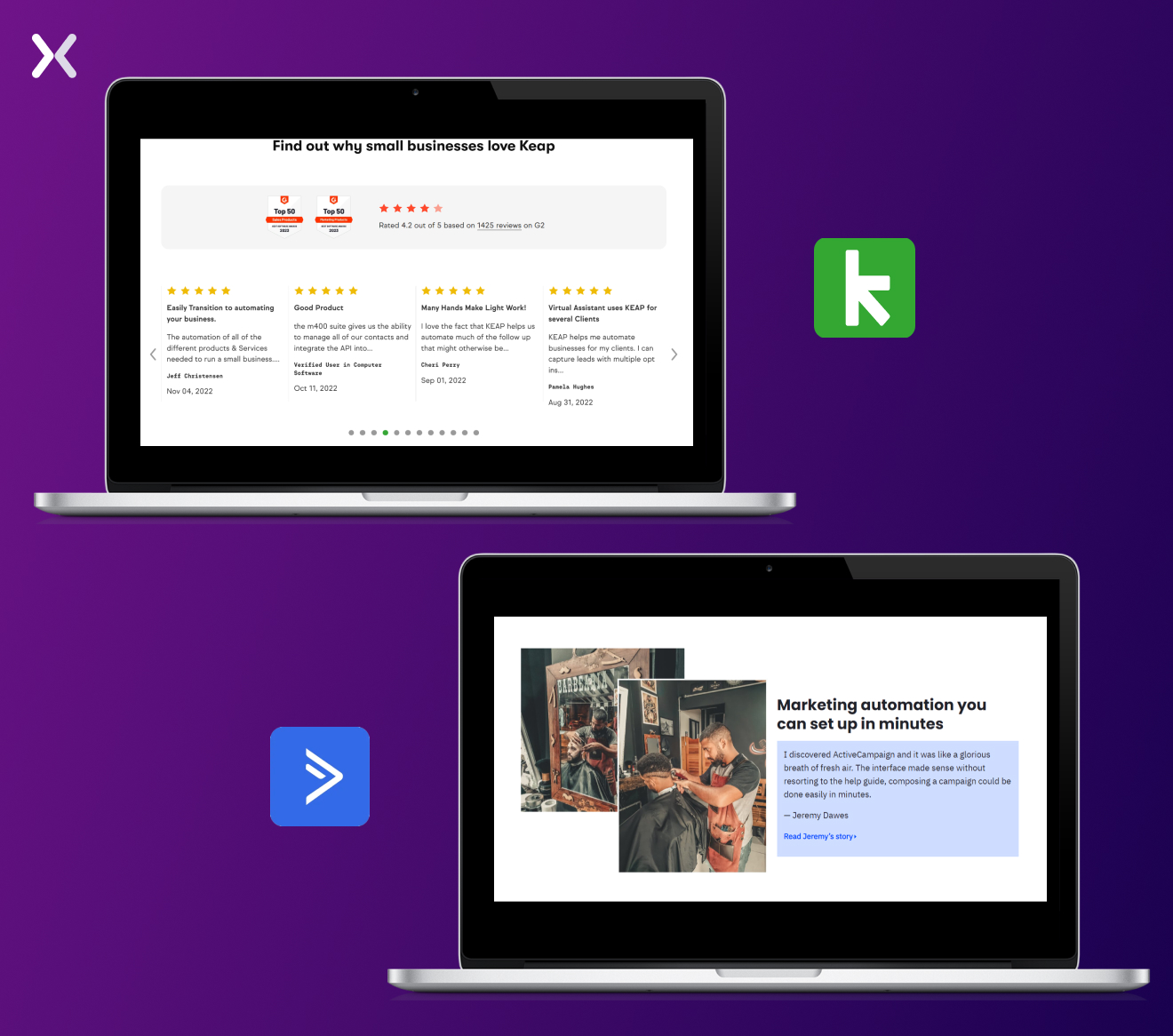
Keap’s SaaS comparison page is busy with trust badges and client testimonials, while ActiveCampaign accents a case study. Both effectively use social proof to win over prospective buyers’ trust.
Keap’s “Try Free” CTA effectively attracts both newcomers and those seeking a switch.
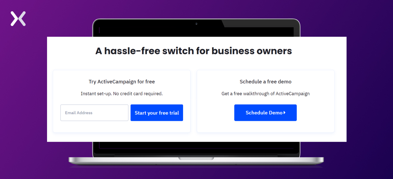
 Meanwhile, ActiveCampaign improves its offer with a strong headline, deliberately crafted to attract both audiences, those seeking a free trial and those interested in a demo, through clever and engaging wording.
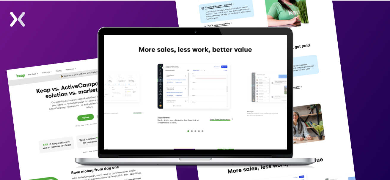
Don’t forget to show your SaaS in action. Offering prospects a sneak peek through interface shots can pique their interest and give them a taste of the user experience. Keap’s landing page effectively uses this approach, while ActiveCampaign’s page could benefit from incorporating it.
So say hello to your new secret weapon in the B2B SaaS world - competitor comparison landing pages. While you greet your new weapon, you can bid farewell to playing catch-up and embrace strategic success with SaaS comparison pages that accent your USPs effectively. Best SaaS competitor comparison landing pages have sections that make sure your product value is delivered without donwplaying other brands. Such SaaS pages are the best way to clear your potential customers’ doubts and help them in decision-making. Make your bottom funnel strong with competitor comparison landing pages and let the SaaS conversions flow.
Did you know that Apexure has 100+ blog posts on landing pages? Building landing pages better than your competitors becomes easier with guides and best practices.
Making a SaaS comparison landing page on your own can be overwhelming. Get the help you need from our experts. Book a call and one of our landing page experts will contact you soon.
Check out our landing page portfolio to discover conversion-friendly landing page elements that might. Filter your industry and check which landing page design is trending.
Full comparison table and clear, transparent information sharing.
Related Article:
Founder & CEO of Apexure, Waseem worked in London’s Financial Industry. He has worked on trading floors in BNP Paribas and Trafigura, developing complex business systems. Waseem loves working with Startups and combines data and design to create improved User Experiences. Read more


Drive More Sales or Leads With Conversion Focused Websites and Landing Pages
Get Started

Eleven percent of Meta ad rejections in 2026 trace back to one problem: the landing page does not...

A B2B SaaS company spends $30,000 per month on Google Ads and Meta Ads. Both campaigns drive traffic...
Get quality posts covering insights into Conversion Rate Optimisation, Landing Pages and great design
