
B2B SaaS marketing is trickier and more complicated than you think. While the basics of marketing remain the same, it becomes increasingly challenging to sell an intangible product and convince someone to buy something they can’t see.
Moreover, when they reach SaaS websites, they are confused and overloaded with product demo videos and millions of benefits and features jostling for space on the screen. Ultimately, visitors have no choice but to abandon your site for good.
To save yourself from these challenges, you need a concrete B2B SaaS marketing strategy. Here conversion-focused B2B SaaS landing pages can be of great help.
This blog will run through everything you need to know about B2B SaaS marketing and how landing pages play an essential role in getting you those SaaS conversions fast.
Let’s dive in.
B2B SaaS companies deal with software solutions that help fellow businesses to improve their daily workflows and enhance outcomes. B2B SaaS marketing is a type of marketing geared specifically toward SaaS (or software-as-a-service) solutions.
The primary distinction between B2B SaaS and other types of marketing is that SaaS goods are typically subscription-based as opposed to traditional products’ single-purchase nature.
Because of this, SaaS companies face a challenge: in order to earn a profit, they must consistently show that their services are valuable enough to justify monthly membership renewals.
And then there are other differentiators as well, like:
A SaaS marketer must provide concrete evidence of the issue and how they improve it to sell a fresh or superior solution.
It’s all about service with SaaS products. You need to make customers understand why they should buy your solution in the first place.
SaaS products need to deal with avenues like freemium versions. You can let them use a part of your SaaS or your entire suite on a trial period.
SaaS companies have to deal with shorter sales cycles.
div class=”extpopup”>
</div>
Like any other B2B marketing strategy, a SaaS landing page tends to the needs of a campaign and traffic source. By offering a hyper-relevant experience, each landing page boosts the number of visitors who wish to benefit from your offer.
However, the majority of SaaS platforms usually depend on completing sales based on features and pricing models rather than focusing on selling value and services.
That’s where landing pages come into B2B SaaS marketing scenarios.
Landing pages are a powerful device that helps highlight every single aspect of SaaS software without sacrificing design and pushes for higher sales.
For instance, you have SaaS solutions that help in the creation of impactful automated email workflows and wish to land more leads through the freemium version. Driving Google traffic to your homepage, where you describe million of other aspects of your product, can be a waste of conversion opportunities. You might create a special landing page that only emphasises how the SaaS’s management capabilities enable customers to exactly reach their email automation goals.
Moreover, there are a million other reasons you should give SaaS landing pages a particular spot in your B2B SaaS marketing funnel. Let’s have a look.
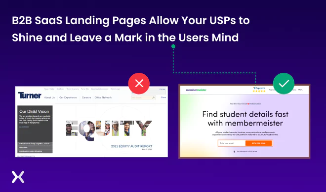
- Presenting a clear value proposition A value proposition is everything in B2B SaaS since they do not offer any tangible element for prospects to judge. Landing pages play a significant role in setting a clear value proposition.
Additionally, a thoughtfully designed landing page will help you distinguish your product from your peers by keeping visitors hooked to the main content. It serves as the visitor’s first impression, and you can persuade them to test your product rather than one from a rival company.
- Provides a room for flexible designing SaaS solutions undergo millions of iterations, innovations, and changes in a short time. Updating each page on the website can take a lot of time. It’s comparatively easier to alter B2B SaaS landing pages and spread awareness about your new versions or offering across all types of audiences.
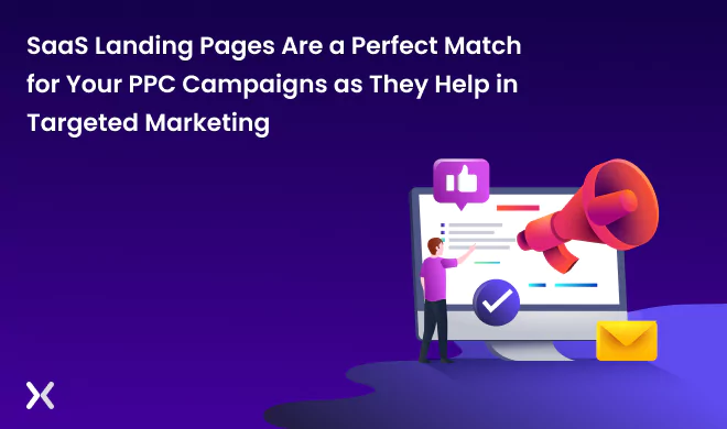
- Making the best use of PPC campaigns Speaking of SaaS companies, websites are not the right place to redirect users through Pay-Per-Click (PPC) campaigns. Websites have millions of other info and solutions, news, etc., which can distract viewers, reducing the scope of conversions.
On the contrary, B2B SaaS landing pages are the best way to reduce viewers’ distractions and convey personalized solution info. This way, you can analyze the paid traffic while maintaining the lower cost-per-click.
Creating high-performing B2B SaaS landing pages is no cakewalk. Ideal B2B SaaS landing pages are the ones that can explain value propositions in the fastest way possible. All elements of landing pages should guide clients toward the heart of the solutions while pushing them for a purchase.
Unfortunately, customers often find it challenging to visualize and relate to SaaS solutions. Research says B2B SaaS landing pages get only 10.1% click-through on average, making it a highly competitive industry.
You need to remember that SaaS solutions are challenging for clients to visualize since it is a digital products. Any instances of design or copy inconsistencies like wrong CTA or inappropriate color of action buttons can lead to countless distractions, ultimately reducing your conversions.
To help you save customers and create the best landing pages for your SaaS solutions at the right cost, here are a few B2B SaaS marketing strategies.
Before you dive headlong into selling your solution, make a clear picture of your audience:
Who are you selling your solution to?
How will your offering help them solve their problems?
Can they visualize your solutions working effectively for them?
Which part of your SaaS solution should you emphasize more?
Analyze your answers and use them to build your buyers’ persona. Additionally, filter out intricate details of buyer personas and make sure your copies, CTAs, images, and everything else reflect on your landing page so that customers can relate easily to your product.
There is no single conversion strategy for a landing page since every user comes with a different purpose on it. While some may be there to check out your offerings casually, others may be in the consideration stage and click your page link to compare solutions with that of competitors. Here it becomes crucial to capture both types of leads.
Marketers can use dual CTAs: one with a direct sales offering like “Book a Call Now” and another like “Join our Discord”. While the first one caters to high-potential customers, the latter is more focused on establishing a channel of communication with the new leads.
Another way to segment your visitors is to ask them a few questions when they land on your page and know more about their intent. You can then take them to the relevant sections and save them time from scrolling through the landing page.
What type of B2B SaaS solution are you dealing with? Is it for automating day-to-day tasks, and can non-tech professionals use it? Or is it too technical and would need time to understand how it works? This will help determine if you need a high-touch approach like booking demo calls or offering a freemium version.
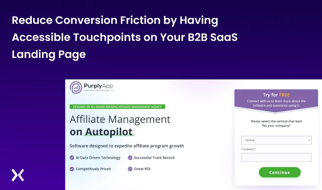
If it is too much to understand the product features in a 30-minute demo, then keep room for a free trial of seven days to allow users to understand your solution better. Vice versa, if it’s an easy-to-use solution, and a demo call will help you convince customers to try out your product, then add click-to-call buttons that allow users to contact you.
For instance, this app, Purply, makes it a no-brainer to insert your email and start a free trial, it doesn’t waste your time with a sales call or long contact forms. Alongside designing an effective landing page, leveraging tools that centralize and streamline the revenue cycle is crucial. Integrating a digital sales room can enhance engagement. Consider using tailored solutions like sales software from Trumpet to optimize buyer interactions.
A good header is just one part of your catchy content. A cluttered screen with hard-to-understand features will drive out the impact of efforts you made on the header. The audience doesn’t tend to care much about all the features you offer but the features that present a solution to their pain point.
Identify such product features and benefits by building buyers’ personas and leverage them on your landing page as USPs. It helps create urgency in visitors’ minds and makes them want to learn more about the product.
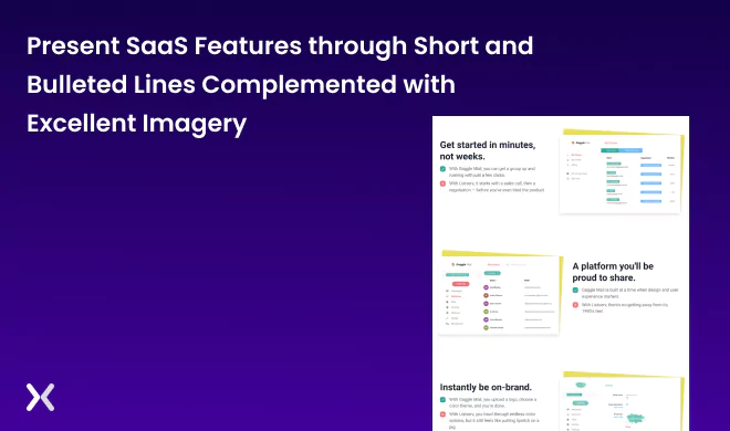
Here’s an example of Gaggle. To inform readers and keep them interested, they use a one-line heading and brief sentences to describe a specific feature or benefit, with the SaaS screenshots right next to them for more impact.
Social proof can do wonders for B2B SaaS marketing. Because SaaS solutions are intangible and cannot be judged in traditional ways, word-of-mouth and social proof play a massive role in building trust. Here are a few ways to do it:
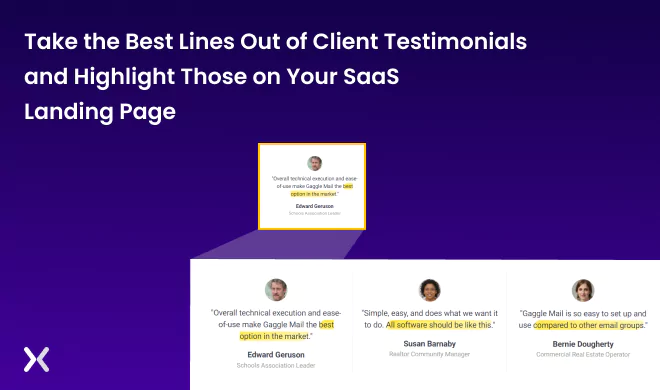
Retrieve one impactful message from your review lists or third-party sites like Capterra or PilotTrust and highlight it on the landing page.
Create video testimonials of some happy customers.
You can flesh out the relevant parts for long testimonials and make them easy to skim.
Use genuine client images along with their job descriptions, company names, and sectors to lend authenticity.
Use the logos of well-known clients to increase your credibility.
However, ensure not to fill your B2B SaaS landing pages with long testimonials and create distractions from the main content. Gaggle is an excellent example of highlighting the main points of reviews and keeping them short.
Only some of your customers will be tech-savvy or professionals who understand all those buzzwords you might use daily. So ensure you explain your solution in the simplest way possible and address prospects’ real-life pain points.
To help the more extensive group comprehend the benefits and features of your SaaS solution, it is crucial to express jargon in layman’s terms. A concise description of how the software makes lives more accessible and structured must be the center of the message, not some hard-to-relate technical jargon.
A study by Unbounce says videos bring down landing page conversions from 1.8% to 1.4%.
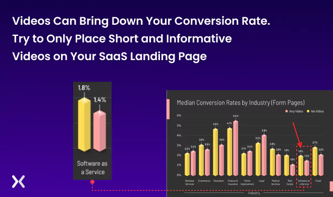
Basically, numerous reasons are responsible for the conflicting video-landing page equation. First, videos consume vast chunks of data and increase the load times manifold. Secondly, the video should deliver helpful and concrete messages quickly. Viewers won’t like to spend their precious time watching a 10 mins long video if it doesn’t have anything impactful or relevant to offer.
So make sure that your videos contain only relevant but not too critical info to gain a reasonable play rate. The best way to understand whether videos work for your B2B SaaS landing page or not is to A/B test it.
One of the best ways to create urgency and curiosity is to compare before and after scenarios. Identify precisely what pain points your solution solves. Help your viewers visualize their workflows in the current scenarios and the improvements they will enjoy after they adopt your solutions.
Interestingly, you can present quantified results of clients with and without your SaaS, create visuals for easy comparison, or build use cases. You will get more conversions when users compare the differences in their current and future scenarios.
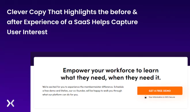
Membermiesters is an excellent example of using the before-after scenario technique. Its landing page closes with a powerful line. It emphasises that finding information shouldn’t be difficult, and with its product, it can become easier and more efficient.
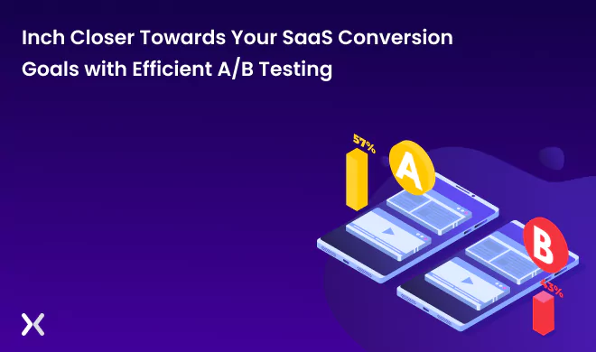
Building the ideal B2B SaaS landing page is not the last step. You are not finished yet. You will never be able to tell if your design concepts genuinely work without testing and measuring. Small details matter. For instance, did you realize that the color of your CTA button might affect conversions?
A/B testing helps you discover what performs and what doesn’t. To determine which variant is superior, test two landing page layouts and track each one’s effectiveness using conversion analytics tools. These tools can offer comprehensive information about which landing page elements perform best and which require revision for the best outcome.
Suggested Read: Landing Page A/B Testing Framework to Maximize Conversions
As the first thing, spend time and effort creating a superb landing page for your B2B SaaS marketing. Whether or not prospects abandon you or decide to test your goods depends on your decisions when designing a landing page. This blog will help you frame effective B2B SaaS marketing strategies and create a landing page that converts.
Want to discover more about designing high-performing B2B SaaS landing pages? We at Apexure design SaaS landing pages that are not only convertible but are user-friendly, eye-soothing, and offer a fantastic browsing experience. Contact us today!
Related Articles:
Founder & CEO of Apexure, Waseem worked in London’s Financial Industry. He has worked on trading floors in BNP Paribas and Trafigura, developing complex business systems. Waseem loves working with Startups and combines data and design to create improved User Experiences. Read more


Drive More Sales or Leads With Conversion Focused Websites and Landing Pages
Get Started


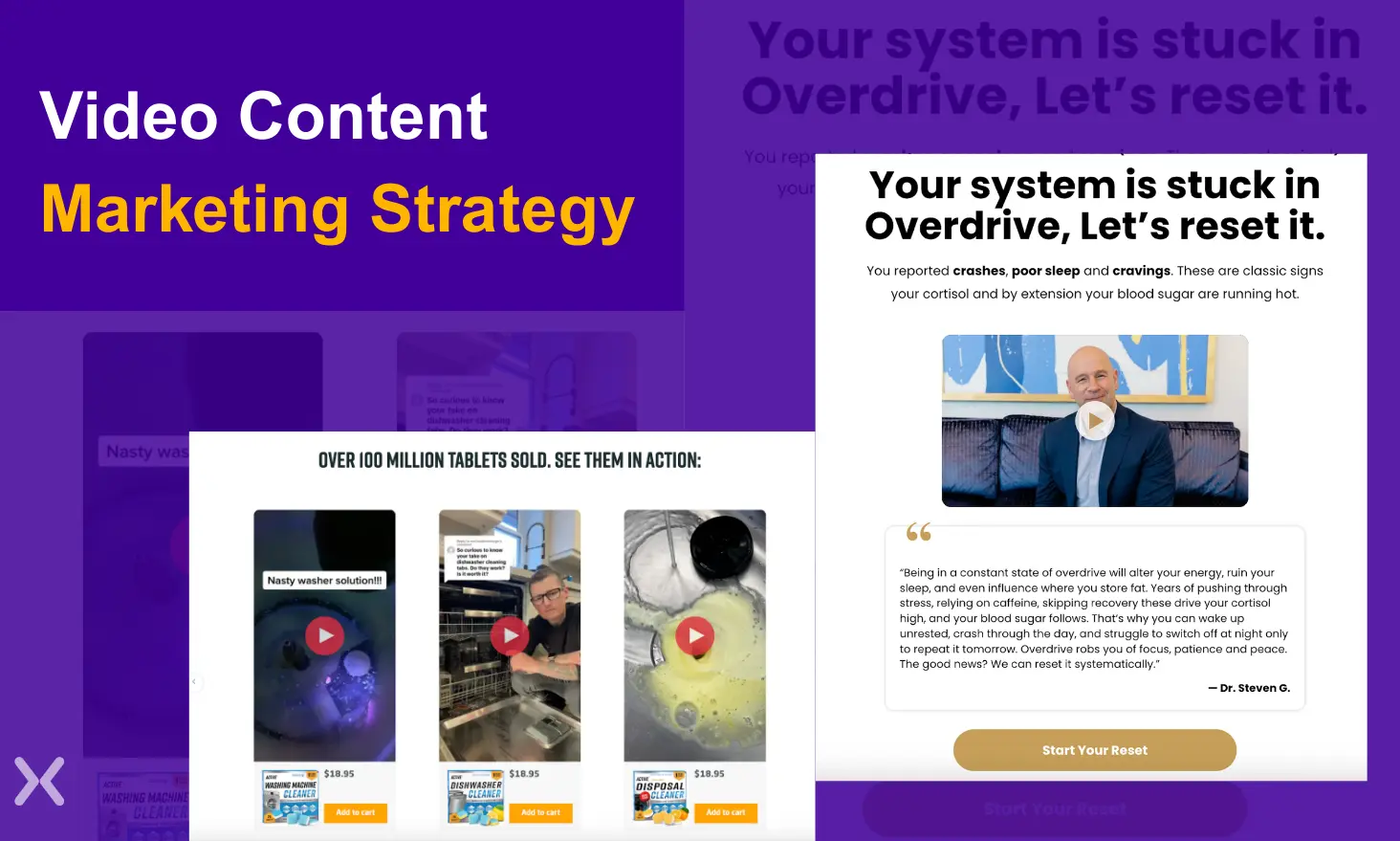
Video content is one of the most powerful tools in modern marketing. It has the ability to capture...
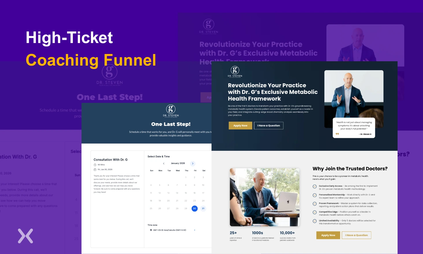
Building a high-ticket coaching funnel for an expertise-driven brand requires a very different approach than traditional marketing funnels....
Get quality posts covering insights into Conversion Rate Optimisation, Landing Pages and great design
