
When it comes to landing page design, it’s important to understand how can you persuade visitors to visit your landing page and make a purchase? Although several landing pages vary in appearance and employ a variety of intriguing landing page inspiration ideas to entice visitors, they all serve the same basic purpose. These pages encourage visitors to move on to the next level of the buying process.
A landing page provides a resource to a potential customer, such as an ebook, free trial or webinar signup in return for their simple contact details. These pages are designed to generate leads while guiding prospects further into the sales funnel. However, there are numerous approaches to landing page design, only some of which will be appropriate for your project. With the right landing page design inspiration, you can take your project to the next level.
We’ve compiled a list of the best landing page design inspiration examples with conversion hints to get ideas for your next project.
 Landing Page Design Inspiration for GenBoost
GenBoost
Ecommerce
Product Detail Landing Page (PDP)
Sell Product
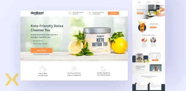
For GenBoost landing page, our design involves telling the story of the product - a list of features, high-level benefits and how the purchase could improve their lifestyle in the long term.
We used bright and engaging images presenting the product and its features.
The Call to action button is strong as it’s short and direct.
Two customer testimonials provide authority and credibility to the GenBoost brand.
There is a 60-day money-back guarantee offer that helps customers feel more secure in their decision to try the product.
 Landing Page Design Inspiration for Ortex
Ortex
SaaS
Click-Through Landing Page
Access a Free Trial
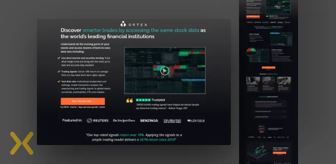
For Ortex landing page design, we focused to bring up the features and benefits of the platform they offered.
We included social proof on the landing page in the form of video, trust labels and company badges to increase credibility and help generate more conversions.
Incorporating FAQs in the landing page design was a priority after testing the page to inform and educate visitors about the platform and its pricing which helped to trigger audience response.
 Landing Page Design Inspiration for Equantiis
Equantiis
Business Management Consultancy
Webinar Landing Page
Visitor Registration
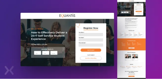
For Equantiis, we designed a webinar landing page with the headline “How To” that helps to communicate the value of registering and attending the webinar.
Using a timer on the page was to create a sense of urgency to persuade prospects to sign up for the webinar. “Save my spot” hints that there are limited seats and that they must be booked.
We showed all the details about the event including the day and time of the event, speaker information and all the key ideas that will be covered in the webinar.
We used two ways of generating leads for the webinar page. We added two CTAs to the landing page design. One simply to drive webinar sign up and extra functionality to sign up for the recording for those visitors who can’t make it to the webinar.
 Landing Page Design Inspiration for Office Solver
Office Solver
SaaS Company
SaaS Landing Page
Demo Booking
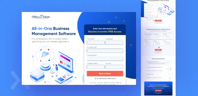
For Office Solver, we created a “Book a Demo” landing page with a simple demo form that appears with a protective indicator to prevent losing out on conversions from visitors who can’t decide whether or not to trust the brand.
The copy is marked in bullet points to draw attention to the important pieces of information about Office Solvers software, which likely makes prospects more eager to schedule a demo.
These have been used a couple of times to intentionally point visitor’s attention to the desired CTA.
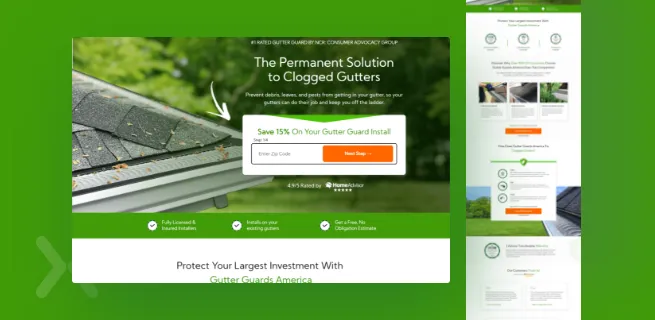 Landing Page Design Inspiration for Gutter Guards America
Gutter Guards America
Cleaning Services
Lead Generation Landing Page
Generate Leads
For Gutter Guards America, we removed asking unnecessary requests from visitors and switched to a multi-step form that encouraged prospects to complete the form and result in more conversions.
We used the navigation menu at the top helps visitors to easily move to different sections of the page and gather more information about the service.
The imagery used in the landing page shows visitors what they can expect from the brand and makes the overall landing page design visually pleasing.
We’ve used multiple customized trust seals on the page to instil a sense of certainty and provide trust value to those visitors who might be hesitant to try out the Gutter Guard services.
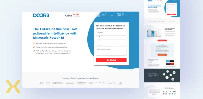 Landing Page Design Inspiration for DOOR3
DOOR3
B2B Technology Consultancy
Lead Generation Landing Page
Fill Out The Lead Form
For Door3’s lead generation landing page. We took a more detailed approach by presenting one of their positive Clutch reviews at the top. Seeing a Clutch review helps prospective customers to build trust in the services the company has to offer.
We included an award section on the page to present the awards received by Door3 for its Power BI product. This helps to increase product credibility and reassure visitors so they can convert with confidence.
We reduced the number of required form fields on the page to encourage visitors to complete the form.
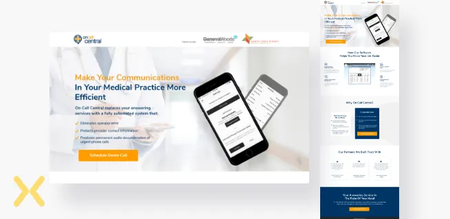 Landing Page Design Inspiration for On-Call Central
On-Call Central
B2B, SaaS
Lead Generation Landing Page
Schedule a Demo Call
We’ve used a clear and concise headline and description copy that dives into the details of the offer along with an image and a bright orange CTA button.
We tried to fit in the important information about the services using eye-pleasing colours and fonts on the landing page to help visitors keep reading without boring them.
To eliminate visitors’ confusions and doubts regarding the brand’s services, we included a section on the landing page to understand the difference between on-call central and traditional call centres.
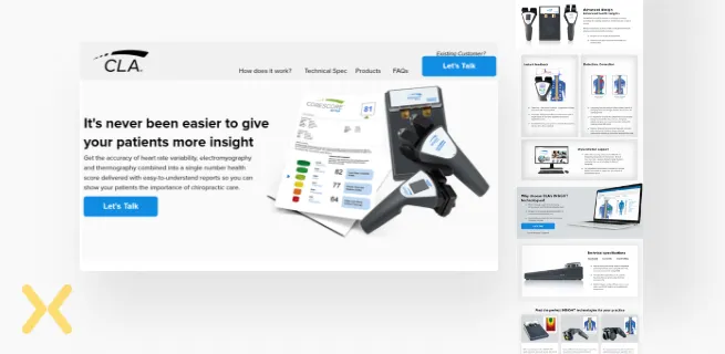 Landing Page Design Inspiration for Insights CLA
Insights CLA
Healthcare
Lead Generation Landing Page/Click-Through Landing Page/ Sales Page
Generate Leads
For Insights Scanning, we used a sticky menu at the top to classify content on the page into respective sections. It helps visitors to access different sections of the page easily.
The details of the product are clearly and carefully displayed with multiple images. Each section of the page is dedicated to a different feature of the product. It makes it easy for prospects to understand what the product offers. Also, if a user wants to learn more about the product, there are clear CTAs to do so.
We set up Hotjar on the landing page to provide special attention to prospects and also provide personalized offers and CTAs for them.
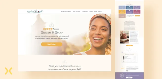 Landing Page Design Inspiration for Recreate and Renew
Recreate and Renew
Education
Lead Generation Landing Page
Generate Leads
For Recreate and Renew, we used a content gating strategy to help engage with our target audience and result in better leads. To open the content, the user is supposed to either log in or make a payment.
We used a well-optimized pricing table marking the benefits the user can get at each plan along with the flexibility of making annual or monthly payments.
We used a colour scheme that best relates to the brand. We chose to use soothing colours like whites, pastel pinks, burnt oranges to depict faith and purity and deliver the brand’s intended message.
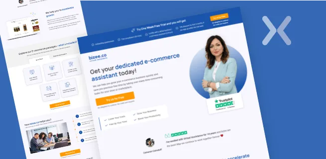 Landing Page Design Inspiration for Bizee
Bizee
IT Consulting
Lead Generation Landing Page
Generate Leads
We positioned a sticky CTA at the top of the page to increase its visibility.
There is a much better chance of convincing your guests to reconsider pressing the back button if you create an exit-intent popup that matches them. For Bizee, we created a strong exit popup to help recover users before they leave the page.
We used short quotes from satisfied customers to improve the credibility of the page and boost the conversion rate.
The advantages of the services are explained in the body text, which is broken down into parts for a better flow.
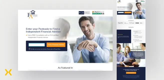 Landing Page Design Inspiration for Financial Advisor Network
Financial Advisor Network
Finance
Lead Generation Landing Page
Generate Leads
For Financial Advisor Network, we designed a simple form that requests more appropriate information from the users for quick action. This helped in keeping visitors focused on the goal and spending as little time and effort as possible while filling out the form.
We tried to include trust signals in the form of 5-star ratings from an industry review site and organizing well-recognized logos of clients that have worked with the brand over time. These are the most valuable trust signals to encourage visitors to take action.
We kept the page short which featured fewer distractions and enough conversion elements to convince a person to perform the desired action.
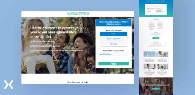 Landing Page Design Inspiration for Health Insurance Comparison
Health Insurance Comparison
Health Insurance
Lead Generation Landing Page
Get Free Quotes
We designed a well-structured long-form asking for information one at a time. The idea to use a long-form was to capture the users who are legitimately interested in the services and would complete multiple fields in the form.
We used clear headlines that immediately addressed the benefits and value proposition of the services to match the visitor’s intent.
We included brand logos and partnership badges to indicate to visitors that many big brands recognize and trust the brand.
 Landing Page Design Inspiration for Help
Help
B2B
Lead Generation Landing Page/ Product Detail Landing page
Lead Generation
For Help we created an app landing page designed for a single focus objective - to promote the mobile app and drive more downloads. We used big bold headlines with a targeted message that describe the app’s features and benefits to drive conversions.
We built an interactive calculator to capture visitors attention and help potential prospects learn more about the brand’s offering. In this way, you can make sure a better user experience and consequently increase the chances of conversion.
We added an influencer/VIP video to increase the credibility and authority of the brand’s application.
We offered live chat assistance on the landing page to assure customers of all-time assistance and make a way for the customer -application interaction. Such interactions build relationships between the two and help customers from bouncing off your page.
 Landing Page Design Inspiration for AHR Private Wealth
AHR Private Wealth
Finance
Ebook Landing Page
Guide Downloads
We used a sticky navigation design element at the top of the landing page screen to help visitors move around the page quickly and keep them engaged on the page.
We used certain visual elements to guide visitors to the strategic areas of the page. We included linear cues to direct attention straight to the call to action.
To benefit from the credibility and trustworthiness of the brand, we featured many testimonials as most visitors don’t trust the brand blindly unless it is recommended by someone else.
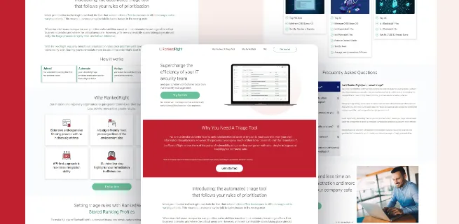 Landing Page Design Inspiration for Ranked Right
Ranked Right
IT
Product Detail Landing Page
Free Trial
For Ranked Right, we incorporated a sticky navigation bar at the top of the page to be in the user’s permanent view, allowing them to move through the page more quickly.
The page is tailored to a Free trial offer making it a no-brainer for prospects to sign up.
We displayed the Frequently Asked Questions about the product and their answers in a drop-down menu to guide visitors down the road to making the all-important buying decision.
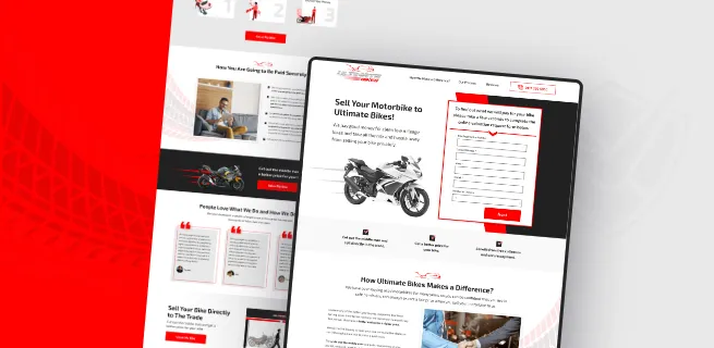 Landing Page Design Inspiration for Ultimate Bikes
Ultimate Bikes
Automotive
Lead Generation Landing Page
Generate Leads
We designed a clear and understandable page navigation menu at the top to help visitors make a smooth journey through the content on the page in a manageable way.
We tried to capture the essence of the offer by providing essential information that will interest the audience without overwhelming them.
We designed a multi-step form in a way to increase the visitors time on the page and generate more qualified leads.
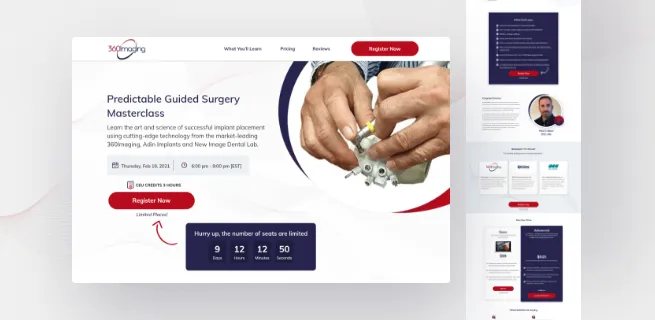 Landing Page Design Inspiration for 360 Imaging
360 Imaging
Education
Webinar Landing Page
Generate Sign Ups
We attempted to instil a sense of urgency in visitors by adding a countdown timer to make it difficult to put the decision off any longer.
We used an attention-focusing sticky bar to make it easy for attendees to sign up for the webinar.
We used strong elements including benefit-oriented headlines, social evidence, authority badges, and testimonials to communicate the importance of registering and attending the webinar.
The above-mentioned landing page design inspiration, ideas and tips will influence visitors to make decisions about your products and services, so it’s important to pay special attention to them.
The following are some of the elements found on a landing page:
The main headline and a secondary headline
A distinct selling point
The advantages of your service
Right images or video
There is social evidence
A declaration of affirmation
A final point to consider
A call-to-action
Need help in designing a landing page? We can design a high converting landing page that is built from the ground up with a high focus on conversions.
Speak to us today and let’s talk about your next landing page design project.
Related Articles:
Email Capture Landing Page: Best Ways To Capture Email Leads
Microsite vs Landing Page: Which is Better for Your Campaign
Click to Call Landing Page: Optimize Landing Page for Phone Calls
Are Ecommerce PPC Ads Worth It? [Research] How Top 100 Shopify Stores Use Ads
Landing Page Design Cost Break Down: Comparisons & Solutions
Founder & CEO of Apexure, Waseem worked in London’s Financial Industry. He has worked on trading floors in BNP Paribas and Trafigura, developing complex business systems. Waseem loves working with Startups and combines data and design to create improved User Experiences. Read more


Drive More Sales or Leads With Conversion Focused Websites and Landing Pages
Get Started.webp)

Eleven percent of Meta ad rejections in 2026 trace back to one problem: the landing page does not...

A B2B SaaS company spends $30,000 per month on Google Ads and Meta Ads. Both campaigns drive traffic...
Get quality posts covering insights into Conversion Rate Optimisation, Landing Pages and great design
