You’ve undoubtedly seen a sales page if you’ve ever bought an online course, software, or other high-ticket items. Honestly, in all likelihood, the sales page is what would have encouraged you to pull out your money and pay for the product you bought.
Some effective sales pages bring in millions of dollars for businesses but designing a sales page as successful as that is far more complicated than simply listing your product’s virtues. Knowing how to create a sales page that converts is an invaluable skill in today’s digital marketing age.
That is why we’re going to talk about how you can create a sales page that converts by providing you with a bunch of strategic tips in addition to showing the best sales page examples currently at play.
A specialised landing page created to convert ad visitors into buyers is a sales page. In a world where consumers are increasingly curious to have pre-sales knowledge about the product they wish to purchase, you can think of sales pages as the modern salesperson, but more virtual, targeted, and data-driven.
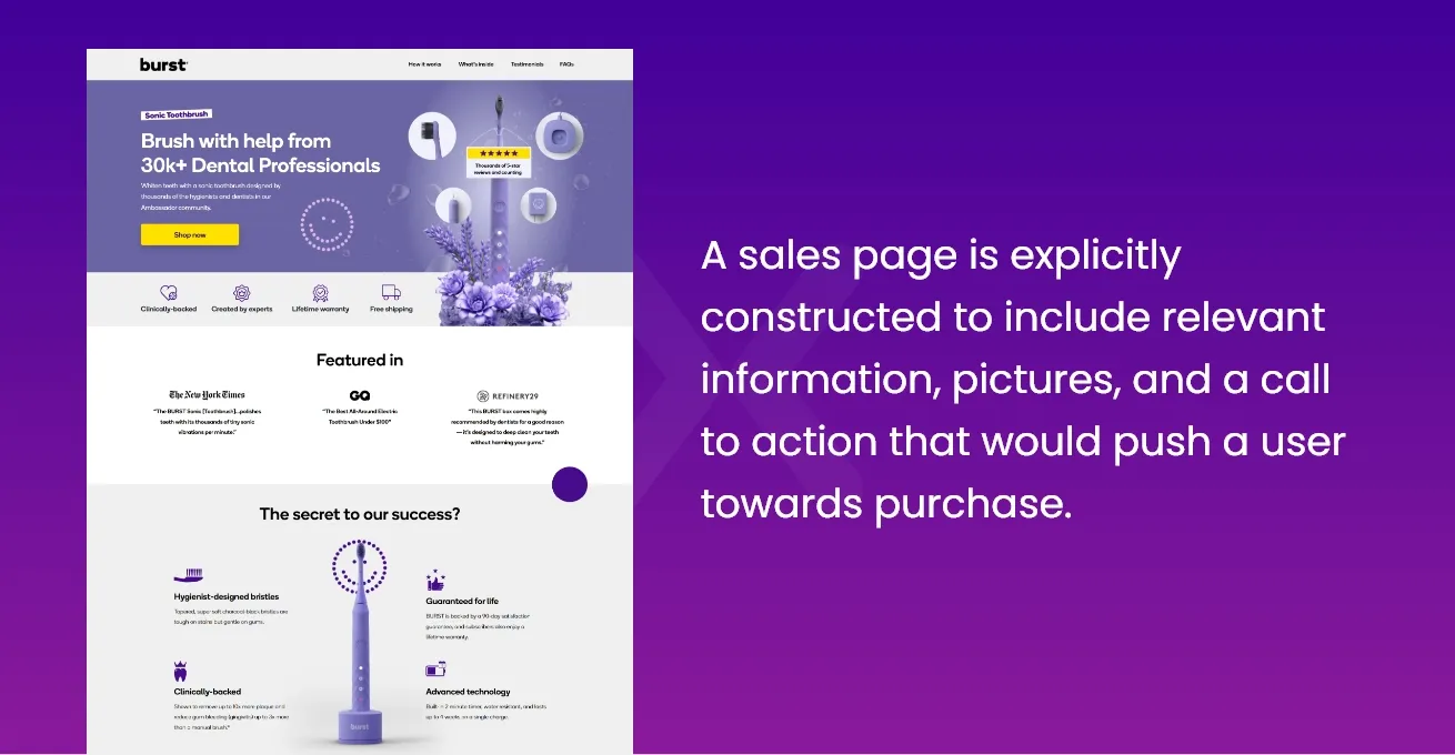
It’s the ideal place to send someone who hits on a targeted ad, whether you’re running paid Instagram ads or an email marketing campaign. Since it is the last page that the consumer sees before divulging their payment details, a sales page’s explicitly constructed to include relevant information, pictures, and a call to action would push a user towards purchase.
However, people often get confused between related terms like landing pages, product pages, and sales pages. Let us understand the fundamental difference among all of these.
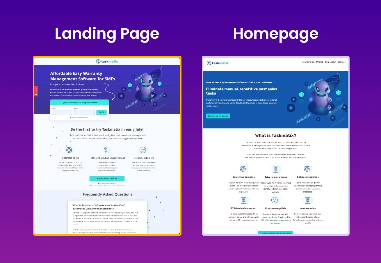
Because both are designed to persuade consumers to convert, a sales page and a landing page are connected. While landing pages are similar to short-form sales pages, they are more commonly utilised for online visitors who are unfamiliar with a company’s brand. Also, because long-form sales pages are more thorough than a conventional high-converting landing page, they are often found further down the sales funnel.
Homepages, on the other hand, aren’t the same as sales pages. The primary goal is to market your entire brand by providing information about who you are and what you do. On the other hand, sales pages focus exclusively on the sale of a specific product because they already assume that the web user knows of your brand.
Related Article: Landing Page vs Homepage: Key Differences Explained
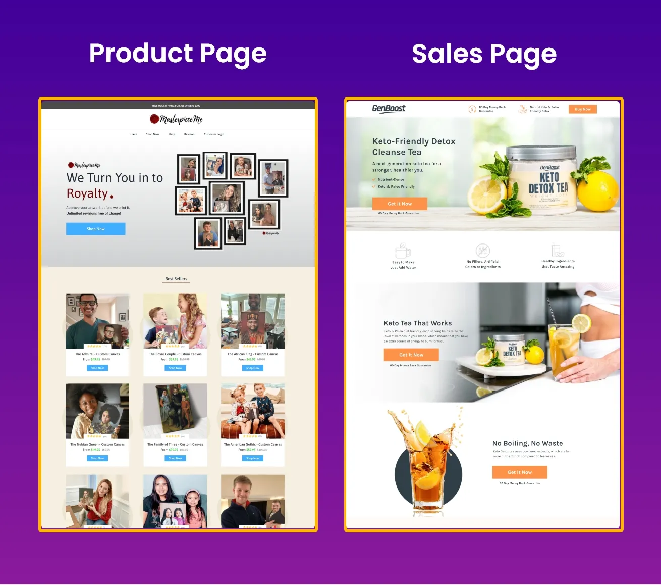
Are sales landing pages still required if you already have product pages? Definitely! Unlike product pages, whose objective is to highlight features in-depth, a sales landing page is built precisely to convert. Visitors will see only the information they need to make a purchase choice, without the clutter that usually accompanies product pages.
Related: Landing Page vs Product Page Debate: Which is Better?
Moreover, sales landing pages are more flexible than traditional product pages. They let you adjust, test, and update them before moving on to the remainder of your website.
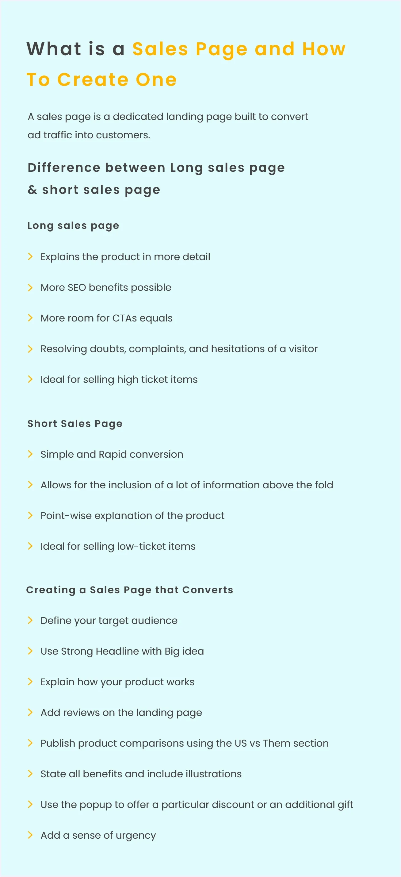
It’s critical to remember that not all sales pages are created equal. Some are brief, requiring only a few hundred words, while others are lengthy, requiring several thousand words.
So, how do you know which of these is best for your business?
The answer is: it depends. Choosing the best sales page design depends entirely upon your needs. Both have their perks and downsides.
Long sales pages are typically used when you are selling at a higher price and you need to explain your product in greater detail.
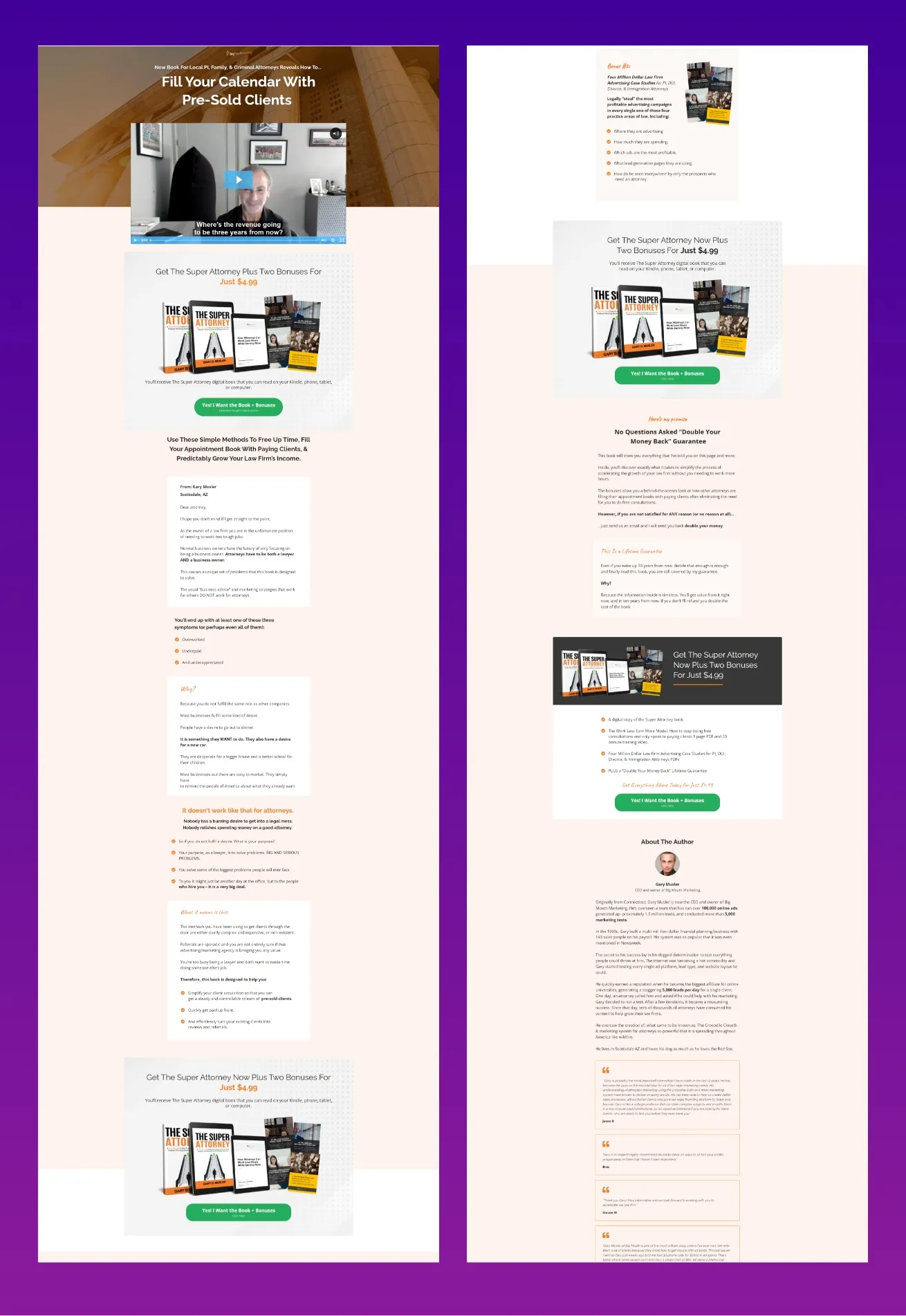
Opportunity for longer explanations: The length of the long-form sales page acts as an excellent opportunity to explain your product in greater detail to your customer. The more the visitor knows about your product, the higher chances that they will buy it.
More SEO benefits possible: More space makes for more SEO opportunities compared to short-run pages.
More CTAs equal more conversions: CTAs are the best way to convert a sales page into a purchase. More room for CTAs equals more opportunities for conversions.
Addressing objections and conflicts: Resolving doubts, complaints, and hesitations of a visitor becomes much easier with a lengthier sales page than a shorter one.
Ideal for selling high ticket items: Employing a long-form sales page is advantageous where the visitor needs to be persuaded emotionally and logically.
Excess Information: Marketers can easily get carried away with the amount of information they put on their sales page. This may deter the visitor from buying your product.
Boring the visitor: As mentioned above, the danger of over-explaining or overselling your product is always a possibility with long-form sales pages.
Long-form sales pages, on the other hand, aren’t always essential. They do more harm than good.
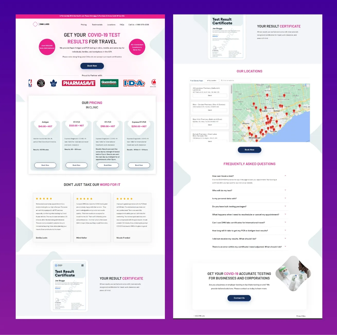
Simple and Rapid conversion: The compact nature of this format allows the developer to explain in as few words as possible, thus effectively retaining the visitor’s attention and increasing the chances of conversion multifold.
“Above the fold” information: The no-nonsense format of short-run sales pages allows for the inclusion of a lot of information above the fold.
Short, concise and to the point: Point-wise explanation of the product makes it easier for a visit to absorb essential information and prevent information loss.
Ideal for selling low-ticket items: Pitching low-ticket items becomes much simpler when one makes use of a short-form sales page. For example, products less than $10 would benefit if presented through a short-form sales page!
Fewer SEO benefits: The absence of more words makes for lesser SEO opportunities than long-run pages.
Danger of overlooking information: Again, a format as short as this sometimes might cause you to leave out input that might otherwise convert consumers.
Leaving the visitors confused: Keeping the format short and compact presents the danger that the consumer might not understand enough from the information presented.
If you wish to create a sales page that is effective at converting visitors into buyers, the following points will aid you in your endeavour.
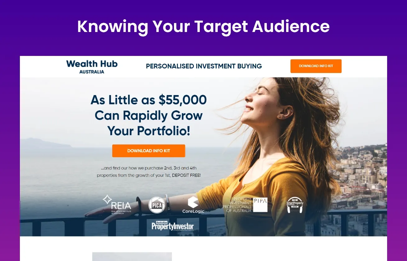
Creating a sales page that is effective involves knowing your target audience like the back of your hand. You must first get to know individuals before you can convert them. What are they looking for? What do they need, love or hate?
More information about your target consumer means more successful sales pages.
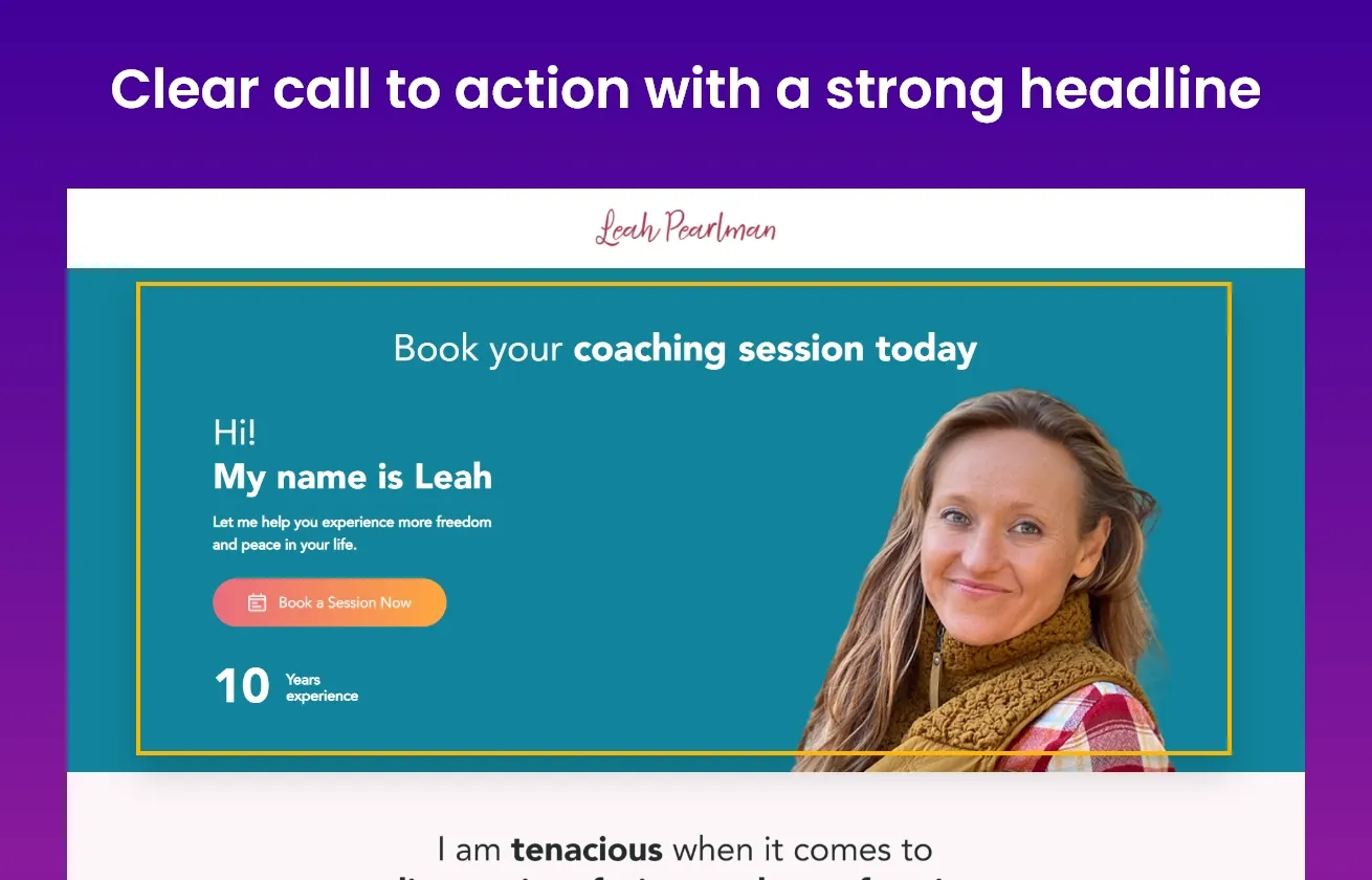
Your sales pages’ headlines may make or shatter them. They’re one of the most- read elements on any website, much like CTAs. A compelling headline combined with a clear call to action is required to produce a lasting impression - consistent and coherent with the rest of the page.
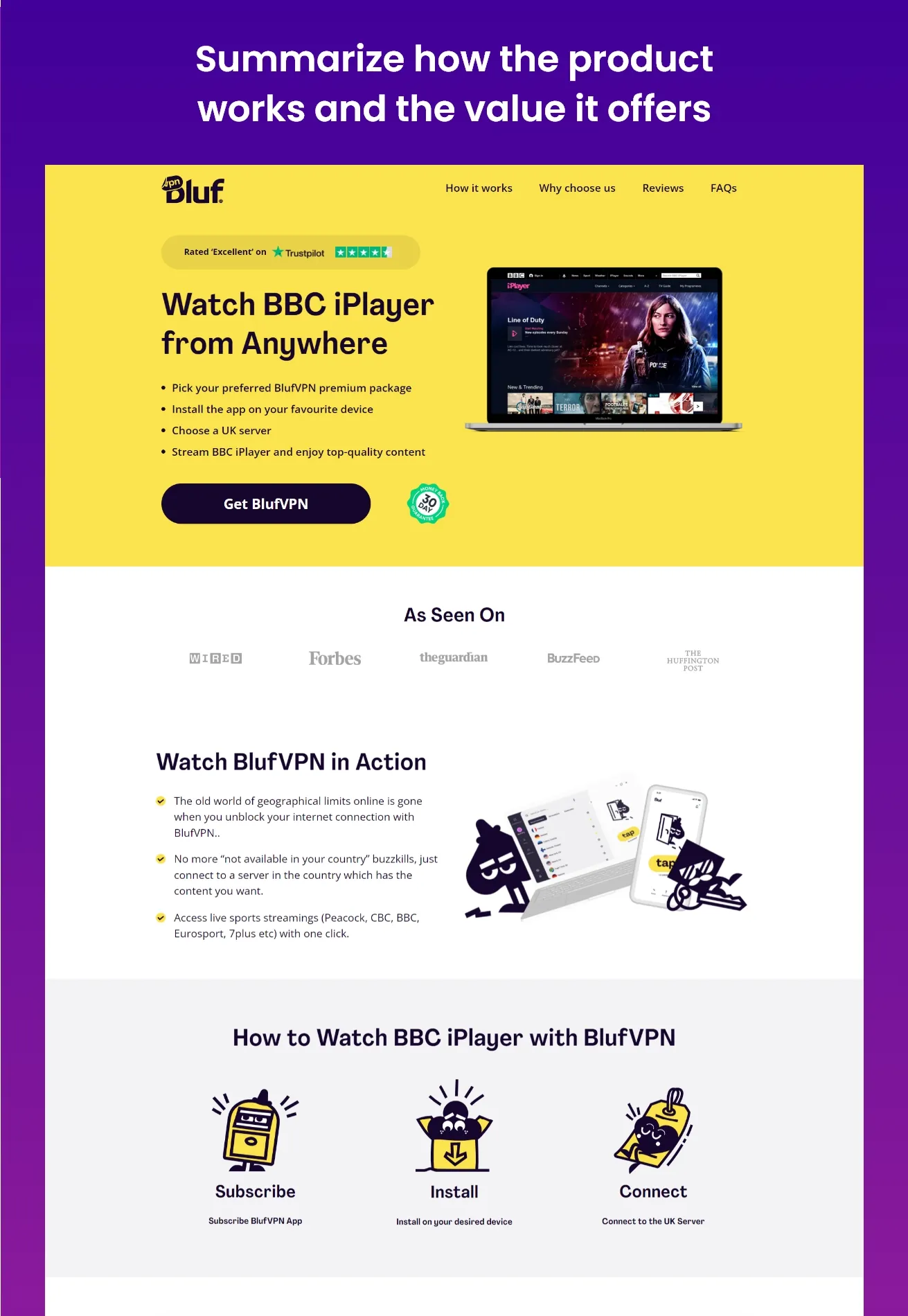
Your product should be the best on your sales page at all times. You must portray your product as one of many possible solutions and the only solution that will give your customers the exact type of relief from whatever pain they are experiencing.
This is where the design matters when it comes to conversions. A minor tweak, such as the colour of your CTA button or the image you choose to demonstrate your goods, can make or break the sale.
That’s why we would recommend you consider design variations. A/B testing to see what your users are doing and their requirements will automatically present the best sales page design for your product.
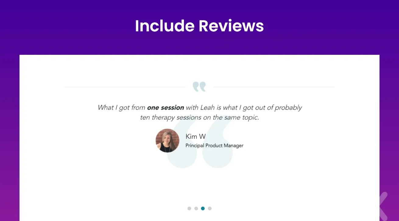
A landing page’s main aim is to convert visitors and move them through your sales funnel. Ideally, you will have a great strategy in place to persuade them that you can address their concerns.
However, it is a well-known fact that consumers don’t trust brands—they trust other people. Including reviews on a landing page is a powerful way to increase trust, drive clicks, and overcome objections.
Here are a few suggestions if you’re stumped as to what extra you could do:
Embed Tweets, Instagram posts, or other social media posts people share about your product.
Look for strategic endorsements.
Use direct quotes.
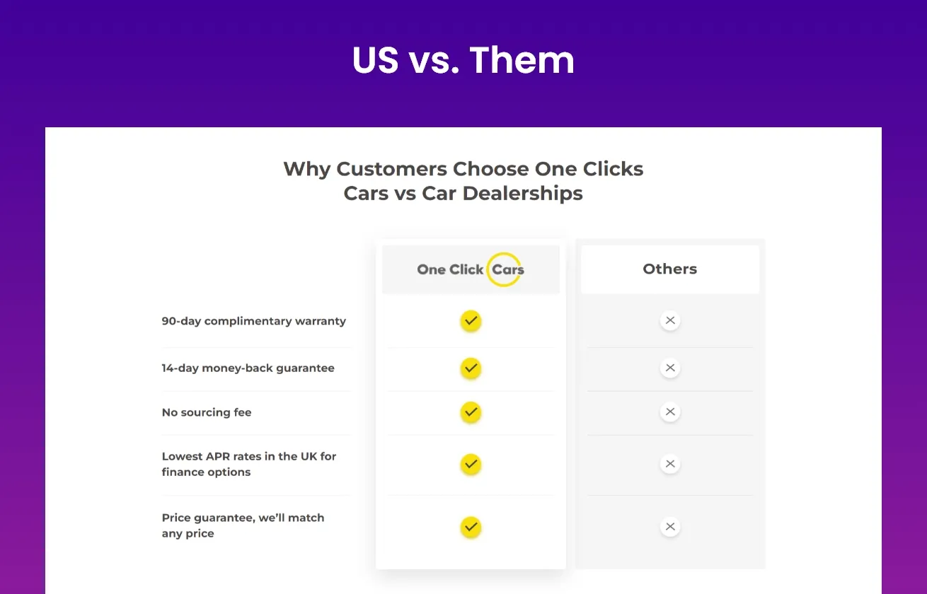
It is well known that buyers have a habit of comparing products before they finalise one.
They’ll do it no matter what, so we suggest why not make it simpler for them?
Publishing a product comparison on your sales page will help the buyers in not only their research process but also project values of honesty and transparency, which goes a long way in establishing that much-needed trust in your product and your brand.It is well known that buyers have a habit of comparing products before they finalize one.
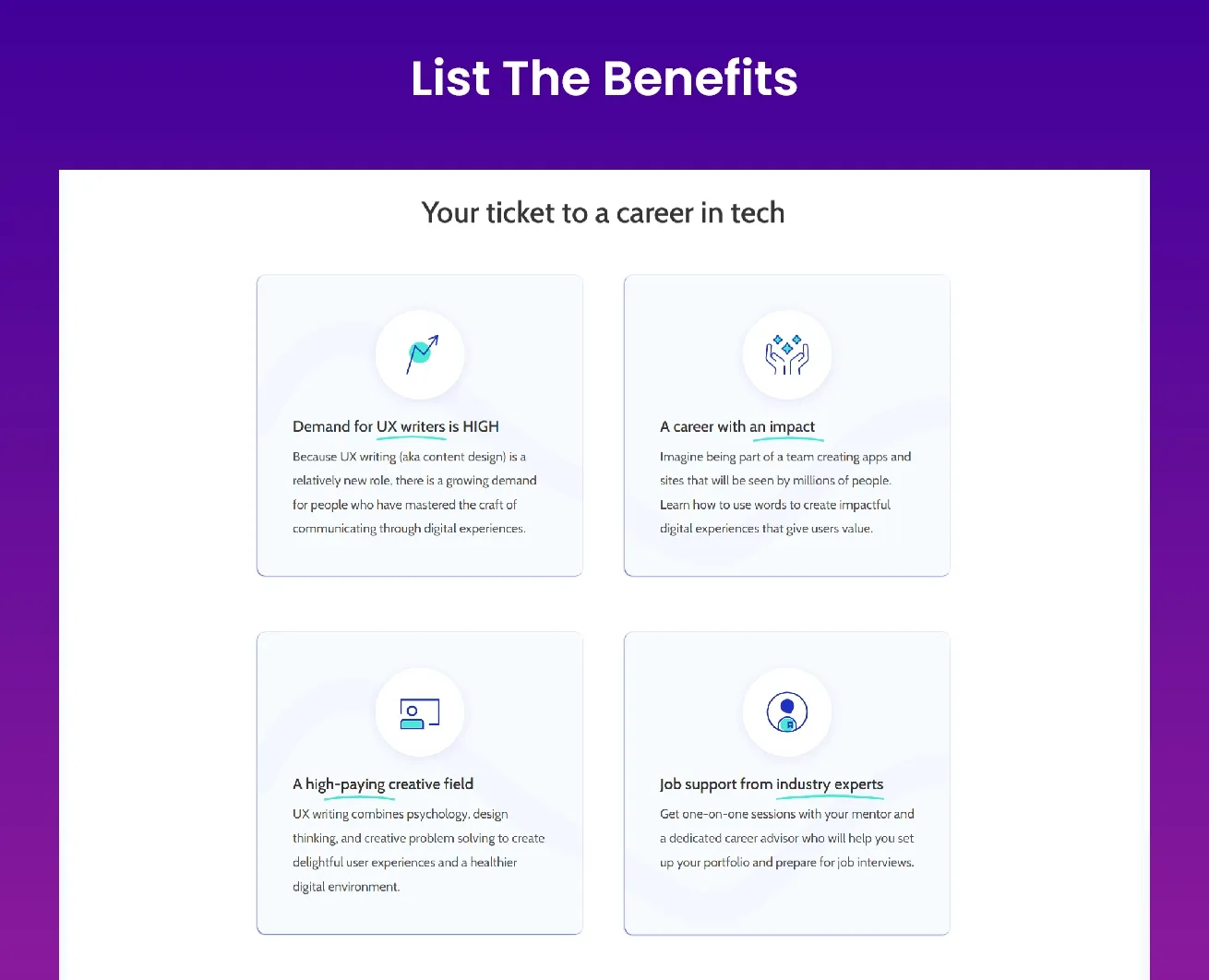
Make it clear to your reader how your product will improve their lives. The advantages are stated plainly in the benefits section. Don’t be hesitant to sell. If you’re going to teach your reader how to generate money online, be confident in your approach.
Your sales copy needs to paint a picture in the visitor’s mind. Tap into the imagination of the reader. Remember, sell the dream but do not forget to list the benefits. Avoid overloading your landing pages with content. Instead, maintain a simple and straightforward approach.
You can achieve this by creating a list of bullet points about the product that will benefit the reader paired with quality illustrations.
Reviews (better with photos): The photographs of each testimonial source and their name and position provide readers confidence that they are genuine reviews. The graphics and logos are particularly appealing, luring scrollers in for a deeper examination.
Ingredients (for a consumable product): When it comes to consumable products, talk more about their quality ingredients and commitment to sustainability. Users love knowing more about the product and what they’ll get out of it. Engaging in exploring your ingredients allows your brand to speak directly to your audience’s pain points.
Above the fold copy: Above the fold, content is what web page visitors see when they land on a sales page. Above the fold, material that communicates what an organisation does and its associated benefits might encourage visitors to investigate the rest of the page and its products.
A sales page that’s slow to load and is congested with information will probably not draw the reader the same way a page with a clutter-free design would.
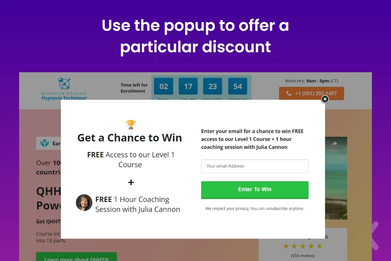
When you want to give visitors one final chance to buy, an exit-intent popup is ideal. You can use the popup to offer a particular discount or an additional gift or confirm that the visitor truly wishes to leave.
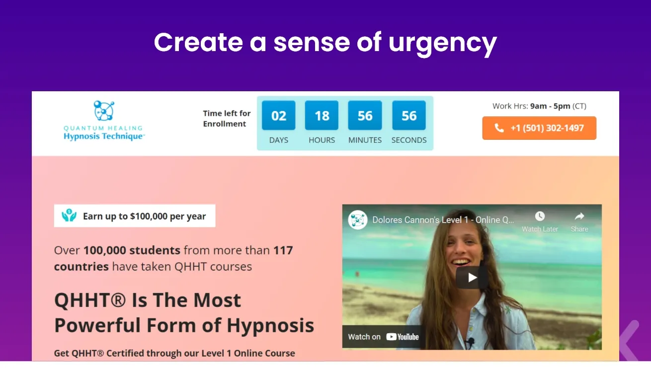
Add a ticking clock whenever you can. It’s an excellent strategy for sales pages because you want consumers to make quick decisions.
For instance, you could use a flash sale to encourage conversions. You’re offering a reduced price, but only if the visitor acts within X hours. The sense of a ticking clock pushes them to make a quick decision - inevitably increasing the chance of your product being purchased.
One can create urgency through desire too. For example, manufacturers of weight-loss products do this by saying things like, “Do you want to shed those last 15 pounds? Why wait?”
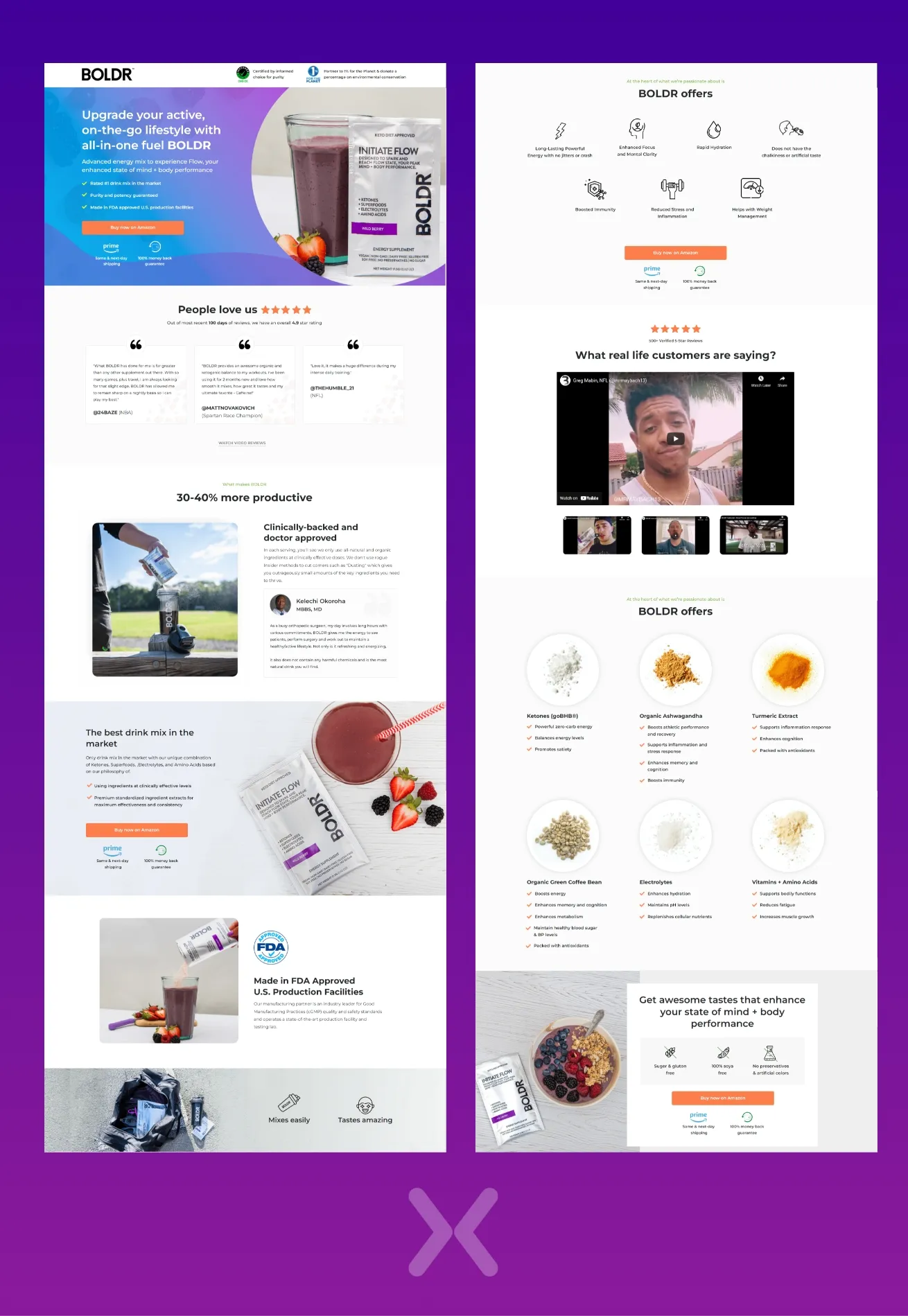
Video Testimonials: Visually representing the product and its benefits improves visitor engagement.
Focused On Benefits: The direct-to-the-point selling method of listing benefits has worked well in their favour. It makes for less confusion and simple information transfer.
Money-Back Guarantee: Using tactics like this makes the visitor trust your brand more, thus leading to a better conversion rate.
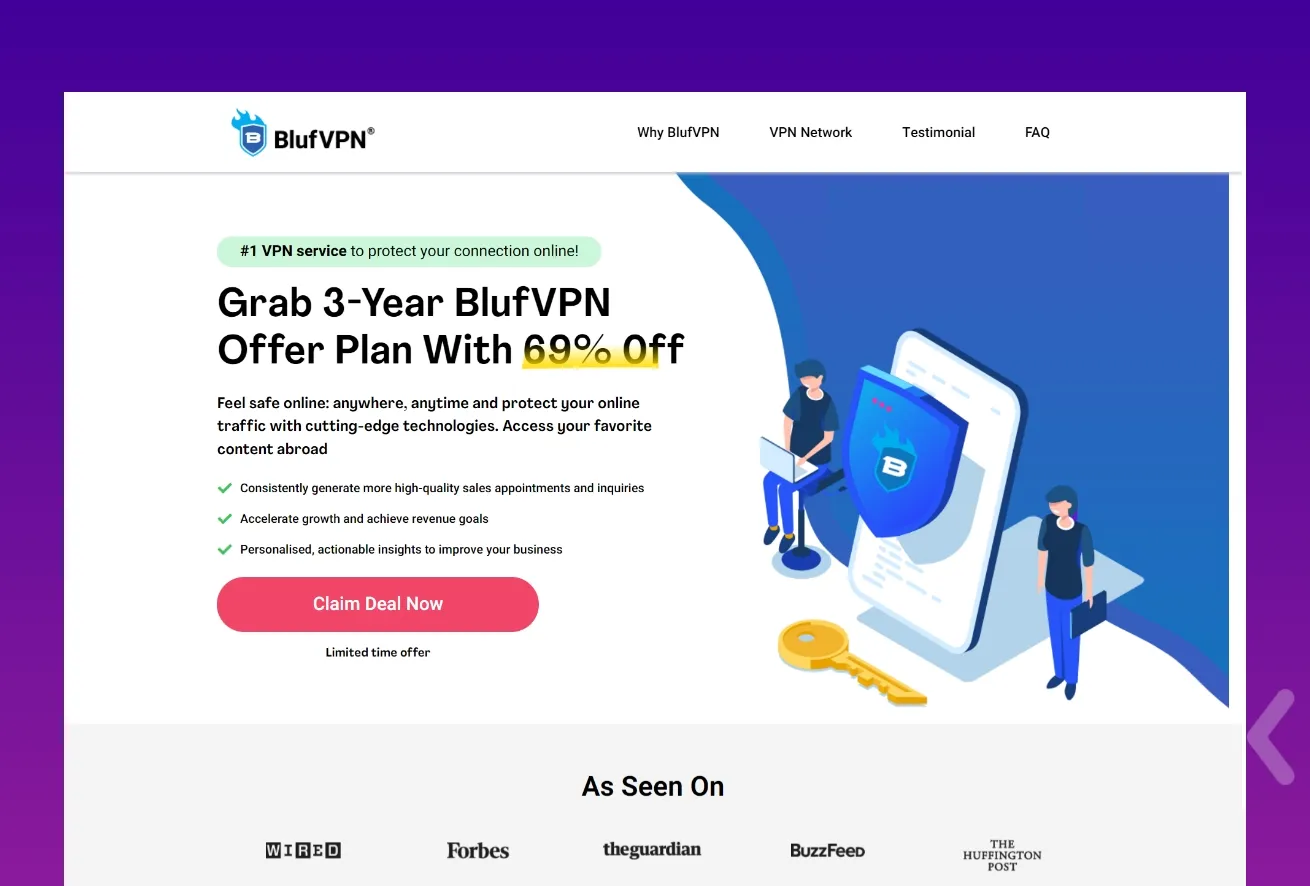
Best Offer/Deal: Eye-catching, dazzling and straightforward deals always capture the visitor’s attention, thus fulfilling the developer’s objective.
Eye Catching CTA: A well-placed, noticeable and creative call to action is always a plus point on a sales page.
Creating Urgency: Creating a sense of urgency pushes the visitor to make split-second decisions that increase the chance of conversions.
We at Apexure can help to create perfect sales pages that increase conversions and attract more qualified leads for all different kinds of products, services, and offerings with a single mission: closing the deal!
So if you are a digital marketer, an entrepreneur, or a business service looking to create the best sales landing page design for yourself, give us a call and experience our services firsthand! Contact us today.
Related Articles:
Drive More Sales or Leads With Conversion Focused Websites and Landing Pages
Get Started.png)
A B2B SaaS company spends $30,000 per month on Google Ads and Meta Ads. Both campaigns drive traffic...
LinkedIn Ads is the most expensive mainstream ad platform. Average CPCs sit between $8 and $14 in the...
Get quality posts covering insights into Conversion Rate Optimisation, Landing Pages and great design