
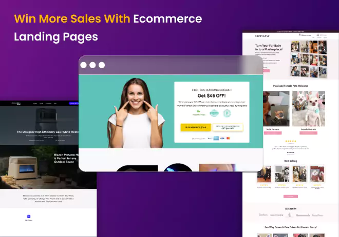
Are you struggling with your ecommerce landing pages? Worried that your PPC ads are not delivering the results you expected? No matter how many fancy ecommerce landing page examples you see, you still don’t understand where to send your ad traffic. As an ecommerce store owner, you know that driving traffic to your site is just the first step. The real magic happens when those visitors turn into paying customers. But here’s the catch - not all ecommerce landing pages are created equal. In fact, many ecommerce businesses struggle with landing pages that fall flat, wasting precious ad revenue and leaving potential customers bouncing away.
 The secret sauce lies in utilising various ecommerce landing pages effectively according to user intent.
In this blog post, we’ll dive into the world of ecommerce landing page examples, exploring different types of pages that can are effective landing pages for your PPC campaigns. From design pitfalls to keyword intent alignment, we’ll share insights and examples to help you position your ecommerce landing pages for success.
So, if you’re ready to optimise your landing pages and turn traffic into sales, get ready to take notes and save some examples. The world of ecommerce landing page examples and understand the basics one step at a time.
The secret sauce lies in utilising various ecommerce landing pages effectively according to user intent.
In this blog post, we’ll dive into the world of ecommerce landing page examples, exploring different types of pages that can are effective landing pages for your PPC campaigns. From design pitfalls to keyword intent alignment, we’ll share insights and examples to help you position your ecommerce landing pages for success.
So, if you’re ready to optimise your landing pages and turn traffic into sales, get ready to take notes and save some examples. The world of ecommerce landing page examples and understand the basics one step at a time.
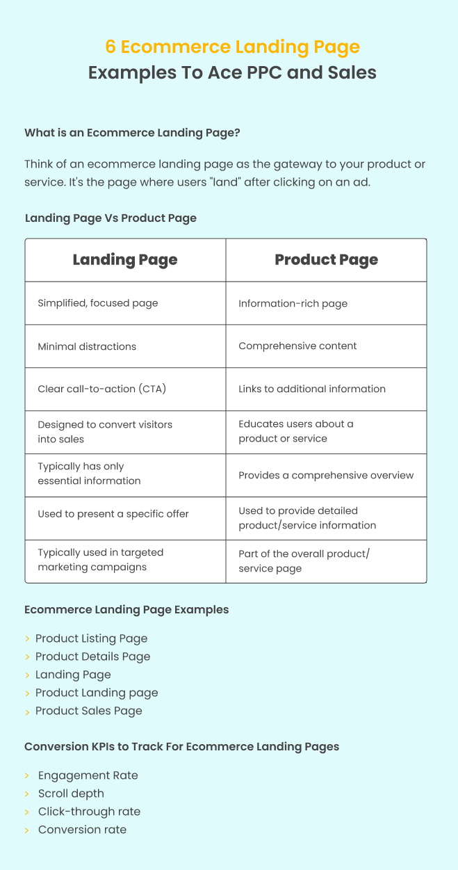
Think of an ecommerce landing page as the gateway to your product or service. It’s the page where users “land” after clicking on an ad, whether from a social media post, a Google search result, a paid ad, an email marketing campaign, or any other source.
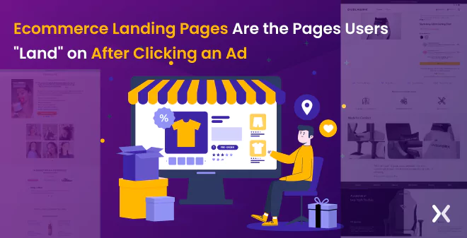 It is your opportunity to make a powerful first impression and guide users towards taking the desired action, whether it’s making a purchase, exploring a new collection, making prospects sign-up for creating a wishlist or showing off new collections.
Ecommerce landing pages positioned correctly can help you drive sales for your online store. While you can create a dedicated landing page if you have a single product. It is harder for stores to create such pages for several products. Here, it becomes smart to use the ecommerce website’s various pages as a gateway for visitors to browse, select, and purchase products.
It is your opportunity to make a powerful first impression and guide users towards taking the desired action, whether it’s making a purchase, exploring a new collection, making prospects sign-up for creating a wishlist or showing off new collections.
Ecommerce landing pages positioned correctly can help you drive sales for your online store. While you can create a dedicated landing page if you have a single product. It is harder for stores to create such pages for several products. Here, it becomes smart to use the ecommerce website’s various pages as a gateway for visitors to browse, select, and purchase products.
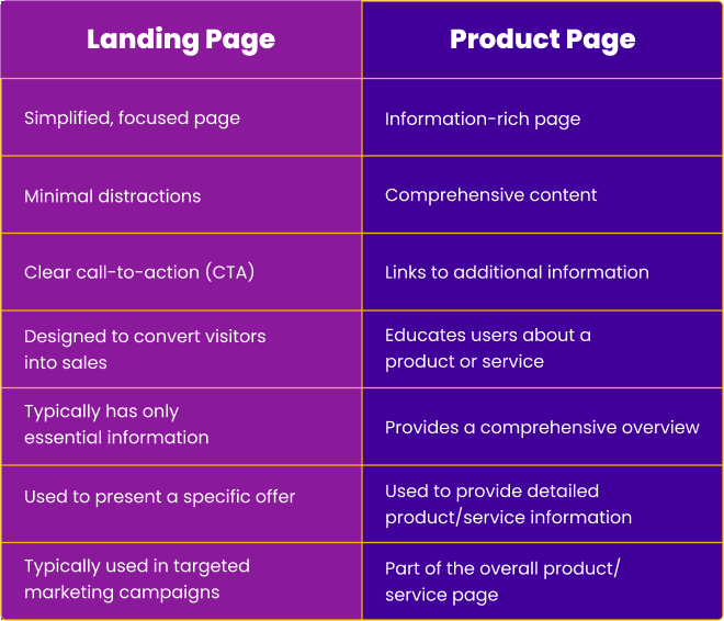
Ecommerce landing pages and product pages serve different purposes. A landing page is a focused page with minimal distractions, designed to convert visitors into sales by presenting a specific product or offer. On the other hand, a product page is an information-rich page that educates users about a product or service, providing a full overview and links to additional information. Both are important in marketing, but they have different functions and are used at different stages of the buyer’s journey.
 Related Article: Landing Page vs Product Page Debate: Which is Better?
There is a common misconception that landing pages are all the same and that following generic templates is the best approach. However, in the world of ecommerce. This is not the case. Simply relying on default templates may cause you to miss easy ecommerce gains. It’s important to understand the differences between various types of ecommerce pages you can use as landing pages and their specific benefits, so you can make informed choices to optimize your ecommerce efforts and achieve better results.
In a recent a recent research done by Apexure. It was revealed that 66% of the Top 100 Shopify stores sent their PPC traffic to the homepage and the rest to either category or product pages.
The exciting possibilities of using landing pages deliberately in your ecommerce strategy.
A Product Listing Page (PLP) is a web page on an ecommerce website that displays a list of products for sale. Typically, a PLP is used as a gateway to help customers browse and find products of interest and often includes filtering and sorting options to help refine the search results. Let’s check this example:
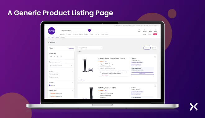 Let’s say you’re looking to buy a ps5 console. You go to a popular ecommerce website, move through to the “Gaming” category, and click ps5 consoles. You’re then presented with a product listing page that displays a list of ps5 available for purchase.
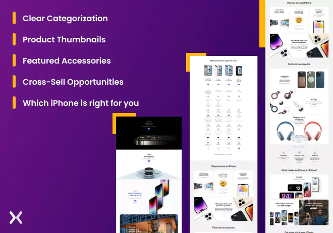
Let’s compare this with Apple’s Product Listing Page (PLP) for the iPhone. The page is minimalistic in design and features high-quality images and descriptions that convey the premium nature of Apple’s brand.
Here is what’s different:
Let’s say you’re looking to buy a ps5 console. You go to a popular ecommerce website, move through to the “Gaming” category, and click ps5 consoles. You’re then presented with a product listing page that displays a list of ps5 available for purchase.
Let’s compare this with Apple’s Product Listing Page (PLP) for the iPhone. The page is minimalistic in design and features high-quality images and descriptions that convey the premium nature of Apple’s brand.
Here is what’s different:
Apple’s PLP is well-organized, with each category of iPhone listed clearly and concisely.
Each product is represented by a high-quality thumbnail image, along with its name and starting price.
This section accents a selection of complementary products and services that are relevant to the iPhone.
The page also presents complementary cloud services that may interest iPhone buyers.
Notice how Apple cleverly shows only 4 of its models. Their decision may be driven by several factors, e.g. The desire to simplify purchasing and accent the most popular or best-selling models. By limiting the number of models included in the comparison, Apple can help to reduce choice overload, a psychological phenomenon in which too many options can lead to indecision, anxiety, and dissatisfaction with the eventual choice.
 By focusing on the four most popular or best-selling models, Apple can also create a sense of exclusivity and desirability, as customers may feel that these models are the most desirable and high-quality. In contrast, a typical ecommerce product listing page may include a wider range of products and filtering options, with a more utilitarian design prioritising functionality over aesthetics. This approach may be more effective for customers looking for a wider range of options and are less concerned with the brand or design of the ecommerce website.
Overall, Apple.com’s PLP is unique, designed with the brand’s minimalist aesthetic, and optimised for ease of use and conversion. The focus is on providing customers with a simplified, hassle-free browsing experience marking Apple’s products’ quality and design.
In both cases, the design of the PLP can influence the perception of the brand and the products being offered, as well as the customer’s decision-making process. By understanding the psychology of your target audience, you can design optimised PLPs for conversions, satisfaction, and loyalty, ultimately leading to increased sales and revenue.
PLP pages done this right definitely will fetch you sales.
By focusing on the four most popular or best-selling models, Apple can also create a sense of exclusivity and desirability, as customers may feel that these models are the most desirable and high-quality. In contrast, a typical ecommerce product listing page may include a wider range of products and filtering options, with a more utilitarian design prioritising functionality over aesthetics. This approach may be more effective for customers looking for a wider range of options and are less concerned with the brand or design of the ecommerce website.
Overall, Apple.com’s PLP is unique, designed with the brand’s minimalist aesthetic, and optimised for ease of use and conversion. The focus is on providing customers with a simplified, hassle-free browsing experience marking Apple’s products’ quality and design.
In both cases, the design of the PLP can influence the perception of the brand and the products being offered, as well as the customer’s decision-making process. By understanding the psychology of your target audience, you can design optimised PLPs for conversions, satisfaction, and loyalty, ultimately leading to increased sales and revenue.
PLP pages done this right definitely will fetch you sales.
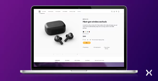
Such pages provide full and detailed information about a specific product, typically a single item available for purchase. A PDP usually includes the product’s name, description, features, specifications, pricing, images, and other relevant information that customers may want to know before making a purchase. It may also include customer reviews, ratings, and related or recommended products. The primary goal of a PDP is to provide customers with enough information about the product to make an informed purchase decision. A well-designed PDP can also help to build trust and confidence in the product and the ecommerce store. The PDP often includes a prominent call-to-action button, such as “Add to Cart” or “Buy Now,” to encourage customers to purchase. Let’s look at some examples: The first one is from Bang & Olufsen. The first thing you will need to notice. It’s highly optimised to fit a laptop screen. On checking the PDP from a laptop, one can see all the major elements like the price, choice of colours, buy button and some strong offers like free delivery, 30-day free trial, and three years warranty.
 There are so many clever bits on this page.
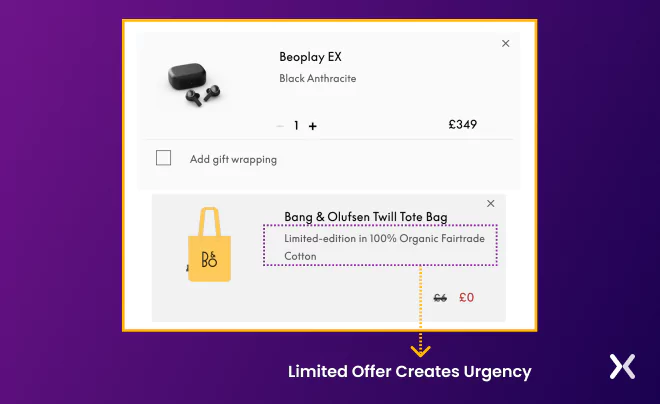
Take a look at this offer where they offer a physical bag with every purchase.
The promotional offer appeals to the psychological principle of Scarcity. Scarcity is the idea that people tend to place more value on things that are rare or in limited supply. By stressing that the offer is only available for a limited time, B&O is creating a sense of urgency among customers to take advantage of the offer before it expires. Only when you check out can you get a real sense of the bag and its price.
There are so many clever bits on this page.
Take a look at this offer where they offer a physical bag with every purchase.
The promotional offer appeals to the psychological principle of Scarcity. Scarcity is the idea that people tend to place more value on things that are rare or in limited supply. By stressing that the offer is only available for a limited time, B&O is creating a sense of urgency among customers to take advantage of the offer before it expires. Only when you check out can you get a real sense of the bag and its price.
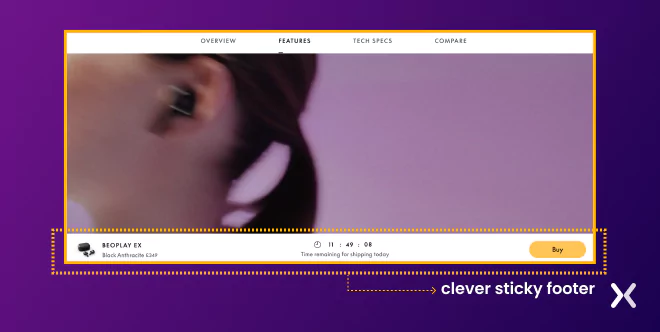
 Also, the moment you add the product to the cart, a countdown timer kicks in to show you the time remaining to check out to get it shipped for today. This shows up in the clever sticky footer.
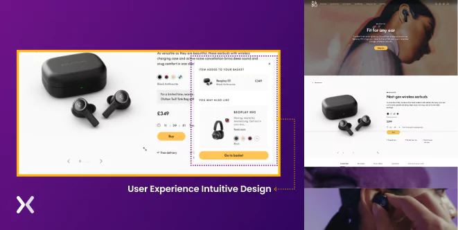
 The page not just looks great but is also highly functional.
The page presents numerous product features through lifestyle shots, animations, and videos. Towards the bottom of the page. You can expand the accordion to reveal more technical details. The page has a full comparison.
One thing worth noting is that adding a product to your basket will immediately display your basket in a pop-up window. This design is user experience intuitive, as it provides immediate feedback.
The page not just looks great but is also highly functional.
The page presents numerous product features through lifestyle shots, animations, and videos. Towards the bottom of the page. You can expand the accordion to reveal more technical details. The page has a full comparison.
One thing worth noting is that adding a product to your basket will immediately display your basket in a pop-up window. This design is user experience intuitive, as it provides immediate feedback.
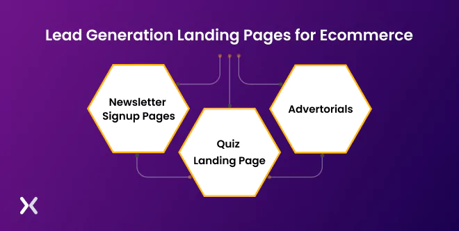
So far, we have looked at pages that are part of the website. But there is another set of pages called landing pages which may or may not feature the product, and these are designed for a specific campaign, and their main focus is driving action. If your end goal is to build a list, then lead capture pages are ideal for creating a database of potential customers who have expressed interest in the brand. This list can be used to drive conversions and sales for future marketing efforts, such as email campaigns or retargeting ads. Here are a few examples of lead capture pages:
Newsletter signup pages are designed to capture the contact information of potential customers interested in receiving updates, promotions, or other marketing messages from the website. These pages typically include a simple form that asks for the user’s name and email and may offer a discount or other incentive in exchange for signing up.
Quizzes effectively engage and educate potential customers about a brand’s products while making them feel like they’re getting something specifically for them. Quizzes can be used for top-of-funnel and mid-to-bottom-of-funnel traffic, but the quiz style and content should be tailored accordingly. Quizzes can also capture leads by asking for email addresses in exchange for showing the quiz results, but it’s important to A/B test whether this approach is effective. Quizzes take time to build and require testing to make sure they match the target audience and drive sales.
Such pages are landing pages that take the form of an article or listicle and aim to lead people to a product or offer through links and a call to action. They aim to sell a product without directly selling it and can be quite text-heavy. The topic of an advertorial needs to incite curiosity and be closely tied to the product being sold. Advertorials are effective for products that require education or have lots of questions from customers. Different formats work best for different brands and can include actual articles or blog posts or snappy listicles.
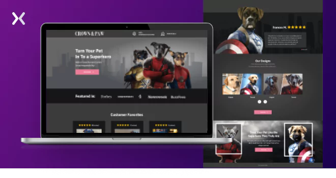
A product landing page is designed to inform and educate users about a specific product. The goal of a product landing page is to provide all the necessary information about the product, including its features, benefits, specifications, and images. These pages are typically used in marketing campaigns to attract potential customers and provide a focused, simplified purchasing experience. A product landing page can effectively build interest and engagement with a product and generate leads and sales. By providing a clear and concise product overview, a product landing page can help potential customers make informed decisions and ultimately lead to more conversions. The typical call-to-action (CTA) on a product landing page is usually focused on encouraging the user to take action related to the product, such as “Learn More”, “View Features”, “Get Started”, “Sign Up”, or “Try for Free”. These CTAs encourage users to engage with the product and move them further in the sales funnel. For example, the Crown and Paws product landing page has everything to capture visitors’ attention and convert them into sales. It uses a short and to-the-point approach with a click-through CTA button.
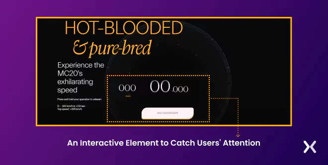
Features the product and is usually part of a sales funnel with one-time-offer, upsell and cross-sell offers. They are focused on persuading users to purchase through persuasive copy, images, and design elements. Product sales pages often have a clear call-to-action (CTA) such as “Buy Now”, “Add to Cart”, or “Order Today”, and are designed to make the purchasing process as easy and straightforward as possible for the user. These pages typically provide a detailed description of the product, accent its benefits and features, and address any potential objections or concerns the user may have. Product sales pages can be used as part of a marketing campaign to drive sales and conversions and are often used along with other marketing channels such as email, social media, and paid advertising. You might be wondering. Can’t a simple product landing page has a buy now button? Well. You are correct that “Buy Now” is a more common call-to-action (CTA) on a product sales page instead of a product landing page. However, depending on the marketing goals of the page, a “Buy Now” CTA could also be used on a product landing page if the page is designed to convert visitors directly into buyers. A product landing page is designed to provide information and educate users about the product. In contrast, a product sales page is designed to persuade users to purchase. However, there can be an overlap between the two types of pages, and the specific CTAs used will depend on the marketing strategy and goals for the page. Let’s take a look at some Product landing pages. The first is from Maserati. The product landing page does quite a few things:
Educate and increase product desire.
Talk about all the tech specs and features
Has interactive elements like you can hold the spacebar and hear the engine sound when the car goes from 0-100 in less than 3 seconds.
The page is visually appealing and features high-quality images and videos that present the product from different angles.
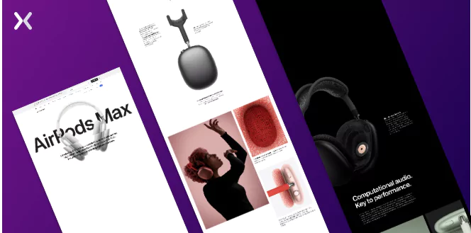
The page accents the key benefits and features of the product, such as high-fidelity audio, active noise cancellation, and the ability to switch smoothly between devices. Pricing: The page clearly displays the product’s price, which is positioned as a premium offering in the market.
The page has a prominent “Buy” button that encourages users to make a purchase, as well as other CTAs such as “Tech Spec” and “Compare”. These CTAs are deliberately placed throughout the page to guide the user toward the desired action. Overall, the Apple AirPods Max product sales page combines persuasive elements to present the product and encourage users to purchase.
Well the simple answer is it depends. It depends on your goal, what tech stack you are currently using, budget, and the landing page’s goal. For a lead generation landing page:
Leadpages
Instapage For driving sales, let’s look at the various tech stacks:
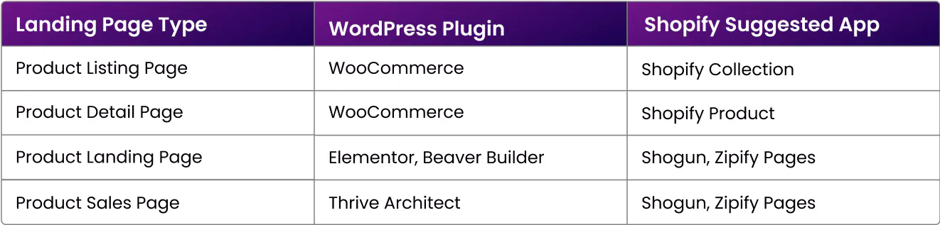 However, if you want to keep your product landing page or sales page separate. We would suggest using tools like Unbounce, SamCart, ThriveCart etc. These tools have a lot more functionality and offer granular control.
And for product sales pages. You can check out tools like Clickfunnels, Kartra, SamCart, and ThriveCart.
However, if you want to keep your product landing page or sales page separate. We would suggest using tools like Unbounce, SamCart, ThriveCart etc. These tools have a lot more functionality and offer granular control.
And for product sales pages. You can check out tools like Clickfunnels, Kartra, SamCart, and ThriveCart.
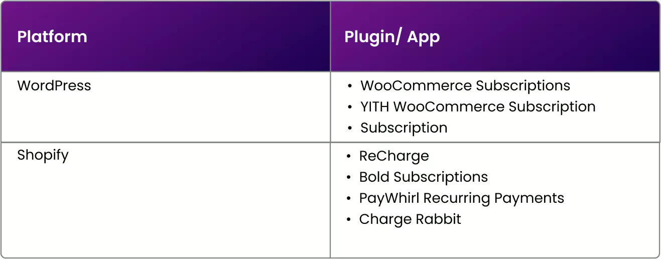
 Also, if you are thinking of converting your product in a subscription model and want to charge recurring payments there are options here too.
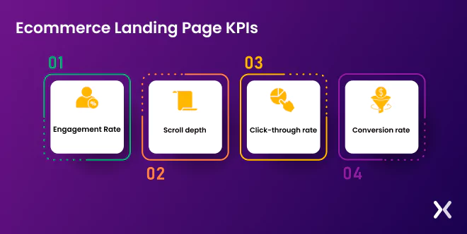
As expected, the overall goal of an ecommerce campaign is to drive sales. However, each page in the funnel has its own KPI and metrics that you should track to understand areas for improvement. Here are some common KPIs to track for each page in the funnel:
Engagement Rate: Engagement rate is a powerful metric giving you an understanding of your user experience and how it can be improved. You can use Google Analytics 4 to analyze this metric.
Scroll depth: It tracks how far visitors scroll down your page. If your call to action is at the bottom of the page, tracking scroll depth can give you an idea of whether visitors see it. You can track scroll depth using tools like HotJar, CrazyEgg, and MS Clarity.
Click-through rate: This measures the percentage of visitors who click on your call to action and move to the next page. Click-through rate provides insight into how effectively the page gets visitors to take action. Specifically, it measures the percentage of visitors who click through to another page on the site, such as a product details page or checkout page.
Conversion rate: This tracks the percentage of visitors who complete a desired action, such as purchasing. This is the ultimate KPI for product landing pages, as it measures the page’s success in driving revenue.
1. For Lead Generation Landing Page: Track the conversion rate as the key metric, which measures the percentage of visitors who complete a desired action, such as filling out a form or subscribing to a newsletter.
2. For the Product Details Page: You should be tracking the CTR or the Add-to-Cart Rate, the percentage of visitors who add the product to their cart. You can also track exit rate, average order value and engagement time on the page.
3. For Product Landing Page: You can track main metrics like Add to cart rate, Click-through to checkout or other secondary goals such as requesting a quote.
4. For Product Sales Pages: You should track the main conversion rate or purchase rate. You can also track some secondary metrics like Cart abandonment rate, which is the percentage of visitors who add products to their cart but do not complete the purchase. This metric can help identify potential issues with the checkout process or opportunities for optimisation. By tracking these KPIs, you can identify areas of your website and landing pages that may be causing friction and make data-driven decisions to optimise the user experience and drive more sales.
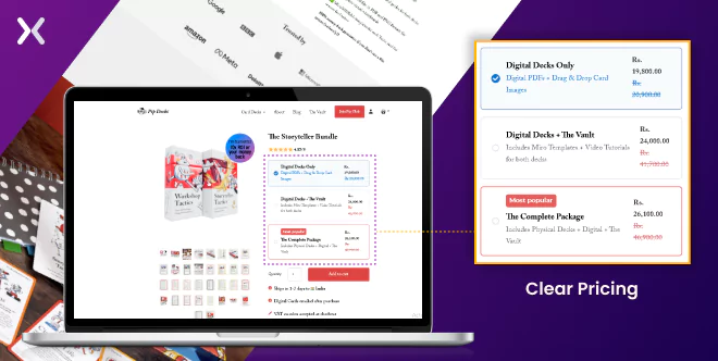
We want to tear down this page from the Pip Decks and show you some of the subtle but clever bits on this page. Pip Decks offer a system which you can use to create unique stories for business meetings and workshops. Let’s first look at the hero section. The hero section includes many product photos, but interestingly, we liked the 3d render as well. The pricing is very clever; the £149.99 is a digital download only, £179.99 is Digital decks and the vault, but the actual physical product is £199.99 By offering a mid-priced option that includes additional features (i.e., the vault), the brand creates a “decoy” that makes the most expensive option seem more attractive. This is because the mid-priced option acts as an anchor, making the most expensive option seem like a better deal. Overall, this pricing strategy encourages customers to choose the most expensive option by making it seem like the best value for money. Very smart!
 The page detects your location and determines shipping dates. It is surprising to see this message - VAT number accepted at checkout.
Asking for a VAT number on the page has two benefits. Firstly, it positions the brand as professional and customer-centric, serving businesses that need to claim expenses. This builds trust and confidence and may encourage more businesses to purchase. Secondly, it creates a sense of urgency and importance around the purchase by stressing the need for a VAT invoice and claiming VAT as an expense. This may make customers more likely to complete the purchase to claim the VAT.
The page overall has really nice structure. The page includes benefits, brand logos, testimonials and FAQs.
One more element which caught my attention was the popup which showed up.
The brand is also running A/B tests on the popups.
In one of the popups, the offer is not listed as the message says, want an exclusive discount?
But in the other variant. They offer 10% directly.
The page detects your location and determines shipping dates. It is surprising to see this message - VAT number accepted at checkout.
Asking for a VAT number on the page has two benefits. Firstly, it positions the brand as professional and customer-centric, serving businesses that need to claim expenses. This builds trust and confidence and may encourage more businesses to purchase. Secondly, it creates a sense of urgency and importance around the purchase by stressing the need for a VAT invoice and claiming VAT as an expense. This may make customers more likely to complete the purchase to claim the VAT.
The page overall has really nice structure. The page includes benefits, brand logos, testimonials and FAQs.
One more element which caught my attention was the popup which showed up.
The brand is also running A/B tests on the popups.
In one of the popups, the offer is not listed as the message says, want an exclusive discount?
But in the other variant. They offer 10% directly.
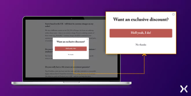 A direct discount is a clear and tangible benefit that the customer can see and understand, which makes it more likely that they will act on it.
In contrast, simply asking if the customer wants an exclusive discount may feel vague or uncertain, and the customer may not be sure what they are getting or whether it’s worth their time.
A direct discount is a clear and tangible benefit that the customer can see and understand, which makes it more likely that they will act on it.
In contrast, simply asking if the customer wants an exclusive discount may feel vague or uncertain, and the customer may not be sure what they are getting or whether it’s worth their time.
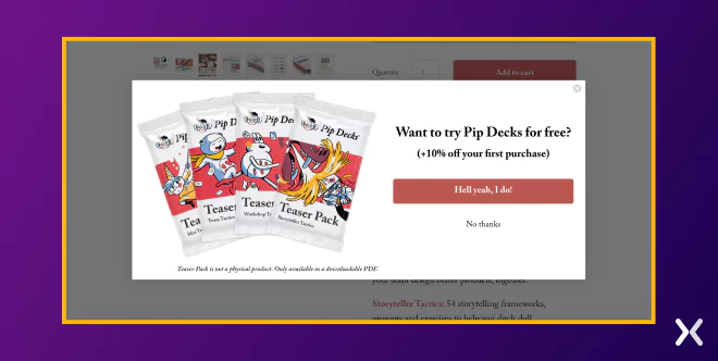 Finally, the brand also offers a 100-refund policy, no questions asked.
Customers may hesitate to purchase if they are uncertain about the product’s value. By offering a 100-day refund policy with no questions asked, the brand is removing some of the perceived risks associated with purchasing. This can make customers feel more confident and comfortable in making a purchase, knowing they can receive a full refund if they are unsatisfied with the product.
The strong refund policy is all about reducing perceived risk, increasing customer confidence, and building trust and transparency with the customer. This can ultimately increase sales, customer satisfaction, and brand loyalty.
Pip Deck have done a great job combining Product details and the sales page. Here are some of the benefits:
Finally, the brand also offers a 100-refund policy, no questions asked.
Customers may hesitate to purchase if they are uncertain about the product’s value. By offering a 100-day refund policy with no questions asked, the brand is removing some of the perceived risks associated with purchasing. This can make customers feel more confident and comfortable in making a purchase, knowing they can receive a full refund if they are unsatisfied with the product.
The strong refund policy is all about reducing perceived risk, increasing customer confidence, and building trust and transparency with the customer. This can ultimately increase sales, customer satisfaction, and brand loyalty.
Pip Deck have done a great job combining Product details and the sales page. Here are some of the benefits:
It simplifies the buying process for customers
Reduces cognitive load for customers
Creates a sense of urgency and immediacy around the purchase
Increases the likelihood of making a sale
Creates a more immersive and engaging experience for customers
Makes the buying process more smooth and integrated Combining product details and sales pages can be effective for products with many visual elements, such as high-quality images or videos. This can create a more immersive and engaging customer experience and help increase sales.
Apexure is a premier landing page agency with a wealth of experience building high-converting landing pages for a wide range of clients, including Fortune 500 companies. With their expertise in web design, conversion optimisation, and user experience, Apexure has established a reputation for creating landing pages that deliver exceptional results. Partnering with Apexure means you can trust their experience and expertise to create landing pages to help you achieve your business objectives and maximise online conversions. Contact Apexure today to see how they can help you build landing pages that convert and drive success for your business.
Related Articles:
Founder & CEO of Apexure, Waseem worked in London’s Financial Industry. He has worked on trading floors in BNP Paribas and Trafigura, developing complex business systems. Waseem loves working with Startups and combines data and design to create improved User Experiences. Read more


Drive More Sales or Leads With Conversion Focused Websites and Landing Pages
Get Started

Eleven percent of Meta ad rejections in 2026 trace back to one problem: the landing page does not...

A B2B SaaS company spends $30,000 per month on Google Ads and Meta Ads. Both campaigns drive traffic...
Get quality posts covering insights into Conversion Rate Optimisation, Landing Pages and great design
