
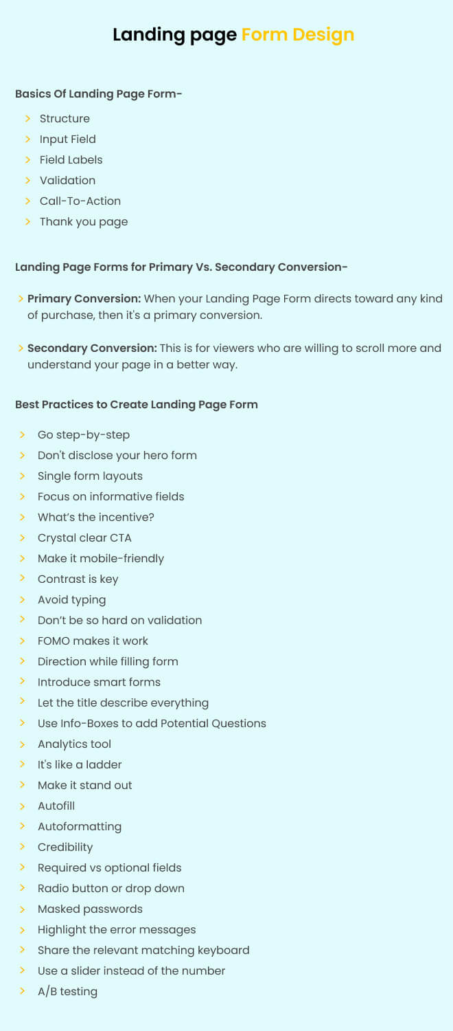
Filling the landing page form is the last step towards locking in a conversion. That’s why extra UI/ UX care should be provided for forms. If your landing page forms have a messy appearance and don’t look convincing, then you are going to miss your conversion goals. Hence, creating a functioning and attention-grabbing form is the most necessary aspect of building a landing page. But what key elements should you keep in mind while creating a landing page with a form? Don’t worry; after years of testing and experimenting. We have identified 23 key points you should keep in mind while creating a landing page form. Let’s start with the landing page form basics.

Before you define the design of your landing page form, you must have a detailed knowledge of what kind of conversion you are aiming for. There are two types of conversions you can target through your landing page forms.
Primary Conversion: When your landing page form directs toward any kind of purchase, then it’s a primary conversion. It can either be purchasing some products or booking an appointment.
This is for visitors who are willing to scroll more and understand your page in a better way. Such conversions target visitors who are not ready to buy but can turn into paying customers if nurtured correctly. You can offer them to sign up for a newsletter, give a demo booking offer, or take a free trial.The chances of getting more information lie with Primary Conversion. This is because a viewer is already persuaded and is at the end stage to buy the service/product. Hence, this is the apt time to share an elongated form with them. The chances of getting more information lie with primary conversion. As the pages with primary conversions target users who present a strong buying potential and might be at the end stage of buying the service/product. Hence, this is the apt time to share an elongated form with them.
Now that you have the theoretical idea of hand-picking the landing page form. It’s time to understand the design perspective of the same.
Long forms make visitors overwhelmed and might look invasive. Instead of asking visitors to fill out the form at once, share a multi-step form with users. It is easier to answer one question at a time for the visitors. This overall improves your user experience, shortens the form, and gives the landing page more breathing space. Sometimes, all your landing page needs is a multi-step form instead of a long form to boost the conversion rate from 4% to 6%. This is what happened for one of our clients when we broke down their form into multiple parts and made the process of signing up less intimidating.

Though multi-step forms help save form space and don’t let users get overwhelmed with too many questions. They need to see how much they have completed the form.
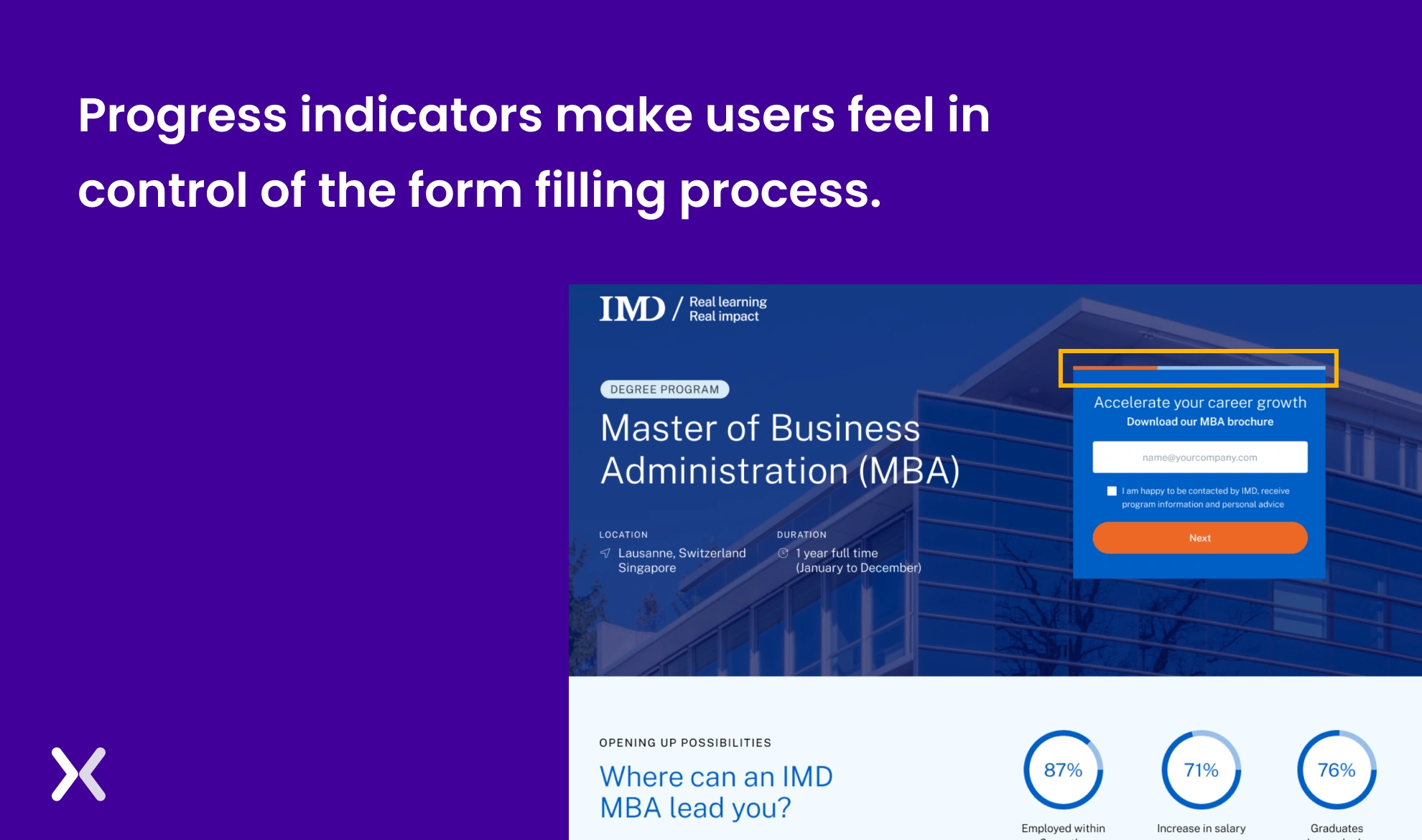 A progress bar at the top of multi-step forms makes it easier for users to fill out the form, knowing how close they are to completion. This single feature raises your user experience a lot.

“When we’re qualifying bigger enterprise leads, multi-step forms help us keep things conversational. The first question might be as simple as, “Are you managing the cloud across more than one provider?” Depending on that answer, we route the next questions. It feels more like a dialogue than a data grab.”
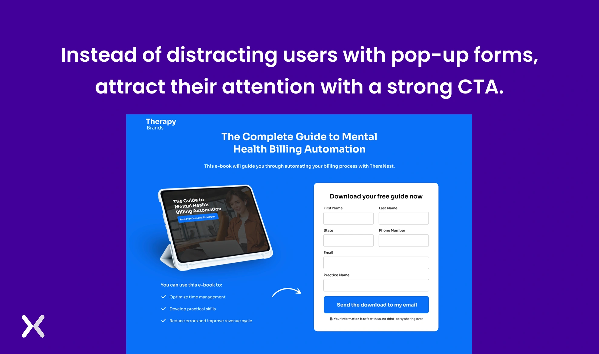
We all want the visitor to convert the minute they enter our landing page. This might make us add pop-ups to appear as soon as the viewer lands on the page. Don’t do that. It can lead to visitors bouncing off your page. Instead, fill the first fold of your landing page with everything necessary: A heading and subheading that communicate your USPs, an eye-catching hero image, and a form with a stand-out CTA.
If your landing page form designs target secondary conversion, then they can be in a single-form layout. As secondary conversion forms have a smaller number of fields (2 to 4). It is more convenient to have them in a single-form layout.
 Such short forms make your page look more appealing and spacious. The best part is that it offers users more time to understand and fill it out accordingly.

“We always start with the minimum viable information, usually name and email, and only add more fields if they directly impact lead qualification or routing. Every extra field gets treated like a friction point, so we run A/B tests regularly to see how far we can push before conversion rates drop.”
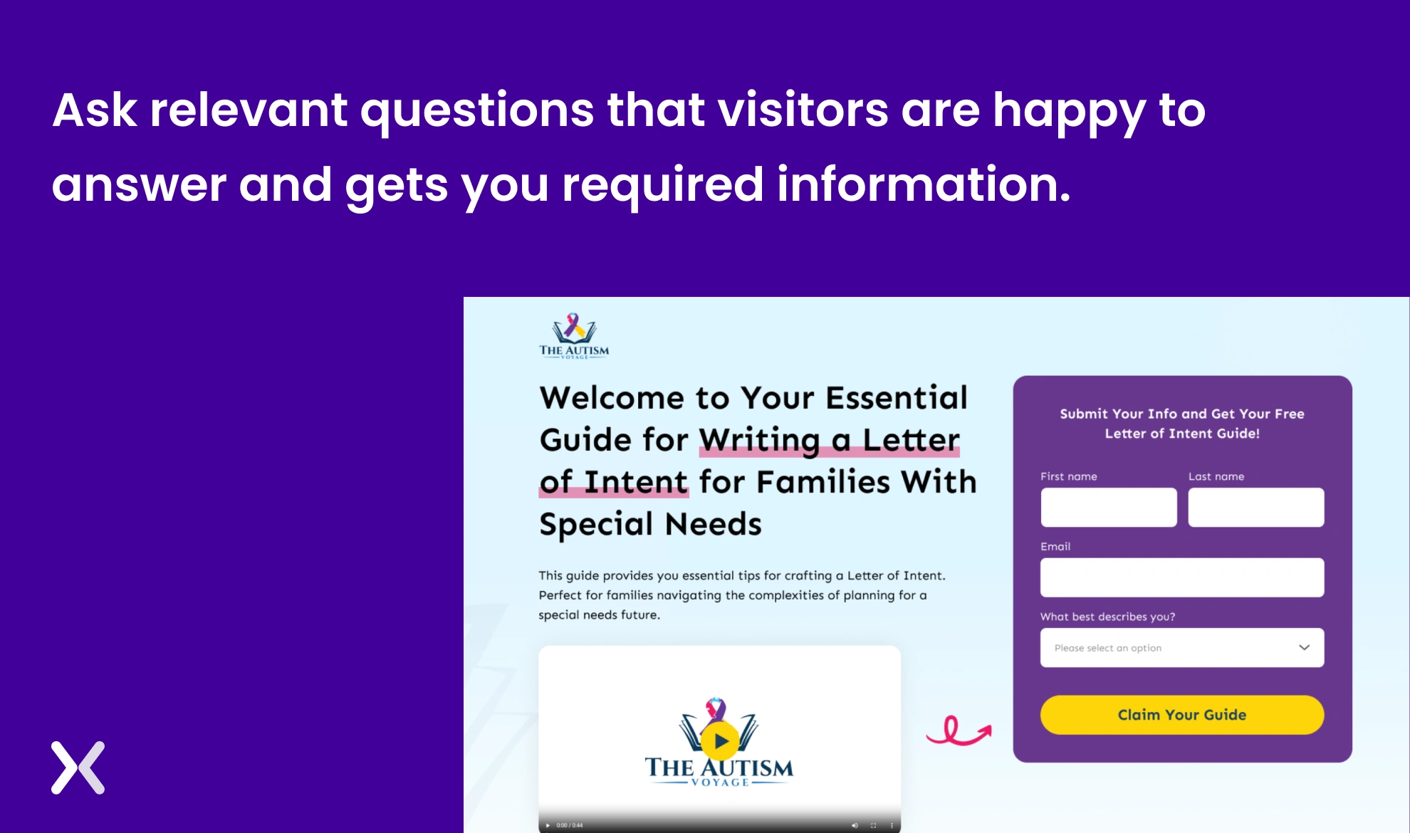
Instead of asking customers to fill in every detail, try focusing on gathering only relevant information. If you want some of the other info to stay, you can try using drop-down fields. Dropdown menus improve user experience by simplifying choices, reducing input errors, and saving space on forms. They make it easier for users to quickly select from predefined options, making sure consistency and faster form completion.
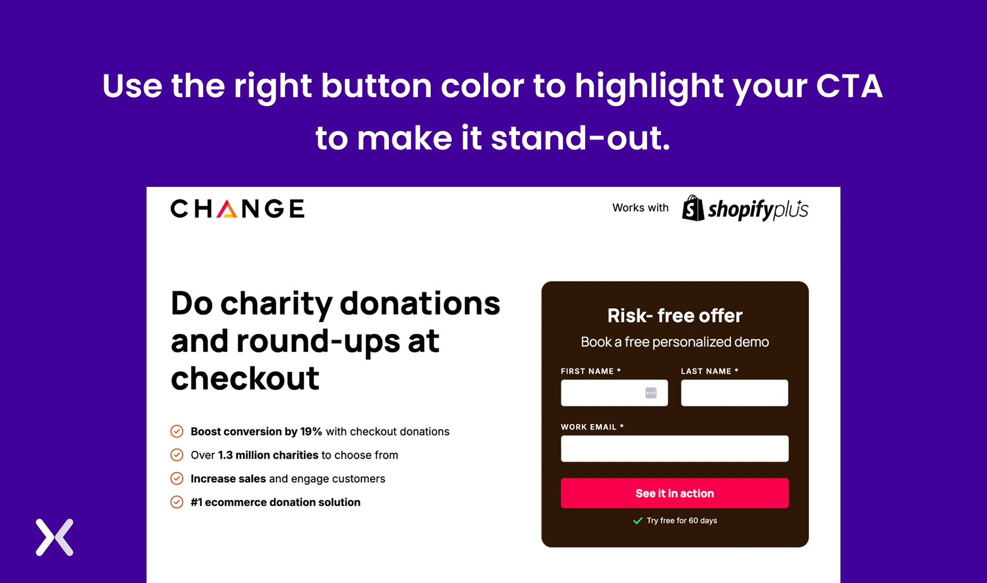
A good call to action is an essential part of the form. Be it the color, text, font size, whitespace around it, or size, everything is necessary when placed at the end of the form. The CTA’s color should complement the form, but also at the same time stand out from it so that users are easily able to locate it. And most importantly, make it look like a button with the help of shadows.
Make sure that your landing page form is visible on mobile and pops up in an aligned format and with a clear CTA. Don’t forget to use special mobile features like a camera, touch tap, and geo-location.
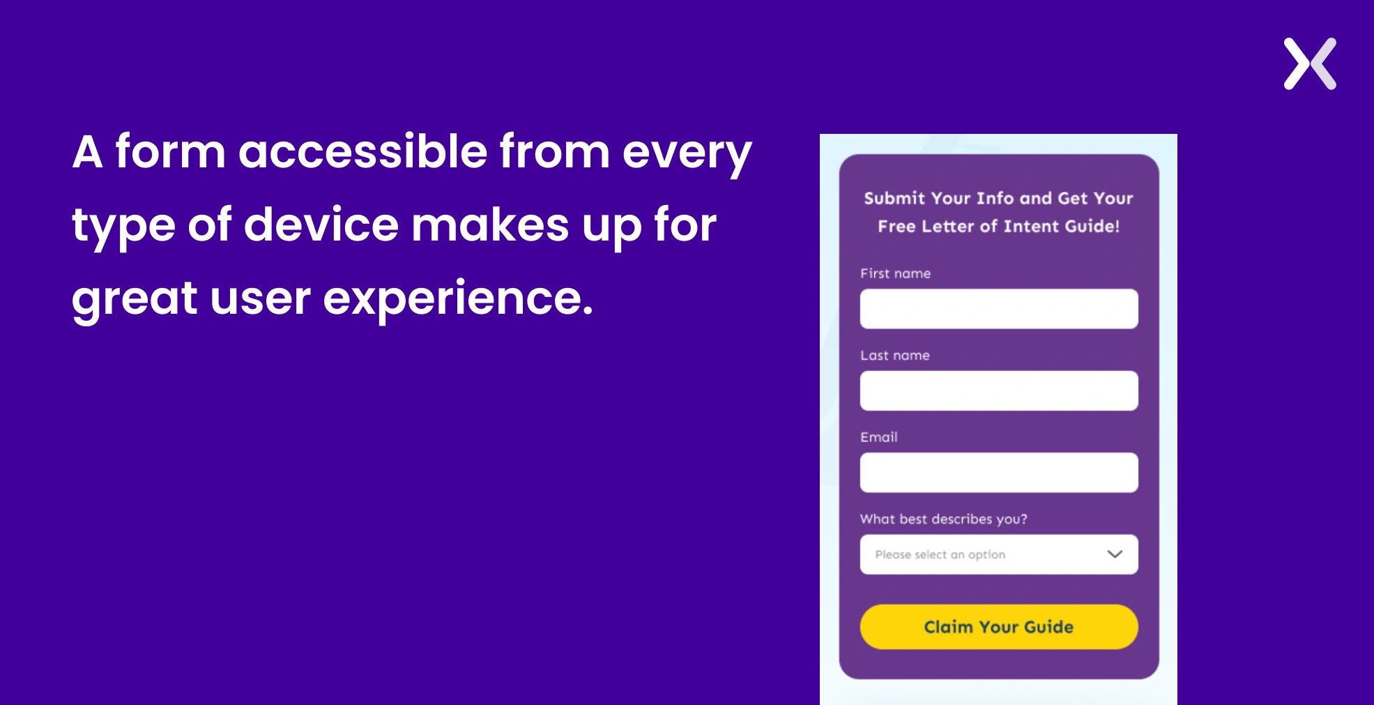 As the size of the screen changes, the size of your CTA button should change accordingly. This keeps the button remains easily clickable and visually prominent across all devices.

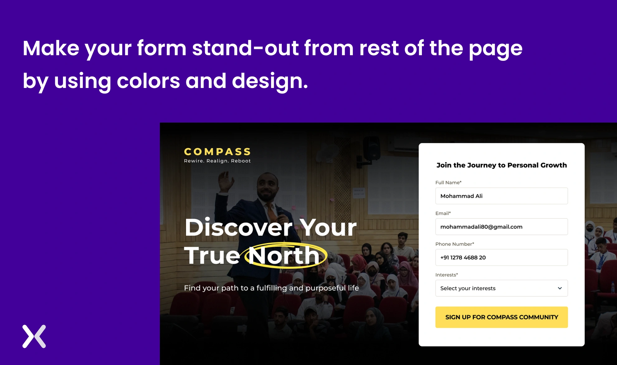
Nobody wants to see a monotone landing page. Most of us invest our time in focusing on aligning the right colours. However, we tend to ignore the power of using contrasting colours. Contrasting colours can help raise the landing page’s overall look and make it more accessible for a viewer. At the same time, contrasting colors can help you accent necessary elements on your page, like the form and CTA.
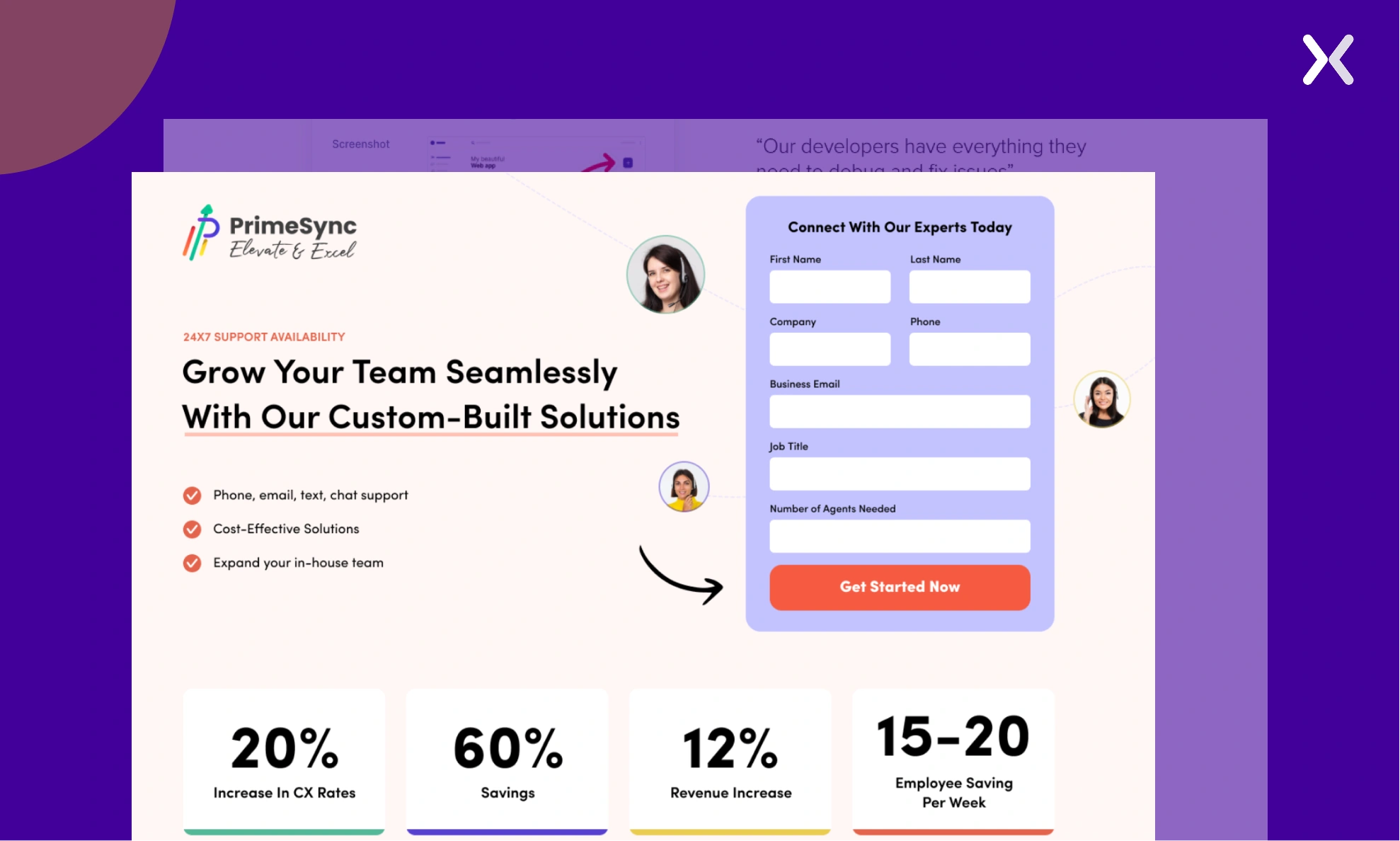 In the example above, we have purple, light pink, and red used as contrasting colors, which together make the landing page look more appealing and make the form stand out.
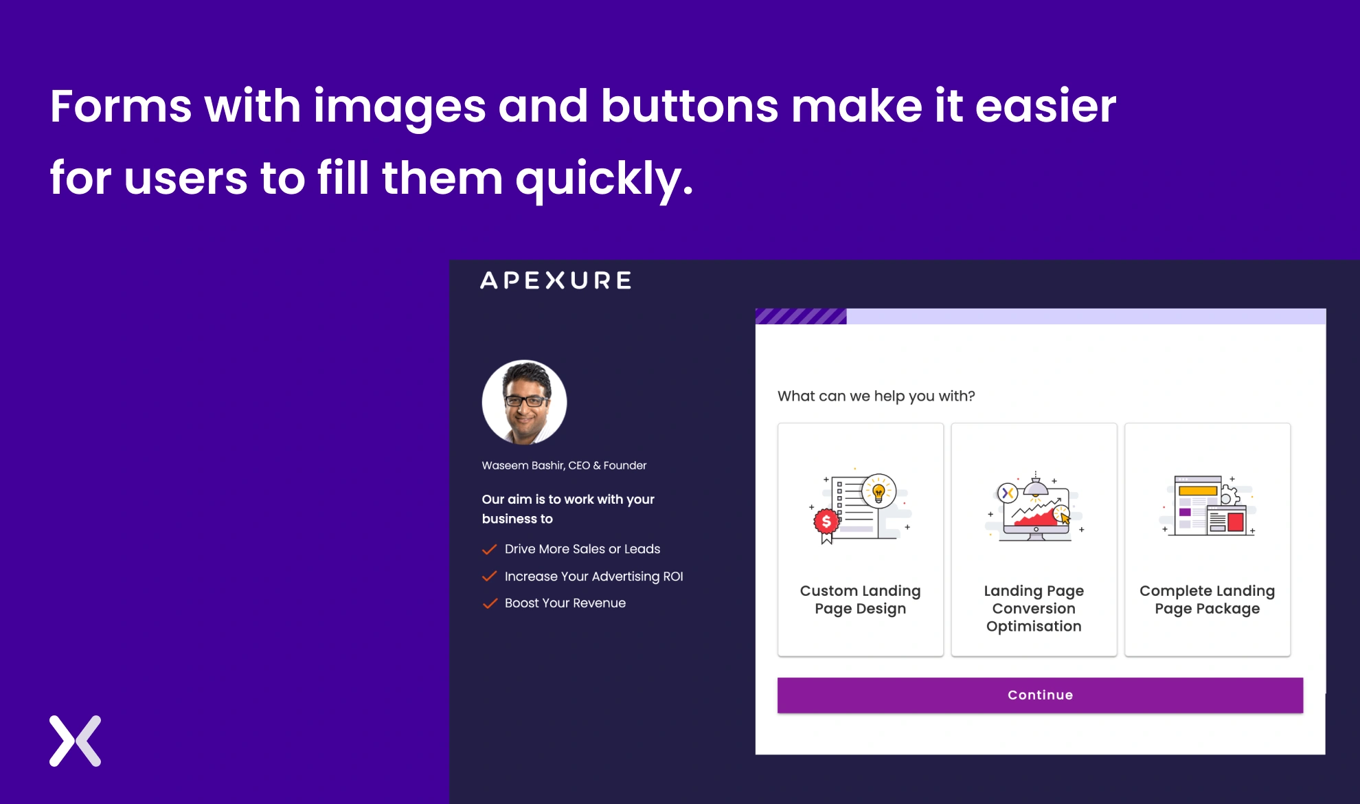
Instead of asking your viewer to type and fill the form, prefer using images, buttons, or sliders to make them fill the form. It makes it easier for the viewer can get more entries.
When everyone is looking at their mobile phones so they don’t miss out on exciting offers, how can you ignore this opportunity when the viewer comes to your landing page form? Using the fear of missing out (FOMO) is an effective way to encourage users to fill out your form immediately. Accent a strong incentive, like an exciting voucher or a “limited-time offer”, as soon as they land on the page. Be sure to clearly state that the offer is only available for a short period to create urgency.
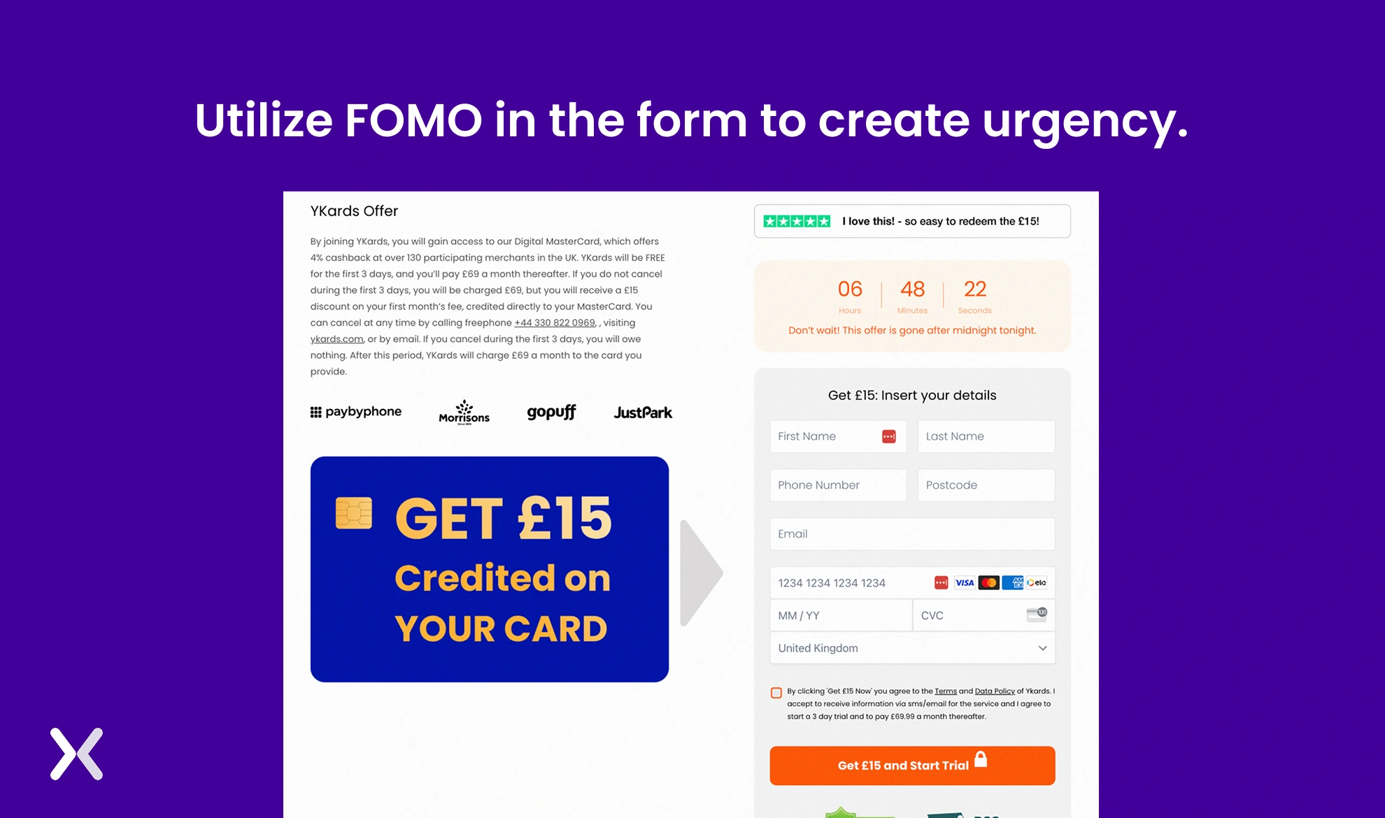 The above example uses a timer and text like “Don’t wait! This offer is gone after midnight,” to create urgency and FOMO.
One might miss out on the importance of the title of the form. However, that’s the first thing users see when they visit the landing page form. Make sure that your title is catchy and portrays exactly what a viewer is looking for. Sometimes it can also lead to a conversion boost when your form heading complements your above-fold headline.
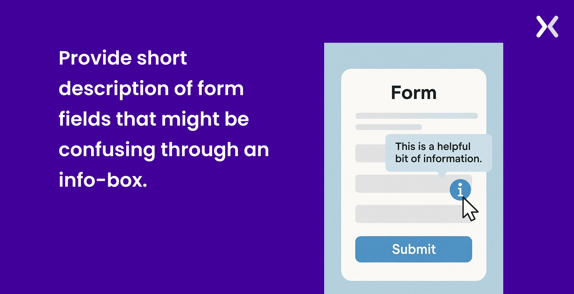
Info Boxes are marked as “i” in a circular box. If users click on it or hover over it, they get a pop-up of relevant information that might be helpful to understand the field and complete the form. These boxes help give a proper direction to the visitor and also make them fill out the form with correct information.
Consider filling placing the fields on the form so it feels like climbing a ladder. At the initial stage, make sure to ask easy and basic questions to people. Make sure to ask difficult questions at a later stage when the viewer can concentrate completely. This applies to both single-form layouts and multi-step form setups.
When a viewer comes to the page, it is not apparent at first glance that a form. Hence, it’s your responsibility to make it stand out so that it’s visible in the eyes of the viewer. Leave white space around the form to be visible to the viewer.
Auto-filling the form with past details makes it easy for a viewer to fill in the basic information quickly. Details like name, phone number, geo Location, email ID, and address- make sure that a viewer can fill it out soon in the landing page form.
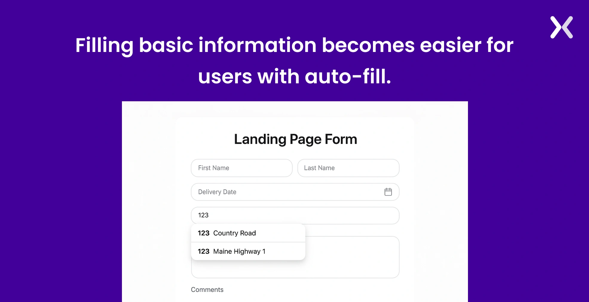
Some information, like date, phone number, and bank details, might need the details in a specific format. As a viewer, it might be difficult for them to make sure of it every time. However, share the form with auto-formatting precise details to avoid this problem.
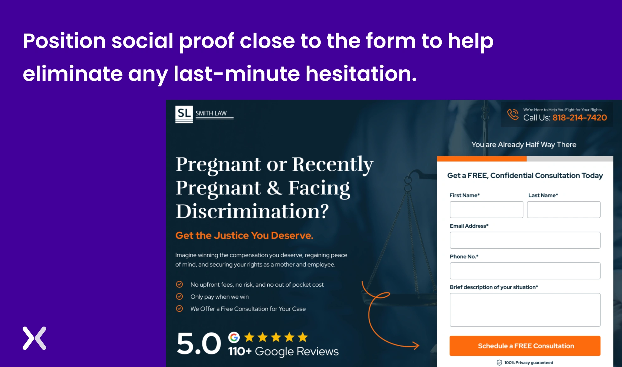
Every viewer might be sceptical about filling out the form as they might doubt whether they have made the right decision. Hence, add customer testimonials, star rating, or social media presence around the landing page form. This can help build credibility among the viewers that they are associated with the right company.
You might require the viewer to fill in all the details. However, the fact is that you want the viewer to share some details as a priority, while others might not be that relevant. Hence, if you want a viewer to fill in specific information on focus, make sure to make it a required box by adding an asterisk alongside. If not required, you can choose not to place the asterisk sign.
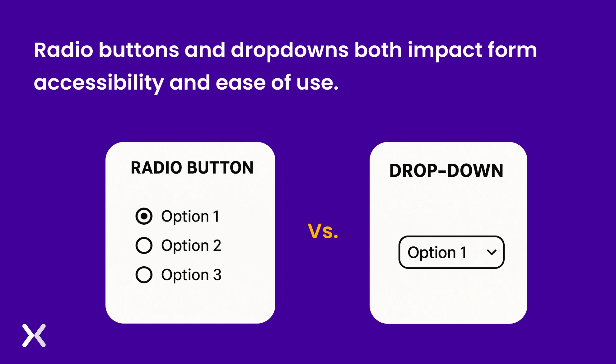
The more accessible the format, the more entries you receive via the form. As per the study, it has been marked that radio button makes the form more accessible than the drop-down. A radio button lets one select one option among multiple options, which makes it easy for the viewer.
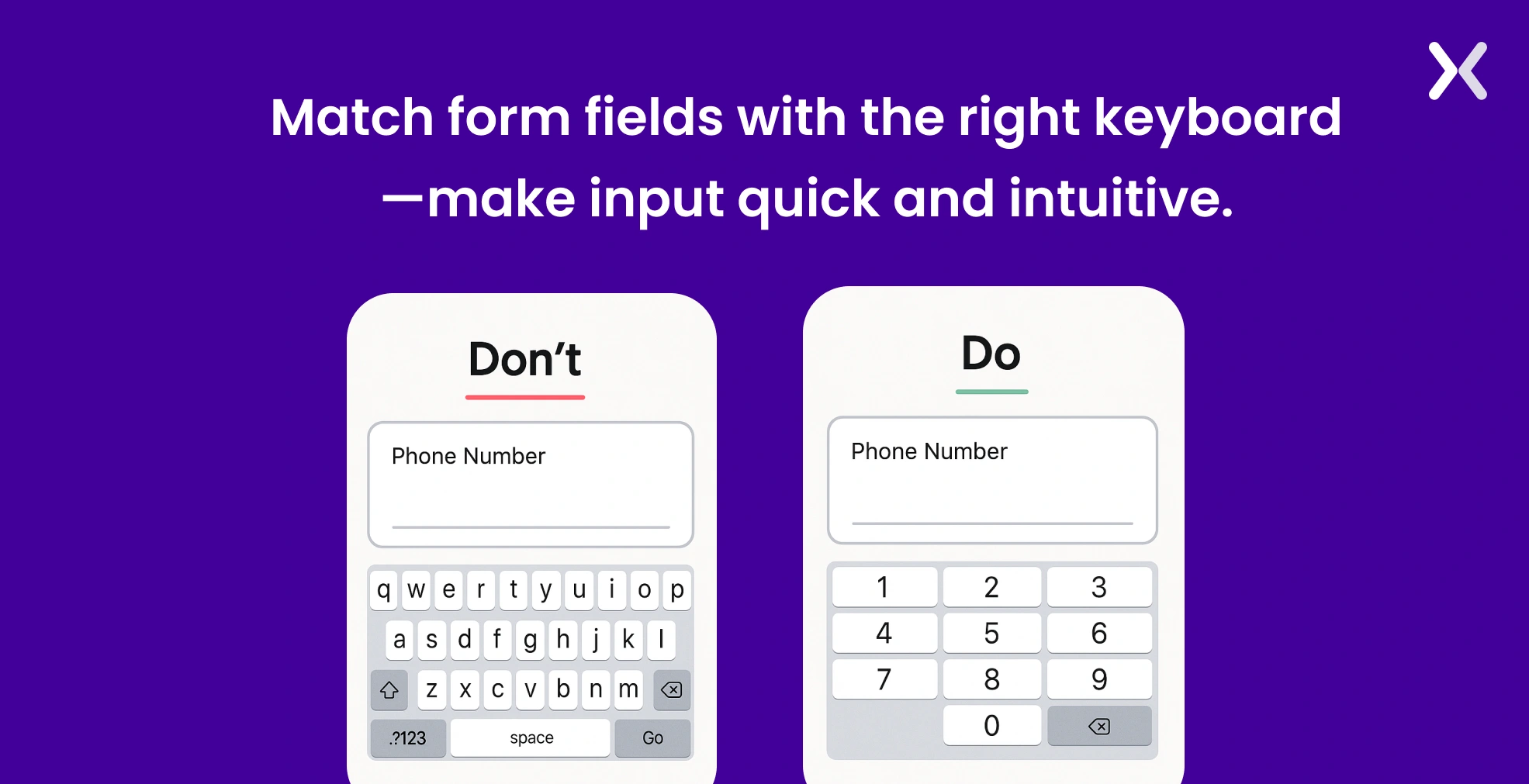
While a user fills in the landing page form, they would like the relevant keyboard to appear on the screen. For example, if a person has to fill in the phone number, a customer would expect a dial pad to appear on the screen.
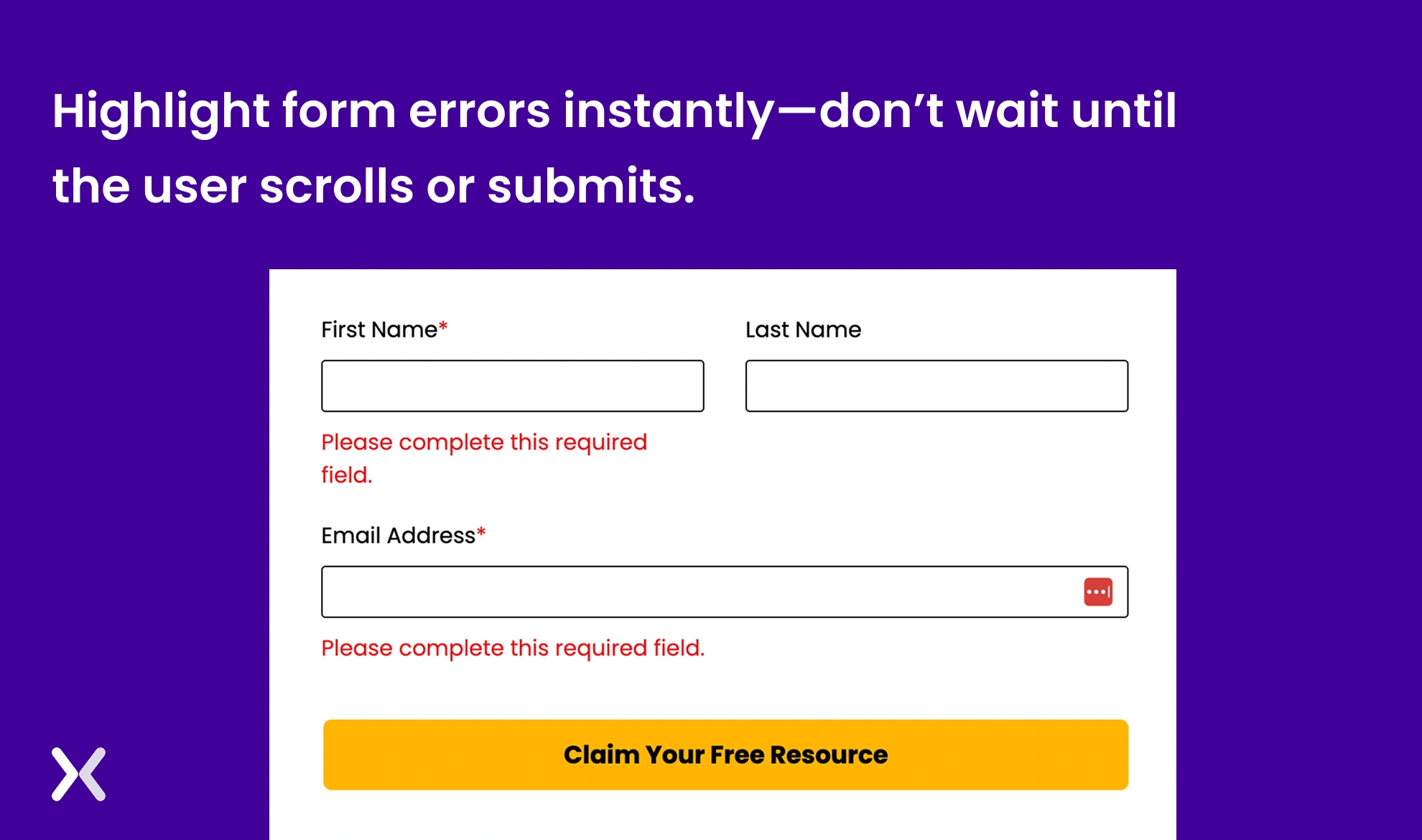
Considering human error as one of the significant factors, the chances are that a customer might fill in some information incorrectly. It’s important to accent the same instantly instead of mentioning it either at the top or lower bottom of the form. It is recommended to accent the error as soon as it is made instead of waiting for the customer to look at the top.
Incorporating clear privacy notices and obtaining explicit user consent are essential for building trust and making sure compliance with data protection regulations like GDPR and CCPA. Place a concise privacy statement near your form fields, explaining how the collected data will be used. Include an unticked checkbox for users to actively consent to communications, such as newsletters or promotional offers. Avoid pre-ticked boxes, as they do not constitute valid consent under most privacy laws.

“I add a short phrase about how we intend to use their data, capture consent using a single checkbox and add a clear and visible link to the privacy policy below the form. It helps to understand privacy laws and include them in your intuitive process.”
Creating a perfect landing page form is not a one-day task. Hence, with the help of A/B testing. You will be able to identify in a better way what’s working for you and what’s not. An effective analytics tool like Hotjar, Crazy Egg, etc., can help one better understand what’s working and what’s not.
Building good landing page forms should be your top priority. A form should deliver a smooth user experience to make sure that the visitor doesn’t leave the form incomplete. For the user to complete the conversion, you need tools like progress bars, well-thought-out form fields, properly working radio buttons with correct options, etc. It takes time to bring your landing page form to perfection. With the help of optimization, it becomes easier to understand what works best for your forms and boost your conversions.
Apexure has 100+ blog posts on landing pages? We have shared everything, from creation to testing, analysis to optimization. Check it out before you build your landing page form and much more.
Making a landing page on your own with just examples can take a lot of time. Get the help you need from our experts. Book a call and one of our experts will contact you soon.
Check out our landing page portfolio to discover conversion-friendly landing page elements that might. Filter your industry and check which landing page design is trending.
Related Articles:
As CEO and Founder of Apexure, Waseem Bashir's decade-old experience in building high-converting landing pages extends to collaborations with Fortune 500 leaders. From free to paid he has tried his hands on all landing page builder tools and knows just the right fit for every business. Read more


Drive More Sales or Leads With Conversion Focused Websites and Landing Pages
Get Started

Eleven percent of Meta ad rejections in 2026 trace back to one problem: the landing page does not...

A B2B SaaS company spends $30,000 per month on Google Ads and Meta Ads. Both campaigns drive traffic...
Get quality posts covering insights into Conversion Rate Optimisation, Landing Pages and great design
