
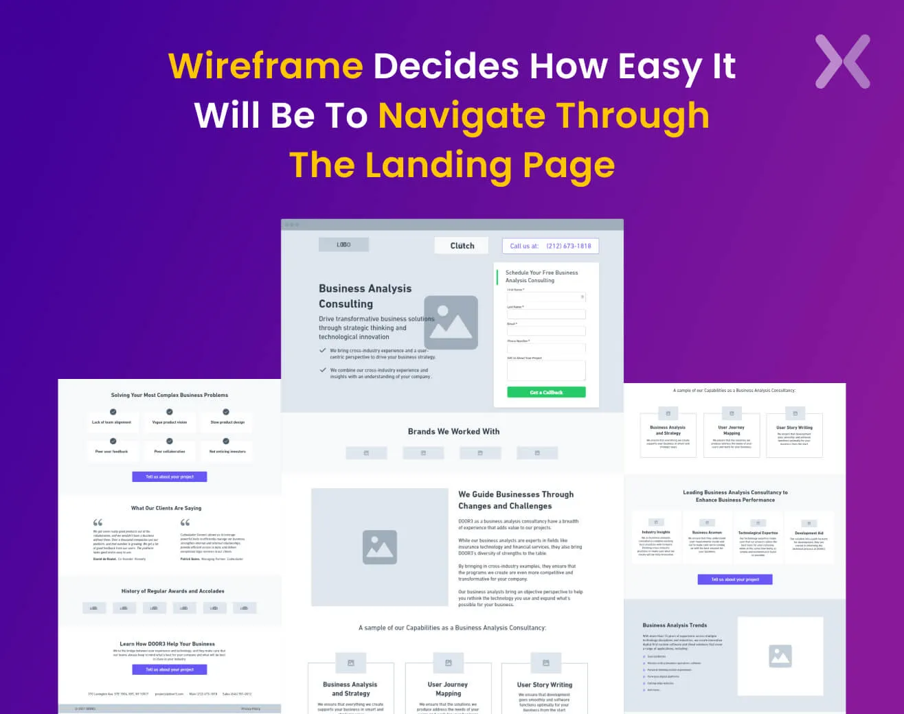
Your first impression is the last. This quote applies in real life and to your paid search landing page. Your landing page plays a prominent role in persuading every customer to get converted into a potential one. Hence, it’s essential to have a landing page that balances practical information, incredible images, and aligned texts. Before you create the landing page, creating the skeleton of the same is necessary. It is known as Landing Page Wireframe. Arranging the page elements will make your further tasks more accessible and practical. Wondering how you can nail that perfect Landing Page Wireframe? Here are some quick tips from our design experts that you can keep in mind.
Understanding your page structure is necessary before designing the complete high-converting landing page or creating content. Hence, landing page wireframe acts as your site’s basic structure/ skeleton and cost much less than a full well-functioning landing page. It’s essential to have a wireframe aligned before you jump on to design or copy because-
It helps you understand necessary elements.
Help hand-pick an overview of the content that will be displayed.
Gives a clyster clear blueprint of the landing page.
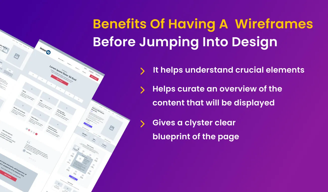 Once you understand what your page will look like- it will help you create landing page designs and copy in a better way.
On the one hand, every landing page wireframe holds a different perspective and structure. However, there are some vital elements that you need to keep in mind before creating your landing page wireframe. Let us take you on a step-by-step journey of what your Wireframe should look like-
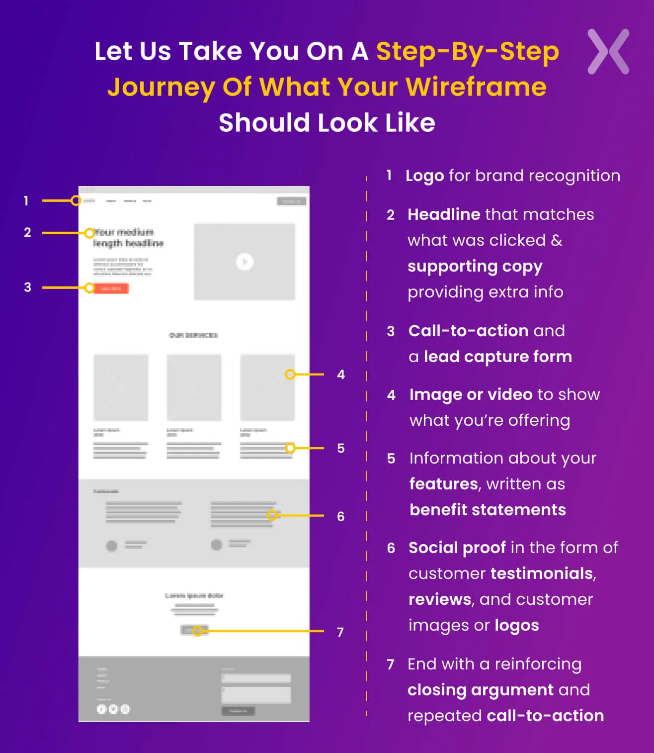
We want to share the complete history behind every product with the customers. But in this hustle and bustle, no one has enough time to deep-dive on the first visit to the page. Hence, it’s essential to offer relevant and crisp information. The information should cover the brand vision, the service/products offered, and what the customer wants.
Every element holds a different priority while designing. Keeping the most vital aspects in the accent while creating is essential. That doesn’t mean that other elements are not necessary. So how do we make sure every element is marked yet doesn’t clutter out the space? Here are a few things that you can keep in mind-
First, things you want customers to see should be adjusted in bigger fonts. This will help serve their focus quickly. E.g., If any discount code is running, it should appear as the pop-up bold and most significant font size compared to other information’s size.
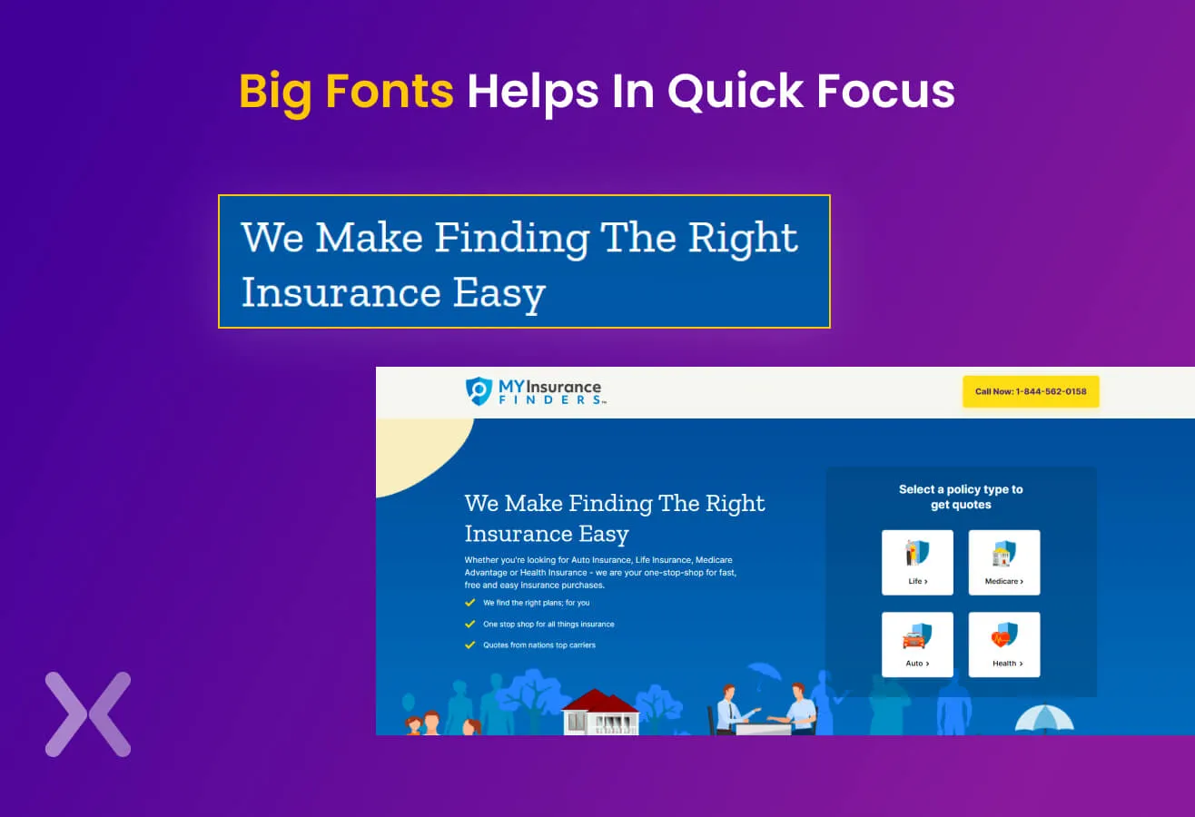
Things that are important for your landing page shouldn’t be cluttered out. Select the elements/information that’s important for you to portray. Make sure it has enough space to stand out from other components.
Every landing page stands meaningless if there’s no straightforward navigation for customers. Offer engaging designs that will help customers to move through through the page.
No customer will scroll till the end to identify the brand’s Unique Selling Proposition or Call-to-action. Offering this information right at the beginning of the page is essential. Refrain from repeating your USP as that might show a lack of knowledge.

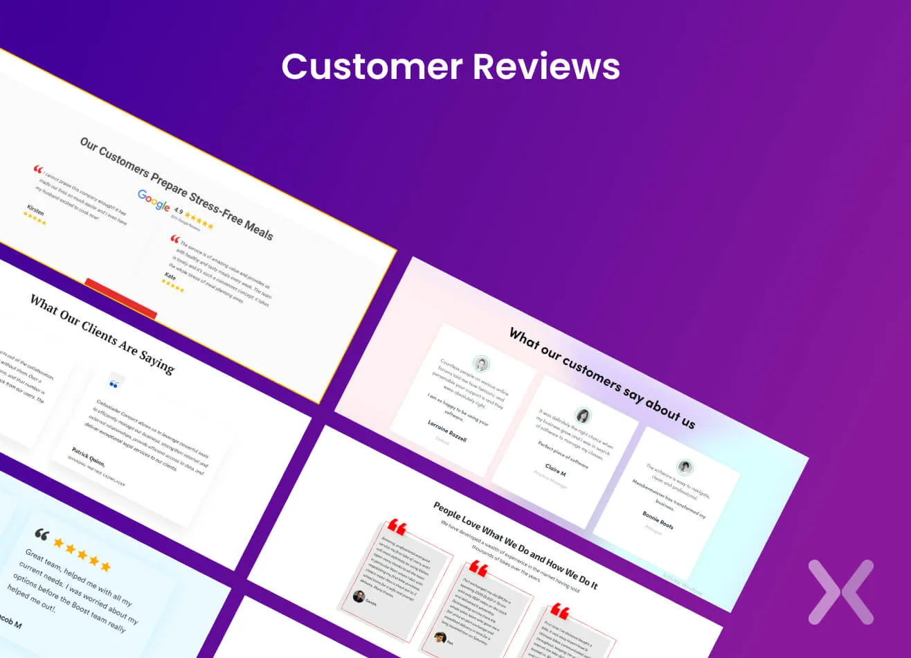
There was a time when social media or presence didn’t hold much importance. However, we live in a society where social presence helps gain credibility within seconds. Hence, it’s essential to promote where all you are present. Share your social media account details, customer reviews, PR presence, and recognized awards.

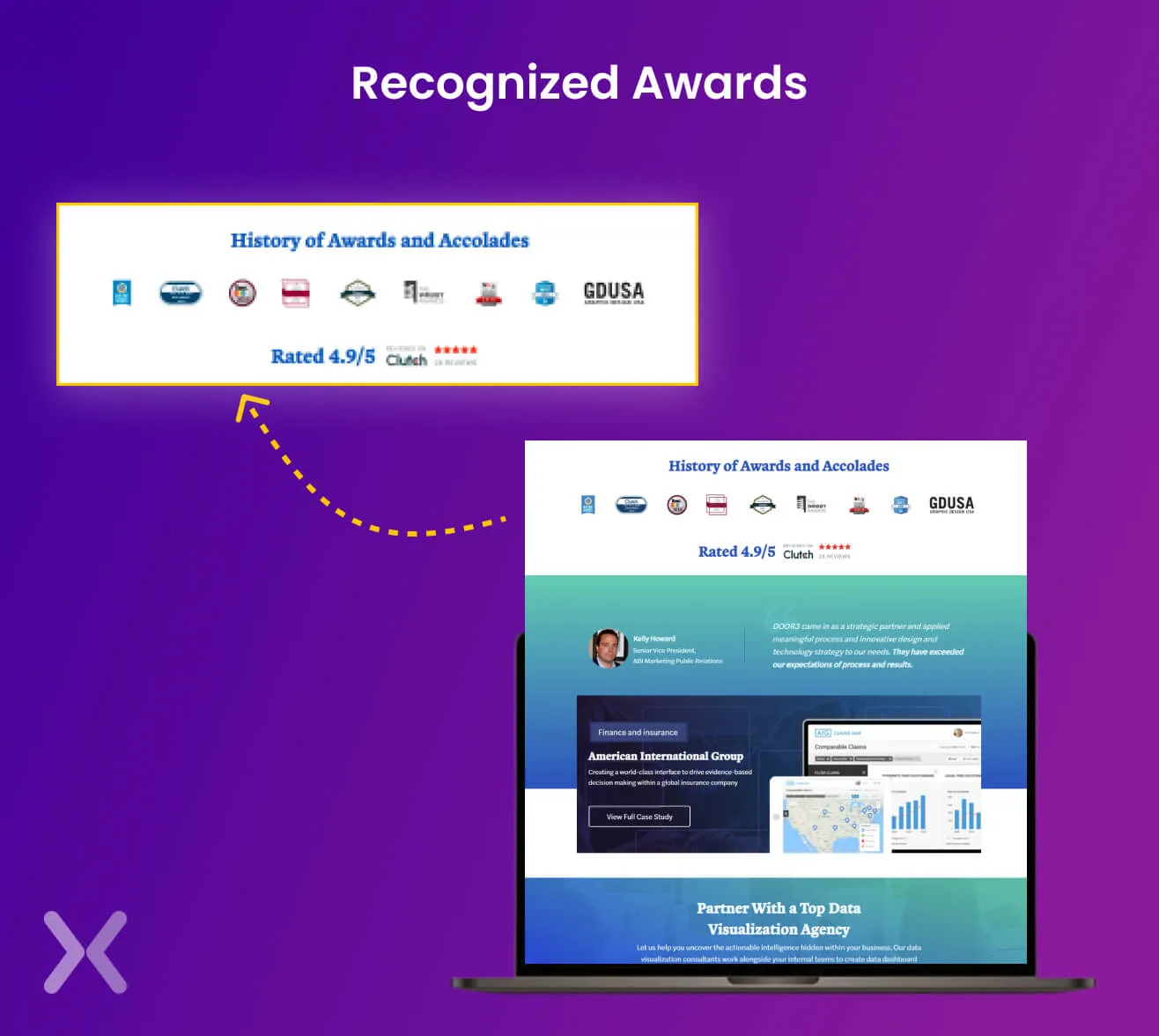 These details can come as the third or fourth header of the page.
Once you have an idea of the structure of your landing page wireframe. It’s time to figure out the gist of the content that will go live. Before writing the final content, identify the critical elements and hand-pick the framework. Sharing a few things that will help structure the content better. Follow these quick tips to create the perfect landing page wireframe-
Headline holds the essential space in your overall content. It will be challenging to control the customer on the page without a persuading headline. Hence, creating a strong headline that doesn’t increase the page’s bounce rate becomes essential.
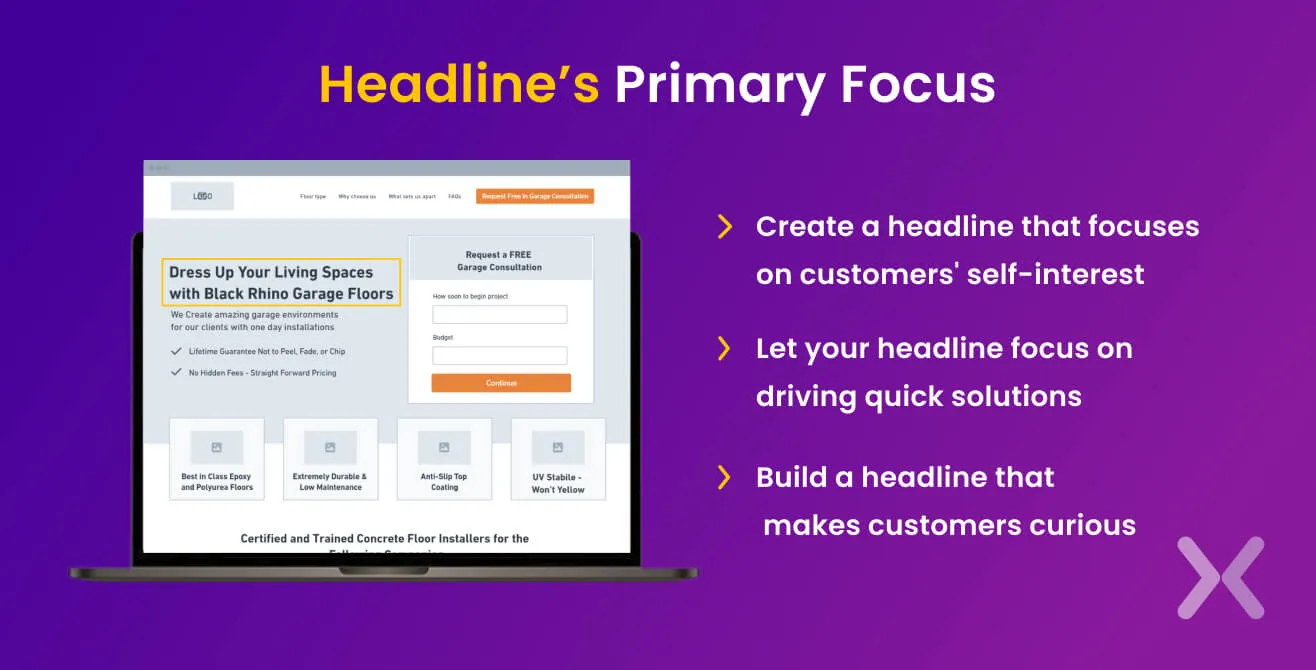 Your headline’s primary focus should be offering the brand’s Unique Value Proposition. Want other ways to write a strong headline? You can focus on the following points-
Create a headline that focuses on customers’ self-interest. Something that they might be able to relate to.
Let your headline focus on driving quick solutions. In this one, the target should be viewers’ desires and how we can help them fulfil them.
Build a headline that makes customers curious. A headline that makes them question ‘What’s that? Let me search more about it.
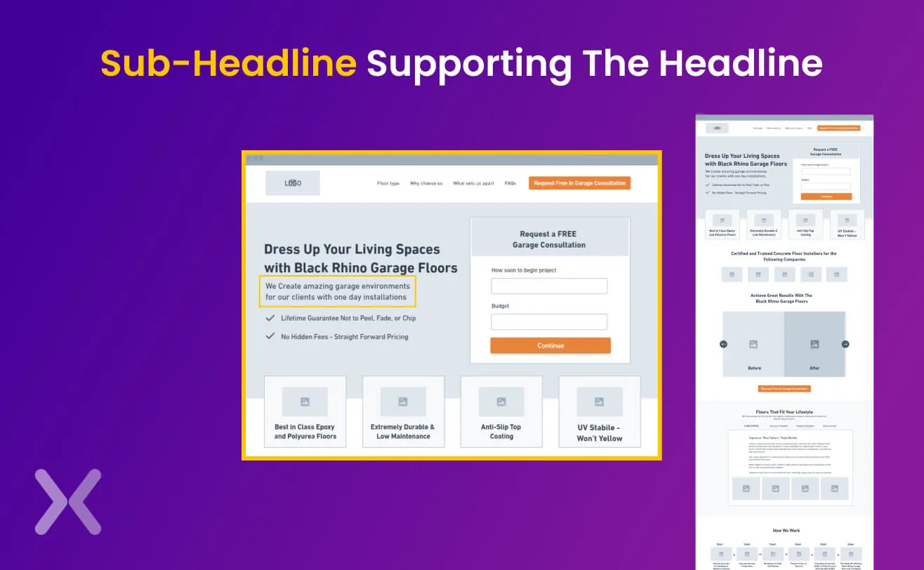
If your headline doesn’t offer the UVP, focus on adding a sub headline supporting the headline. It can include statistics or data, which increases credibility.
Every header or sub-header will require high-quality copy that delivers the correct information and makes sure that it’s not “too much”. Hence, figure out your copy’s central concept, which will help you later write high-quality content. People tend to memorize images more than the text they read. Using engaging images to build customers’ curiosity to know more about the brand is essential. No matter how much images play an essential role in building the landing page. It’s nothing until and unless it goes in sync with the text and other elements of the framework. Hence, adding images supporting the copy and design is essential.
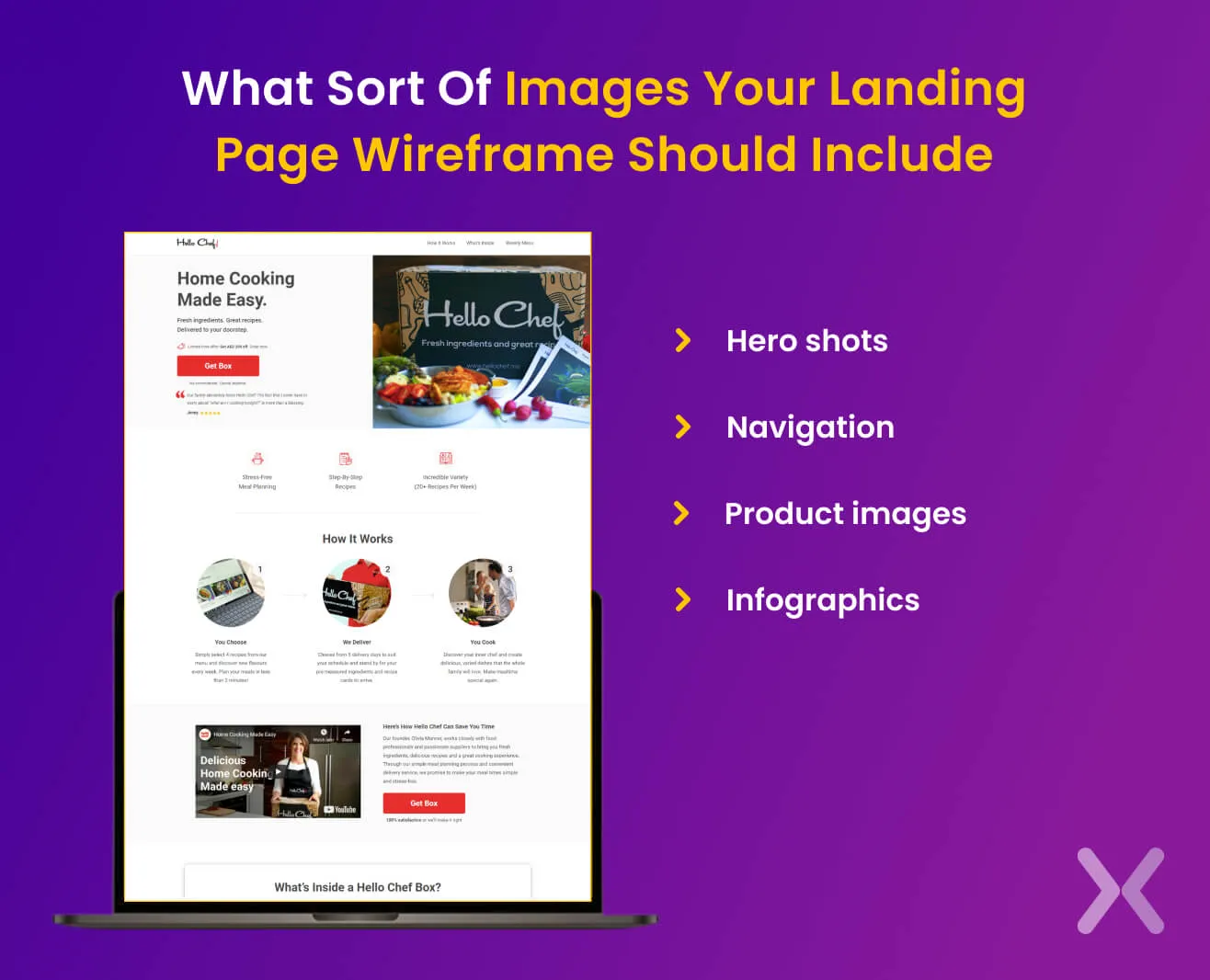
Here are some quick suggestions for you
Hero shots - There should be one or two hero shots on your page that convey the brand’s Unique Value Proposition. After seeing this shot, a customer should feel satisfied that she/he is on the right page and will find the solution.
Navigation - Once you persuade a viewer to stay and explore more- it’s time to move through the viewer through eye-catching and informative images.
Product images - Give a viewer a glimpse of your products and services. Make sure that the pictures accent the unique features.
Infographics - Instead of stating facts through text, add images to display the brand’s statistics. It will be easier for consumers to remember the data.
People end up assuming wireframes as the final draft. Hence, they invest more time identifying the right font or image that should go on the page. Explore before you implement. We all have a frame in mind that we plan to bring into play as soon as we think of our brand. However, one should first explore different concepts and understand how competitors perform. Only after proper research should one start hand-picking the wireframe.
 Not everything has to be perfect- While planning or designing the landing page wireframe be it for newsletter sign-ups, free trials, demo booking, etc. It’s essential not to deep-dive into every detail. Wireframes are meant to be the skeleton. Hence, keep it rough yet clear.
Make notes- Wireframe decides how easy it will be to move through through the landing page. Therefore, don’t forget to include sticky notes, arrows, or callouts.
Not everything has to be perfect- While planning or designing the landing page wireframe be it for newsletter sign-ups, free trials, demo booking, etc. It’s essential not to deep-dive into every detail. Wireframes are meant to be the skeleton. Hence, keep it rough yet clear.
Make notes- Wireframe decides how easy it will be to move through through the landing page. Therefore, don’t forget to include sticky notes, arrows, or callouts.
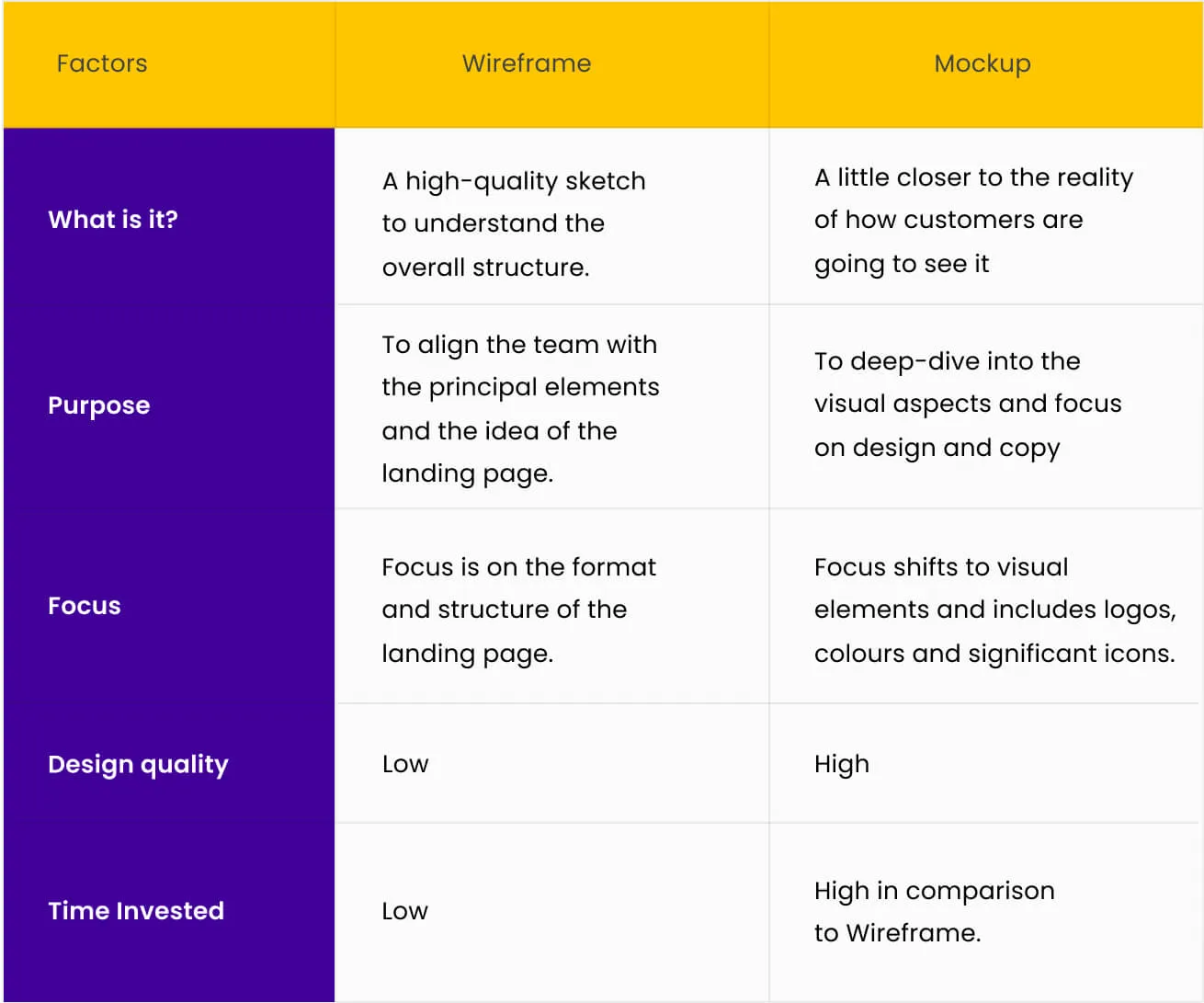
Landing Page Wireframe defines a rough draft of the site’s look, while Landing Page Mockups depict a detailed, more professional wireframe version. The execution wireframe comes first, and then comes the mockup. However, people confuse landing page mockup with the landing page wireframe and start focusing on every element in the wireframe stage itself. Hence, it is vital to understand the difference between both stages.
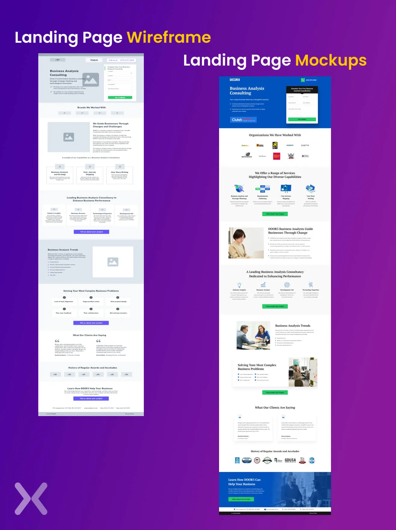
Landing Page Wireframe focuses on building a skeleton/sketch for internal team members. It is a gist for everyone to understand what the page will look like. The design quality or the focus on the elements at this stage is pretty low. More focus is given to the alignment and whether it is easy to move through at this landing page stage. The structure includes simple boxes and texts to convey the concept.
Landing Page Mockup is the next stage where the primary focus is on the basic elements of the page. This stage serves the design and content of the overall page. Even at this stage, one need not have a final design or cop. But one must make sure what the overall page design will look like and what can be changed. This stage includes logos, icons, colours, and texts to show the final glimpse of the landing page design. Here, a wireframe represents simple texts and boxes to give the landing page a gist. It’s a combination of structure, functions, and meaningful content. On the other hand, the mockup is an amalgamation of the right style, appealing colours, and apt content. However, at this stage, little focus is invested in design and text elements.
Creating a landing page with the perfect image, text, and alignment balance is essential to meeting your business goals. To reach this level, it’s necessary to create a sketch that will let you go to the end goal within a glimpse of an eye. At Apexure, our landing page specialists help create a personalised landing page wireframe that will help you meet your business goals, is 100% customizable, and brings in successful numbers. Contact us today!
Related Articles:
Founder & CEO of Apexure, Waseem worked in London’s Financial Industry. He has worked on trading floors in BNP Paribas and Trafigura, developing complex business systems. Waseem loves working with Startups and combines data and design to create improved User Experiences. Read more


Drive More Sales or Leads With Conversion Focused Websites and Landing Pages
Get Started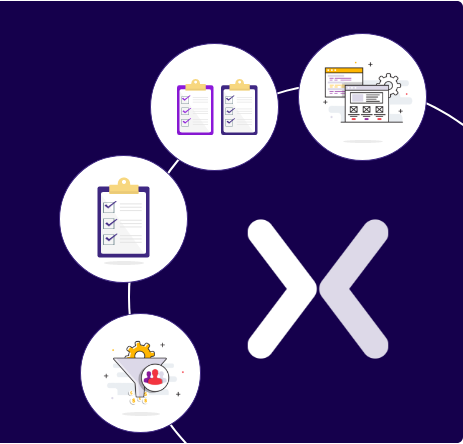

Eleven percent of Meta ad rejections in 2026 trace back to one problem: the landing page does not...

A B2B SaaS company spends $30,000 per month on Google Ads and Meta Ads. Both campaigns drive traffic...
Get quality posts covering insights into Conversion Rate Optimisation, Landing Pages and great design
