
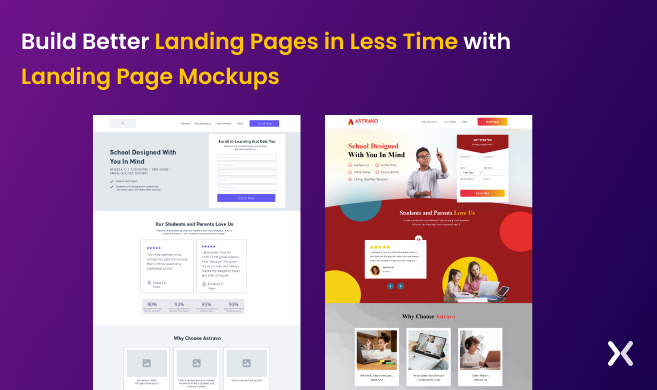
Why building a Landing page mockup is an essential part of your online marketing? Building a landing page for a niche audience comes with numerous roadblocks. Businesses often struggle with determining what works best for their landing pages and how to make them engaging and converting. Unfortunately, this process ends up consuming a lot of time and resources in revisions and creating iterations. To escape this prime hurdle, the best way is to develop a landing page mockup. A landing page mockup is a great way to design a successful landing page that is both visually appealing and effective for online marketing. Creating a mockup instead of an actual landing page will help prevent unnecessary waste of time and resources on revisions. By visualising the design and layout of the landing page, marketers can get a better idea of what the final version will look like before investing time and money. However, teams must figure out the right tools and understand how to design effective landing page mockups. This blog will cover the benefits of creating mockups, their importance, the concept of high fidelity and low fidelity, and the top tools to consider. But before that, let’s take a look at what a mockup actually is.
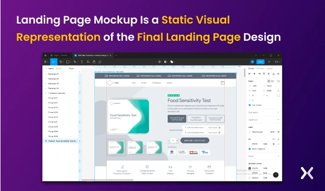
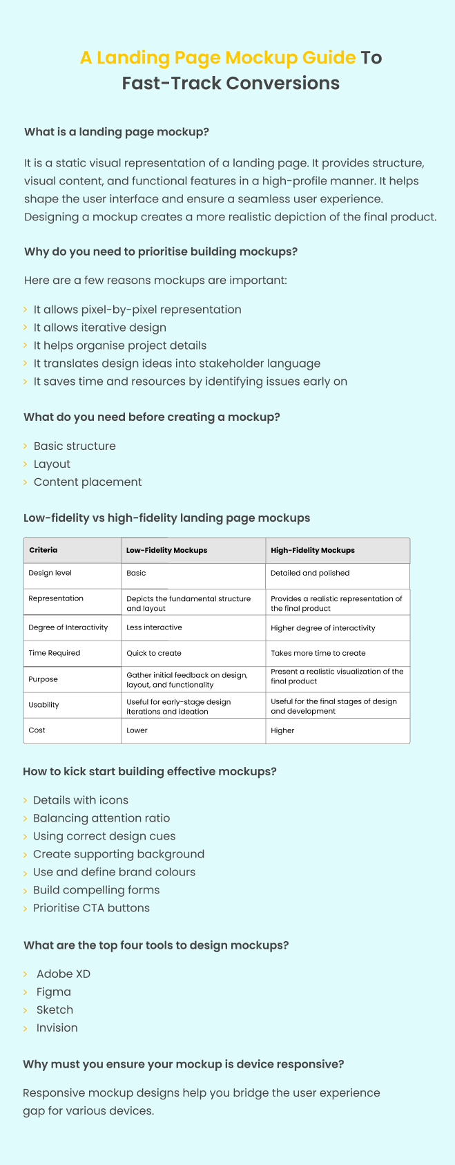
A landing page mockup is a static visual representation. It provides structure, visual content, and functional features in a high-level manner. It helps shape the user interface and make sure a smooth user experience. Designing a mockup creates a more realistic depiction of the final page.
Mockups play an important role in determining and finalising elements of a landing page, like:
Information Architecture
Visual Hierarchy
Colour scheme
Images
Background
CTA button colour, etc.
It also provides room to experiment with various visual aspects of the page until optimal appearance is achieved.
In addition, creating a mockup holds an edge over providing stakeholders and investors with a wireframe of the landing page. It offers a realistic UI representation and helps better understand the final product.
There are tons of reasons to consider building a mockup before digging deeper into making the final one. For starters, here are some:
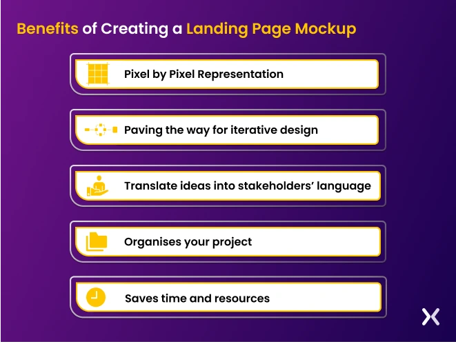
1. Pixel by Pixel Representation A mockup allows a preview of the landing page’s appearance before the final build. This feature helps detect any possible design concerns early in the process and saves time and cost.
2. Paving the way for iterative design Mockups simplify modifying and refining the design. It helps the team:
Test various layouts, colour schemes, and other design components.
Revise until you achieve the ideal combination.
Allows team buy-in.
3. Organises your project Mockups help businesses identify conflicts between visual elements in the design. It enables brands to rectify clashes between elements, such as colour or fonts and solves issues at an early stage of landing page designing.
4. Translate ideas into stakeholders’ language Producing mockups provides stakeholders and investors with a clear visualisation of your ideas. It also makes it easier for viewers and users to grasp your vision and enables them to perceive and experience the final layout of landing pages.
5. Saves time and resources Mockups help early detection of design issues. You can save time and money from extensive revisions and redesigns in the later stages. This approach guarantees that the project remains on track and meets the deadline.
Wireframe is a vital mockup component as it is the skeletal landing page blueprint, outlining the following:
Basic structure
Layout
Content placement
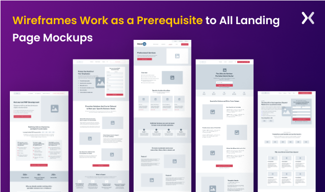 A wireframe will help you establish the foundation of the landing page, including the user flow and overall structure, making it an essential step in the design process.
Developing wireframes before starting the mockup design helps establish fundamental landing page elements. It is a primary step to meet client and target audience requirements and helps understand the placement of fundamental elements on the landing page.
A wireframe will help you establish the foundation of the landing page, including the user flow and overall structure, making it an essential step in the design process.
Developing wireframes before starting the mockup design helps establish fundamental landing page elements. It is a primary step to meet client and target audience requirements and helps understand the placement of fundamental elements on the landing page.
a wireframe acts as the foundation for a mockup as it assists you in placing visual elements like colours, fonts, and images, making it quintessential for mockup design. Besides, a wireframe is vital in guiding designers through the mockups, making sure they don’t omit any essential elements in the structure and layout. Designers can create a more effective and user-friendly mockup by defining fundamental elements with a wireframe.
When creating a landing page mockup. It’s essential to consider the level of fidelity you want to achieve. Fidelity refers to the level of detail and complexity in the mockup. There are two main types of landing page mockups: low-fidelity and high-fidelity.
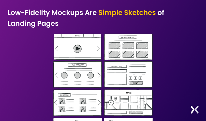
A low-fidelity mockup is a basic, rough sketch of the landing page. It is typically created using pen and paper or a simple graphic design tool like PowerPoint or Sketch. These mockups are quick and easy to create, and they are used to represent the overall layout and functionality of the landing page. Low-fidelity mockups are useful in the early stages of the design process. They allow designers to experiment with different layouts and concepts without investing too much time or effort. They also help teams to quickly identify any major flaws, e.g. Target persona or usability issues, that need to be addressed before moving on to a higher fidelity mockup.
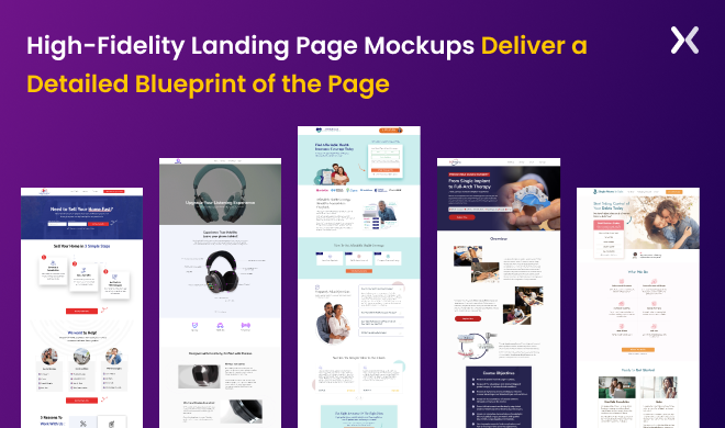
A high-fidelity mockup is a more detailed and polished version of the landing page design. It is typically created using a professional graphic design tool like Adobe XD or Figma, and it includes more specific details like font styles, colour schemes, and images. High-fidelity mockups are used to test the landing page’s visual appeal and user experience. They help designers see how the landing page will look and feel in the final version and allow stakeholders to provide feedback on specific design elements. Both low-fidelity and high-fidelity mockups have their place in the design process. Low-fidelity mockups are great for exploring different concepts and ideas, while high-fidelity mockups are useful for fine-tuning the final design and testing the user experience. Ultimately, the level of fidelity you choose will depend on the stage of the design process and your team’s specific needs.
The next step after wireframing involves adding design elements. You must remember that this is the most critical step in preparing mockups. Here are a few elements to consider when developing mockup pages.
The structure of a landing page mockup is critical to making sure that the page is easy to move through and delivers great user experience. A well-structured landing page allows you to organise your content in a way that is easy to read and understand, helping users to quickly find the information they are looking for and making your message more effective. By prioritising the most important elements on the page, such as the headline, call-to-action, and key features. It becomes easier to design further the mockup revolving around these critical elements, making the final product more conversion-oriented. Elements like information blocks, trust badges’ banners, testimonials, product images, price listings, subscription packages, etc., need a defined space on the landing page mockup. It helps in following a clear visual hierarchy from the start of the project and making it easier to execute changes.
Icons add interest to text and help viewers digest information quickly, leaving a lasting impression. The ultimate goal of icons is to provide specific visual information without distraction. To achieve this, make sure that icons possess features like:
Icons should be as simple as possible. But at the same time, their details should be neatly arranged. Icons that are difficult to grasp may convey the wrong message.
When using icons, it is necessary to consider established icon models widely accepted by the public. For instance, if an error message appears while filling out a form, the accompanying alert icon must indicate the gravity of the error or warning. If you use unrelated symbols like a heart, the chances are that users may get confused. You must remember that putting formats that differ from recognised practices can result in wrong messages, leading to communication and information failures. An example can be the feature page shown below. Note that the icon and the copy impart the same meaning when we say flexible schedule. Or, the calendar icon symbolises the action of creating schedules, and so on.
![]()
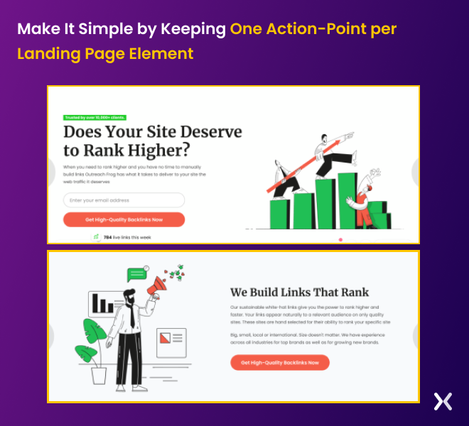
Designers must consider the attention ratio when creating mockups. This ratio compares the number of desired actions to the number of possible actions on a page. A page with multiple clickable elements or calls to action has a low attention ratio. It can distract visitors from the intended action, reducing conversion rates. Interestingly, the attention ratio was first conceptualised by Unbounce. The aim was to stress eliminating diversions from landing pages. By limiting the number of possible actions, businesses can:
Direct users act as per the intended objective.
Declutter landing pages with unnecessary and distracting elements. It will, in turn, help steer users toward more sales. Also, when you define attention ratio. It will help you achieve a conversion-oriented final design. This process involves:
Evaluating the hierarchy of information and visual elements
Deliberately placing the call to action
Eliminating irrelevant disturbances In addition, you should note that a higher attention ratio indicates the ease with which users can identify the desired and intended actions. This will help you increase the chances of conversions by manifolds. Take a look at the landing page below. It’s clear that the point of action is to help viewers improve their website’s ranking. The headline is followed by a space to enter an email and a call-to-action button. The page is simple and uncluttered, making it easy for viewers to know what to do next and meet your expectations.
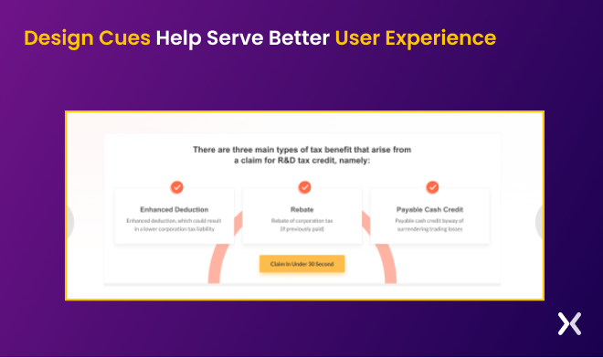
Visual elements help visitors identify and understand the desired action on a landing page. You can incorporate them in many forms like buttons, arrows, typography choices, or colour schemes to make the experience more interactive. Design cues, when done correctly, will help you make sure a more intuitive and user-friendly experience. This results in improved conversion rates. Here are some design cues to consider:
Making smart use of white spaces. Do not clutter landing pages with unnecessary elements. It’s necessary to give space to your content, allow it to breathe, and make it look polished and appealing.
Using shapes and lines makes it easier for users to identify data in groups. It will also help you provide a sense of hierarchy.
Position your elements to give a natural flow. Consider giving mockups a grid system or aligning elements. In the below landing page, each element is neatly arranged in the centre. Also, note that features and one-line descriptions are kept in a rectangle as it helps ask viewers to read that information piece together.
The background you choose for your landing page significantly impacts the user experience and the page’s overall efficacy. Selecting a suitable background can help you:
Improve the page’s visual appeal
Convey the core message
Direct users; Attention toward essential elements. Also, applying a minimalistic background assists you in marking your message and the necessary page elements. To say, a plain colour, gradient, or subtle pattern will provide a good contrast to the text, thereby improving the readability and user-friendliness of B2B landing pages. For instance, in the image below, the light-textured background helps the bold black font appear prominent and catches users’ immediate attention. Besides, applying soft colour supports the visuals and conveys a calm aura.

Brand colours play a necessary role in businesses as they trigger emotions and create different atmospheres, impacting each viewer differently. Using the right brand colours helps express and recognise the brand, strengthening brand awareness, establishing brand recognition, and maintaining consistency. A designer must dig deeper when using a brand’s colour palette to use brand colours on a landing page prototype. The palette refers to a set of colours that consistently represents the brand across all touchpoints. When choosing brand colours for mockups, designers should make sure that they:
Are complementary
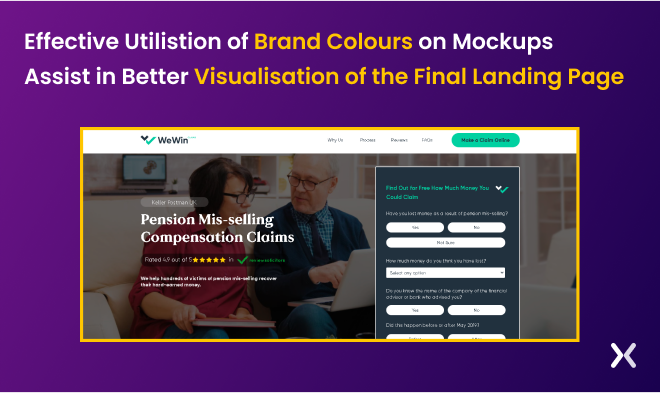
Match the brand’s values and personality Also, you must pay close attention to the emotional impact of different colours on viewers. For instance, blue mostly indicates trust and security, while red often evokes a sense of urgency, alertness, or excitement. Besides, brand colours in typography, buttons, and graphics aid in promoting a consistent and identifiable brand image. However, make sure that designers take into consideration text readability. For this, they must select colours that provide sufficient contrast with the background. To say, WeWin’s landing page derives its colours from the brand’s logo and uses them uniformly and effectively throughout the landing page. It means when you skim through the page. It’s easy to point out what colours build the WeWin brand’s visual elements, viz., white, black, green, and touches of grey.
A form is a critical element of any landing page. Here are a few tips for building strong forms for landing pages.
Using clear and precise labels for each form field will help visitors understand what data they need to type in the forms. However, be sure to avoid putting generic labels, like name, email, etc., since it can be confusing. The solution is to use specific labels like “first name” or “work email” to gain more information from viewers.
Provide visual cues to clarify which form fields are critical to conversions. Make sure using asterisks for the purpose.
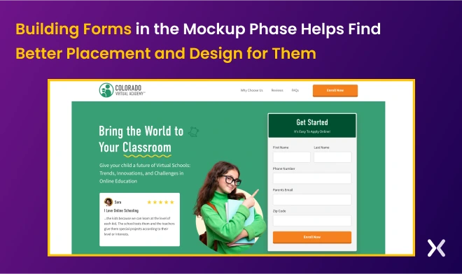
Smart defaults to pre-fill form fields with data the business already knows about is the best way to engage the visitor. Auto-filling can include names, emails, phone numbers, locations, etc. It helps them save time and effort and reduces the chances of errors. For instance, the landing page of Colorado virtual academy accents a short, crisp form. It specifies the label as a parent’s email and has a clear CTA at the bottom.
A CTA button is one of the most necessary elements when building mockups. Before diving straight into designing, you must clearly envision where to place the CTA. CTAs should be easily visible without the need to scroll down the page. Also, remember the user’s journey when placing the CTA button. It must be in a logical location, such as at the end of a product description or in a pop-up that appears after the user has spent time on the page. To make the CTA button stand out from the rest of the page. You should research the right design, colour, and copy. Consider using contrasting colours, bold text, and a noticeable button shape. Also, make sure that the button is large enough to make it easier for users to click on the desktop and optimise it for mobile devices. For instance, despite having an image and other elements in the background, the CTA button on the landing page stands out. It is because of the ample whitespace around the CTA and the striking colour that blends smoothly with the background.
Many designers use mockup tools to simplify the design process. It enables them to create visual mockups quickly and efficiently. If you are searching for tools to kickstart your landing page, here are the top four mockup tools to keep up your sleeves.
Adobe XD is a user-friendly option for wireframing and interface design projects. It is widely popular despite Adobe products being known to be feature-heavy and difficult to master. XD lets you use its features for wireframing and basic prototyping within the interface, making it a one-stop shop for your B2B design team. Also, unlike other complex Adobe tools, XD has a minimal interface. AdobeXD efficiently tracks basic CSS and HTML for mockup designs, allowing you to extract the code directly from the interface when passing the same to the programming team. Along with this, Adobe Illustrator and Adobe Photoshop are popular Adobe programs that you can use for wireframing.
Sketch has established itself as a prominent player in software design. Introduced in 2010, this agile vector design software has since earned a strong reputation. Its user-friendly interface enables the effortless creation of design sketches or layouts. It also uses a blend of the artboard and vector design shapes. The main aim of this tool is to simplify the design process. It helps designers to generate vector-based designs and preview them with clickable prototypes. Also, Sketch offers many design kits, templates, plugins, and integrations, making sure a smooth and speedy prototyping process. The only setback for Sketch is that it only works on Mac for creation and editing purposes, though you can view mockup designs created with it on any operating system.
Figma is a strong cloud-based alternative to software tools such as Sketch and Adobe XD. It provides free users with a suite of features, making it an excellent option for independent designers and those working in larger teams. It is a strong wireframing tool well-known for its excellent team collaboration capabilities. Designing wireframes using Figma is a smooth process wherein designers can create user interface components or import them separately from a UI kit. When working with Figma, you can manage your designs on the left-hand panel, consisting of artboards, shapes, and texts. You can also use Figma constraints to make sure responsive designs. It also helps specify how each element should behave when you resize the design for different screens and supports a collaborative team environment.
InVision is known for the ease with which designers can achieve a responsive landing page design. For instance, you can change an object’s size and position independently. This, in turn, allows you to control how an icon responds when the screen size changes from desktop to mobile or vice versa. Before its launch in 2018, InVision prototyping tool users had to use a third-party wireframe tool. With the InVision suite, you can now do both tasks smoothly.
Designing mockups for desktop and mobile devices is necessary to maintaining a consistent user experience. While tools like Unbounce can help adapt desktop mockups for mobile screens, making sure design integrity and conversions across all devices can be challenging. To avoid potential issues, it’s best to prepare a separate mobile mockup to make sure a smooth design experience across all screen sizes.
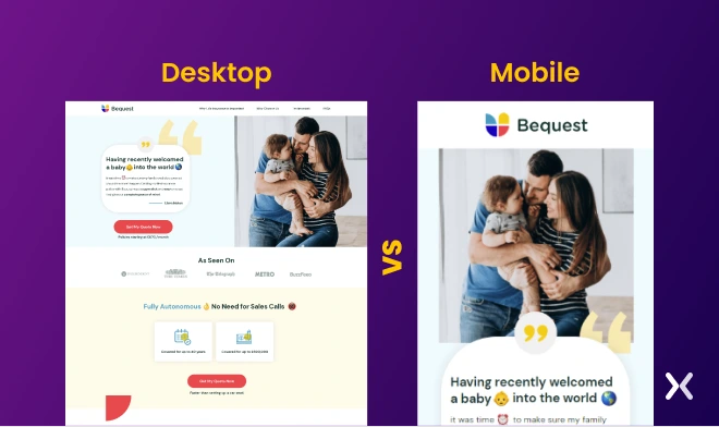 Also, you must remember that desktop and mobile need different approaches when designing landing pages. It is because users interact with these devices differently, owing to the screen size disparity. Responsive mockup designs will help you bridge this gap by making sure that the design translates smoothly from desktop to mobile devices.
Besides, responsive mockups entail designing a layout that employs:
Also, you must remember that desktop and mobile need different approaches when designing landing pages. It is because users interact with these devices differently, owing to the screen size disparity. Responsive mockup designs will help you bridge this gap by making sure that the design translates smoothly from desktop to mobile devices.
Besides, responsive mockups entail designing a layout that employs:
Fluid grid layouts
Flexible images
Media queries Depending on the screen size and device, these elements help adjust the layout and content. This approach makes sure that the design adapts to smaller screens by resizing font and image sizes while still preserving the overall look and feel of the design. Now, speaking of why responsive design is essential. Responsive designing is a great way to make landing pages accessible for usability on multiple devices. It also helps you save time from creating different designs for each device and makes sure a consistent user experience across all devices.
Preparing a landing page mockup is a critical component of the design process. They allow businesses to test various layouts and design elements without putting in excessive time, effort, or investment. With the help of appropriate tools, you can generate a mockup that closely resembles the final landing page, providing a clear picture of what to expect before proceeding to the final development phase. However, investing in mockups is a small step. The success will rely on developing the final landing page to convert visitors into leads and help achieve marketing objectives. That is where Apexure comes into play. Apexure offers a full inventory of tips and tricks that your design team can use as starters to begin the design journey. Over the course, we have worked with many clients and developed a portfolio that will help you create conversion-centred mockups. Have a look: Apexure Portfolio. Apexure offers assistance in crafting the most effective landing page. Drawing upon our vast experience, our team is skilled at producing precise wireframes and thorough mockups that result in landing pages with high conversion rates. Our services not just involve creating outstanding landing pages but also determining the ideal strategy for crafting one that suits your business. To learn more, get in touch with us for a consultation.
Related Article:
Founder & CEO of Apexure, Waseem worked in London’s Financial Industry. He has worked on trading floors in BNP Paribas and Trafigura, developing complex business systems. Waseem loves working with Startups and combines data and design to create improved User Experiences. Read more


Drive More Sales or Leads With Conversion Focused Websites and Landing Pages
Get Started

Eleven percent of Meta ad rejections in 2026 trace back to one problem: the landing page does not...

A B2B SaaS company spends $30,000 per month on Google Ads and Meta Ads. Both campaigns drive traffic...
Get quality posts covering insights into Conversion Rate Optimisation, Landing Pages and great design
