A subscription landing page is necessary to any marketing campaign, whether for a newsletter or a paid SaaS service. These pages are a gateway to acquiring new users and driving conversions. Subscription pages can be built to capture leads at any marketing funnel stage, be it at the awareness level or when prospects are ready to commit. It becomes essential to set clear goals for these landing pages and make sure their design and content advocate for the same. In this post, we will examine various subscription landing pages, such as those for SaaS, streaming services, or newsletters, to understand how to use these pages for your brand.
What is a subscription landing page?
Subscription landing pages are used for offers that require a recurring commitment from the prospects. Be it for monthly newsletters or yearly subscription fees. As subscription-based services are becoming common, you might lose interested visitors if your product’s value proposition is not shared correctly. Landing pages with subscription offers in focus are not completed with just solid copy and design. They need to accent necessary elements like the spread-out costs, automatic payments, differences between tiers for SaaS, and much more. They can be as simple as newsletter pages to as complex as SaaS pages, with their cost increasing proportionally to their value.
Next, let’s look at the different types of subscription landing pages and why they are necessary for various industries.
Types of subscription landing page examples
Here are five different types of subscription landing pages with examples to make it easier to understand how they are used across industries and funnels.
1. Newsletter subscription page
A newsletter subscription page is designed to encourage visitors to sign up for a regular newsletter delivered right to their choice of email inbox. Depending on the subscriber’s interest, the newsletter is full of insights, news, or trends. The primary goal of such pages is to create a dependable email list of prospects with similar demographics, firmographics, or interests. Effective newsletter subscription pages often include strong headlines, concise descriptions, social proof, and straightforward signup forms to maximize conversions. Let’s look at an example of a newsletter subscription page to learn more.
-
Demand Curve’s Newsletter Subscription Page
Demand Curve’s newsletter subscription page presents clarity with persuasion. The top fold starts with a strong headline, followed by an equally strong subhead. Right above, the form three pointers share the USPs of the newsletter- actionable, free insights, and twice weekly, making it easier for users to know what value they will receive by subscribing.
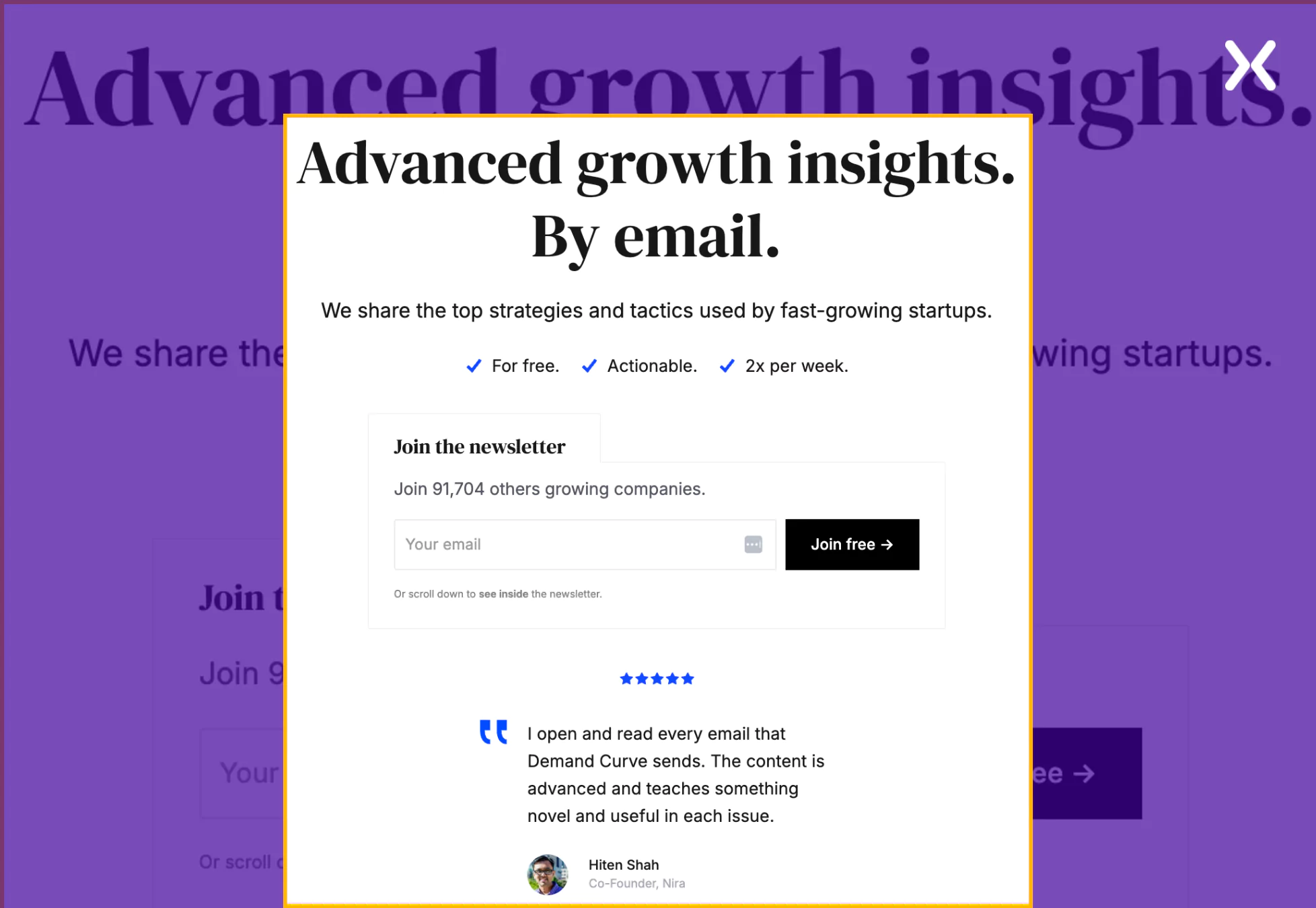
To win visitors’ trust further, the page’s form has quantified social proof and a single form field, removing all conversion friction. The subscription page also previews newsletter content, helping visitors gauge its quality before subscribing. With clean visuals, targeted social proof, and a structured layout, this page effectively drives conversions by minimizing hesitation and maximizing perceived value.
-
HeyOrca Newsletter Subscription Page
HeyOrca’s newsletter subscription page is engaging and designed to attract its target audience with a headline directly addressing its target audience: social media managers.
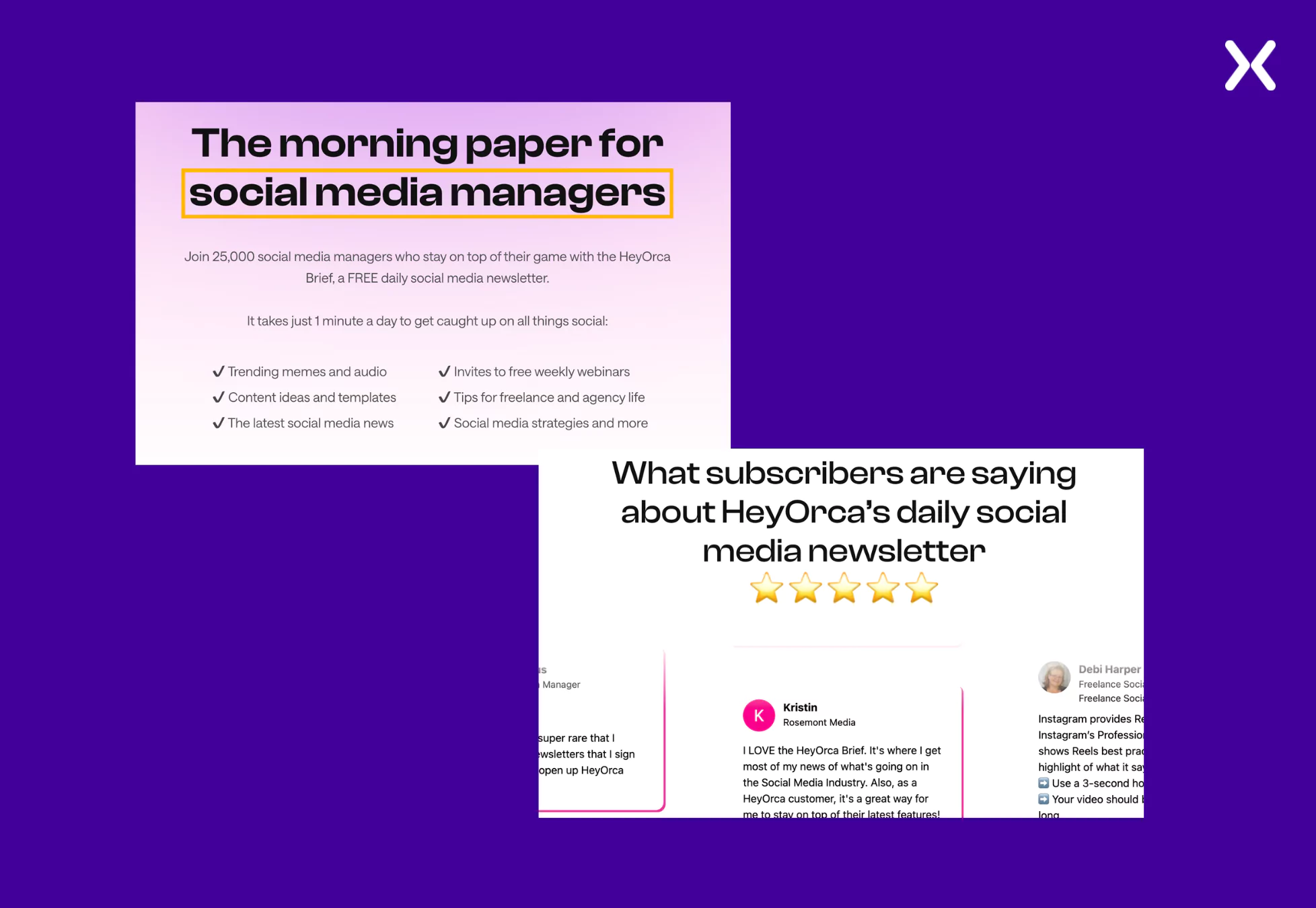
The copy is concise and doesn’t waste time on filler content. Instead, it lets a whole section of social proof advocate for the authenticity and value of content shared through the newsletter.
2. SaaS subscription landing page
In stark contrast to newsletter subscription pages, SaaS subscription landing pages are dedicated to offering the available subscription plans to potential customers. These pages belong to the bottom of the funnel and target high-potential and hot leads, who are coming after a free trial or demo. As the primary goal of such pages is to make a purchase, there is much information to share. From each plan’s features, benefits, and pricing to USPs and social proof, all elements must fit into your SaaS subscription landing page without overwhelming the visitor. Let’s see how some leading SaaS brands execute their SaaS subscription landing pages.
-
EmailOctopus SaaS Subscription Landing Page
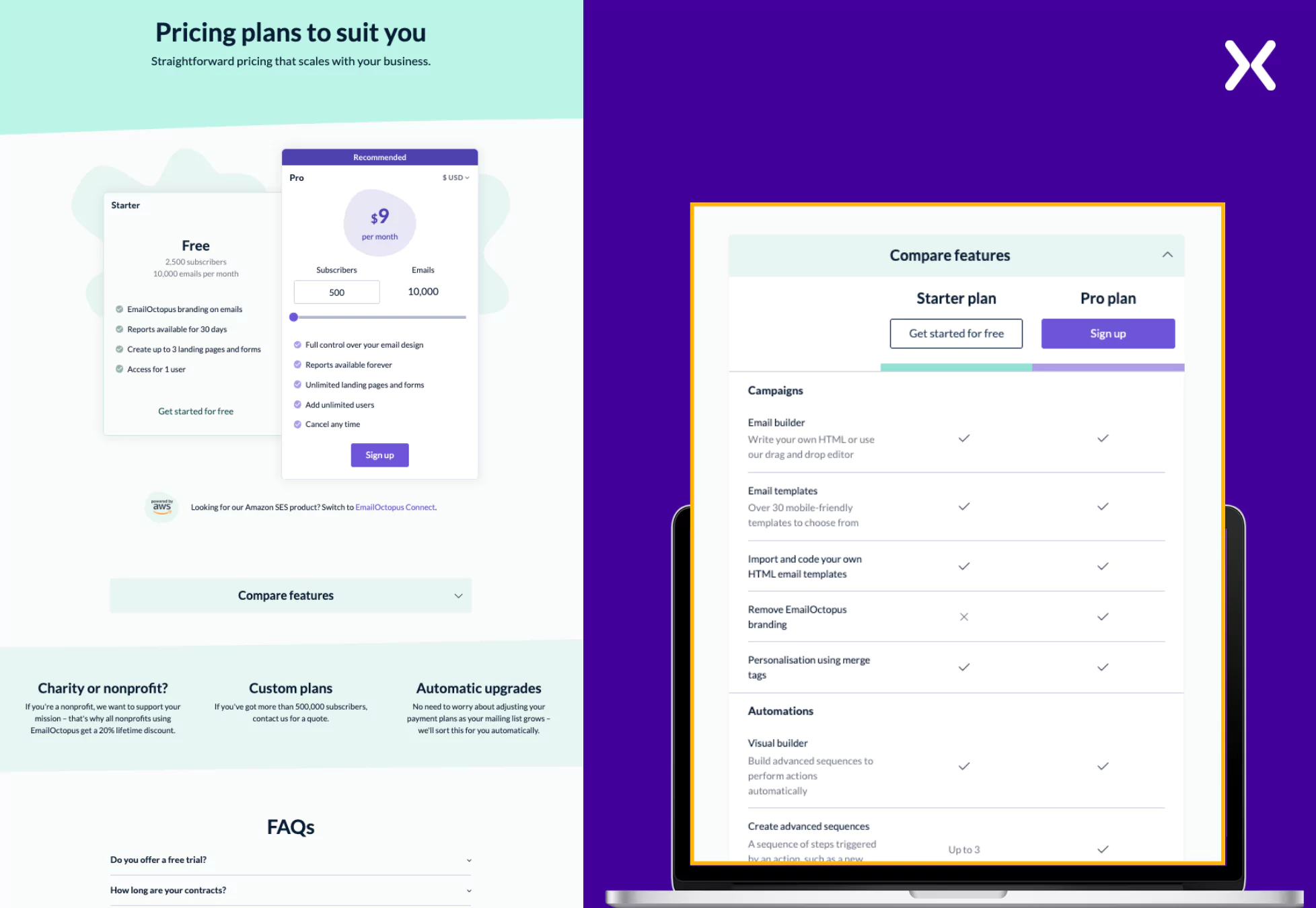
EmailOctopus has a straightforward subscription landing page that doesn’t waste time on long headlines and immediately shares the pricing tiers on the first fold. The page is divided into two sections:
-
Pricing tiers: The two subscription tiers offered by EmailOctopus are featured here. Instead of filling it with many features and benefits, they have kept it short by just sharing critical information about them.
-
Tier comparison: This section is present under a toggle that efficiently makes the page look cleaner and, on a click, swiftly shares a comparison between paid and free tiers of the product. Such a section serves visitors who want a more detailed tier comparison. The page cleverly compares their free and paid subscriptions, making sure visitors understand the value of becoming a paid customer. Any page asking for a purchase is incomplete without an FAQ and social proof section. These elements are fundamental when it comes to removing potential barriers to conversions and winning visitor trust.
-
Zoho Desk Subscription Landing Page
Following the lead of EmailOctopus, the Zoho Desk subscription landing page shares their subscription tiers directly, with every feature attached. Despite having a lot of information, the benefits under various tiers are clearly displayed. Minute details like the “Monthly” to “Yearly” pricing toggle and the “Popular” tag on the enterprise tiers raise the page’s user experience.
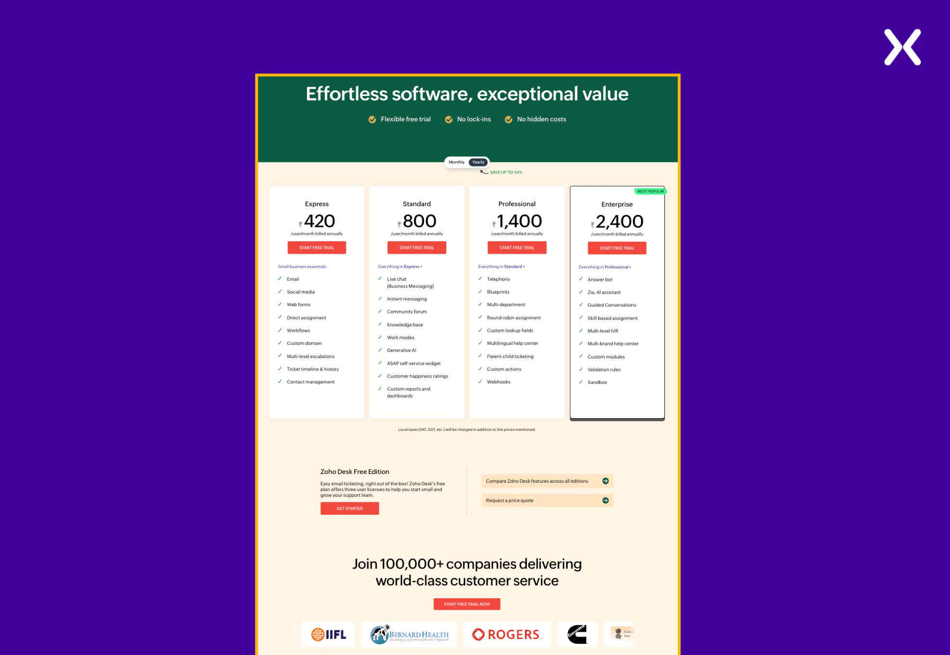
The page further shares authentic social proof with reiterations of its USPs to build trust, reinforce credibility, and encourage conversions by presenting key benefits.
-
Grammarly Subscription Landing Page
Grammarly’s Plans page follows a clean and minimalistic design, making it easy for visitors to compare options at a glance. Using ample white space, clear typography, and structured pricing tables makes sure effortless readability. Each plan is presented in a visually distinct way, with key benefits marked to guide decision-making.
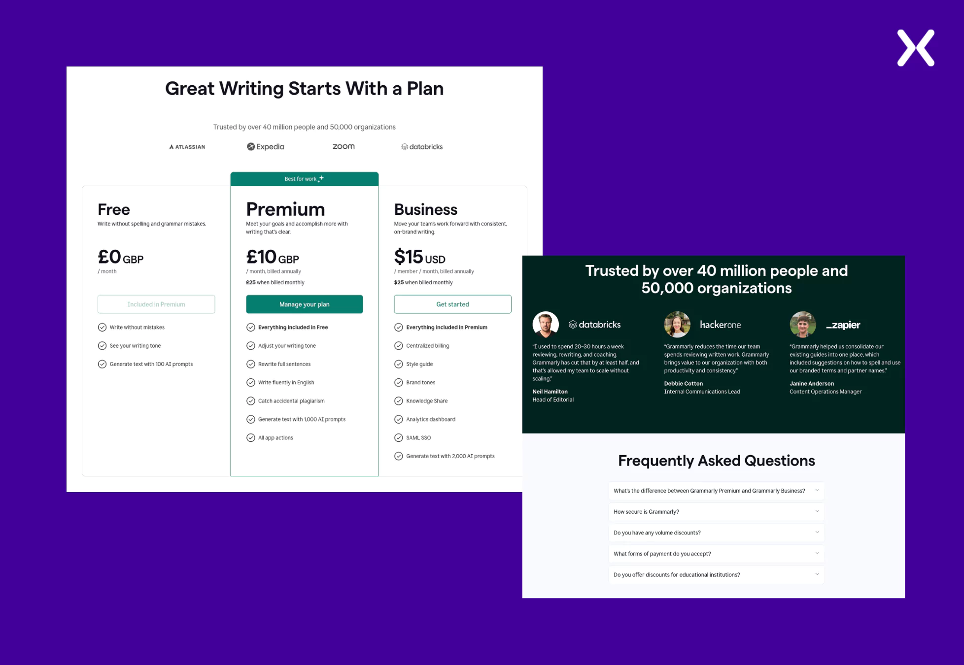
The concise and persuasive copy stresses Grammarly’s credibility with trust signals like “Trusted by 50,000 teams worldwide.” Action-oriented CTAs such as “Get Started” keep the focus on conversions. The page maintains a professional yet approachable tone, balancing essential information with a frictionless user experience.
3. Membership-Based subscription landing page
A membership-based subscription landing page is somewhat like a SaaS subscription page but offers a broader range of benefits, resources, and community engagement besides just software. Content creators often use it to build a paid community of followers. These subscription pages have a similar format to SaaS subscription pages. Let’s check out an example.
-
KAMAUU’s Patreon Membership Subscription Landing Page
KAMAUU’s Patreon page is a great example to understand how membership-based subscription pages work that has nothing to do with SaaS. It immediately invites visitors to be part of his creative journey, stressing that subscribers are supporting something meaningful, establishing a strong emotional connection.
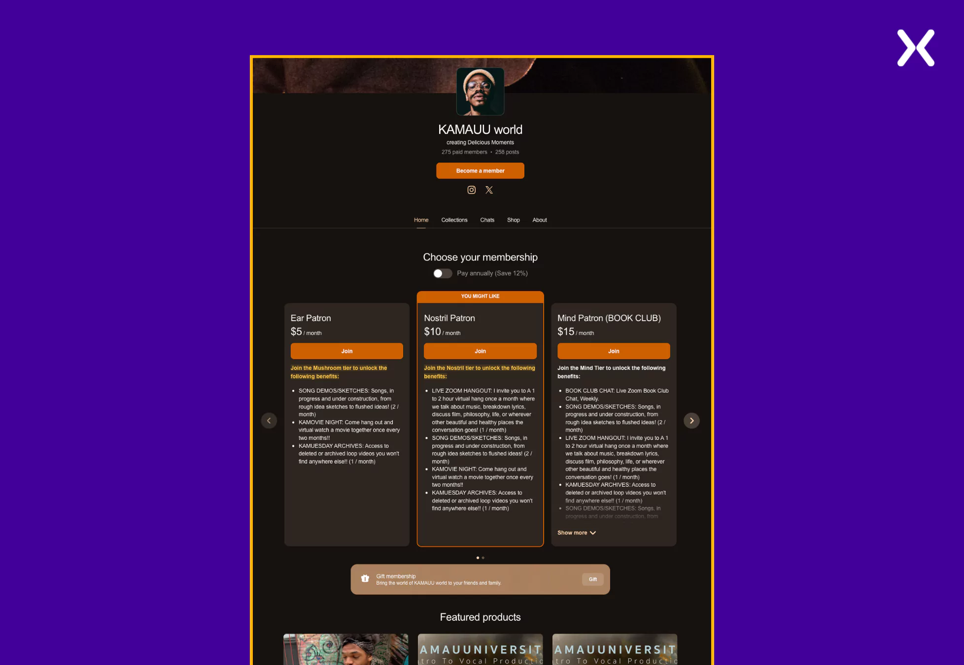
The page effectively communicates its value by offering various membership tiers, each unlocking unique perks like exclusive music, behind-the-scenes content, and live hangouts. Social proof plays a necessary role, with over 1,800 total members reinforcing the legitimacy and appeal of the community.
4. Streaming services subscription landing page
A streaming services subscription landing page is standard in the entertainment industry. But we can learn a thing or two from their design and layout. These subscription pages offer plans with unique features and focus on the easy sign-up process without complicating it with value proposition or their latest shows, as visitors are mostly aware of them. Let’s look at some of the biggest streaming platforms and their subscription landing pages.
-
Netflix Subscription Page
Netflix’s subscription page doesn’t complicate things and uses a click-through landing page. Once the email is entered and the CTA button is clicked, a multi-step form appears, which is excellent for guiding users through a smooth signup process, reducing friction, and keeping them engaged step by step.
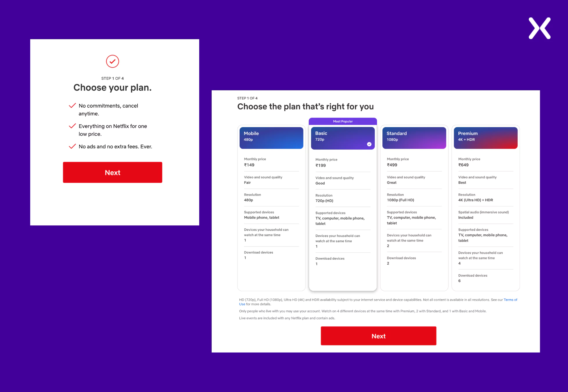
Instead of being a question, the first slide shares major USPs of subscribing to Netflix’s streaming services to immediately accent the benefits, set clear expectations, and reinforce the value proposition before users proceed with the signup process. A pricing section and other steps are followed. Overall, it is a strong page that clearly communicates everything of value.
-
YouTube Subscription Page
The YouTube Premium subscription landing page is basic in its design, making sure that all essential information is shared efficiently. The top fold shares necessary benefits, appealing to users seeking an uninterrupted and enriched experience. The copy of the page has been written in a digestible format with a small section dedicated to USPs in bullets and then a simple pricing tier.
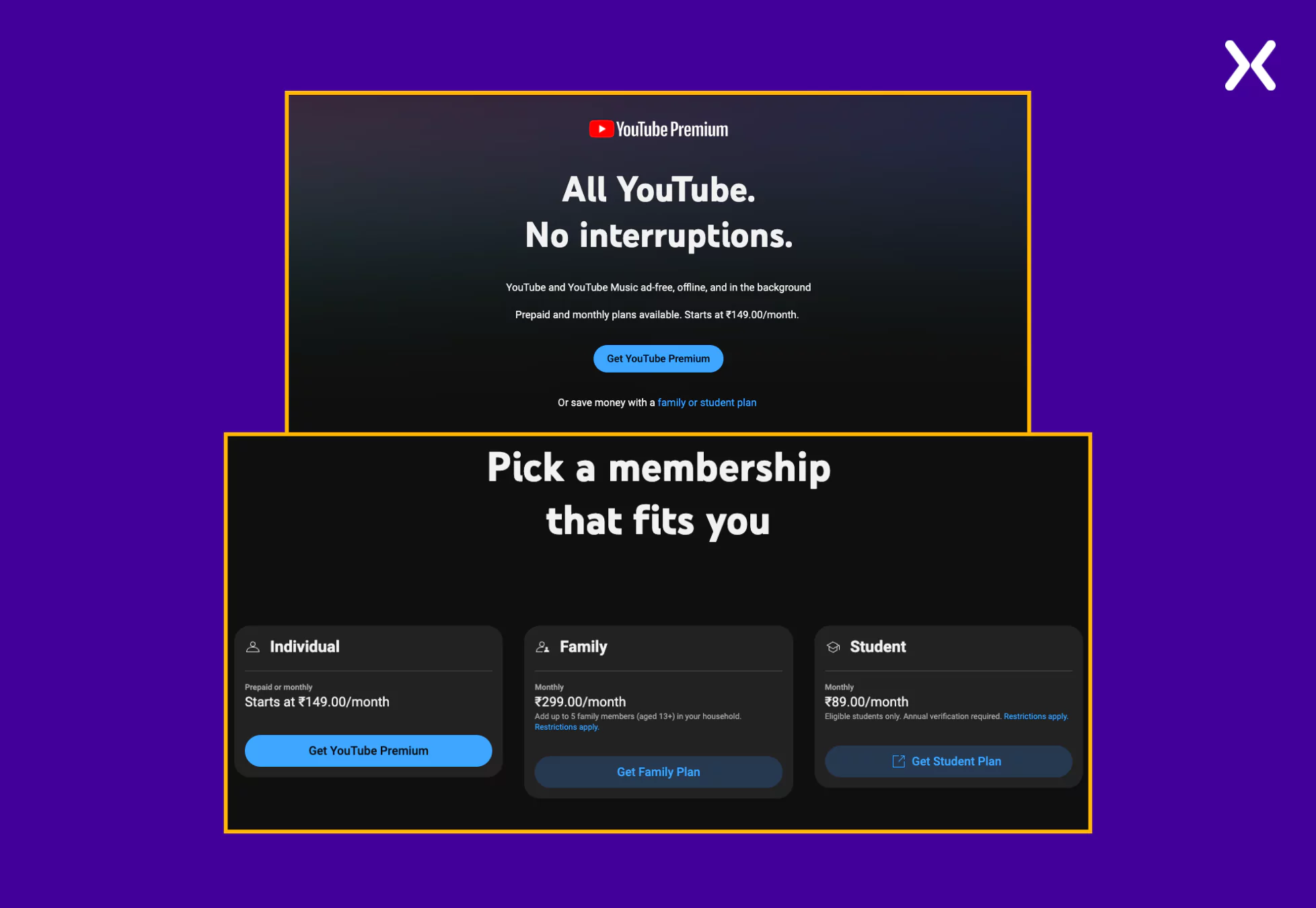
The page ends with an extensive FAQ section, which addresses common concerns and eliminates any last-minute doubts, making sure prospects feel confident before subscribing.
5. Box subscription landing page
A box subscription landing page is a dedicated webpage designed to convert visitors into subscribers by offering hand-picked products delivered regularly, stressing convenience, personalization, and value. These pages typically accent the contents of the subscription box, the benefits of subscribing and provide a straightforward signup process.
-
Dollar Shave Club
Dollar Shave Club’s New Member Starter Set landing page is a great example of an effective box subscription page. It immediately captures attention with an enticing offer, marking a significant discount to encourage sign-ups. The page clearly presents what’s included in the kit through images, helping potential subscribers understand the value they’re getting.
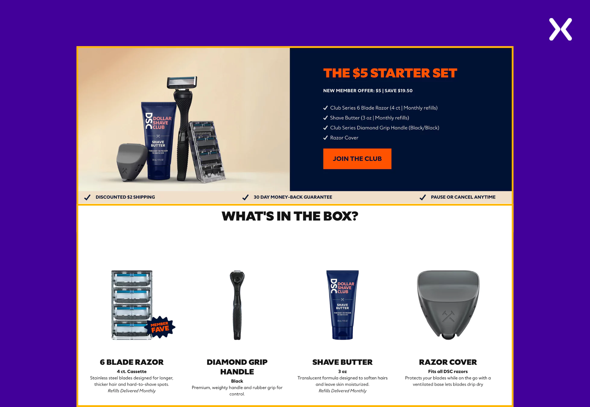
Social proof is used deliberately, featuring customer testimonials stressing product quality and satisfaction. Statements like “Best razors on the market. They make my legs feel so nice and smooth.” from real users help build trust and credibility. The page also accents additional perks, such as free shipping on the starter set, making the offer even more appealing.
-
Perfect Bar
Perfect Snacks’ Subscribe & Save page is designed to make signing up for recurring deliveries effortless. It opens with a strong headline, “On-the-Go Protein Bars, On Repeat,” immediately stressing the convenience of the subscription, the layout is clean and structured, guiding visitors through a simple subscription process while marking key benefits like 10% off, free shipping, and the ability to skip or cancel anytime.
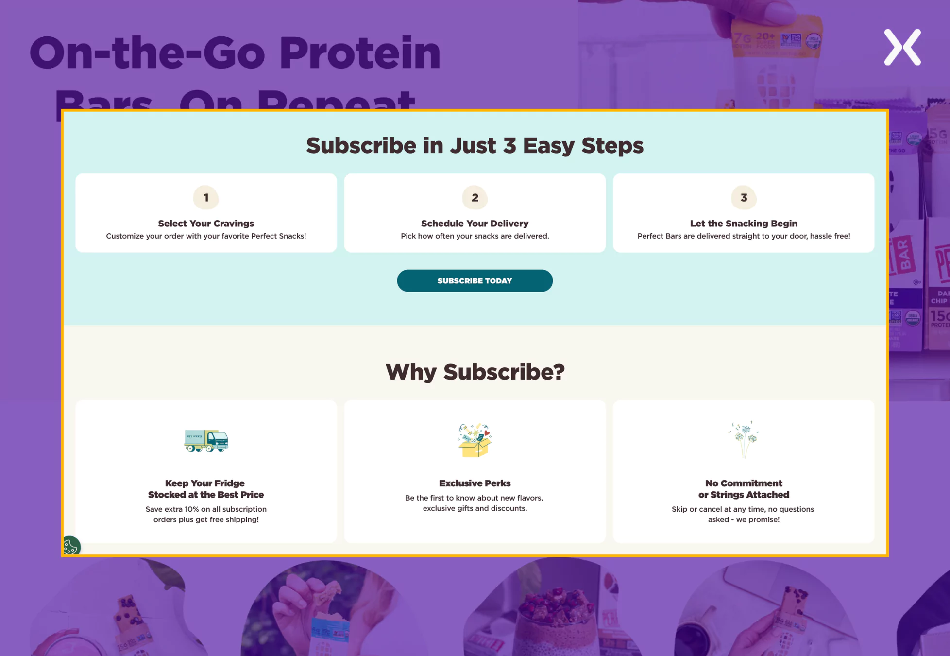
The page effectively reassures potential subscribers with a no-commitment policy, making sure they can manage their subscriptions on their terms. Exclusive perks like early access to new flavors and special discounts add further incentive. The combination of persuasive copy, a user-friendly design, and a flexible approach makes this a strong and conversion-driven subscription landing page.
Not sure why your landing page isn't converting?
Send us the URL. We record a short video showing what is costing you conversions and email it back within three working days.
Need a new page built instead? Get a fixed quote.
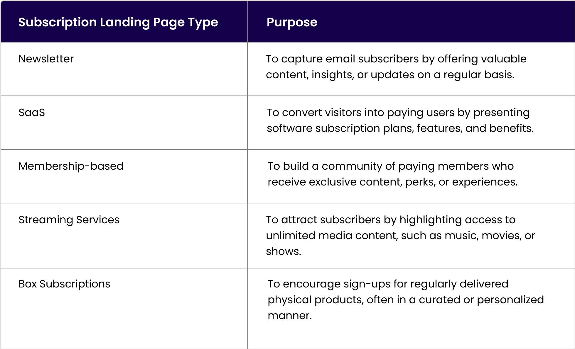
Comparison table for various subscription landing pages
Here’s a comparison table summarizing the purpose of different subscription landing page types:
You also need to make sure that your subscription landing page has a good thank you page waiting for the leads, once they are finished filling the form.
Don't Forget To Optimize Your Subscription Landing Pages
You need to optimize your subscription pages once they go live to increase your chances of securing more conversions. Here's a video that will teach how to do that.
Ready to build your subscription landing page?
Subscription landing pages are the most effective asset in your marketing funnel as a conversion-focused page. They suit SaaS, solopreneurs, and companies looking to build a solid email list. While a newsletter subscription landing page is simple, a SaaS subscription landing page has complexities. It is necessary to keep the end goal of a subscription landing page before you finalize the page. By understanding the shared subscription landing page examples, businesses can optimize their pages to drive engagement and increase subscriber growth.
What you should do now
Found this blog post helpful? Here are more ways in which we can help you build your SaaS landing page:
- Building a SaaS landing page
Apexure has 100+ blog posts on landing pages. We have shared everything, from creation to testing, analysis to optimization. Check them out before you build your SaaS landing page.
- Get the right help
Making a SaaS landing page on your own with just examples can take a lot of time. Get the help you need from our experts. Book a call and one of our experts will contact you soon.
- Your SaaS pages might be missing something
Check out our landing page portfolio to discover conversion-friendly landing page elements that might. Filter your industry and check which landing page design is trending.
Frequently asked questions
Reducing the number of form fields lowers barriers to entry, making it more likely that visitors will complete the subscription process.
Yes, transparency builds trust. Hide it, and bounce rates spike.
Only if short (<60 sec) and focused. Long videos often lower conversions.

Waseem founded Apexure in 2015 and has led its work on 3,000+ pages for 300+ clients since. He writes about what the team sees after the click, which is pages, forms, tracking and the systems behind them.
 Vitynex
 Vernte
 Trucker Fuel
 SportHamper
 Sleep Sounds
 Rubicon Dog