Professional services are the hardest thing to sell on a single page, because there is nothing to show. A law firm, a recruiter or a consultancy is selling judgment, and the buyer usually needs it at a stressful moment, at a price they cannot see, from people they have never met. The twelve pages below were all designed by our team for firms in exactly that position, and each one had to find a way to make a stranger’s expertise feel safe to buy.
We have built landing pages for law firms, accountancies, executive search firms, IT consultancies and advisers since 2015, and the pattern is consistent enough that we now start every professional services brief with the same three questions: what is the buyer afraid of, what is the smallest first step they will accept, and what proof would make them believe this firm has solved their exact problem before. Read the examples with those questions in mind. If you want to browse first, every page is in our landing page examples gallery with a CRO breakdown.
Key takeaways
- Professional services buyers are not short of options. They are short of a reason to trust one firm with a problem they find stressful.
- A fixed fee or a defined first step (a free fifteen-minute call, a contract review with a stated price) removes the commitment anxiety that kills most law and consulting pages.
- Proof has to be specific to the buyer's problem: case results, named clients, a founder who has done the job, a logo wall for enterprise buyers.
- The visual register should match the buyer. Enterprise IT gets dark and technical; a grieving executor gets calm and plain.
- Every page here removes the firm's other services. One offer, one form, one phone number.
What makes professional services pages different
The buyer is anxious about commitment, not about the product. Nobody lands on a probate page unsure whether probate exists. They are unsure what it will cost, how long it will take and whether calling means they are trapped. Pages that leave those questions open lose the visitor to the next tab.
Price is usually invisible, which makes any price a weapon. A flat fee, a stated hourly rate or even “the first call is free and lasts fifteen minutes” converts better than “contact us for a quote”, because it answers the question the visitor is most afraid to ask.
Expertise has to be shown, not claimed. Every competitor says they are experienced, client-focused and results-driven. Named clients, quantified case results, accreditation marks and a founder with relevant history are the only things a sceptical buyer cannot dismiss.
Law firm landing page examples
Legal is the largest professional services sector in our gallery, and the pages split into two kinds: the visitor in crisis and the visitor making a considered decision. The design has to know which one it is talking to.
1. Alix: a fixed fee for a grieving executor
Alix is a US flat-fee probate service that bundles a probate attorney, a CPA and a coordinator into one fixed-price engagement, replacing the hourly-billed attorney model. The visitor is typically the executor of a parent’s or spouse’s estate, two to four weeks after the loss, grieving, time-poor and afraid of being exploited.
The Alix page treats that visitor as an adult making a procurement decision under stress rather than as someone to be consoled. A six-step multi-step form asks small questions one at a time, customer quote cards show people who were in the same position, and accordion tabs hold the detail for those who want it. The fixed fee is the page’s central argument. It removes the fear that makes people put off calling a lawyer for weeks.
2. Shakfeh Law: a defined first step for a considered buyer
Contract review is an underserved niche. The person who needs a contract reviewed is not in crisis. They have a job offer, a vendor agreement or a property deal, a deadline, and enough legal knowledge to know they do not have enough.
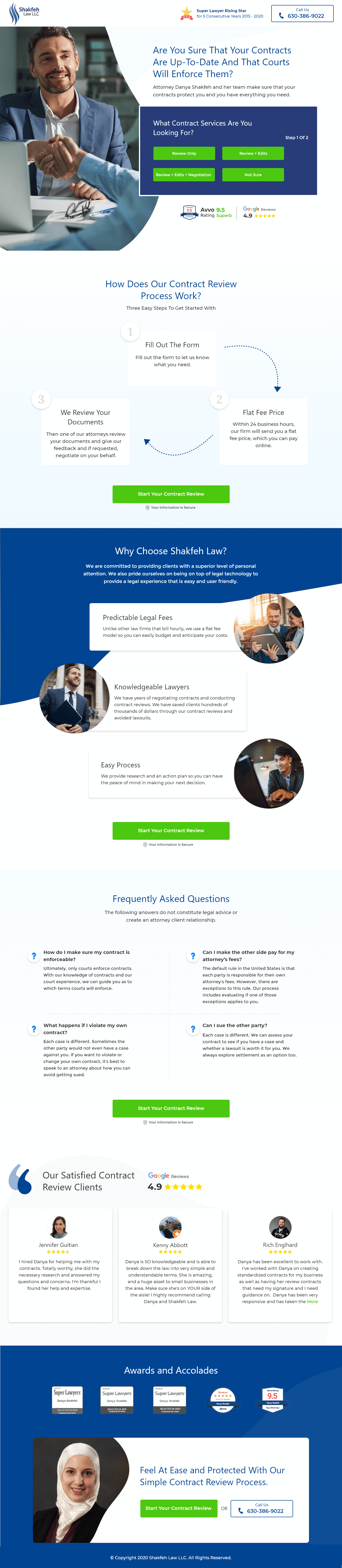
The barrier on the Shakfeh Law page is commitment anxiety: the fear that calling a law firm opens an undefined financial and time commitment. So the page defines the commitment. Numbered process steps show exactly what happens, a multi-step form starts the review, and the call to action says “Start Your Contract Review” rather than “Contact Us”. Attorney Danya Shakfeh’s Google review afterwards: “The team knows exactly what they are doing and the process and communication was very smooth.”
3. SmithLaw: giving the visitor permission to take her claim seriously
Pregnancy discrimination is under-litigated for a psychological reason. Women who have experienced it often minimise what happened. The legal barrier is not awareness. It is permission.
The SmithLaw page opens with an empathy-first hero, puts the attorney’s photograph where the visitor will see it, lists what counts as discrimination as a checklist so the visitor can recognise her own experience, and makes the phone number prominent because this is a conversation people want to have with a person. The free consultation is the ask, and it is repeated without ever becoming pushy. Benjamin Smith, the firm’s head attorney, wrote in his Clutch review that “the system they have in place is meticulously designed to cater efficiently to their clients’ needs.”
4. AMF Elder Law: three answers in one headline
Families searching for an elder law attorney are usually in a stressful situation: a parent needs care, assets are at risk, the Medicaid application is complex and unforgiving. They need to know within seconds that this firm does exactly this.
The AMF Elder Law page answers with one headline: “Qualify for Medicaid. Protect Your Assets. Free Consultation.” Outcome, benefit and the removal of the financial barrier in eight words. A sticky header keeps the consultation request in view, and the rest of the page is clean and short because the visitor has no patience left for reading.
5. Tax Law Advocates: credentials before copy
People searching for IRS tax relief are frightened and, because the sector has enough bad actors, deeply distrustful of anyone offering help. The barrier is not finding the right firm. It is trusting any firm.
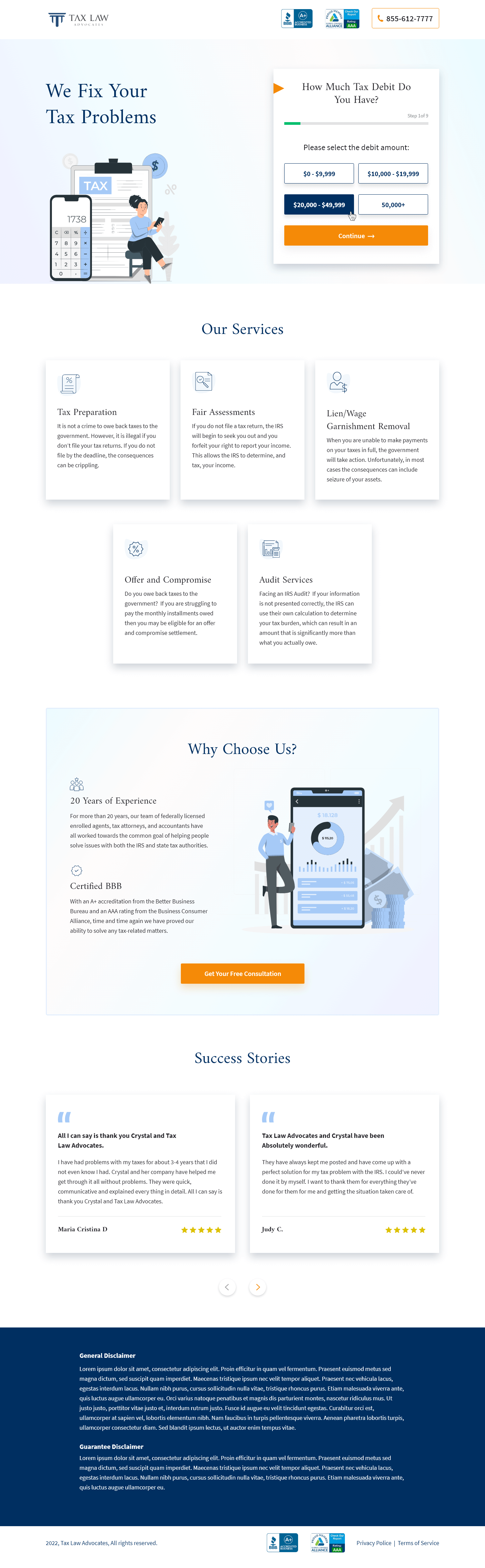
The Tax Law Advocates page puts its BBB A+ and BCA AAA ratings in the header, above the headline, before a single sentence of persuasion. The multi-step form then asks about the tax situation in small, non-threatening steps and ends with a free consultation. It is one of the highest-scoring pages in our gallery because it understood that in this category, credibility has to arrive first.
6. Elite Practice: consulting for a once-in-a-lifetime decision
Elite Practice advises dentists who plan to sell their practice within one to five years and want to maximise the outcome. The visitor is a practice owner in their fifties or sixties with decades of wealth tied up in the business.
The Elite Practice page is long-form and scenario-driven, because the fee has to be justified against what a broker or a direct sale would produce. Dark layout, big typography, testimonials from dentists who have sold, and a single ask: schedule a free call. Nobody buys this on a first visit, and the page does not pretend otherwise.
Legal and advisory pages from the gallery




Recruiting and HR landing page examples
Recruiting pages sell to buyers under pressure from above. A short-staffed sales team is a revenue number that is not being hit, and the person on the page wants to know quickly whether this firm can solve it in their timeline.
7. Shortlist: answering the VP’s question in the first screen
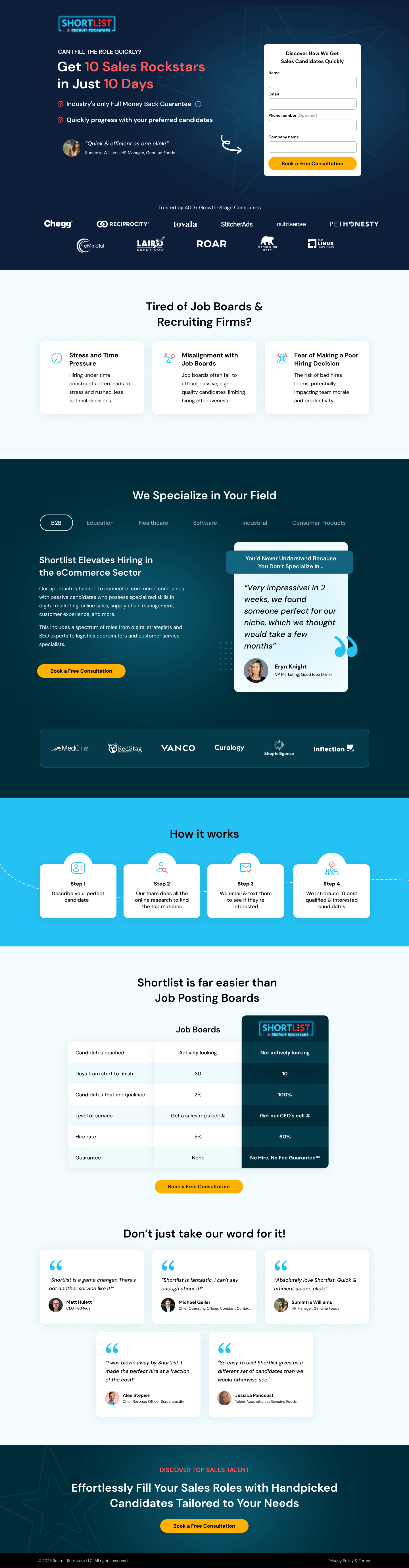
A VP of Sales evaluating recruiting partners is not exploring. They want to know whether the firm can hire sales reps for them, now. The Shortlist page puts the form above the fold, a client logo wall beside it, a comparison table against in-house recruiting below, and a money-back guarantee where the objection about risk would otherwise form. It is the highest-scoring professional services page in our gallery because it never makes the visitor scroll to find out whether they are in the right place.
8. Wagepoint: removing every reason to hesitate
Wagepoint sells payroll to small Canadian businesses. The brief was not “build a landing page”. It was “remove every reason a Canadian small business owner would hesitate”. We found three: uncertainty about Canadian compliance, unfamiliarity with the brand, and the fear that switching payroll mid-year is complicated.
Every element on the Wagepoint page answers one of those three. Compliance is addressed in plain words, recognisable brand logos supply familiarity, and the switching process is laid out step by step. The call to action is a free trial, which is the lowest-commitment ask a software-backed service can make.
9. Riviera: a logo wall for an executive audience
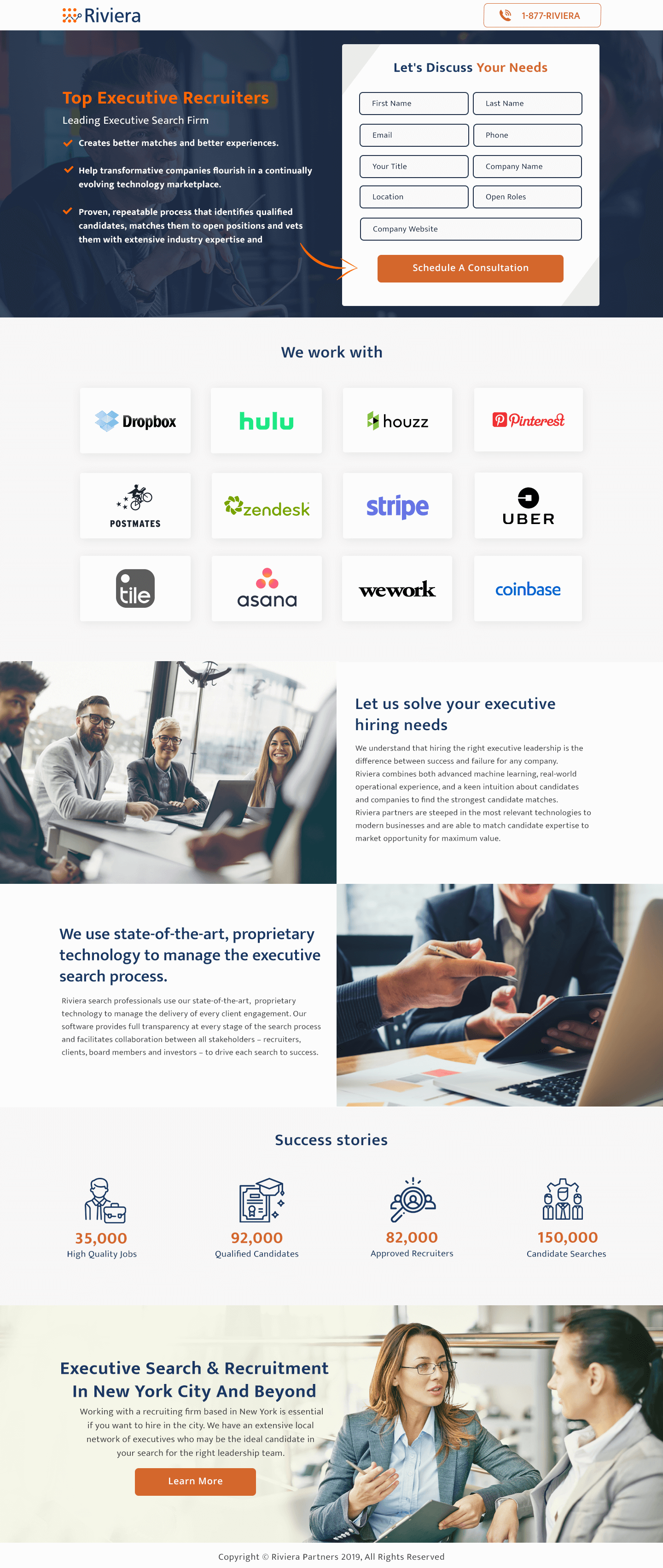
Riviera places C-suite and senior leadership talent at technology and venture-backed companies. At that level the firm is not selling a recruiting service. It is selling access, judgment and a network that took years to build.
The Riviera page shows that positioning rather than stating it. A client logo wall carries most of the argument, success metrics make it concrete, and an inline lead form in a split layout keeps the ask visible without shouting. Executive search is one of the few services where the logo wall can do more work than the headline, and this page lets it.
Consulting and advisory landing page examples
Consulting buyers are experienced, sceptical and have heard every promise before. The pages that work for them lead with evidence and let the visual register match the seniority of the buyer.
10. ROCIMG: evidence over adjectives
ROCIMG is a technology and management consultancy in a market where every firm claims expertise, experience and client focus. The ROCIMG page skips the adjectives and leads with case studies, client names and a testimonial with specific outcomes. Three service cards keep the offer legible, industry sectors show the buyer that the firm has worked in their world, and the ask is deliberately soft, “Discover More About Us”, because a consulting mandate is never won on the first click.
11. Support Revolution: trust for a decision an IT director owns personally
Third-party support for Oracle and SAP has an unusual buyer psychology. The prospect already knows their vendor support costs too much. The question is which third party they trust with the central nervous system of their organisation, because if it goes wrong, the IT director who approved the switch owns the failure.
The Support Revolution page uses a dark, serious layout, video and a slider of proof to answer two questions at once: is this a credible provider, and what happens when something breaks. The call to action, “Tell Us About Your Project”, is a conversation opener rather than a sales trap, which is the right tone for a buyer who needs to be sure.
12. STENN: speed as the whole proposition
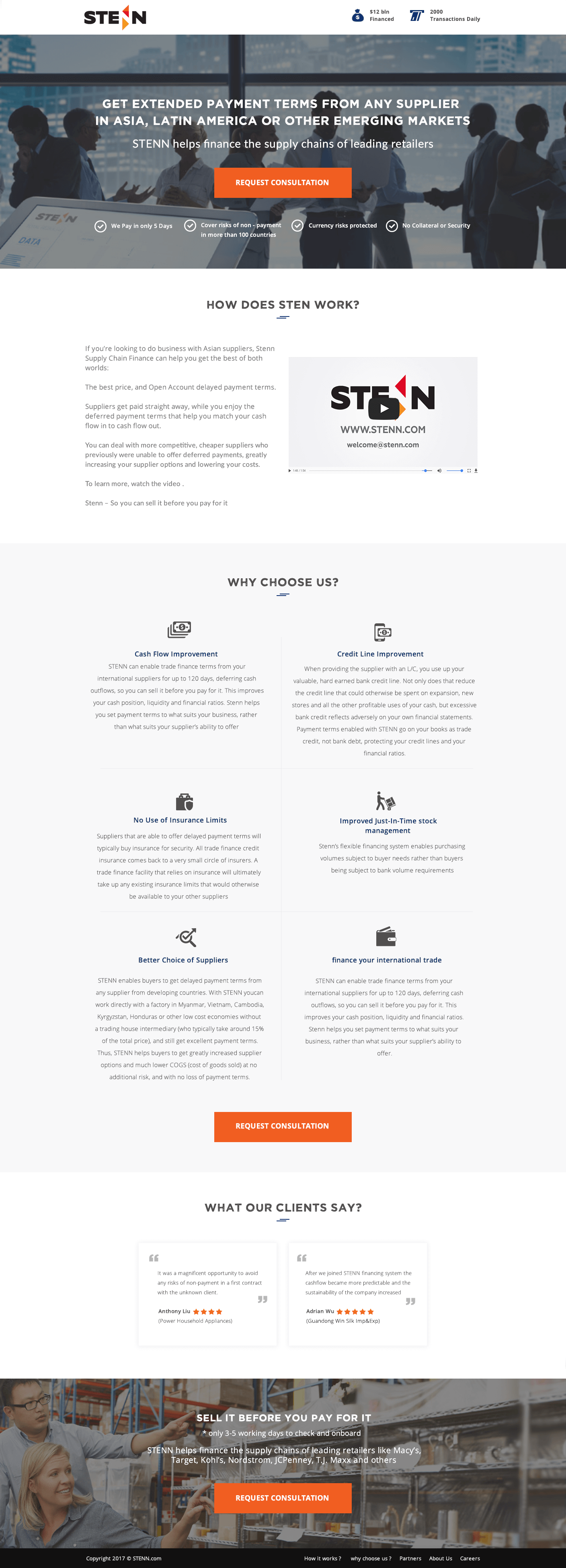
STENN provides trade finance to sophisticated buyers, CFOs and supply chain directors, whose banks either cannot lend in the geographies they operate in or cannot move fast enough. STENN’s claim is “supply chain finance in as little as 24 hours”.
The STENN page builds everything around that claim: dual-benefit cards, a stats bar, a news ticker banner that signals an active, credible operation, a short video explainer for a complex product and a minimal form because a CFO will not fill in twelve fields to request a consultation. In a sector where bank processes take weeks, the page makes speed visible.
Recruiting, consulting and finance pages from the gallery



What these twelve pages have in common
- The commitment is defined before it is asked for. A flat fee, a fifteen-minute call, a free trial, a stated process.
- Credentials arrive before copy. Ratings in the header, logos beside the form, the attorney's face in the hero.
- The proof matches the buyer's problem. Dentists who sold their practice, executors who used the service, CFOs who got funded.
- The tone matches the buyer's state. Calm and plain for grief, dark and technical for enterprise IT, brisk for a VP under pressure.
- Nothing else is on the page. The firm's other practice areas, the team page and the blog are all gone.
The fifth point is the one firms find hardest, and it is also the one that moves the numbers. The result below is from a bottom-of-funnel page we built for a UK renewables installer, a service business selling a high-ticket installation to homeowners who had already spoken to competitors.
Harry Haines at Cahill Renewables described it in his review: “The Apexure team built me a bottom-of-the-funnel landing page that converted above 4%, double the industry average. Likewise, they made the entire process simple by educating me the entire way through.” The page did one thing for one kind of visitor, and that is most of why it worked. You can compare your own rate against sector medians in our conversion rate benchmarks by industry.
If you sell professional services and run paid campaigns
We have written up the specific structures for several of these sectors: professional services landing pages, personal injury lawyer landing pages, legal landing pages and accountant landing pages. For anything else, the landing page design service explains how we research and build a page and what it costs.
Want a page that makes your expertise easy to buy?
Tell us which service you want to promote and where the traffic will come from. We will tell you what the page should say, what proof it needs and what it would cost, before you commit to anything.
See Our Professional Services PagesProfessional services landing page FAQs
What is a professional services landing page?
A professional services landing page is a single page that sells one service from a firm that sells expertise, such as a law firm, an accountancy, a recruiter or a consultancy, and asks for one action, usually a consultation or a call. It differs from the firm's website by removing navigation and every other service, so a visitor from an ad or a search sees one offer and one way to respond.
Why do professional services pages convert lower than ecommerce pages?
Because the visitor is buying a relationship with a stranger, usually at a stressful moment and at a price they cannot see in advance. The barrier is commitment anxiety rather than product doubt. The pages that convert best remove that anxiety with a fixed price, a defined first step such as a free fifteen-minute call, and proof from clients who were in the same position.
Should a law firm landing page show fees?
Where the firm can, yes. Alix's flat-fee probate page and Shakfeh Law's contract review page both convert better than a typical "contact us" law firm page because the visitor knows what the engagement will cost before they call. Where fees vary, state how they work and what the first conversation costs, which is usually nothing.
What proof works on a consulting landing page?
Evidence that the firm has handled the buyer's exact problem: named clients where permitted, case studies with numbers, a client logo wall for enterprise buyers, and a named founder with relevant background. Generic claims of expertise do nothing because every competitor makes them.
Does a professional services firm need a landing page if it already has a website?
If you run paid campaigns, yes. A website asks the visitor to find the right service among many. A landing page matches the ad they clicked, answers the one question they have and gives them one thing to do. That match is why landing pages built for a single campaign consistently convert paid traffic better than a homepage or a services page.
Not sure why your landing page isn't converting?
Send us the URL. We record a short video showing what is costing you conversions and email it back within three working days.
Need a new page built instead? Get a fixed quote.

Waseem founded Apexure in 2015 and has led its work on 3,000+ pages for 300+ clients since. He writes about what the team sees after the click, which is pages, forms, tracking and the systems behind them.