
Step one asks how much you owe, nothing else.
Tax Law Advocates' free consultation page for IRS tax relief, built in Unbounce for people with tax debt and reason to distrust the industry. Why BBB and BCA badges sit in the header, and the outcome counter it lacks.
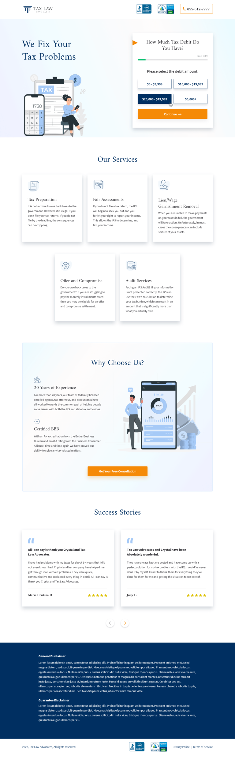
- Primary CTAGet Your Free Consultationthe button the page is built around
- GoalLead Generationwhat counts as a conversion
- PlatformUnbouncelead generation page
- Built forB2CAccounting
- The page as built, not a mockup.Analysed by Apexure, not by Tax Law Advocates.
- Client
- Tax Law AdvocatesAccounting
- Industry
- Accounting2 examples
- Audience
- B2CLead Generation
- Platform
- Unbounce132 examples
- Page type
- Lead generationLead Generation
- Analysed by
- Waseem BashirMarch 2026
What the page does, and why
Why we built this IRS tax relief lead generation
People searching for IRS tax relief are in a state of financial anxiety. They owe money they may not be able to pay, they’ve received threatening letters, and they are worried about what happens next. The conversion barrier on a tax relief page is not “finding the right firm”. It is “trusting any firm at all.” The tax relief industry has enough bad actors that a legitimate firm must work harder to establish credibility than almost any other financial service category.
Tax Law Advocates needed a page that addressed the IRS-specific fear while immediately establishing their credentials as a regulated, long-established practice. The BBB A+ and BCA AAA ratings at the top of the header are not decorative. They are the primary conversion mechanism for a category where trust is the only thing that moves the visitor from scepticism to action.
The second challenge was qualification. A firm that handles $0–$9,999 debts runs a very different operation from one specialising in $50,000+ cases. The multi-step form opening with a debt-range selector gives Tax Law Advocates immediate insight into each prospect’s situation while making the first step feel manageable rather than invasive.
Design decisions
The form opens with a visual debt-range selector: not text fields
Step 1 of the form card asks “How Much Tax Debit Do You Have?” with six button options: $0–$9,999, $10,000–$19,999, $20,000–$49,999, $50,000+. The “Continue” button is orange on white. No name, no email, no phone on step one. This framing treats the visitor as a person describing their situation, not an applicant completing a form. The Zeigarnik effect means that clicking a debt range creates psychological investment in completing the next steps.
The hero layout is split: headline and illustration left, form right
The headline “We Fix Your Tax Problems” on the left is surrounded by a clean light background, no threatening imagery, no IRS logos, no red warnings. The illustration shows a calm figure reviewing documents. This deliberate tonal choice counters the anxiety the visitor arrived with. We want them relaxed enough to engage, not further alarmed.
The BBB A+: BCA, and phone number in the header provide instant credibility before the hero
The header carries three trust elements: BBB A+ badge, AAA Business Consumer Alliance rating, and a prominent “855-612-7777” phone number. This header is visible before any page content. A visitor who has been scammed by a previous tax relief company will check these credentials immediately. The phone number matters too, IRS debt clients often need to speak to someone before they’ll submit a form.
The services section uses paired icons on clean white cards without pricing
Six services (Tax Preparation, Fair Assessments, Lien/Wage Garnishment Removal, Offer and Compromise, Audit Services) are each described with consequences-first copy. Rather than “we offer lien removal services,” the copy describes what a lien means and why someone would need removal. Problem-description before service description keeps the visitor in the context of their specific situation, not in the context of reading a menu.
The “why choose us?” section leads with “20 years of experience” and “certified BBB.”
These two credentials answer the two most common objections in tax relief: “Are you legitimate?” and “Will you still be there when my case takes 18 months?” Both are positioned as visual checkmarks with supporting explanation rather than bare claims.
The "Get Your Free Consultation" CTA in the Why Choose Us section is placed at the natural resolution point of the anxiety arc. By this point the visitor has selected their debt range, read the services, and absorbed the credentials. The consultation CTA is the logical next step, not a cold ask but a completion of the evaluation journey the page was designed to walk them through.
Trust architecture
Layer 1: Regulatory badges above all content
BBB A+ and BCA AAA in the header signal external validation before the visitor engages with any content. For a category riddled with scams. These are categorical separators, they place Tax Law Advocates in a different bucket from unregulated operations. The phone number at header level adds an accessibility layer that signals a real, staffed business.
Layer 2: Consequence-aware service descriptions
Each service description names the IRS mechanism it resolves. “When you are unable to make payments on your taxes in full, the government will take action. In most cases the consequences can include seizure of your assets.” This is not scaremongering. It is accurate information that helps the visitor understand why they need the service. Accurate consequence framing keeps the visitor’s problem visible throughout the page rather than letting anxiety recede as they read about services.
Layer 3: Free consultation near the form CTA
“Free Consultation” is the de-risked first step. In a category where legitimate firms and scams look similar, offering a free consultation before any fee is discussed reduces the primary commitment barrier. Visitors who have been burned before understand that a free conversation costs nothing; they only become a paying client if they choose to. That framing directly addresses the category’s trust deficit.

"On tax relief pages, we've found that describing the IRS enforcement process in plain language, not legalese, not euphemisms, is the single most effective conversion technique after the trust badges. Visitors who understand exactly what a wage garnishment or tax lien means have a clearer sense of urgency. They're not scared off by the information. They're motivated by it."
What we would test today
1. Add a client outcome counter above the form
“We’ve resolved over $X million in IRS debt” is a quantified social proof element that the page currently lacks. A running total, even a conservative, verified figure, would answer the implicit question “have you actually solved this problem for people like me?” before the visitor enters the multi-step form. High impact, requires sourcing a verifiable number from the client.
2. Test a testimonial adjacent to the debt range selector
The form card is currently clean and unadorned. Adding a single testimonial from someone who selected a similar debt range, “I owed $38,000 and thought I had no options. They resolved it with an Offer in Compromise in 11 months.”, immediately below the selector would give the visitor peer validation at the highest-anxiety moment of the interaction. Medium placement change, potentially high conversion impact.
3. Add a “What happens after your consultation” section
The page describes services but doesn’t walk the visitor through what the tax relief process actually looks like after they call. A simple timeline, “1. Free consultation. 2. IRS account review. 3. Strategy recommendation. 4. We negotiate on your behalf.”, reduces the unknown-process anxiety that stops already-convinced visitors from submitting. Many tax relief leads drop off at the submission stage because they don’t know what they’re committing to.
Browse our full collection of landing page examples to see how we approach financial and legal services pages across verticals.
Waseem founded Apexure in 2015 and has led its work on 3,000+ pages for 300+ clients since. He writes about what the team sees after the click, which is pages, forms, tracking and the systems behind them.
What the page leans on
The principles at work on this page, each named in the analysis above.
Loss aversion
People feel losses more strongly than gains. Framing around what they will miss motivates action.
Authority bias
People trust credible experts. Certifications, awards, media mentions, and expert endorsements boost credibility.
Cognitive load reduction
Simpler pages convert better. Reducing visual noise, breaking forms into steps, and clear copy lower mental effort.
Commitment consistency
This principle influences visitor behaviour and supports the page's conversion goal.
What people ask about pages like this
People with IRS tax debt are not browsing for information, they are looking for a way out of a problem they find deeply stressful. A service description at the hero would make them read. A debt amount selector at the hero makes them act. The selector also functions as segmentation: someone selecting '$50,000+' gets routed to a different follow-up process than someone selecting '$0–$9,999'. Multi-step forms that start with a preference or situation question rather than contact information tend to outperform contact-first forms on high-anxiety financial service pages by 30–50%.
People with IRS tax problems are extremely vulnerable to predatory services. The tax relief industry has a documented history of scams, firms that take large upfront fees and disappear. The BBB A+ and BCA AAA ratings in the header address this fear directly and immediately. These are third-party regulated ratings that cannot be faked. For a visitor who has already been burned by one tax relief company, or who has read about others being burned, seeing these credentials at the top of the page is the difference between staying and bouncing. They signal: this company has been independently evaluated.
Tax debt clients are not looking for a popular service, they're looking for a proven one. '20 Years of Experience' means the firm has moved through multiple IRS policy changes, economic recessions, and the full range of tax debt situations. A star rating tells them other clients were satisfied; 20 years of operational history tells them the firm won't disappear with their retainer. For a category where the service can take 12–18 months to resolve and requires ongoing communication with the IRS, longevity is a more relevant credential than popularity.
Tax relief pages that lead with 'we can fix your tax problem' have a conversion problem: the visitor doesn't feel urgency. Describing the consequences of inaction, 'The government will begin to seek you out and you will begin to face issues', activates loss aversion, which is a stronger motivator than the prospect of gain. The services section lists Tax Preparation, Fair Assessments, Lien/Wage Garnishment Removal, Offer and Compromise, and Audit Services. Each service description names a specific consequence it resolves. This pain-before-solution sequencing is standard in high-conversion financial relief pages.
Three more, taken apart the same way



Want one like this?
Tell us what the page has to do and where the traffic comes from. Within 48 hours you get a written quote from the people who wrote this breakdown. Already have a page that is not converting? Send it for a free audit instead.
UK hours, which is the East Coast morning.
"Tax relief pages are among the most psychologically loaded we design. The visitor is stressed, potentially embarrassed, and has usually been sitting on this problem for months. The page has to communicate safety before anything else, not capability, not pricing, not process. Safety: you're not going to be judged here, and we've helped thousands of people in exactly your situation."