
Ten reps in ten days, or your money back.
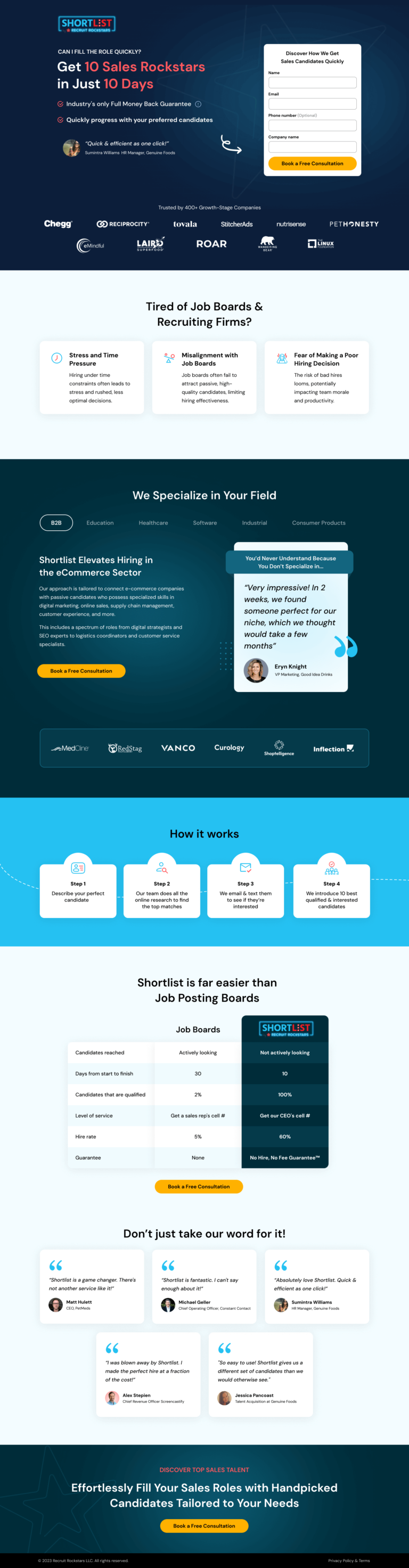
Shortlist's sales recruiting page for sales leaders, built on Unbounce with the form above the fold. Covers the industry proof tabs, the job board comparison, the named testimonials and the calculator we would test.
- Primary CTABook a Free Consultationthe button the page is built around
- GoalLead Generationwhat counts as a conversion
- PlatformUnbouncelead generation page
- Built forB2BRecruiting
- The page as built, not a mockup.Analysed by Apexure, not by Shortlist.
- Client
- ShortlistRecruiting
- Industry
- Recruiting4 examples
- Audience
- B2BLead Generation
- Platform
- Unbounce132 examples
- Page type
- Lead generationLead Generation
- Analysed by
- Waseem BashirMarch 2026
What the page does, and why
Why we built this recruiting lead generation
Sales recruiting is one of the most pressure-laden B2B buying decisions that exists. A sales team that’s short-staffed is a revenue number that’s not hitting. The person looking for a recruiting solution is almost certainly already under pressure from above, the CEO wants pipeline, the board wants growth, and there’s a hiring backlog creating a real business problem right now.
That urgency is both the opportunity and the design constraint. A VP of Sales evaluating recruiting partners isn’t in exploratory mode. They want to know quickly whether this service can solve their specific problem in their specific timeline. If the page doesn’t answer “can you actually help me hire sales reps in the next 30 days” in the first screen. They’re gone.
The secondary challenge was differentiation in a crowded market. Job boards, staffing agencies, direct sourcers, the VP of Sales has seen all of them, and most of them have failed to deliver at some point. Shortlist’s genuine differentiator was their passive candidate methodology: they don’t post jobs, they research and approach candidates who aren’t actively looking. That approach produces higher-quality hires at faster timelines than reactive job posting. The page needed to make that distinction visceral, not just claim it.
Design decisions
The form sits above the fold on the right side of the hero
For a B2B page targeting an audience under time pressure, asking for an email and phone number immediately isn’t too aggressive. It’s respecting their time. A VP of Sales who wants to hire in 10 days doesn’t want to scroll through six sections before they can talk to someone. The above-fold form placement is matched with minimum fields: Name, Email, Phone, Company Name. That’s enough to qualify the lead without creating friction that would reduce completion rate.
The industry vertical tab system
B2B (Education, Healthcare, Software, Industrial, Consumer Products) is one of the highest-converting elements on the page. It solves a fundamental B2B landing page problem: different visitors need to see different proof. Instead of showing generic testimonials, the tab system shows industry-matched case studies with company logos. A healthcare SaaS company seeing “Shortlist found us our Head of Sales at Curology in 9 days” converts at a completely different rate than a healthcare company reading generic recruiting copy. The tab defaults to B2B but switches contextually, visitors self-select their industry and receive targeted proof.
The “Tired of Job Boards?” pain articulation section
sits at the transition point between hero and mid-page. This section names three specific frustrations with existing alternatives: time pressure leading to bad hires, job boards producing unqualified applicants, and the cost of a wrong hire. We wrote this section in the second person, “you” language, because the visitor needs to see their specific frustration named to feel understood. Visitors who feel understood are more likely to keep reading. This is Peep Laja’s “jobs-to-be-done” framework applied to copy: don’t describe your service, describe the problem it solves.
The comparison table against “Job Boards”
uses specific metrics in every row. Shortlist: 10 days to fill. Job Boards: 30 days. Shortlist: 100% qualified candidates. Job Boards: 2%. Shortlist: 60% hire rate. Job Boards: 5%. Shortlist: No Hire, No Fee. Job Boards: None. This table does what no testimonial can do. It makes the ROI case quantitatively. A VP of Sales reading this table can calculate the cost difference of a 10-day vs 30-day hire cycle in terms of missed quota and conclude the fee is justified before they’ve even talked to anyone.
The money-back guarantee badge
appears in the hero headline area, not at the bottom with terms and conditions. “Industry’s Only Full Money-Back Guarantee” as a headline-level element removes the primary objection to trying a new recruiting partner: “what if it doesn’t work?” By answering that objection before it’s asked, we eliminated the single most common reason visitors don’t convert on this type of page.
Trust architecture
Layer 1: Instant credibility
The client logos in the hero (Chegg, Reciprocity, Tovalia, Stitcherads, Nutrisense, PetHonesty, Inflection) are all recognisable growth-stage companies that a VP of Sales at a similar company would know or at least recognise as legitimate peers. The social proof transfer here is peer-to-peer: “if companies I respect use Shortlist. It’s worth my time.” We chose logos from multiple industries to match the vertical tab system and show breadth.
Layer 2: Specific outcome evidence
The six testimonials mid-page are each attributed to a named person with a real title at a real company. No anonymous quotes. “Matt Hulatt, CEO, PetLet” and “Michael Geller, Chief Operating Officer, Connect Control” are real people with real companies that can be looked up. That verifiability makes the testimonials carry weight, the visitor knows they’re real because they could be verified.
Layer 3: Guarantee and reputation
The footer section repeats the “No Hire, No Fee Guarantee” and shows the Shortlist logo badge, closing the trust loop that the hero opened. Visitors who read to the bottom are self-selected engaged prospects; the guarantee reminder at that point functions as a final push that removes the residual “what if it fails” objection.

"The vertical tab system on this page is solving a problem most recruiting pages ignore: the hiring manager at a software company and the hiring manager at a healthcare company have different proof requirements. Showing both the same generic testimonials satisfies neither. The tab system means every visitor sees proof that shows their specific context. We've tested industry-matched proof against generic proof on three similar pages, and industry-matched wins by 25-40% every time."
What we would test today
Since this build, our research on B2B recruiting and talent pages points to three specific improvements:
Test 1: A time-stamp on the “10 days” promise
The current page states 10 days as a flat claim. A version that says “Average time to first qualified candidate: 7.4 days”, with a specific decimal figure, would be more believable because it reads as measured data, not marketing copy. Round numbers feel like approximations. Specific numbers feel like records. High impact because it makes the central claim more credible to the sceptical B2B buyer.
Test 2: Video case study replacing the testimonial carousel
A 60-second video of a VP of Sales from one of the logo companies describing a specific hire outcome, “we needed a Head of Enterprise Sales in 12 days, Shortlist delivered in 8”, would outperform any written testimonial at that scroll position. Video proof is harder to fabricate, feels more immediate, and is watched by exactly the engaged prospects who would convert anyway. Medium-high impact.
Test 3: ROI calculator in the mid-page
A simple calculator where the visitor enters their average sales rep quota, current time-to-hire, and ramp time could generate a personalised “cost of vacancy” figure. If the calculator shows “your current 30-day hiring process is costing you $120,000 in missed quota” and then shows “Shortlist’s 10-day process reduces that by $80,000,” the conversion math becomes undeniable. High potential impact for this specific audience because sales leaders think in revenue terms, not fee terms.
"The 'How It Works' four-step process near the bottom of the page is positioned there deliberately. Visitors who reach step descriptions have already decided they're interested. They're now doing due diligence. Putting the process steps at the top would slow down visitors who just want to know if you can help them. Sequencing content by where the visitor is in their decision, not where you want them to be, is one of the most consistent conversion improvements we make on B2B service pages."
Need a B2B lead generation page that filters for high-intent prospects and closes the conversion loop? Talk to our team.
Waseem founded Apexure in 2015 and has led its work on 3,000+ pages for 300+ clients since. He writes about what the team sees after the click, which is pages, forms, tracking and the systems behind them.
What the page leans on
The principles at work on this page, each named in the analysis above.
Authority bias
People trust credible experts. Certifications, awards, media mentions, and expert endorsements boost credibility.
Social proof
People follow the actions of others. Testimonials, reviews, and client logos build trust and reduce hesitation.
Anchoring effect
The first piece of information shapes all subsequent judgements. Price comparisons and headline stats set expectations.
Loss aversion
People feel losses more strongly than gains. Framing around what they will miss motivates action.
Paradox of choice
This principle influences visitor behaviour and supports the page's conversion goal.
What people ask about pages like this
Job boards attract active candidates. A recruiting agency landing page targets the buyer, the hiring manager or VP of Sales who needs candidates they can't find through job posts. That buyer has a different set of concerns: speed to qualified candidate, candidate quality (not just quantity), and what happens if the hire doesn't work out. The page needs to address those concerns in the B2B buyer's language, ROI, time-to-hire, and risk reduction, not the candidate experience language job boards use.
Sales leaders under pressure to hit quota don't have patience for vague recruitment promises. '10 days to 10 Sales Rockstars' is a specific, testable claim with a clear payoff. Specificity in a headline does two things: it filters for the right prospect (someone who urgently needs sales talent) and it signals confidence in delivery. Vague claims like 'we find great candidates fast' require the visitor to do mental work. '10 days' does the work for them. The money-back guarantee then removes the risk that the specific promise creates.
Recruiters are selected through comparison. Every hiring manager evaluating Shortlist has also looked at job boards and staffing agencies. Rather than ignoring those comparisons, the page makes the comparison explicit and controls the frame. The table shows the exact metrics that matter to a sales leader: days to hire, candidate qualification rate, and guarantee terms. When Shortlist shows '10 days vs 30 days' and '100% qualified vs 2%', those aren't abstract claims, they're the specific numbers the buyer uses in their internal evaluation.
Early-stage companies (Series A-B) care most about speed and cost, they need to hire fast and can't afford a months-long process. Growth-stage companies care more about candidate quality and retention, a bad hire at scale costs far more than agency fees. The Shortlist page handles this through its vertical tabs system, showing industry-specific case studies for each growth stage. A VP of Sales at a healthcare SaaS company sees their specific situation showed, not a generic recruiting promise.
Three more, taken apart the same way
Want one like this?
Tell us what the page has to do and where the traffic comes from. Within 48 hours you get a written quote from the people who wrote this breakdown. Already have a page that is not converting? Send it for a free audit instead.
UK hours, which is the East Coast morning.
"'Get 10 Sales Rockstars in Just 10 Days' is doing several things at once. The word 'Rockstars' filters for a specific type of buyer, someone who thinks about their sales team in terms of talent quality, not headcount. The 10-day timeframe creates a concrete benchmark against which every alternative is evaluated. And putting both in the headline means the visitor is already thinking 'could they actually deliver this?' rather than 'what do they do?' That's the right question to trigger."