CRO breakdown of BrightR's Canadian Employer of Record lead generation page built in Unbounce. Expert conversion analysis by Apexure.
What is ConvertScore™? ConvertScore™ is Apexure's proprietary landing page performance metric. We evaluate every page across four dimensions — Copy & Messaging, Layout & Hierarchy, Trust & Social Proof, and CTA & Conversion Path — to produce a single score out of 100.
Hiring internationally sounds straightforward until you try it. Work permits, payroll registration, local employment law, benefits compliance, each jurisdiction adds layers that most companies aren’t equipped to handle alone. BrightR’s landing page targets exactly this moment of realisation: the company that wants to hire in Canada but doesn’t want the complexity of setting up a legal entity to do it.
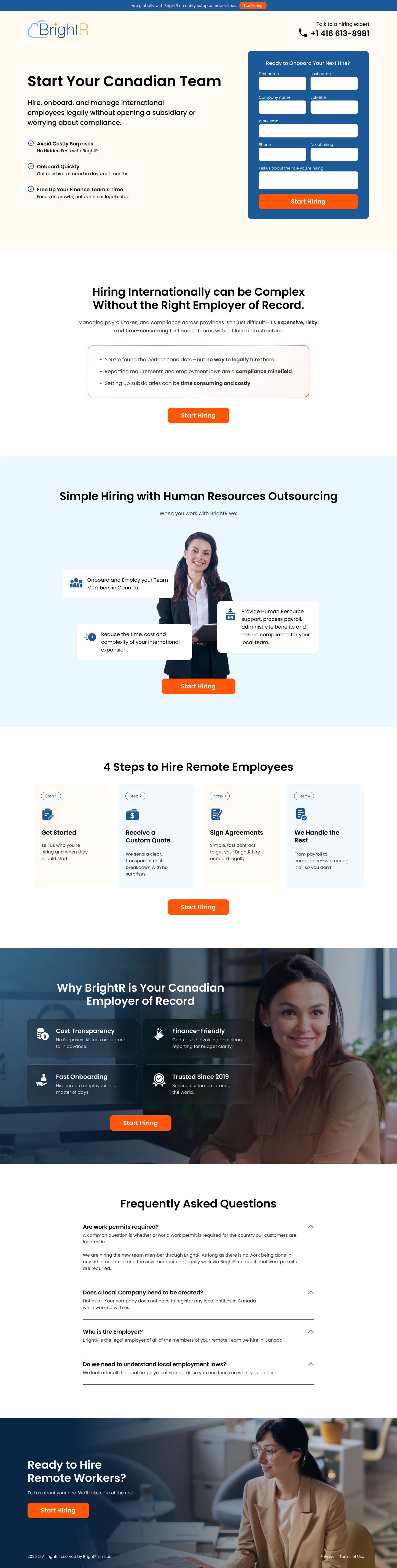
The hero headline, “Start Your Canadian Team”, is precise in a way that generic recruiting agency pages aren’t. It names the goal (a Canadian team) without the legal overhead (a subsidiary). The three checklist items below the headline spell out the value proposition in plain language: Avoid Costly Surprises, Onboard Quickly, Free Up Your Finance Team’s Time. These aren’t feature descriptions, they’re outcome promises addressed directly to the people who feel those pain points.
The mid-page positioning statement sharpens this further: “Hiring Internationally can be Complex Without the Right Employer of Record.” That single sentence validates the visitor’s experience without being condescending about it, and positions BrightR as the solution before any feature is mentioned.
The inline form sits above the fold on the right side of the hero, opposite the headline and bullet points. Fields are minimal, first name, last name, email, company, phone, with a single “Start Hiring” CTA. This is the right form length for a B2B service at this price point: enough to qualify the lead, not so much that it creates friction. The orange button colour creates clear contrast against the white background without visually dominating the page.
Below the main headline, three checkmarked benefit statements anchor the hero’s persuasive case. Each addresses a distinct buyer concern: financial (avoid costly surprises), operational (onboard quickly), and strategic (free up the finance team). The checklist format allows fast scanning, a visitor who sees only the bullets and the form has still captured the core value proposition.
One of the most effective sections on the page is the four-step hiring process: Get Started, Receive a Custom Quote, Sign Agreements, We Handle the Rest. This sequential clarity is psychologically important for a compliance service. It removes the ambiguity of “what actually happens”, the buyer’s biggest anxiety about switching to an EOR model, and turns an unfamiliar process into something predictable and manageable.
The mid-page “Why BrightR Is Your Canadian Employer of Record” section uses four credibility icons: Cost Transparency, Finance-Friendly, Fast Onboarding, and Trusted Since 2019. “Trusted Since 2019” is doing specific work here, it transforms the company’s age into a social proof signal rather than just a founding date. For a compliance-heavy service, tenure matters.
The FAQ accordion near the bottom, featuring questions like "Are work permits required?", "Does a local company need to be created?", and "Who is the Employer?", is handling the precise objections that slow B2B decisions down. Each answer is written to move the conversation forward, not just answer academically. That's a meaningful distinction.
Displaying “+1 416 613-8981” with “Talk to a hiring expert” copy in the header accomplishes something a form alone cannot: it signals that humans are available. For buyers making a compliance decision, knowing there’s a phone line reduces perceived risk before they’ve read a single line of body copy.
The 4-step process section transforms an opaque service into a visible journey. Buyers don’t fear things they understand. By mapping the full arc from “Get Started” to “We Handle the Rest,” the page removes the hesitation that comes from not knowing what you’re signing up for.
The FAQ addresses the four most common legal questions a company asks when considering an EOR: work permits, entity creation, the identity of the legal employer, and local employment law. Answering these in writing, before a sales call, means prospects arrive with their core objections already resolved. That shortens sales cycles and improves close rates.

"For high-value B2B services, the FAQ isn't an afterthought. It's a sales tool. Every question answered on the page is a question the sales team doesn't have to answer on the discovery call. And a buyer who arrives having already read 'Do we need to understand local employment laws?' and gotten a clear 'no' is a much warmer prospect."
The page runs two CTAs in parallel throughout: the above-the-fold form and the phone number in the header. The “Start Hiring” button appears three times, in the hero form, after the HR outsourcing feature grid, and in the closing “Ready to Hire Remote Workers?” banner. This repetition is calculated: B2B visitors don’t all convert at the same point, and each CTA appearance catches a different decision moment without the page feeling repetitive.
The closing banner, dark background, photo of a professional at a laptop, “Start Hiring” button, acts as a catch-all for visitors who scrolled the whole page before committing. Structurally, it mirrors the hero but in a reduced format, which works because by this point the visitor has absorbed the full case and doesn’t need to re-read it.
The form asks for company name alongside contact details, a small addition that serves a strategic purpose. It lets the BrightR team personalise follow-up and research the prospect before the call. That personalisation signals professionalism and preparation, which increases the likelihood of converting the meeting into a client.
The page currently relies on the “Trusted Since 2019” badge and general credibility language. A row of recognisable company names, even mid-size businesses, would provide the social proof signal that the target audience (international companies evaluating vendors) finds most persuasive. Peer validation from recognisable names shortens B2B sales cycles.
“Start Your Canadian Team” is clean but broad. Testing a version that speaks to the specific anxiety, something like “Hire in Canada Without Opening a Subsidiary” or “Onboard Canadian Employees in 3 Days, No Entity Required”, would likely improve qualified lead volume by filtering for exactly the buyer who needs what BrightR offers.
The page promises “Onboard Quickly” but doesn’t quantify it. A specific number, “onboard your first employee in 72 hours”, creates a concrete competitive differentiator. In a market where other EOR providers take weeks to set up payroll and benefits, a named speed claim is powerful.
BrightR scores 83 because the page structures a genuinely complex B2B service into a clear, scannable journey, from problem identification through a step-by-step process to FAQ objection handling. The above-the-fold form, phone number visibility, and multiple “Start Hiring” CTAs cover the main conversion mechanics well. The score sits just under mid-85s because there’s no client social proof (logos or testimonials), the hero headline could be sharpened to target the specific intent, and no specific metrics are given for the onboarding speed claim. These are each testable in isolation and would likely move the score into the high 80s.
Browse more recruiting and HR examples in our landing page examples gallery. For related reading, see our guide to B2B Landing Page Examples.
People trust credible experts. Certifications, awards, media mentions, and expert endorsements boost credibility.
Simpler pages convert better. Reducing visual noise, breaking forms into steps, and clear copy lower mental effort.
People feel losses more strongly than gains. Framing around what they will miss motivates action.
People follow the actions of others. Testimonials, reviews, and client logos build trust and reduce hesitation.
This principle influences visitor behaviour and supports the page's conversion goal.
B2B hiring service pages need to lead with the problem they solve, not the product they sell. International companies searching for an Employer of Record aren't looking for a features list, they're looking for someone who understands the compliance, payroll, and legal complexity they're trying to avoid. The page should open by naming that complexity, then position the service as the shortcut around it. Specific numbers (e.g., 'onboard in 3 days' or 'trusted since 2019') carry more weight than general claims about speed and expertise.
Employer of Record services are highly considered B2B purchases, but the query intent when someone searches for 'Canadian EOR' or 'how to hire in Canada without a subsidiary' is often urgent. A hiring manager who's just been told to onboard a Canadian contractor in two weeks is in problem-solving mode. An above-the-fold form that offers a custom quote meets that urgency without forcing them to read the entire page first. It also qualifies the lead immediately, someone who fills in a quote form is far higher intent than someone who just scrolled.
Compliance-heavy services have an unusual conversion active, the complexity of what you're helping buyers avoid is also the complexity that overwhelms them. The structure should mirror how a trusted advisor would explain the service: here's the problem, here's why it's harder than it looks, here's exactly what we do, here's how we do it step by step, here are the questions others asked. The four-step process section and FAQ accordion on this page follow that logic, they de-mystify the service without understating its value.
For high-value B2B services, yes. A visible phone number in the header communicates that real people are available, which matters more for compliance and legal services than it does for consumer products. It also serves a specific type of buyer: the executive who would rather speak to someone than fill in a form. Displaying the number prominently ('Talk to a hiring expert: +1 416 613-8981') rather than hiding it in the footer gives this buyer a clear path without disrupting the primary form-based conversion flow.
Other CRO breakdowns from our lookbook
We design high-converting landing pages for B2B and B2C brands. Let's talk about yours.
Get a Free Consultation Or browse more examples →
Founder & CEO of Apexure, Waseem worked in London's Financial Industry. He has worked on trading floors in BNP Paribas and Trafigura, developing complex business systems. Waseem loves working with Startups and combines data and design to create improved User Experiences.
Get quality posts covering insights into Conversion Rate Optimisation, Landing Pages and great design
"When the service you're selling is essentially risk removal, the page has to make the risk feel real before it offers the solution. BrightR's page does this well, naming compliance headaches, legal exposure, and time cost before introducing the EOR model. Without that problem setup, the solution doesn't feel necessary."