CRO breakdown of RecruitTalent's B2B recruiting lead gen page. Expert analysis of service cards, testimonials, and conversion architecture by Apexure.
What is ConvertScore™? ConvertScore™ is Apexure's proprietary landing page performance metric. We evaluate every page across four dimensions — Copy & Messaging, Layout & Hierarchy, Trust & Social Proof, and CTA & Conversion Path — to produce a single score out of 100.
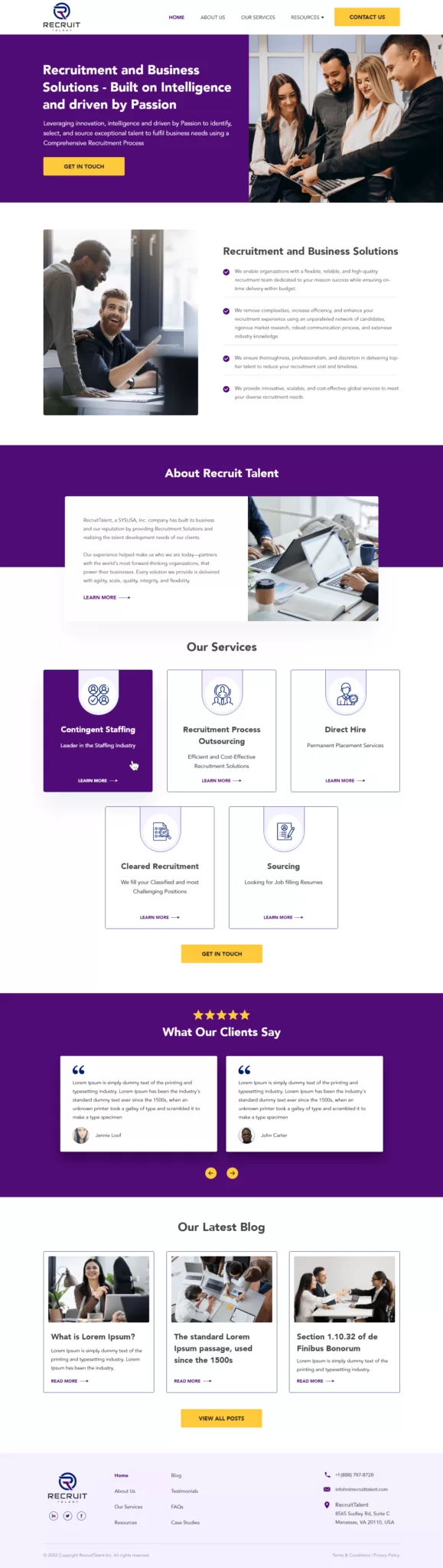
RecruitTalent needed a lead generation page that could do what a website homepage can’t: persuade a single audience to take a single action. In recruiting, that audience is usually a VP of HR or Operations who has been burned by a previous hire and is evaluating multiple agencies in parallel. Every decision on this page was made with that visitor in mind.
Purple carries deliberate psychological weight. It signals expertise and premium positioning and is widely used in professional services because it reads as authoritative without being as cold as navy or as aggressive as red. The gold CTA button creates sharp contrast against both the purple sections and the white background, which keeps it the most visually prominent element on screen.
The 3-on-top, 2-on-bottom grid is an intentional layout choice. Strict symmetrical grids feel bureaucratic and safe. The offset arrangement creates movement and signals a active, modern operation. Each card has a consistent structure (icon, title, one-line description, “Learn More” link), so visitors can scan all five in seconds.
Text sits on the left, an aspirational workplace image on the right. The pairing communicates credibility through proximity. Claims about being partners with forward-thinking organisations sit next to a visual of exactly that kind of modern, collaborative workspace.
The single mid-page CTA ("Get In Touch" in gold) appears after the service cards and before the testimonials. The placement is deliberate. Visitors who've understood the service range but haven't yet seen proof are caught at the moment of peak curiosity, before doubt has a chance to set in.
The testimonials use placeholder text in this portfolio screenshot, but the layout (circular avatar photos with names beneath paired quotes) is the right structure. In production, the strongest testimonial should lead with a specific outcome, not a generic compliment. “They filled our three senior engineering roles in under six weeks” beats “Great service, highly recommend” every time.
The page layers trust across three distinct zones. At the top, the headline’s language (“intelligence,” “passion,” “full recruitment process”) signals a methodology rather than a spray-and-pray approach. In the middle, the service grid communicates capability breadth. At the bottom, the testimonials provide peer validation from clients who’ve already made the decision the visitor is now considering.

"The biggest trust gap in B2B services is between 'we seem credible' and 'they've done this exact thing for someone like me.' Testimonials from recognisable company names or specific roles (Director of HR at a 500-person tech firm, for example) close that gap faster than any copy."
Read more about building trust signals into landing pages in our guide to B2B Landing Page Examples.
The 'Latest Blog' section at the bottom of the page serves a dual purpose: it gives visitors who aren't ready to convert something useful to engage with, and it positions RecruitTalent as a thought leader rather than just a vendor. This matters enormously in recruiting where the buyer is evaluating whether the firm truly understands their market.
The page uses a single CTA, “Get In Touch,” placed at two moments. Above the fold for ready buyers, and after the service grid for visitors who needed to understand the scope before committing to outreach. There’s no form on the page itself. Clicking the CTA takes visitors to a contact page where qualification happens. That reduces the perceived friction on the landing page while still capturing intent.
"Some pages convert better with the form on-page. Others, especially professional services where the average deal value is high, convert better by separating the discovery of value from the act of giving information. Testing both versions on the same traffic is the only way to know which works for your specific audience."
The service card grid collapses from a 3+2 layout to a single-column stack on mobile, which gives each card full-width attention. The CTA button hits 48px minimum touch target, and the testimonial carousel works with swipe gestures rather than requiring precise tap targets.
Jekyll was chosen for this project because it builds to static HTML. No database queries, no server-side rendering delays at load time. For a B2B lead gen page where page speed directly affects Quality Score in Google Ads. That's a meaningful performance advantage.
Looking at this page through a current CRO lens, three changes would move the needle.
The hero subheadline “Using innovation, intelligence and drive by Passion” is aspirational but vague. Replacing it with a specific proof point (something like “Placing 1,200+ professionals annually across the US”) would anchor perceived capability before the scroll begins.
A visible phone number in the nav: B2B buyers who are ready to talk now shouldn’t have to hunt for contact information. A click-to-call number in the header removes that friction entirely.
Testimonial specificity: replace the placeholder text with real client quotes that name the specific service used and the measurable outcome delivered.
This page scores 72 out of 100. The visual design is clean, the service architecture is clear, and the brand identity is cohesive. What holds it back from a higher score is the absence of specific proof metrics above the fold, placeholder testimonial content in the portfolio version, and no visible trust badge or accreditation near the primary CTA. These are fixable without a redesign; they’re content and layout adjustments that a focused CRO sprint would address.
Browse our full collection of landing page examples or contact us to discuss how we’d approach a page like this for your recruiting firm.
People trust credible experts. Certifications, awards, media mentions, and expert endorsements boost credibility.
People follow the actions of others. Testimonials, reviews, and client logos build trust and reduce hesitation.
Controlling what visitors see first, second, and third guides them toward the conversion goal.
Simpler pages convert better. Reducing visual noise, breaking forms into steps, and clear copy lower mental effort.
Above the fold, a B2B recruiting page needs to answer three questions fast: what do you do, who is it for, and why should I trust you? RecruitTalent's headline, 'Recruitment and Business Solutions Built on Intelligence and Driven by Passion', covers the what and the why emotionally, while the sub-copy reinforces the value proposition. The CTA above the fold captures visitors who are ready to act without needing to read further.
Showing service breadth (Contingent Staffing, RPO, Direct Hire, Cleared Recruitment, Sourcing) tells buyers they're dealing with a full-service partner rather than a niche specialist. This reduces the objection that the firm might not cover their specific hiring need. Each card has a 'Learn More' link that takes visitors deeper without cluttering the main page.
In recruiting, buyers hire people to find people, so trust is the entire product. Testimonials from real clients with names and photos provide the social confirmation that the firm delivers. Placing them after the service cards means visitors have already understood the offering before they encounter validation, which reinforces rather than introduces credibility.
We start by auditing what the current page is asking visitors to do, and whether the trust architecture matches the decision-making process of the target buyer. For recruiting specifically, we look at CTA placement, qualification questions in the form, and whether testimonials show the hiring scale the firm is targeting. [Book a call with us](/contact-us/) to get a specific audit of your page.
Other CRO breakdowns from our lookbook
We design high-converting landing pages for B2B and B2C brands. Let's talk about yours.
Get a Free Consultation Or browse more examples →
Founder & CEO of Apexure, Waseem worked in London's Financial Industry. He has worked on trading floors in BNP Paribas and Trafigura, developing complex business systems. Waseem loves working with Startups and combines data and design to create improved User Experiences.
Get quality posts covering insights into Conversion Rate Optimisation, Landing Pages and great design
"In recruiting, the buyer's biggest fear isn't the fee. It's wasting six months on the wrong person. The landing page's job is to neutralise that fear before the visitor has a chance to close the tab. That means leading with process, not personality."