
Your call-to-action button is the single most decisive element on any landing page. It is the point where attention, trust, and intent converge into a click – or don’t. After building 3,000+ landing pages for clients across 20+ countries. We have seen small CTA changes produce outsized results: a colour swap that lifted conversions by 30%, a copy tweak that doubled demo bookings, a placement shift that cut bounce rates in half. Yet most teams still treat CTA buttons as an afterthought – a rectangle dropped onto the page at the last minute with “Submit” as the label. That approach leaves revenue on the table. In this guide, we break down 15 proven CTA strategies grounded in real A/B test data, behavioural psychology, and lessons from our own client work. Whether you are optimising a PPC landing page, a SaaS demo page, or a lead generation form, these principles apply.

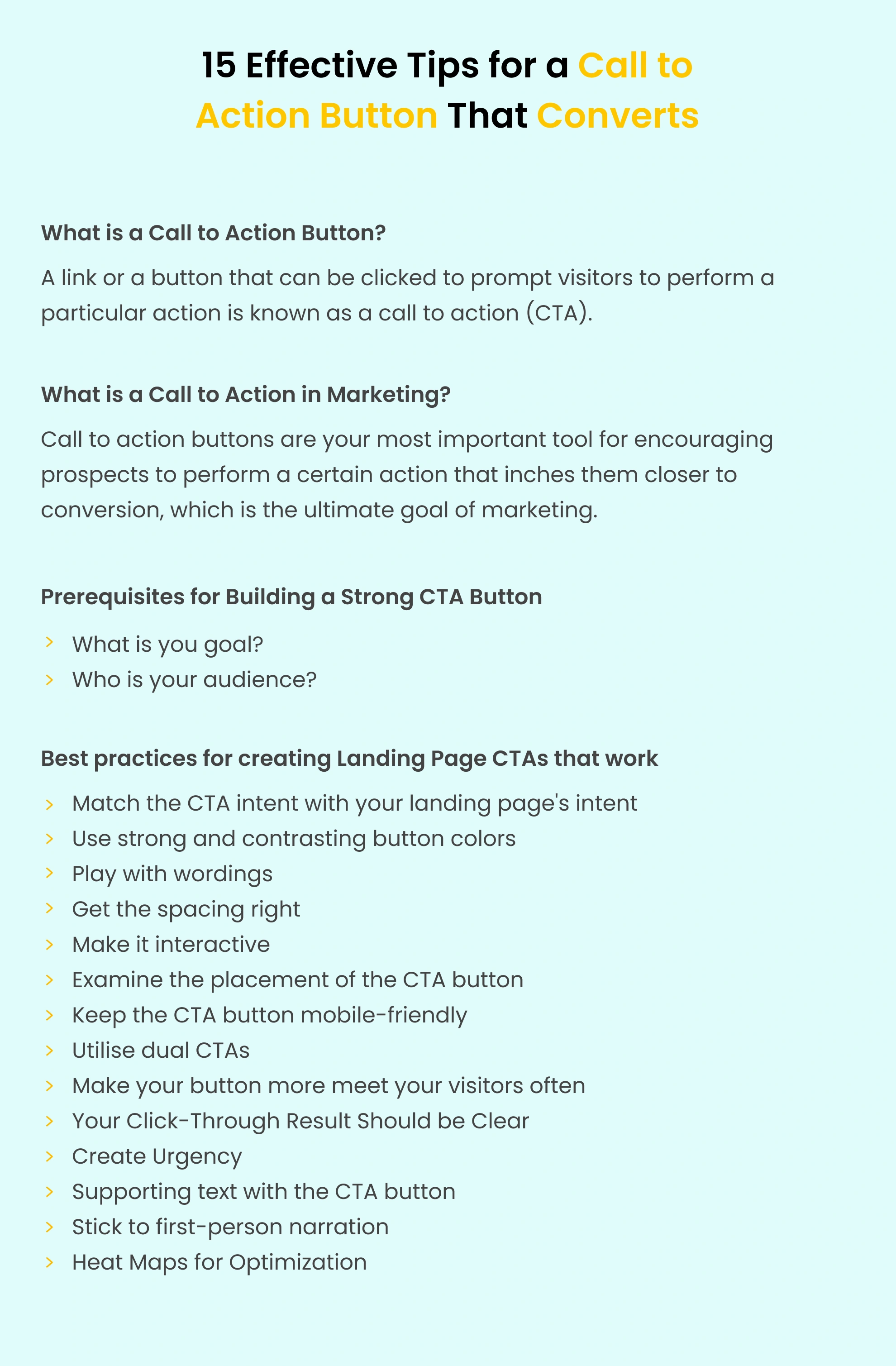
A call-to-action (CTA) button is the clickable element on your landing page that directs visitors toward a specific conversion goal. It might prompt someone to sign up for a free trial, download a resource, book a demo, or make a purchase. The CTA is where your page’s persuasion work either pays off or falls flat. In our experience building 3,000+ landing pages, the CTA button is responsible for more conversion variance than any other single element. Headlines attract attention. Copy builds trust. But the CTA button is where the decision happens.
In the broader marketing context, a call to action is any prompt that encourages a prospect to take the next step in the buyer journey. On landing pages, that prompt takes physical form as a button. On email campaigns, it might be a hyperlink. On social ads, it is the ad-platform CTA selector, the principle remains the same across channels: clarity of action, alignment with intent, and reduction of friction.
A landing page should focus on one conversion goal – but that single goal can be reinforced by multiple CTA buttons placed deliberately throughout the page. This is a distinction many marketers miss. Having three “Book a Demo” buttons at different scroll depths is not the same as having three different CTAs competing for attention. The first reinforces; the second confuses. One pattern we see consistently across projects for 300+ clients worldwide: pages with a single repeated CTA goal outperform pages with competing CTAs by 20-30% on average. The number of CTA buttons depends on the landing page length, but the action should always be singular.
These 15 strategies are drawn from our work across industries – from B2B SaaS to financial services to e-commerce. Each one is backed by real test data and client outcomes.
The most common CTA failure we see in audits is intent mismatch. The ad promises one thing, the page discusses another, and the button asks for something else entirely. This disconnect kills conversions. Before choosing your CTA copy, answer two questions: where is this visitor in the marketing funnel, and what did they click to get here? A visitor who searched “best project management tool” is in a different mental state than one who clicked a retargeting ad after visiting your pricing page. The first needs a low-commitment CTA like “Watch a 2-Min Demo.” The second is ready for “Start Your Free Trial.”
When we audit a new client’s landing pages, the first thing we check is this ad-to-CTA chain. In our experience, fixing intent mismatch alone can lift conversion rates by 15-25% without any design changes.
Colour influences up to 90% of snap purchasing judgments, but the specific colour matters less than the contrast ratio. A green button on a green page is invisible. An orange button on a blue page is unmissable. The “squint test” is the simplest way to evaluate CTA contrast: squint at your landing page until everything blurs. If the CTA button is still the most prominent element, your contrast is working. If it blends into the background, change it.
Brand colours are a starting point, not a constraint. If your brand palette doesn’t offer a strong contrast option, introduce an accent colour specifically for CTAs. Some of the highest-converting pages we have built use a CTA colour that appears nowhere else on the page – precisely because it stands out.
Generic CTA labels like “Submit,” “Click Here,” or “Learn More” leave conversion potential on the table. The best CTA copy does two things simultaneously: it tells visitors exactly what will happen, and it frames that action as a benefit.
| Weak CTA | Strong CTA | Why It Works |
|---|---|---|
| Submit | Get My Free Audit | First-person + benefit + specificity |
| Learn More | See How It Works | Curiosity + low commitment |
| Download | Download the 2026 Report | Specificity + timeliness |
| Sign Up | Start My Free Trial | First-person + value proposition |
| Contact Us | Book a 15-Min Strategy Call | Time-bound + specific action |
| Buy Now | Claim My 30% Discount | Ownership language + incentive |
Keep your CTA to 2-5 words. Anything longer creates hesitation. Anything shorter lacks specificity. And always use language your audience actually speaks – not marketing jargon.
White space around a CTA button is not empty space – it is attention space. The more breathing room your button has, the more the eye gravitates toward it. We recommend a minimum of 24px of padding on all sides of a CTA button, and 40-60px of margin between the button and surrounding elements. On mobile, increase these values by 20-30% to account for thumb targeting.
Static buttons convert. Interactive buttons convert better. Adding subtle hover states, micro-animations, or directional cues draws attention to the CTA without being obnoxious. Effective interactive techniques include:
The “above the fold” debate is settled: your primary CTA belongs above the fold, but it should not be the only CTA on the page. In our experience building 3,000+ landing pages, we find that pages with CTAs at every major scroll fold outperform single-CTA pages by 20-35%. The pattern that works:
If your CTA doesn’t look clickable, it won’t get clicked. This sounds obvious, but we regularly audit pages where the CTA is a flat rectangle with no visual depth, no shadow, no border – indistinguishable from a decorative element.
More than 60% of landing page traffic now comes from mobile devices. If your CTA isn’t thumb-friendly, you are losing the majority of your potential conversions. Mobile CTA best practices:
Not every visitor is ready for your primary conversion action. A dual CTA strategy offers two paths: a high-commitment option for ready buyers and a low-commitment option for those still evaluating. This works exceptionally well for SaaS landing pages. For example:
People don’t read web pages linearly – they scan in predictable patterns. The two most common are the F-pattern (for text-heavy pages) and the Z-pattern (for image-heavy pages). Placing your CTA where the eye naturally lands increases visibility without requiring conscious effort. Headers and hero images attract immediate attention. Position your CTA adjacent to these high-attention areas. For content-rich landing pages, insert CTA buttons after each major content section where interest peaks. Using heatmap tools like Hotjar or Crazy Egg reveals exactly where visitors are looking and clicking on your specific page – removing guesswork from CTA placement entirely.
Nothing erodes trust faster than a CTA that says one thing and delivers another. If your button says “Get My Free Report,” the next page should immediately deliver that report – not a 15-field form, a payment page, or a generic thank-you page. Post-click experience matters as much as the CTA itself. Build a dedicated thank-you page that confirms the action was completed, delivers the promised value, and offers a logical next step.
Urgency works because of loss aversion – people are more motivated to avoid losing something than to gain something of equal value. But there is a fine line between authentic urgency and manipulative dark patterns.
Authentic urgency examples:
Dark patterns to avoid:
The text immediately surrounding your CTA button has a disproportionate impact on conversion rates. This micro-copy serves one purpose: overcoming the final objection that prevents a click. Common objections and their micro-copy solutions:
| Visitor Objection | Micro-Copy Solution |
|---|---|
| "Will they charge my card?" | "No credit card required" |
| "How long will this take?" | "Takes less than 60 seconds" |
| "Can I cancel later?" | "Cancel anytime, no questions asked" |
| "Is my data safe?" | "256-bit SSL encryption. Your data is secure." |
| "Will I get spammed?" | "We'll never share your email" |
| "Is this really free?" | "100% free. No hidden costs." |
Place this copy directly beneath the CTA button in a smaller, lighter font. It should reassure without overshadowing the button itself.
First-person CTA copy (“Get My Report”) outperforms second-person copy (“Get Your Report”) in the majority of A/B tests. The reason is psychological ownership – first-person language makes the visitor feel in control of the decision.
This shift is subtle but measurable. In conversion-focused redesigns, this tends to matter more than teams expect. We have seen first-person CTA copy lift click-through rates by 10-25% across multiple client projects.
Gut instinct is not a CTA strategy. Every recommendation in this guide should be treated as a hypothesis to test on your specific audience, not a rule to blindly follow. Two tools are essential for CTA optimisation:
Heatmaps (Hotjar, Crazy Egg) reveal:
A/B tests (VWO, Unbounce, Google Optimize) validate:
Theory is valuable, but results speak louder. Here are real outcomes from Apexure client projects where CTA strategy played a central role in conversion improvements.
Flare.io, a cybersecurity SaaS company, had a long-form "Book a Demo" page that was underperforming. The CTA was buried beneath extensive product information, and the button copy was generic ("Request a Demo").
Our team simplified the page to a short-form layout, moved the CTA above the fold, and changed the copy to "See Flare in Action." The result: a 65% increase in demo bookings within one week.
When Radicle Science needed to enroll 10,000 participants in clinical trials through social media campaigns, the CTA strategy was critical. We designed a focused landing page with a single, repeated CTA -- "Join the Study" -- placed at three strategic points. Supporting micro-copy addressed the key objection ("100% free to participate").
The page achieved a 51.78% conversion rate -- 3,443 conversions from 6,649 visitors.
For IMD's MBA program landing page, the initial design had the CTA ("Download a Brochure") below a lengthy about section. Through heatmap analysis, we discovered visitors weren't scrolling far enough to see it. We repositioned the CTA above the fold, added a secondary CTA after video testimonials, and refined the copy to "Download the MBA Brochure."
The conversion rate improved from 3.91% to 6.38% -- a 63% lift.
Every element of a CTA button influences click-through rates. Here is the anatomy of a high-converting button, based on patterns from our highest-performing client pages.
Button sizing follows a simple principle: big enough to click easily, small enough to look intentional.
| Device | Minimum Height | Recommended Height | Width |
|---|---|---|---|
| Desktop | 44px | 48-56px | Auto (based on text + 40px padding) |
| Tablet | 48px | 52-60px | 60-80% of container |
| Mobile | 48px | 56-64px | 100% of container (full-width) |
Before optimising your CTA, eliminate these common mistakes that silently kill conversions. When we audit a new client’s landing pages, these are the issues we see most frequently.
Having “Sign Up,” “Learn More,” “Contact Sales,” and “Download Guide” on the same page creates decision paralysis. Each additional choice reduces the likelihood of any action being taken.
Fix: Choose one primary conversion goal. If you must offer alternatives, use a clear visual hierarchy (primary + secondary button styles).
If your Google Ad says “Get 50% Off Today” but your landing page CTA says “Contact Us,” you’ve broken the promise chain. This hurts both Quality Score and conversion rates.
Fix: Mirror ad language in your CTA copy. Use dynamic text replacement to automatically match CTAs to ad keywords.
A CTA that loads 3 seconds after the rest of the page might as well not exist. Visitors have already formed their impression – and possibly bounced – before the button renders.
Fix: Make sure your page loads in under 2 seconds. Optimise images, minimise scripts, and use a performant landing page builder.
The conversion doesn’t end at the click. A poorly designed confirmation page, a slow form submission, or a missing follow-up email can undo all the work your CTA did.
Fix: Build a conversion path, not just a button. Map the full journey from click to post-click experience.
For a visual walkthrough of the monitoring and optimisation tools that complement CTA testing, watch this guide from Apexure founder Waseem Bashir:
Not all CTA tests are created equal. Some changes (like button colour) are easy to implement but have uncertain impact. Others (like restructuring the entire hero section) have high potential but require significant resources. We use the EPIC CRO Framework to prioritise CTA tests:
This framework makes sure you spend testing resources where they will produce the biggest returns. A simple copy change scoring 17/20 should be tested before a complex redesign scoring 16/20 – even if the redesign has higher raw impact potential – because the cost-to-value ratio is better.
CTA strategy varies by industry because visitor intent, purchase complexity, and risk tolerance differ significantly. Here is what works based on our experience across verticals.
"Waseem and his team bring a truly unique creativity, energy, and commitment to all of the work they do. We recommend their team to anybody and everybody. The results that we've seen from the collaboration are outstanding, from the tremendous improvements in our own page speed and marketing performance to the satisfaction of the clients who work with them on PPC."
"Every month we need to create new landing pages for campaigns, events, or influencers and edit the previous ones. Apexure's team is always on time, and they always answer to all of our needs. Their team is very reactive, proactive, and friendly."
Multiple CTA placements with varied copy ("Get in Touch" and "Speak to a Specialist") all pointing to a single conversion goal. Reduced cost per lead from $2,300 to $550.
Professional B2B design with a multi-step registration form and strong CTA alignment to the corporate governance audience. 82 conversions from 294 visitors.
Use this checklist before launching any landing page to make sure your CTA is optimised for maximum conversions.
The key insight from running 800+ A/B tests for clients: CTA optimisation is never “done.” The best-performing pages are those with an ongoing testing culture, where every assumption is validated with data.
To turn visitors into customers, you need to make the next step obvious and easy. One of the most important elements on any landing page is the call-to-action button. From the CTA copy to the landing page design, from form design to post-click strategy, every element must work together to drive conversions. After 10 years of optimising landing pages, the fundamentals remain the same: clarity beats cleverness, contrast drives attention, and testing proves what works. The 15 tips in this guide give you a framework to systematically improve your CTA performance – but the real gains come from implementing them and measuring the results on your own pages.
With 3,000+ landing page projects and 200+ five-star reviews, Apexure helps businesses turn more visitors into customers. From CTA copy to full landing page redesigns, our team delivers conversion-focused results backed by real data.
Book a Free CTA AuditApexure has 100+ blog posts on landing pages? We have shared everything, from creation to testing, analysis to optimization. Check it out before you build your SaaS demo landing page.
Making landing page on your own with just examples can take a lot of time. Get the help you need from our experts. Book a call and one of our experts will contact you soon.
Check out our landing page portfolio to discover conversion-friendly landing page elements that might. Filter your industry and check which landing page design is trending.
A landing page should have one primary conversion goal, but that single goal can be reinforced by multiple CTA buttons placed at different scroll depths. We typically recommend 3-5 CTA buttons on a standard-length page, all pointing to the same action. Pages with a single repeated CTA goal outperform pages with competing CTAs by 20-30% in our testing.
There is no universally "best" colour. The most important factor is contrast -- the button must stand out against its surrounding elements. Green and orange tend to perform well because they provide strong contrast against most backgrounds, but the right answer depends on your specific page design. A/B test your colour choices rather than following generic advice.
No. "Submit" is one of the weakest CTA labels because it describes the mechanical action rather than the benefit. Replace it with action-oriented, benefit-driven copy like "Get My Free Quote," "Start My Trial," or "Download the Guide." In our A/B tests, specific CTA copy outperforms "Submit" by 30-40% on average.
Place your primary CTA above the fold for visitors who arrive ready to convert. Then repeat it after each major content section -- typically after the value proposition, after social proof, and at the bottom of the page. Use heatmap data to identify the optimal positions for your specific audience and page layout.
In most cases, yes. Sticky CTAs that remain visible at the bottom of the mobile screen as visitors scroll can increase conversions by 15-25%, particularly on long-form pages. However, they need to be implemented carefully -- the bar should be slim enough not to obscure content and should have a clear close/dismiss option to avoid user frustration.
Continuously. CTA testing should be part of an ongoing optimisation programme, not a one-time event. We recommend running a new CTA test every 2-4 weeks, using the EPIC CRO Framework to prioritise which elements to test first. Each test should run until it reaches statistical significance -- typically requiring 100+ conversions per variation.
In the majority of A/B tests we have run, first-person copy outperforms second-person by 10-25%. The psychological mechanism is ownership -- first-person language makes visitors feel in control of the decision. However, this is a general pattern, not a universal rule. Test it on your specific audience to confirm.
The minimum recommended button height is 48px on mobile (WCAG accessibility guideline) and 44px on desktop. For optimal conversion performance, we recommend 52-60px on desktop and 56-64px on mobile, with full-width buttons on mobile viewports. The button should be large enough to tap easily with a thumb but not so large that it dominates the page awkwardly.
Related Articles:
Founder & CEO of Apexure, Waseem worked in London's Financial Industry. He has worked on trading floors in BNP Paribas and Trafigura, developing complex business systems. Waseem loves working with Startups and combines data and design to create improved User Experiences. Read more


Drive More Sales or Leads With Conversion Focused Websites and Landing Pages
Get Started

Eleven percent of Meta ad rejections in 2026 trace back to one problem: the landing page does not...

A B2B SaaS company spends $30,000 per month on Google Ads and Meta Ads. Both campaigns drive traffic...
Get quality posts covering insights into Conversion Rate Optimisation, Landing Pages and great design
