
Even though clicks have been considered as a vanity metric, high-intent clicks like a click-to-call can lead to conversions that’ll double your revenue if properly maximized. This is because 61% of prospective customers who click to call are ready to make a purchase. So while you might already have a click-to-call landing page. It’s time to double down on the number of clicks you get on this page. In this article, we’ll be showing you what a click to call landing page means, why it’s important to your business, and how you can optimize your click to call landing page for more conversions.
 Today, customers prefer to speak to a company employee when they have any questions about your product or service and that’s why click to call landing pages have become increasingly popular.
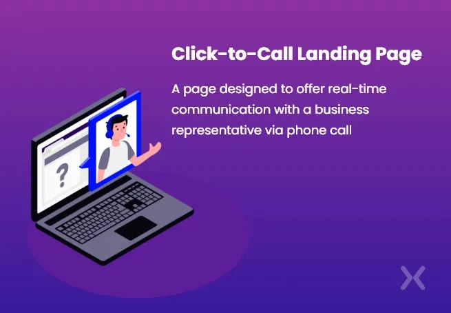
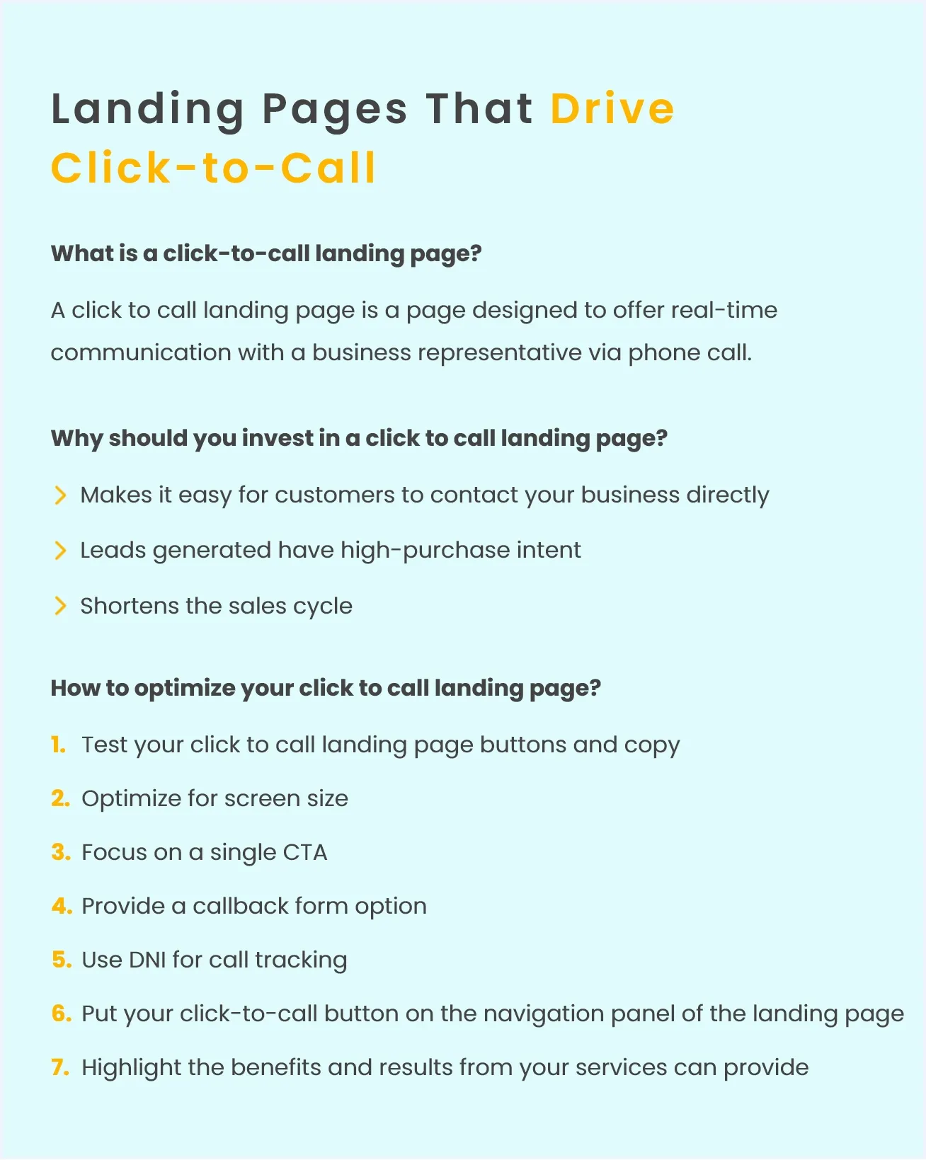
A click to call landing page is a page designed to offer real-time communication with a business representative via phone call. This design is usually a clear CTA button.
Today, customers prefer to speak to a company employee when they have any questions about your product or service and that’s why click to call landing pages have become increasingly popular.
A click to call landing page is a page designed to offer real-time communication with a business representative via phone call. This design is usually a clear CTA button.
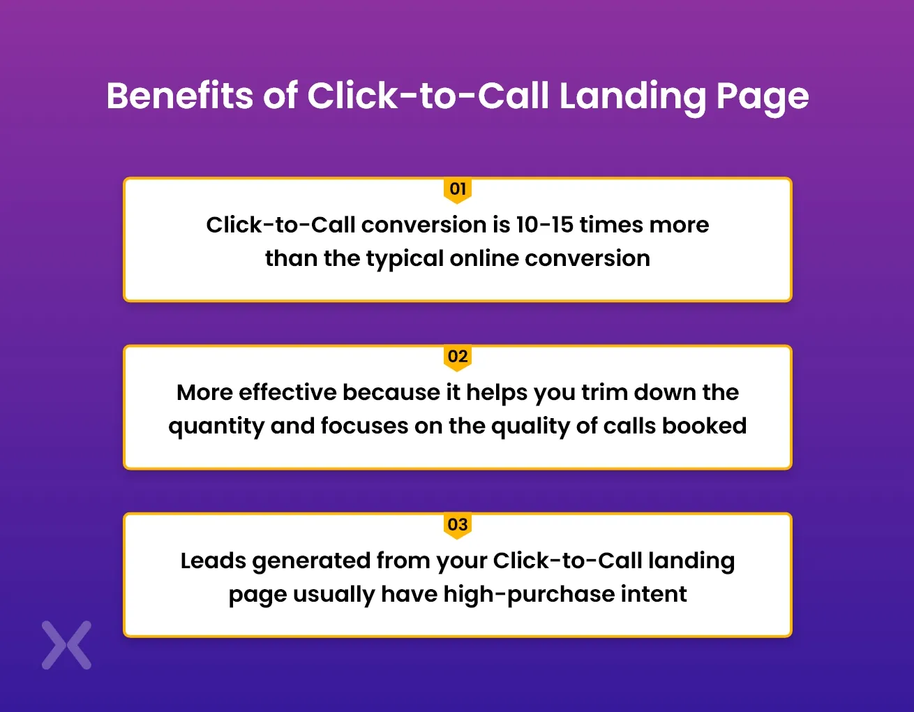 Click-to-call conversion is 10-15 times more than the typical online conversion. Customers who can’t find a click to call get frustrated and are more likely to explore other brands.
Now, aside from the fact that they make it easy for customers to contact your business directly, the click to call conversion is 10-15 times more than the typical online conversion.
However, your click to call can be placed anywhere. It could be on an ad or a social media post.
A click-to-call landing page is more effective because it helps you trim down the quantity and focuses on the quality of calls booked. Leads from an advert might not be ready to purchase immediately. They will be more interested in understanding more about your company, features, use case, etc.
The landing page gives more details about your offerings before asking users to place a call. So leads generated from your click to call landing page are usually high-purchase intent.
Click-to-call conversion is 10-15 times more than the typical online conversion. Customers who can’t find a click to call get frustrated and are more likely to explore other brands.
Now, aside from the fact that they make it easy for customers to contact your business directly, the click to call conversion is 10-15 times more than the typical online conversion.
However, your click to call can be placed anywhere. It could be on an ad or a social media post.
A click-to-call landing page is more effective because it helps you trim down the quantity and focuses on the quality of calls booked. Leads from an advert might not be ready to purchase immediately. They will be more interested in understanding more about your company, features, use case, etc.
The landing page gives more details about your offerings before asking users to place a call. So leads generated from your click to call landing page are usually high-purchase intent.
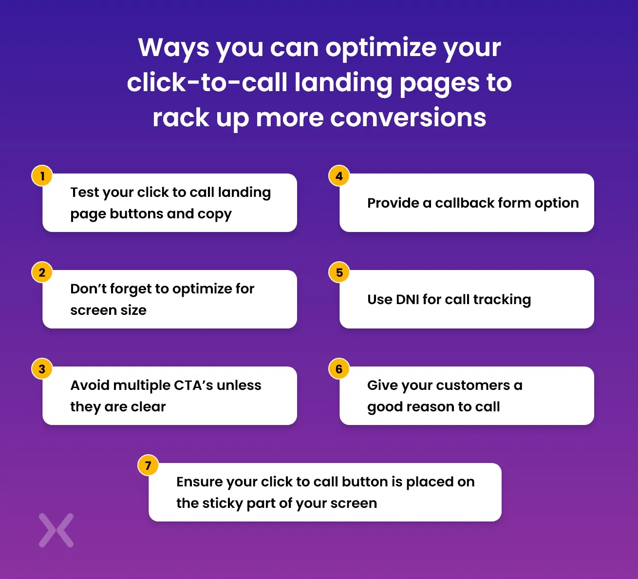
Now that you’re ready to increase your conversions and ROI through phone calls. You should understand that they don’t just come on their own. Here are seven ways you can optimize your click to call landing pages to rack up more conversions. Understanding such tactics will help invest the right resources into building a high-converting click-to-call landing page.
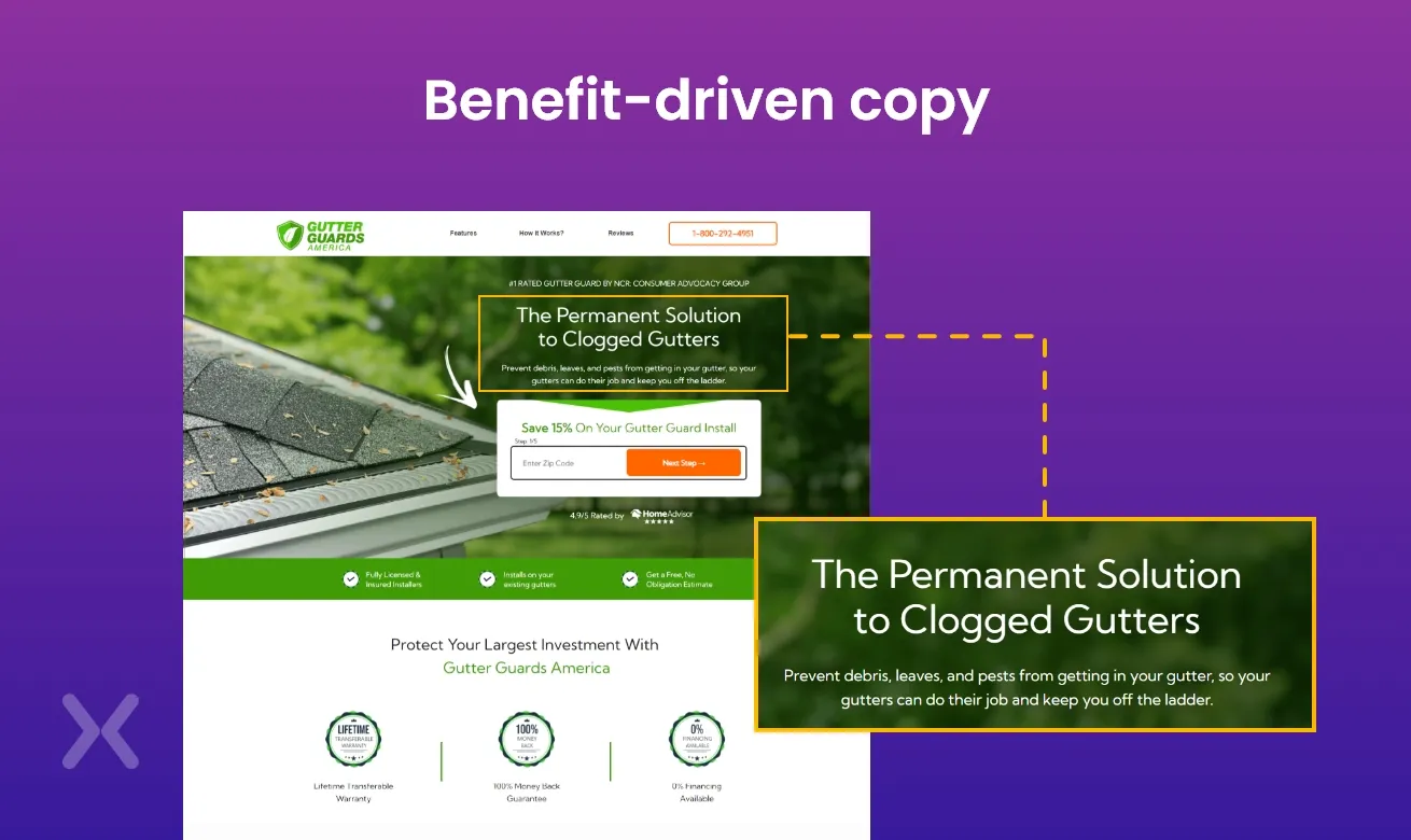
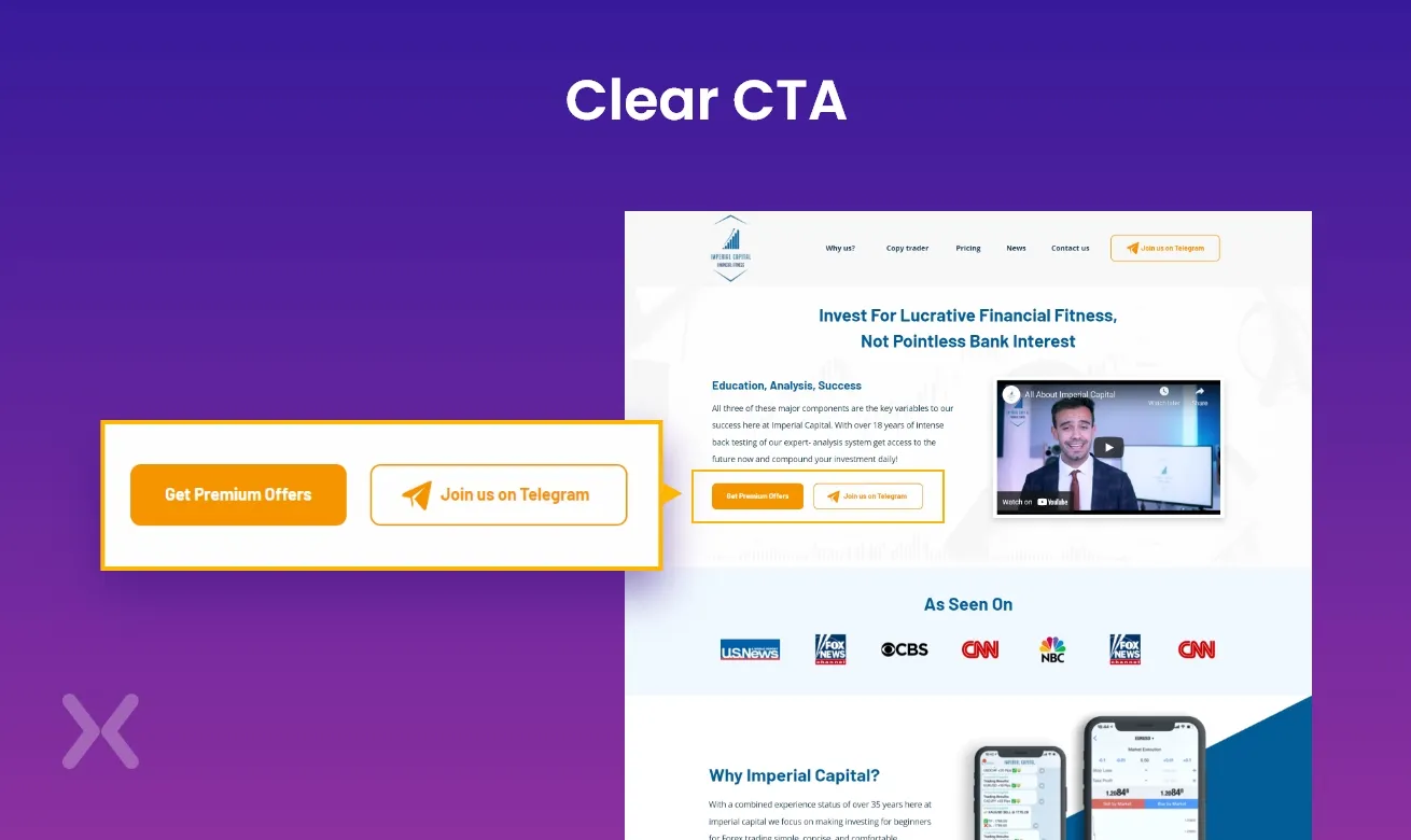
Every element on your click to call landing page has to complement each other. From the font to the colors and placements. While your designer or chosen theme might have a good idea of what your landing page should look like. You might end up being surprised at what your leads actually match the most. The same applies to your landing page copy. You may be focused on the landing page design and find out that what needed to change was your copy. In our example below, you’ll see how Gutter Guards America drives more conversions by offering a benefit-driven copy - ‘solution to clogged gutters’
 So if you want to create a strategy that’ll work, thoroughly optimize your click-to-call landing page based on data as opposed to assumptions. Start by conducting A/B tests with your CTA.
Although our example above used just a phone number, you can change the text on your CTA to book now, call now, call for free etc. With this test, you can find out what words push more to actually click on that button faster.
So if you want to create a strategy that’ll work, thoroughly optimize your click-to-call landing page based on data as opposed to assumptions. Start by conducting A/B tests with your CTA.
Although our example above used just a phone number, you can change the text on your CTA to book now, call now, call for free etc. With this test, you can find out what words push more to actually click on that button faster.
Mobile searchers tend to use the call button and so it’s super important to optimize landing page for every available screen size. This can be quite tricky making it difficult to find the right placement. The best way to tackle this is to make sure that your landing page is mobile responsive and that it’s adaptable to every screen. Next, you want to take advantage of icons in delivering your click-to-call. Icons are great indicators. So placing them on strategic areas of your screen can help increase your prospective callers. In the click to call landing page example below, JL studios positioned their CTA at the upper middle of the screen so it’s easier to tap on.
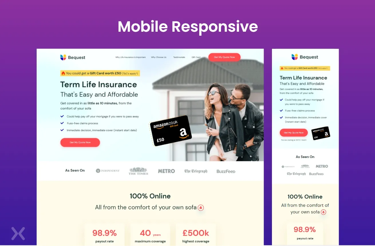 It is clear that this landing page has been optimized for mobile visitors to easily place a call in one click, with a straightforward CTA.
When you refer your leads to your click-to-call landing page. It’s best to avoid too many distractions on this page and multiple CTA’s can be a distraction. This is because when a prospective customer is shown so many different options, it significantly reduces the chances of them placing that call. This is why it’s best to avoid using multiple CTA’s. However, if you’d still like to provide options, make sure that they are tied towards the same goal. In this example below, you’d see that there are multiple CTA’s but the goal is to provide a more personalized experience for prospective callers. The ‘pick a time to call that suits you’ button redirects users to a booking page that still reinforces the need for a phone call.
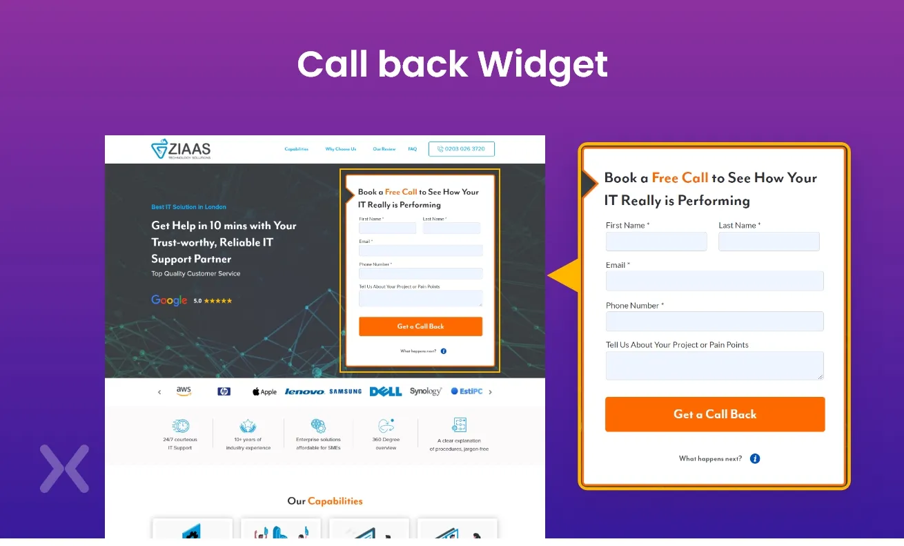
Sometimes, your prospective customers might not be ready to place that call immediately when they see your landing page. Or, they’d just be more comfortable if you did the calling. This is why you add a callback form or widget to collect your prospective caller’s phone number. So at a later time. You can place a sales call and expect them to convert because they offered their phone number with consent. You can get started by creating a simple call-back form and embed it on your landing page design. See how Ziaas does it below:
 If your business is targeted at users in several countries, you might be tempted to use the same phone number across these landing pages. To avoid losing out on customers, consider using a local number on every click to call landing page.
You can start by segmenting your visitors based on their geographical location or country. Then create a local phone number and forward calls from your local numbers to your main one. That way, you have a centralized call center and you don’t miss out on any prospective customer.
If your business is targeted at users in several countries, you might be tempted to use the same phone number across these landing pages. To avoid losing out on customers, consider using a local number on every click to call landing page.
You can start by segmenting your visitors based on their geographical location or country. Then create a local phone number and forward calls from your local numbers to your main one. That way, you have a centralized call center and you don’t miss out on any prospective customer.
DNI which is short for dynamic number insertions is a sort of tag that can help you assign a new number to each CTA button. This way, you can track where each caller is calling from and easily identify what exactly they want. Think of it as a UTM tag but for phone numbers. It’s simply installing a string of Javascript and then the code places a cookie on the browser of every site visitor. Once the data is collected, it then feeds the information into your Google Analytics where you can adequately track your customers. Using a DNI is great for your click-to-call landing page because it gives you insights into who your customers are. This can help you further optimize your marketing strategy and campaigns so you can rack up more conversions.
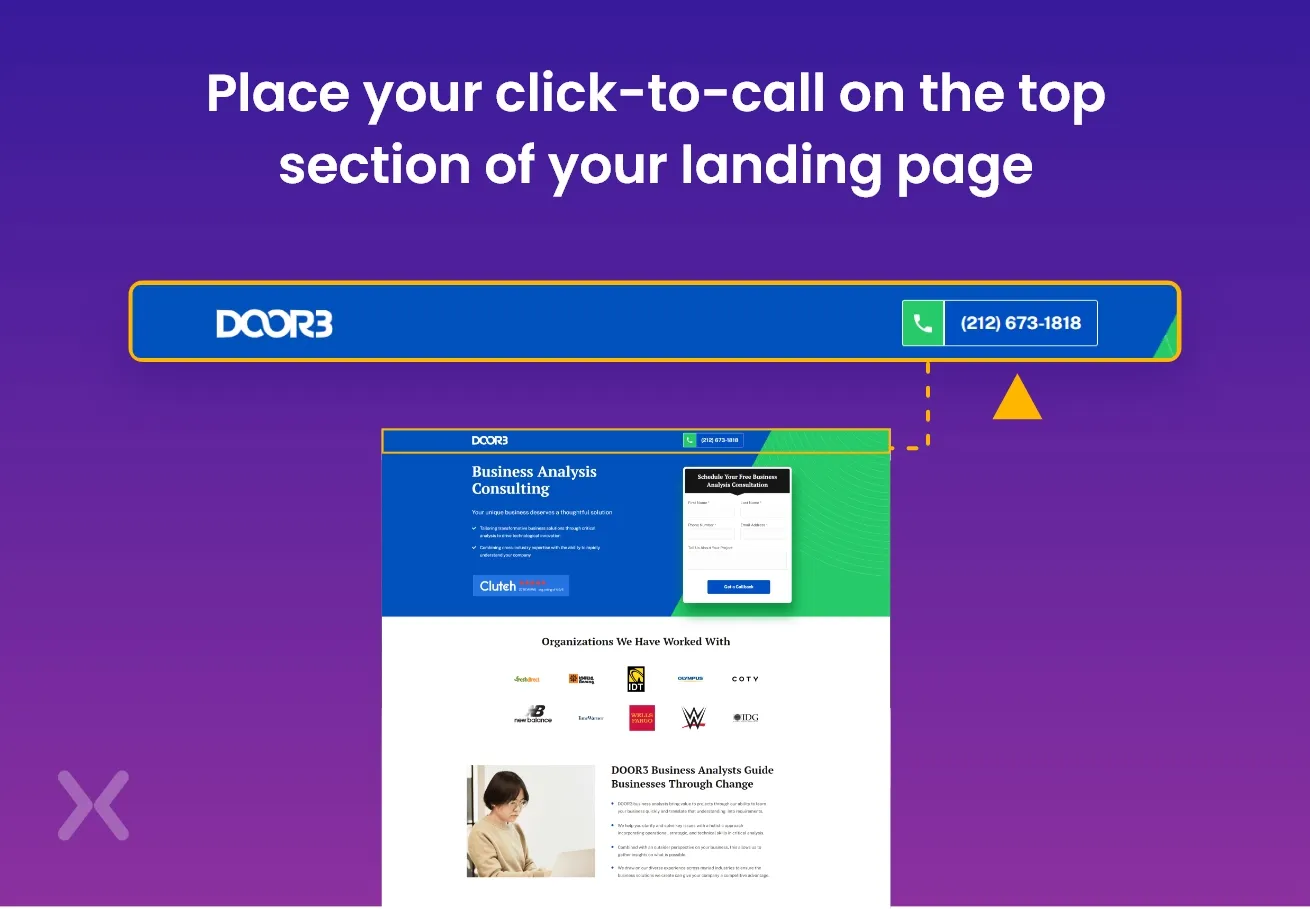
So your prospective customers have read through your content or watched the videos on your landing page. What happens when they are ready to place that call? Truthfully. It would be a poor user experience if your customers cannot find your click to call button after spending time perusing through your site. This is why we advise placing your click to call on the top section of your landing page. If you have a navigation panel located there, you should consider placing it there. The goal of this is to position this button or anchor text on a sticky section of your page. That way, even when a prospective user spends significant time on your page. They can always find your click to call in one glance. In the click to call landing page example below, see how DOOR3 positions its click to call on the navigation panel.
While this might seem quite obvious. There’s a difference between what you think your prospective customers are interested in and what they are actually interested in. Take time to look through your top-performing landing pages and sell your value proposition in simple clear sentences. Don’t just sell your services with big terms on your click to call landing page. Instead, sell the outcome of what they get by engaging your services. In our example below, Big mouth marketing gives an overview of the benefits of calling for a proposal. This landing page offers convenience, respect, transparency, and straightforward solutions when a user clicks on that CTA. Appeal to their emotions and they’ll be interested in actually clicking that button.
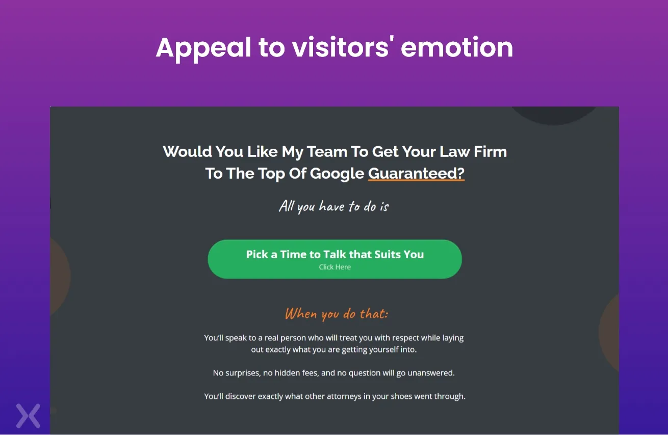 Appeal to their emotions and they’ll be interested in actually clicking that button.
In a bid to increase the number of their inbound phone calls and conversions in general, these companies outsourced their landing pages to Apexure for a redesign. Here’s how we’ve been able to optimize their landing pages and how you can use these examples to influence yours.
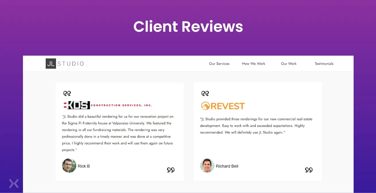
In our example below, JL studios offer a reason to click on their sticky CTA on the navigation panel. They figure that interested clients would want to hear from existing customers and so, they stay one step ahead by showing off reviews from their clients. You’ll see that the reviews aren’t anonymous when compared to other sites. They want interested clients to know that they work for real people, hence the headshot and the full name of the reviewer is included.
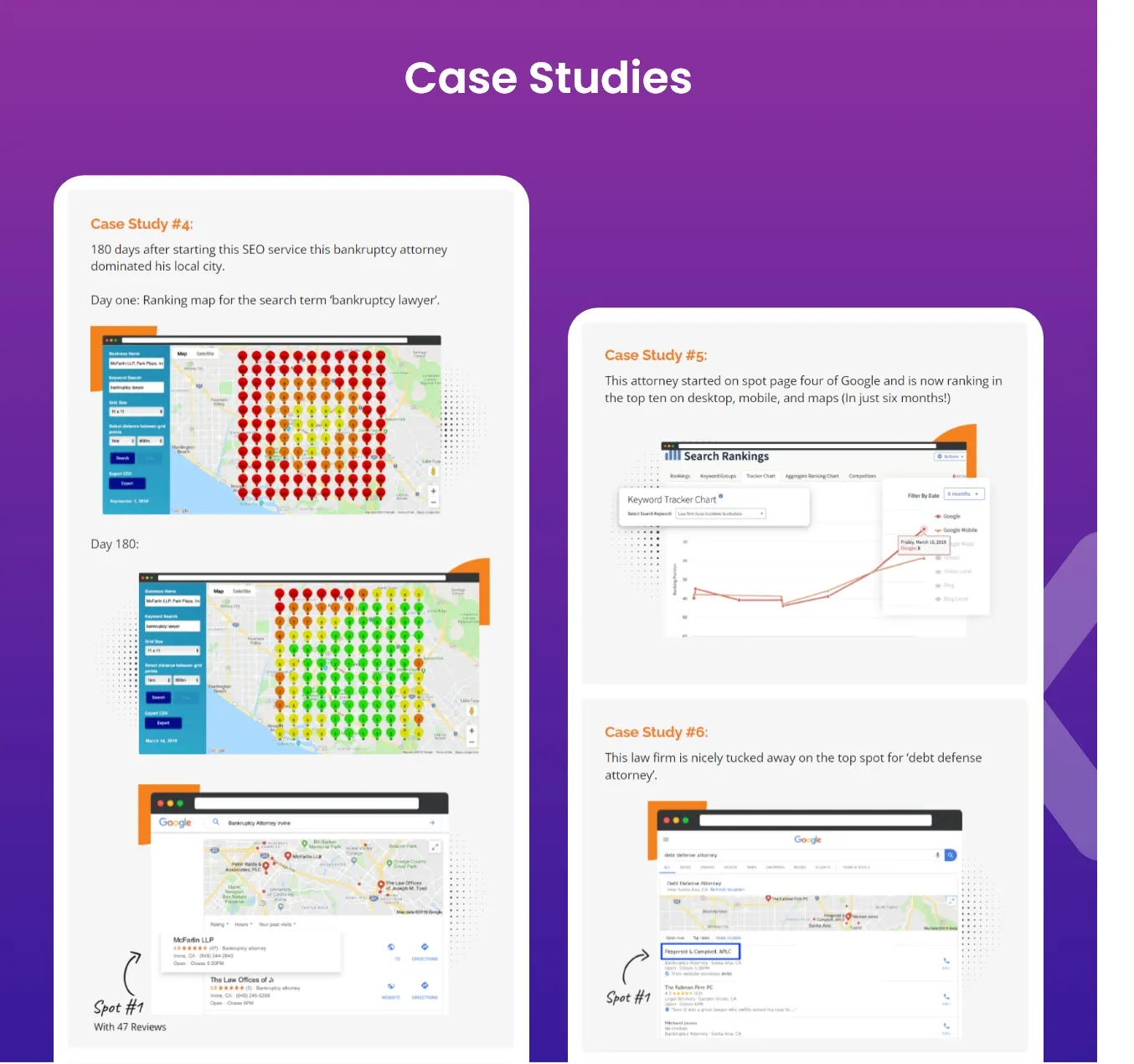
Big mouth marketing understands that telling their prospective clients they have a strategy isn’t enough. They needed to show some sort of proof that categorically states that they know their onions. This is why Apexure decided to design a landing page that shows their case studies. By showing the data-driven results they got from Google Ads for a client, Big mouth makes it easy for their clients to click on the CTA.
If you’re a bit skeptical about showing your data to the general public. You can take the ZIAAS approach by using brand logos to show off your clientele. ZIAAS understands the number of powerful brands they work with. So to increase trust and build solid credibility for their services, Apexure chose to place these logos on their click to call landing page.
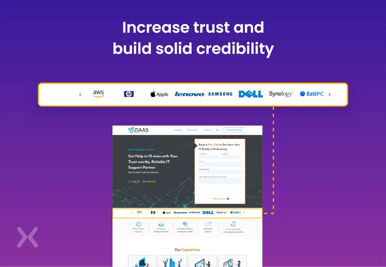 With this, they can squash any skepticism prospective clients have about their brand.
Mobile users tend to get a lot more distracted when they’re undergoing research and that’s why you have to maximize every second they spend on your website. ZIAAS takes this into account by making sure that when a user clicks on the phone number on the landing page, it automatically triggers a phone call on their mobile.
 On desktop, when you try to click on that same number. You get a call prompt. This is a great example you can emulate when you’re trying to optimize your click to call landing page on mobile.
After providing alternative clickable measures for interested users to contact them (both email and call), Galago creates a form for users who’d prefer a callback. This form is a destination for any user who clicks on the ‘Let’s Talk’ CTA distributed across the page.
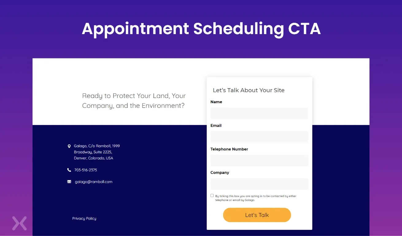 In this simple form, they request contact details which include a phone number. And just before the submit button. They have a disclaimer checkbox as a way to record consent.
While your regular clicks are deemed as a vanity metric, click-to-call landing pages are a very high converting channel you should explore. You can start by speaking to conversion experts at Apexure for a professionally designed landing page. At Apexure, we design click-to-call landing pages that are visually appealing, value-driven, and mobile responsive. In addition to the standard features, to drive more call conversions we take it up a notch with;
Irresistible offers are designed to show a clear link between the visitor’s pain points and how the offer is the solution they require.
Standout call-to-action; strong, noticeable, prompt, well-worded, and placed logically to optimize click-to-call landing page conversion.
Skim-friendly copy and design that boosts your offerings without boring out visitors.
Talk to us today and let’s create magic with your click-to-call landing page.
Related Articles:
Founder & CEO of Apexure, Waseem worked in London’s Financial Industry. He has worked on trading floors in BNP Paribas and Trafigura, developing complex business systems. Waseem loves working with Startups and combines data and design to create improved User Experiences. Read more


Drive More Sales or Leads With Conversion Focused Websites and Landing Pages
Get Started.png)

Eleven percent of Meta ad rejections in 2026 trace back to one problem: the landing page does not...

A B2B SaaS company spends $30,000 per month on Google Ads and Meta Ads. Both campaigns drive traffic...
Get quality posts covering insights into Conversion Rate Optimisation, Landing Pages and great design
