Ever felt stuck with your mobile conversion rates, unable to nudge them upward? You’re not alone in this struggle. CRO mobile optimization, once deemed the Achilles’ heel of digital marketing, remains often misinterpreted due to the varied motives of users across different devices. The question at hand is whether your mobile conversion results keep pace with your desktop performance. Never evaluated it? No worries. This piece is a wake-up call to take action and chart your path toward effective CRO mobile optimization today. Considering the expected rise in mobile commerce, which reached $2.2 trillion in 2023, your mastery of CRO for mobile should be at par with desktop optimization. Stay with us as we start with some basic concepts, making the complexities easy to digest. Let’s get going!
Certainly, there are stark contrasts between typical desktop conversion rate optimization and its mobile counterpart. These distinctions can turn the tide, leading a potential customer to hit either “sign up” or leave for a different site.
 The things that could define CRO mobile optimization include:
Examining user behavior trends on mobile
Experimenting with various design elements
Employing data-driven strategies to raise the conversion rates on mobile websites or landing pages
Though seemingly similar to desktop CRO, the crux lies in understanding the user’s intent on mobile, which often diverges significantly from that on desktops. CRO for mobile focuses precisely on addressing these unique aspects.
 A strong understanding of mobile user behavior is fundamental to a successful mobile optimization strategy. By recognizing the following user trends and preferences, businesses can make insightful strides in boosting their website and landing page conversion rates:
This trend is evident in sectors like travel, where users may hastily check for flight schedules or hotel room availability. A quick-to-load, well-organized site thus becomes vital for conversions, a key factor in CRO for mobile.
Given the design of mobile devices, users tend to scroll vertically when cruising through content. It’s necessary to bear this in mind when structuring your website or landing page, as it will heavily influence your content presentation and organization.
For sectors like e-commerce or subscription-led services like SaaS, knowing what payment methods users favor can be a big improvement.
Mobile users often multitask - simultaneously watching TV while scrolling through a food delivery mobile commerce app, for instance. Therefore, websites attuned to this split-focus habit will likely score higher on the CRO ladder. Utilizing these mobile user behaviors can enable businesses to refine their CRO mobile optimization strategies effectively. It’s all about in-depth analysis and tactical refinement for effective CRO for mobile results.

Speed and efficiency are what drive mobile users predominantly. As they browse on cellular networks and smaller screens, they require optimized web pages for quick loading. Unfortunately, poor mobile user experience is widespread, often leading to lower engagement than desktop pages.
 While the basics of CRO for mobile devices remain constant, mastering the subtle mobile-specific nuances could determine customer retention or loss. It is proved in Forrester’s 2018 Retail Wave, which reported that smartphones pointed toward over $1 trillion worth of US retail purchases.
In more than a third of all U.S. Retail transactions, consumers integrated smartphones somewhere in their buying journey for tasks such as product research, pricing comparisons, or actual purchasing.
Focusing solely on desktop traffic is no longer a sustainable approach. A carefully crafted mobile experience can multiply your conversion rates significantly.
While the basics of CRO for mobile devices remain constant, mastering the subtle mobile-specific nuances could determine customer retention or loss. It is proved in Forrester’s 2018 Retail Wave, which reported that smartphones pointed toward over $1 trillion worth of US retail purchases.
In more than a third of all U.S. Retail transactions, consumers integrated smartphones somewhere in their buying journey for tasks such as product research, pricing comparisons, or actual purchasing.
Focusing solely on desktop traffic is no longer a sustainable approach. A carefully crafted mobile experience can multiply your conversion rates significantly.
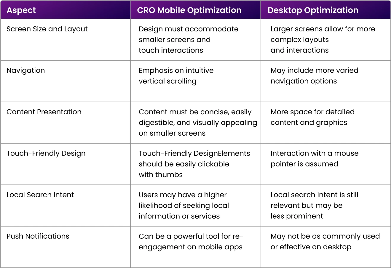
To help you have a clearer understanding, here’s a comparison chart detailing the primary differences between mobile and desktop optimization. It should further aid your grasp of the unique traits and needs of each platform:
Here are 12 tips to optimize your mobile designs for more conversions.
Rigorous CRO mobile optimization begins with mobile-first research. It’s a journey of endless investigations to comprehend your customer base deeply, guiding the formation of testable hypotheses.
 As we move through through the year, users demand smooth browsing experiences regardless of device size. Google Analytics and similar tools can offer full data, revealing visitor traffic, popular pages, and exit points, thus enabling effective mobile conversion rate optimization decisions.
As mobile users value swift, smooth experiences, delays can result in frustration and an increased bounce rate. How to improve your mobile site’s speed to help conversions:
Limit your site’s page size to 1-2MB by compressing images without losing quality. In mobile designs, use minimal but effective images, retaining only necessary ones from your desktop designs.
Minimize redirects to quicken page load time. The fewer the clicks, the faster and more smooth the user journey.
Reduce server requests for elements like images, scripts, and stylesheets to boost page load speed.
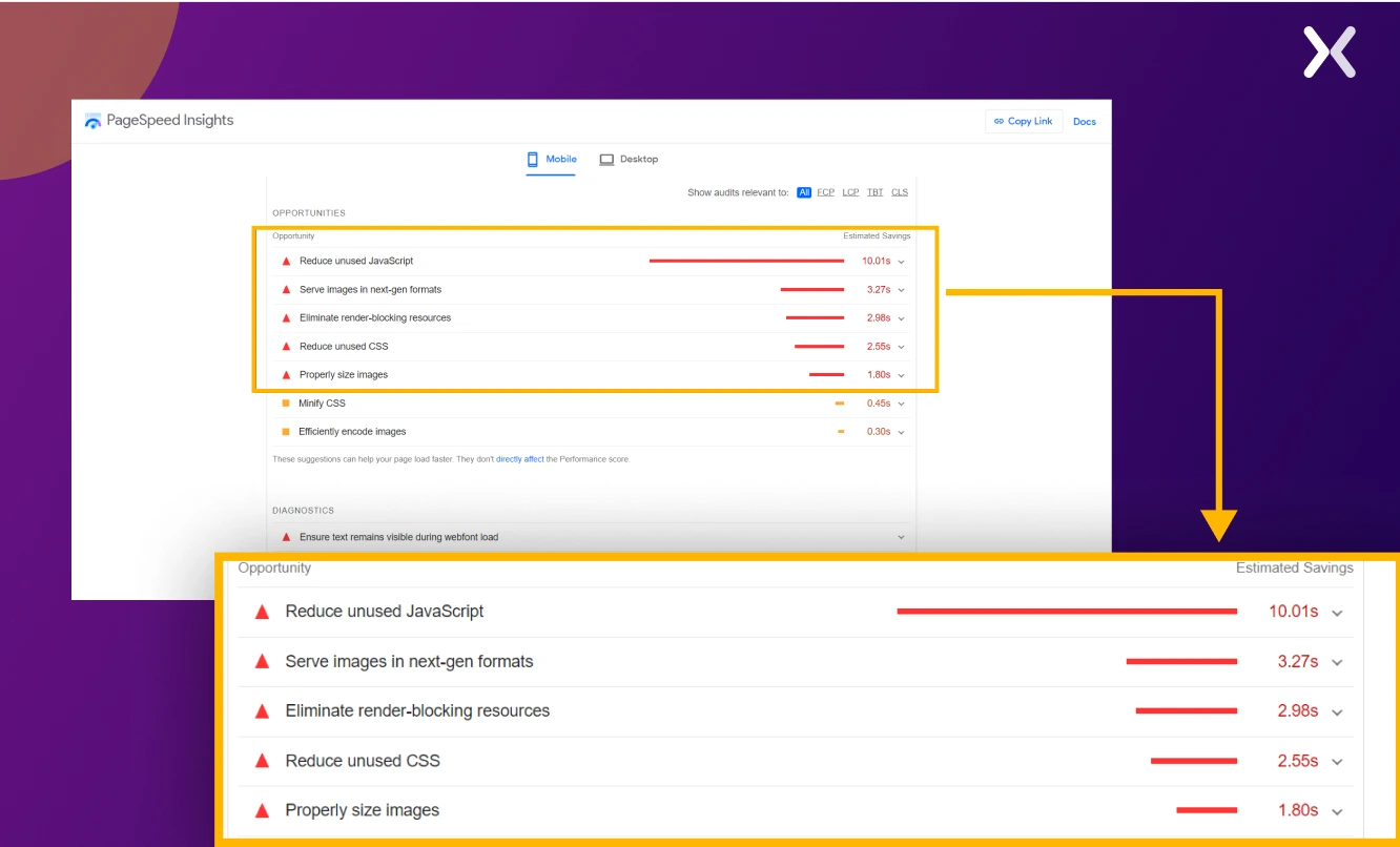
Use this to store frequently accessed data, reducing server load and increasing your web page’s load speed for repeat mobile visitors. For a full review of your website or landing page’s mobile speed, use Google’s PageSpeed Insights.
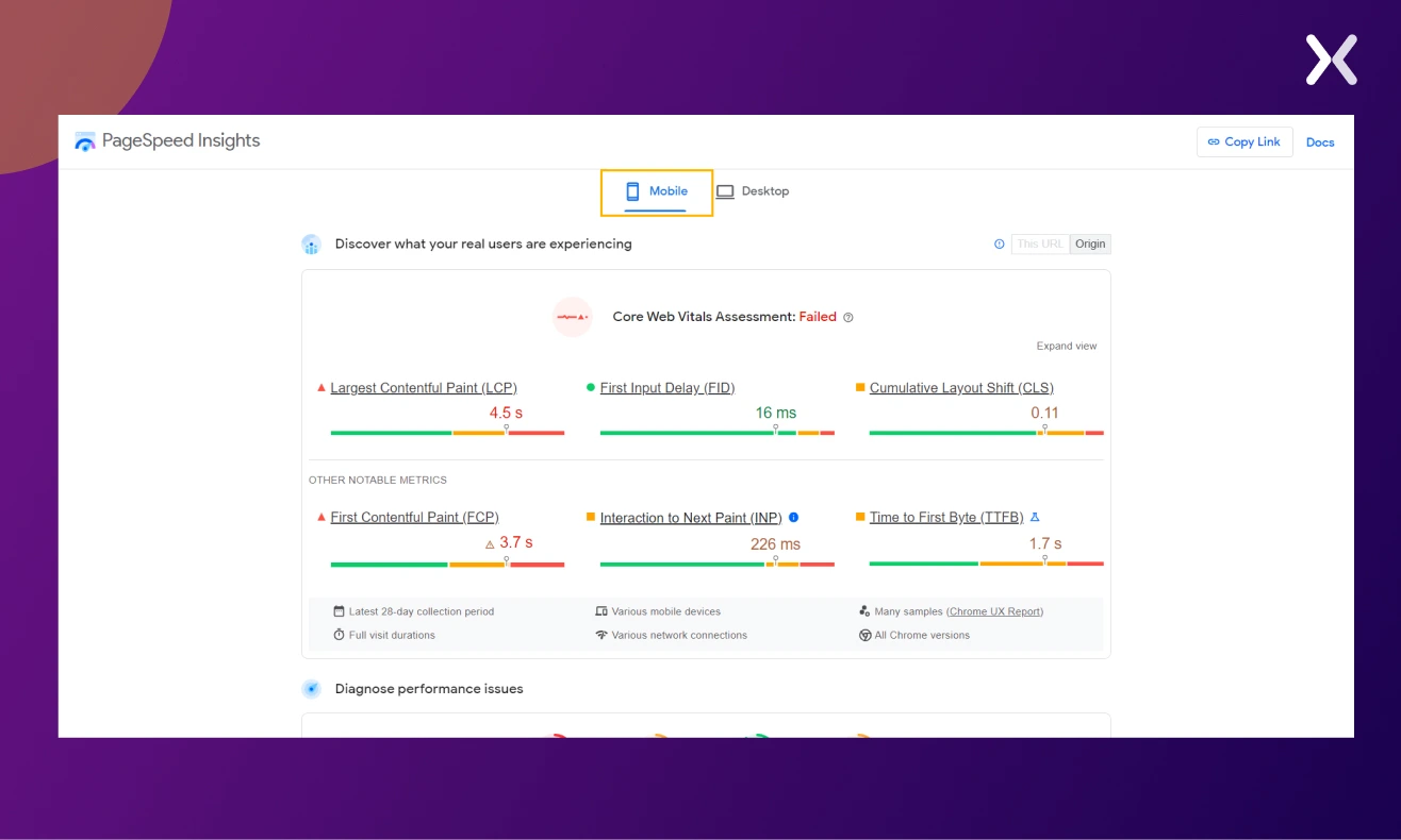 Besides providing a performance report, it also offers improvement suggestions for your mobile design.
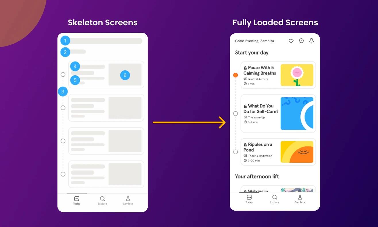
Tip: If speed optimization is taking time, consider using skeleton screens, these distraction-free views keep users engaged while content loads. Far more effective than loading bars or spinners, skeleton screens give users a sense of activity and page layout, reassure users the page is loading, and provide a rough estimate of load completion. For example:
In CRO mobile optimization, the design and functionality of forms matter in determining the likelihood of user conversions. Mobile users, often on the go and with limited screen space, prefer simplified and efficient interactions. Simplified mobile forms address this need by optimizing the process of gathering information from users. To implement simplified mobile forms effectively, businesses should:
Conduct user tests to identify hurdles and areas needing improvement.
Use progressive profiling, a technique for gradually collecting information across multiple interactions.
Focus on collecting only the essential information, using multistep forms for larger ones.
Avoid mobile hindrances like CAPTCHAs and complicated validations.
In light of smaller screens, opt for a single-column design for better accessibility.
Pop-ups can be a significant obstacle to smooth mobile browsing. By occupying the entire screen, they can disrupt user interaction and mar the overall experience. However, they can still be effective if implemented with justice. Here’s how:
Keep your message brief and concise.
Let users easily dismiss the pop-ups.
Use contrasting colors for better visibility.
Design an obviously clickable call-to-action button.
Make sure your pop-up appears at an opportune moment. Each of these points can help maximize the potential of your pop-up strategy without detracting from the mobile user experience.
Moving through a clunky mobile menu can be a daunting task. Simply recreating your desktop menu for your mobile platform could result in it being excessive and cumbersome, adversely affecting conversion rates. Adopt a more straightforward, intuitive mobile navigation menu. Implementing a hamburger menu could be beneficial. Here are some features you should consider for your mobile navigation bar:
Use clear labels and symbols for easier navigation.
They can be useful but overwhelming in excess, particularly on smaller screens.
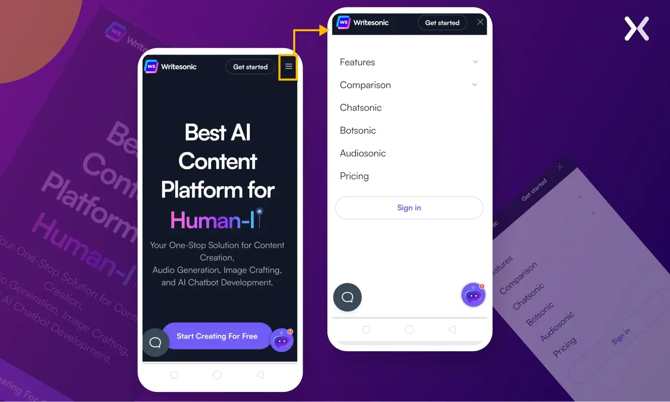
Keep a readily accessible search bar for users seeking specific content or products. For example, here is the desktop version of the Writesonic website:
 Here is what it looks like on mobile:
One unchanging factor in mobile device usage is thumb placement. Coined by Steven Hoober in one of his studies, the “thumb zone” is a primary consideration in mobile interface design and development. Recognizing these zones - easy, hard, and in-between - points toward creating a smooth user experience.
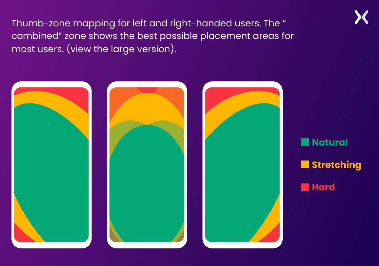 Guided by a thumb zone, critical design decisions shape a user-friendly mobile layout that improves interaction. Positioning your CTA in the green zones can send your conversion rates soaring.
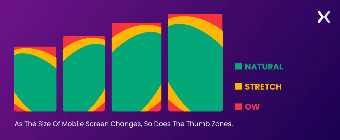
With evolving mobile screen sizes and designs (think of the iPhone 15 or Samsung Galaxy Z Fold5), interface design needs to adapt.
Guided by a thumb zone, critical design decisions shape a user-friendly mobile layout that improves interaction. Positioning your CTA in the green zones can send your conversion rates soaring.
With evolving mobile screen sizes and designs (think of the iPhone 15 or Samsung Galaxy Z Fold5), interface design needs to adapt.
 Users often alter their grip depending on the task and context, affecting their thumb’s reach on the screen.
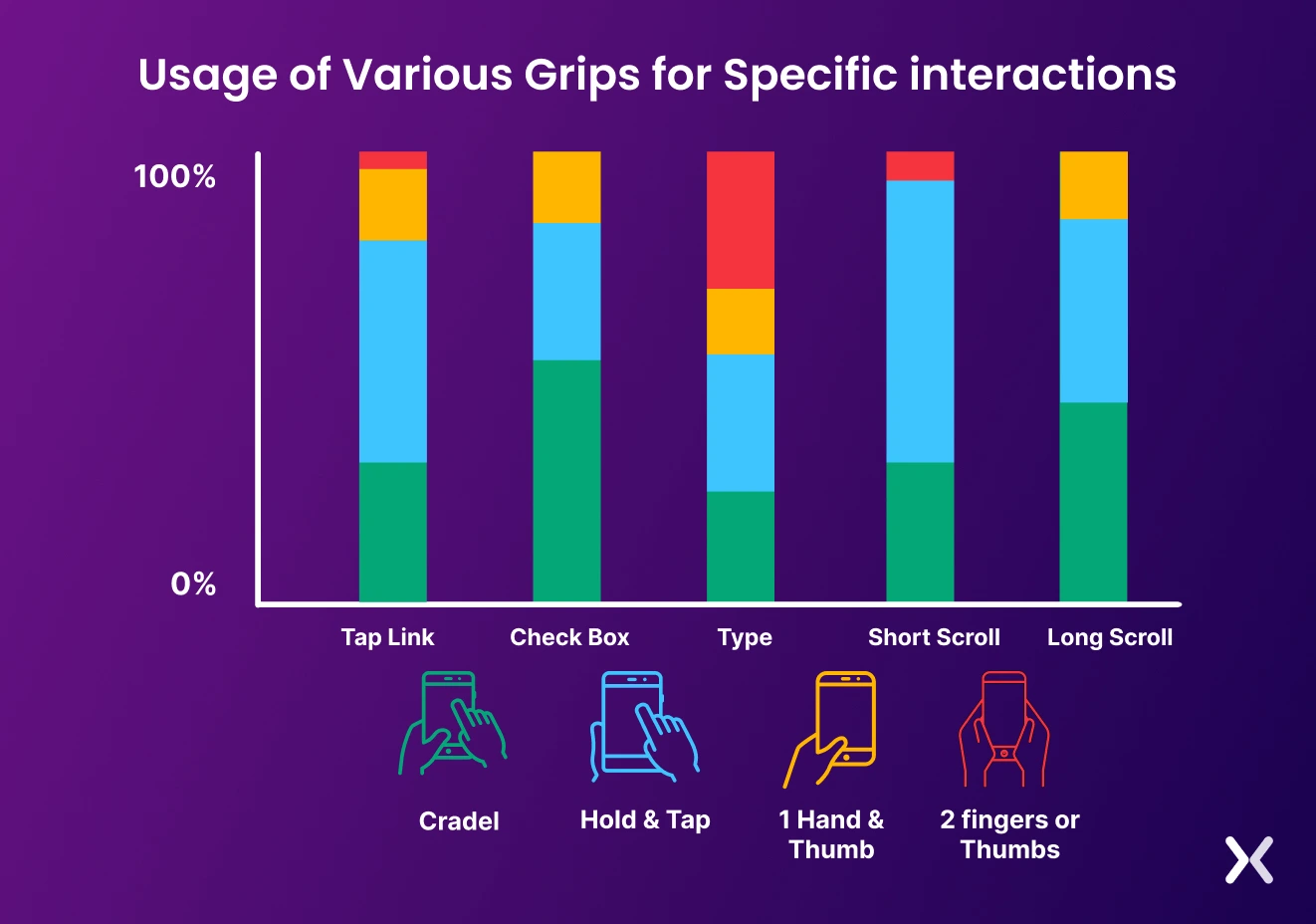 As revealed in Hoober’s study, users prefer to move content to the screen’s center before tapping. Hence, placing primary clickable options in the center with secondary navigational options along the top and bottom improves user engagement.
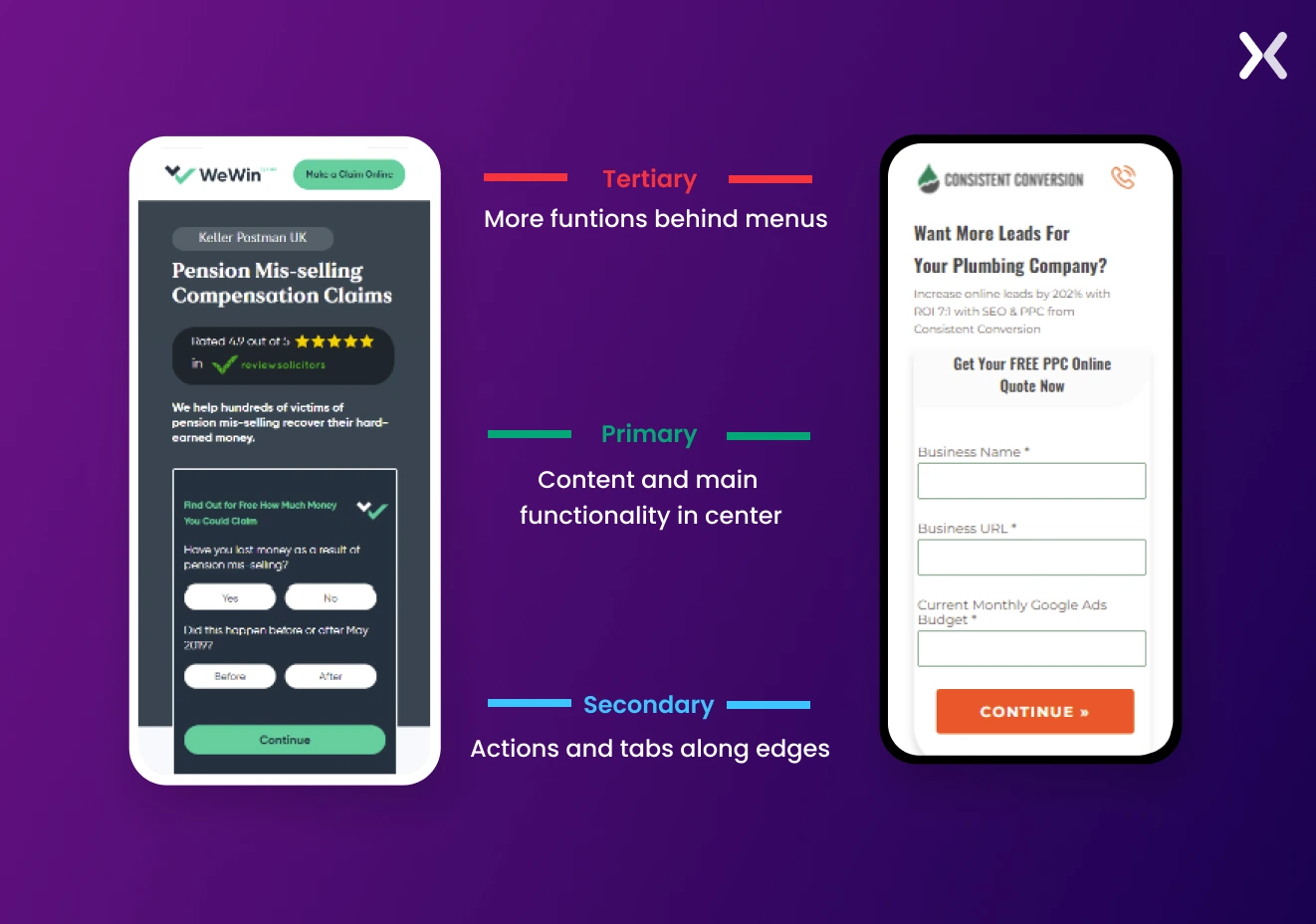
Steven Hoober provides us even more with his cardinal rules for UI/UX designers to follow to make for a touch-friendly interface, which includes:
Centralizing primary content and actions
Positioning secondary functions along the edges
Housing tertiary functions behind menus Expanding further, here is a roadmap every marketer needs to know for effective mobile CRO, according to Hoober’s heuristics:
Users look at the center of the screen - centralize key content
Users touch the center of the screen - it is a logical place for essential actions
Users only tap what they see - maintain space around touch targets to allow users to tap and register changes
Tip: Consider placing a sticky navigation menu at the screen bottom, contrasting with the standard desktop design practice of positioning it at the top.
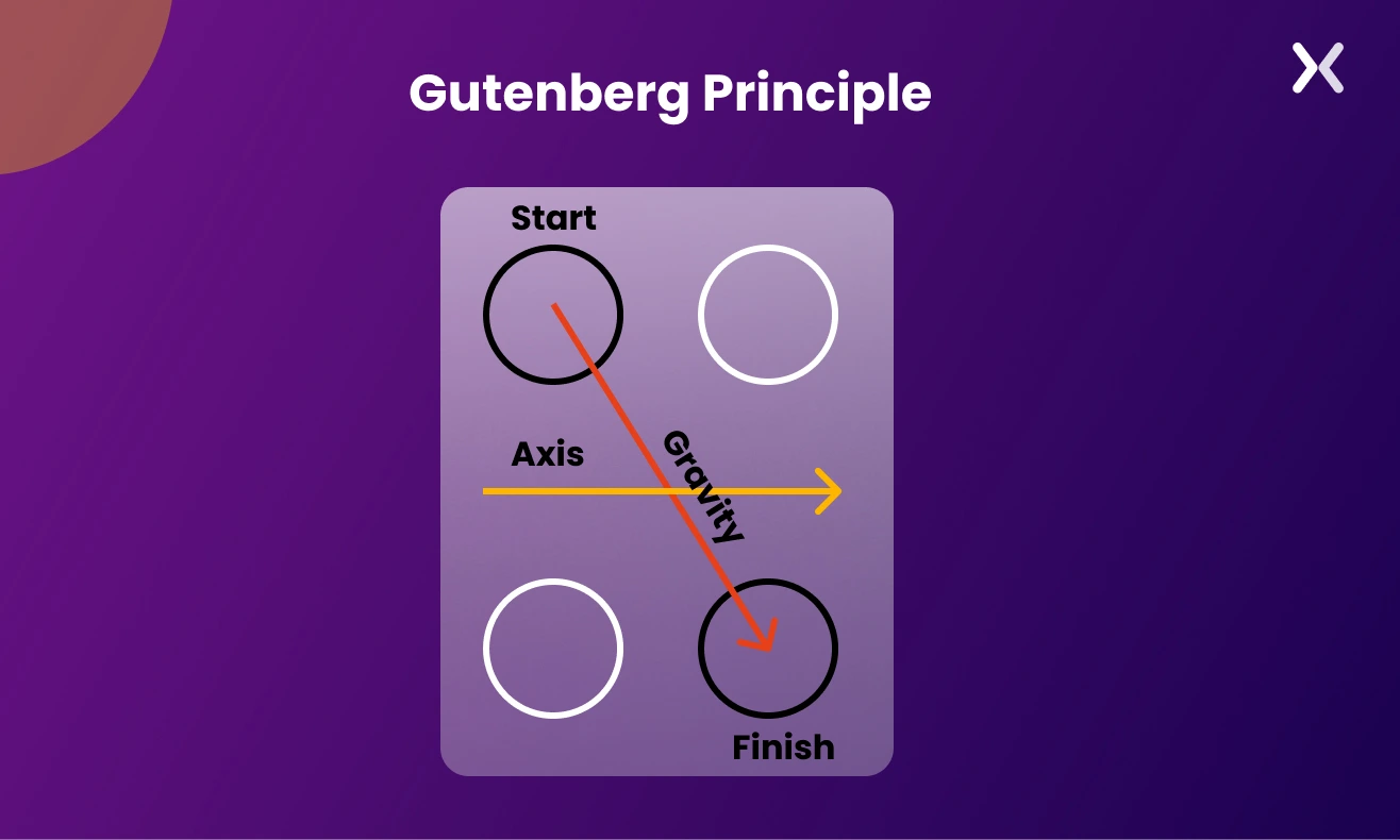
Where should the Call-to-Action (CTA) button be positioned on mobile platforms? Let’s examine this question in light of the Gutenberg Principle. The Gutenberg Principle suggests that users’ eyes move from the top to the bottom of the screen; upon ending their content scan, they seek the CTA. Hence, a top-placed CTA can confuse users, whereas a bottom-placed one is more quickly located.
 But here’s a twist - what about a floating CTA button?
Rather than at the bottom, a floating CTA button remains conveniently fixed atop or beneath the user’s screen, regardless of scrolling. It’s always within reach, enabling immediate action without CTA-seeking effort.
Just remember to maintain a considerate size, making sure content visibility is not compromised.
But here’s a twist - what about a floating CTA button?
Rather than at the bottom, a floating CTA button remains conveniently fixed atop or beneath the user’s screen, regardless of scrolling. It’s always within reach, enabling immediate action without CTA-seeking effort.
Just remember to maintain a considerate size, making sure content visibility is not compromised.
With mobile devices’ restricted screen size, brevity and purpose become principal. The need for short and engaging mobile copywriting boils down to two main reasons:
Mobile users typically have lesser attention spans, making crisp, strong copy necessary for retention and engagement.
As a result, these users tend to skim content instead of reading it thoroughly. Hence, lucid headings, bullet points, and brief paragraphs can improve content scannability. To harness effective mobile optimization in your copywriting, consider tweaking these factors:
Prioritize necessary information and key messages at the page top, making sure visibility even without scrolling.
Convey your message or value proposition clearly and concisely. Avoid fluff and stick to relevancy.
Aim for a mobile-friendly font size of about 16 pixels to make sure readability without pinching and zooming.
Tip: Don’t forget to apply the same principles to your thank you pages. Just like your main website. They should be fully optimized for mobile devices.
Moving through mobile device design? Two prevalent methods are responsive design and adaptive design.
Responsive Design This flexible approach serves varied screen sizes. Think of it as a one-size-fits-all solution - you craft a website that fluidly adjusts and provides an ideal viewing experience across all devices, whether a desktop or a mobile phone.
Adaptive Design Also known as dynamic serving, this method offers a tailored fit. You create multiple website versions, each optimized for specific device types or screen sizes. The smart server senses the user’s device and delivers the suitable website or landing page version. Below is a feature-based comparison table:
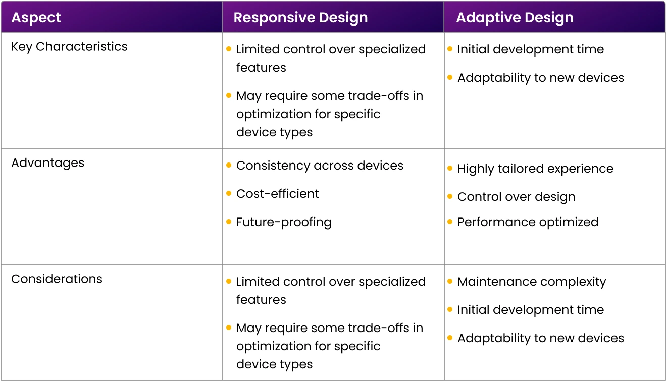
Tip: As a starting point for CRO for mobile sites, we’d suggest opting for a responsive design. It’s easier to learn and implement, saving your resources while offering valuable user data and a smooth user experience across varied devices.
Remember: A user’s trust is essential. Regardless of space constraints, never overlook GDPR guidelines while sharing your privacy policy and securing consent where needed. Also, while it’s essential to use social proof. Don’t bombard your readers with too much information.
This is always the golden rule for any optimization effort. Whenever you tweak your site or landing pages. It’s vital to conduct A/B tests to confirm the effectiveness of these changes. After all, some modifications could inadvertently hinder your site’s performance. Gauge your CRO strategies’ success by comparing your current conversion rate with past and competitors’ rates.
Mastering mobile conversion optimization isn’t just about following trends; it’s about solidifying an essential digital strategy. The journey to conversion also doesn’t need to be packed with obstacles. With a smooth mobile experience, it can become a rewarding adventure that leads users straight to your conversion objectives. And that’s where Apexure, a conversion-focused agency, steps in. Specializing in morphing ordinary mobile interactions into formidable conversion machines, Apexure helps your website and landing pages cater graciously to bustling mobile users and desktop users seeking a rich online experience. Don’t just optimize; Apexure-optimize and watch your digital presence grow across all devices.
Get in touch for an in-depth discussion today!
Do you know Apexure has 100+ blog posts on landing pages? We have shared everything, from creation to testing, analysis to optimization. Check it out before you build your mobile landing page.
Making a landing page on your own with just examples can take a lot of time. Get the help you need from our experts. Book a call and one of our experts will contact you soon.
Check out our landing page portfolio to discover conversion-friendly mobile landing page elements that might. Filter your industry and check which landing page design is trending.
Designing for mobile first makes sure intuitive layouts tailored to small screens, easy navigation, and faster adoption by Google’s mobile-first indexing—all helping to reduce bounce rates and improve usability.
Related Articles:
Founder & CEO of Apexure, Waseem worked in London’s Financial Industry. He has worked on trading floors in BNP Paribas and Trafigura, developing complex business systems. Waseem loves working with Startups and combines data and design to create improved User Experiences. Read more


Drive More Sales or Leads With Conversion Focused Websites and Landing Pages
Get Started

Eleven percent of Meta ad rejections in 2026 trace back to one problem: the landing page does not...

A B2B SaaS company spends $30,000 per month on Google Ads and Meta Ads. Both campaigns drive traffic...
Get quality posts covering insights into Conversion Rate Optimisation, Landing Pages and great design