
A landing page that looks great but does not convert is a UX problem. A landing page that converts once but frustrates users into never coming back is a CRO problem. Same page, different failure modes. Same fix: stop treating these as separate workstreams. We see the split constantly when onboarding new clients at Apexure. One team is building Figma prototypes based on design principles. Another team is running A/B tests based on whatever the founder read on LinkedIn that morning. Neither team has access to the other’s data. The designer does not know which layout actually converted better. The CRO analyst does not know why users are rage-clicking the hero section. After nearly a decade of running CRO programmes, the pattern is clear: the biggest conversion lifts do not come from better design OR better testing in isolation. They come from using UX research to find the real problems, then using CRO experiments to validate the fixes. This guide is the process we actually use.
Before getting into the process, a quick clarification, because we have sat in enough meetings where people use “CRO” and “UX” interchangeably, and the confusion costs real money.
Conversion rate optimization (CRO) is the systematic process of increasing the percentage of visitors who complete a desired action. It is driven by data, experimentation, and statistical validation. The output is measurable: conversion rate went from X% to Y%.
User experience (UX) is the practice of making the entire journey smooth, intuitive, and satisfying. It draws on research, psychology, and design principles. The output is qualitative: users can complete tasks more easily, with less frustration. The confusion happens because they share the same goal, getting more people to convert, but they approach it from different angles. UX asks “is this experience good?” CRO asks “does this change measurably improve the number?”
The relationship is not “CRO vs UX”. It is “UX research informs CRO experiments.” Without UX research, you are testing random hypotheses. Without CRO experimentation, you are implementing changes based on opinions.
Here is the uncomfortable truth about “top 10 UX tips” articles: they work, once. You implement the green CTA button, the single-column layout, the social proof above the fold. Conversions tick up 5-10%. Then nothing. The problem is not that the advice was wrong. The problem is that your competitors read the same article. When everyone follows the same playbook, the playbook stops being an advantage. The initial gains came from fixing obvious problems. The sustained gains require knowing something your competitors do not: what YOUR users specifically need.
A 2026 Baymard Institute study found that the average e-commerce site can gain a 35.26% increase in conversion rate through better checkout design alone. But which checkout changes matter for YOUR users? That depends on where they abandon, why they hesitate, and what they need to feel confident. Generic best practices cannot tell you that. Research can.
This is the actual process we run at Apexure. Not a conceptual model, the real sequence of steps, with the real tools, that we use on every client engagement.
This is where most CRO programmes go wrong: they skip straight to testing. Do not do that. Before touching any design or copy, watch what your users are actually doing. The research toolkit:
This is where we spend the most time arguing with clients, in a productive way. They want to jump straight from “we found a problem” to “let us redesign the page.” The step in between is what separates random changes from informed experiments. The technique is borrowed from management consulting. Ex-McKinsey consultant Ameet Ranadive wrote about the question his teams used relentlessly: “Where’s the So What?” We adapted it for CRO work, and it is now baked into every engagement. Here is how it works in practice:
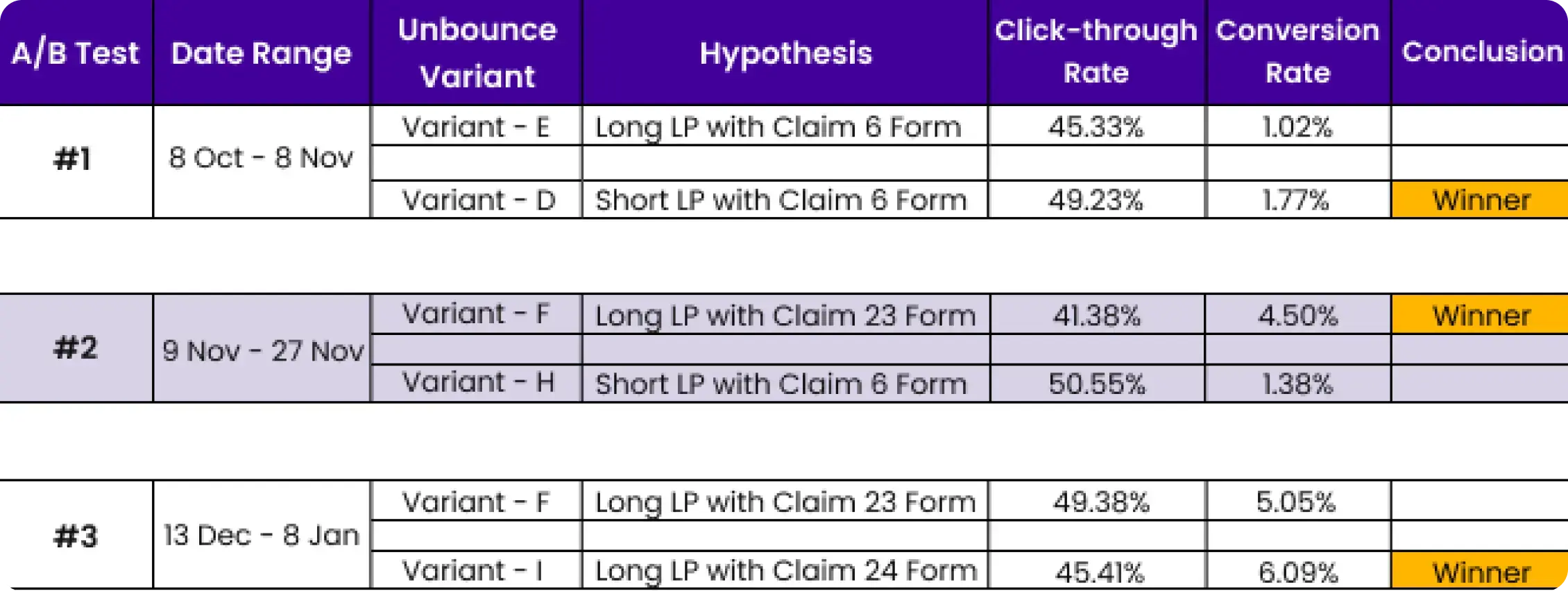
Observation: 30% of visitors click the logo at the top of the landing page.
So what? Users want to know more about the brand before converting.
So what? We have two testable hypotheses:
So what? We can A/B test both against the current version and measure which drives more conversions. Without the “So What?” chain, that heatmap data is just a stat in a report. With it, you have two test concepts ready to run.
After a thorough UX research phase, you will have 15-20 hypotheses. You can test maybe 3-4 per month. Choosing the wrong three means months of wasted capacity. At Apexure, we use the EPIC framework (Experimentation, Priority, Impact, Cost) to score every potential test on four dimensions:
This is where discipline matters more than creativity. Run the experiments properly:
Not every UX fix moves conversions. Some just make the experience nicer without changing behaviour. These four areas consistently produce measurable lifts in our testing.
Nobody says “this page is slow. I will leave now.” They just leave. Speed is invisible UX, you never notice it when it is good, but it kills conversions when it is bad. Google’s data shows that a 1-second delay in page load reduces conversions by up to 7%. In 2026, Google’s Core Web Vitals include three metrics that directly affect UX and conversions:
INP replaced First Input Delay in March 2024 and measures how quickly your site responds to user interactions. If a visitor clicks a button and nothing visibly happens for 300ms, that lag erodes trust, even if the page eventually responds.
Forms are where conversion intent meets UX friction. Baymard Institute’s 2026 research found that the average checkout has 23 form elements, while the ideal is 12-14. That gap represents pure friction. For lead-gen forms, the same principle applies. Every unnecessary field is a dropout point. In our testing, reducing a 7-field form to 3 fields typically increases completion rates by 30-50%.
Users scan before they read. If your page does not immediately communicate what it offers and why the visitor should care, they leave. This is a UX problem with direct conversion consequences. The fixes are often simple:
Trust is a UX element that directly gates conversion. Users look for signals that reduce perceived risk before committing. The most effective trust signals we see in testing:
"They're collaborative, and it'll feel like they're part of your own team. They had a very strong process, wherein they were able to integrate the right resources at the right time."
We do not separate CRO and UX into different teams. Every engagement runs through the same integrated process: research the user experience, build data-informed hypotheses, score them with the EPIC framework, test, and iterate.
We install Hotjar or Clarity, run heatmap and session recording analysis, and review GA4 funnels. This gives us a friction map, not opinions, data.
Using the "So What?" framework, we translate every friction point into a testable hypothesis with defined success criteria.
Each hypothesis gets scored on Experimentation, Priority, Impact, and Cost. Highest-scoring tests run first.
Our in-house team designs and develops test variants. We run A/B tests with proper sample size calculations and wait for statistical significance.
Results feed back into the next research cycle. Every test (win, lose, or inconclusive) adds to our understanding of your users.
We will audit your landing pages for UX friction and conversion leaks, then build a prioritised test roadmap using the EPIC framework, free of charge.
Book a Free CRO + UX Audit →We will review your landing pages for UX friction and conversion leaks, then give you a prioritised action plan. Book a call to get started.
Our Complete Guide to CRO covers the full optimisation process, and our CRO Consultant Guide helps you decide when to bring in help.
Our case studies show how UX-driven CRO has lifted conversion rates by 40-150% across SaaS, healthcare, finance, and e-commerce.
CRO (conversion rate optimization) focuses on increasing the percentage of visitors who complete a desired action — filling out a form, booking a demo, making a purchase. UX (user experience) focuses on making the overall journey smooth, intuitive, and satisfying. They overlap heavily: good UX almost always improves conversions. The difference is that CRO adds a measurement and experimentation layer that pure UX work often does not.
Related reading:
Founder & CEO of Apexure, Waseem worked in London's Financial Industry. He has worked on trading floors in BNP Paribas and Trafigura, developing complex business systems. Waseem loves working with Startups and combines data and design to create improved User Experiences. Read more


Drive More Sales or Leads With Conversion Focused Websites and Landing Pages
Get Started

Eleven percent of Meta ad rejections in 2026 trace back to one problem: the landing page does not...

A B2B SaaS company spends $30,000 per month on Google Ads and Meta Ads. Both campaigns drive traffic...
Get quality posts covering insights into Conversion Rate Optimisation, Landing Pages and great design

