
Most marketers treat the thank you page as an afterthought, a generic “thanks, we’ll be in touch” message. That is a wasted conversion opportunity. Your thank you page after form submission is the one moment when a visitor has just committed to your brand. They filled out your form. They are engaged, trusting, and receptive. What you show them next determines whether they become a passive lead or an active prospect moving deeper into your funnel. After building 3,000+ landing pages, including the post-conversion flows that follow them. We have seen well-designed thank you pages drive referrals, upsells, social follows, and second conversions in the same session. This guide covers 10 real thank you page examples by use case, best practices for designing yours, and the mistakes that silently kill your post-conversion momentum.

A thank you page, also called a success page or confirmation page, is where visitors land immediately after completing a form submission, purchase, sign-up, or booking on your site.
 It serves three purposes:
The thank you page is the bridge between lead capture and lead nurturing, the highest-intent moment in your funnel.
“Why bother with a thank you page when we already send a confirmation email?” We hear this from about a third of new clients. Fair question. Here is why it falls apart:
 After building 3,000+ landing pages, we can say this with confidence: the thank you page is the most neglected page in most funnels. Teams agonise over headline copy and hero images for weeks, then ship a thank you page that says “Thanks, we’ll be in touch.” Full stop. Nothing else.
One example: a clinical trials company we worked with hit a 51.78% conversion rate on their enrolment page. That number did not happen because of the landing page alone. The thank you page reinforced why participation mattered and walked people through the next enrolment step. We designed both pages as one connected experience, not two separate projects.
After building 3,000+ landing pages, we can say this with confidence: the thank you page is the most neglected page in most funnels. Teams agonise over headline copy and hero images for weeks, then ship a thank you page that says “Thanks, we’ll be in touch.” Full stop. Nothing else.
One example: a clinical trials company we worked with hit a 51.78% conversion rate on their enrolment page. That number did not happen because of the landing page alone. The thank you page reinforced why participation mattered and walked people through the next enrolment step. We designed both pages as one connected experience, not two separate projects.

We have built thank you pages for 300+ clients across 20+ countries. Tell us about your funnel and we will show you where the gaps are.
Get a Free Audit →Each example below is matched to a specific funnel stage. The elements we recommend come from patterns across hundreds of client projects, not theory.
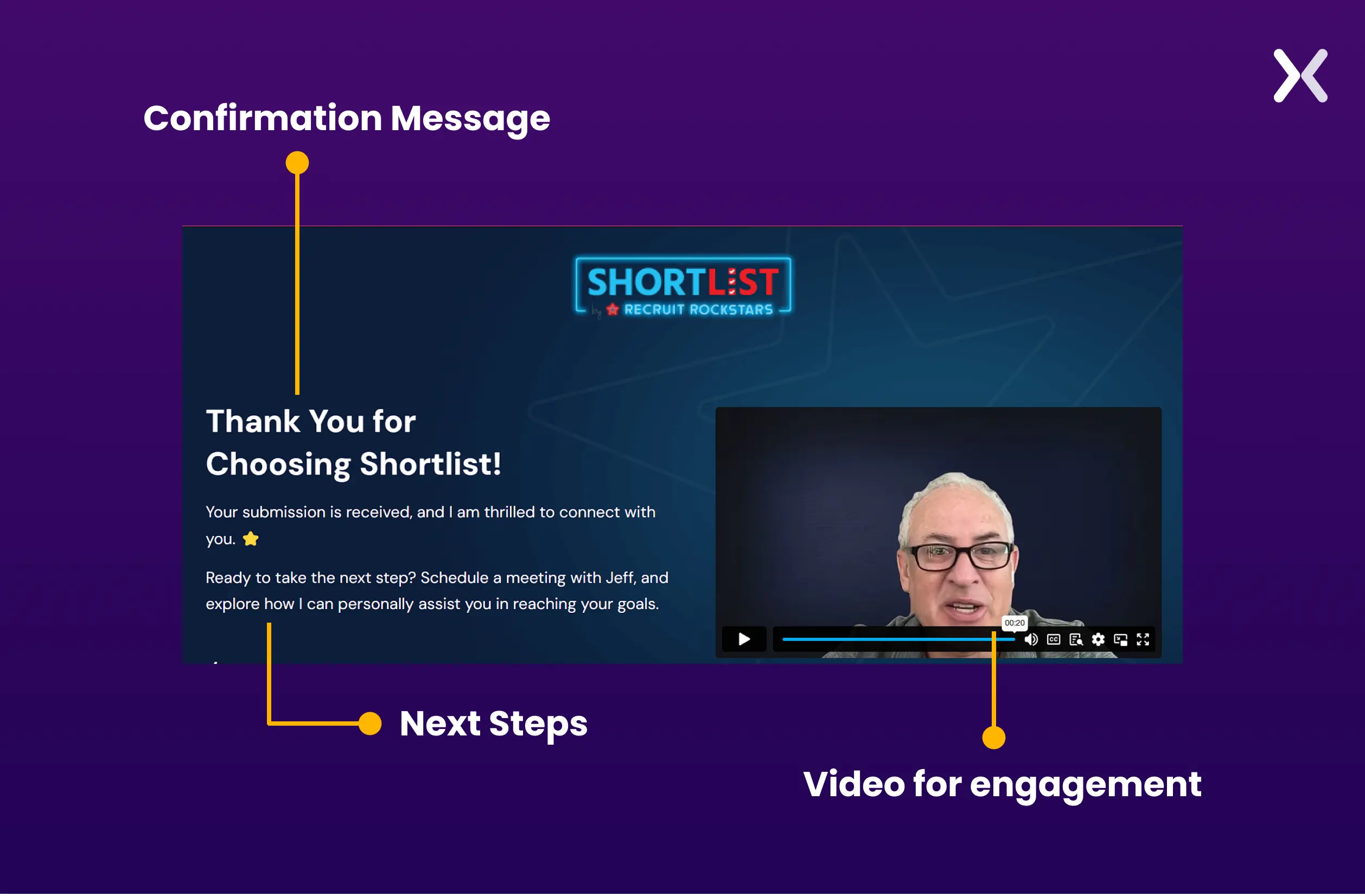
The visitor has expressed direct interest in your services. This is a high-intent lead. Your thank you page should reinforce trust and keep them engaged while they wait for a response.
What to include:
What to avoid: Asking them to fill out another form. They just gave you their information, respect that.
For a B2B corporate governance publication, we built a contact form funnel where the thank you page included a speaker preview and a multi-step qualification flow. The result: 27.89% conversion rate, 82 conversions from 294 visitors.
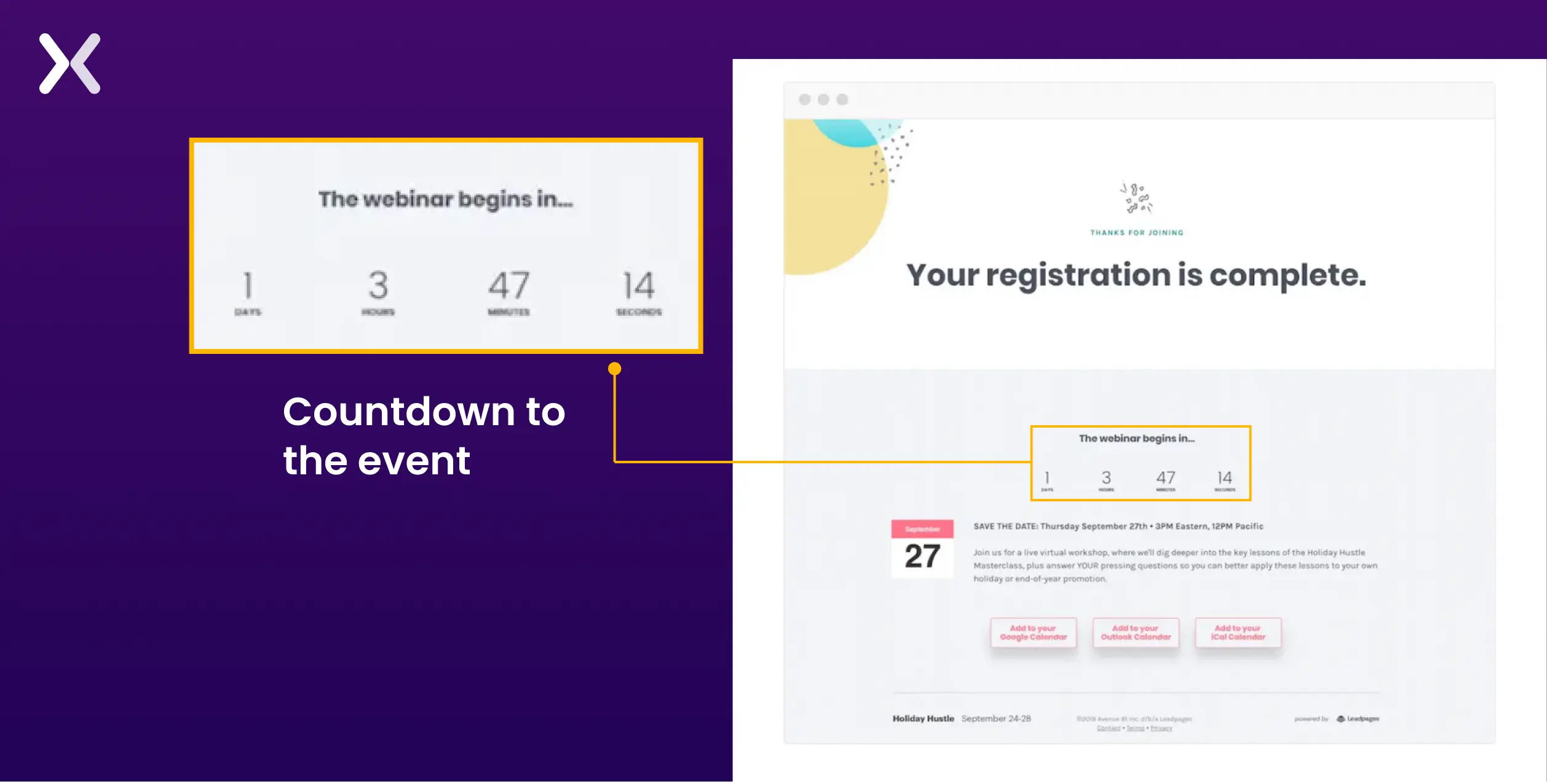
Webinar registrants need clear logistics. Confusion about when, where, or how to join kills attendance rates.
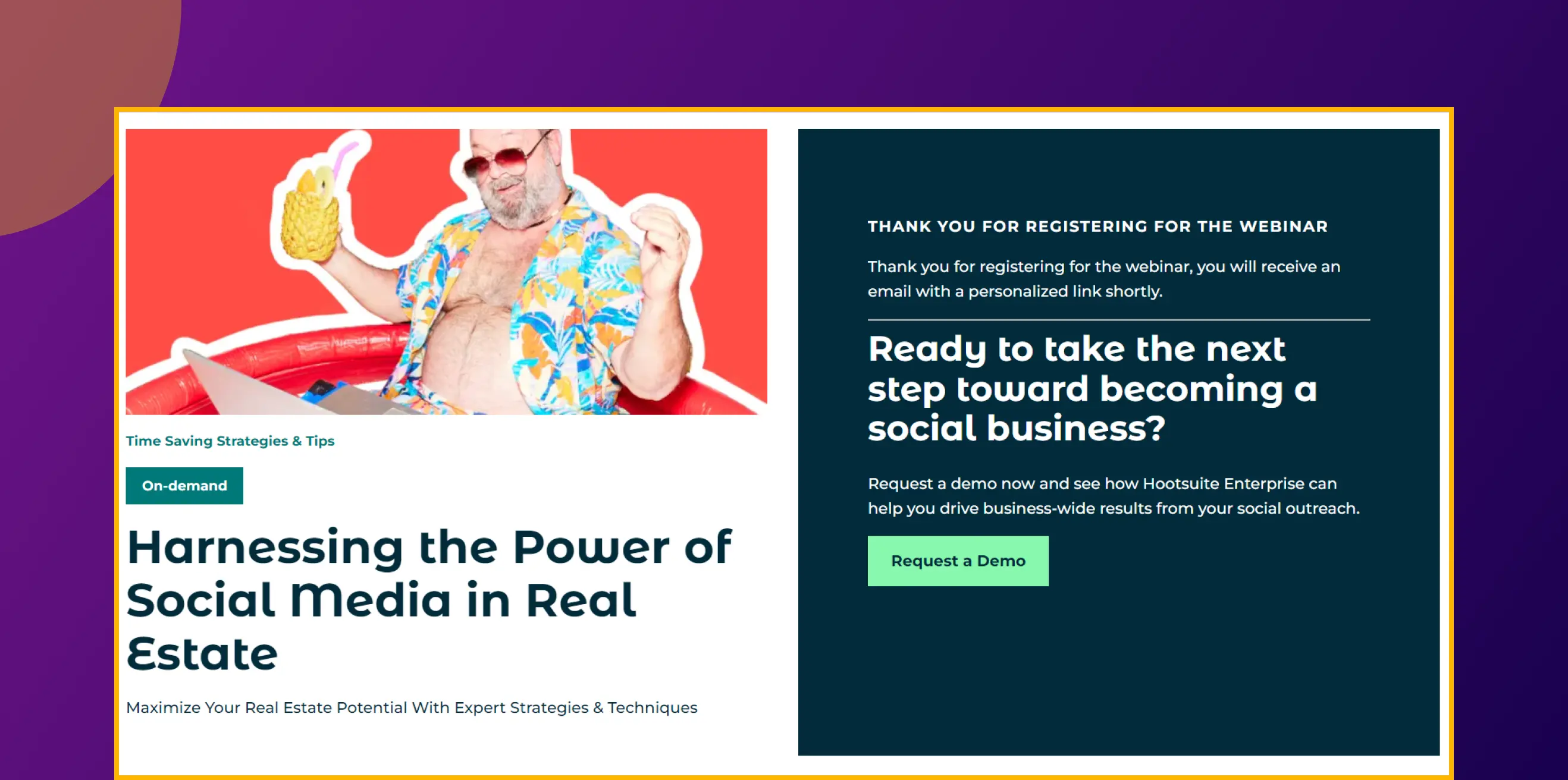
What to include:
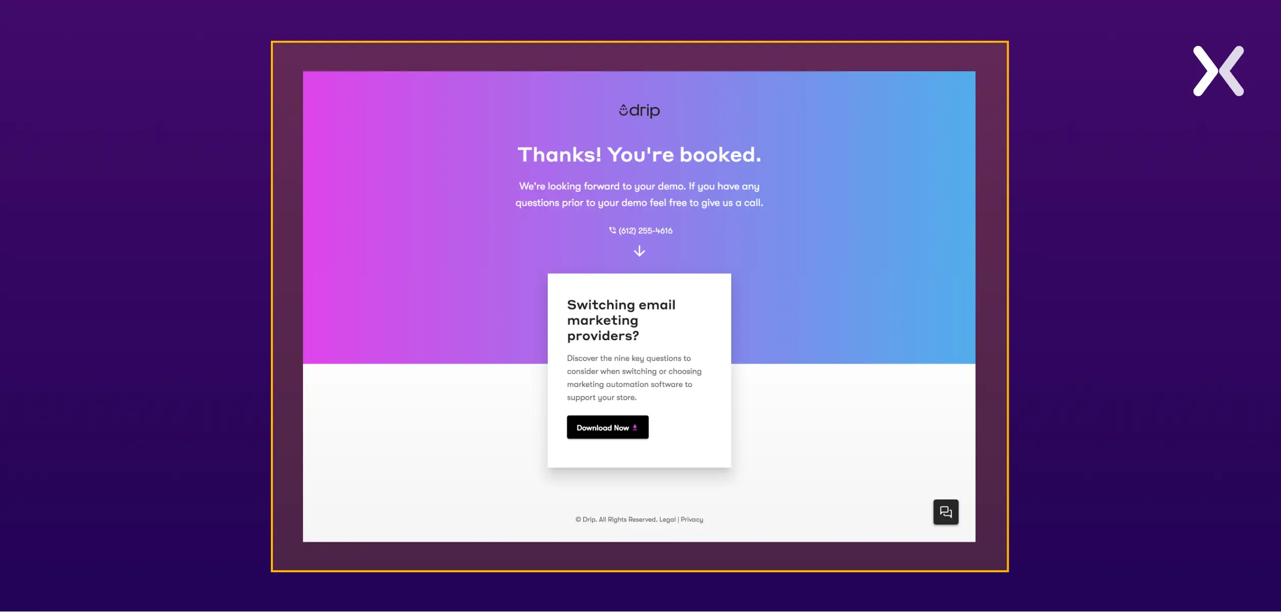
When someone books a call or demo, they are signalling serious buying intent. Use the thank you page to prepare them for the conversation.
What to include:
For Flare.io, a cybersecurity SaaS company, the original Book a Demo page had a bare-bones thank you screen. We added a 90-second product overview video and an industry-specific case study to the thank you page. The result: a 65% increase in demo conversions, within the first week.
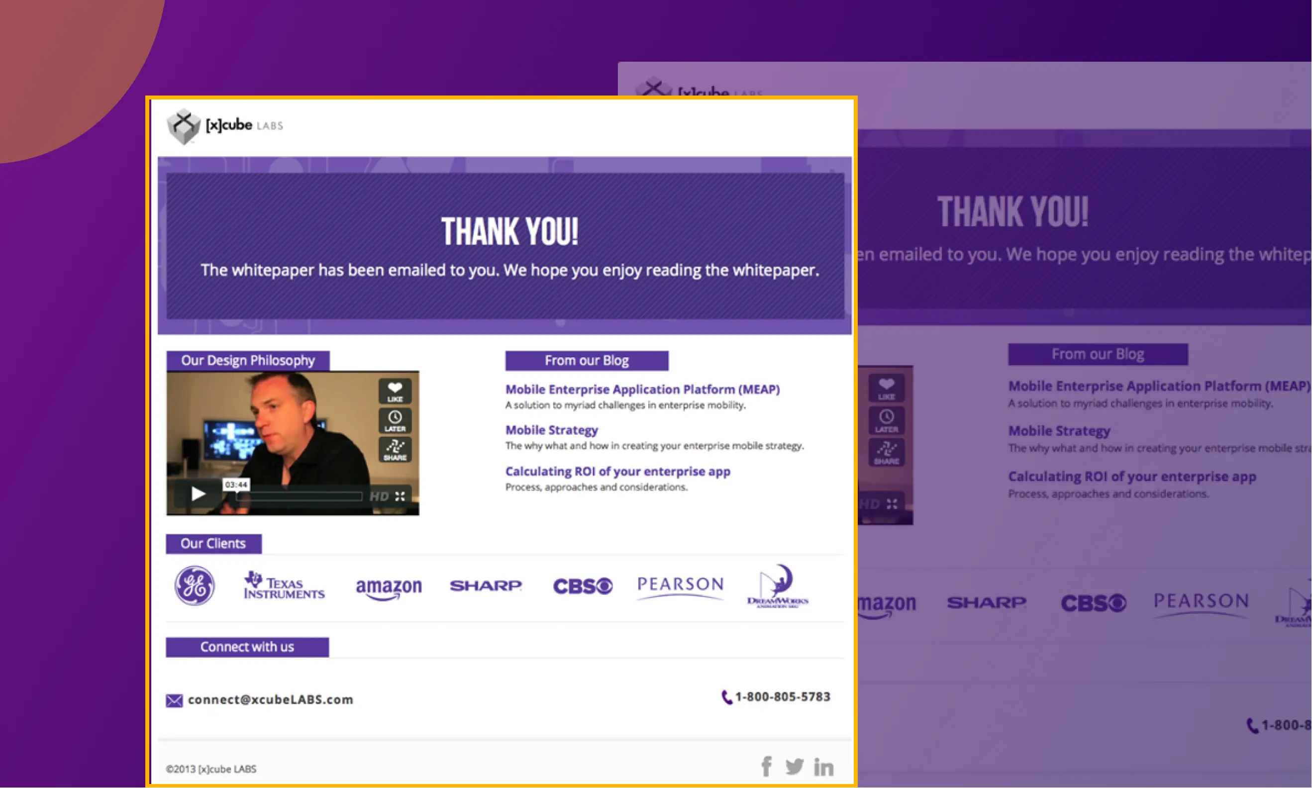
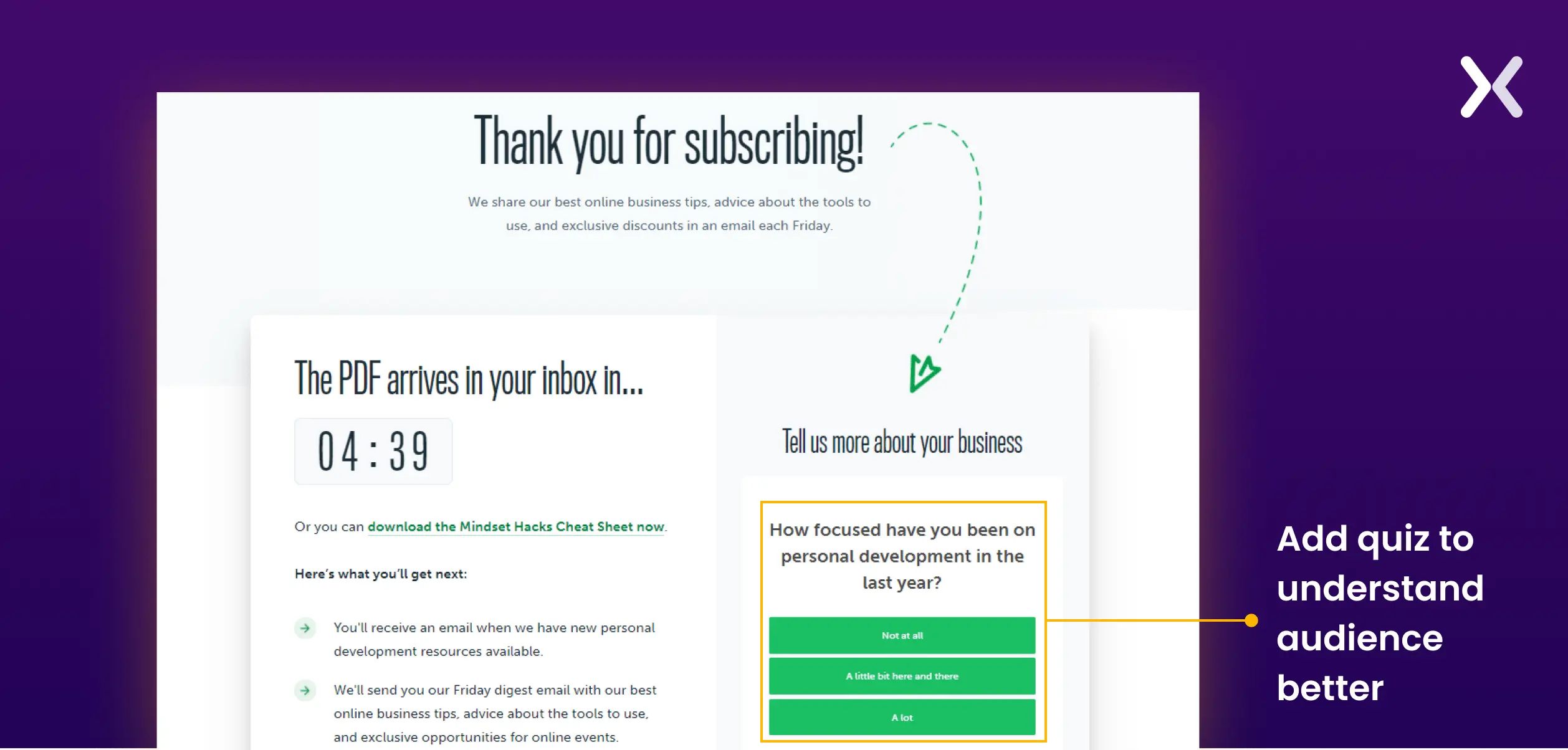
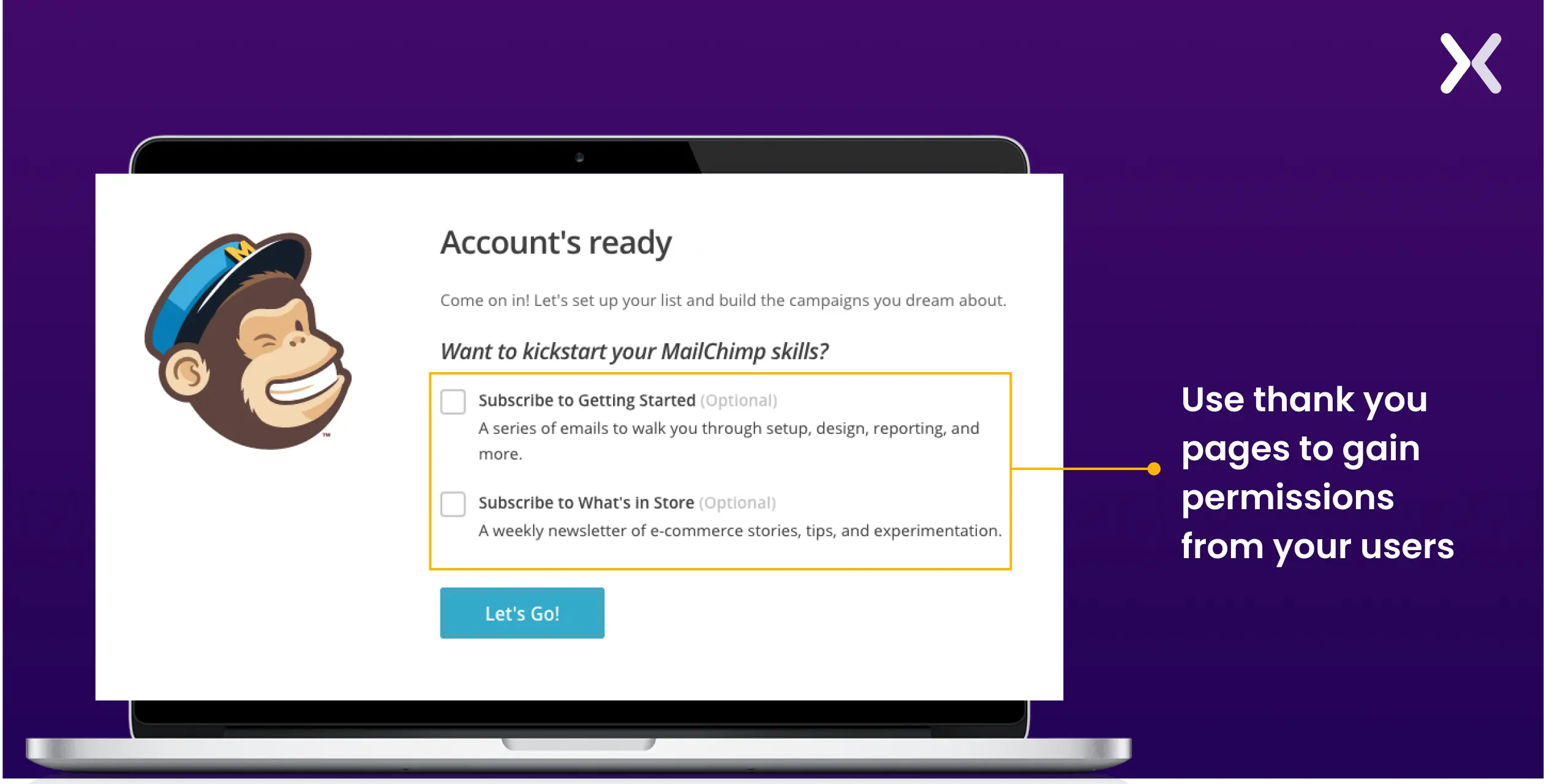
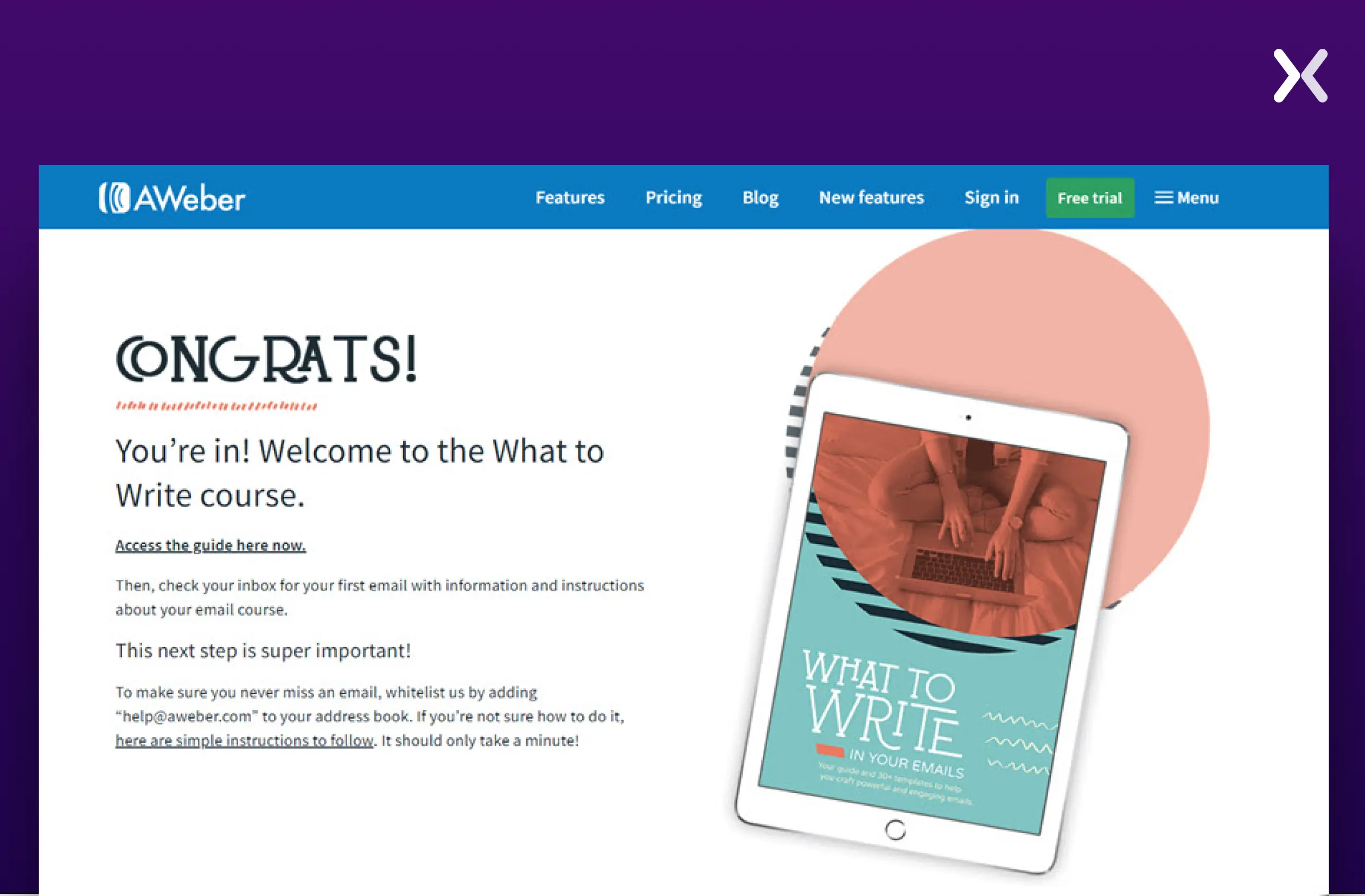
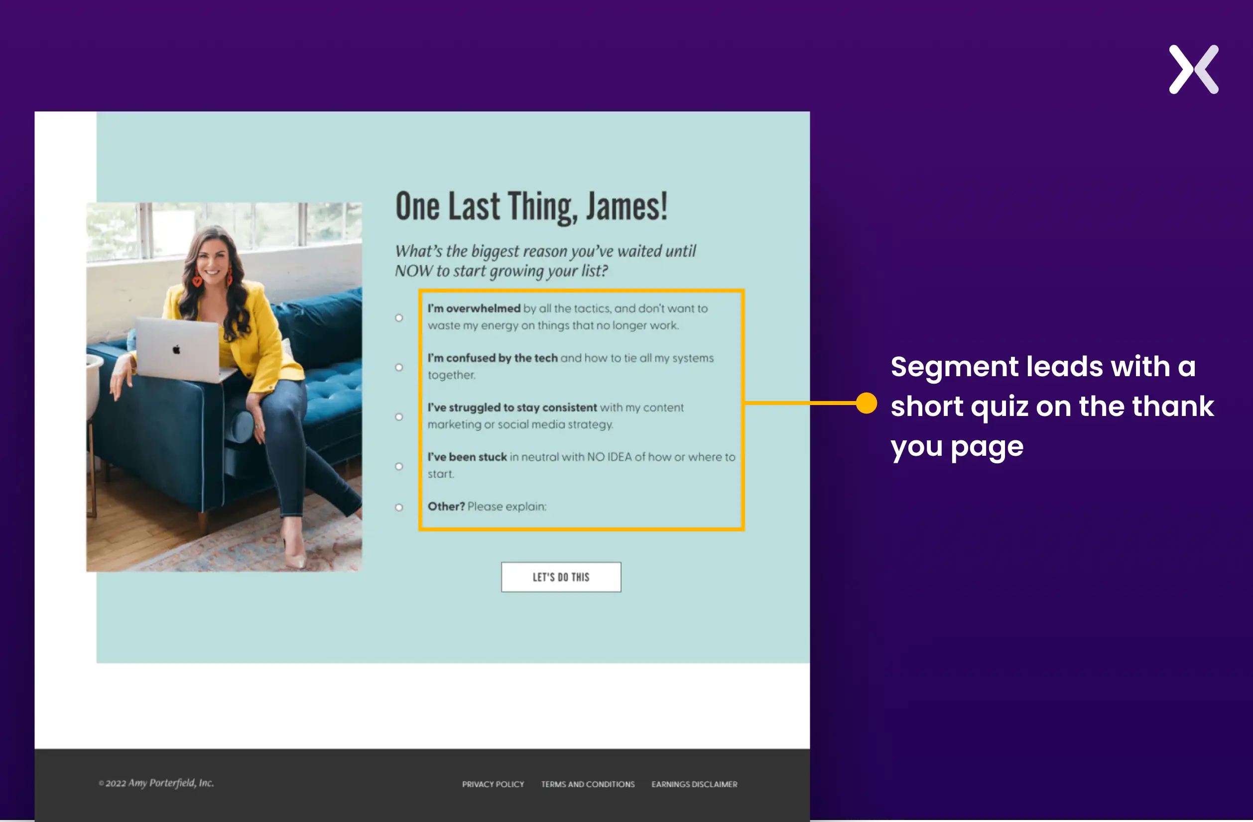
Lead magnets are top-of-funnel. The thank you page is your chance to push the lead toward the middle of the funnel.
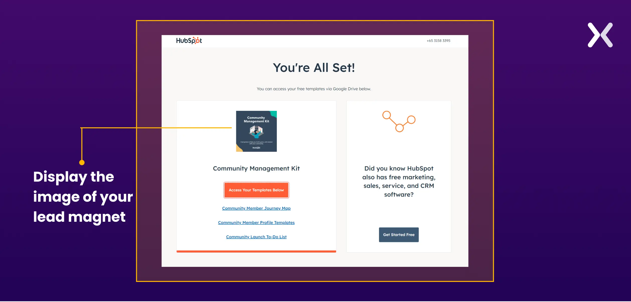
What to include:
Do not gate the download behind another form. If you promised immediate access, deliver it on the page. Sending it only by email risks the download never happening, email open rates are 20-30%, and spam filters catch more every year.
Newsletter subscribers have opted into a recurring relationship. Set content expectations early.
What to include:
Not confirming what the subscriber will actually receive is a common mistake. "Thanks for subscribing!" without context creates uncertainty. Tell them exactly what to expect, how often, and from which email address.
The visitor just gave you their money. That is the strongest trust signal in the entire funnel. Do not waste it with a generic “order confirmed” screen.
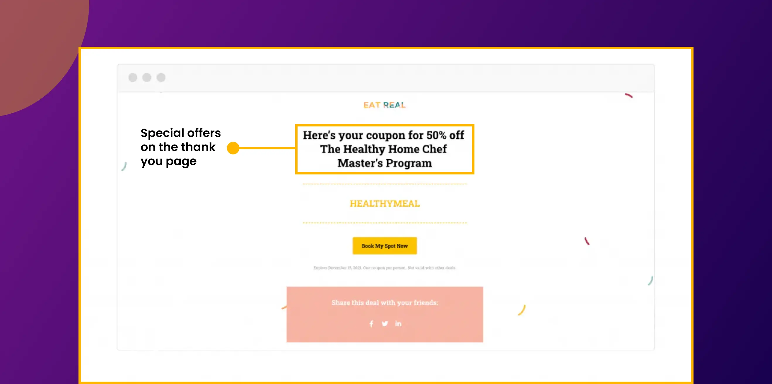
What to include:
This principle extends beyond purchases. For a top-of-funnel lead magnet, share middle-of-funnel content on the thank you page, a webinar invite, a case study, or a demo booking link. Guide leads deeper into the funnel at every stage.
After account creation, the thank you page is your onboarding trigger. The goal: get users to take the first meaningful action inside your product.
What to include:
What to track: Measure how many users who see the thank you page complete their first in-product action within 24 hours. This is your activation rate, and the thank you page directly influences it.
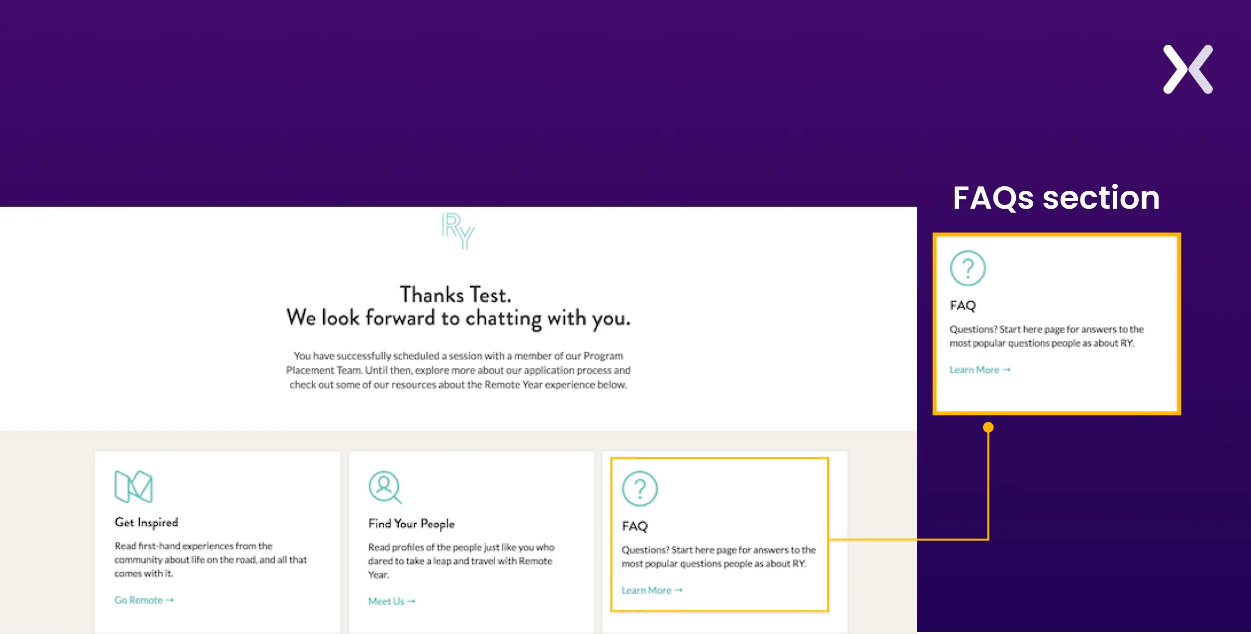
Students have committed time and often money. Make the thank you page their launchpad, not a dead end.
What to include:
A SaaS demo request is one of the highest-value conversions in B2B. The visitor has self-identified as a potential buyer. Prepare them before the call.
What to include:

"Essential elements for our thank you pages include a clear confirmation message, an additional call-to-action (CTA), and a sneak peek into our product offerings or content. We turn the page into a tool for engagement and lead nurturing."
Survey respondents gave you something valuable: their time and opinions. Reciprocate.
What to include:
See our workApexure Landing Page Portfolio, 117 projects including post-conversion flows→
These principles come from building and testing thank you pages across 3,000+ client projects over 10 years.
What you put on your thank you page depends on where the buyer is in the funnel. A lead magnet download page should educate. A book-a-call page should prepare. A purchase page should upsell. The content of thank you pages should vary based on the next steps in the user journey.
The first thing visitors must see is confirmation that their submission worked. Remove doubt before asking for anything else.
Good: “Thank you! We’ve received your enquiry and will respond within 24 hours.”
Bad: Jumping straight to upsells without confirming the form submitted. Sounds basic. And yet, when we audit client funnels, about one in five thank you pages skip this entirely.
Tell visitors exactly what happens next:
“Soon” means something different to everyone. “Within 24 hours by email” means exactly one thing. Specificity builds trust.
The thank you page can drive a secondary action, but keep it focused. Pick one:
Match the secondary CTA to the funnel stage. A contact form lead is ready for a demo or case study. A lead magnet download lead needs more education first. We have tested this across dozens of client projects, one CTA beats three, every time.
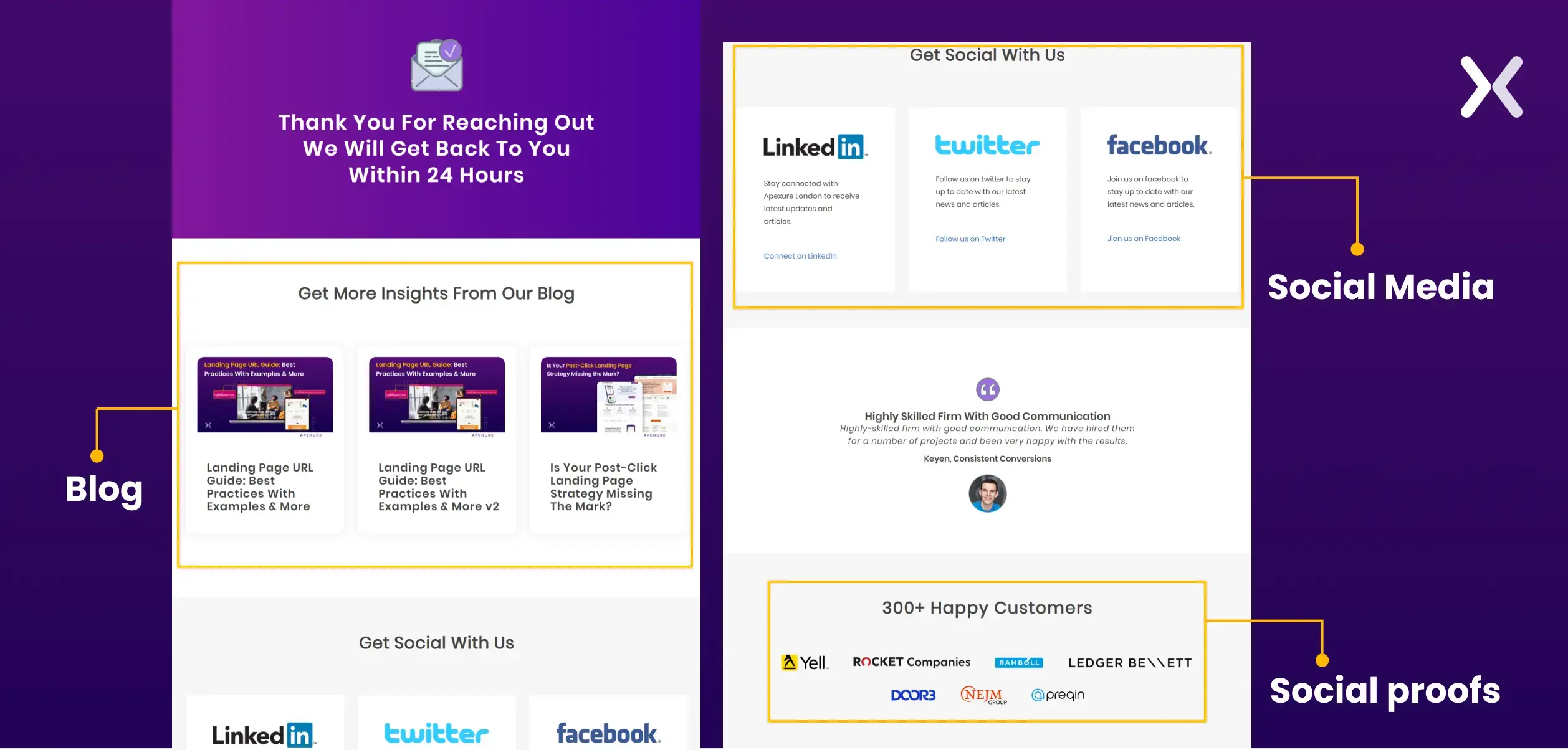
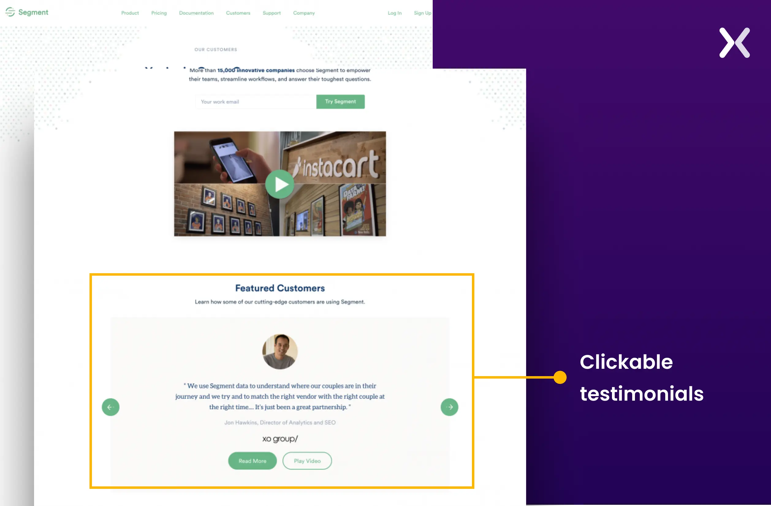
Testimonials, client logos, and trust badges reassure visitors they made the right choice. The visitor just handed over their information. They want validation. Place social proof prominently, not buried below the fold. A short testimonial with a real name and company carries more weight than a wall of anonymous five-star ratings.
"Their knowledge of landing page design and CRO is second to none."
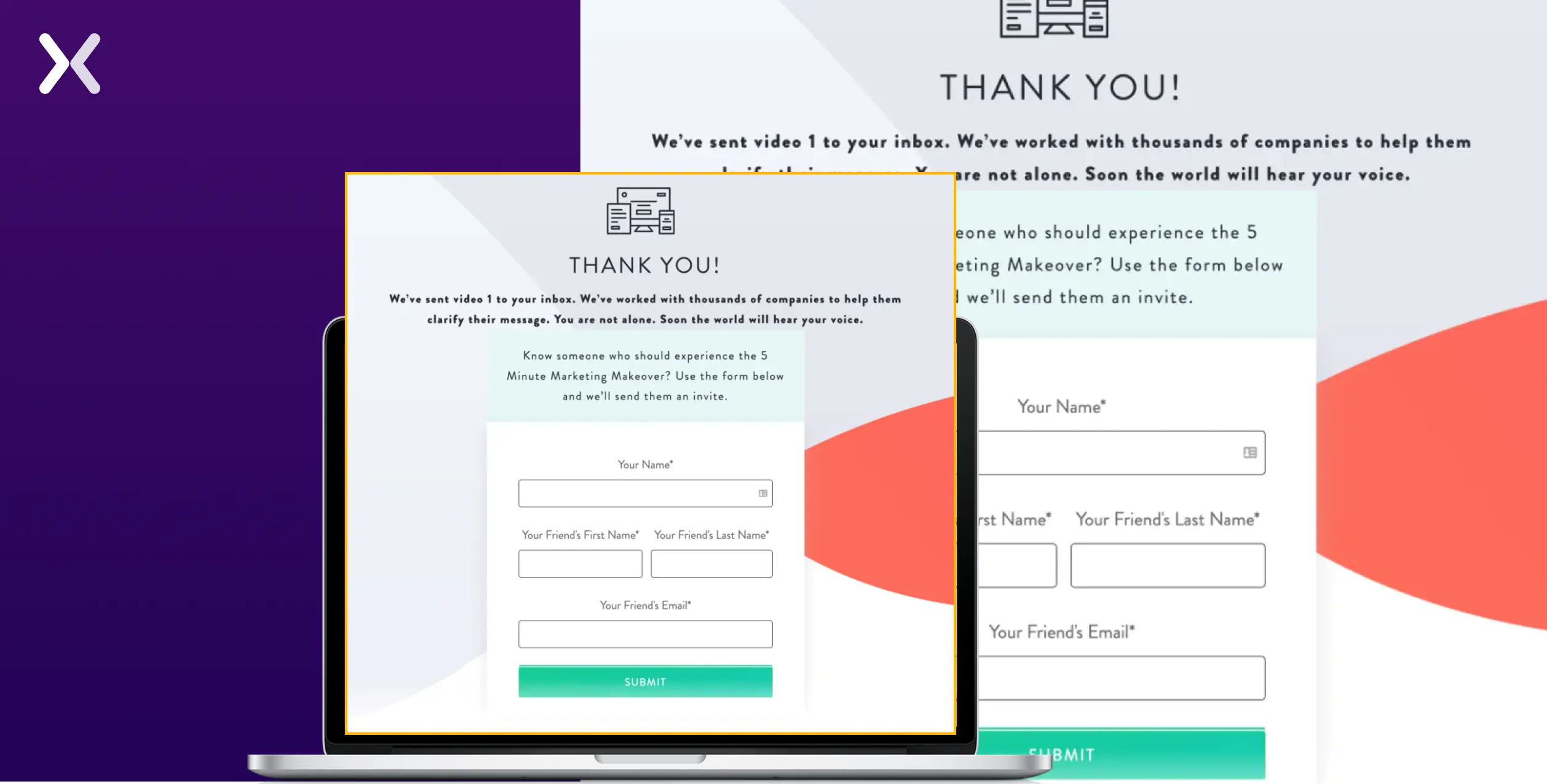
If the visitor just signed up for something valuable (a webinar, a free tool, a course) make it easy to share with colleagues. Include pre-written share messages for LinkedIn, X (Twitter), and email. Reduce friction to a single click. In our post-conversion tests, a well-timed referral ask right after conversion outperforms email-based referral requests by a wide margin.
Use form submission data to personalise the thank you page. If you collected their name, use it. If you know their industry, show a relevant case study. If you know their company size, adjust the CTA.
Dynamic landing pages, where the content adapts based on form field values, are underused but effective. Most landing page platforms (Unbounce, HubSpot, Instapage) support this without custom code.
Your thank you page should look and feel like the rest of your site. Same logo, colours, typography, and tone. A jarring design break at this stage undermines the trust you just built. We see this most often with third-party form builders that redirect to a generic confirmation page. If your tool does not support branded thank you pages, build a custom one on your site and redirect to it after form submission.
Always add <meta name="robots" content="noindex, nofollow"> to your thank you page. If search engines index it, people will land on it from organic search without submitting a form, breaking your conversion tracking and creating a confusing user experience. Check Google Search Console periodically to verify your thank you pages are not indexed.

Your thank you page is the foundation of conversion tracking for paid campaigns. Every major ad platform uses it.
| Platform | How It Tracks | What to Set Up |
|---|---|---|
| Google Ads | Fires conversion tag on thank you page load | Add Google Ads conversion snippet to thank you page only |
| GA4 | Records page_view event on thank you URL | Create a conversion event for /thank-you/ page views |
| Meta Pixel | Fires Lead or Purchase event on page load | Add fbq('track', 'Lead') to thank you page |
| LinkedIn Insight | Records conversion on specific URL match | Set conversion URL to your thank you page path |
| TikTok Pixel | Fires CompleteRegistration or PlaceAnOrder event | Add event code to thank you page via GTM |
Use a dedicated thank you page URL (e.g., /thank-you/ or /confirmation/) rather than an inline success message. Dedicated URLs are easier to track, easier to A/B test, and compatible with every ad platform. If you use Google Tag Manager, fire all conversion tags via a single GTM trigger that matches your thank you page URL pattern.
Here is something that still surprises us: teams will run 10 A/B tests on their landing page and never once test the thank you page. Think about it. Every single visitor on your thank you page is a qualified conversion. You are not testing with random traffic. You are testing with your best audience. The signal-to-noise ratio is excellent.
What to test:
More than 60% of form submissions now come from phones. If your thank you page breaks on mobile, and many do. You are losing the attention of most of your new leads the moment they convert.
Mobile-specific rules:
Ten years. 3,000+ projects. Plenty of mistakes along the way. These are the patterns that keep showing up.
A referral ask right after conversion beats email-based referral requests every time we test it. The visitor just trusted you with their information. They feel good about their decision. That is when you ask, not two days later in a drip email they may never open. Give them a reason to share: a discount, an incentive, or a pre-written message they can forward to a colleague with one click. We have seen post-conversion referral modules drive 8-15% additional leads at zero acquisition cost.
Short forms convert better, but they capture less qualifying data. The thank you page is the right place to ask one or two additional questions that segment the lead for your email nurture sequences. Keep it optional. And frame it carefully. “Help us personalise your experience” gets answers. “Complete your profile” gets ignored. Small wording change, big difference in completion rates.
Do not wait for the drip campaign. Begin nurturing directly on the thank you page with relevant content, articles, case studies, webinar recordings, or product comparisons. Remember: the drip email might not get opened for hours or days. The thank you page is the one moment where you have guaranteed attention.
Buyer’s remorse sets in faster than most teams realise. The visitor just gave you their information, or their money. Within 30 seconds, they are already second-guessing. Trust badges, a client testimonial, and a clear “here’s what happens next” message all fight that doubt at the exact moment it appears.
For IMD's MBA programme, we built a complete funnel from landing page to thank you page. The original page converted at 3.91%. By redesigning the full post-conversion experience, including strategic placement of video testimonials and a clear next-step CTA on the thank you page, we lifted conversions to 6.38%.
The lesson we keep relearning: treat the landing page and thank you page as one funnel, not two separate pages. Optimise them together or you leave performance on the table.
These errors silently waste your post-conversion opportunity:
No confirmation message. The visitor wonders if their form actually submitted. Always lead with “We’ve received your [request/registration/order].”
No next-step guidance. “Thanks!” with no further instruction. Tell them when to expect a response, what to do next, or where to go.
Too many CTAs. Offering five different actions dilutes focus. Pick one secondary CTA that matches the funnel stage. Pages with a single focused action outperform scattered ones.
Indexed by search engines. Organic visitors landing on your thank you page without submitting a form inflates your conversion data and creates a confusing user experience. Add a noindex tag.
Broken conversion tracking. If your thank you page URL uses inconsistent query strings or changes dynamically, your Google Ads and GA4 tracking misses events. Use a clean, stable URL.
Mismatched design. A thank you page that looks completely different from your landing page breaks trust at the worst possible moment. Same brand, same colours, same tone.
Generic messaging for all conversion types. A webinar registration thank you page needs different content than a purchase confirmation. Map your thank you page content to the specific action the visitor just completed.
No mobile testing. If the thank you page looks fine on desktop but the CTA is cut off or the calendar button does not work on mobile. You are failing 60%+ of your converters.
The thank you page is not a footnote. It is the one moment in your funnel where you have 100% of your converted audience’s attention. Use it or waste it. At Apexure, we build the entire conversion journey, from landing page design to post-conversion flows. With 3,000+ projects across 300+ clients, an average conversion lift of 80%, and 200+ five-star reviews. We know how to make every page in your funnel work harder.
Tell us about your funnel. We will design thank you pages that confirm, nurture, and convert, turning one-time form submissions into ongoing engagement.
Get Started →The thank you page is the final step in your conversion funnel. Make sure every step before it converts too. Explore our 160+ blog posts on landing pages, CRO, and conversion design.
Want us to audit your thank you pages and landing pages? Book a call with one of Apexure’s CRO experts and discover your full conversion potential.
Check out our portfolio of 117 landing page projects — including thank you pages, multi-step funnels, and post-conversion flows.
A thank you page confirms the user’s action, sets expectations for next steps, and creates an opportunity for additional engagement. It has a 100% view rate — every person who converts sees it — compared to 20-30% email open rates. It is also the foundation of conversion tracking for Google Ads, GA4, Meta Pixel, and LinkedIn Insight Tag.
Related Articles:
Ways To Increase Landing Page Social Proof For More Conversions
How to Create Personalized Landing Pages For Increased Conversions
As CEO and Founder of Apexure, Waseem Bashir's decade-old experience in building high-converting landing pages extends to collaborations with Fortune 500 leaders and over 1000 clients. He transforms this wealth of expertise into remarkable landing pages, inspiring marketers towards targeted marketing success. Read more


Drive More Sales or Leads With Conversion Focused Websites and Landing Pages
Get Started

Eleven percent of Meta ad rejections in 2026 trace back to one problem: the landing page does not...

A B2B SaaS company spends $30,000 per month on Google Ads and Meta Ads. Both campaigns drive traffic...
Get quality posts covering insights into Conversion Rate Optimisation, Landing Pages and great design
