
Financial services website design is often the difference between earning trust and losing attention. Finance is an industry where credibility is everything. A clunky, outdated, or hard-to-move through site can quietly cost you valuable clients. Today’s investors expect smooth digital experiences that feel as polished as the services you provide. But we get it. You’re not looking for something flashy. You want a website that’s functional, professional, and built to perform. The good news? Functionality doesn’t have to mean boring. Some of the best financial services website designs strike a perfect balance between utility and aesthetic, proving that clean, conversion-focused design can still look great. In this post, we’ll accent 10 standout examples that do exactly that, blending sharp visuals, intuitive UX, and clear messaging to turn visitors into clients.
Here are some good financial services website designs that will help you understand the elements necessary for building a website that brings in the ROI and serves a great user experience.
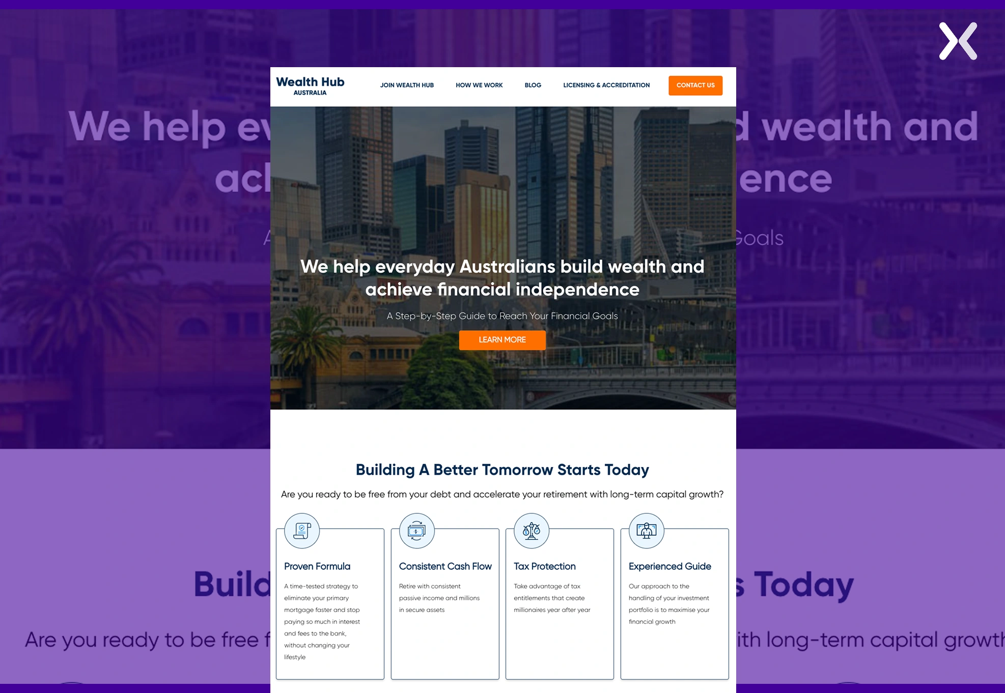
Offering a modern approach to finance web design, this website combines rich visuals and user-friendly navigation. Interactive tools, such as investment calculators, are deliberately placed to engage users, demonstrating how well-integrated financial services website design can raise a financial business’s online presence.
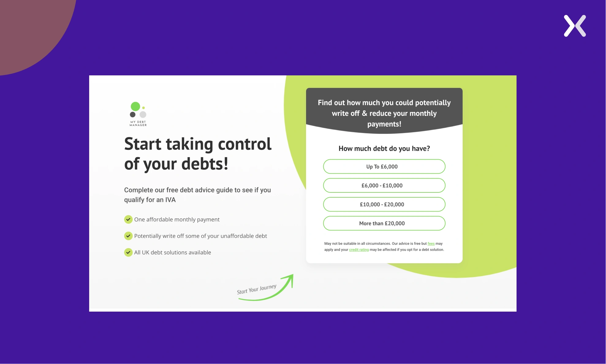
Known for its excellent financial services website design, My Debt Manager website offers an intuitive user journey, making sure that visitors find what they need quickly. Strong calls to action, paralleled with the financial UX design, effectively motivate users to act by either signing up for services or inquiring.
This online platform is neat and easy to use, with the navigation being optimized for a better user experience. With bold visuals and simple language, complicated financial concepts have been simplified for the reader.
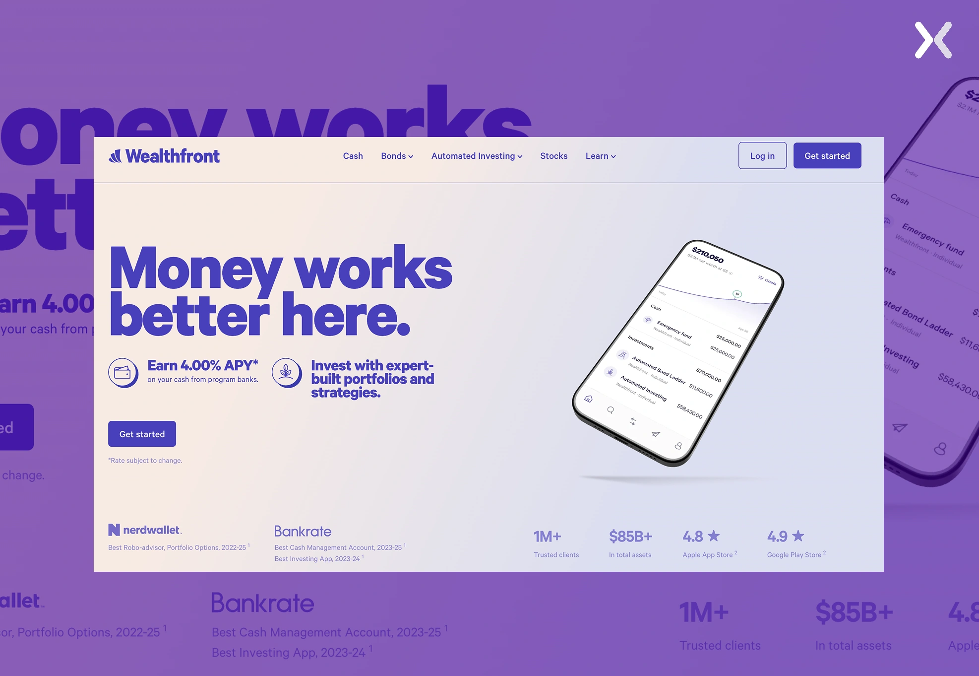
Wealthfront uses a minimalist and simple site for ease of access. Integrated educational content acts to inform the users regarding investment approaches.
Help provides a clean, intuitive design that simplifies personal finance. The website focuses on helping users to track their spending, saving, and investments with ease.

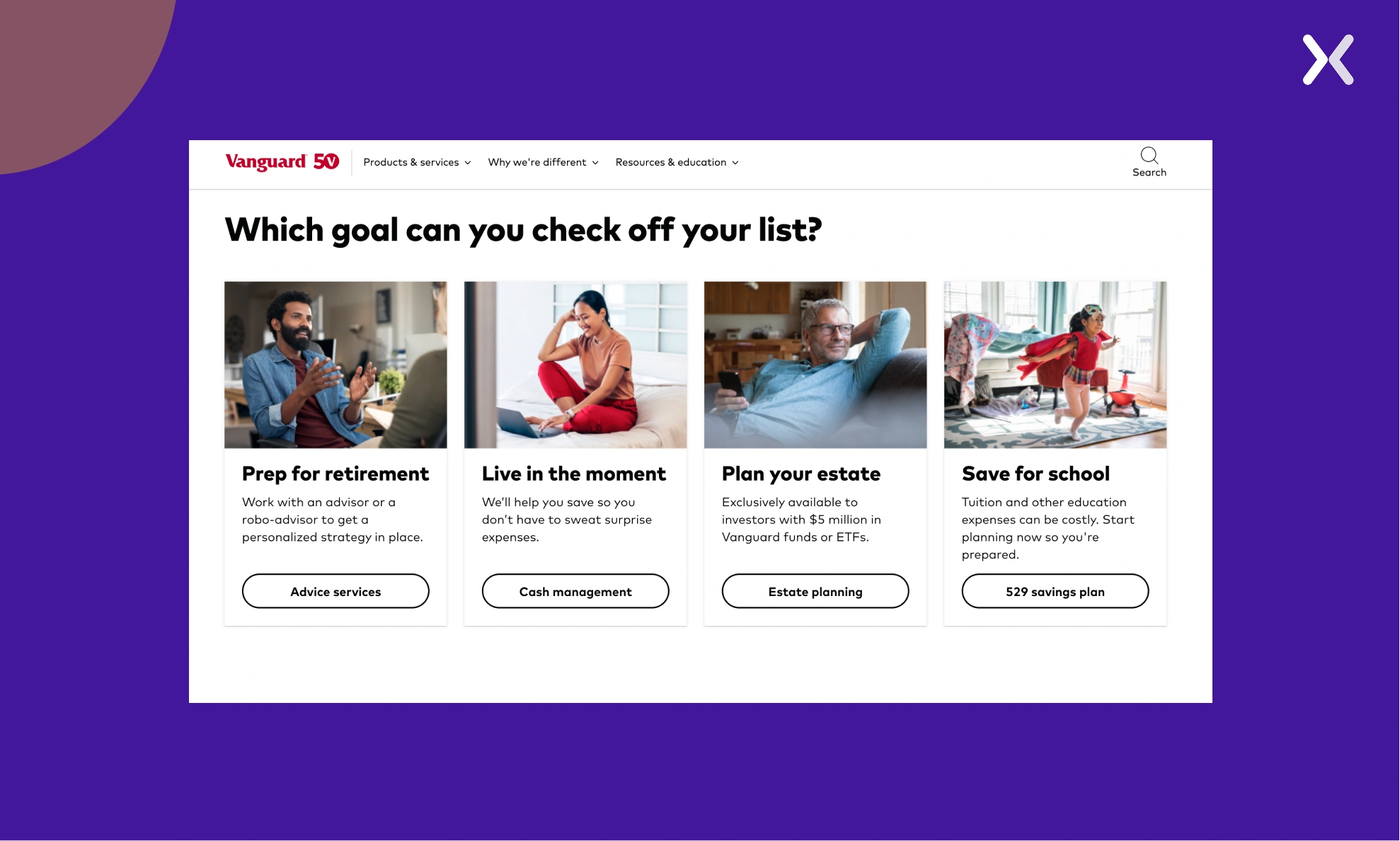
Vanguard’s site plays heavily with themes of trust and legitimacy. Professional imagery, testimonials by clients, and straightforward disclosures make sure users feel secure in their choices.
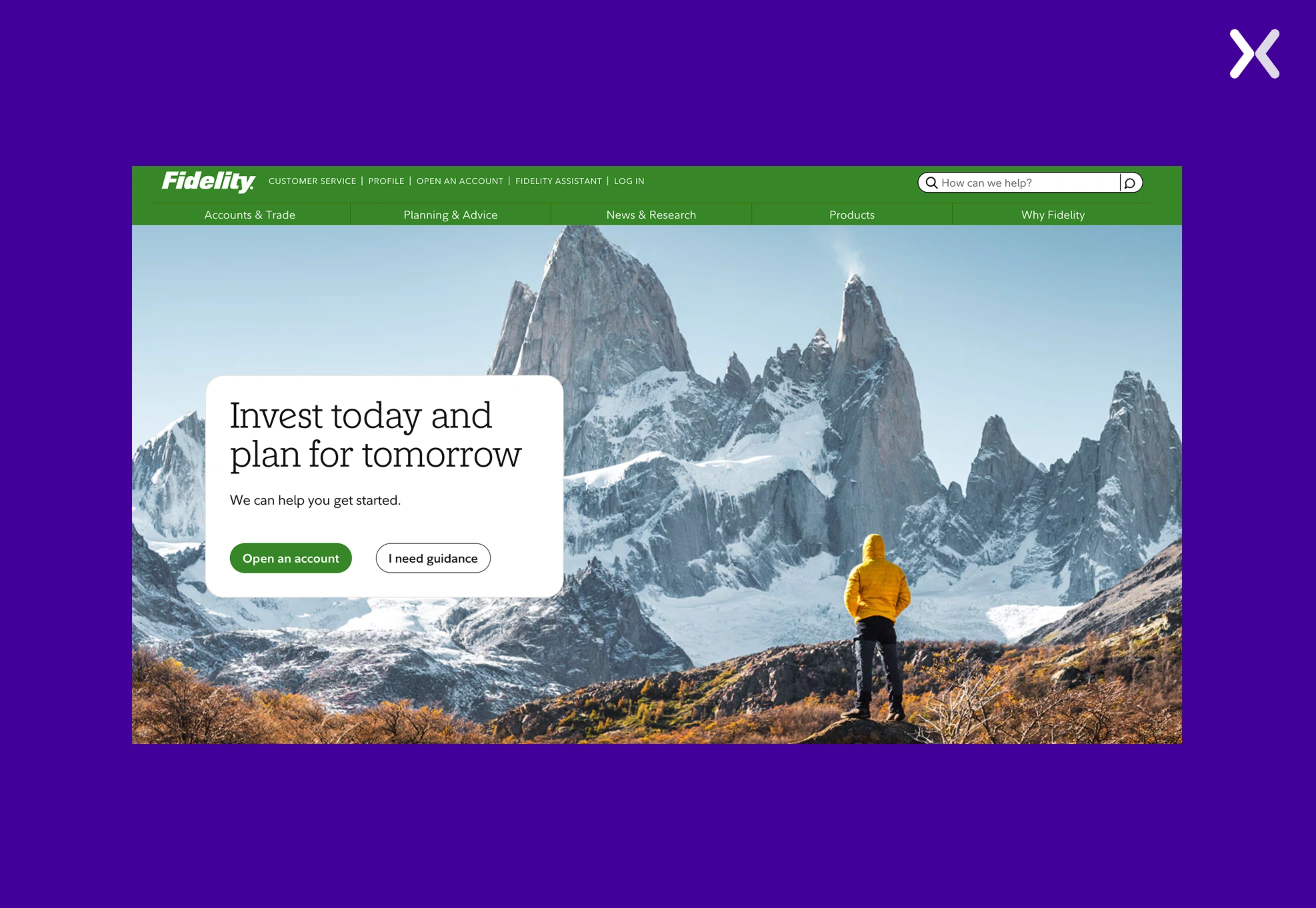
Fidelity’s website focuses on accessibility and user-centricity: customizable dashboards and educational material serve certain users’ needs.
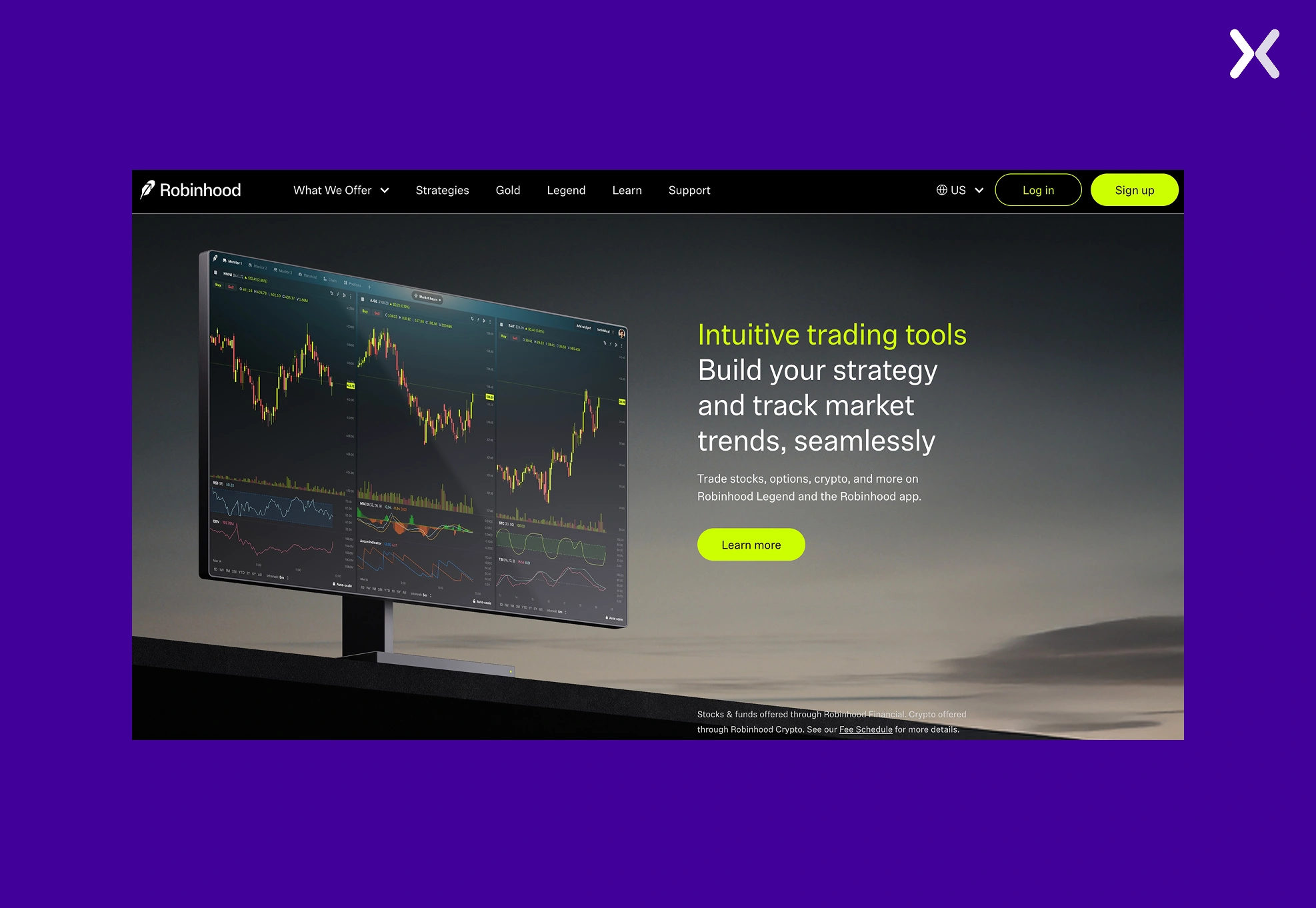
Robinhood is characterized by a slick, easy-to-move through platform appealing to a younger audience. Straightforward navigation, watchlists, and dynamic data visualizations build a stronger trading experience.
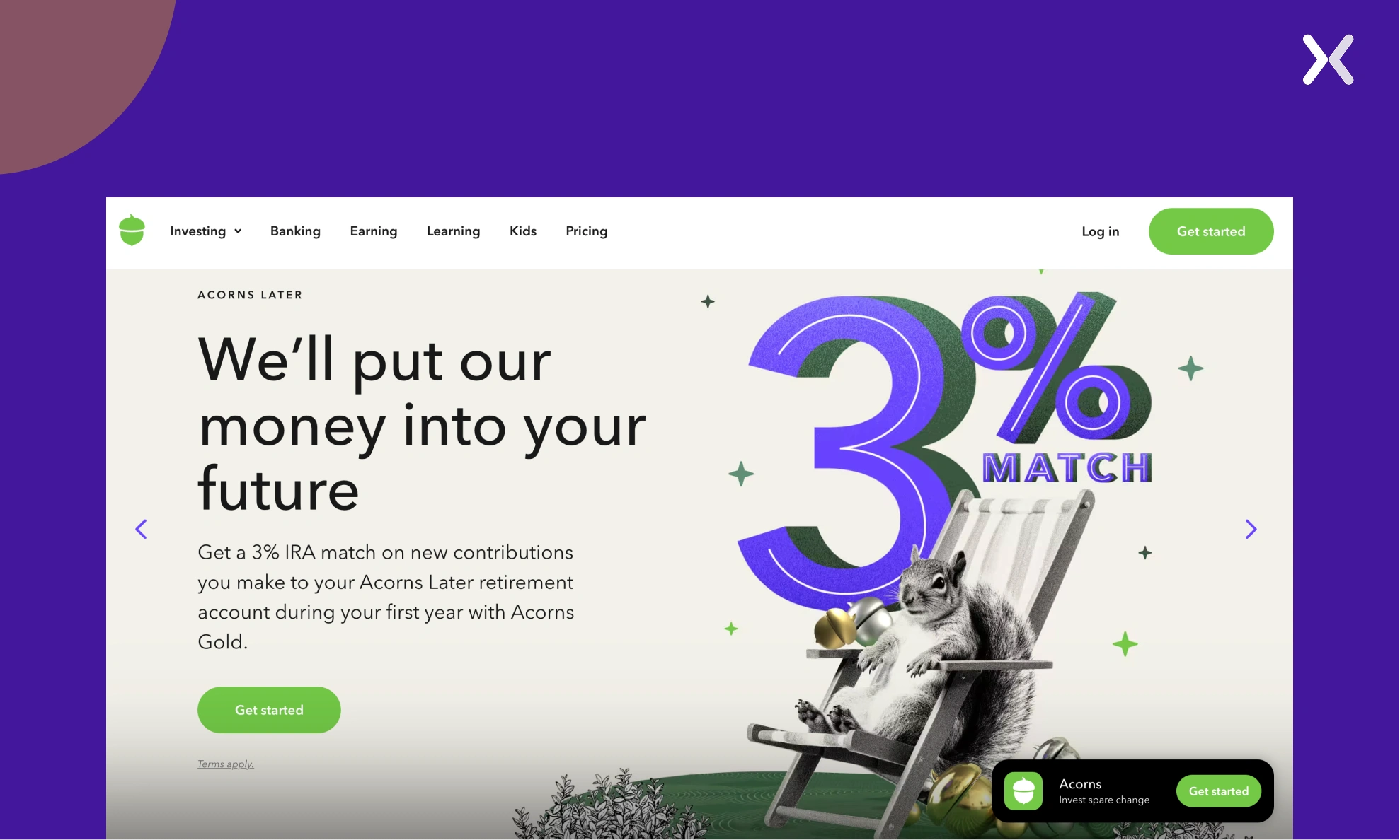
Acorns has a very user-friendly and simple design. With this simple layout, the website quickly conveys the benefits of the proposition.
The best financial services websites share several takeaways that can be applied to financial services website design to boost ROI:
Websites like Vanguard show how a minimalistic, clean design can build trust and make it easier for users to move through financial services. Making sure that your finance web design is not cluttered improves the overall user experience.
Tools like investment calculators and custom quote generators (seen on Wealth Hub Australia) keep users engaged and encourage them to return. Personalization and financial UX design are vital for creating value for visitors.
Websites such as My Debt Manager are simple places for users to start taking action on. The best practices for CTAs in financial services website development are best incorporated to inspire website conversions and lead generation. With the incorporation of these successful strategies, financial services website design can improve user engagement and point toward better ROI.
A well-optimized financial services website design can significantly impact user experience, trust, and conversions. Quandis, a financial software provider, underwent a website transformation to improve usability, branding, and engagement. Below is a comparison of its before and after design.
The previous website had several limitations that affected user experience and conversion potential:
The UI lacked modern design elements, making it appear outdated and unengaging.
Information was scattered, and users struggled to find relevant details quickly.
The site wasn’t fully responsive, leading to usability issues on mobile devices.
Call-to-action buttons weren’t prominent, making it harder to guide users toward key actions.
The website didn’t effectively prioritize content, reducing readability and engagement.
The new website incorporates the best web design for financial services with a focus on conversion optimization:
A fresh, visually appealing design with structured layouts improves readability and engagement.
Improved menu structure and user-friendly paths make it easier to access information.
Optimized for all devices, making sure a smooth experience across desktops, tablets, and mobiles.
Deliberately placed call-to-action buttons guide users toward inquiries and service pages.
The new layout stresses trust-building elements such as testimonials, case studies, and industry credibility markers.
Here are some key elements to keep in mind while building a financial services website design:
The core of financial UX design lies in giving the user a frictionless and intuitive experience. For financial websites, this means:
With a growing number of financial service consumers using mobile devices (over 60%), making sure that your website is responsive across various screen sizes is necessary. A responsive design adapts to all devices: desktop, tablet, and mobile, providing users with a consistent experience. It boosts engagement, reduces bounce rates, and leads to higher conversion rates, as users can interact with your website smoothly, regardless of the device they use.
Speed is a critical factor in user retention. Websites with slow loading times frustrate users, often leading them to leave before completing desired actions. Optimizing image sizes, minimizing code, and using techniques like caching can improve page load times significantly. A fast website not just improves the user experience but also helps with search engine rankings, as Google prioritizes fast-loading sites.
Users should find it easy to move through through services such as account management, loan applications, or investment options. The goal is to make finding information quick and straightforward.
The website should be accessible to everyone, including those with disabilities. This includes providing alt text for images, adequate color contrast, and keyboard navigation.
Another important aspect of building a financial services website is addressing security and regulatory compliance, both critical in an industry that handles sensitive client information. Below are considerations:
Owing to the sensitive nature of information being sent, making sure security is essential while building a financial services website.
The use of SSL certificates makes sure that encrypted data remains safe while in transit.
There would be compliance with yet another aspect of financial regulations.
Websites must comply with regulations like GDPR, protecting data, and other specific industry regulations.
When creating a website for finance, the team must make sure that the website is safe and compliant with legal and other regulations.
A financial services website is most effective with prominent and persuasive calls to action. CTAs are those buttons, links, or banners that ask people to take a step, for instance, by subscribing to the newsletter, making an application, or scheduling a consultation. Call-to-action elements in website design should be:
Visually prominent and distinct from all other elements on the page.
Action-oriented, including words like “Get Started” or “Learn More.”
Deliberately placed, set in positions on the site where users would more likely take action, such as at the end of a service description or after they have been offered useful financial tools. By integrating clear and strong CTAs, financial websites can guide users toward completing key actions supporting ROI.
Financial websites must include certifications (e.g., FDIC), partner logos, and client testimonials to establish credibility.
Clear disclosure of fees, terms, and conditions builds trust by making information easily accessible to users.
In addition to security and compliance, a well-structured financial website should also clearly communicate important legal and user-protection information. Key elements include:
Clear Policies: A financial website should provide easy access to all policies, terms of service, and cookie consent forms.
Disclaimers: Include risk warnings for investment products to help educate users about the potential risks involved.
Crisis Management Features: Offer clear guidance on reporting fraud, changing passwords, or addressing account security issues.
Tailoring the website experience to different audience segments is a smart way to improve both usability and conversion. By creating distinct pathways for users based on their needs, such as individuals, small businesses, or corporate clients, financial websites can deliver more relevant content, reduce friction, and guide visitors more effectively toward action. Key benefits of segmented pathways include:
Improved Relevance: Content and services are matched each audience’s specific financial goals and challenges.
Higher Conversion Rates: Visitors are more likely to engage and take action when they see information that speaks directly to them.
Simplified Navigation: Reduces confusion by showing only what’s necessary for each user type.
Stronger Personalization: Improves the overall experience by addressing unique pain points and expectations.
A financial services website design should prioritize functionality and simplicity above all. Finance is a sector known for its complex terminology, and overwhelming visitors with jargon can quickly erode trust. That’s why it’s essential to keep your messaging clear, direct, and approachable, breaking down complicated concepts into easily digestible language. Remember, building a user-friendly financial website isn’t just about how it looks; it’s also about how it communicates. From intuitive design to thoughtful content, every element should work together to make visitors feel informed and confident. The key design and content strategies we’ve covered above will help make sure your site is not just compliant and secure, but also welcoming, professional, and built for conversion.
Apexure provides landing page design services for financial services companies across the UK and US. If you need a high-converting landing page for your financial product, get in touch.
Related Articles:
As CEO and Founder of Apexure, Waseem Bashir's decade-old experience in building high-converting landing pages extends to collaborations with Fortune 500 leaders. From free to paid he has tried his hands on all landing page builder tools and knows just the right fit for every business. Read more


Drive More Sales or Leads With Conversion-Focused Websites and Landing Pages
Get Started

Eleven percent of Meta ad rejections in 2026 trace back to one problem: the landing page does not...

A B2B SaaS company spends $30,000 per month on Google Ads and Meta Ads. Both campaigns drive traffic...
Get quality posts covering insights into Conversion Rate Optimisation, Landing Pages and great design
