
An app landing page increases your visibility and helps you effectively present your product’s features to your target audience. While being listed on the Apple App Store or Google Play Store provides exposure, it often isn’t enough to fully accent your product’s capabilities. A basic webpage also falls short, especially for PPC ads. A conversion-optimized app landing page combines strong visuals and persuasive copy to build curiosity and trust to attract new users. As marketers and product managers, we aim to create a conversion-friendly app landing page. In this post, we will explore some winning app landing page examples. Whether launching an app or optimizing an older page, these examples will surely give you ideas about which elements to use.

Even if you don’t have a full website. You can still create a landing page for your app. It’s a great way to build traction, present your features, and drive more downloads, a solid first step before launching a full site. Here are some examples of mobile app landing pages that make up for great inspiration. Even if you don’t have a website you can still built your app landing pages for more traction and downloads.
Rocket Money is a personal finance app that helps users to manage subscriptions, track spending, and achieve financial goals. Their app landing page is short but delivers effective information about the product without wasting time with a filler copy. It features gifs and social proof that grab attention and intrigue visitors. The layout intuitively guides visitors through key features and benefits with concise copy and engaging visuals.
Here are some standout elements from the Rocket Money app landing page.
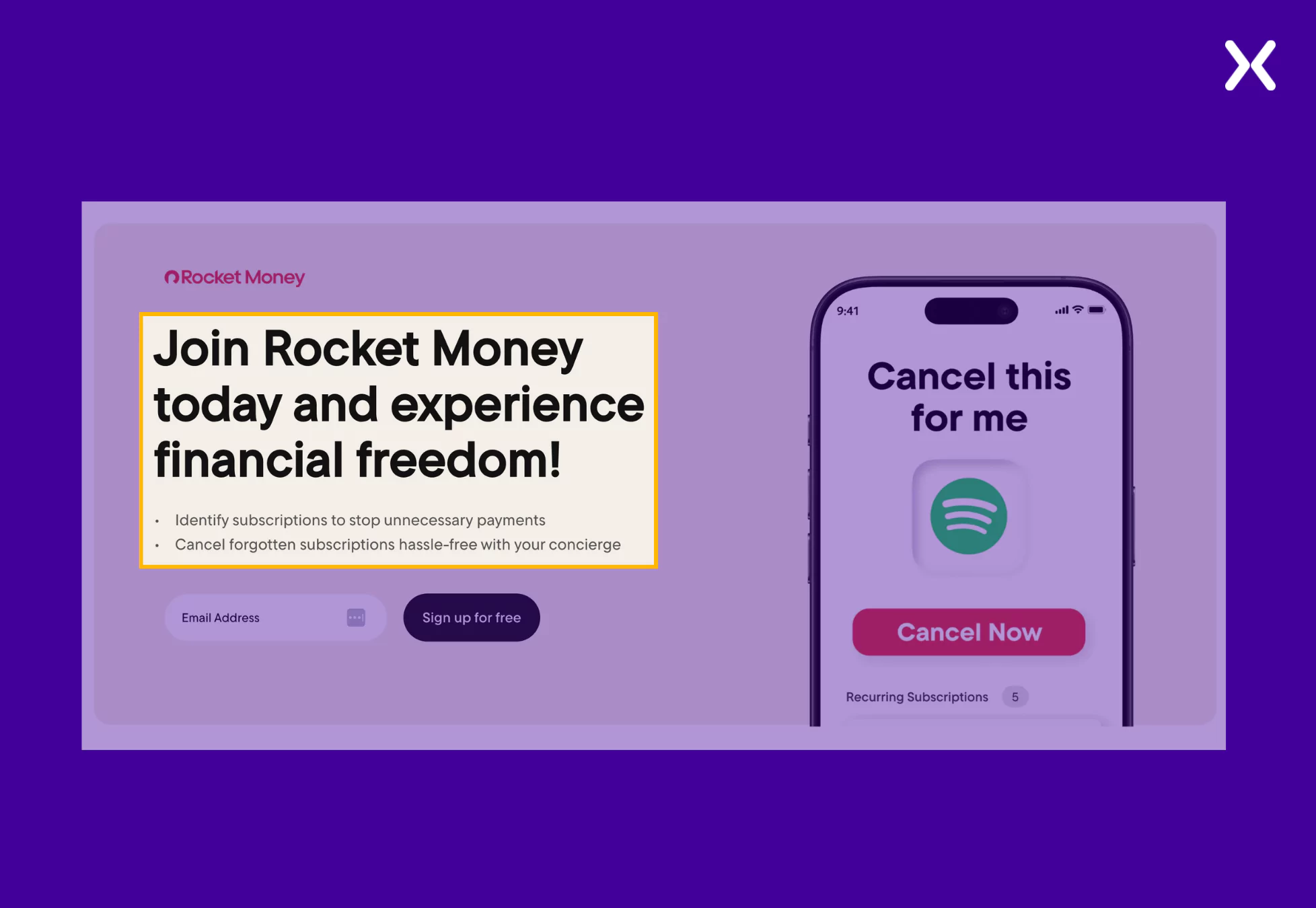 To complement the headline, we have a subhead in the form of two bullets that accent the USPs of the app. Instead of using complex jargon, the app landing page makes a great first impression with its top fold, keeping it engaging with visuals and interesting with the copy.
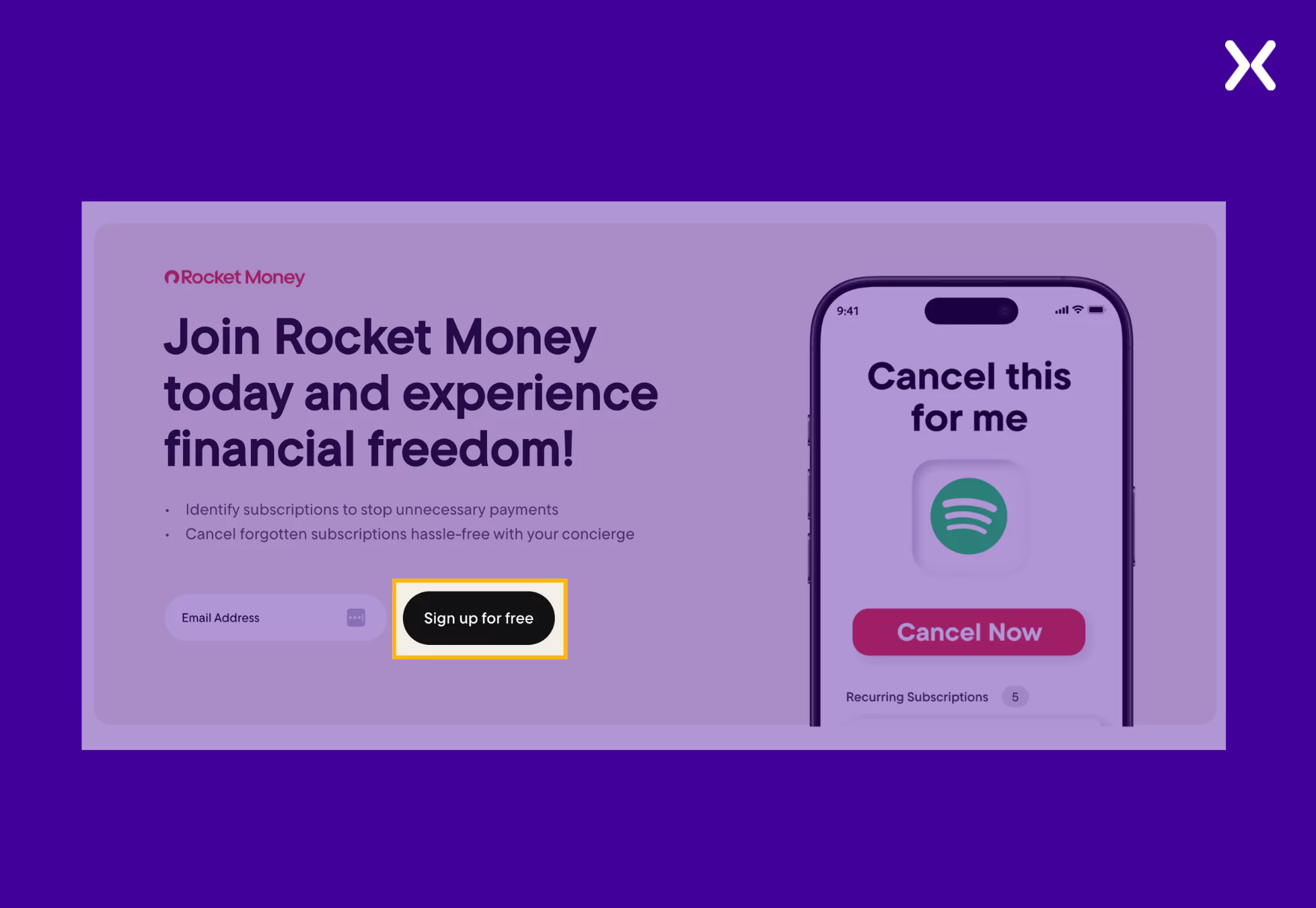 Ditching boring CTA copy, the app landing page CTA shares a tempting offer: “Sign for free,” which can definitely get more sign-ups than something simple like “Sign up now” or “Explore,” etc. The CTA is repeated throughout the page, constantly reminding users to get started.
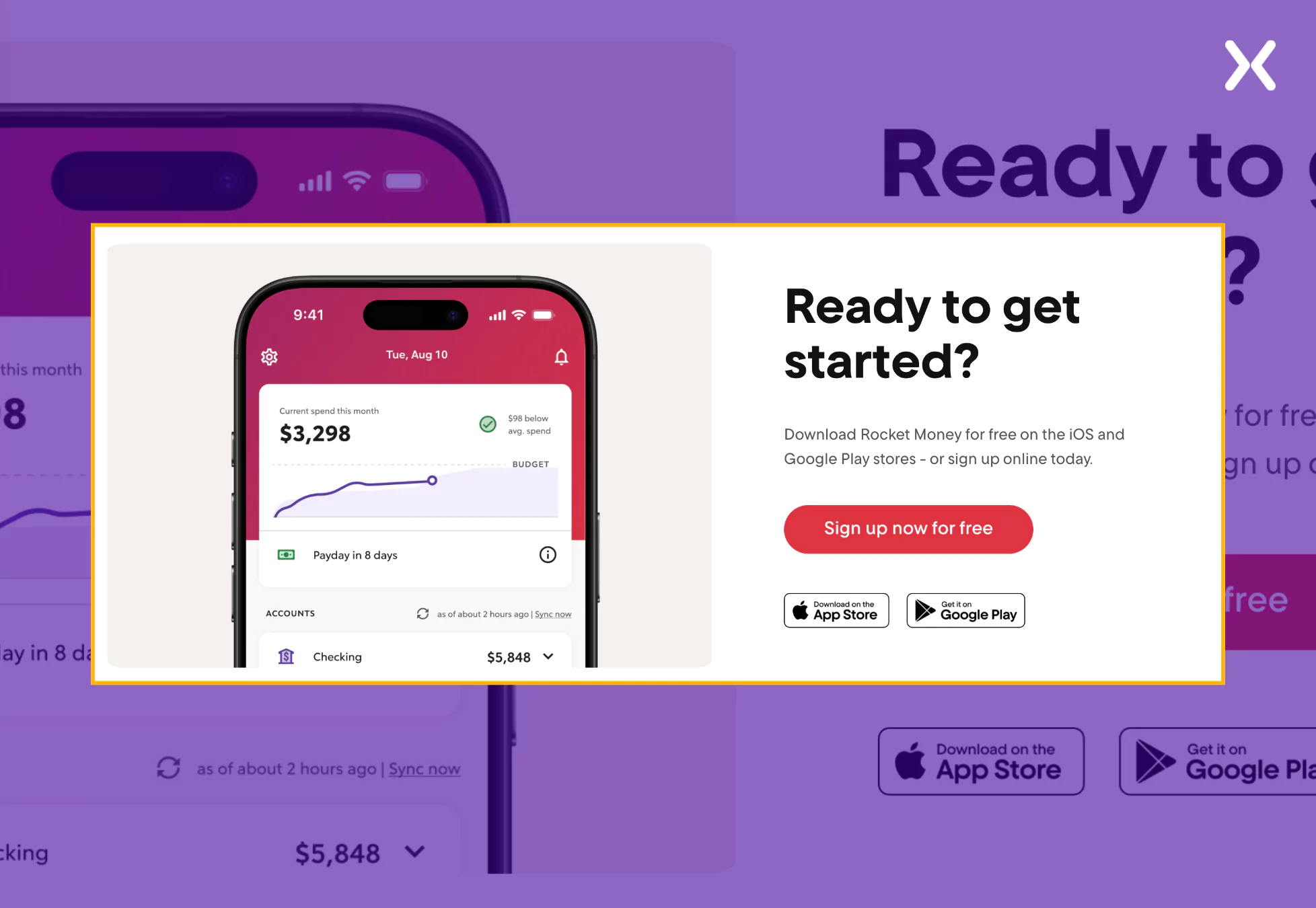 The page images show the app’s interface on mobile screens, making it easy for visitors to imagine using Rocket Money on their devices. The app will eventually be used on mobiles.
Monarch Money is a full personal finance app similar to Rocket Money. It is designed to help users track spending, manage budgets, and achieve financial goals collaboratively. Their app landing page has a clean design with well-organized sections that take users on a journey to understanding how the app benefits them feature-wise. The page has a simple CTA with supporting text that keeps the CTA’s copy short but packs an impact.
Check out the standout elements from the Monarch Money app landing page.
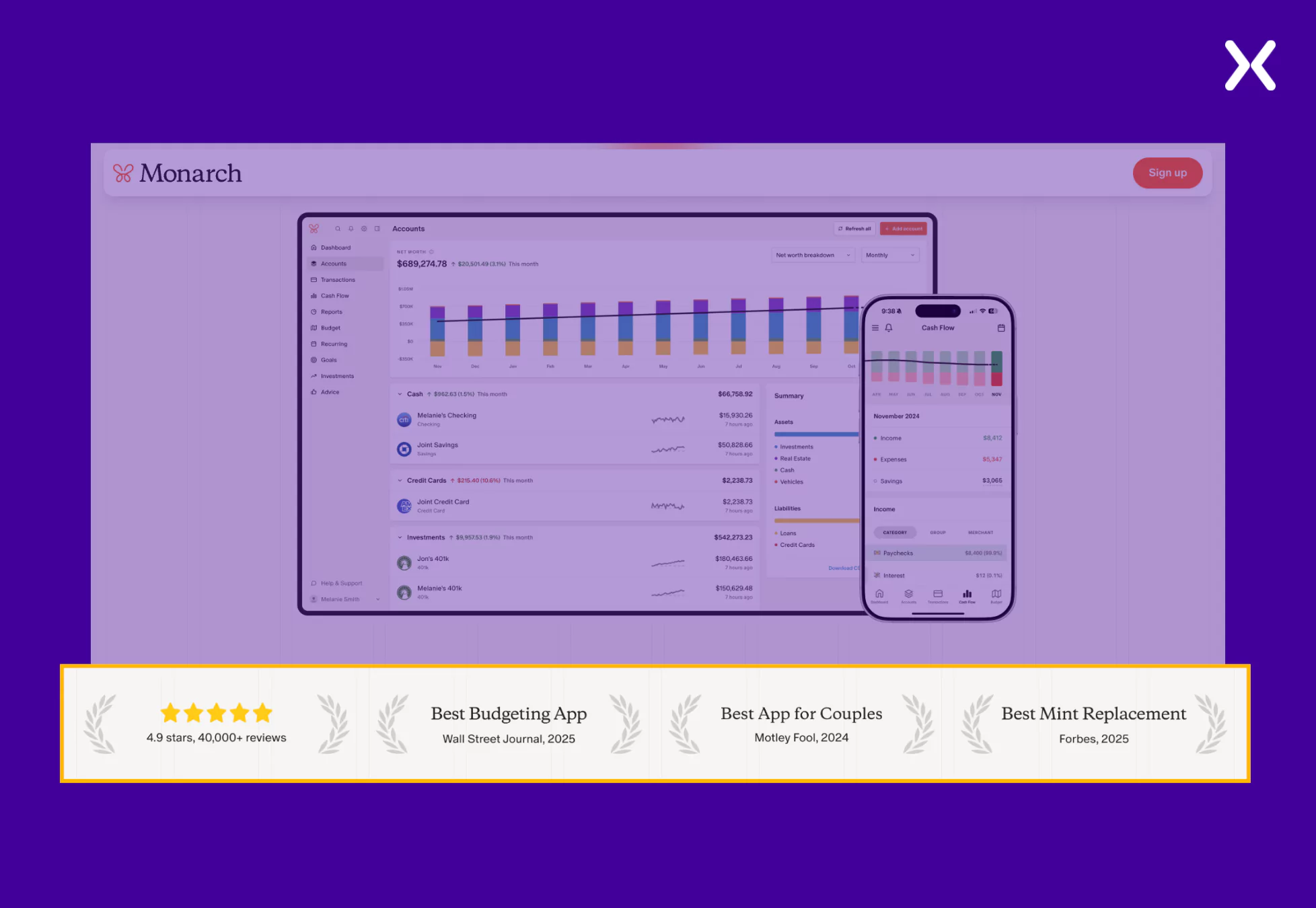 They use logos from recognizable brands, reinforcing credibility and winning visitor trust. Such social proof signals visitors that your app is well-regarded and used by industry experts, reducing their hesitation to sign up.
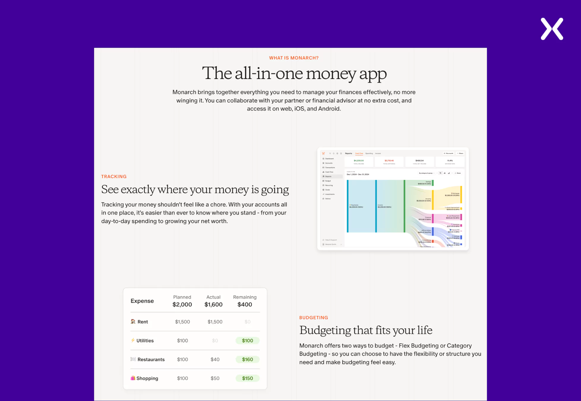 The layout makes sure users can quickly grasp the app’s benefits without sifting through heavy text.
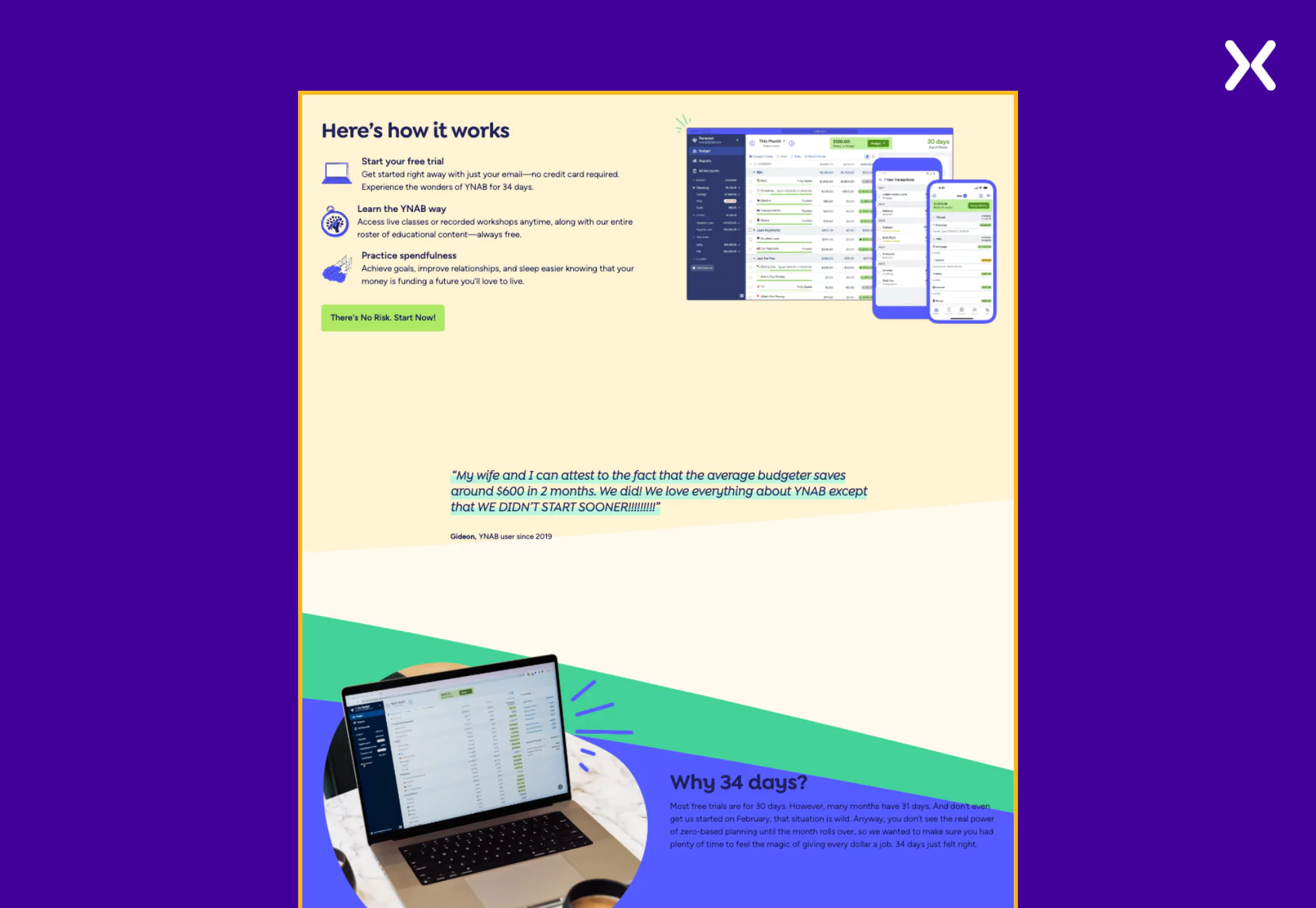
You Need a Budget (YNAB) is a personal finance app designed to help users manage their money by implementing a proactive budgeting approach. This app landing page relies heavily on social proof to communicate the product’s value to visitors. The playful design and conversational copy engage visitors and nudge them toward conversion. Let’s examine these elements in more detail and see how they help YNAB’s app landing page.
Let’s look at the YNAB app landing page’s standout elements.
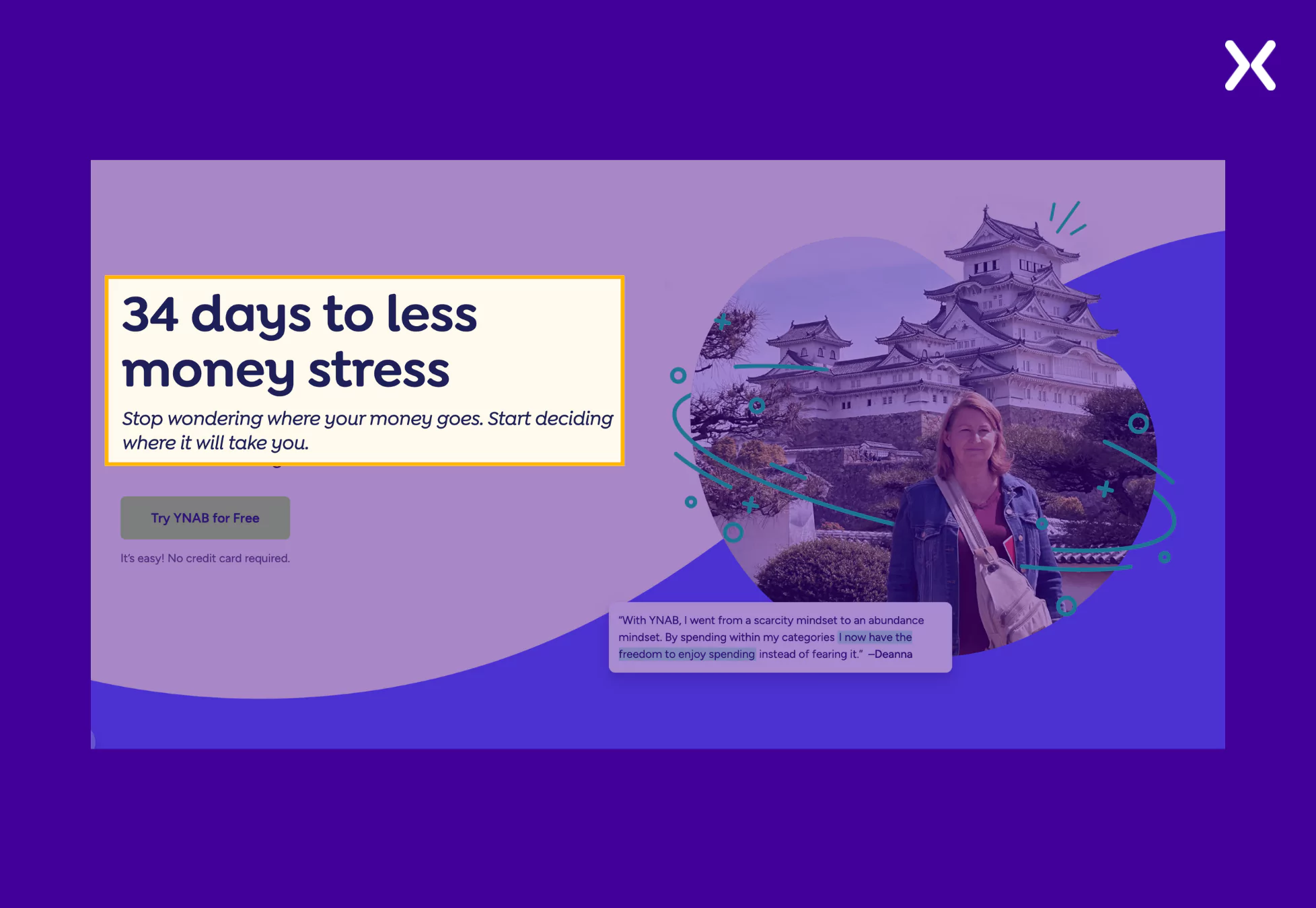
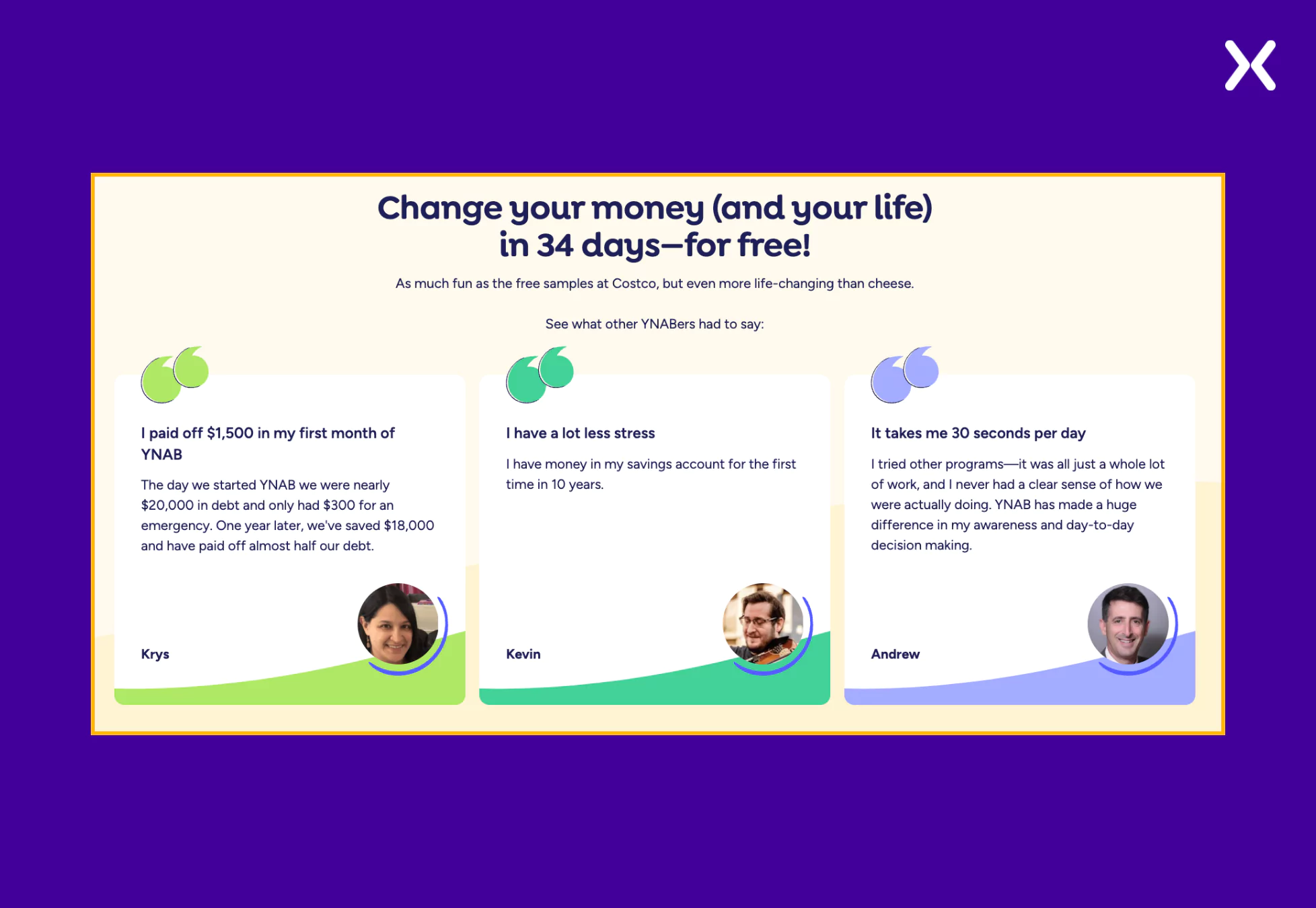 The testimonials have been purposively used to create mini-stories that inspire visitors to sign up; for example, phrases like “On average, new users save $600 in their first two months” are user-backed proof of the app’s effectiveness, making the offer even more strong.
QuickBooks is a full accounting solution designed to help small businesses manage their finances efficiently. Their app landing page perfectly balances social proof and product USPs. Since the app can be used on desktop and mobile, many images show its UI in action on various devices. The page also features short videos that deliver necessary information about the tool.
QuickBooks landing page’s standout elements are as follows.
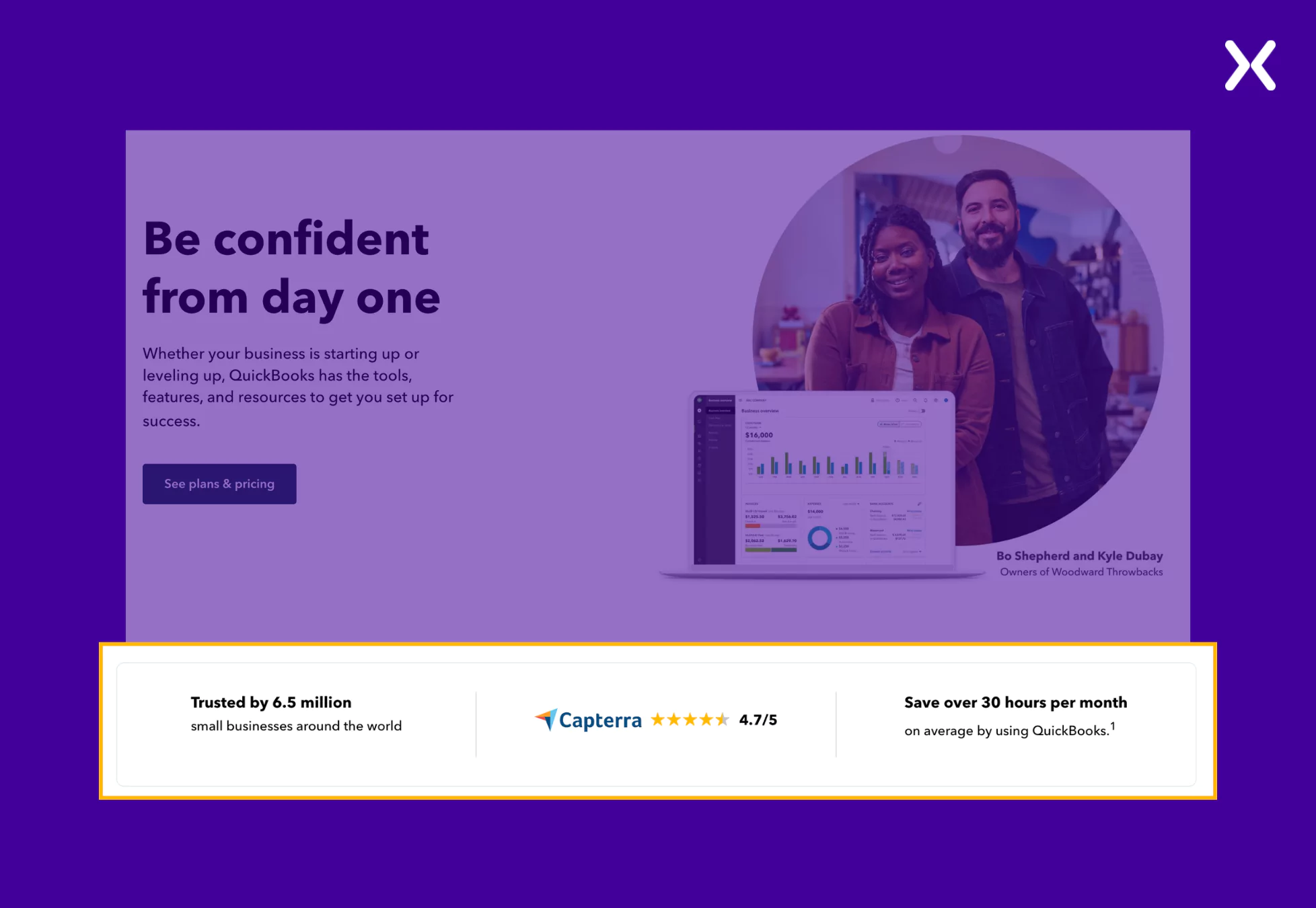 While visitors might not know the logos of all the companies using your app, quantified social proof is definitely effective for all types of visitors. This section is quickly followed by a segment marking four valuable QuickBooks USPs, making a strong case for conversion.
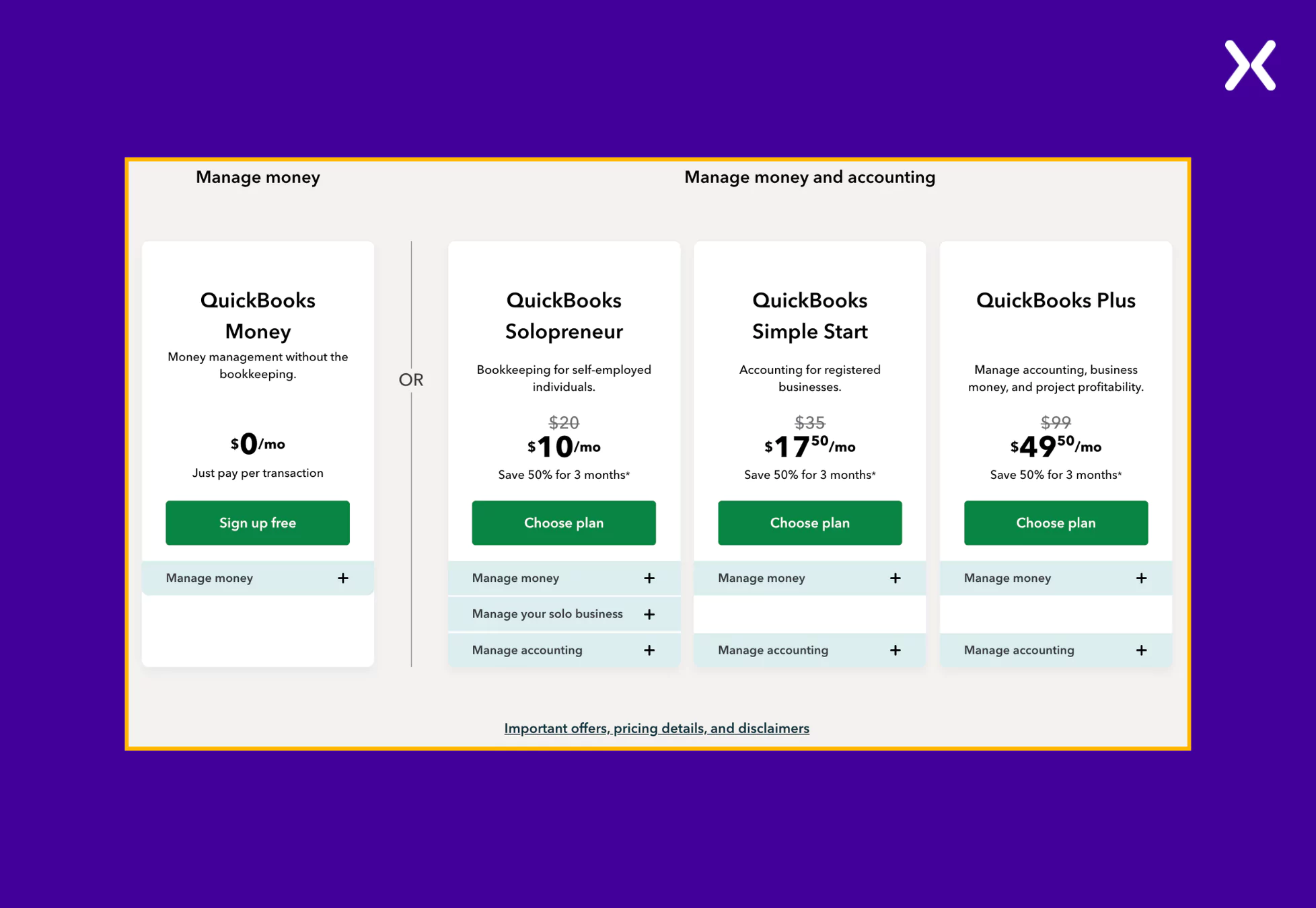 By answering a few questions about their business priorities, visitors receive personalized recommendations, simplifying the decision-making process.

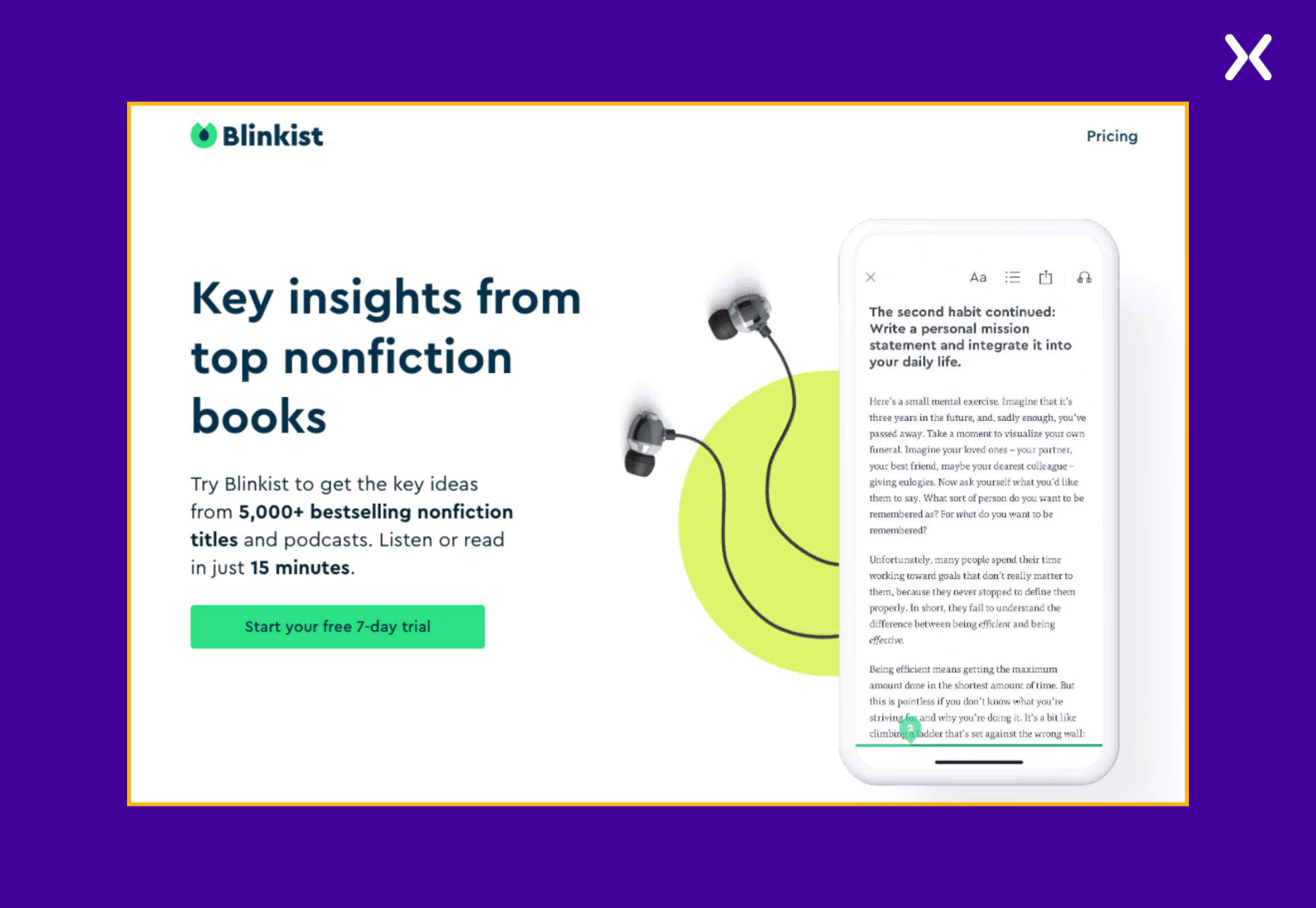
Blinkist is a reading app that provides insights from over 5,000 bestselling nonfiction books and podcasts. It allows users to absorb knowledge in just 15 minutes. The app landing page follows a modern, clean, and trust-building design. The color scheme features Blinkist’s signature green and much white space, making the content easy to digest. The layout is structured to guide users from understanding the product to signing up for the free trial, utilizing sections that present features, user reviews, and book categories.
Some of the effective elements of the Blinkist app landing page are as follows:
Visual Categorization of Book Topics with Interactive Elements Instead of listing books randomly, the landing page organizes content by categories such as productivity, society and culture, and relationships.
Clickable category filters allow users to explore topics relevant to them.
Book cover carousels make the page visually engaging, helping users discover specific titles.
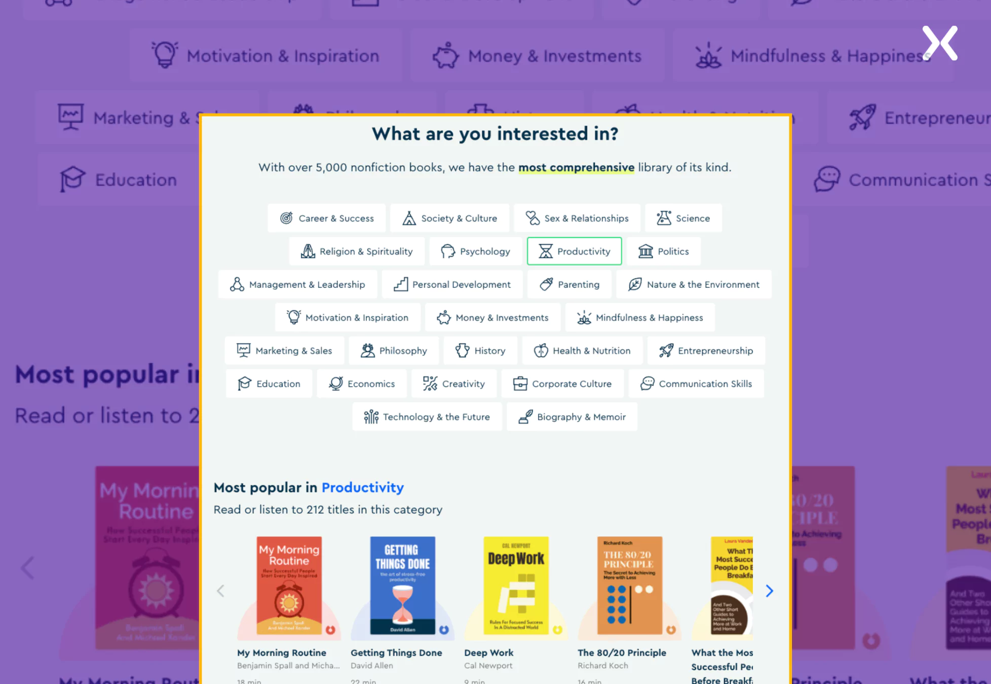 This interactive and structured layout improves usability, making it easier for visitors to find books they’re interested in.
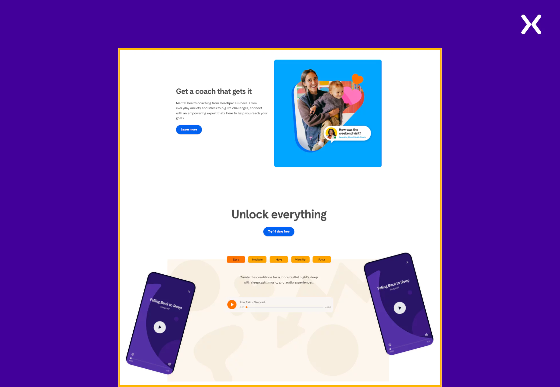
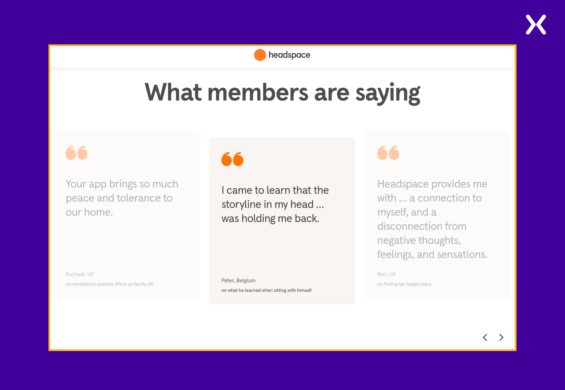
Headspace is a digital health company that helps people improve their mental well-being through guided meditation and mindfulness programs. Staying true to the brand, the app landing page is visually calming, uses soft colors, ample white space, and a minimalist approach to its design. It effectively balances visuals and copy, creating a soothing user experience resonant with the brand on the landing page.
Here are the standout elements from the Headspace app landing page.
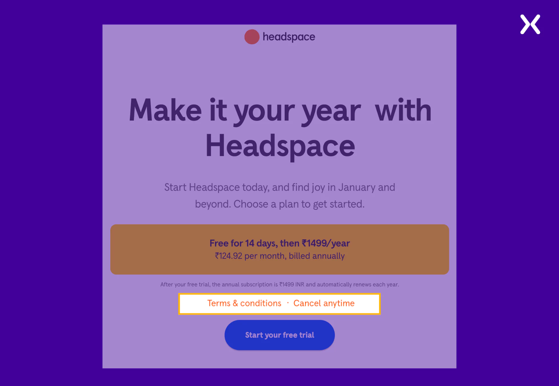 Headspace solves this by placing its terms and conditions policy above the CTA. This policy is complemented by another text, “Cancel anytime,” which removes user anxiety about a complex subscription cancellation process. Both these elements help win user trust and sign-ups.
Spotify is a leading music streaming service that offers users access to millions of songs and podcasts. Their app landing page has a dark layout, bright images, and bold headings. Most of the layout follows a centered design approach, where key elements like headlines, CTAs, and images are positioned centrally for a balanced and visually appealing experience. Overall, the page has an inviting tone that fits the brand.
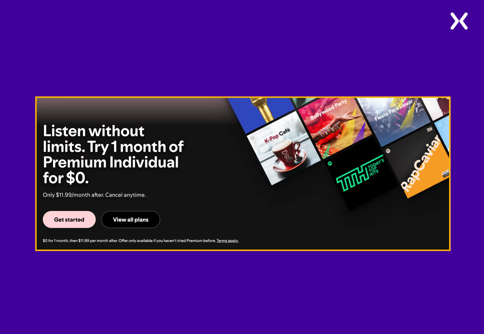 By marking the free trial prominently, Spotify lowers the barrier to entry, inviting potential subscribers to explore the service risk-free.
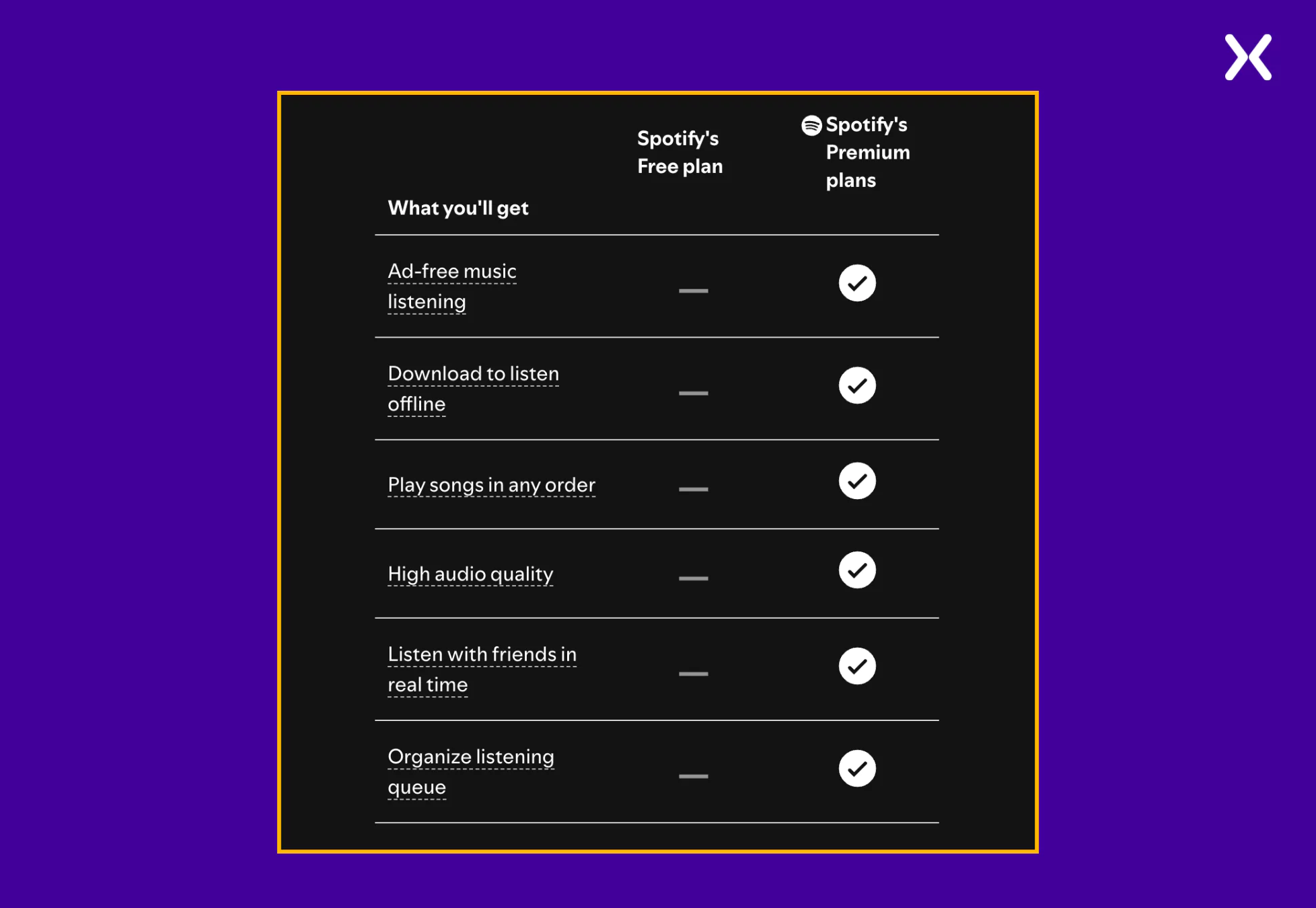
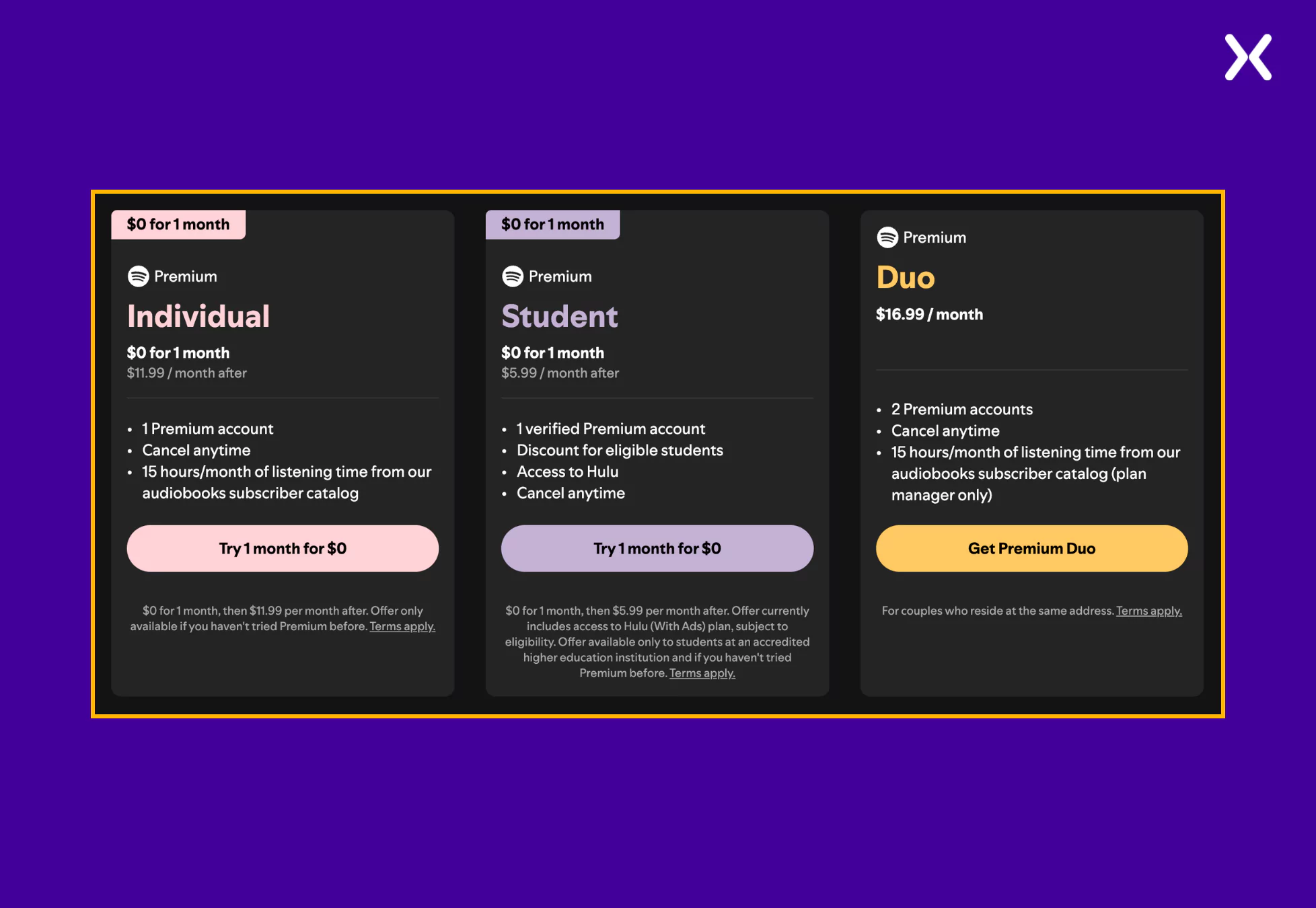 Each plan is accompanied by a brief description and pricing details, enabling users to select the option that best fits their circumstances. This way of presenting various subscription tiers helps people make better purchase decisions, coming in return as added user trust.
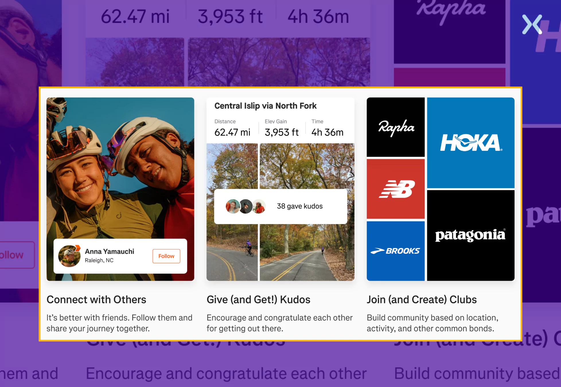
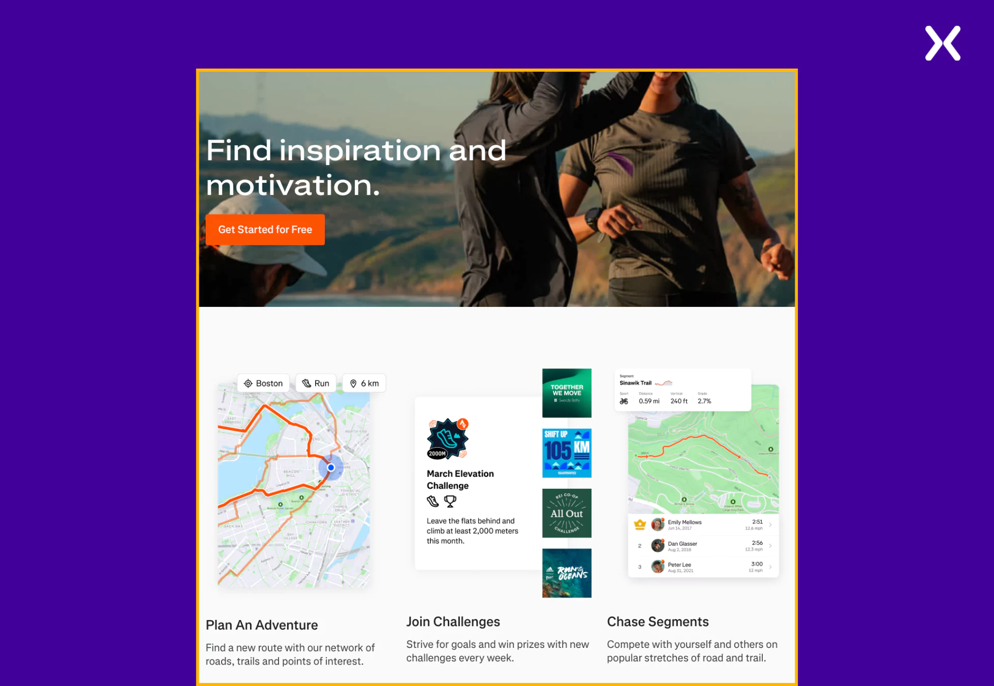
Strava is a leading social fitness platform that enables athletes and fitness enthusiasts to track their activities, analyze performance, and connect with a global community. The “Get Started” app landing page welcomes new users with a dynamic visual of an athlete in motion, immediately conveying the platform’s energetic and community-driven spirit. The clean and intuitive design motivates visitors to join the app with clear benefits and engaging visuals.
Strava app landing page standout elements are:
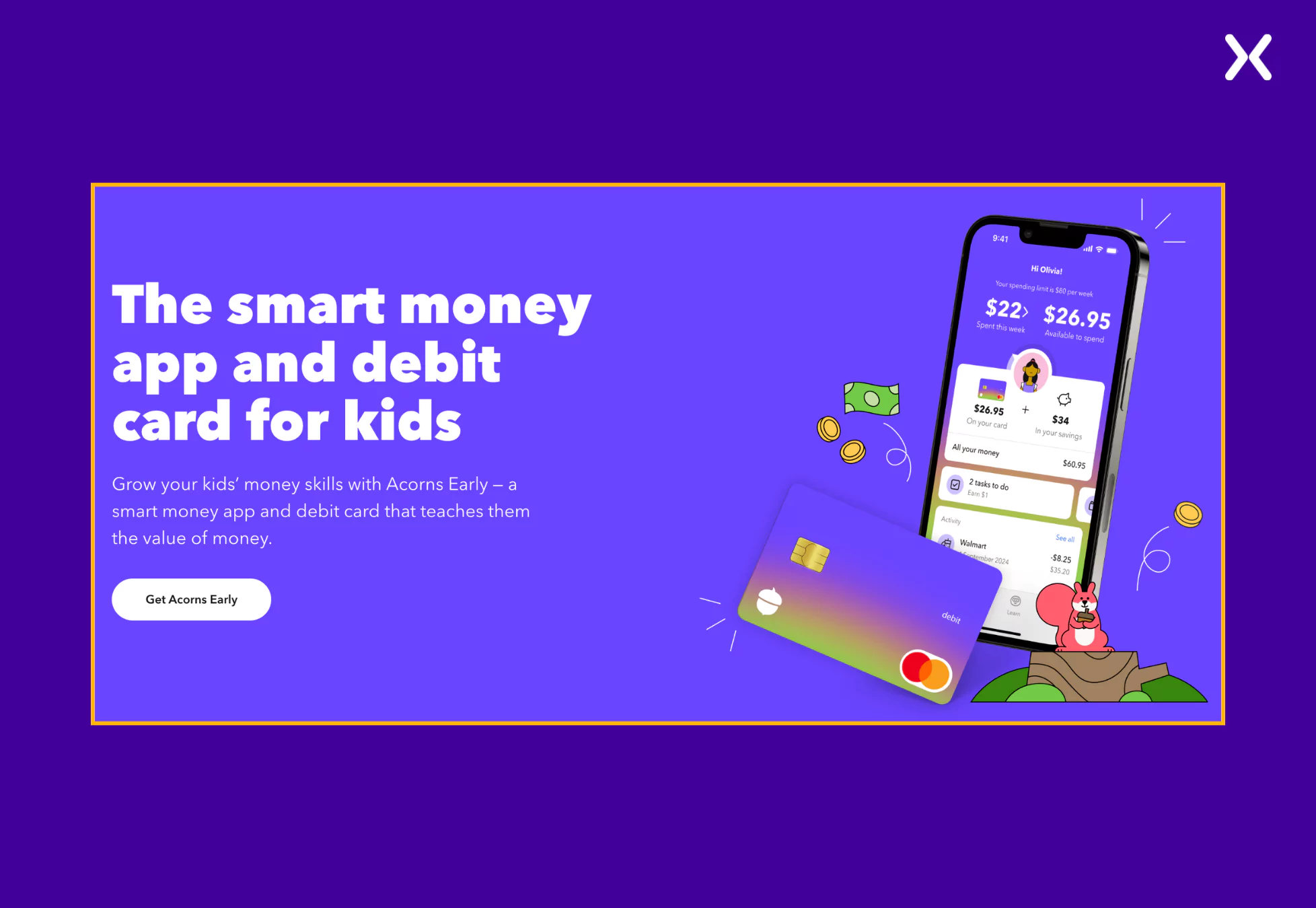
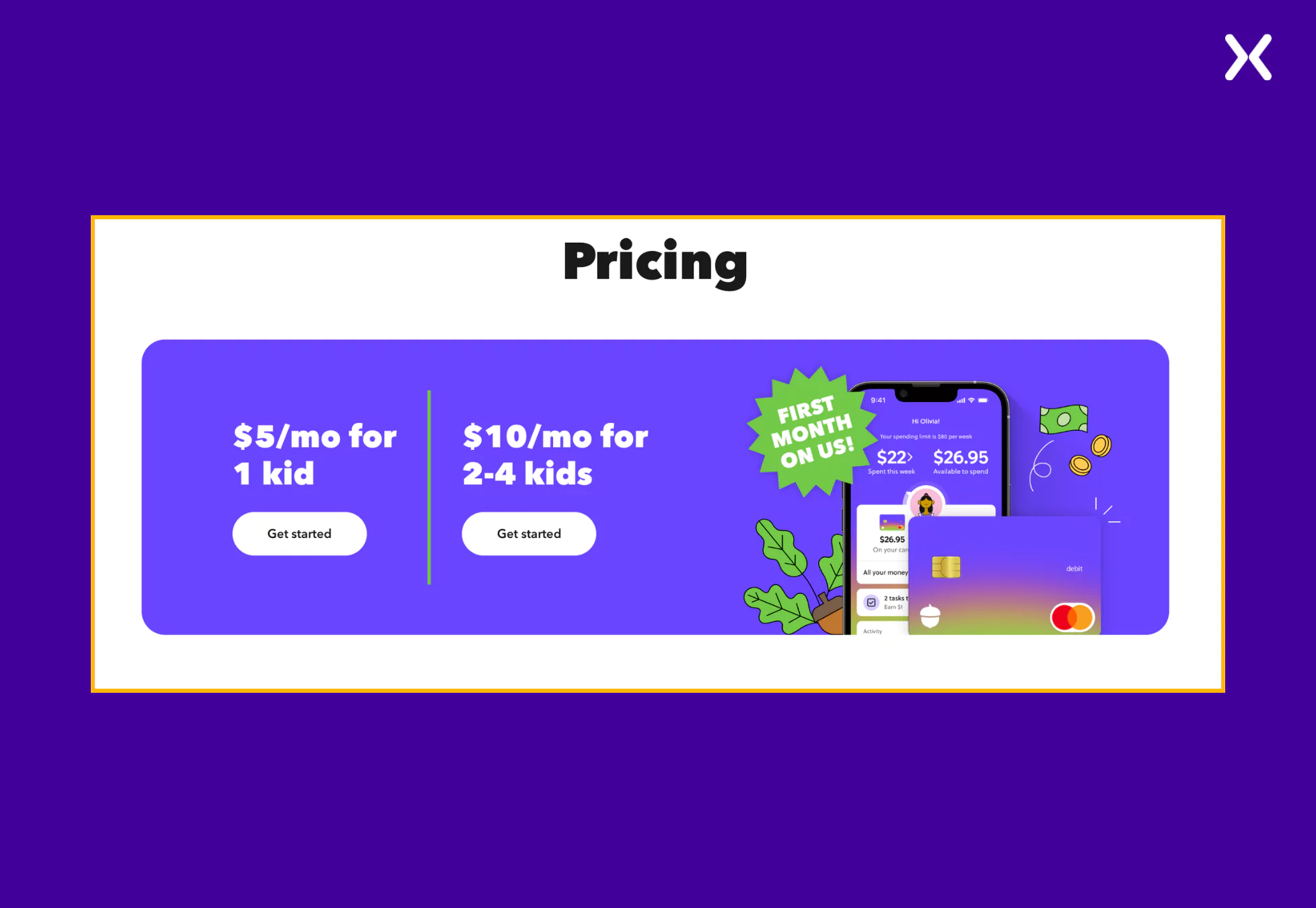
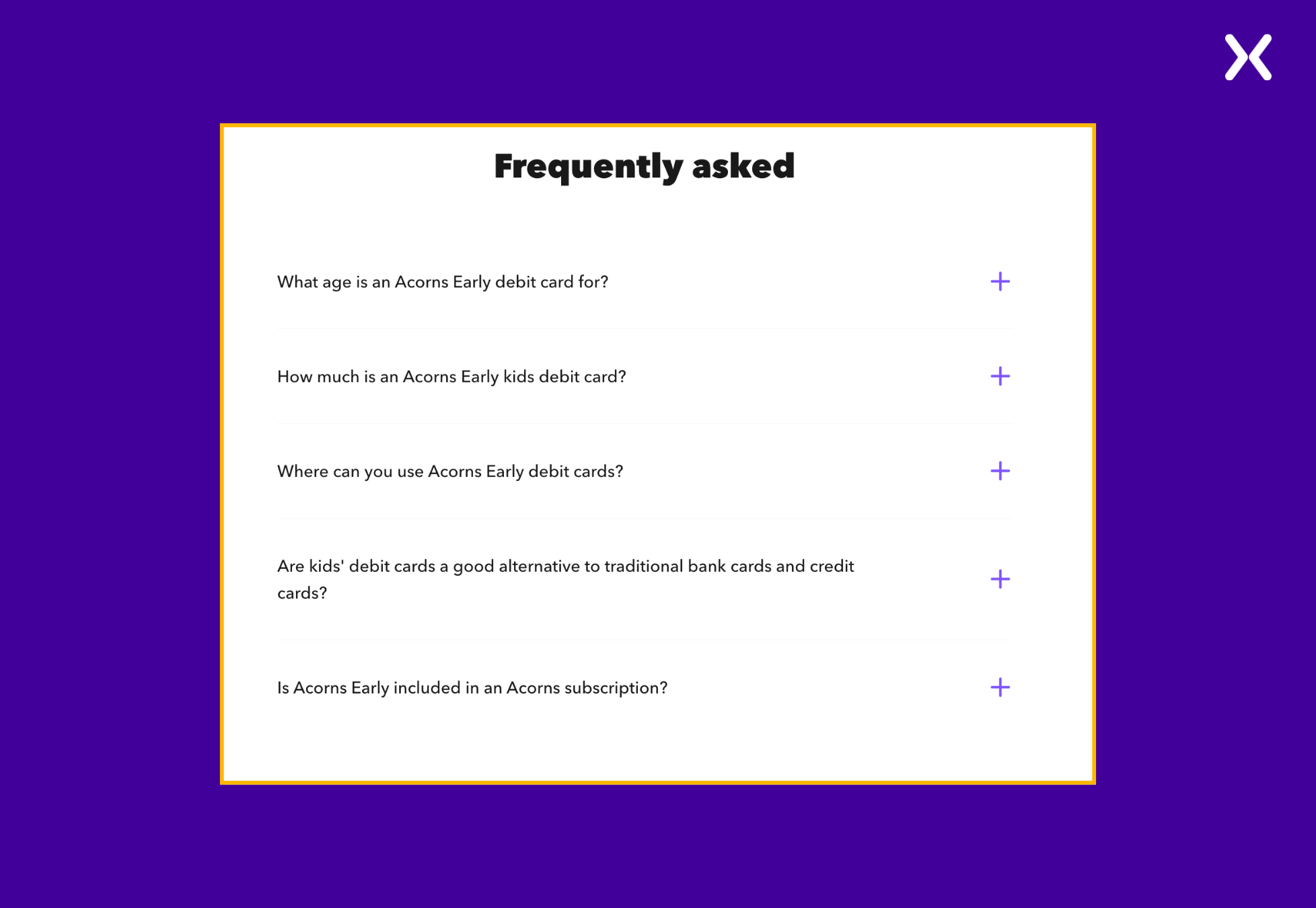
Acorns Early is an investment account designed to help parents start saving and investing for their children’s future, smoothly integrated within the Acorns financial ecosystem. The app landing page is visually clean, trust-building, and easy to move through. It uses soft colors, rounded fonts, and real-life imagery of parents and children, creating an emotional connection with visitors. The design reinforces security and long-term planning, making it approachable for parents unfamiliar with investing.
Let’s look at the Acorns app page’s standout elements.
Most app landing page examples we analyzed focused on visual design and copywriting. However, functionality is just as necessary. As a app owner, you must make sure your SaaS landing page is fully responsive across all devices. Every example above featured a clean, well-optimized mobile version, which is necessary since most users will ultimately access your app from their phone. Conducting competitor research can help you create a more strong app landing page, whether it offers a demo, a free trial, or instant download options. Make your app landing pages even better by adding a thank you page after the visitors and done filling your form and clicking the submit button. It looks professional and add more space to start a conversation with your new lead.
A well-designed app landing page does more than present an app, it drives conversions by clearly communicating value, building trust, and guiding visitors toward action. The best app landing pages make a lasting impression with strong headlines, engaging visuals, trust signals, and strong CTAs. Studying these examples can help you gain insights into creating or improving your app landing page, making sure it looks great and converts visitors into users.
Apexure has 100+ blog posts on landing pages? We have shared everything, from creation to testing, analysis to optimization. Check it out before you build your SaaS demo landing page.
Making an app landing page on your own with just examples can take a lot of time. Get the help you need from our experts. Book a call and one of our experts will contact you soon.
Check out our landing page portfolio to discover conversion-friendly landing page elements that might. Filter your industry and check which landing page design is trending.
An app landing page is a standalone web page designed to promote and provide information about an app, encouraging users to download or sign up.
Related Articles:
As CEO and Founder of Apexure, Waseem Bashir's decade-old experience in building high-converting landing pages extends to collaborations with Fortune 500 leaders. From free to paid he has tried his hands on all landing page builder tools and knows just the right fit for every business. Read more


Drive More Sales or Leads With Conversion Focused Websites and Landing Pages
Get Started

Eleven percent of Meta ad rejections in 2026 trace back to one problem: the landing page does not...

A B2B SaaS company spends $30,000 per month on Google Ads and Meta Ads. Both campaigns drive traffic...
Get quality posts covering insights into Conversion Rate Optimisation, Landing Pages and great design
