
Awareness of SaaS landing page best practices saves you time when building PPC campaigns or optimizing older ones. Unlike Ecommerce, SaaS companies deal with intangible products, and customers only have words and visuals to rely on. Any shortcomings in the CTAs or the presence of distracting elements are enough to drive away your potential leads for good. There are various ways to make your SaaS landing pages appealing. You can include numerous components, such as offering free trials and demo sessions, pre-launch offers, or technical lead magnets to accent the strong offerings. All these are potent ways to reel in customers. This blog talks about such SaaS landing page best practices in detail. You will learn why SaaS landing pages differ from other landing pages and some vital tips you need to know to boost your ROI. Let’s get started.

Let’s consider this. Today, 70% of the business apps used are SaaS-based, and the number is expected to grow a whopping 85% by 2025. With 25000 conversions in its fold, SaaS companies today are under the limelight across all industries globally. B2B prospects often fail to match SaaS solutions as the messaging and its use cases must be clarified. SaaS services can be complex to explain, and so is the path to pitch them. You only have a few words, pictures, videos, and minutes to show what your SaaS can do.
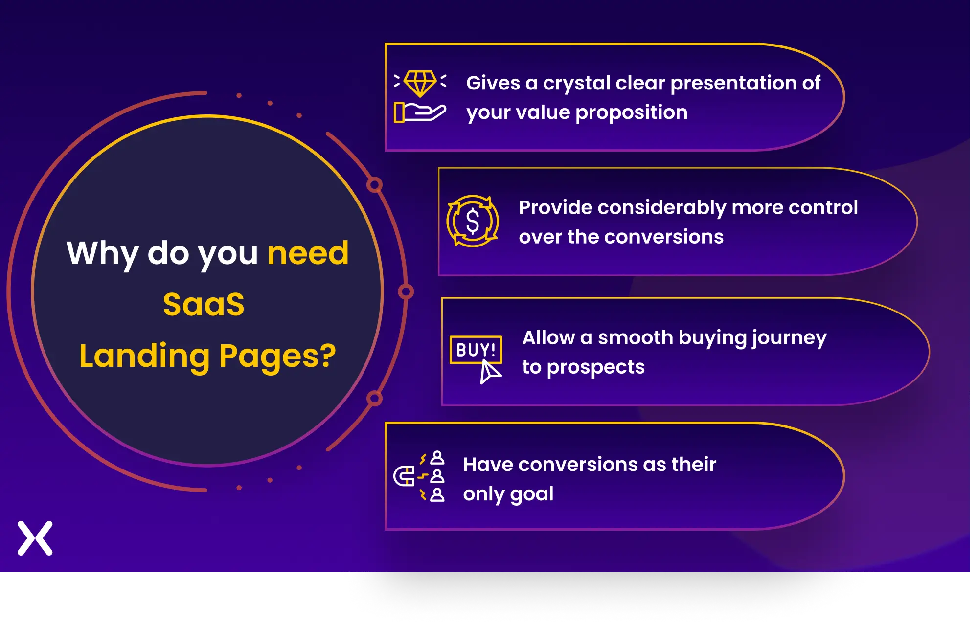 Not all prospects will be too tech-savvy to translate jargon and buzzwords at one go. Unfortunately, this often makes your value proposition appear complex. This, in turn, makes the product ungraspable for prospects, and you lose out on conversions.
That’s where SaaS landing page best practices come into play. A thoughtfully designed landing page will help you strike the right balance. It will help provide information to encourage clicks while educating visitors about the offer and keeping them hooked.
Not all prospects will be too tech-savvy to translate jargon and buzzwords at one go. Unfortunately, this often makes your value proposition appear complex. This, in turn, makes the product ungraspable for prospects, and you lose out on conversions.
That’s where SaaS landing page best practices come into play. A thoughtfully designed landing page will help you strike the right balance. It will help provide information to encourage clicks while educating visitors about the offer and keeping them hooked.
These SaaS landing page best practices aim to:
Effectively communicate the workings of your software service
Make sure a smooth user experience. It should also pave the way for a user-centered design approach to reach and match potential customers.
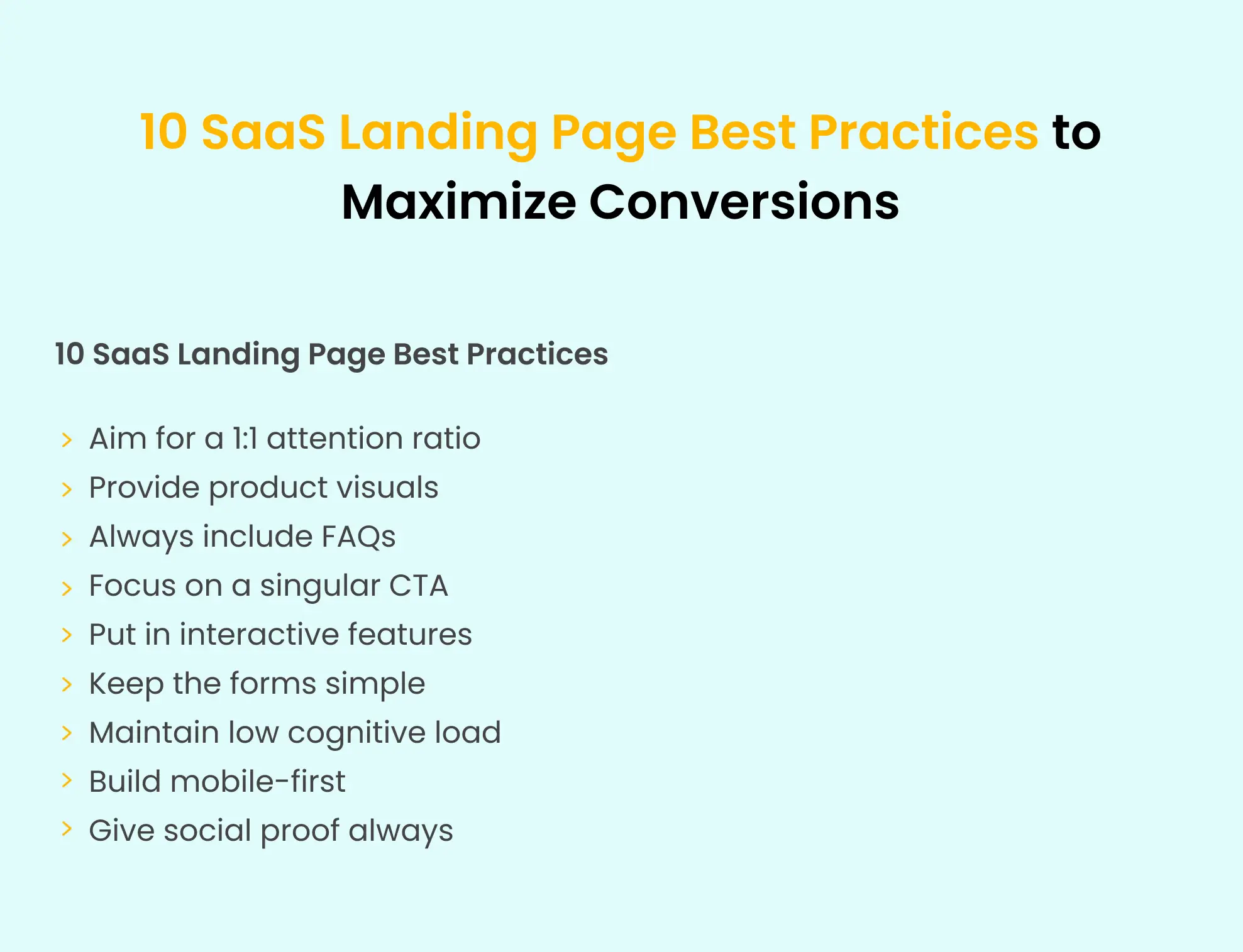
Now that we have covered the ‘why’ of the concept. It’s time to discover some of the SaaS landing page best practices.
To create a marketing campaign centered around a single objective. You must improve the attention ratio on your landing pages. A low attention rate can directly and negatively affect your conversion performance. A critical principle in SaaS landing page best practices is maintaining a 1:1 attention ratio. The attention ratio, popularized by Unbounce, compares the number of actions you can take on a page with the number of actions you should take. An uneven attention ratio on a website homepage is acceptable. But you must know how to accommodate these different awareness and intent levels on a landing page. A website’s homepage, in particular, intends to enable users to explore and discover. Therefore, different attention ratios can be distributed throughout the page.
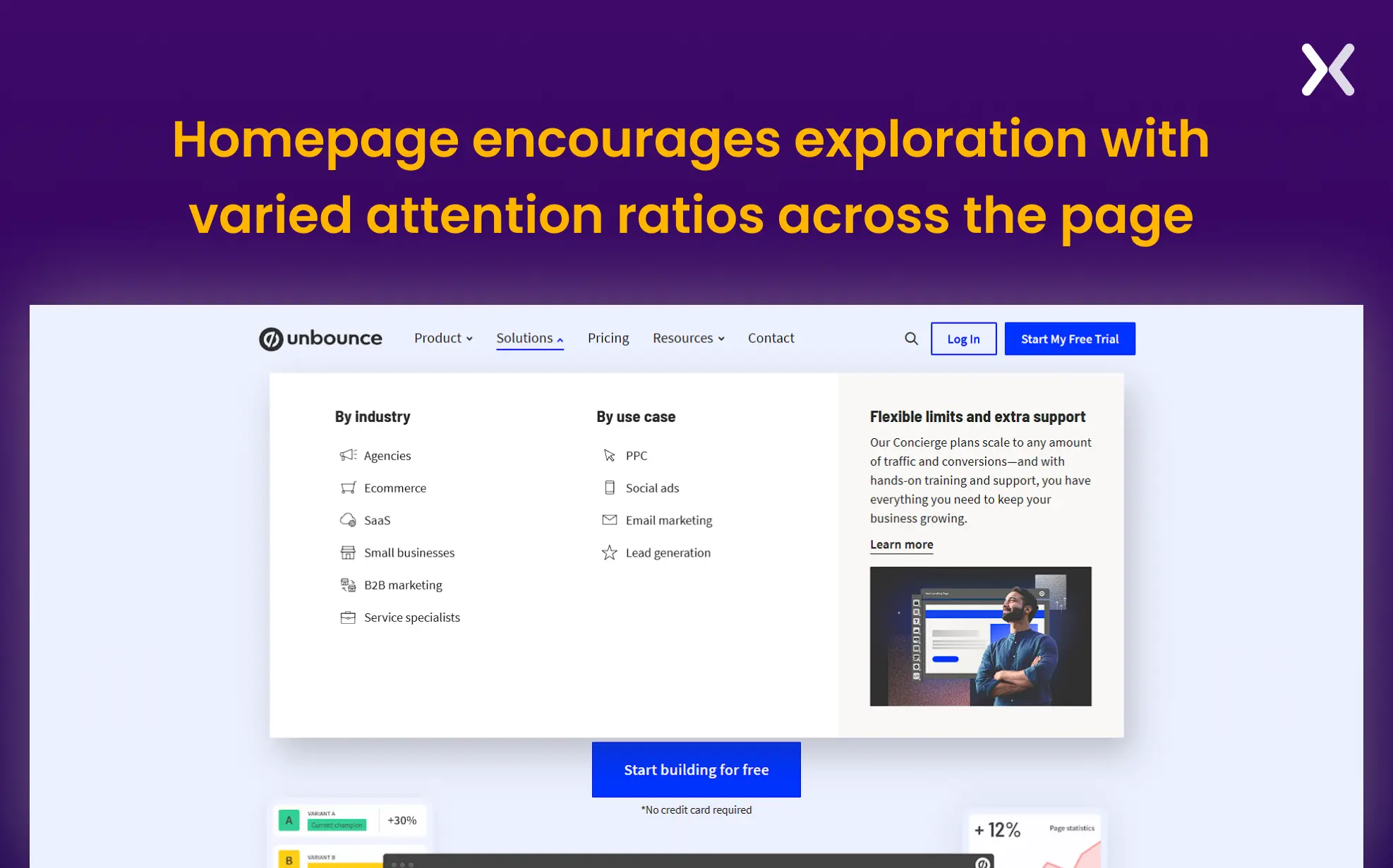 On the other hand, SaaS landing pages should only support one campaign objective. Because of this, they consistently have higher conversion rates than most home pages.
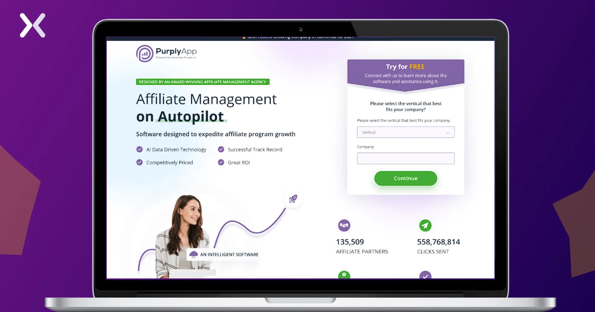 Check out this Purply App example, which has the ideal 1:1 attention ratio. Here, every button and element serves the same purpose.

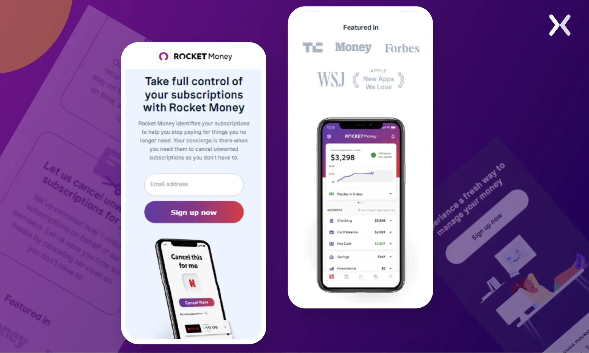
Incorporate authentic product visuals to match SaaS landing page best practices. Unlike abstract or overly stylized graphics, authentic images of the product’s user interface (UI) provide potential customers with a clear sense of what it’s like to interact with the software. For example, on the SaaS landing page below, Rocket Money understands that most of their audience will be using their application on mobile; hence, all product visuals on their landing pages are mobile-centric.
 Such transparency builds credibility and allows visitors to visualize the product’s functionality in their own workflows. For example, instead of relying on generic images or illustrations, SaaS brands should include screenshots, walkthrough GIFs, or even demo videos of the actual software.
Many leading SaaS companies use original visuals to increase their impact on their audience. Consider Monday, a work operating tool with more than ten SaaS landing pages to promote its various features. Various relevant SaaS images and GIFs are present on all these landing pages.
Such transparency builds credibility and allows visitors to visualize the product’s functionality in their own workflows. For example, instead of relying on generic images or illustrations, SaaS brands should include screenshots, walkthrough GIFs, or even demo videos of the actual software.
Many leading SaaS companies use original visuals to increase their impact on their audience. Consider Monday, a work operating tool with more than ten SaaS landing pages to promote its various features. Various relevant SaaS images and GIFs are present on all these landing pages.
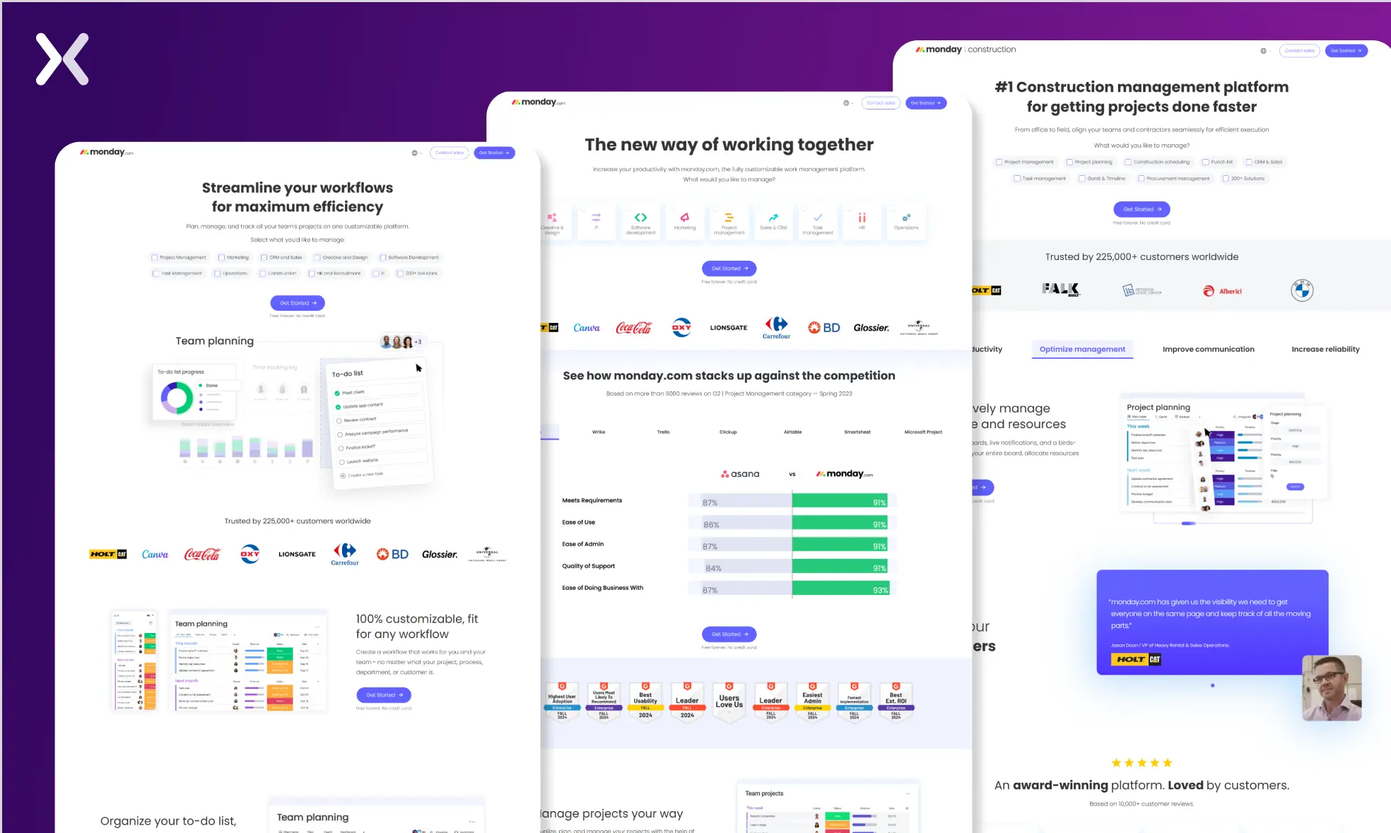 Incorporating real product visuals makes sure that your landing page becomes a window into the user experience, bridging the gap between curiosity and conversion.
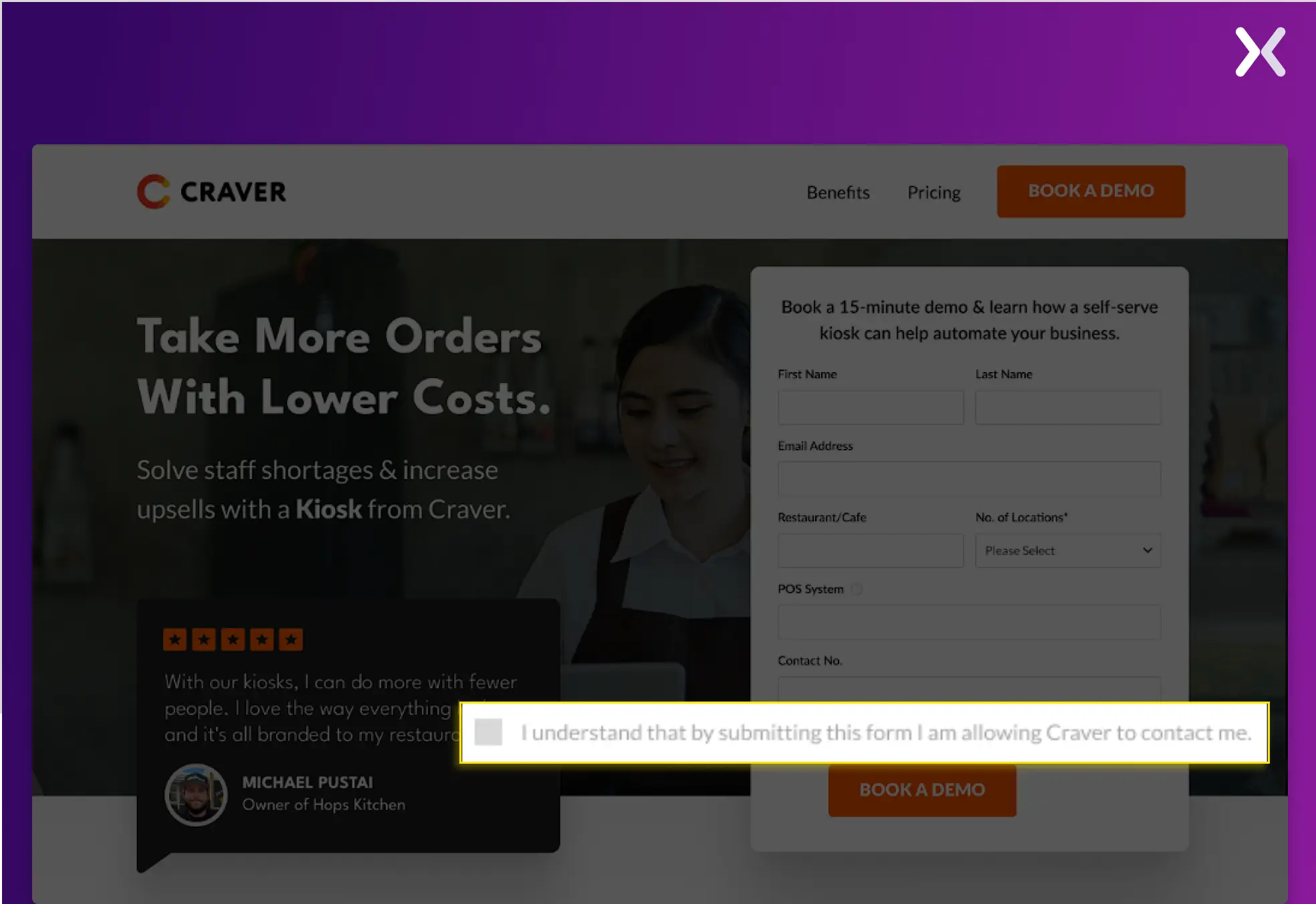
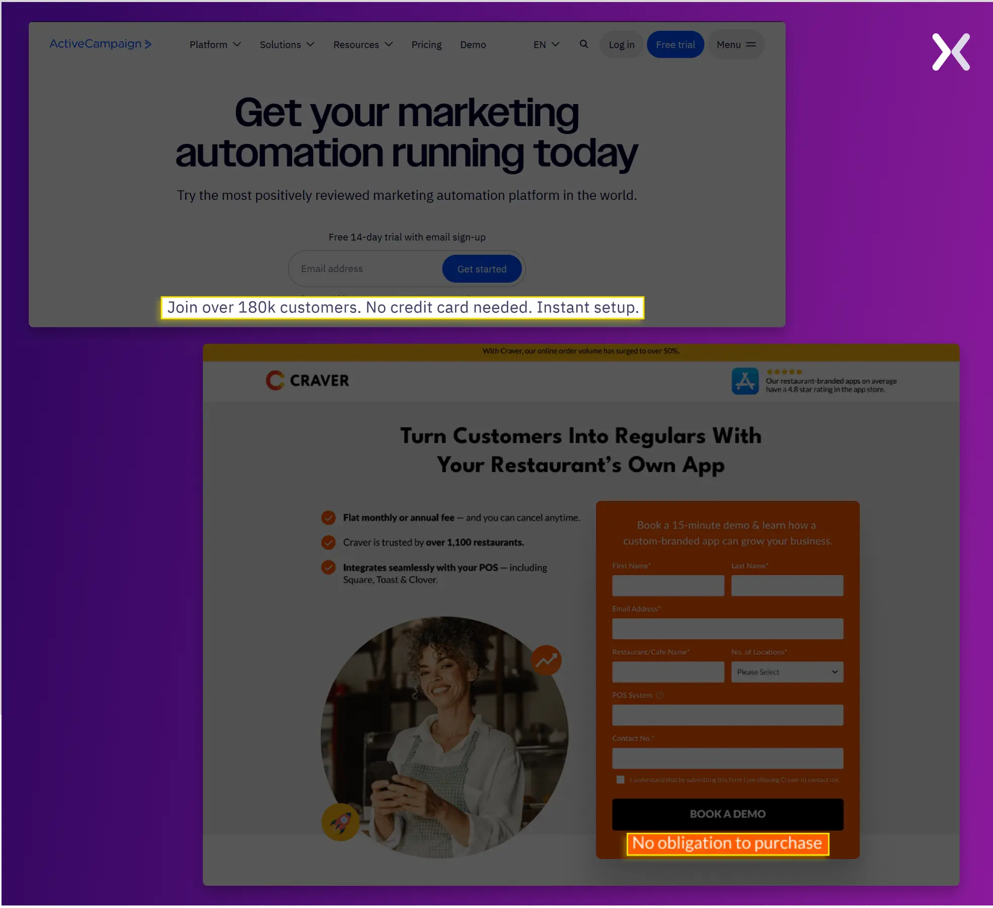
Imagine entering a room filled with strangers and doubting your whereabouts. That feeling is almost identical to what a user feels when browsing for a new product. But what happens when you find an old friend in a room full of strangers? You begin to relax. This is also true for SaaS solutions. Even if prospects find something that answers their pain points, learning and incorporating a new product into their workflow immediately requires more convincing efforts. For starters, visitors often find it hard to share their vulnerable personal information, such as phone numbers, location, etc. For example, just before the form’s CTA, Craver included a disclaimer and checkbox that informs users that their submission grants permission to be contacted. This makes sure transparency and fits data privacy regulations like GDPR, which require explicit consent before collecting personal information. By making the checkbox unchecked by default, Craver makes sure users actively opt-in, building trust while building compliance with privacy laws.
 Transparency is a key part of SaaS landing page best practices.
Such a SaaS landing page will help you build a rapport with your visitors and create an experience where they feel valued and informed.
Transparency is a key part of SaaS landing page best practices.
Such a SaaS landing page will help you build a rapport with your visitors and create an experience where they feel valued and informed.
A visitor scrolls this far down the page, and their intent to buy is high. But they might still have a few unanswered queries. FAQs address common objections and accent key details, making them a vital part of SaaS landing page best practices. They should be used when the most critical questions haven’t already been addressed prominently on your page. If a frequently asked question, like “How much does it cost?”, is getting a lot of attention or clicks. That’s a sign it shouldn’t be hidden in an FAQ section. Instead, address it higher up on the page. FAQs serve two primary purposes:
Marking Key Questions and Answers Identify the FAQs people mostly ask and make sure these answers are prominently featured on your page. With the help of heat maps, you can also understand which FAQ is the most popular among the visitors and then add it to the main content, as it will have more impact.
Addressing Common Objections Use FAQs to tackle frequently arising objections in sales calls or customer interactions. For instance, if people often ask, “What’s the difference between X and Y?” or “Why should I choose this?” answer these directly in your FAQ section.
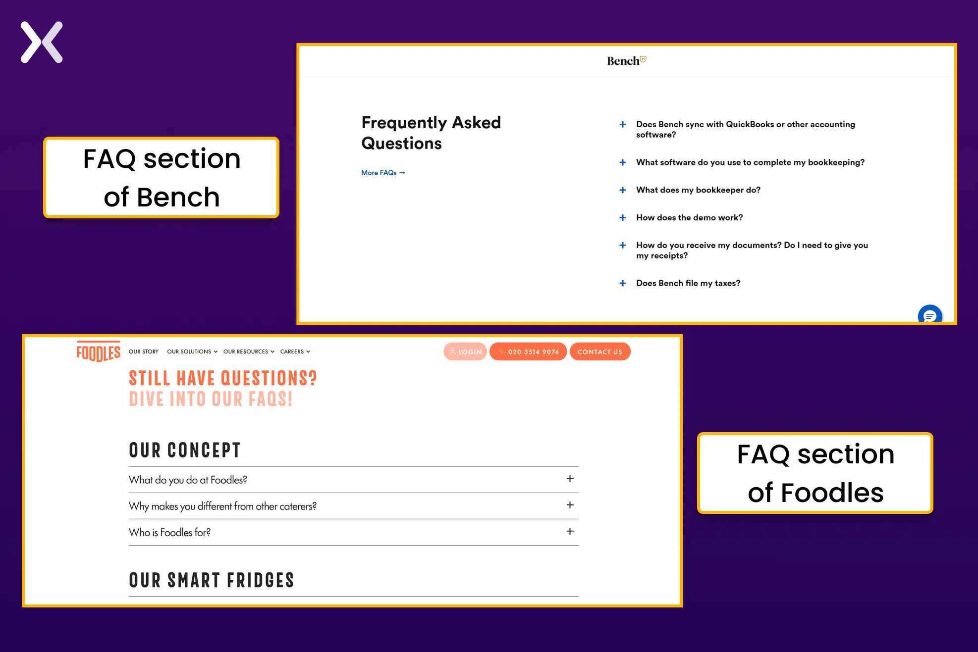
Pro Tip: Group FAQs into categories for better clarity and user experience. Take inspiration from companies like Foodles, which organize FAQs into logical sections such as:
What is the concept?
Tell me about the food.
How does it work? This structure makes it easier for users to find relevant information based on their needs or interests.
One of the golden rules of SaaS landing page best practices is to focus on a singular CTA. Multiple CTAs look good only on homepages and extended websites, which aim to encourage visitors to explore the brand. The same is not true for landing pages. SaaS landing pages need to be attenuated to targeted marketing. A single CTA leaves the visitor with only two options: to convert or not. It also helps capture only those leads who are actually interested in SaaS.
 So, whether your offer is a free demo or trial. It is necessary to stick to one CTA. Doing so might increase your conversion rate by 161%.
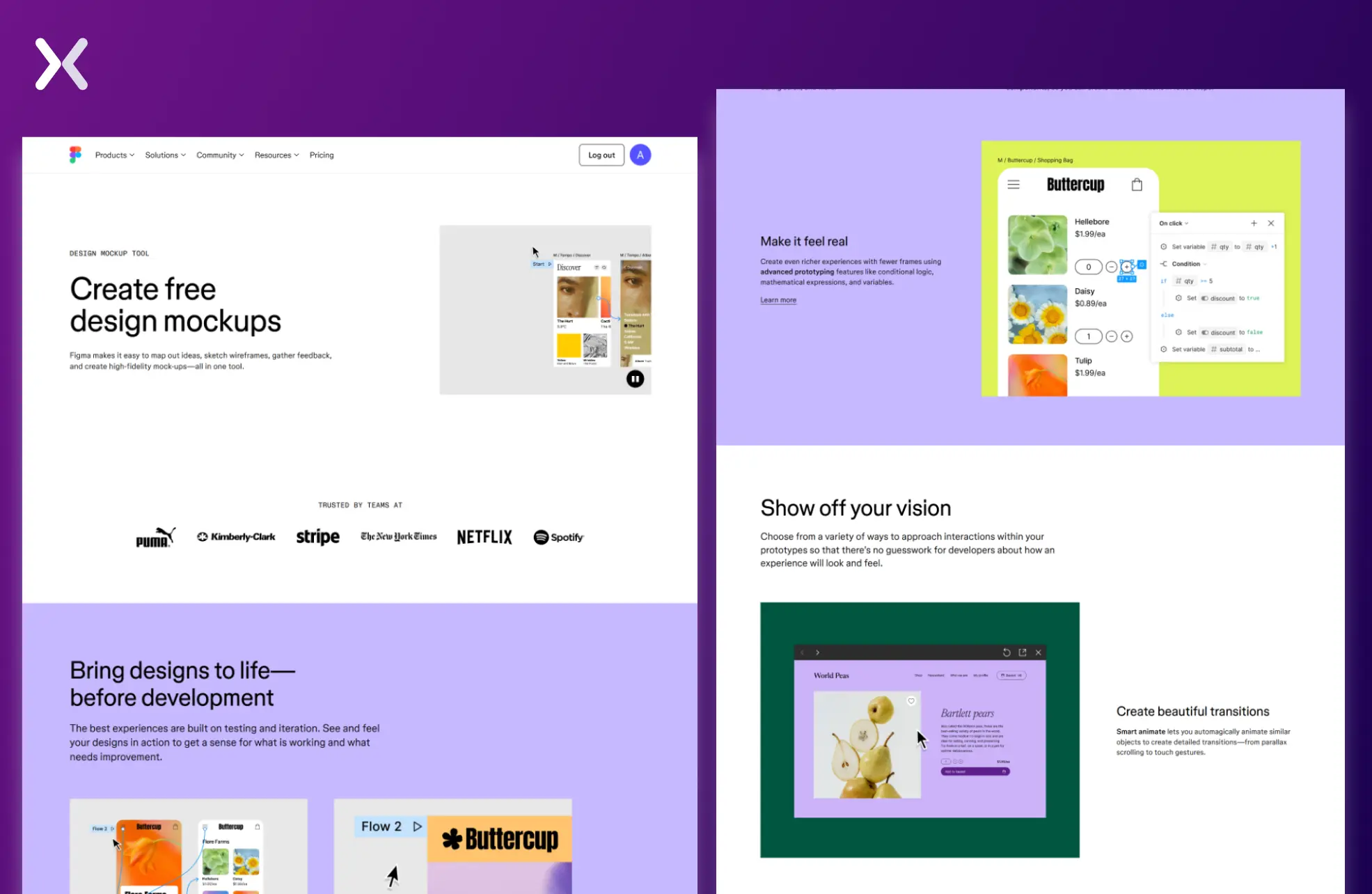
The primary element that differentiates SaaS landing pages from others is that the product can be easily communicated and visualized through the page. While physical product landing pages can include many product images in different shapes and sizes, SaaS can be presented innovatively to demonstrate its actual value. For example, Figma’s landing page is filled with GIFs and images that display its product in action, performing specific tasks that are highly relevant and intriguing to its target audience.
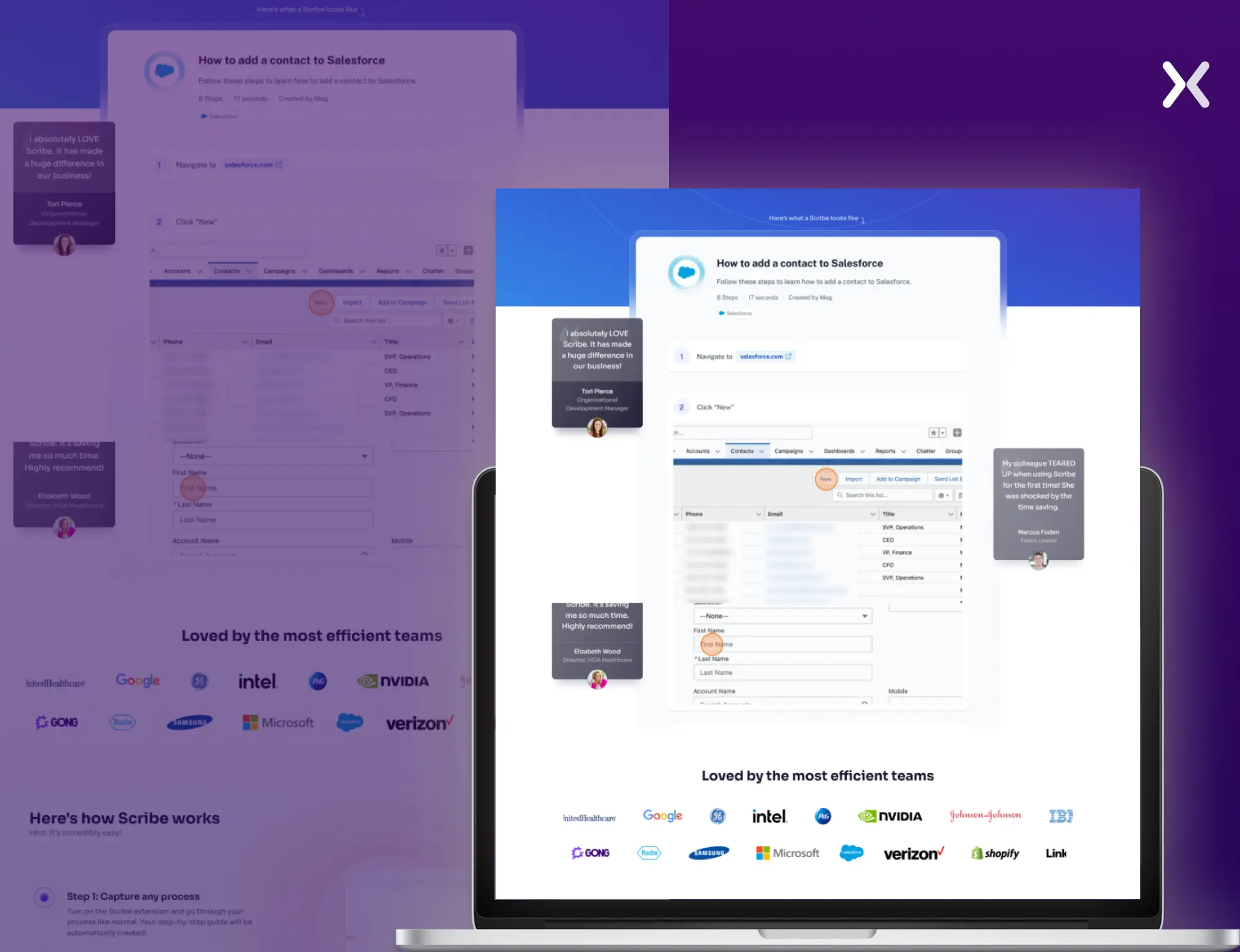
 Scribe, a process and guide builder, uses the same formula by sharing an example of a process document built on their platform. They further improve it by marking social proof around this display.
 The conclusion is that instead of showing simple images of your SaaS. You should show its applications and use cases through videos, GIFs, photos, interactive demo, and other innovative methods. They match SaaS landing page best practices by demonstrating your product’s functionality compellingly.
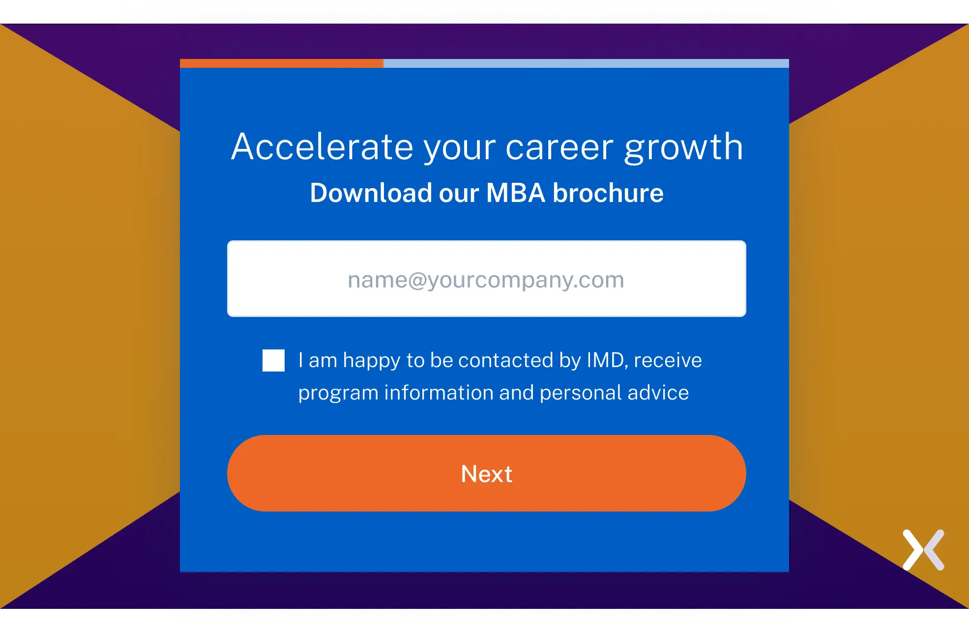
SaaS landing page forms need to be designed smartly. A form with numerous complex fields can feel overwhelming to visitors, leading them to abandon it, even if they were highly relevant leads. It is necessary to use the latest processes to capture lead information instead of relying on large, chunky forms. One of the most popular ways to reduce this is to break the form into steps, popularly known as multistep forms. Presenting the form in a more user-friendly and digestible format reduces the mental strain on visitors, making it easier for them to become leads.
 Progressive profiling is one of lesser-known SaaS landing page best practices but highly effective method for capturing lead information at any funnel stage.
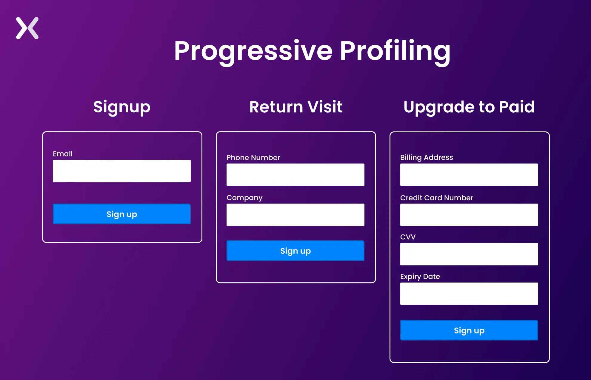 This method gathers data incrementally over multiple interactions, reducing friction and improving user experience.
A successful SaaS landing page minimizes the mental effort required for visitors to process information and make decisions. Avoid bombarding users with excessive text, cluttered designs, or too many options. Instead, present information in clear, digestible chunks, using bullet points, headings, and visuals to guide them smoothly through the page. A clean and intuitive layout makes sure visitors focus on the key message and CTA without distractions, making it easier for them to convert. The primary goal of your SaaS landing page is to convert visitors into leads and, eventually, loyal customers. So prospects don’t face any extra hassles in achieving this goal, customers should not wander and look for a clue: ‘What should I do next?’ The trajectory should be self-explicable and easy to follow.
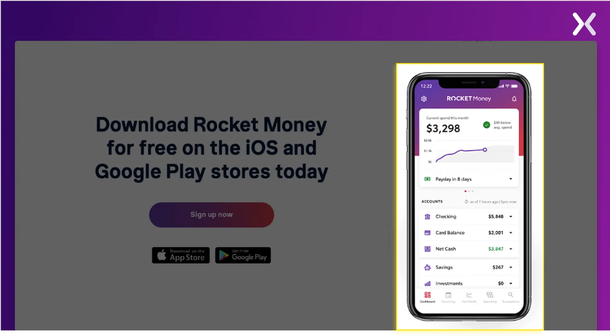
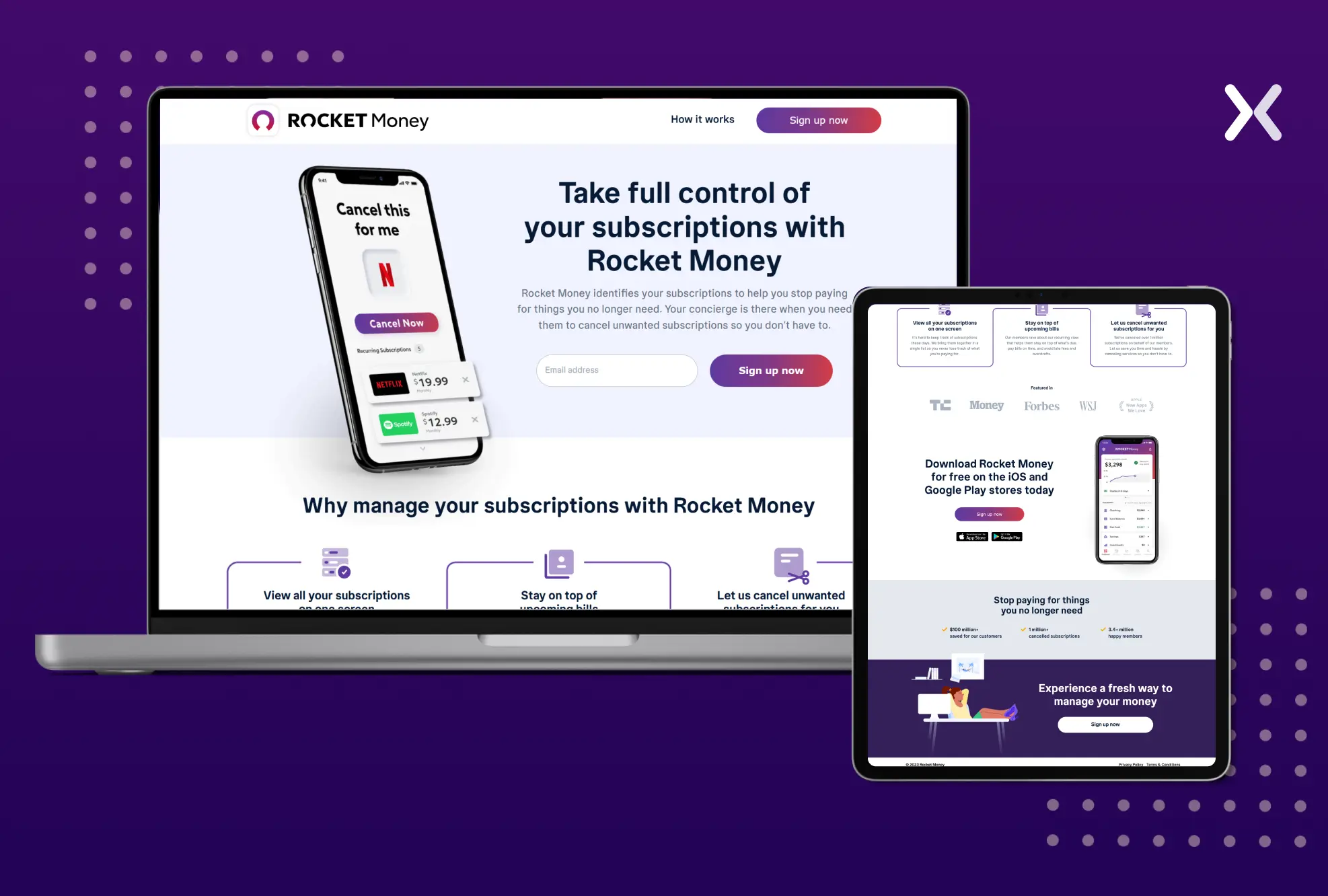 Rocket Money, for example, includes only a few words and then consists of a simple CTA button that says, “Sign Up Now.” This keeps the landing page clear of redundant and irrelevant information.
Building mobile-responsive designs is integral to SaaS landing page best practices. First, nearly half of the traffic comes from mobile devices. However, the catch is that their purpose may differ from desktop users. Mobile users primarily aim to explore and find critical information first. Navigation and quicker access to the main context should be the goal of a mobile-responsive SaaS landing page. Second, mobile devices work differently. The biggest mistake you can make is forcing a desktop-designed landing page onto a mobile device. Given the screen space, desktop pages can accommodate many size-heavy visuals, images, and texts. But when you shrink them and force-fit them onto mobile devices. They become heavier, increasing the loading times infinitely. This leaves your visitors frustrated, leading to abandonment.
 When you shrink your desktop landing pages for mobile, the content shifts to a smaller grid and is stacked vertically. This change in architecture reduces the potential of your messaging, leading to doubts about whether a vertically stacked layout is a good decision. The alternative here would be to use horizontal carousels or tabs.
To make a long story short, you must communicate your product efficiently on every screen type and size. Failing to do so might result in a high bounce rate for your SaaS landing page.
When you shrink your desktop landing pages for mobile, the content shifts to a smaller grid and is stacked vertically. This change in architecture reduces the potential of your messaging, leading to doubts about whether a vertically stacked layout is a good decision. The alternative here would be to use horizontal carousels or tabs.
To make a long story short, you must communicate your product efficiently on every screen type and size. Failing to do so might result in a high bounce rate for your SaaS landing page.
Social proof is necessary for SaaS products. Describing your list of trusted partners can do wonders, significantly increasing users’ inclination to explore your product. The second way to show social proof is to form positive peer pressure. How frequently do you research a restaurant online because it has good reviews before making a reservation or buying something? Consumers do that 87% of the time, according to BrightLocal. However, endorsements must be instructive and pertinent to the user to be effective. When done right, they can perform multiple tasks at once. Social proof must demonstrate one of the following qualities:
Show you are running with a good demand
Create a sense of community
Promote credibility
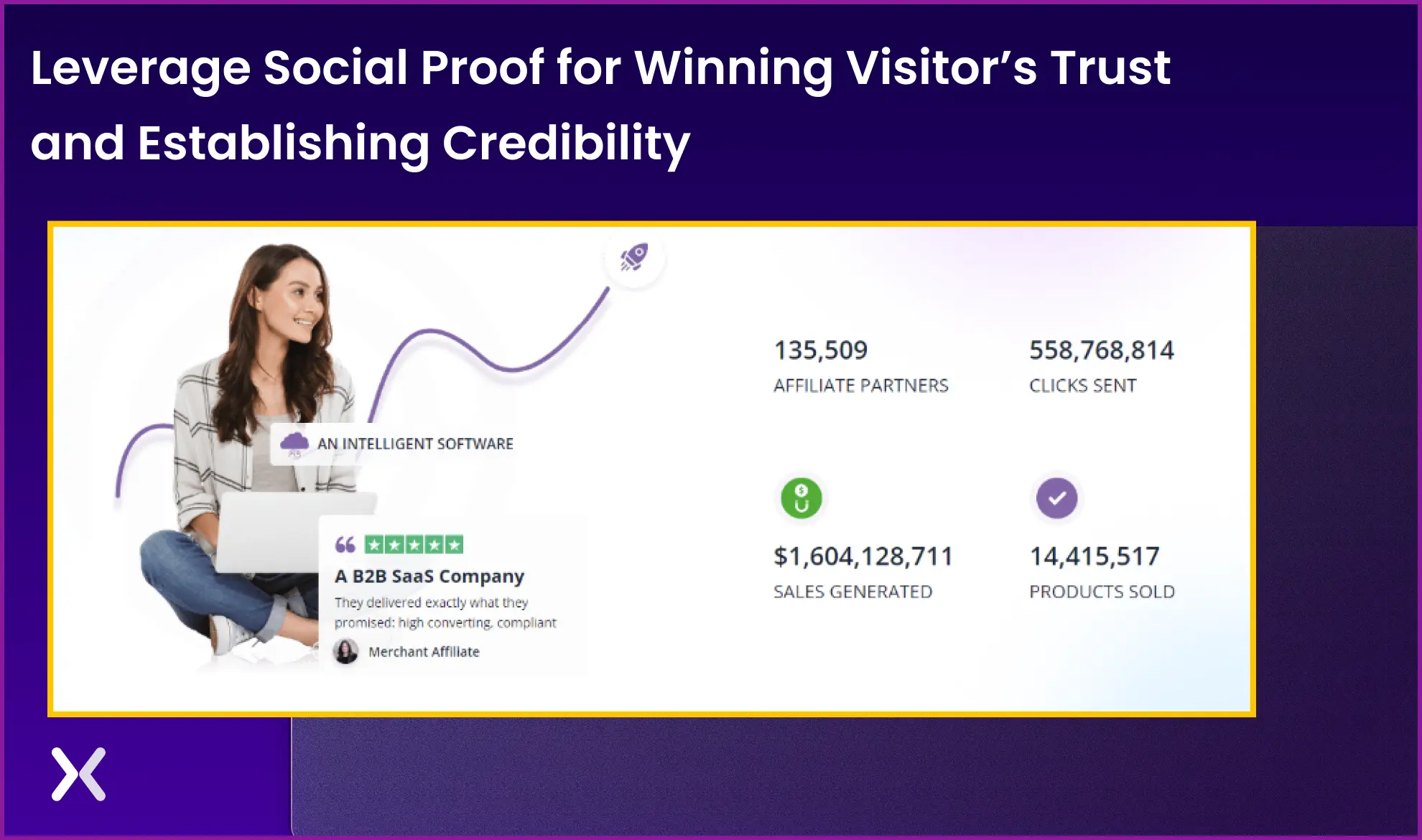 For example, in bold, Purply accents click rate figures, affiliates, sales, etc. These numbers play a significant role in grabbing instant attention. Alongside these stats, you will find customer reviews with ratings in stars. Thereby advocating for their business growth and credibility.
One of the essential SaaS landing page best practices is maintaining a positive attitude and hoping for the best outcome when optimizing a landing page. However, it is also necessary to stay alert and prepared for any potential issues that may arise on the way. The reasons for this can be high bounce rates, poor conversion rates, subpar user experience, etc. To deal with this, you can:
conduct thorough research,
analyze user data and feedback
timely test and optimize your landing page To build a strong SaaS landing page optimization. You can use various tools and methods. Heat maps and A/B testing are essential tools in SaaS landing page best practices.
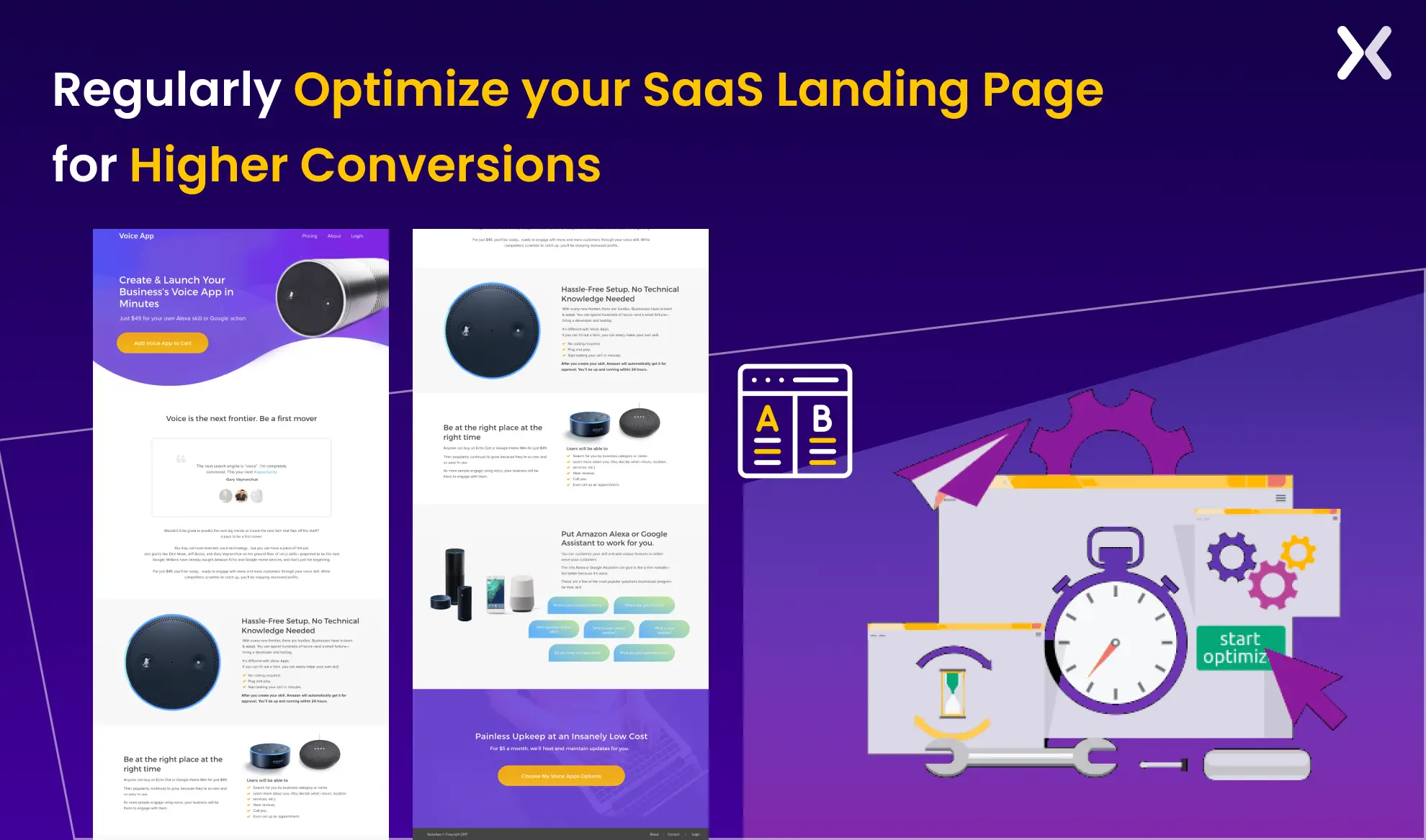 Heat maps are a great way to boost engagement. They can pinpoint the parts of a page receiving the most attention. For instance, if a heat map reveals that users spend a lot of time on a particular page region, consider extending or making that section more noticeable here.
Conversely, A/B testing enables you to compare the performance of various page iterations, such as multiple headlines, graphics, or call-to-action buttons. It will assist you in locating and optimizing a page’s most valuable components for improved performance.
Combining these two techniques will help you better understand how users engage with your SaaS landing page. And it will also enable you to make data-driven decisions to improve user experience and conversion rates.
Heat maps are a great way to boost engagement. They can pinpoint the parts of a page receiving the most attention. For instance, if a heat map reveals that users spend a lot of time on a particular page region, consider extending or making that section more noticeable here.
Conversely, A/B testing enables you to compare the performance of various page iterations, such as multiple headlines, graphics, or call-to-action buttons. It will assist you in locating and optimizing a page’s most valuable components for improved performance.
Combining these two techniques will help you better understand how users engage with your SaaS landing page. And it will also enable you to make data-driven decisions to improve user experience and conversion rates.

“For high-traffic pages, make gradual changes to avoid disrupting conversions. Small adjustments, like changing a headline, can lead to measurable improvements. For low-traffic pages, a full overhaul may help, but A/B testing is essential to assess impact. The approach depends on traffic, performance, and risk tolerance. A/B testing helps find effective changes without harming results”
Let’s learn how different SaaS landing page and their necessary elements.
The one best practice for a free trial SaaS landing page that is absolutely necessary is to have a clear, strong, and prominent call-to-action (CTA) above the fold. The CTA should immediately grab attention with action-oriented language like “Start Your Free Trial” or “Try for Free - No Credit Card Required.” It should stand out visually with contrasting colors and be repeated throughout the page to encourage users to take action.
 A frictionless sign-up process, ideally requiring minimal fields, is also essential to complement this CTA and make sure users can quickly get started without barriers.

“Yes, but the video must demonstrate tangible benefits. For our "free trial" page, a quick video showing how users could secure their devices in under 5 minutes increased sign-ups by 14%.”
If your SaaS hasn’t launched yet, consider showing visuals of your Minimum Viable Product (MVP) or mockups of the planned UI designs. These visuals set expectations and create excitement about what’s to come.
 Potential users can start imagining how the tool will fit into their daily tasks, which may motivate them to sign up for early access or subscribe to updates.
Users visiting a SaaS demo pages typically expect to schedule or watch a walkthrough of the product. They seek clarity on what the demo entails and how it will address their specific needs or pain points. These pages target users who need guidance, have specific questions, or want a personalized walkthrough.
Therefore, the most necessary element of the page is setting expectations for the demo call. Don’t leave your potential customers wondering if their questions will be addressed during the demo.
"We’ve done this before, where users enter their name and email to access a demo video. You can use this approach, skip the lead magnet with a direct explainer video, or opt for an interactive product showcase demo using tools like Storylane. Choose what best engages your audience."
Here’s an example from Ctrl Hub’s landing page, which effectively employs two CTAs.
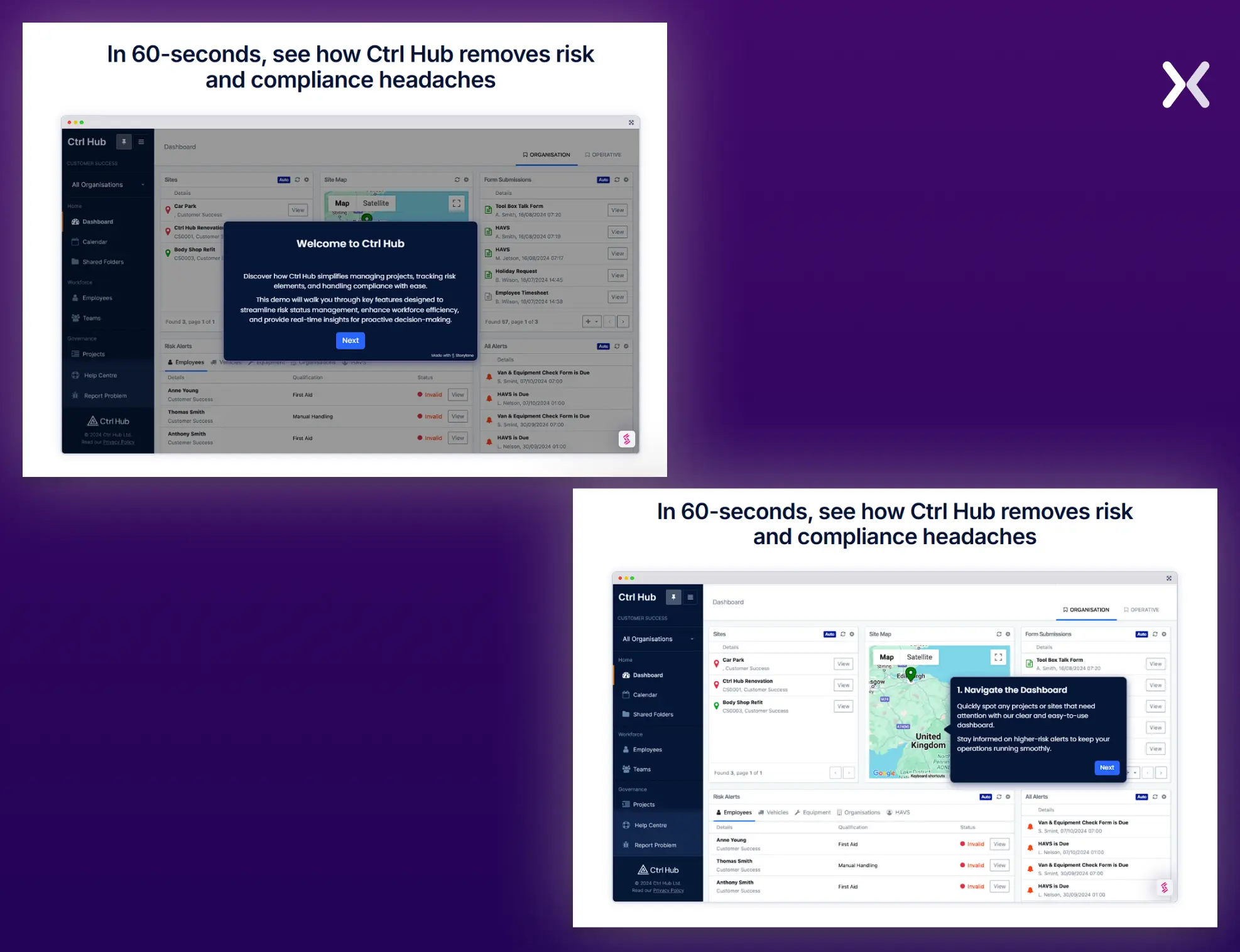 The first is a standard “Book a Demo” option, while the second is more engaging: “60-Second Interactive Demo.” This secondary CTA leads users to a section of the page presenting the SaaS in action, complete with a live demonstration of the dashboard UI. It’s a brilliant strategy to boost sign-ups for the full demo, creating immediate intrigue and delivering a tangible preview of the product’s value.
The pricing section is the most necessary part of your main SaaS product page. This is where users compare and choose the right level of your services for their needs. Instead of making it sound boring, you can make it engaging and relatable. Avoid generic plan titles like: “Basic, Starter, Platinum.” Instead, name your plans based on the value they provide to users. For example: “For Freelancers, For Growing Teams, For Enterprises.”
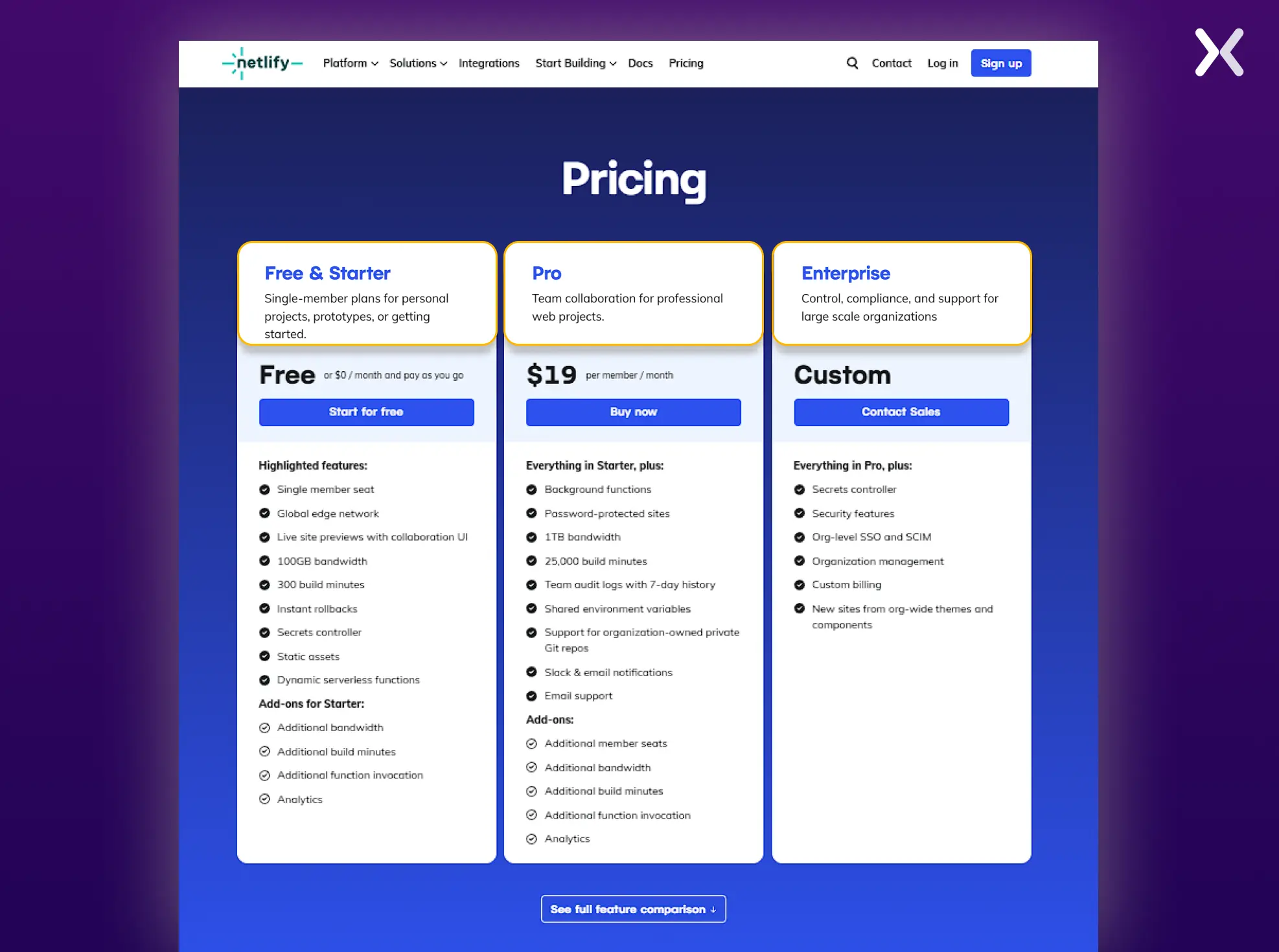 This approach helps customers immediately relate to a plan that fits their needs and goals, making the decision process faster and easier. To improve it further, specify the ideal use case for each pricing tier.
Include a plan comparison table below the pricing options. This clear, side-by-side breakdown helps users visualize what they’re getting with each plan.
A comparison landing page is essential for SaaS products. The cornerstone of these pages is a well-defined, honest comparison table that directly contrasts your tool with competitors. This table lets users easily and visually grasp how your product stands out while subtly marking your unique selling points (USPs).
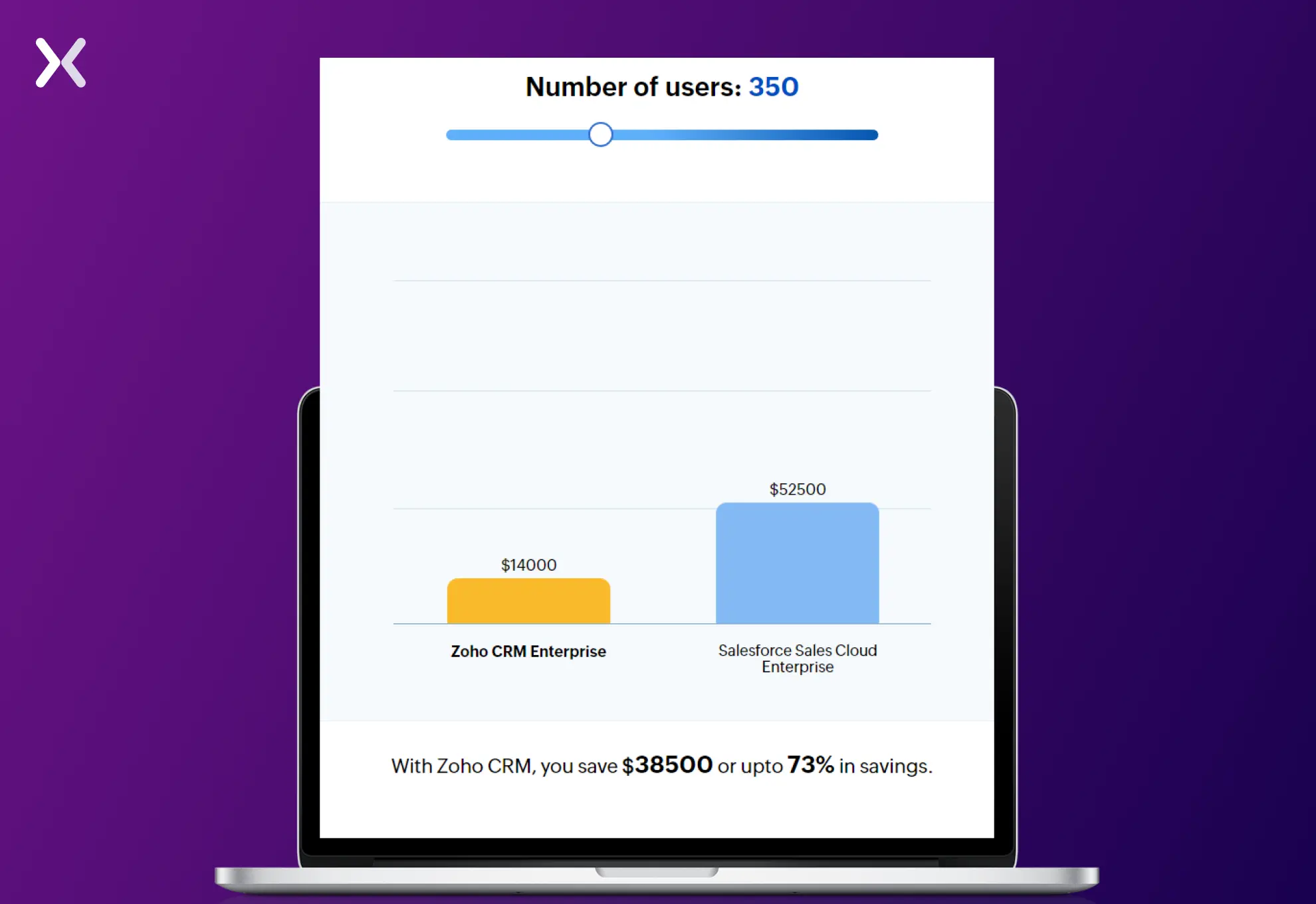 It’s an underrated yet powerful way to present your advantages. So, don’t hold back, create a strong competitor comparison page and set it up with a standout comparison table that makes your product shine. Remember, every SaaS landing page should be paired with a sleek thank you page that matches its tone and design for a cohesive user experience.
Applying SaaS landing page best practices makes sure valuable leads are secured through targeted marketing. By focusing on clear messaging, user-centric design, and strategies like a singular CTA, social proof, and mobile-first layouts. You address key challenges unique to SaaS products. With tools like A/B testing and heat maps, you can continually optimize for better results. Whether launching a product or driving sign-ups, these SaaS landing page best practices make sure your camapigns are effective, trustworthy, and conversion-focused.
SaaS landing page best practices aren’t enough for you? Apexure has 100+ blog posts on landing pages? We have shared everything, from creation to testing, analysis to optimization. Learn more in-depth about the SaaS landing page best practices through these blog posts.
Making a SaaS landing page with just the best practices won’t be enough. Get the help you need from our experts. Book a call and one of our landing page experts will contact you soon.
Check out our landing page portfolio to discover more SaaS landing page best practices in action. Filter your industry and check which landing page design is trending.
Focus on a clear value proposition, fast loading times, and an actionable CTA above the fold.
Related Articles:
Founder & CEO of Apexure, Waseem worked in London’s Financial Industry. He has worked on trading floors in BNP Paribas and Trafigura, developing complex business systems. Waseem loves working with Startups and combines data and design to create improved User Experiences. Read more


Drive More Sales or Leads With Conversion Focused Websites and Landing Pages
Get Started

Eleven percent of Meta ad rejections in 2026 trace back to one problem: the landing page does not...

A B2B SaaS company spends $30,000 per month on Google Ads and Meta Ads. Both campaigns drive traffic...
Get quality posts covering insights into Conversion Rate Optimisation, Landing Pages and great design
