
Picture this: you’re trying to sell a high-ticket item, something that requires a significant investment from your potential customers. Just a regular landing page won’t cut it. You need a landing page that’s a powerhouse of information, a persuasive masterpiece that leaves no stone unturned. Enter the long-form landing page. Unlike its short and sweet-counterpart, the long-form landing page goes the extra mile. It’s not afraid to look at the nitty-gritty details, answering every possible question your visitors might have. From the “what” and “how” to the “where” and “who,” this landing page leaves no room for doubt.
 But why go long when short seems so tempting? Well, for starters, long-form landing pages attract more qualified leads from the get-go. They provide the in-depth information that visitors need to make informed decisions. A long-form landing page takes your potential customers on a journey, presenting the value and benefits of your offer in a way that’s hard to resist.
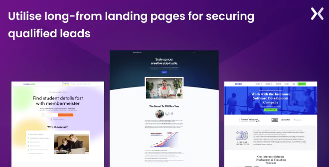
Sure, short landing pages can be effective in a pinch, but if you really want to up your conversion game. It’s time to think long-term. So, we have collected eight long-form landing page examples you can learn from and get inspiration for your next design.
Buckle up, because we’re about to take your landing page game to the next level, starting with some basic questions.
But why go long when short seems so tempting? Well, for starters, long-form landing pages attract more qualified leads from the get-go. They provide the in-depth information that visitors need to make informed decisions. A long-form landing page takes your potential customers on a journey, presenting the value and benefits of your offer in a way that’s hard to resist.
Sure, short landing pages can be effective in a pinch, but if you really want to up your conversion game. It’s time to think long-term. So, we have collected eight long-form landing page examples you can learn from and get inspiration for your next design.
Buckle up, because we’re about to take your landing page game to the next level, starting with some basic questions.
Long-form landing pages are like the superheroes of persuasive online marketing. They’re regular landing pages on steroids, using their length to educate and convince visitors about complex or high-priced products or services. These landing pages are perfect for businesses with products or services as complex as solving a Rubik’s cube blindfolded or requiring a bigger commitment than adopting a pet unicorn.
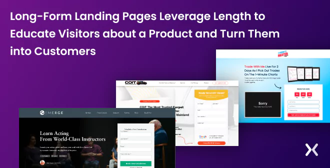 You see, the more complex or pricey your offering is, the more you must school your visitors to win them over. It’s like convincing your grandma to try sushi for the first time. You need to educate, reassure, and present the benefits, and that’s where long-form landing pages come to the rescue.
But it’s not about throwing in every single factoid you can find. Clarity is still king. The goal is to captivate your visitors and nudge them to take action. An effective long-form landing page gives you enough space to introduce your product, accent its awesomeness, address the pain points it solves, and back it up with social proof, like testimonials and reviews.
These pages are designed for curious and analytical buyers who want to inspect every nook and cranny before deciding because visitors reading every line of your landing page are seriously considering a purchase.
When done right, long-form landing pages can be like a masterclass in persuasion that informs, engages, and ultimately converts visitors into customers.
You see, the more complex or pricey your offering is, the more you must school your visitors to win them over. It’s like convincing your grandma to try sushi for the first time. You need to educate, reassure, and present the benefits, and that’s where long-form landing pages come to the rescue.
But it’s not about throwing in every single factoid you can find. Clarity is still king. The goal is to captivate your visitors and nudge them to take action. An effective long-form landing page gives you enough space to introduce your product, accent its awesomeness, address the pain points it solves, and back it up with social proof, like testimonials and reviews.
These pages are designed for curious and analytical buyers who want to inspect every nook and cranny before deciding because visitors reading every line of your landing page are seriously considering a purchase.
When done right, long-form landing pages can be like a masterclass in persuasion that informs, engages, and ultimately converts visitors into customers.
Here is a video you can check out about long-from sales landing pages.
It all comes down to psychology.
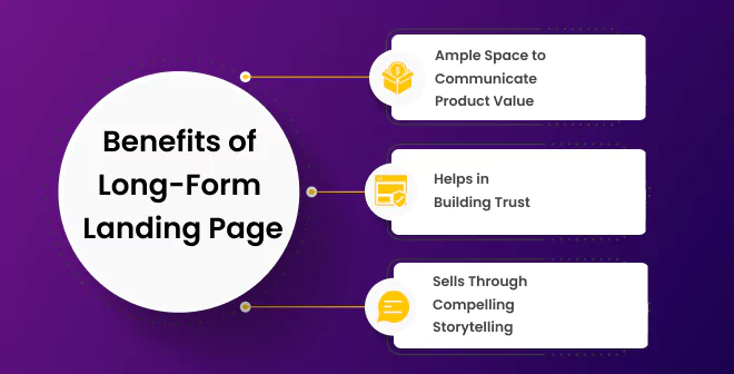
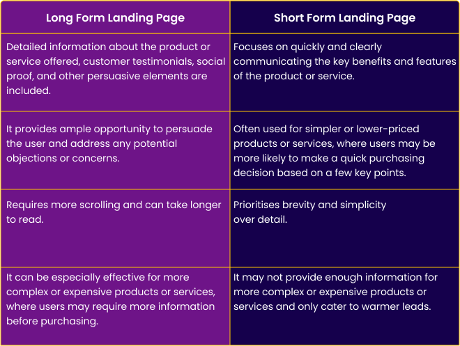
Ample Space to Communicate Product Value First of all, long-form pages allow you to provide your visitors with a full understanding of your product or service. You can accent its features, benefits, and unique selling points in detail, leaving no room for confusion or misunderstanding.
Helps in Building Trust But it is about providing information - long-form pages are also great for building trust and credibility. Such pages give you enough room to properly present your social proof through customer reviews, testimonials, and case studies. It helps easily communicate with visitors that your service is trusted and respected by others in your industry.
Sells Through Strong Storytelling Another reason is that they allow you to use persuasive copywriting techniques. By telling a strong story, using emotional appeals, and addressing objections and concerns. You can engage your visitors and persuade them to take action.
Long-form landing pages can be incredibly effective, but they’re not always the right choice for every situation. The ideal page length is not solely based on preference but rather depends on factors such as the complexity of the offer and the stage of the buying process the individual is in.
So, when should you use a long-form sales landing page?
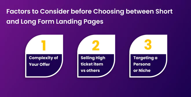
Complexity of Your Offer You should consider using a long-form landing page when a product or service requires much education. Suppose you’re selling an unfamiliar or complex product to your audience. In that case, a long-form page can help you provide the necessary context and information to help your prospects understand the value of your offering and build a conversion path for them.
Selling High Ticket Ttem vs Others Another situation where a long-form sales page can be useful is when you’re selling something that’s expensive or requires a significant investment of time or resources. In these cases, your potential customers will likely have more questions and concerns, and a long-form page can help you address these issues comprehensively and persuasively.
Targeting a Persona or Niche Long-form sales pages can also effectively target a specific audience or a niche market. By tailoring your messaging and content to your target audience’s unique needs and interests. You can create a page that speaks directly to their pain points and desires. By considering the complexity of your product or service, your target audience’s needs and interests, and your marketing campaign’s goals. You can determine whether a long-form sales page is the best choice for your business. But let’s compare it with a short-form sales page.
When it comes to long-form landing pages, forget about the “right length.” It’s all about giving your visitors the juicy details they need to make informed decisions. Think of it as a crash course in your product’s fundamentals. From benefits to features, social proof to FAQs, make sure every bit of relevant information is included. It’s like serving up a buffet of knowledge, helping your visitors to click that CTA button confidently. So, remember, when it comes to long-form landing pages, more is more!
Let’s list all the necessary elements of a long-form landing page design so you can always get back to them when building your page.
First up is the headline. It is your hook - the element that grabs the reader’s attention and entices them to keep reading. Your headline should clearly communicate your product or service’s main benefit or unique selling proposition
This helps break your content into easily digestible sections and maintains the reader’s interest. Subheadings should be informative and relevant, providing a clear roadmap of the information you’ll cover on your sales page.
A strong introduction is necessary. It sets the stage for the rest of your sales page and should establish a connection with your reader. Use this opportunity to empathise with their needs, pain points, or desires. Now, let’s talk about storytelling. Sharing stories or case studies can create an emotional connection with your reader, making them more invested in your product or service. These narratives can present how your offering has positively impacted others or solved specific problems.
A sticky navigation bar can help improve the user experience by allowing visitors to easily move through to different landing page sections without having to scroll back to the top of the page to access the menu. It can also increase engagement and conversions by making it easier for users to find the information they want and take the desired actions on the landing page.
To effectively price your product, subscription, or service. It’s necessary to be transparent about the cost and any additional fees. Justify the pricing by presenting the value your customers receive, and provide context by comparing it to more expensive options or industry standards. Offering discounts or promotional pricing for a limited time creates a sense of urgency and accents the savings.
Consider offering flexible payment options to make your product or service accessible to a wider range of customers with different budgets.
Your sales page must clearly outline the benefits and features of your product or service. Explain how they address the customer’s needs or solve their problems. Use bullet points or numbered lists for easy readability. And now, we come to bonuses. Bonuses are a fantastic way to add extra value to your offer, making it more enticing for potential customers. These could be additional products, services, or resources that complement your main offering. Be sure to accent these bonuses’ exclusivity to create a sense of urgency.
Social proof is essential for building trust with your audience. Including video testimonials, reviews, or endorsements from satisfied customers or industry experts will help validate your claims and reassure potential buyers. Risk reverses such as a money-back guarantee can also be a powerful persuasion tool. By reducing the perceived risk of making a purchase, you make it easier for customers to commit to your offer.
Your call to action, or CTA, is the moment of truth. This is where you tell your reader exactly what to do next - whether to buy now, sign up, or learn more. Make sure your CTA is clear, concise, and prominent on your sales page.
Last but not least, address any frequently asked questions or potential objections. This will help provide clarity and reassurance to your readers, making it more likely that they’ll take the desired action.
Now for some inspiring long-form landing page examples.
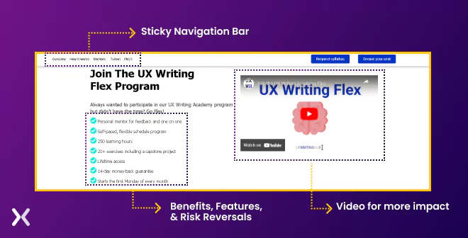
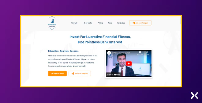
UX writing hub starts its landing page with a solid benefit-centred headline, followed by a short sub-heading explaining the course-which is great to help people categorise and understand the offering. Right above the fold, they feature:
A detailed video explaining their program works as a great idea for businesses looking to present the step-by-step process of their service.
Features, benefits, and risk reversals accent right below the subheading.
A sticky navigation bar for users to move around the page easily.
 Below, you’ll notice their effective approach to addressing readers’ pain points and illustrating how their program can provide solutions. Following that is a clear and concise section explaining how the UX writing hub can assist.
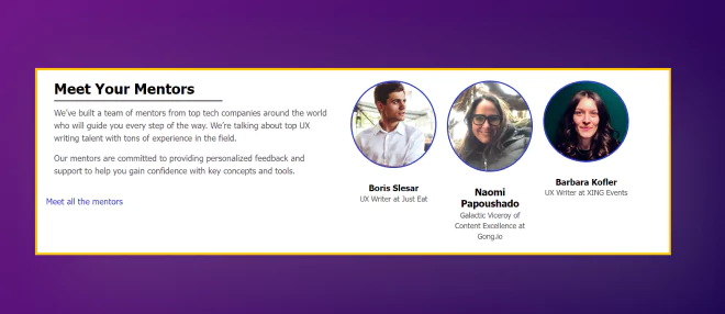
Scroll a little further, and they also present trust badges and a picture of their mentors.
Below, you’ll notice their effective approach to addressing readers’ pain points and illustrating how their program can provide solutions. Following that is a clear and concise section explaining how the UX writing hub can assist.
Scroll a little further, and they also present trust badges and a picture of their mentors.
 The aim? Gain visitors’ trust and address their objections and concerns.
Two more things that level up this landing page:
The aim? Gain visitors’ trust and address their objections and concerns.
Two more things that level up this landing page:
Explaining tuition and financing of the program
An FAQ section that answers any remaining questions visitors may have
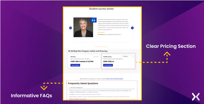 In summary, the landing page is incredibly persuasive. Although long-form, it doesn’t unnecessarily drag on, as each section serves a necessary purpose in strong visitors to take action.
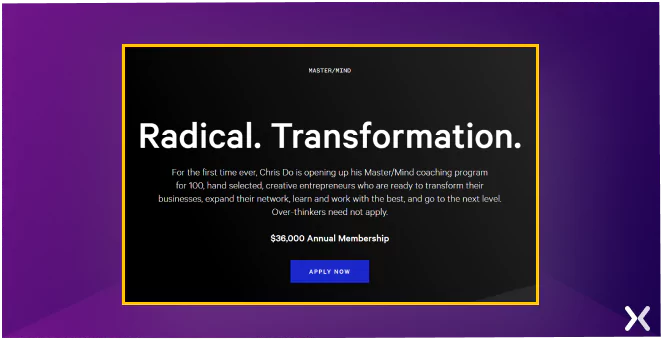
Let’s have a look at Chris Do’s mastermind program long-form landing page. This program costs $36,000, so needless to say. It’s a high-ticket item. Long-form landing pages often have a narrative structure because storytelling is a powerful tool for engaging and persuading potential customers. By presenting the product or service in the context of a strong story, the sales page can create an emotional connection with the reader and help them understand the value of what’s being offered. Chris Do’s page does exactly that. The heading and sub-heading state that Chris is offering his transformational MasterMind coaching program to a limited number of creative entrepreneurs who are ready to change their businesses and take their careers to the next level. This phrase creates urgency and tries to serve the right set of target audiences.
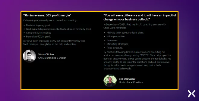
 The testimonial section is also pretty clever. It’s not your typical testimonial where the client is happy, and they share a few lines. These reviews detail how long they have worked with Chris, what results they achieved and some actual numbers.
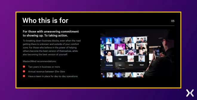
 In the “Who this is for” section, Chris outlines exactly who this program is for. So here, he is pre-qualifying his prospects and repelling some with whom he doesn’t want to work. It helps get quality leads from a single page that won’t take long to convert into paying clients.
Again, you’ll see an engaging, benefit-oriented headline, an explanatory sub-headline, and a CTA above the fold.
 They subtly persuade their reader by showing brands’ logos in their hand-picked collections.
![]() The page then lists the benefits of the service by honing in on a key pain point of the target customer and explaining why they should choose them.
The page then lists the benefits of the service by honing in on a key pain point of the target customer and explaining why they should choose them.
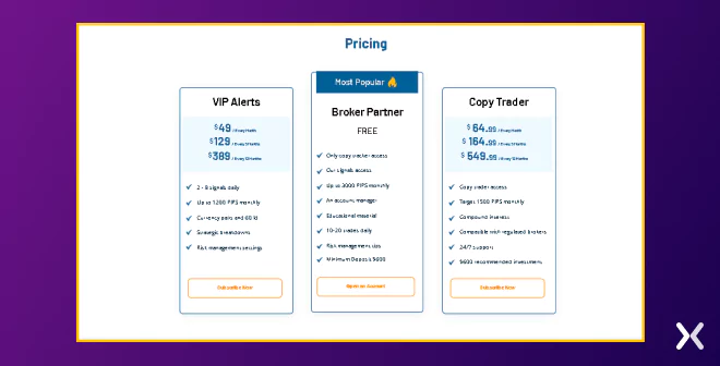
![]() Further down, the page follows this with a strong section addressing the pricing package, followed by the steps to join their membership.
Further down, the page follows this with a strong section addressing the pricing package, followed by the steps to join their membership.
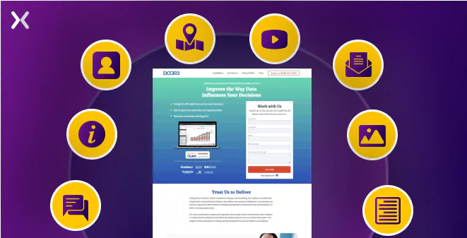
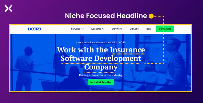
DOOR3 starts their click-through landing page with a niche-focused headline that sends visitors a direct message that they have reached the right page. The top of the fold is kept less crowded with a simple preheader and subheading, followed by an outshining CTA. The CTA button pops out due to the colour choice.
 On a further scroll, all necessary services provided by DOOR3 under the targeted niche are communicated effectively through short copies that accent every service’s benefits as well.
Testimonials and quantitative social proof are great ways to anchor visitors’ trust and encourage them to spend more time on the page.
On a further scroll, all necessary services provided by DOOR3 under the targeted niche are communicated effectively through short copies that accent every service’s benefits as well.
Testimonials and quantitative social proof are great ways to anchor visitors’ trust and encourage them to spend more time on the page.
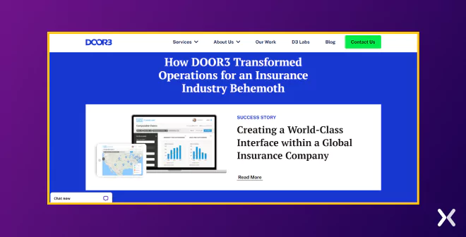
 They have also marked a case study that generates interest with its heading and further develops user interest.
The OffPlan Properties landing page design greets you with a clean above-the-fold. The hero image, headline, subhead, and CTA button are all in sync to explain the services. As the landing page is long, a navigation bar is at the top to make it easier for visitors to jump directly to the section of their liking. The accent of the navigation bar is the click-to-call button that helps in prompt communication. Along with the landing page form, the hero section looks great.
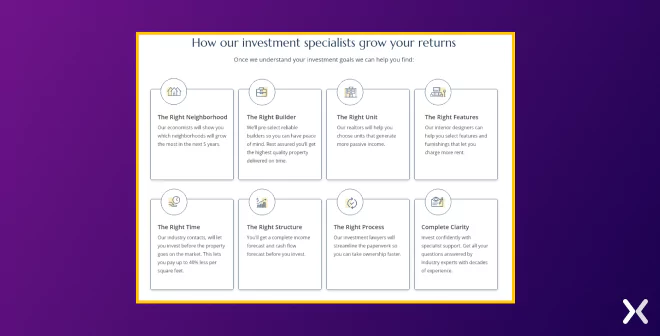
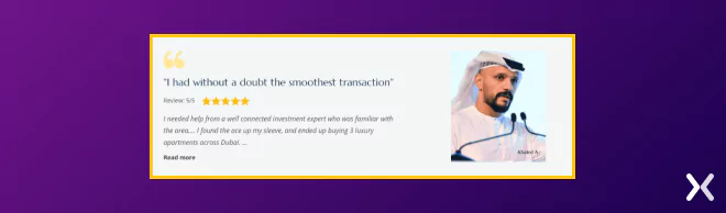
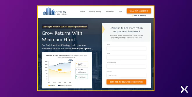 On the first scroll, we see a list of all the essential features of the OffPlan Properties services are presented. The use here is simple and will be visible to prospects just skimming through the page. It is quickly followed up by a testimonial, establishing brand trust.
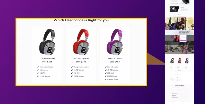
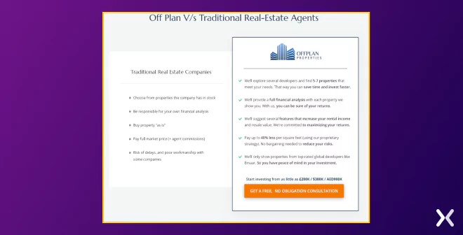
 It also has a comparison table that maintains the simplicity of the page and accents the brand’s USPs efficiently.
 So here we can say:
Above the fold: Gave a quick brief about the services with a catchy headline and CTA.
Middle the fold: Establishes the brand and the services in focus.
Below the fold: All about social proof and FAQs.
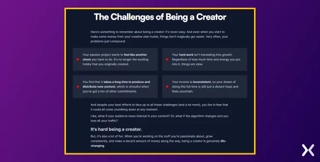
Ali Abdaal’s long-form landing page targets the audience’s pain point through storytelling. In “The Challenges” section, Ali uses storytelling to create a sense of relatability and vulnerability. By sharing his own experiences, he identifies common pain points that creators face, such as feeling burnt out, struggling with growth, and facing inconsistent income. This helps the reader feel understood and heard.
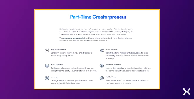
 The Solution here, we can read the benefits of enrolling in the Part-Time Creatorpreneur course. The purpose of the text is to persuade and motivate the reader to enrol in the course to achieve their creative goals.
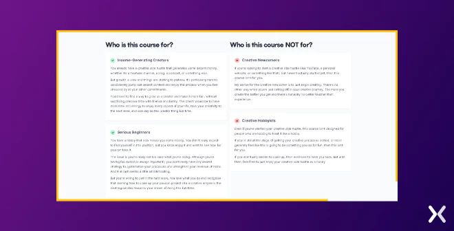
 The section about Who is this course for/ Who is this course NOT for? By identifying who the course is not for, Ali can manage the expectations of potential prospects and avoid having them enrol in the course with unrealistic expectations.
 You might have noticed limited CTA blocks on this long-form landing page. We are unsure if that was deliberate, but we always recommend adding CTA buttons or blocks after every 2 sections.
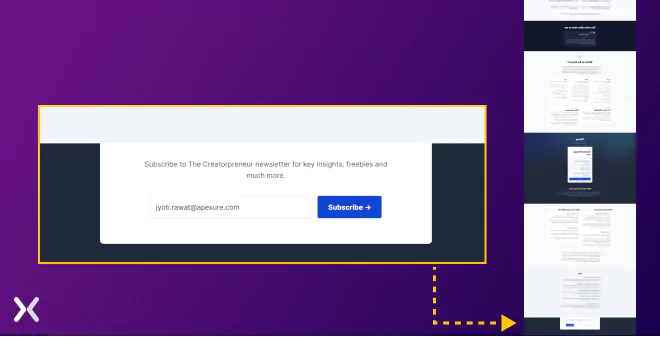
You can see there are some similarities between the 2 sales pages. Chris has more CTA blocks but also Ali has a newsletter sign-up option as a secondary CTA.
You might have noticed limited CTA blocks on this long-form landing page. We are unsure if that was deliberate, but we always recommend adding CTA buttons or blocks after every 2 sections.
You can see there are some similarities between the 2 sales pages. Chris has more CTA blocks but also Ali has a newsletter sign-up option as a secondary CTA.
 Also, comparing the two designs. Ali has used a blog standard template, while Chris Doe’s long-form landing page looks more ‘Apple-Esque’, but both landing pages use white space aptly.
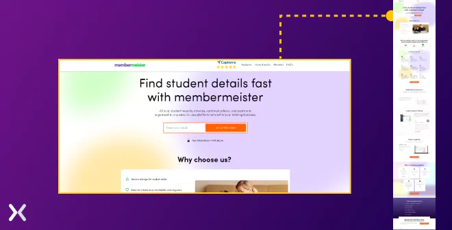
“Find student details fast with membermeister” this heading points out the problem and its solution and leaves the visitors thinking about how the SaaS will solve their problem. Membermeister’s landing page opens with a great headline and a single form field for capturing a prospect’s email address. It encourages visitors to try the SaaS once. At the top, a sticky navigation menu is also available, which makes it easier for prospects to jump from one section to another.
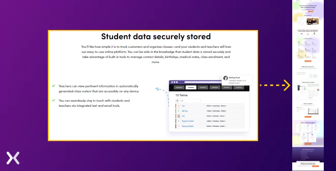
 Further down, they have well-explained all the qualities of the software and what it offers to its users. As this is a SaaS landing page. It is necessary to show the software in action at some point. Membermeister does it while pairing every software image with a positive client testimonial. It is a great way to win visitors’ trust while showing the SaaS.
 When SaaS landing pages are build with such details they are sure to get pruchase, free trial sign-ups, or demo booking.
On a high level, there are about 18 sections on this page (now that’s what we call a long-form landing page). There are 2 sections which we really want to talk about. One is the big fat Guarantee, and the other is right at the bottom, which we call ‘Why systems matter?’ Let’s take a look at them:
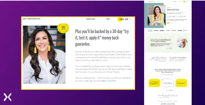 In the money guarantee section, Amy uses a common copywriting framework known as the “Risk Reversal” framework. This framework is designed to alleviate the fear and scepticism of potential customers by removing or minimising the perceived risk of buying a product or service.
The psychology behind this framework is rooted in the idea that people are generally risk-averse and fear losing their hard-earned money on a product or service that may not deliver the promised results. The money-back guarantee is a safety net, giving customers the confidence to try the product without fear of losing their money.
Amy urges potential customers to take action and reminds them that they have nothing to lose but time. This creates a sense of urgency and encourages potential customers to decide without delay.
If you want to learn more about this approach, I recommend checking out “The Psychology of Price: How to Use Price to Increase Demand, Profit and Customer Satisfaction” by Leigh Caldwell.
In the money guarantee section, Amy uses a common copywriting framework known as the “Risk Reversal” framework. This framework is designed to alleviate the fear and scepticism of potential customers by removing or minimising the perceived risk of buying a product or service.
The psychology behind this framework is rooted in the idea that people are generally risk-averse and fear losing their hard-earned money on a product or service that may not deliver the promised results. The money-back guarantee is a safety net, giving customers the confidence to try the product without fear of losing their money.
Amy urges potential customers to take action and reminds them that they have nothing to lose but time. This creates a sense of urgency and encourages potential customers to decide without delay.
If you want to learn more about this approach, I recommend checking out “The Psychology of Price: How to Use Price to Increase Demand, Profit and Customer Satisfaction” by Leigh Caldwell.
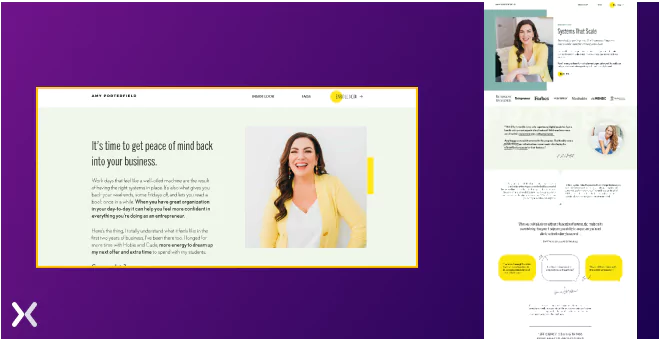 The other section we want to title is “Why Systems Matter”. It stresses the importance of having systems to run a successful business and achieve a better work-life balance. The text also acknowledges entrepreneurs’ challenges, particularly in the early stages of starting a business. The section concludes by introducing the Systems That Scale program, which promises to simplify and simplify business operations to reduce overwhelm and help entrepreneurs achieve their revenue goals.
The whole landing page is great to look at if you want to understand how to write a strong long-form sales copy. And don’t forget to add a thank you page to complement your landing page as it helps open up new conversations with visitors turned leads.
The other section we want to title is “Why Systems Matter”. It stresses the importance of having systems to run a successful business and achieve a better work-life balance. The text also acknowledges entrepreneurs’ challenges, particularly in the early stages of starting a business. The section concludes by introducing the Systems That Scale program, which promises to simplify and simplify business operations to reduce overwhelm and help entrepreneurs achieve their revenue goals.
The whole landing page is great to look at if you want to understand how to write a strong long-form sales copy. And don’t forget to add a thank you page to complement your landing page as it helps open up new conversations with visitors turned leads.
Long-form and short-form landing pages are two different approaches to designing a landing page, and each has advantages and disadvantages. The table below will help you understand their difference better:
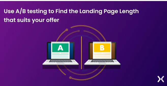
A short-form post-click landing page with a long-form challenger page If there is still confusion regarding what type of landing page will suit you, then an A/B test will be your best bet. After you’ve created a long-form or short-form post-click landing page based on how your offer fares, A/B test the page to see what impact a length variation has on your conversion rates. Each offer is unique, and through A/B testing, we gather data-driven insights to determine the optimal page length with the help of prospective customer behaviour for maximising conversions. By comparing the performance of the two landing pages, business owners can identify which design and messaging elements are most effective at communicating the value of the product or service to the target audience.
In conclusion, long-form landing pages are a big improvement for digital marketers, and as a leading landing page agency with over 8 years of experience, Apexure knows firsthand the power of these pages in driving conversions. With a portfolio of high-converting landing pages, including some of the examples discussed in this blog post, we’ve seen the impact that well-crafted long-form landing pages can have on businesses. So, if you’re ready to take your landing pages to the next level, trust Apexure to deliver landing pages that captivate, convert, and raise your online presence. Contact us today to see how our expertise can change your landing pages and drive meaningful results. Let’s create landing pages that make your audience say “wow”, and your business say “ka-ching!”
Related Articles:
Founder & CEO of Apexure, Waseem worked in London’s Financial Industry. He has worked on trading floors in BNP Paribas and Trafigura, developing complex business systems. Waseem loves working with Startups and combines data and design to create improved User Experiences. Read more


Drive More Sales or Leads With Conversion Focused Websites and Landing Pages
Get Started

Eleven percent of Meta ad rejections in 2026 trace back to one problem: the landing page does not...

A B2B SaaS company spends $30,000 per month on Google Ads and Meta Ads. Both campaigns drive traffic...
Get quality posts covering insights into Conversion Rate Optimisation, Landing Pages and great design
