
Though B2B and B2C industries are extremely different, and the customer journeys are too, landing pages for both B2B and B2C campaigns have a lot of similarities. Of course, there are some differences. While B2C landing pages focus heavily on emotional impulse, B2B landing pages need to convince buyers who are often more calculating. This doesn’t mean, of course, that emotion isn’t a factor in securing a higher B2B landing page conversion rate. There’s just more of a fine balance.
blog, we’ll cover some of the best tips to increase B2B landing page conversion rate.
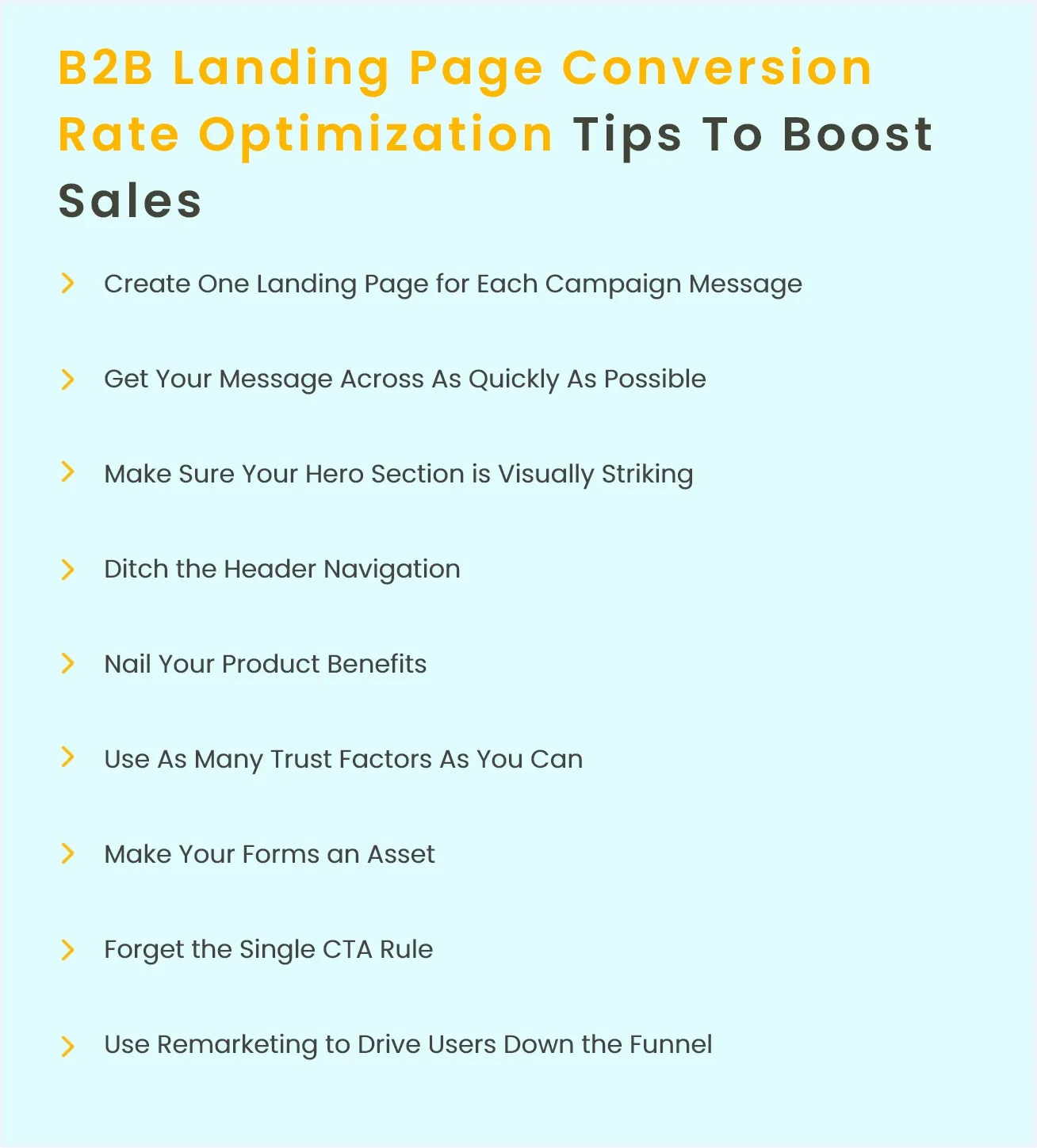
According to a Kissmetrics study, 52% of B2B PPC ads redirect to a homepage rather than a paid search landing page. This is just about the worst mistake a business can make. At different stages of the purchase process, you should have ad campaigns targeting users with targeted messages that allow them to convert based on their needs at the moment. And to finish off the job, each marketing campaign with a specific message requires an equally unique and targeted landing page. Marketers know that high B2B landing page conversion rates are achievable by employing consumer-centric content that gets personalised with different landing page types according to the visitors intent.
 As your PPC campaigns are designed around these messages. You should already know the message you need to get across on each landing page (see point number 1). Now, particularly for B2B customers who expect you to get straight to the point. You have to convey this message as quickly as possible.
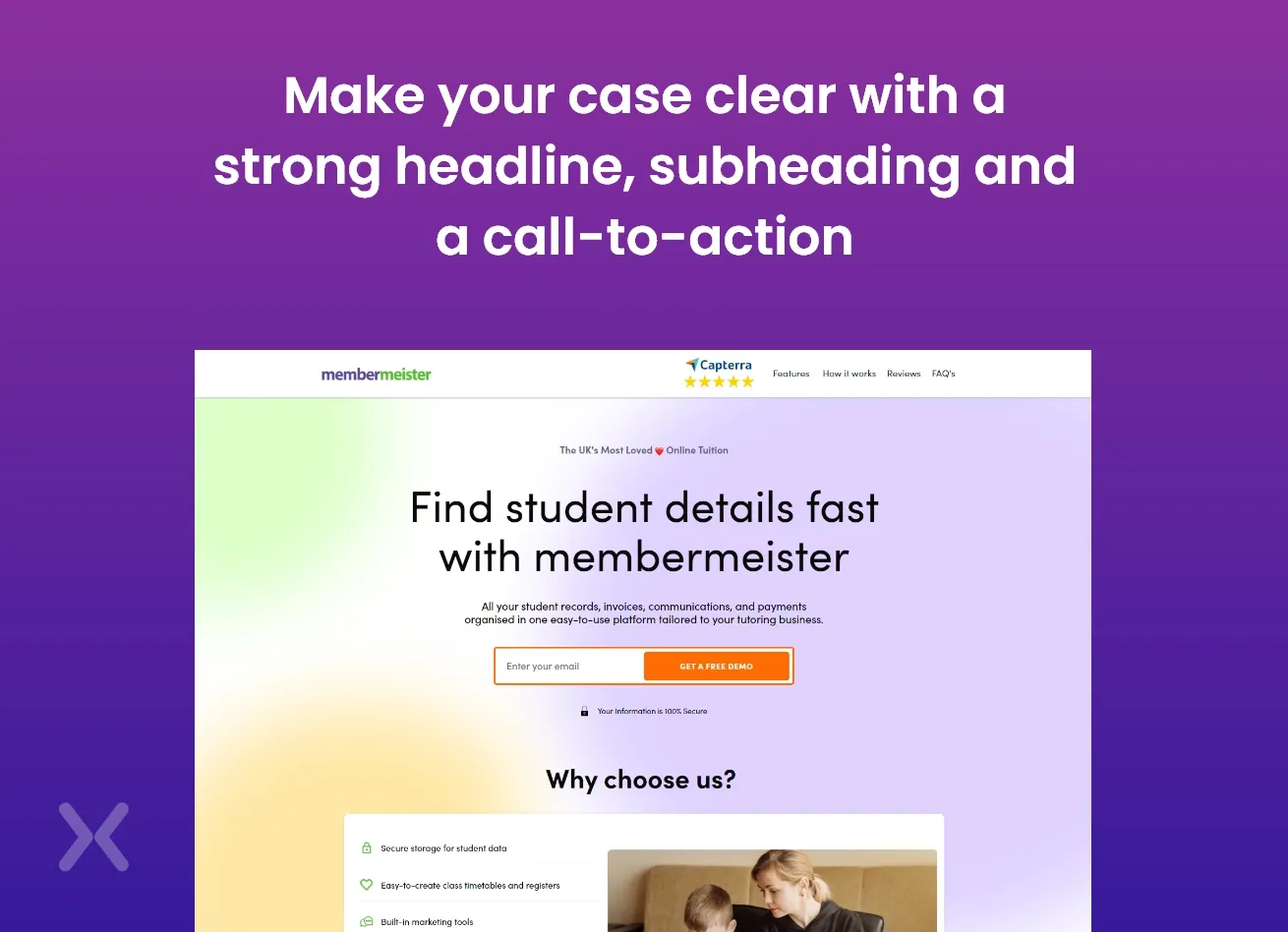
What is this visitor looking for, and how should you deliver it? From the moment they land on your page, make your case clear with a strong headline, a strong subheading and a convincing call-to-action. By using this method, you can have a better B2B landing page conversion rate along with a short and strong landing page copy.
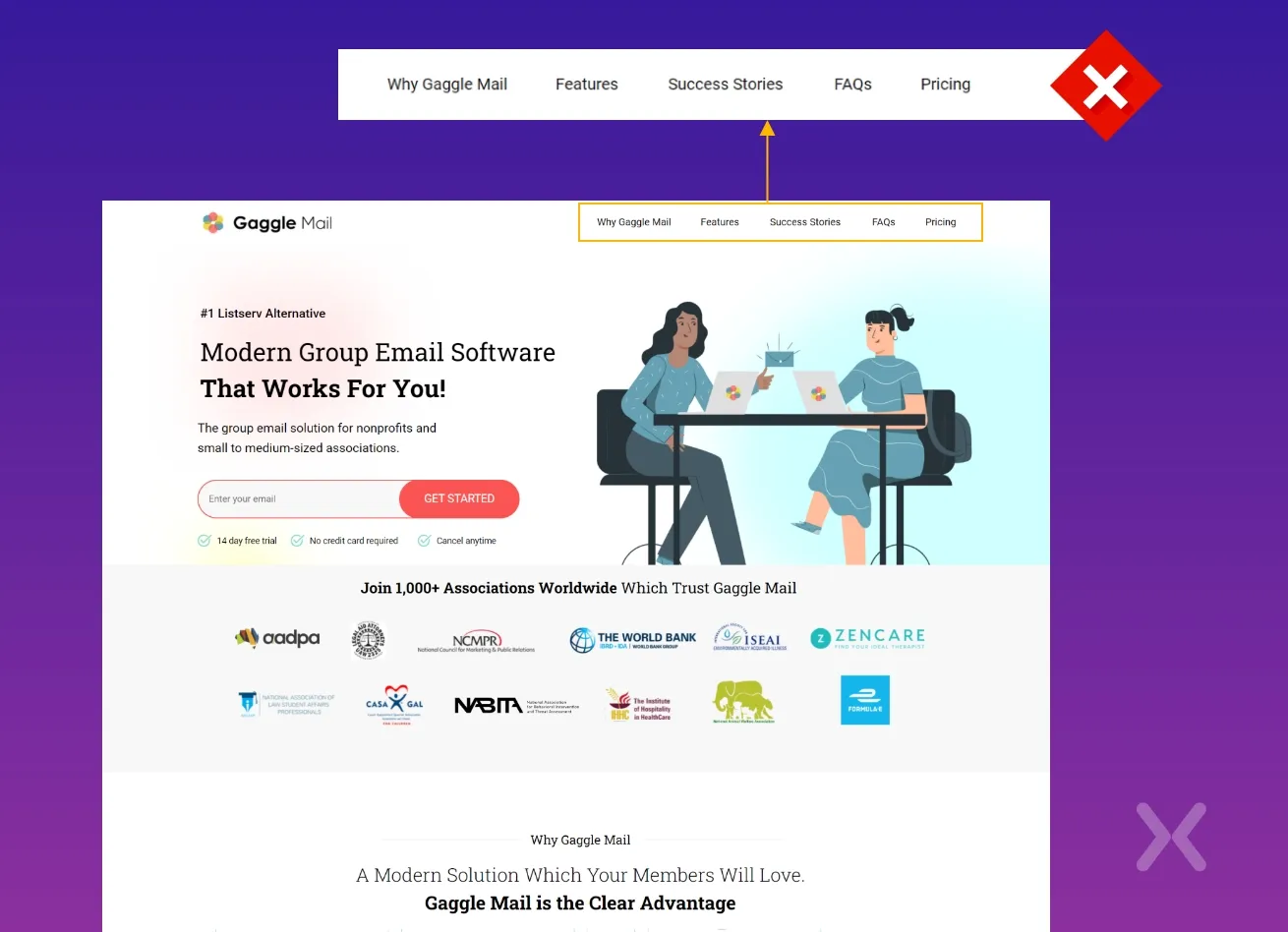
It’s reassuring to see Unbounce get so much right, given that landing pages are what their whole business is based on. On this occasion, they don’t even go for a subheading, trimming all the fat they can to instantly deliver their message. It’s a classic hero section design that goes for minimal, efficient material above the fold.
As your PPC campaigns are designed around these messages. You should already know the message you need to get across on each landing page (see point number 1). Now, particularly for B2B customers who expect you to get straight to the point. You have to convey this message as quickly as possible.
What is this visitor looking for, and how should you deliver it? From the moment they land on your page, make your case clear with a strong headline, a strong subheading and a convincing call-to-action. By using this method, you can have a better B2B landing page conversion rate along with a short and strong landing page copy.
It’s reassuring to see Unbounce get so much right, given that landing pages are what their whole business is based on. On this occasion, they don’t even go for a subheading, trimming all the fat they can to instantly deliver their message. It’s a classic hero section design that goes for minimal, efficient material above the fold.
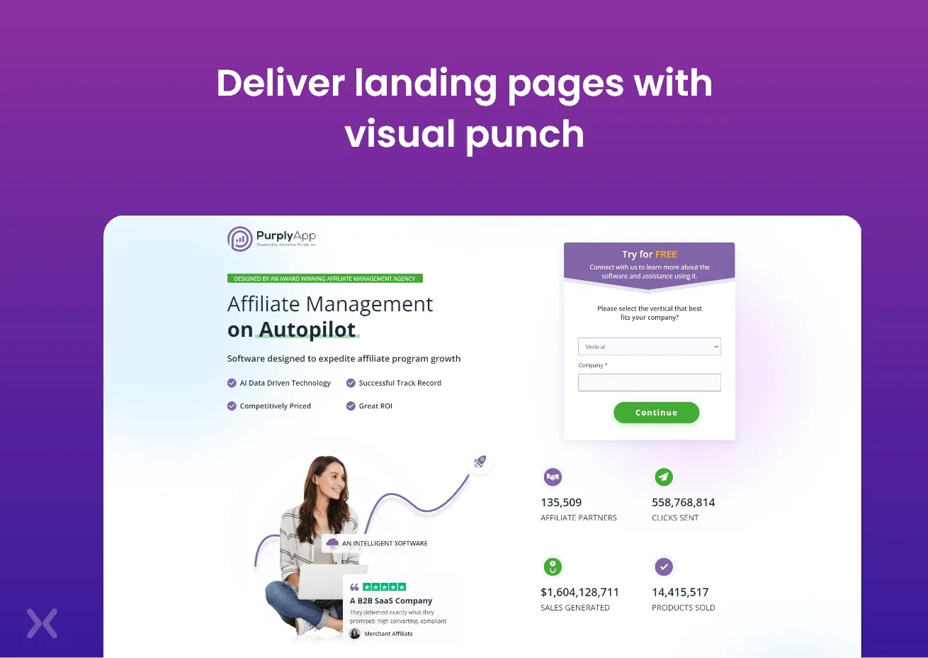 It’s not just B2C landing pages that can make effective use of visual hero sections. Even businesses with the dullest of services can deliver landing pages with visual punch.
While full-screen background images have been popular for a while. It’s important to make sure that they are optimised for speed and are responsive. The same goes for video backgrounds on full-screen, which have recently become more common. Be cautious with loading times and make sure that video footage does not divert the attention of users from the message that you really want to get through.
Product photos are still a popular approach, like the Unbounce example we looked at earlier, but when designing to get a reasonable B2B landing page conversion rate, people do better than products.
It’s not just B2C landing pages that can make effective use of visual hero sections. Even businesses with the dullest of services can deliver landing pages with visual punch.
While full-screen background images have been popular for a while. It’s important to make sure that they are optimised for speed and are responsive. The same goes for video backgrounds on full-screen, which have recently become more common. Be cautious with loading times and make sure that video footage does not divert the attention of users from the message that you really want to get through.
Product photos are still a popular approach, like the Unbounce example we looked at earlier, but when designing to get a reasonable B2B landing page conversion rate, people do better than products.
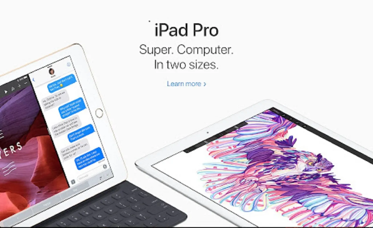 Check out the Apple page for the new iPad device. With its luxurious, trendy devices, this page appeals to customer desires. The Apple Business page, on the other hand, focuses on showing individuals who use its goods and services.
According to Chartmogul, nearly half of SaaS hero images feature people. This doesn’t mean, however, that you should just do what everyone else does. Test both options, and see which gets you better results. If you do make use of images with people, make sure that they’re not just cheesy stock images.
Check out the Apple page for the new iPad device. With its luxurious, trendy devices, this page appeals to customer desires. The Apple Business page, on the other hand, focuses on showing individuals who use its goods and services.
According to Chartmogul, nearly half of SaaS hero images feature people. This doesn’t mean, however, that you should just do what everyone else does. Test both options, and see which gets you better results. If you do make use of images with people, make sure that they’re not just cheesy stock images.
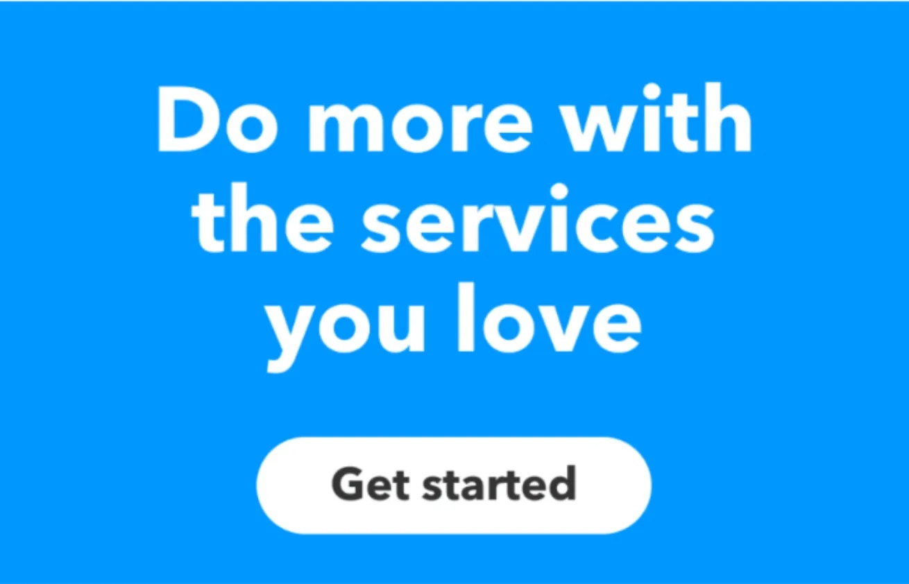 The IFTTT homepage above proves that you don’t need images to make a visual impact. The ultimate way to create an impact can be a bold choice of colour, text and contrast, and this kind of design is not as easy or plain as it seems.
Make the most of the hero section, whichever approach you go for, to get people scrolling further down the page and converting there.
The IFTTT homepage above proves that you don’t need images to make a visual impact. The ultimate way to create an impact can be a bold choice of colour, text and contrast, and this kind of design is not as easy or plain as it seems.
Make the most of the hero section, whichever approach you go for, to get people scrolling further down the page and converting there.
 There is a simple purpose for each landing page you design, and you don’t want people wandering off to irrelevant parts of your site. So delete any header navigation from your landing pages and keep users focused on the task at hand.
If they click through to another section, users will soon get their navigation back, and you can add secondary CTAs and links in the footer to provide next-step options. But header navigation just distracts user attention and leads to option fatigue.
There is a simple purpose for each landing page you design, and you don’t want people wandering off to irrelevant parts of your site. So delete any header navigation from your landing pages and keep users focused on the task at hand.
If they click through to another section, users will soon get their navigation back, and you can add secondary CTAs and links in the footer to provide next-step options. But header navigation just distracts user attention and leads to option fatigue.
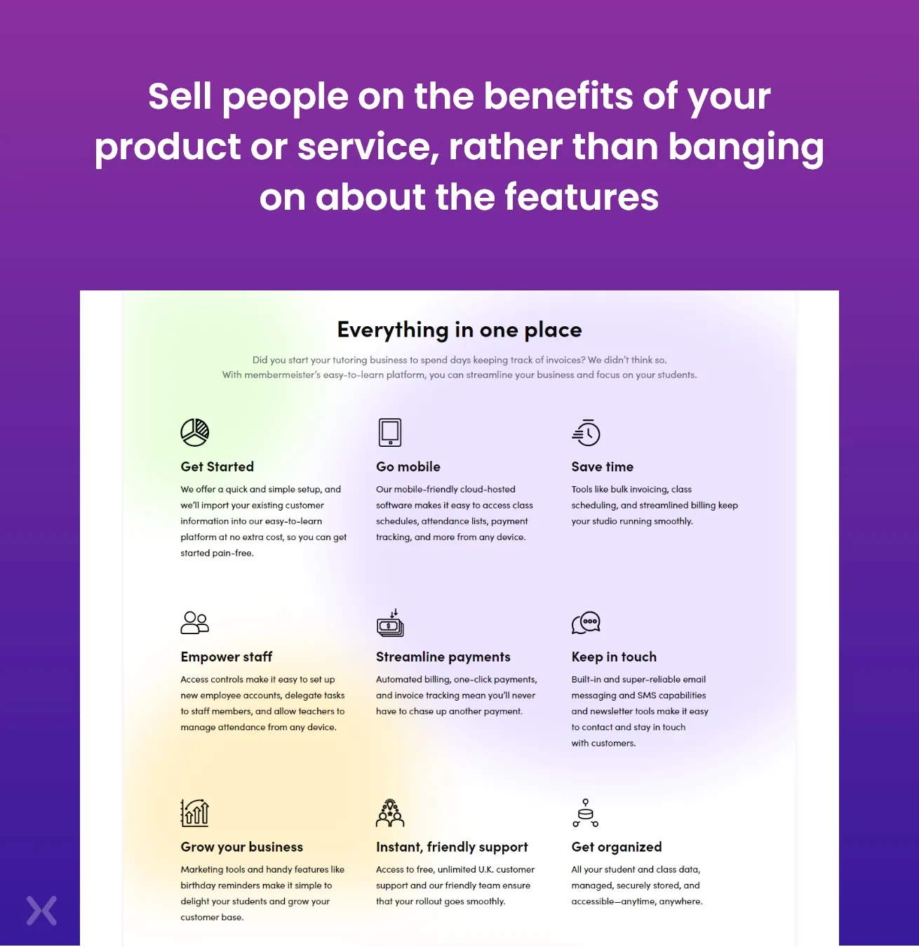 One of the first lessons you learn in copywriting is to sell people on the benefits of your product or service, rather than banging on about the features.
The team at UserOnBoard provides a good elaboration for this:
One of the first lessons you learn in copywriting is to sell people on the benefits of your product or service, rather than banging on about the features.
The team at UserOnBoard provides a good elaboration for this:
“People don’t buy products; they buy better versions of themselves.” For B2B brands, the issue is that it can be painfully tempting to include functionality rather than benefits. You might even find it hard sometimes to tell the two apart. After all, even if it’s a feature. Isn’t 100GB of free cloud storage a benefit to all your customers? Uh, well, no. In this case, the benefit would be something more like ‘access your files, anytime, anywhere’, or ‘never lose a file again’. Your goods are defined by features; benefits represent the “better versions of themselves” that your clients want to be. But you need to understand who your target audience aspires to be. What’s getting in the way of that, and how those obstacles can be overcome by your product. When your benefits represent solutions to common consumer pain points in a direct manner, B2B landing page conversion rates are bound to do better. As far as product features are concerned, they are good for product pages or price plan pages, not landing pages.
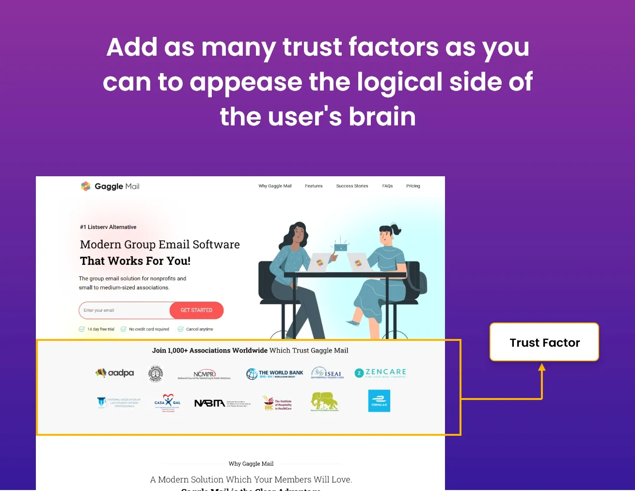 Once you’ve appealed to their emotions. It’s time to appeal to their logical side. Hit them with as many trust factors as you can to appease the logical side of their business brain.
You can make use of reviews, case studies, testimonials, and even examples of some of your highest-profile customers. Just reassure them that what you’re offering is the real deal.
Social proof is also a well-loved tactic for improving B2B landing page conversion rate, as it provides feedback from real clients without any kind of censorship.
Social proof is a well-loved tactic with B2B brands. This way, potential clients can see the real feedback from your clients, without any interference from your part. Of course, this does mean that your services really need to be up to par, because a page full of customer complaints won’t look good for your business.
Trust factors are fantastic, but you’ve got to earn them.
Once you’ve appealed to their emotions. It’s time to appeal to their logical side. Hit them with as many trust factors as you can to appease the logical side of their business brain.
You can make use of reviews, case studies, testimonials, and even examples of some of your highest-profile customers. Just reassure them that what you’re offering is the real deal.
Social proof is also a well-loved tactic for improving B2B landing page conversion rate, as it provides feedback from real clients without any kind of censorship.
Social proof is a well-loved tactic with B2B brands. This way, potential clients can see the real feedback from your clients, without any interference from your part. Of course, this does mean that your services really need to be up to par, because a page full of customer complaints won’t look good for your business.
Trust factors are fantastic, but you’ve got to earn them.
 Almost every conversion will include some kind of form, and you don’t want all of your hard work to go down the drain at the last moment just because of a bad form. When aiming for a high B2B landing page conversion rate, form optimisation is the constant struggle.
The key to the success of your landing page is to make your forms an asset, not an impediment. So invest in an optimisation tool that accents issues with the forms to improve landing page UX. You can make informed design changes to maximise conversions and remove pain points by gaining insights into what prevents individuals from completing your forms, which might hinder potential leads from making the final purchase.
Almost every conversion will include some kind of form, and you don’t want all of your hard work to go down the drain at the last moment just because of a bad form. When aiming for a high B2B landing page conversion rate, form optimisation is the constant struggle.
The key to the success of your landing page is to make your forms an asset, not an impediment. So invest in an optimisation tool that accents issues with the forms to improve landing page UX. You can make informed design changes to maximise conversions and remove pain points by gaining insights into what prevents individuals from completing your forms, which might hinder potential leads from making the final purchase.
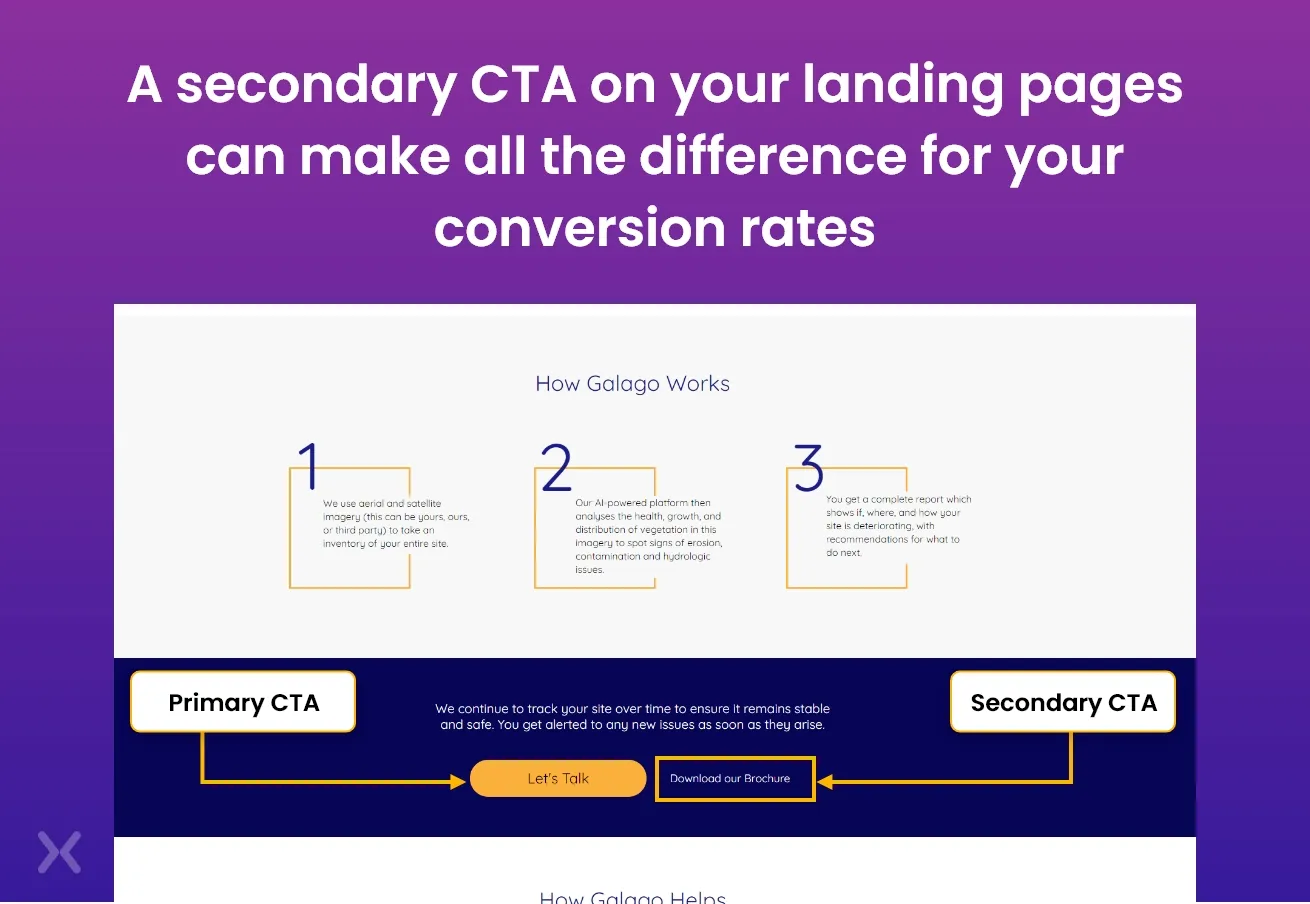
This is a sort of anti-best practice because, per landing page, the general rule is to have only one call to action. I’m calling this one a bluff, though. You’re never going to convert anyone the first time around, no matter how good your ad campaigns and landing pages are. This is why there are things like email and AdWords remarketing, and precisely why getting a secondary CTA can make all the difference for your B2B landing page conversion rates. At the bottom of its landing page, Infusionsoft goes for this second CTA, knowing that users who got this far might not be ready to buy right away. However this does not mean that they would not be prepared to complete another form of conversion, and providing an intermediate phase in the purchase process will keep individuals engaged with your brand when they would otherwise leave. Of course, if you go for a secondary CTA, the main action that you’re targeting can never interfere with it.
Create remarketing lists for each step of your funnel. This allows you to create specific ads that give leads the nudge they need to move to the next stage. Rather than showing the same ads to all of your leads as they browse the web. You can adjust your strategy.
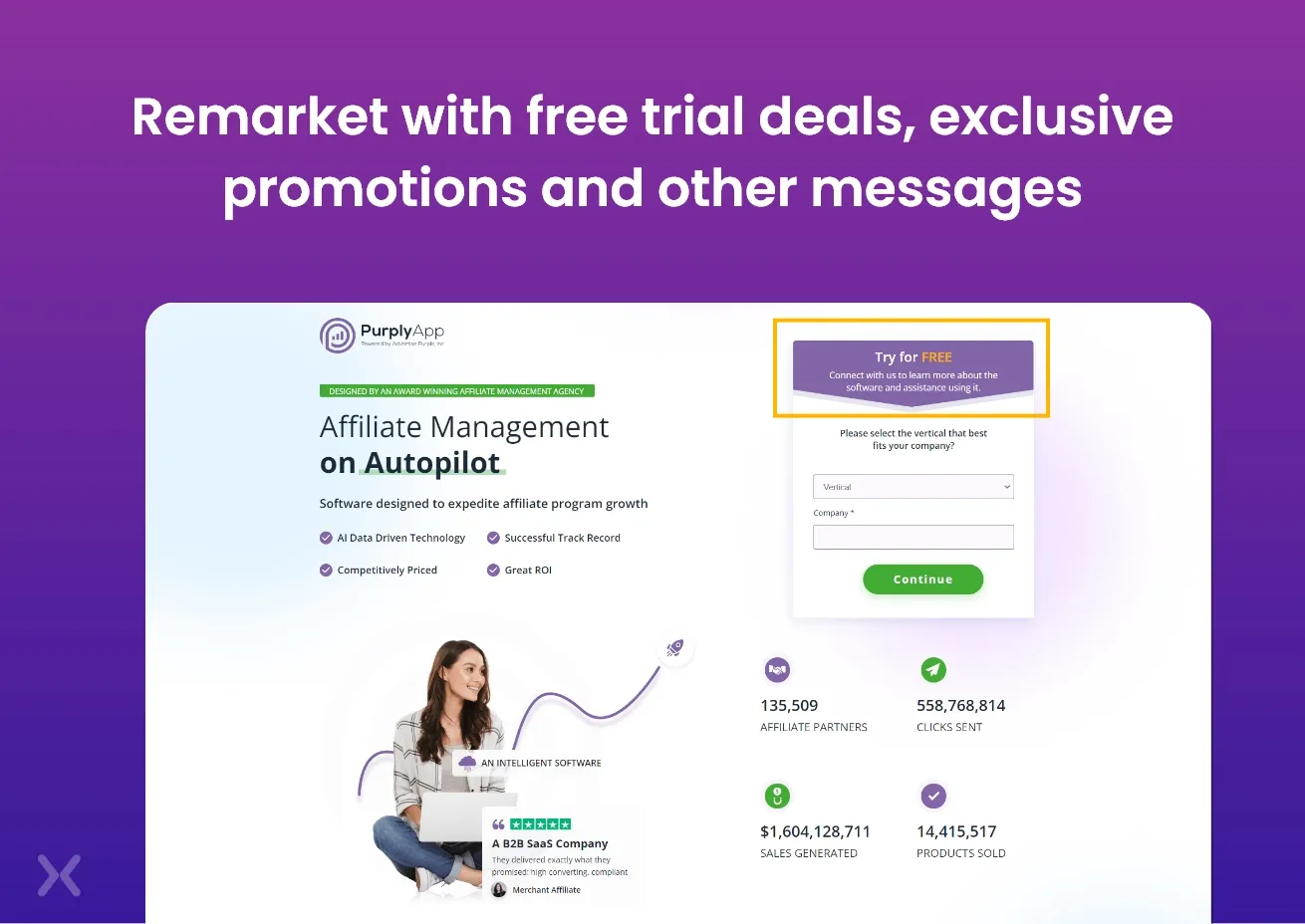 For those at the beginning of the funnel, show them ads with a link to a free webinar, or some other intermediary step. This requires the least commitment and is a good way to get their contact details. By remarketing with free trial deals, local landing pages, demo bookings, exclusive promotions and other messages that make it difficult to resist, you’ll end up closing more leads and a higher B2B landing page conversion rate.
The truth of the matter is that B2C and B2B marketing aren’t really as different as people make them out to be. The idea that business people are robots who aren’t swayed by emotion and only make decisions based on logic is faulty. After all, they’re still people, the main challenge with B2B marketing, and with creating B2B landing pages that convert is striking the right balance. Hitting the emotional reaction first, and then following up with sound logical reassurance to allow your leads to buy with confidence. This goes for B2C leads too, but the balance is far more complex in boosting the B2B landing page conversion rate. At Apexure, we build B2B landing page designs that will match your personas and drives the most conversions for you. Contact us today!
Related Topics:
Founder & CEO of Apexure, Waseem worked in London’s Financial Industry. He has worked on trading floors in BNP Paribas and Trafigura, developing complex business systems. Waseem loves working with Startups and combines data and design to create improved User Experiences. Read more


Drive More Sales or Leads With Conversion Focused Websites and Landing Pages
Get Started.png)

Eleven percent of Meta ad rejections in 2026 trace back to one problem: the landing page does not...

A B2B SaaS company spends $30,000 per month on Google Ads and Meta Ads. Both campaigns drive traffic...
Get quality posts covering insights into Conversion Rate Optimisation, Landing Pages and great design
