
The difference between a landing page that converts at 2% and one that converts at 12% is not magic. It is twelve specific decisions made correctly, and a few common ones made differently than most marketers expect. We have built more than 1,000 landing pages at Apexure over the past decade. The pages that convert at 10%+ are not prettier than the ones that convert at 3%. They are more precise. They match the visitor’s intent, remove every unnecessary distraction, and make the next step obvious. This guide breaks down the twelve elements that high converting landing pages share, backed by current benchmarks, data from our own A/B tests, and the patterns we see repeated across every project.
A high converting landing page is a standalone web page designed for a single conversion objective, capturing a lead, booking a demo, starting a trial, or completing a purchase. Unlike a typical web page with multiple navigation links and competing CTAs, a high converting landing page removes all distractions and funnels every visitor toward one action. The key distinction: your homepage is designed to serve five different audiences and 20 different goals. A high converting landing page is designed to serve one audience with one goal. That focus is what makes the conversion rate possible.
These are not suggestions. They are the patterns we see on every high converting page we have built or audited. Miss two or three of these and your conversion rate drops measurably. Get all twelve right and you are in the top quartile.
When a visitor clicks an ad that says “Free Marketing Audit for SaaS Companies,” your landing page headline should say “Free Marketing Audit for SaaS Companies”, not “Welcome to Our Agency” or “Our Marketing Services.” This sounds obvious. We still find message mismatch on roughly 40% of the landing pages we audit. Optimising headline-to-ad alignment typically lifts conversion rates by 15-25%. For PPC campaigns, use dynamic text replacement to insert the search keyword directly into the headline.
Your visitor should understand what you offer, who it is for, and why it matters, in the time it takes to read a single sentence. If your value proposition requires a paragraph of explanation, it is too complicated for a landing page. A strong formula: [What you get] + [who it is for] + [why it is different]. Example: “Conversion-focused landing pages for SaaS teams, designed by a team that has built 1,000+ pages.”

Removing navigation from a landing page can increase conversions by up to 100%. Every link that does not lead to your conversion goal is a funnel leak. A homepage has 20+ links. A high converting landing page has one, the CTA. If visitors need to explore different sections of the page, use anchor links that scroll within the page rather than links that move through away from it.
Reducing form fields from 11 to 4 yields a 120% increase in conversions. For most lead generation pages, the ideal form has three to five fields: name, email, and one qualifying question. When you genuinely need more information, use a multi-step form. Start with name and email (low commitment), then ask qualifying questions on step two. The foot-in-the-door effect means visitors who complete step one are far more likely to finish the rest.
“Submit” reduces conversions by roughly 3% compared to benefit-oriented alternatives. The CTA should tell visitors what they receive, not what they must do.
Personalised CTAs convert 202% better than generic ones. “Get Your SaaS Audit” outperforms “Get Started” because it mirrors the visitor’s specific intent.
Testimonials at the top of the page build general awareness. Social proof placed within one scroll of the CTA overcomes last-moment objections. The timing matters more than the quantity. Testimonials can boost conversions by up to 34%. Short, specific quotes with real names and outcomes (“We generated 40% more leads in month one”) convert better than vague endorsements (“Great service, would recommend”).
Every additional second of load time costs approximately 7% in conversions. A 0.1-second improvement delivers an 8.4% lift for retail and 10.1% for travel. This is not an SEO metric. It is a conversion metric. Core Web Vitals (LCP, INP, CLS) affect both rankings and conversions. Compress images, lazy-load below-the-fold content, and minimise JavaScript. If your page takes more than 3 seconds to load on mobile. You are losing a meaningful percentage of your conversions before anyone reads a word.
Mobile accounts for 83% of landing page traffic but converts at roughly half the desktop rate. The gap is not visitor intent. It is design execution. Most landing pages are designed on a 27-inch monitor and “made responsive” as an afterthought. Mobile-first means: thumb-friendly tap targets (minimum 44x44px), forms that do not require horizontal scrolling, a CTA visible without scrolling past the fold, and content that loads fully within 2 seconds on 4G.
The visitor’s eye should follow a clear path: headline → supporting text → visual → social proof → CTA. If their eye wanders because everything on the page has equal visual weight. You have a hierarchy problem. Use size, colour contrast, and whitespace to create a clear reading flow. The CTA should be the most visually prominent element on the page, not the logo, not the hero image, not the headline.
Client logos, security badges, industry certifications, review counts, and “as seen in” press mentions reduce perceived risk. Place them near the form where hesitation is highest. For B2B pages, specific logos outperform generic “trusted by 1,000+ companies” claims. If your visitors recognise a client name, show it. If they do not, show the count instead.
Countdown timers, limited availability, and seasonal offers work when the constraint is real. Webinar registrations, cohort-based programmes, and seasonal sales are natural fits.
“Only 3 spots left” on a SaaS demo page with unlimited capacity is a lie that erodes trust. Manufactured urgency converts once, genuine urgency converts and retains.
The visitor should see the headline, value proposition, and CTA without scrolling. On mobile, this means the hero section is tight, no massive background images that push the CTA below the fold. This does not mean everything must be above the fold. It means the core promise and the action must be immediately visible. Content below the fold supports the decision. It does not introduce it.
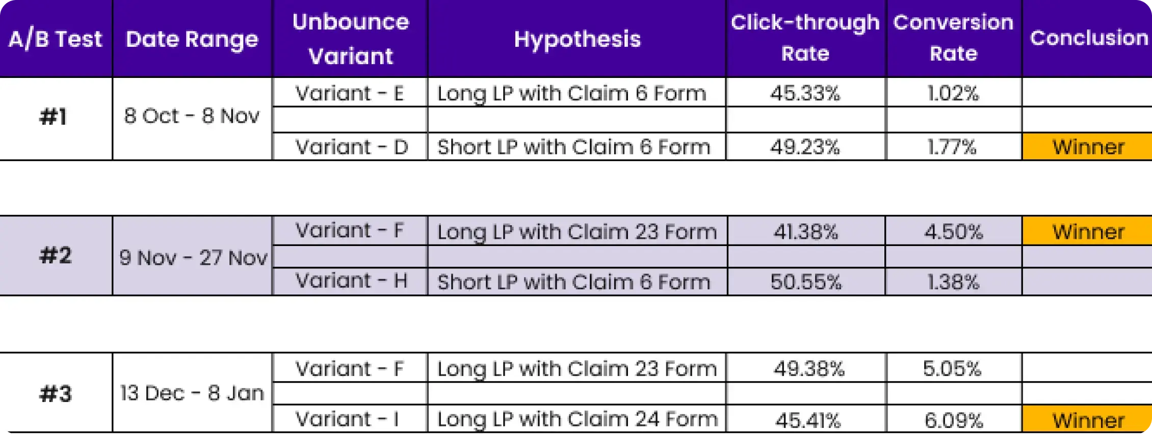
To make landing page testing more reliable, we consider both traffic and time, changing only one variable at a time. For small traffic volumes, we conduct split tests with completely different page versions.
| Metric | Benchmark | Source |
|---|---|---|
| Median conversion rate (all industries) | 6.6% | Unbounce Q4 2024 |
| Top 10% landing pages | 11.45%+ | Unbounce Q4 2024 |
| B2B average | 13.3% | First Page Sage 2026 |
| SaaS average | 3.8% | Unbounce Q4 2024 |
| Financial services | 8.4% | Unbounce Q4 2024 |
| Removing navigation | Up to 100% lift | Invespcro |
| Form field reduction (11 → 4) | 120% lift | Industry composite |
| Video on page | Up to 86% lift | Industry composite |
| Personalised CTAs | 202% better | HubSpot 2026 |
| Each second of load time | 7% conversion loss | Hostinger 2026 |
The highest-performing landing pages in 2026 are not static. They adapt. AI-powered tools now personalise headlines, CTAs, and offers based on visitor source, behaviour, and segment, in real time.
AI content for landing pages: 30% of companies plan to use AI for landing page creation in 2026. AI is excellent for generating test variants and headlines at scale. It is not a substitute for understanding your audience, your offer, or why visitors hesitate at the form. Use AI for speed. Use human judgment for strategy.
After auditing hundreds of landing pages, these are the mistakes we see most often, and the ones that cost the most conversions.
We have been designing landing pages since 2014. SaaS, healthcare, financial services, home services, e-commerce, the verticals change, the conversion principles do not.
Before designing a pixel, we clarify the single conversion goal, the target audience, and the traffic source. These three inputs shape every decision that follows.
We map the visitor's decision journey, from the ad click through the hero section to the form. Each section answers the next logical question: "What is this? → Is it for me? → Can I trust them? → How do I start?"
In-house design and development. We build on Unbounce, Instapage, WordPress, or Webflow depending on the client's needs. No outsourcing, no template themes.
We use our EPIC CRO framework to prioritise tests by impact and effort. A/B test headlines, form lengths, CTA copy, and social proof placement. Run to 95% statistical significance. Roll out winners.
"The results that we have seen from the collaboration are outstanding, from the tremendous improvements in our own page speed and marketing performance to the satisfaction of the clients who work with them on PPC. We really went from terrible performance to doing really well."
We will audit your current pages, identify the biggest conversion leaks, and give you a prioritised action plan, free of charge.
Book a Free Audit →We will review your landing pages, identify the biggest conversion leaks, and give you a prioritised action plan. Book a call to get started.
Read our Landing Page CRO Strategy Guide or explore 100+ articles on landing pages and conversion optimisation.
Our case studies show how we have helped clients lift conversion rates by 40-150%.
The median landing page conversion rate across all industries is 6.6% (Unbounce, Q4 2024, 41,000 pages). B2B pages average 13.3%. Financial services leads at 8.4%, SaaS averages 3.8%. A rate above 10% puts you in the top quartile. ‘Good’ depends on your traffic source — cold PPC converts at 2-5%, while warm email traffic can reach 19%.
Related reading:
Founder & CEO of Apexure, Waseem worked in London's Financial Industry. He has worked on trading floors in BNP Paribas and Trafigura, developing complex business systems. Waseem loves working with Startups and combines data and design to create improved User Experiences. Read more


Drive More Sales or Leads With Conversion Focused Websites and Landing Pages
Get Started

Eleven percent of Meta ad rejections in 2026 trace back to one problem: the landing page does not...

A B2B SaaS company spends $30,000 per month on Google Ads and Meta Ads. Both campaigns drive traffic...
Get quality posts covering insights into Conversion Rate Optimisation, Landing Pages and great design

