Businesses that serve other businesses, aka B2B brands, while building their website user experience often make the mistake of looking at their clients as brands themselves and not as ‘users’.
They see their clients targeting the end-user and fail to acknowledge their own B2B clients as users themselves. What exactly are the implications of this?
Well… the website user experience often goes wonting.
At the end of the day, B2B clients are more than brands. They are brands made up of marketing professionals and entrepreneurs just like you or me. These are very real people with real responsibilities.
If the website user experience hasn’t been optimised or streamlined for this user, they will surely be tempted to try other business solutions that offer a better website user experience.
The website user experience is all about ease of use and functionality. Are you able to do what you need to do, and is it easy enough to accomplish? If your user’s answers aren’t an immediate and confident YES, your lead conversions may not be at high as they could be.
In the following blog, we will chat about the website user experience best practices for B2B companies and how optimising the website user journey can help your business reach your conversion goals.
Thought leaders have put a lot of emphasis on website user experience in recent times, but a problem that B2B professionals deal with is the myriad of definitions we have for the term ‘user experience’ (which is often written as ‘UX’). We know that we need to emphasise UX, but before we can do so, we need to agree on what the term refers to.
The user experience concept is used throughout the IT industry and can refer to different things in different spaces. It’s a highly discussed topic in spaces like software design, website design, app design, and many others.
According to the International Organisation for Standardisation (ISO 9241-210), UX is described as:
“An individual’s perceptions and responses that result from using or the anticipated use of a product, service, or system”.
However, according to UXPA, aka the User Experience Professionals Association (UXPA), user experience can be defined as:
“Every aspect of the user’s interaction with a product, service, or company that make up the user’s perceptions of the whole. User experience design as a discipline is concerned with all the elements that together make up that interface, including layout, visual design, text, brand, sound, and interaction. UX works to coordinate these elements to allow for the best possible interaction by users.”
This still feels slightly confusing, though. So let’s try to break it down a little further and pay special attention to what industry leaders specifically mean by website user experience, seeing as there are many different components to UX.
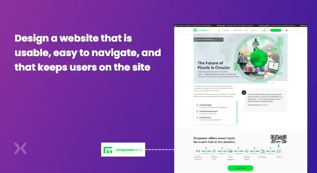
The main focal point of the website user experience is to design a website that is usable, easy to navigate, and that keeps users on the site. To get this right, you need to integrate the key elements of your design and create an interface that resonates with the user.
User experience on a website is obviously important for any business, whether it’s in a B2B or B2C space. For your site to be successful, you have to ensure that your design has a positive impact on the website user.
In the context of B2B websites, the website user experience is one of the most important factors of your online presence. Your B2B customer is going to rely on your B2B product to boost their ROI and save them money. If they have a negative user experience, they will think that your product isn’t capable of doing this.
A well-designed B2B site user experience will actually result in your client boosting their productivity. It makes sense to think that if the website is easy to use and a pleasure to use, the user will be able to get more done.
These are two cornerstones of great website UX design. When you get the design right and the website’s user experience is positive, you will end up supporting the customer’s work instead of hindering it.
If you can eliminate poorly designed features and cumbersome tools, your customer can concentrate on her core tasks unimpeded.
Enjoying the process will undoubtedly lead to greater results than if she were to use a tool she didn’t enjoy.
Besides giving your client the B2B best website user experience possible and the implications that will have on their business, it is also important to your client that you understand what they need from you.
Your client is using your product to aid them in their own professional endeavours. They will appreciate you optimising a website for their benefit, and a result will reinforce confidence in you and the service/product you’re providing.
If you build a site that is unattractive to your target audience and that is cumbersome and frustrating to use, your customer will feel as though your product is wasting their time. They will probably feel that your website inhibits their productivity, and they will be inclined to find an alternative solution.
It is vital that your customer enjoys your website user journey because they will certainly be on the lookout for something else if they don’t.
You need to design around the website UX best practices which are based on what the client expects. Using the interface needs to be intuitive. In other words, the way clients interact with your website needs to make sense. If you achieve this, your B2B customer will be able to read, scroll, interact with ease until they reach the conversion. And that’s the whole point, isn’t it?
Failing to deliver a positive B2B user experience on the website can be destructive to your brand, so you have to pay attention to the finer details as well as the big picture.
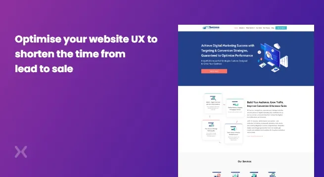
By optimising the website user experience and making it as positive as it can be, it is likely that your rate of return will increase. By optimising all processes to start off with, your business will be able to become a user favourite, and you will reap the rewards with higher profits.
Your success will not only be measured in money. If you optimise the UX, you will shorten the time from lead to sale. The buyer’s journey will literally be more streamlined and easier to complete. This will boost the quality of your leads, as it will filter out those lacking strong interest in your product.
When interested customers end up converting with ease, they’ll probably become return users and happily promote your services.
The following flaws in your UX design could confuse customers or put them off your site. This will impede your conversions and send your clients straight into the arms of your competitors. Keep these points in mind as you follow website UX best practices.
If your customers can’t navigate your site easily, they will become frustrated and turn to your competitors for an easier solution.
Don’t bombard your users with popups and forced signups. It’s definitely acceptable to try and get your website users to sign up for your newsletter, booking a demo, or follow your social, but once or twice is enough. If you make sign-ups compulsory, you run the risk of annoying your customer, which will lead them to look for an alternative website.
Remember, the best way to achieve a positive B2B site user experience is with simplicity and effective design. While it is important to keep up with trends to stay relevant, be wary of modernising your site to the extent that it makes it more complicated to use. Don’t let trendy gimmicks get in the way of functionality.
Information such as contact information, dates, and customer care is absolutely vital. Not being able to find this info on your site is aggravating and unforgivable.
If a consumer is not able to find the answer to a question, they need to be able to contact someone who will be able to help. By not having the information ready, many leads might drop out of the buyer’s journey, meaning your conversions will teeter off.
That being said, if you overload your site with content, it will be difficult for your customer to find what it is they’re actually looking for. This can be overwhelming, and it might be easier to just find a different site rather than find whatever they’re looking for. If your site is clean and clear, the website visitors will find what they’re looking for without distractions.
Address the needs of your customers without constantly forcing a sales pitch down their throats. You need to ensure that you provide the user with valuable content and not just CTAs. For a website user experience to remain positive, you need to keep your visitors engaged.
By over-promoting, you will detract from the website user experience and lose leads before they convert.
Bad content will certainly detract from the user experience on the website. Everything on your site needs to be relevant to the user and must be written in a way that will keep them engaged and entertained.
If your site is outdated, the customer will perceive you to be outdated too. Users want to know that you’re on top of your game and that you’re up to date with industry best practices.
People use their phones for everything these days as we are always on the move. If users can’t use your site from their mobile, they will go to a different site. Simple. Optimise your site for mobile to ensure the best website user experience.
You have to understand the needs of your website users. These users are your customers, and if you don’t understand their needs, they will never complete the buyer’s journey and convert.
You need to carefully curate each aspect of your website to what they expect and what they need.
Take a look at the following strategies.
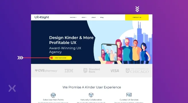
If you cluster too many CTAs together, the website user will become confused. They may potentially click on the wrong CTA, which will annoy the user and may cause them to leave your site. You can use more than one CTA on a page. After all, CTAs are needed to help you boost conversions, but make sure you are as clear as possible.
You need to analyse the separate elements on your webpage and understand which are receiving the most clicks. You need to ensure that whatever is fetching the most clicks is clicking through to a valuable page.
The website user experience will improve this way as the most valuable information is also the most eye-catching. You will be leading the user exactly where they want to go. It is a good idea to link this element of your webpage to a landing page, which will maximise your chances of conversion.
You can’t optimise your site for future visitors if you don’t know how people are behaving when they land on your site.
You should use scroll maps to see where people stop scrolling and where activity tapers off. Understand which parts of your site are the hotspots and which parts are overlooked. You have to understand these implications. Many users will be unaware of the information you’ve included in the parts of your site that are frequently overlooked. Is this information important? It is up to you to optimise this to produce the best website user experience.
When you’re improving the user experience on a website, take a look at your homepage, landing pages, sales pages, about page and contact pages. These are the most important pages on your site and where the most valuable information is kept. Take your industry into consideration. If you’re in eCommerce, your sales page is probably the most important.
Run user behaviour reports on these pages, as well as A/B tests. Optimise these pages as best you can. The process might be time-consuming, but doing this will improve your website user experience and increase your conversions.
Customer service on your website is one of the most vital contributing factors to the website user experience. You need to respond quickly, treat leads with respect and gratitude, and help in whatever way you can. If the customer feels valued, the user experience on the website will already be positive.
Besides using bots, have someone available to address issues that the bots are not able to handle. Be specific with waiting time in terms of a customer care agent responding. Stick to the time you indicate.
It is also smart to have an extensive help section that includes tutorial videos and FAQs. This helps customers save time by finding answers themselves instead of waiting for an email response or being on hold with a call centre.
At Apexure, we accelerate business growth with an effective website (WordPress, Jekylll) that focus on delivering a positive website user experience. We are a conversion-focused B2B brand and have extensive experience in dealing with B2B website improvement ideas and best practices.
The internet is full of bog-standard stuff. Your website needs to be different and echo your brand’s personality and style. We spend time learning about your target audience and website visitors and design from the ground up to match your brand.
As a business owner, I understand you need to know how your website performs across all channels, and I deliver exactly that. We put pixels and tracking in place to ensure we know the precise journey your visitors go through to become a Lead. We are a Databox registered partner and build custom dashboards to report your KPIs. We want the data to drive your business decisions and take the stress away.
If you’re interested in optimising your website to maximise the website user experience, look no further. Let’s talk today.
Related Articles:
Drive More Sales or Leads With Conversion Focused Websites and Landing Pages
Get Started.png)
Most landing page audit checklists floating around the internet read like they were written by someone who has...
Key Takeaways 25+ real B2B landing page examples from Apexure's portfolio — each with a CRO score, design...
Get quality posts covering insights into Conversion Rate Optimisation, Landing Pages and great design