Many marketing managers may overlook bounce rates, only to be shocked at the potential loss in revenue when they finally take notice. In the world of digital marketing, landing pages play a necessary role; they are standalone web pages intentionally crafted for specific marketing or advertising campaigns. They are the destination for visitors to click on links from emails or various web ads, where you’ll eventually earn more, hence the importance of having a few landing page hacks up your sleeve. That’s not all. The objective of a landing page is singular yet significant: converting visitors into leads. However, recent statistics from the 2021 Unbounce Conversion Benchmark Report indicate that the median conversion rate for lead-generating landing pages hovers only below 3.9%.
 Even though such figures may be satisfactory for some businesses, marketers striving for superior results often target a 10% conversion rate.
Achieving this is no easy feat, particularly when adhering to conventional practices. It’s precisely here that Apexure, with nearly a decade’s experience in the landing page industry, steps in. Possessing many proven landing page hacks to increase your ROI. We offer assistance to refine your planning and optimization tactics.
Before digging into these exceptional insights, let’s first go through some common landing page hacks and then get to the ones that no one shared with you.
Even though such figures may be satisfactory for some businesses, marketers striving for superior results often target a 10% conversion rate.
Achieving this is no easy feat, particularly when adhering to conventional practices. It’s precisely here that Apexure, with nearly a decade’s experience in the landing page industry, steps in. Possessing many proven landing page hacks to increase your ROI. We offer assistance to refine your planning and optimization tactics.
Before digging into these exceptional insights, let’s first go through some common landing page hacks and then get to the ones that no one shared with you.
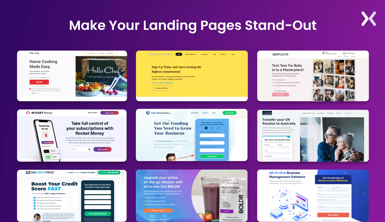
Getting over the generic landing page hacks
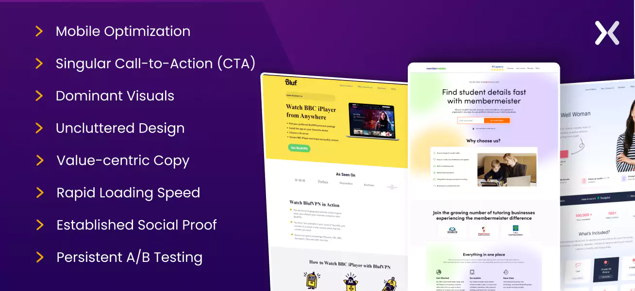
Despite being often reiterated as common knowledge, these generic landing page hacks warrant repeating as marketers can easily overlook them to their digital strategy’s detriment.
-
It’s necessary to create a landing page that smoothly adapts to various devices. With an increasing number of users browsing on mobile devices, responsive design is sure to capture a wider audience.
-
Adhere to one succinct yet powerful CTA that steals the spotlight and promptly guides visitors toward the desired outcome.
-
Incorporate superior quality imagery, engaging videos, or striking graphics that both appeal to your target demographic and boost your key message.
-
Embrace a minimalistic design ethos, honing in on necessary elements like the headline, CTA button, and primary visuals. Less is more when it comes to guiding visitor focus.
-
Shift the spotlight onto the advantages your product or service brings to the consumer rather than simply enumerating features. The “why” can be more persuasive than the “what.” Keep your copies short and simple, avoid turning them into educational pieces, rather stick to the USPs and benefits.
-
Optimization for swift loading times is essential. Each second loss could mean potential customers lost due to impatience with sluggish performance.
-
Incorporate testimonials, trust badges, or customer reviews, and present the logos of reputable client companies you’ve collaborated with. This earns trustworthiness and substantiates your brand’s credibility.
-
Adopt an iterative approach and keep experimenting with different elements such as headlines, CTAs, images, and colors. This practice will uncover what genuinely connects with your audience and drives conversions. With these essential landing page hacks now clarified, we can progress to more unconventional yet powerful strategies for PPC ads and marketing success.
9 landing page hacks you need to know
Here’s a brief rundown: the upcoming hacks are bespoke strategies for optimizing your landing page to improve performance and conversion rates. Use these perfect landing page hacks to increase ROI.
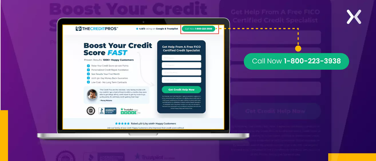
1. Implementation of Click-to-Call buttons
Click-to-call is an igneous feature that permits desktop and mobile device users alike to instigate a phone call merely by clicking or tapping. It effortlessly delivers customers to the doorstep of your business or service without the fuss of remembering or jotting down a phone number prior to dialing it. The feature works in your favor, too. Driving premium conversions that readily evolve into sales becomes less arduous as visitors can locate your contact details with greater ease. Believe it or not, you mostly only have an average of 15 seconds to snare someone’s attention on your website. Every moment is precious.
This simple addition to your landing page can significantly improve your users’ experiences. It stops short potential roadblocks to interaction with your business by serving convenience. Consider, for instance, the landing page pictured below, where a click-to-call button is deliberately perched at the top. Its positioning makes sure its continuous visibility and accessibility, inviting engagement from every visitor.
2. Using your background design for better engagement
Think of your landing page’s background as a canvas that shapes the emotional and visual resonance of your page and sets the stage for your color and design choices. Thus, keen attention to your background selection is a big improvement.
 Here are three design elements vital in the background of your landing pages:
Whitespace
This landing page design element, also known as negative space, is the void bordering your content. Beyond supporting readability and focus, it offers balance to your overall design aesthetics. Skillfully deployed whitespace makes for a neat, organized look that is necessary for the user experience. It not just boosts the brand perception but also makes sure legibility across diverse screen sizes.
Brand Color
Align your background color with your brand palette. Just like a uniform, brand colors convey emotions and forge connections. They also assure visual consistency. Familiar brand colors in the background can boost trust and instant content-brand association.
Images and Shapes
These vital components of your background can visually communicate your message while improving aesthetics. Aptly chosen images and shapes infuse depth and variety into your landing page, significantly boosting its visual appeal and memorability.
3. The art of navigation on a landing page
Though it’s generally advantageous to grant users control via navigation, landing pages call for a more strategic approach. The primary mission here is to focus users on a single objective. However, industry data from Wordstream indicates excessive off-page links on landing pages as high as 96%. While side trips to other website areas may be justified at times, the one-goal principle central to landing pages demands selective navigation. To balance this, consider including all off-site links on your “Thank You” page, where your visitor has been converted to a lead. This approach makes it convenient to acquaint leads with your company more deeply and anchor social media connections without distracting from the landing page focus.
What About Long Pages? For lengthy landing pages, a sticky navigation bar can help hopping to different sections. On shorter pages, such sticky banners can house succinct social proofs (like trust badges) and a strong CTA, reinforcing your core message.
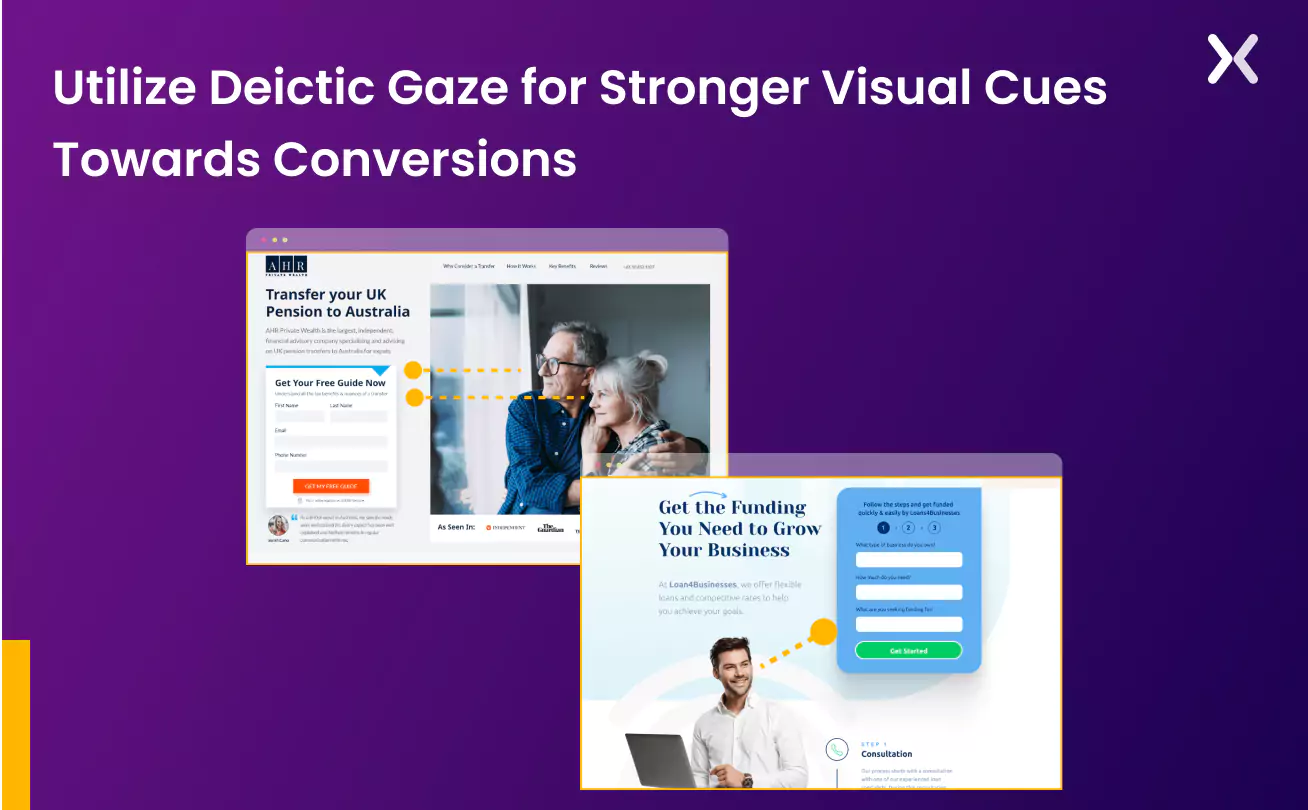
4. Playing with deictic gaze
The whites of our eyes, or the sclera. Aren’t just for improved vision. According to research. They’re necessary to social cues and communication Revealing where a person is looking and insinuating their intentions. Use this inherent human trait on your landing page to subtly guide visitor focus and action. The real-world concept of “deictic gaze,” coupled with great design, can raise your landing page’s effectiveness. Explore the examples below:
5. Choosing the right KPIs and beyond Surface-Level metrics
Assessing your landing pages’ real influence on concrete business results requires an exploration beyond typical metrics. You may initially consider factors such as clicks, conversions, and cost-per-click (CPC), but these only scratch the surface. They often fail to expose the true impact your ads and landing pages have on tangible business achievements.
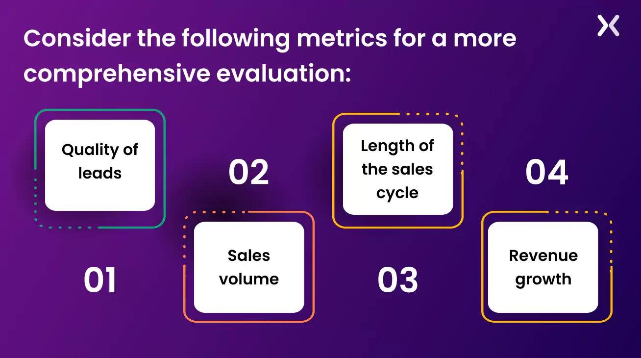 Consider the following metrics for a more full evaluation:
-
Quality of leads
-
Sales volume
-
Length of the sales cycle
-
Revenue growth For example, a SaaS landing page associated with several PPC ads might seem to perform better with a 10% conversion rate. However, a deeper examination might reveal these leads have low intent, cluttering your sales funnel and spending your sales team’s time inefficiently. Looking beyond typical metrics and evaluating performance using deeper KPIs are landing page hacks that help you gain a full understanding of the true potential of your landing pages and entire marketing campaigns. Remember to monitor your CRM software- not just your ad dashboard.
6. Cognitive ease is all you need
The secret sauce of all the best landing page hacks? Cognitive ease pertains to the mental load a reader incurs to digest your information. By simplifying your content to minimize mental effort, you can maximize audience response with increased visitor comfort, engagement, and action tendencies. Here are the reasons cognitive ease is key to landing page optimization:
-
Clear, simple content appeals to a diverse audience, transcending familiarity barriers with your topic. When comprehension isn’t strenuous, engagement soars.
-
Improved cognitive ease shrinks potential user struggle in reading your content, reducing page abandonment rates due to bewilderment or frustration.
-
Optimized cognitive ease often employs succinct sentences, bullet points, headers, and visuals segmenting the text, improving readability and engagement. You can also try a squint test for cognitive ease. This type of test assesses your CTA button’s prominence with one simple question: Can it stand out in a quick glance or a squinted view? See this SaaS landing page exemplifying a successful implementation of cognitive ease:
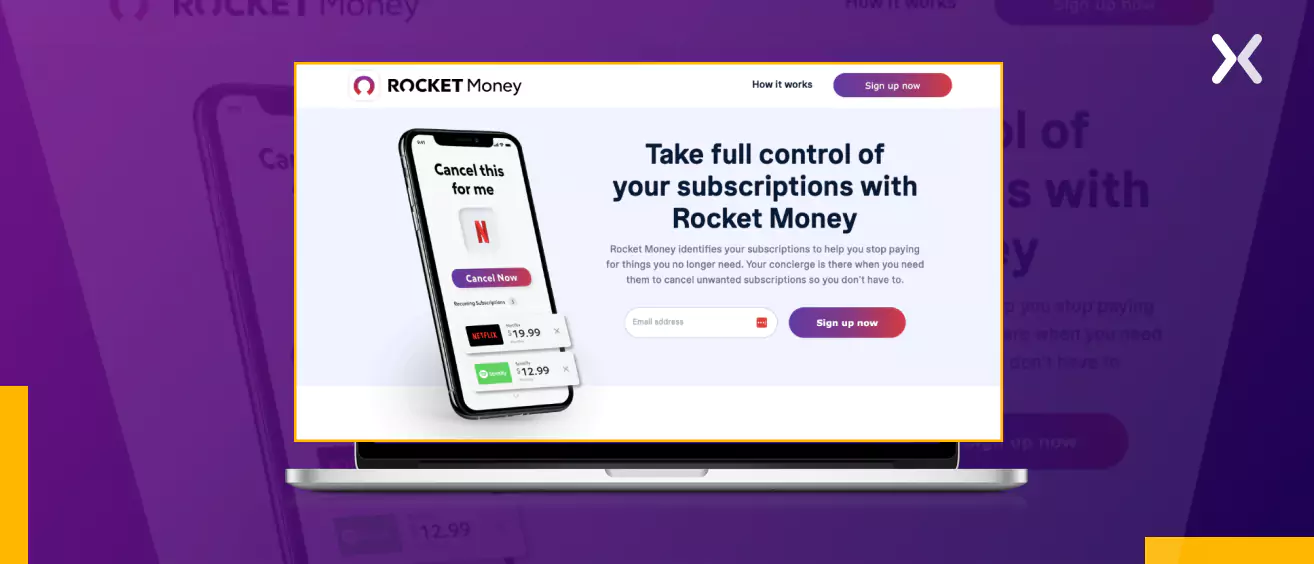 This page presents an optimal exemplification of cognitive ease in landing pages, with its precise headline, effective CTA, well-structured form field, and strong hero image.
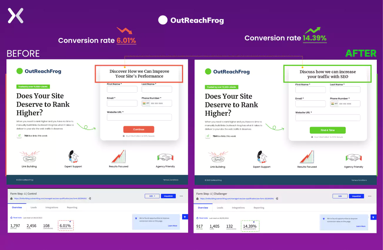
7. Treating your landing page form as High-Stakes terrain
Think of forms as the terminus of your landing page’s journey, transitioning mere visitors into promising leads. As such, every element warrants careful scrutiny. An exemplary form is not just user-friendly and devoid of distractions but also expertly balanced in terms of field quantity. Nevertheless, one must not overlook another vital form feature - the headline. This principle is ground in our case study involving OutReachFrog, a firm committed to boosting businesses’ Google rankings. Despite their service excellence, the company’s landing page was faltering. The headline, “Does Your Site Deserve to Rank Higher?” was strong, but the form’s headline was found wanting. A slight tweak in the form headline concurrently tweaked OutReachFrog’s conversion rate - a leap from the initial 6.01% to an impressive 14.39%. These refinements to the landing page stem from a thorough understanding of the buyer persona, which is then skillfully mirrored in the copy. See this screenshot below to see how minute changes in your landing page form can yield seismic conversion improvements:
8. Optimal typography for better perceptions
Typography goes beyond providing legibility to your text. It is an unsung hero, deftly constructing a visual hierarchy and improving user experience on your landing page. For any viewer, this hierarchy offers a navigational guide rail, distinguishing between headings, subheadings, and body text. Bizarre as it may sound, psychological research suggests we assign “personalities” to fonts. For example, Times New Roman is often perceived as witty. For digital marketing, this means that these subtle perceptions can affect how visitors interpret your landing page. So here are a few landing page hacks to consider when tweaking your typography:
Kerning and Leading The significance of whitespace isn’t confined solely to your design layout; it extends to your text. Kerning refers to the space between letters while leading defines the spacing between text lines.
 Both these elements contribute toward coherent visuals and ease of reading. Misaligned or overcrowded text appears chaotic. Using proper leading - usually, the font size plus 20pt - maintains balance.
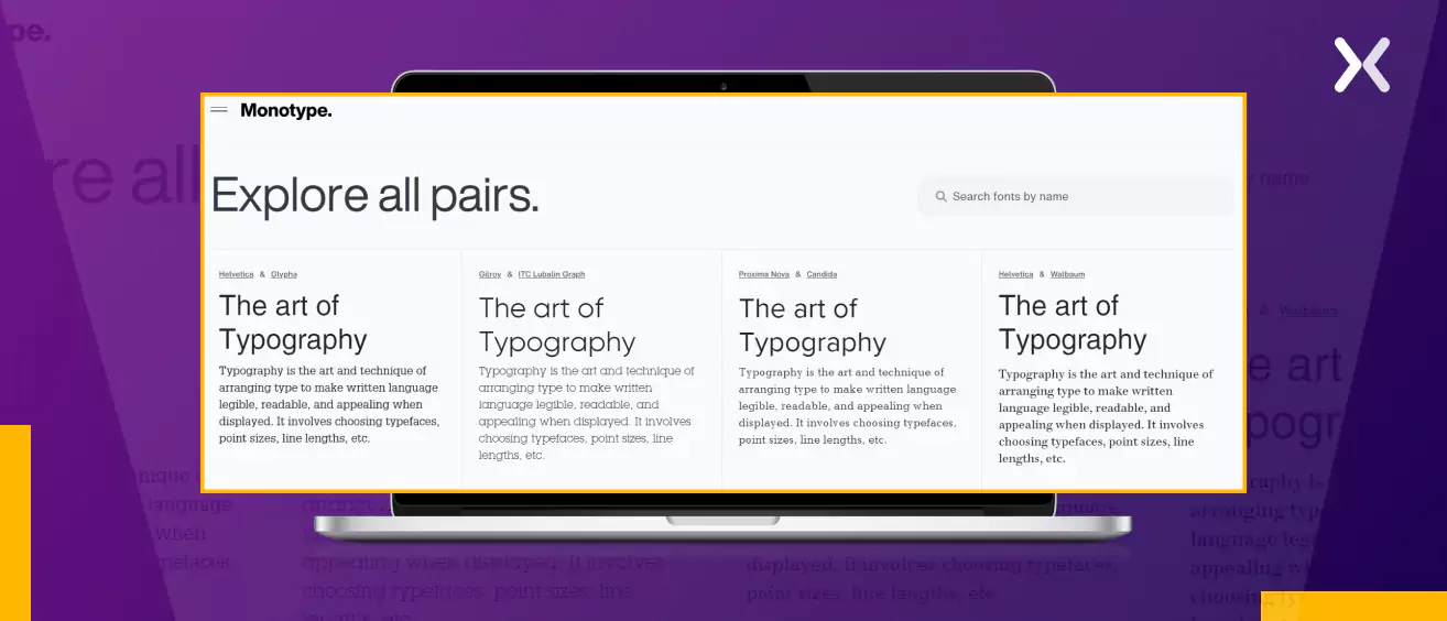
Pairing Don’t shy away from blending two fonts on your landing page. The pairing must be an orchestrated aesthetic choice rather than randomly selected fonts. Often, mixed fonts from different categories (say, a serif with a sans-serif) work well. A resource like Monotype can are a handy tool to experiment with various font pairing options and visualize which match improves your brand image best.
Colors While we’ve underlined the impact of font typeface, let’s not skip the color of your fonts, which should contrast with the background for maximal legibility. Remember, your audience can only respond to your call to action if they can read your message with ease.
9. Right channels: right messages
Lead generation sparks from a diverse array of channels, each requiring a tailored approach. To optimize your high-ticket offers’ efficacy. It’s essential to grasp your target audience’s pain points, their stage in the sales funnel, and the best channels to reach them.
Channels Influence Audience Types Your audience varies across channels - social media, paid ads, and search queries. A visitor generated from a purchase-intent keyword on Google typically possesses a higher intent to buy than an Instagram user. Hence, channel selection and user intent are interconnected.
Be Mindful of Your Keywords When using a landing page builder for either PPC or SEO. It’s critical to be circumspect with your keyword selection. For instance, a generalized keyword like “consulting services” may drag in undesired search queries, diluting your ad clicks.
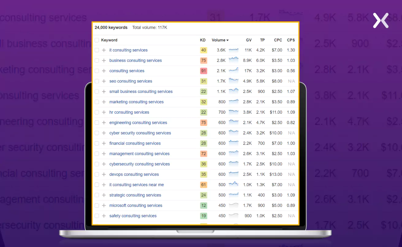 However, by using specific keywords like “best consulting services,” you can significantly reduce matching terms and make sure your landing page appears for the most relevant search queries.
Which landing page hack did you like?
The landing page hacks discussed above can help raise your conversion rates and secure an advantage in your industry. However, results may vary across different industries, underlining the necessity to personalize these hacks for your brand. The moment your landing page is live, set your focus on its optimization to create a truly brand-aligned, high-performing page. Need help building an optimized landing page? Apexure is ready to support your goals with the necessary tools and expertise. From creating high-converting landing pages that are all set for sign-ups and demos to assisting you through the optimization process. We have got you covered.
Reach out to us today. Let’s open the power of your offers and take your marketing stratosphere-bound.
Related Article: