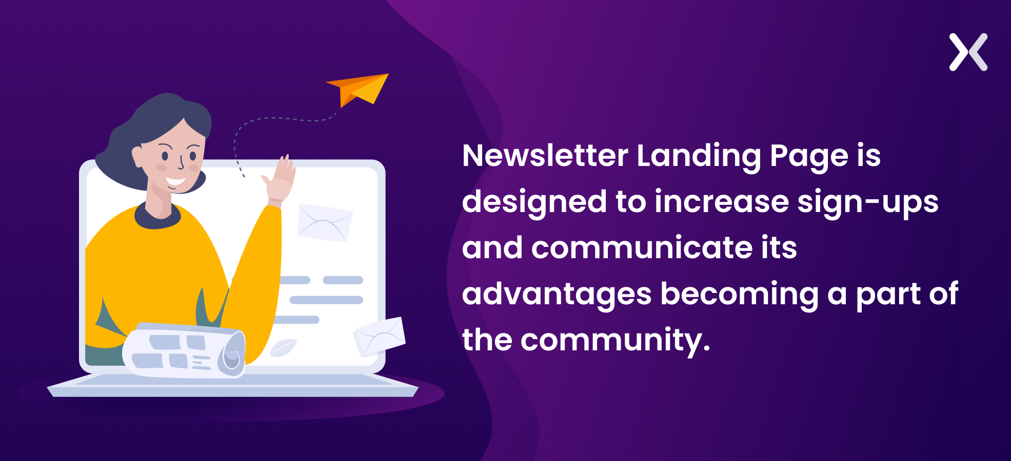
You understand your newsletter’s value, but does your audience? A standard web page won’t attract subscribers. You need a newsletter landing page that communicates your value. Crafting an effective newsletter sign-up page is a task, but the payoff can be huge - with a remarkable 23% conversion rate. A well-designed newsletter landing page can significantly boost subscriber numbers. While basics are easy, mastering high-converting landing pages is another story. In this blog post, rather than just listing best practices, we share various newsletter landing page examples to demonstrate these practices in action. We also dig into necessary elements and more. Let’s start with the basics.
When should marketers use newsletters?
An effective top-of-the-funnel campaign is incomplete without the integration of newsletters. They are powerful tools for boosting brand awareness, given their capacity to carry in-depth information about your products and services. By regularly relaying messages, brands become entrenched in the minds of customers and prospects alike. This is where newsletter campaigns can also play a significant role in retention, tempering the churn rate, and maintaining customer engagement.
 Even better, they act as informational tools and pivot points for building relationships and personalizing customer interactions that better the brand image via word of mouth. When that happens, you further expand your customer base, which is the ultimate goal of a successful newsletter.
11 newsletter landing page examples (with best practices)
Newsletter landing pages are easy to build and do not cost much to build. To provide you with some well-rounded insight, let’s look at 11 real-world newsletter landing page examples incorporating the hacks that deliver successful results.
1. Keep it Short and To The Point
True to its primary audience, top-of-the-funnel leads, CoffeeCup is one of the most effective newsletter landing page examples. It adeptly addresses user queries without overwhelming them with unnecessary details.
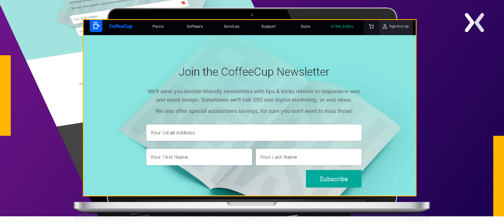 It has bright, refined aesthetics. This email newsletter landing page is a masterclass in brevity and clarity. The minimalist design assures easy navigation, eliminating the risk of alienating users with lengthy content.
2. Give an inside glimpse
Going visual is a big improvement for newsletter landing pages. Overthink Group is another strong contender among newsletter landing page examples, using visuals effectively. Their landing page beautifully presents a strategic hero image displaying a peek into their newsletter’s look, feel, and easy accessibility across devices, including smartphones. It helps visitors envision themselves as future patrons.
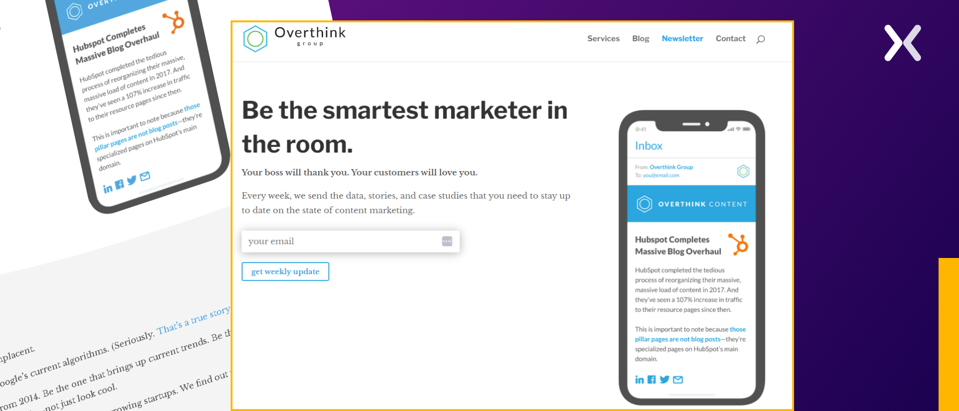 Paired with a succinct headline, subhead, and minimalist single-field form. It makes for a full newsletter landing page, setting a high benchmark for user engagement.
3. Introduce Yourself
Since newsletter landing pages serve top-of-the-funnel marketing efforts, many visitors may not be familiar with your brand. So don’t hold back. Let your brand shine! A brief (yet strong) introduction about who’s behind the newsletter can be effective. Copy Posse gives us one of the strongest newsletter landing page examples, carving out a dedicated space on their newsletter sign-up page to acquaint newcomers with the creative minds delivering the content.
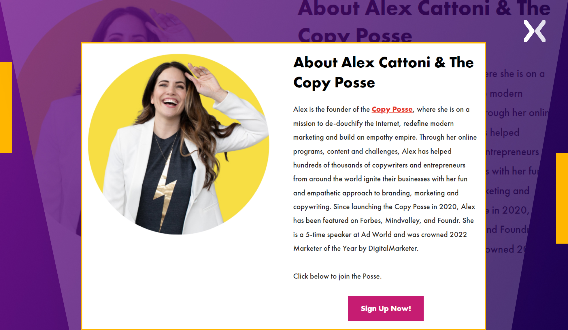 It encourages fresh visitors with the confidence to hit that subscribe button, having gained a better understanding of the entity they will hear from regularly.
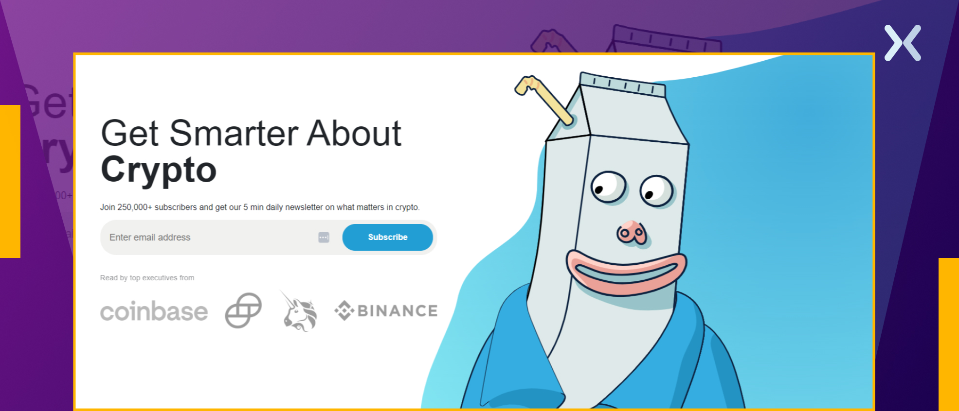
4. Niche-driven Content
Milk Road stands out with its Beehiiv platform-based newsletter, a globally recognized player in the crypto sphere. The landing page distinctly communicates what the newsletter is about and its target audience.
 If you’re contemplating a lengthier newsletter landing page, remember to stay true to your niche, just like Milk Road, so your content continuously matches your target audience’s interests.
Staying on brand, Milk Road makes sure every element of the newsletter, from visuals to copy, down to the social proof, echoes their central theme: Crypto. An entertaining mascot holds visitors’ interest, subtly nudging them to explore further and, ultimately, subscribe to the newsletter.
If you’re contemplating a lengthier newsletter landing page, remember to stay true to your niche, just like Milk Road, so your content continuously matches your target audience’s interests.
Staying on brand, Milk Road makes sure every element of the newsletter, from visuals to copy, down to the social proof, echoes their central theme: Crypto. An entertaining mascot holds visitors’ interest, subtly nudging them to explore further and, ultimately, subscribe to the newsletter.
5. Provide a Log
Transparency plays a significant role in building trust among your audience. The Leap matches this notion and that’s why is one of our favorite newsletter landing page examples. Here, it cleverly provides a log of previously published newsletters, which offers visitors a sneak peek into the rich repertoire of topics covered and helps them assess its relevance.
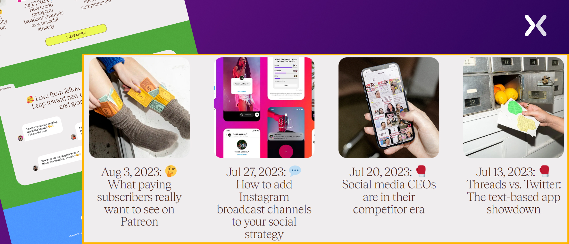 By revealing these behind-the-scenes glimpses, Leap improves its trust quotient, paving the way for increased subscriber engagement.
This ingenious approach demonstrates the sheer value of its newsletters while earning them brownie points on transparency.
By revealing these behind-the-scenes glimpses, Leap improves its trust quotient, paving the way for increased subscriber engagement.
This ingenious approach demonstrates the sheer value of its newsletters while earning them brownie points on transparency.
6. Flaunt social proof
Payload astutely taps into the power of social proof on its newsletter landing page. The company intriguingly stokes a sense of FOMO (fear of missing out) in visitors by intimating that industry leaders are also subscribers.
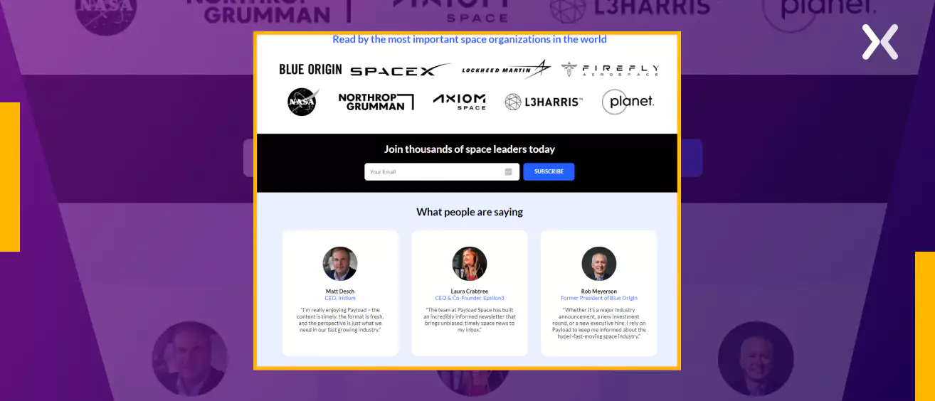 Presented against an elegant backdrop are authoritative endorsements from well-known organizations subscribing to the newsletter, complemented with glowing testimonials from prestigious C-suite executives.
Such professional presentation of social proof imbues the landing page with credibility and prestige, ultimately guiding the visitor’s decision-making process toward newsletter subscription.
Presented against an elegant backdrop are authoritative endorsements from well-known organizations subscribing to the newsletter, complemented with glowing testimonials from prestigious C-suite executives.
Such professional presentation of social proof imbues the landing page with credibility and prestige, ultimately guiding the visitor’s decision-making process toward newsletter subscription.
7. Use click triggers
Implementing the classic click-trigger strategy, the Get SaaS Weekly newsletter landing page provides that necessary last push needed for visitors to take action.
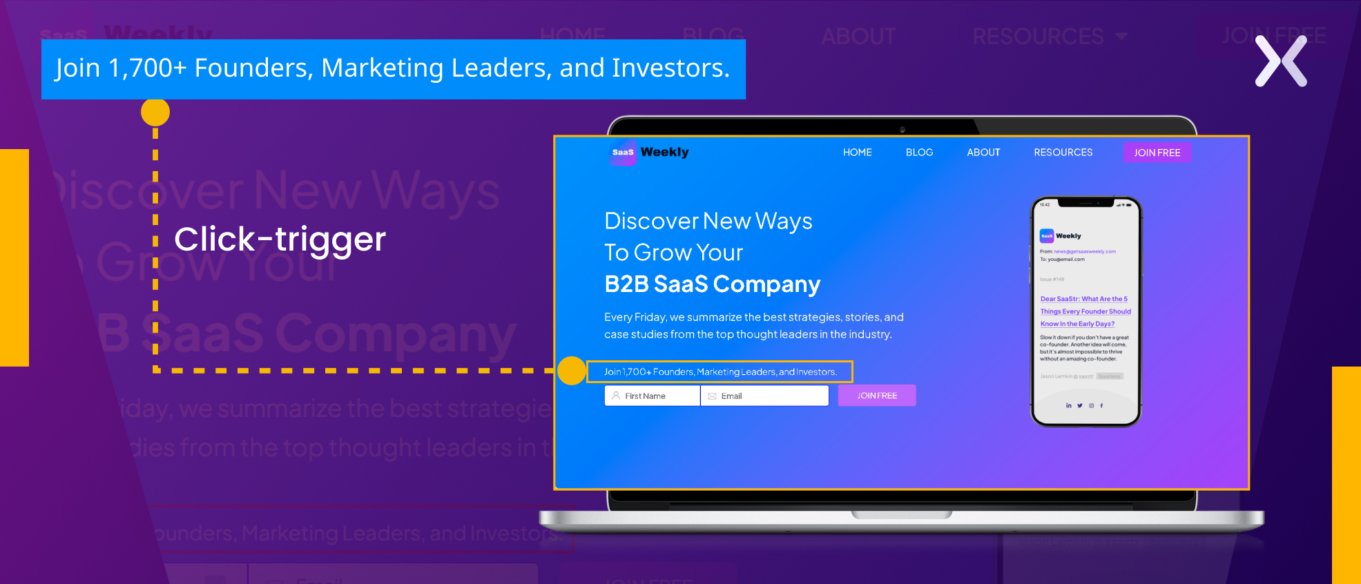 Click triggers (short, persuasive snippets like testimonials, reviews, statistics, or endorsements) are carefully positioned right before the calls-to-action (CTAs).
They assuage visitor apprehensions, boosting credibility and building trust.
Presenting positive feedback or strong data reinforces the reputation and boosts conversion rates. This strategic placement encourages hesitant visitors to click your CTAs confidently and what’s make this part of the best newsletter landing page examples.
Click triggers (short, persuasive snippets like testimonials, reviews, statistics, or endorsements) are carefully positioned right before the calls-to-action (CTAs).
They assuage visitor apprehensions, boosting credibility and building trust.
Presenting positive feedback or strong data reinforces the reputation and boosts conversion rates. This strategic placement encourages hesitant visitors to click your CTAs confidently and what’s make this part of the best newsletter landing page examples.
8. Give users options
Addressing diverse niches through your newsletter demands strategic user segmentation.
Factset’s newsletter landing page shines by giving users the flexibility to select their preferred niches during signup. Such customization respects user preferences and staves off content overload, thereby reducing the chances of unsubscribing.
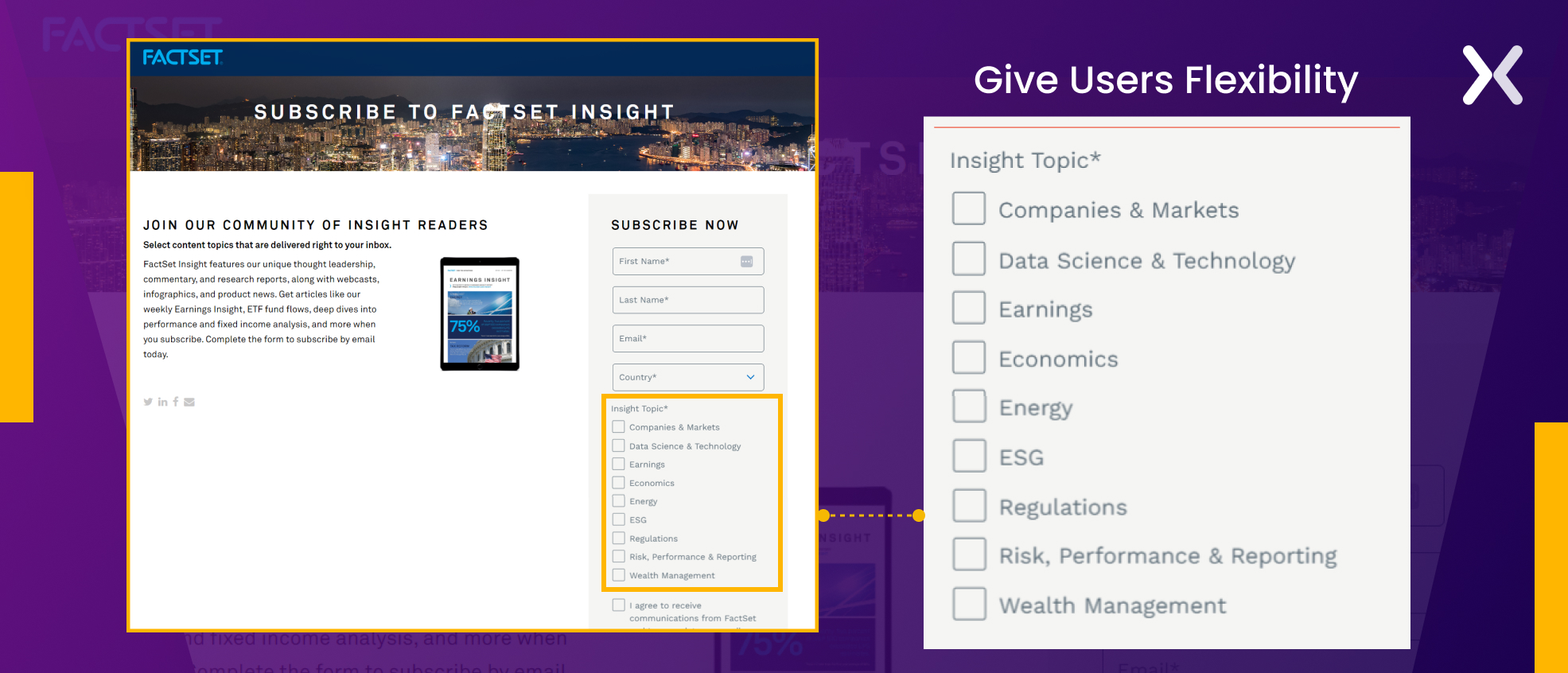 You naturally improve user engagement and open rates by offering tailored content that feeds their specific interests. Such purposeful segmentation also gives you valuable insights into subscriber preferences, helping subtle targeting.
Thus, giving users options on your newsletter landing page is a winning strategy for building enduring connections and content relevance.
You naturally improve user engagement and open rates by offering tailored content that feeds their specific interests. Such purposeful segmentation also gives you valuable insights into subscriber preferences, helping subtle targeting.
Thus, giving users options on your newsletter landing page is a winning strategy for building enduring connections and content relevance.
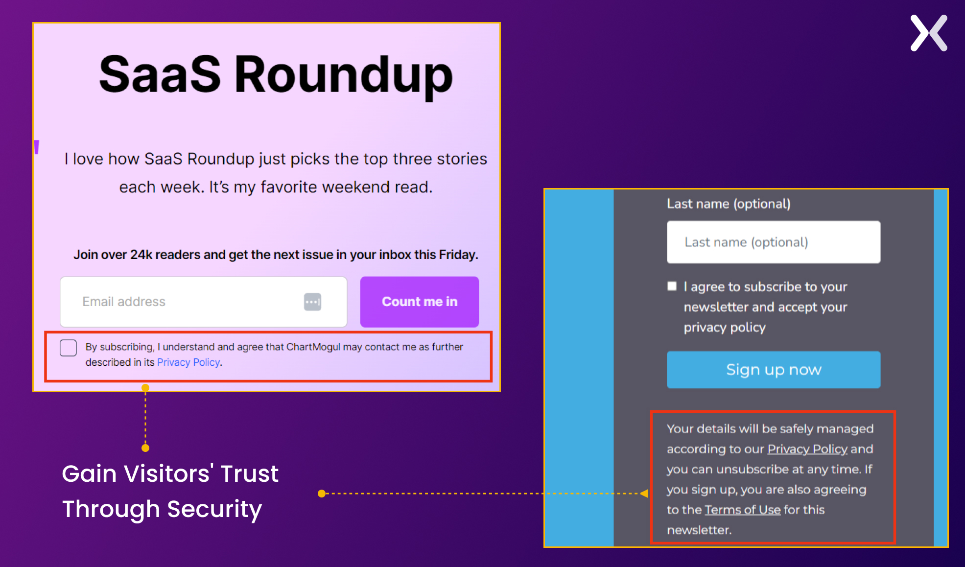
9. Make users feel secure
In security, we trust, this notion rings true, especially during newsletter sign-ups. It is essential to inspire a sense of security in your visitors for trust to grow and your brand to flourish. Here’s how:
-
Safeguard data transmission using SSL encryption.
-
Maintain transparency with a clear discourse on data collection and utilization.
-
Improve credibility by presenting recognized security logos.
-
Validate subscriptions using confirmation email links.
-
Demystify data handling processes and opt-out procedures.
-
Extend assistance and clarity when needed. By prioritizing security, you nurture trust, minimize sign-up abandonment, and build successful subscriptions. Here are two newsletter landing page examples that exemplify security preservation on their platforms: ChartMogul and Level Up
10. Deliver great user experience
A smooth user experience is the heart of a landing page, minimizing conversion friction and maximizing CTA clicks. This principle holds true not just for general landing pages but also for newsletter sign-up landing pages.
The New York Times, a frontrunner in the news industry, understands the importance of delivering exceptional user experiences on its newsletter sign-up landing page. The page is carefully designed to provide clarity and convenience to its visitors.
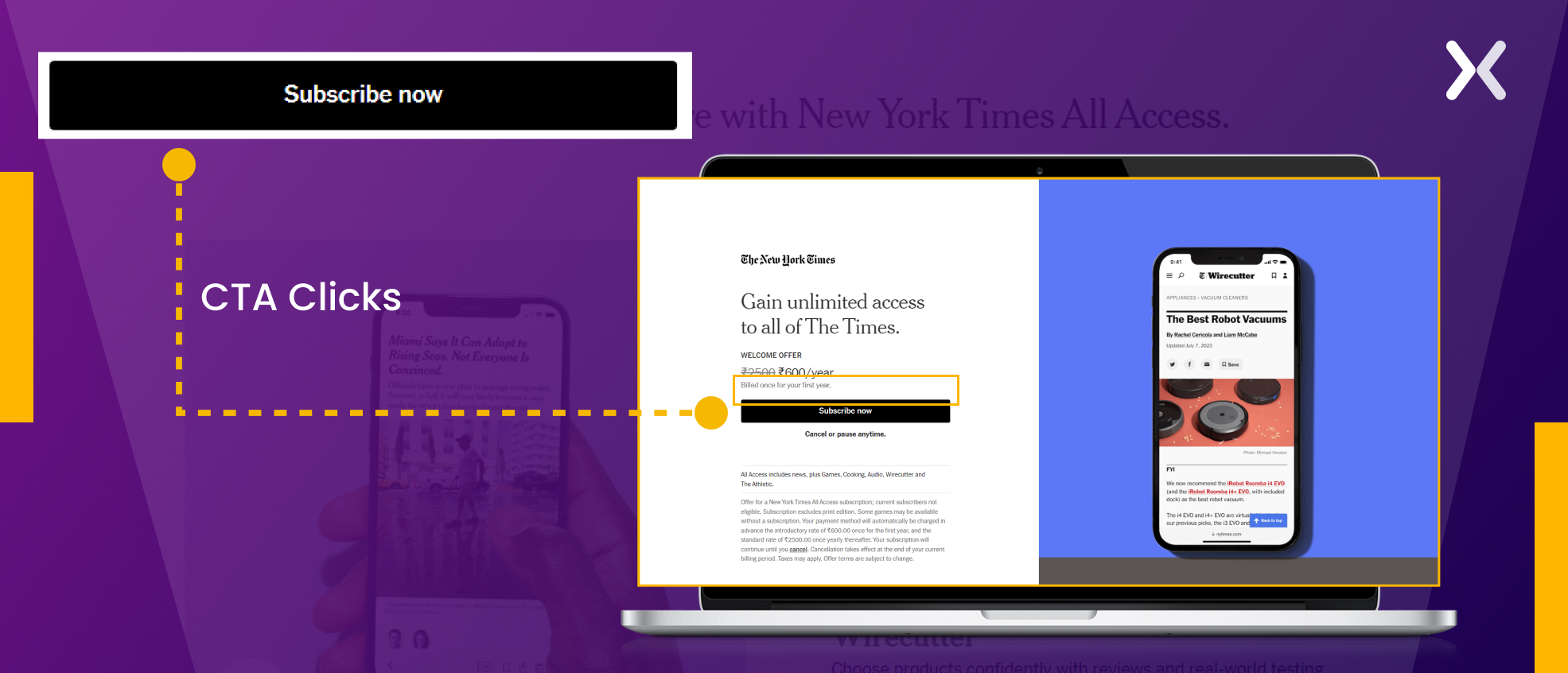 Upon landing on the page, users are presented with a straightforward layout that clearly outlines the subscription details, including pricing and payment options deliberately positioned near the call-to-action. It provides options for those interested in receiving a physical copy, demonstrating the Times’ commitment to serving diverse reader preferences.
With its clean and intuitive design, the landing page effectively communicates the benefits of subscribing, particularly marking the perks exclusive to “All Access” subscribers. This emphasis on clarity and personalization improves the overall user experience, making sure a smooth journey from landing on the page to completing the subscription process.
Upon landing on the page, users are presented with a straightforward layout that clearly outlines the subscription details, including pricing and payment options deliberately positioned near the call-to-action. It provides options for those interested in receiving a physical copy, demonstrating the Times’ commitment to serving diverse reader preferences.
With its clean and intuitive design, the landing page effectively communicates the benefits of subscribing, particularly marking the perks exclusive to “All Access” subscribers. This emphasis on clarity and personalization improves the overall user experience, making sure a smooth journey from landing on the page to completing the subscription process.
11. Accent value proposition
Strategy Breakdowns’ newsletter sign-up page defies the notion that unique features are exclusive to product or service landing pages. Despite its short length, this page incorporates all the essential elements we have discussed above while specifically marking its value proposition - a strategic move indeed.
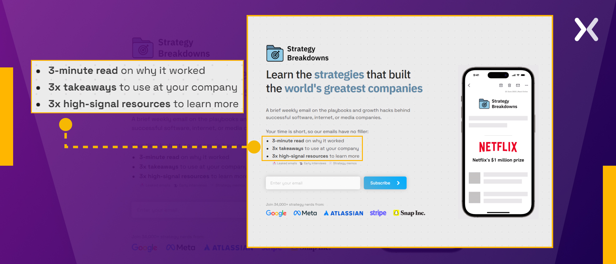 From its attention-grabbing headline to concise bullet points, the copy consistently reinforces its message and the value it offers to readers. Placing the value proposition just before the call-to-action (CTA) and incorporating sliding images presenting the prominent companies covered builds numerous micro-conversions. Including social proof at the end further improves the page’s credibility.
Bonus newsletter landing page examples best practice
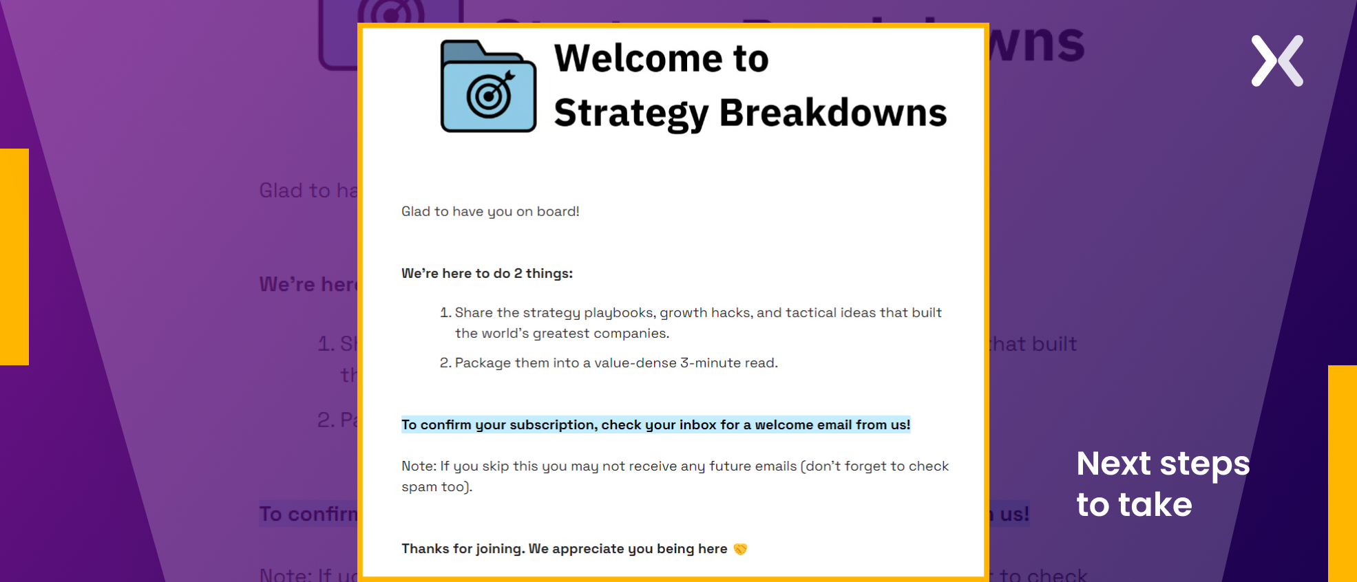
Don’t let your new subscriber’s journey hit a dead end. After they’ve filled out that short form. It’s necessary to give them a warm welcome. A newsletter subscription thank-you page is more than just a simple “thank you.” It’s a chance to extend a warm welcome to your new subscribers, confirm they’ve entered the correct email address, and invite them to join the community. Take a leaf out of Strategy Breakdown’s book. They have the next steps inscribed right into their newsletter landing page.
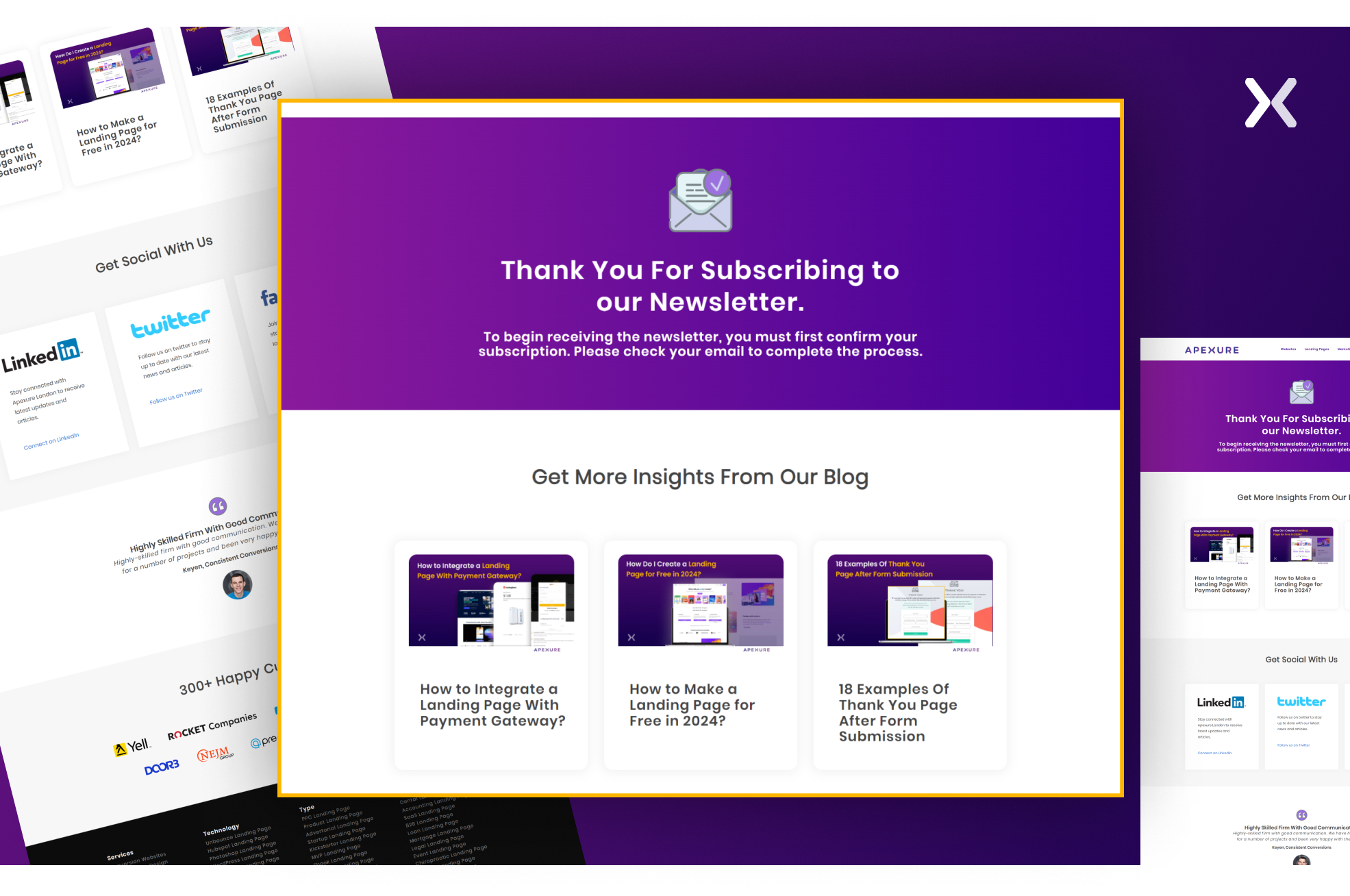
 Newsletter thank-you pages present a golden opportunity to introduce new subscribers to additional ventures or content you offer. At Apexure, our newsletter success message is more than just a gesture of gratitude. It’s a gateway to our latest blog posts and social media platforms, allowing subscribers to look at our world with ease.
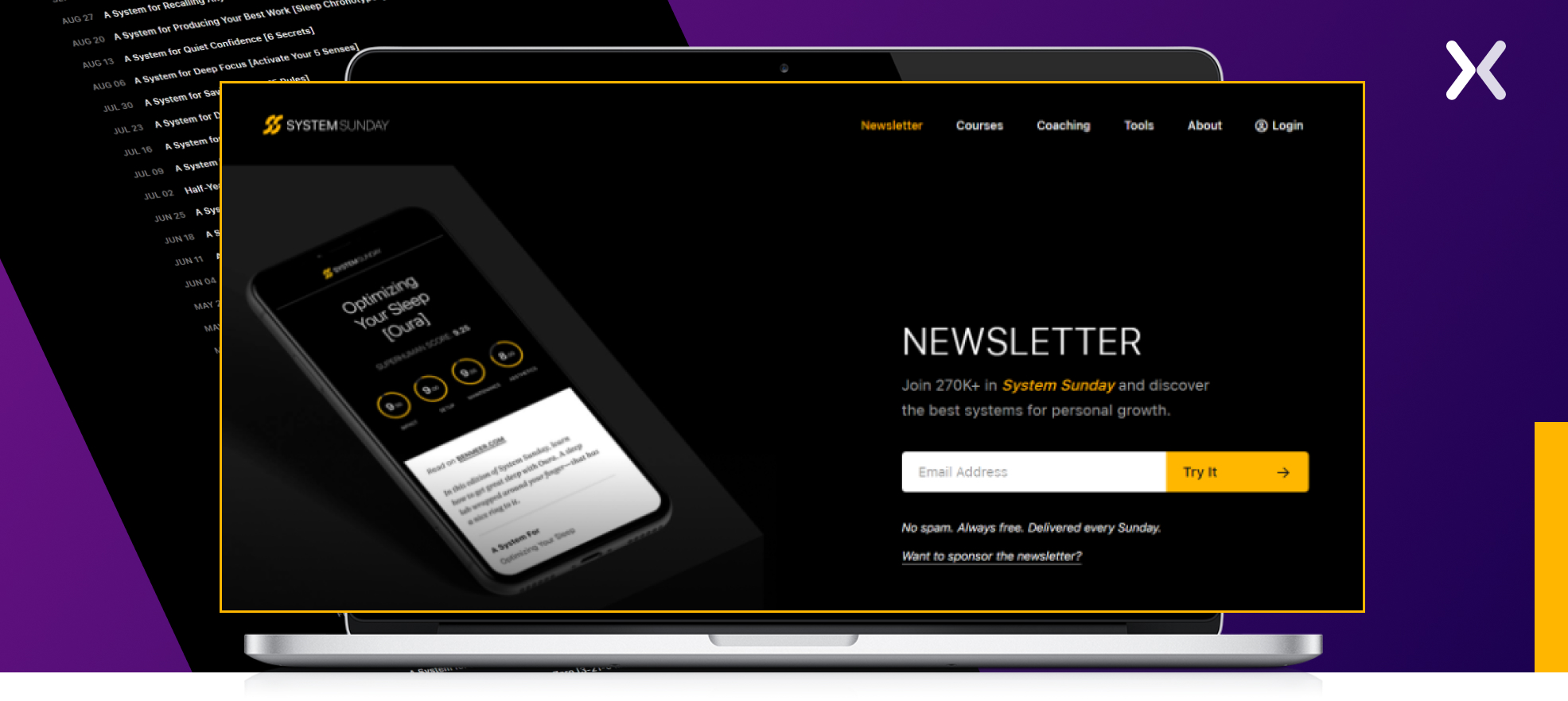
 You can also check out Ben Meer’s newsletter page. Upon signing up, instead of a conventional thank-you page, a pop-up appears, confirming the new signup. It’s a unique and engaging method of verifying newsletter subscriptions.
5 essential elements of a newsletter landing page
Now that you’re primed to use a newsletter landing page, let’s dig into the five quintessential elements that drive its efficiency and success.
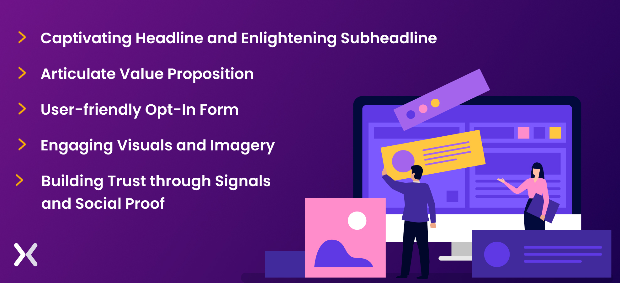
1. Engaging headline and enlightening subheadline
As we understood from the newsletter landing pages examples, a powerful page commence with a strong headline that immediately captures attention. The headline must be crisp yet informative, delivering the crux of your newsletter. The subheadline then provides that extra layer of context, revealing special features or adding necessary details.
2. Articulate value proposition
Next, you have the significant task of convincing your visitors why they should subscribe to your newsletter. Hence, a clear value proposition is key. You want to give them strong reasons. What benefits will they reap? What type of content can they anticipate? What kind of insider access or exclusive insights will they be privy to as subscribers?
3. User-friendly Opt-In form
The heartbeat of your newsletter landing page lies in its opt-in form. Here, simplicity is essential. Keep it straightforward by asking for the essentials, typically an email address. Depending on your needs, you may also want to include an optional field for the subscriber’s name.
4. Engaging visuals and imagery
A picture is worth a thousand words. Use relevant images, the right background, engaging graphics, or fascinating videos that embellish your content and boost the overall aesthetic value of the page. The right visuals can unearth the ethos of your newsletter, define the intended tone, and enliven the entire visitor experience.
5. Building trust through signals and social proof
Trust is a critical factor when asking visitors to share their contact information. You reassure visitors of the worthiness of your newsletter by including elements that establish your credibility like:
-
Applauding testimonials
-
Rave reviews from contented subscribers
-
Awards or recognition you’ve received
-
Number of current subscribers
-
Logos of popular companies you’ve collaborated with Each reinforces the visitor’s decision to subscribe, making it feel like a safe, trustworthy choice.
Setting up landing page for newsletter - best approach?
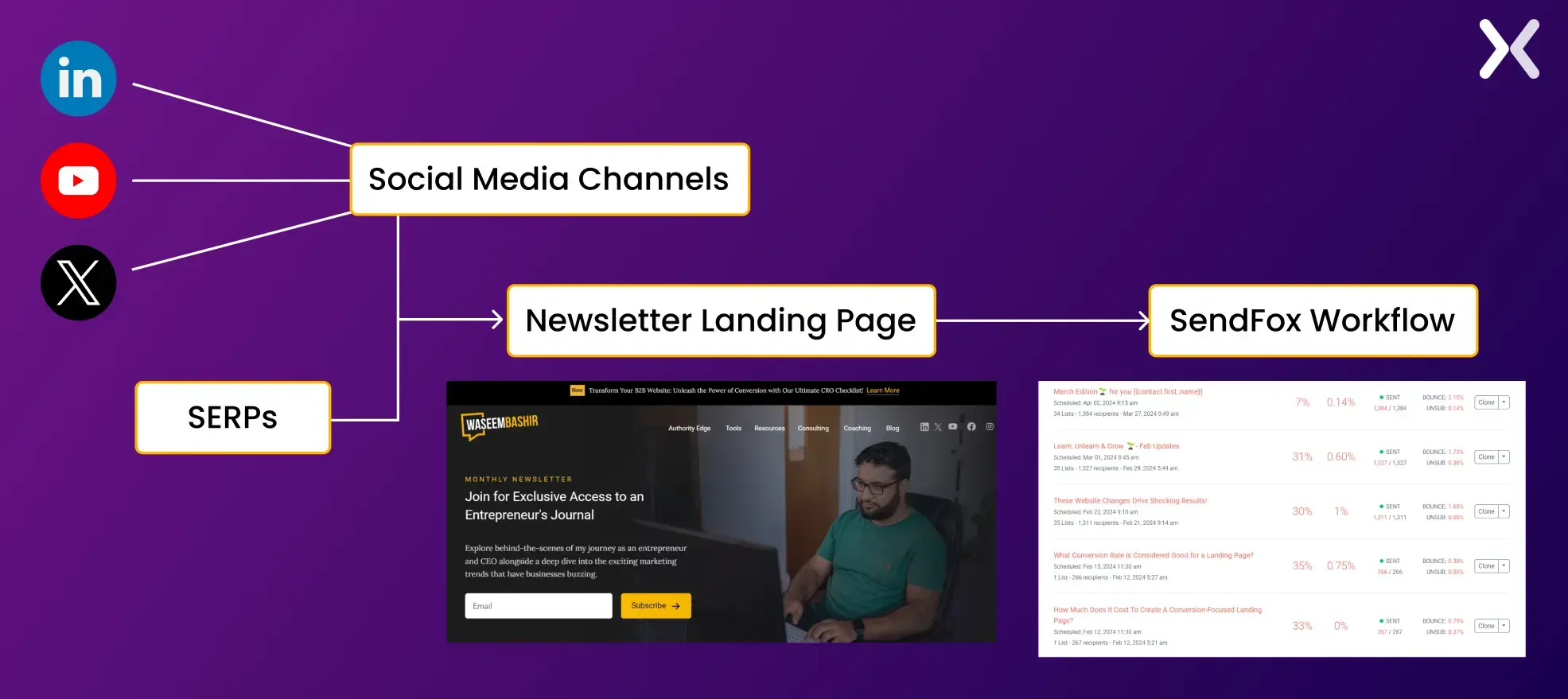
When setting up a newsletter landing page, you can begin by selecting an appropriate landing page builder tool. You can pick Unbounce or Leadpages, but you can also explore free alternatives. After completing your landing page, the next step is integrating a marketing automation tool like ActiveCampaign or Drip to create email lists and set up automation for your subscribers. Alternatively, businesses can opt for all-in-one solutions like GetResponse or Mailchimp, which offer landing page creation, email list management, and automation capabilities in a single platform. For example, this is how a newsletter landing page workflow might look like:
So, do you really need a newsletter landing page?
Engaging in the digital space involves building a strong online presence and cultivating valuable relationships. A specific marketing tool like a newsletter landing page can significantly aid in hand-picking strong email lists for future promotional endeavors. Despite many ways to engage website visitors, a dedicated landing page trumps them all. It offers an unparalleled platform to communicate subscriber benefits, attract users with appealing visuals, and entice them with insightful information. Digging deeper into this concept can help us better understand the numerous advantages that well-crafted newsletter landing pages bring to the table.

1. Better user engagement and experience
Newsletter landing pages present an unparalleled opportunity to engage your audience consistently. Providing visitors with valuable and relevant insights about the newsletter makes them connected with your brand. Another excellent byproduct of utilizing a dedicated newsletter landing page for signups is improving user experience. Unlike the bombardment of pop-ups, ads, and offers elsewhere on your website, a landing page offers a simplified, distraction-free path guiding visitors toward newsletter subscription, building a user-friendly experience.
2. Credibility and Authority
Regular dispatches of quality content via newsletters support your reputation as a field expert, improving your credibility and building trust among subscribers. Incorporating a landing page allows you to illustrate your brand’s distinctive value, helping you rise above the competition and cultivate a communal environment. As a result, you build a group of loyal subscribers more likely to boost your reach through referrals and content sharing.
3. Control over messaging
Contrary to social media platforms, newsletters circumvent algorithmic or policy shifts, providing you with unadulterated control over content dissemination. A newsletter landing page introduces an extra level of personalization into email marketing. It lets you harvest precise details about your subscribers, such as name, location, and interests. It helps you to create tailored email campaigns, effectively segment your list, and deliver highly relevant content to keep each subscriber engaged.
4. Measurable user data
Newsletter landing pages enable an in-depth understanding of subscribers through strong data collection and detailed analytics. You can capture subscriber interests and track metrics such as conversion and bounce rates. It helps help data-driven decision-making, optimizing your campaigns and overall marketing efficiency.
Creating a newsletter landing page inspired by the examples
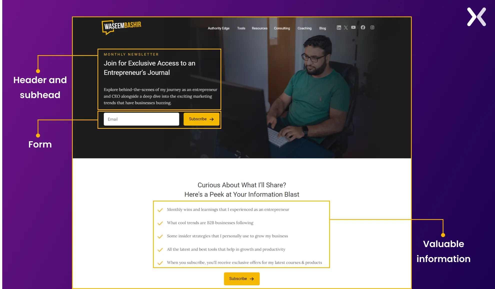
Drawing inspiration from the newsletter landing page examples. It was time to create one. So, a newsletter landing page was designed for wassembashir.com, an online platform where I share insights about my entrepreneurial journey and various other topics. The newsletter page starts with a header and subhead that give a glimpse of what will be shared in the newsletter. The form has been simplified to contain just one essential field, keeping user convenience in mind.
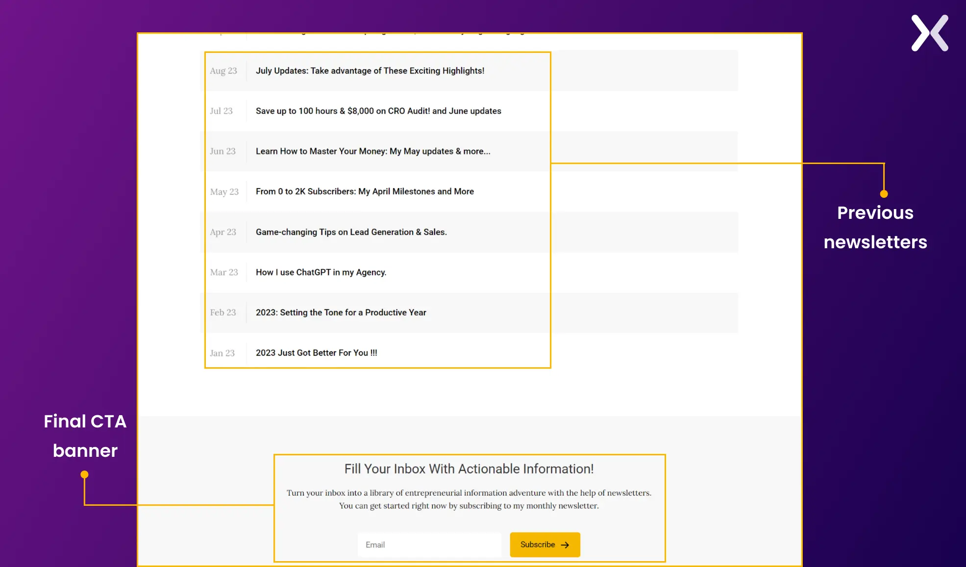
 Following this, a short list outlines the valuable information subscribers can expect to receive with a brief author introduction. The page concludes with a list of all the newsletters that were previously shared and a final CTA banner.
Build your newsletter landing page
Revisiting the newsletter landing page examples and hacks we’ve discussed can spark fresh ideas tailored to fit your brand’s unique voice and style, elements that could fast-track your journey to achieve a subscriber-rich newsletter. Crafting a landing page for a newsletter marks the start, but its growth through ongoing testing and optimization is vital. Adjusting strategies in alignment with your audience’s evolving preferences maximizes your newsletter’s influence and builds lasting relationships with your subscribers. To create the best newsletter landing pages, keep all the elements we’ve mentioned and your brand voice intact. You’ll definitely see a rise in subscribers.
Related Article: