Responsive landing pages make sure that no matter where your traffic is coming from, your user experience delivers conversions. Slow loading speed, distorted images, and hard-to-click buttons are some of the biggest reasons visitors bounce away from landing pages. Such things happen when your page is not optimized for various screens and lacks a focus on UX. This negligence can hamper your conversion rate and landing page experience as Google favors mobile-first designs for organic and paid results.
Responsive design is the key to building landing pages that look great on any device. In this article, we’ll explore how to create a responsive landing page and why it’s essential for your business. Let’s begin with the basics.
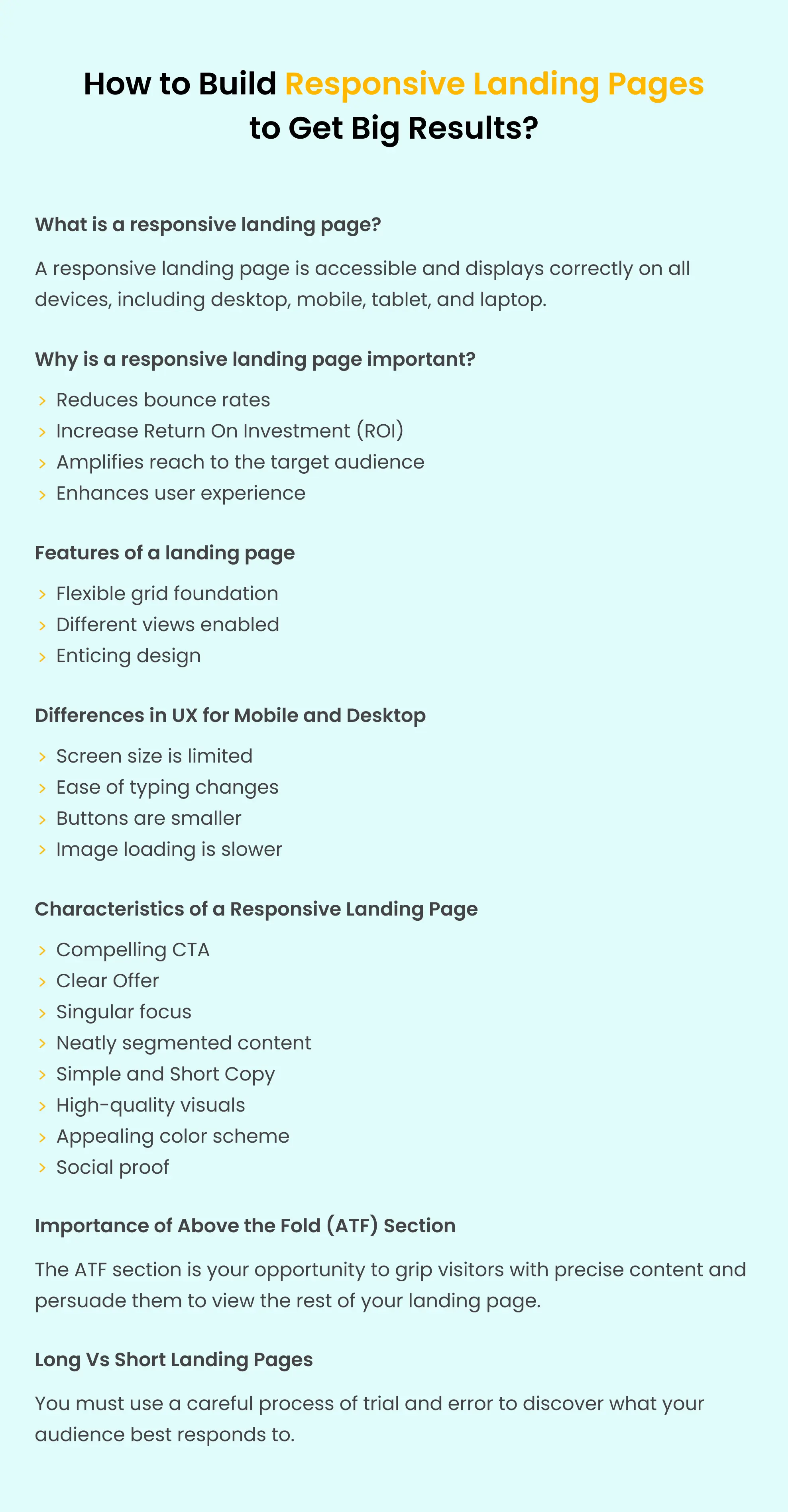
What is a responsive landing page?
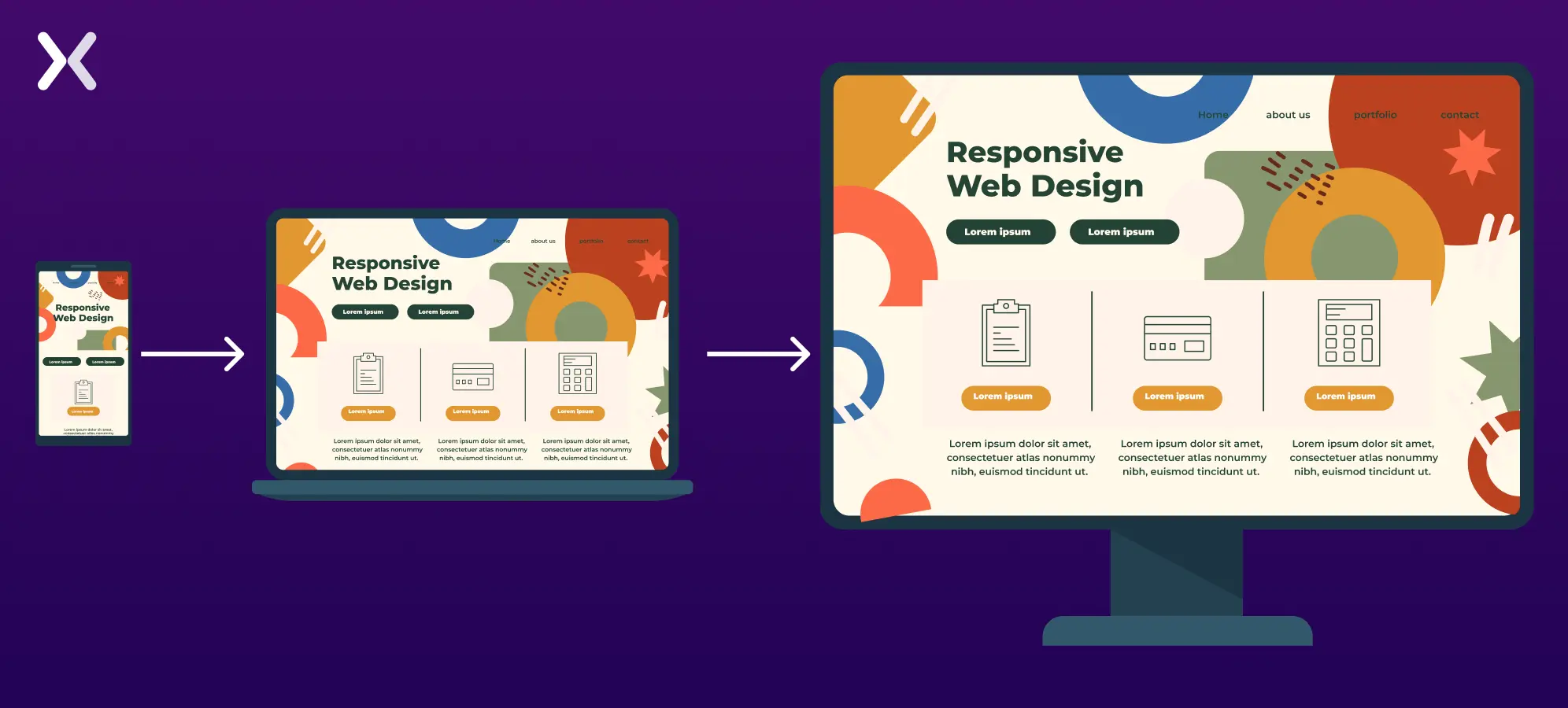
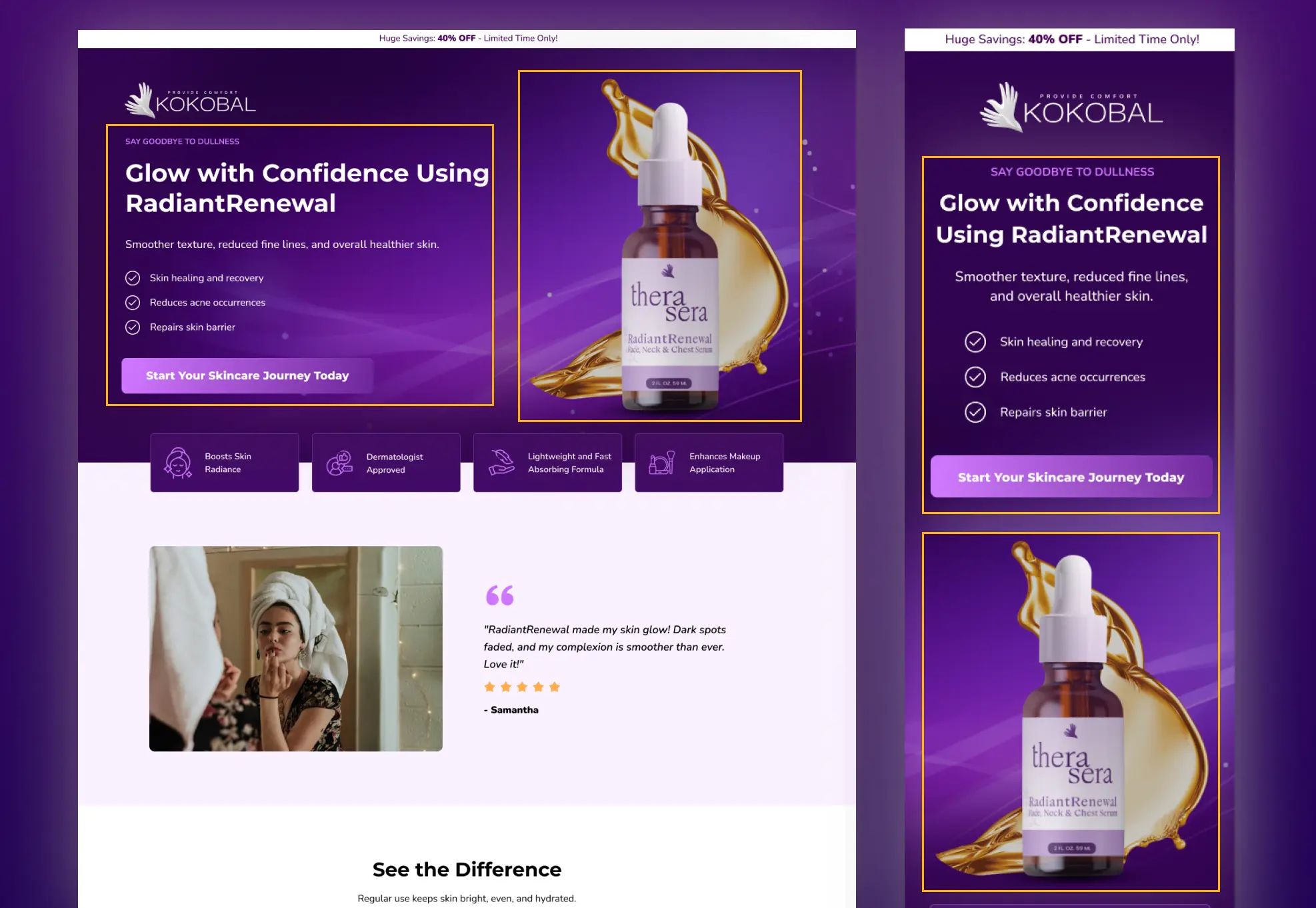
A responsive landing page is designed to adjust its layout and content to fit different devices, including desktop, mobile, tablet, and laptop, with varying screen sizes and browsers.
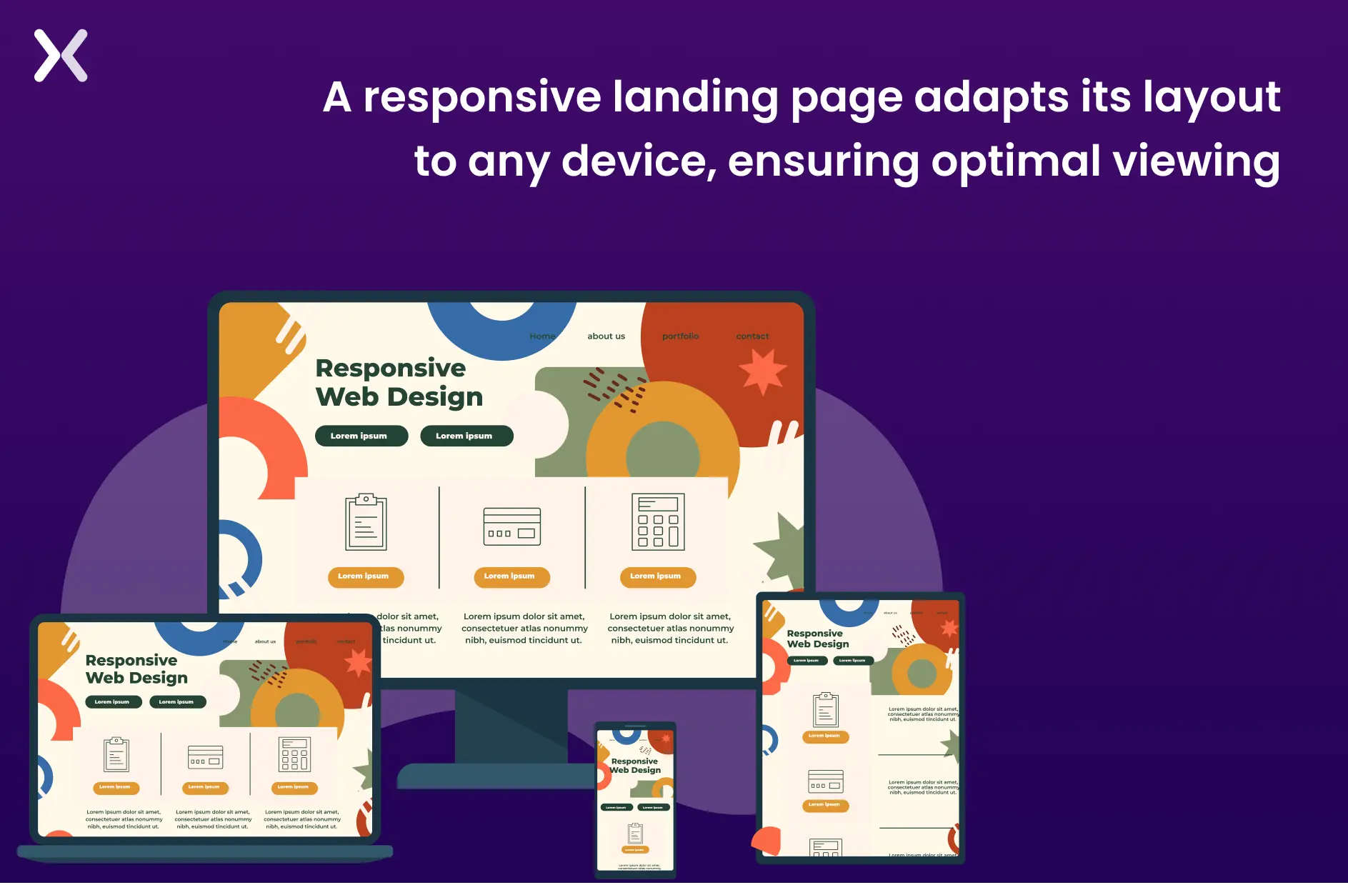 The goal of a responsive design is to provide users with an optimal viewing and interactive experience. It makes sure that the page looks good and functions well on any device without requiring the user to resize or scroll excessively manually, making it worth the cost.
Responsive landing page designs take accessibility and usability to a new level, opening doors to higher traffic and visitor satisfaction.
The goal of a responsive design is to provide users with an optimal viewing and interactive experience. It makes sure that the page looks good and functions well on any device without requiring the user to resize or scroll excessively manually, making it worth the cost.
Responsive landing page designs take accessibility and usability to a new level, opening doors to higher traffic and visitor satisfaction.
Why is a responsive landing page important?
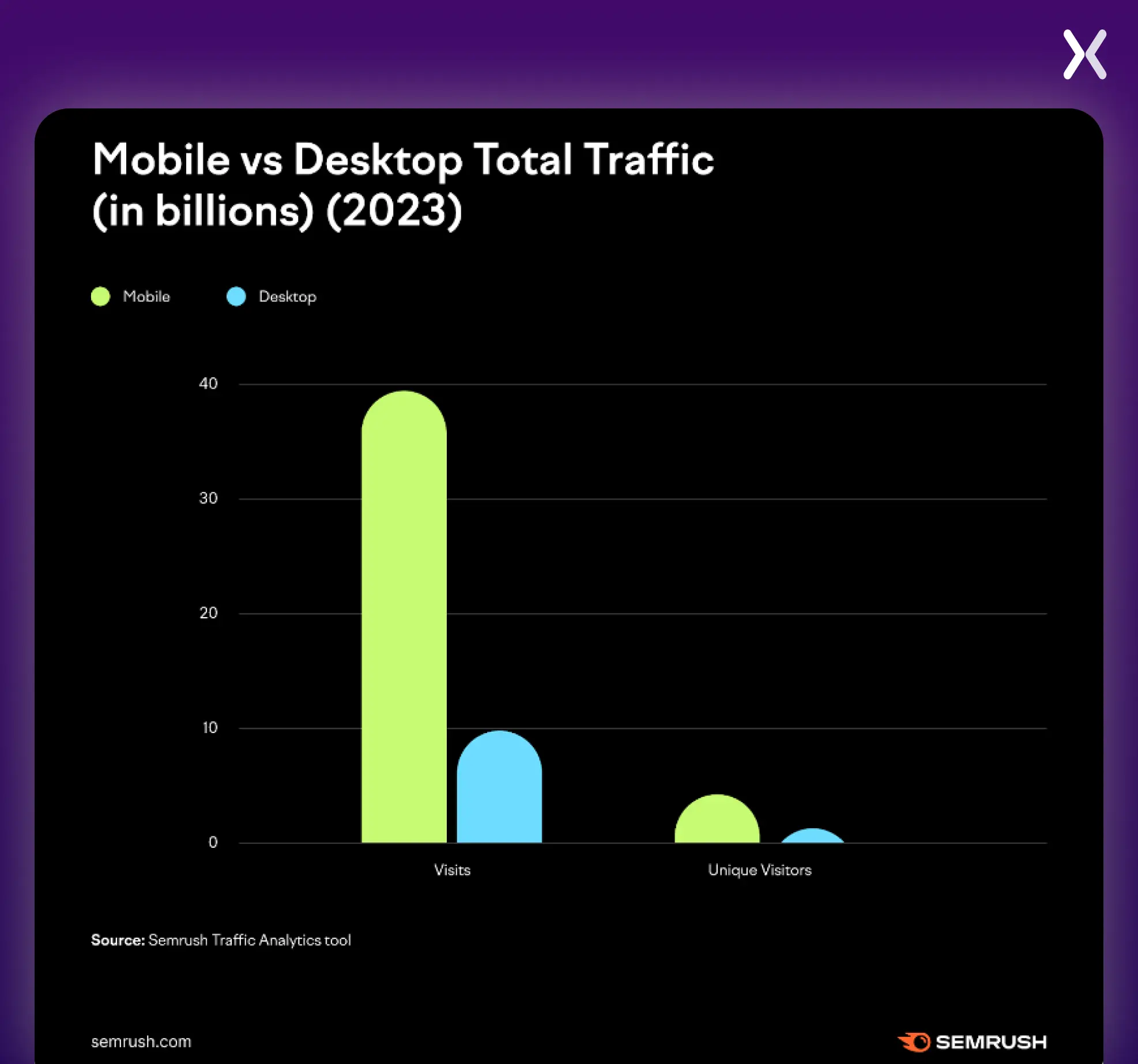
The best landing page is useless in a world without identical devices to access information on the Internet. Failure to address the responsiveness of your entire website will lead to significant losses, including immediate traffic and money spent on setting up the campaign. Let’s not forget that an unresponsive website often won’t reach your unintended audience, leading to a lack of visitors and a higher bounce rate. Yes, getting a responsive website or landing page requires resources, but the investment is worthwhile. It will save you money and time in the short and long term. The importance of landing page optimization across devices cannot be overstated. According to Semrush research, in 2023, the top 100 most visited websites in the US had 313% more mobile visits than desktop visits. Here are some other trends marked by Semrush.
Five key elements of a responsive landing page
A responsive landing page makes sure visitors enjoy the same user experience (UX) expected when accessing their daily email, making a calendar entry, or filling in a simple online form. Your landing page’s responsive design allows users to complete any instruction you give them through the call to action (CTA). Essential aspects of a responsive landing include:
1. Flexible Layouts
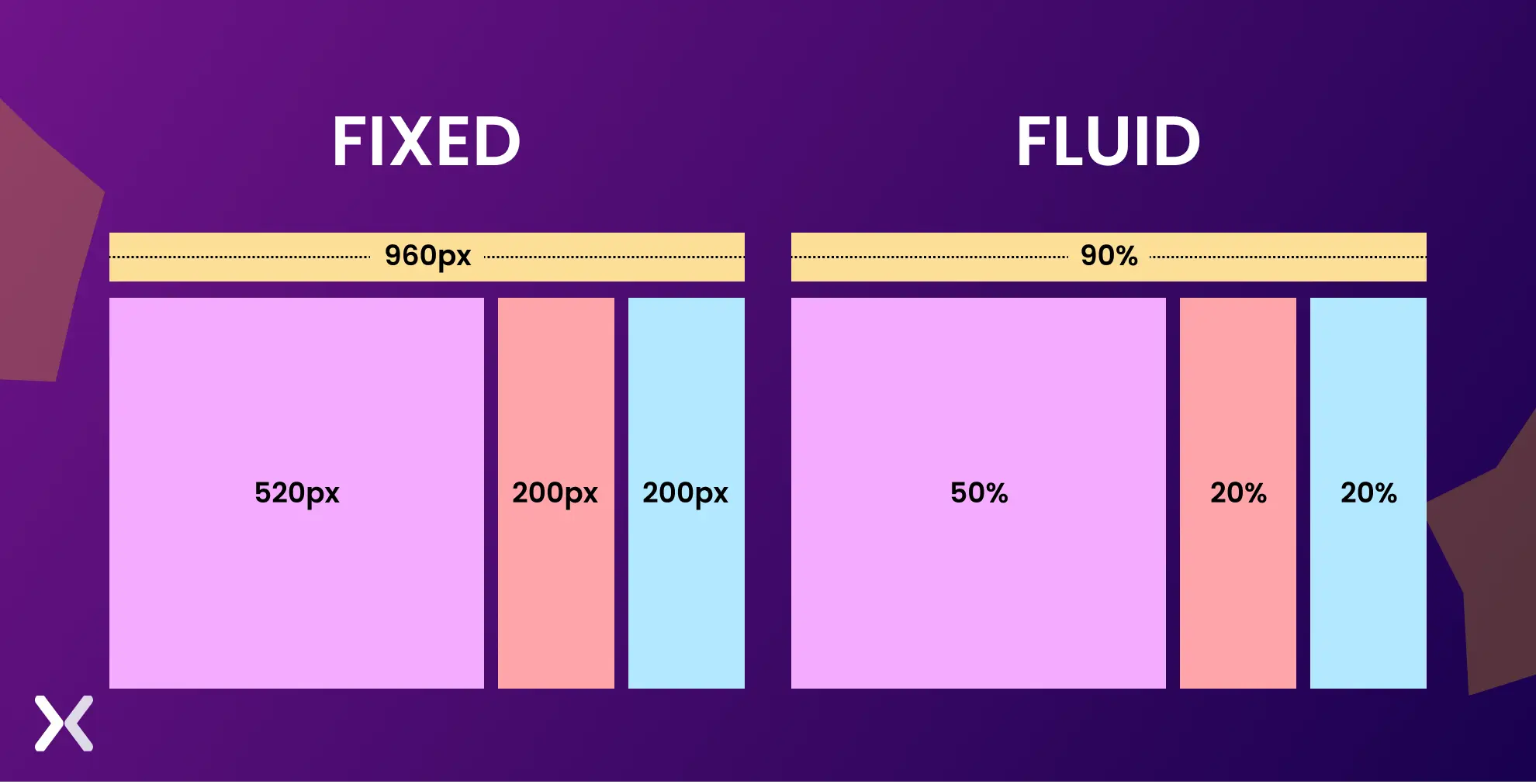
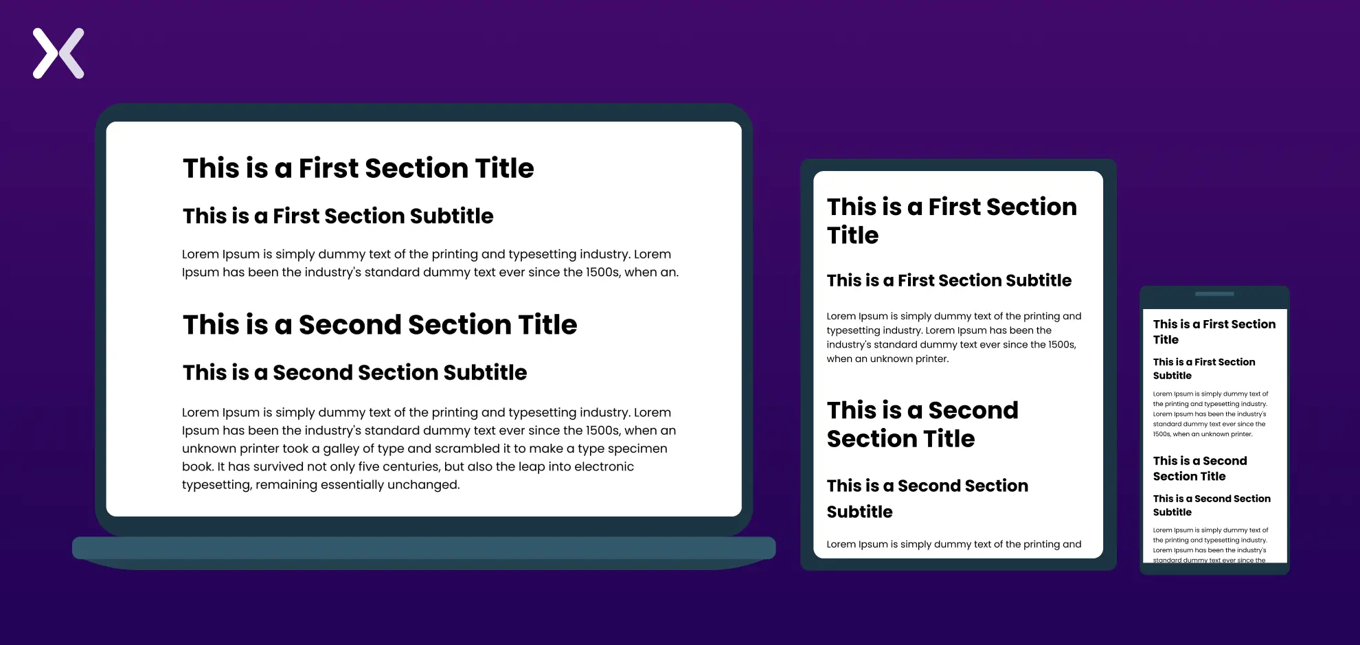
A responsive landing page adapts its layout to the user’s screen size using flexible, fluid grids with percentage-based widths rather than fixed dimensions. In such designs, the columns adjust dynamically to fit various screen sizes. The responsive grid divides available space into columns and rows, providing a scalable and flexible structure for organized content placement. A fluid grid system layouts remain consistent and easily adjustable across different devices, offering a user-friendly experience on any screen resolution.
 It is often achieved through CSS Grid, Flexbox, or media queries. These tools help developers create a design that can move, resize, or even hide certain elements depending on the device used.
-
CSS Grid allows developers to define rows and columns, which can automatically adjust to fit different screen sizes.
-
Flexbox is another powerful layout module that helps elements expand, shrink, and wrap within containers, making it perfect for responsive design.
-
Media Queries allow different styles to be applied at various screen sizes (e.g., a two-column layout on a desktop may collapse into a single-column layout on a mobile device).
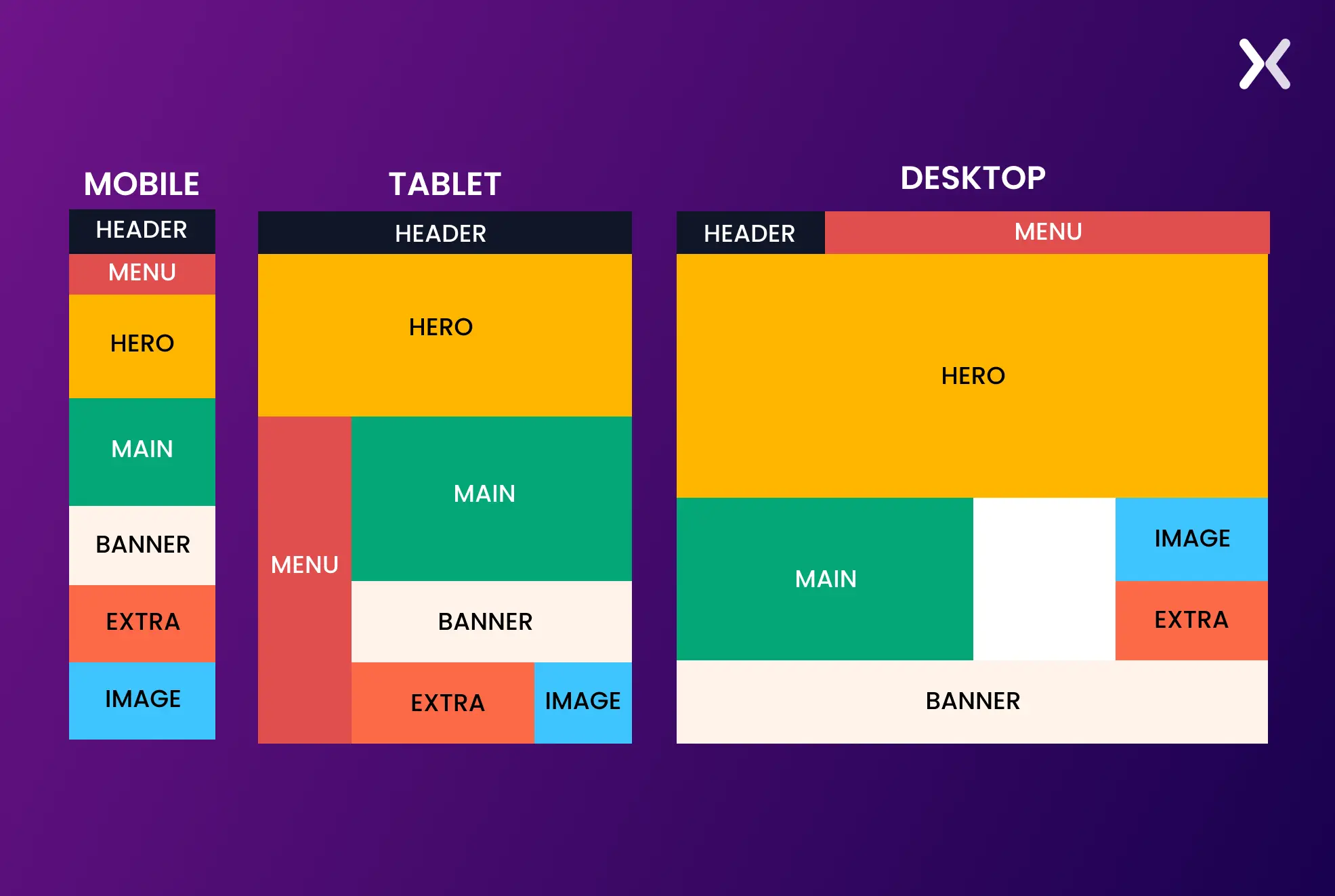 A responsive landing page design keeps the content is easy to move through and remains visually appealing whether a user uses a large desktop or a small smartphone.
2. Adaptive images and videos
Images and videos make up a considerable part of an effective landing page. The impact of an ad landing page should not be affected by badly resized pictures and videos. Here’s how to fix them for a responsive landing page:
Fluid Images
These images scale proportionally within their containers. Instead of using fixed-width images, designers use percentage-based widths (e.g., width: 100%) to enlarge or shrink the image depending on the screen size. For example, on a large desktop screen, an image will take up 50% of the screen, while on mobile. It can enlarge up to 100%.
Video Responsiveness
Embedding videos require unique managing so that they adjust without breaking layouts. Responsive landing pages use techniques like wrapping videos in a box that resizes consistently with the display screen.
3. Responsive Typography
Typography is frequently unnoticed in responsive design but is critical in readability and user experience. Text size, line spacing, and font selections must adapt to the consumer’s device to make sure the content is legible across all display sizes.
Font Sizes
To make text responsive, we need to scale it based on the screen size, making sure it adjusts proportionally to fit different devices for better readability.
line height and spacing
The quantity of space among lines and paragraphs should be optimized for readability. Line height may increase to improve readability on larger screens, while on smaller monitors. It’s adjusted for compact viewing.
Hierarchy and Readability
Headings and frame text on cell gadgets may also require distinctive sizing compared to computer variations. For example, an H1 heading may appear prominent and distinguished on a computing device; however. You may want to cut back on cellular to avoid overwhelming the person with excessively colossal text.
 Good responsive typography guarantees that users can study the content on any mobile, tablet, or computer device.
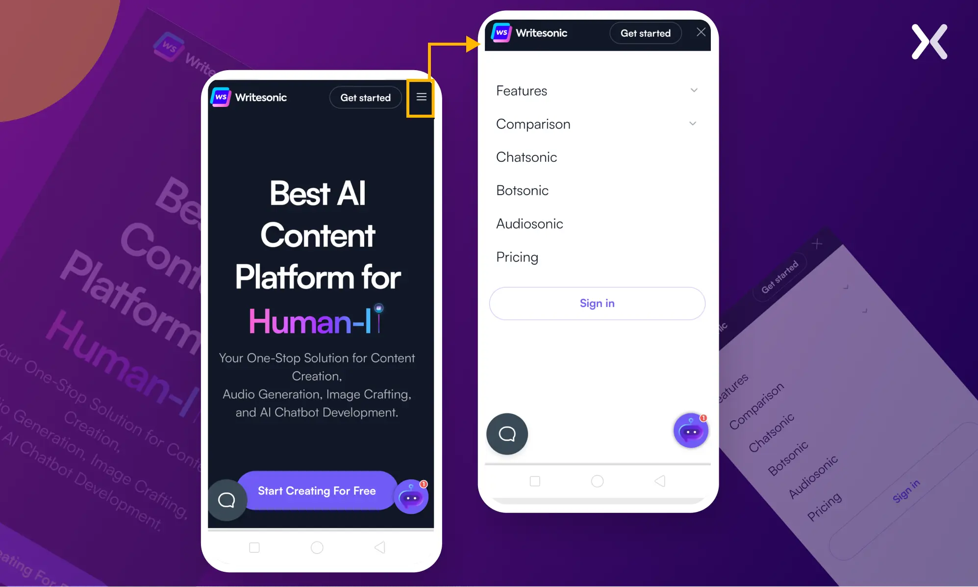
4. Optimized for Touch
In responsive landing pages. It’s necessary to account for touch interactions, especially on cell devices and drugs. This entails designing contact-friendly elements that improve the user experience.
Clickable Elements
Buttons, links, and forms must be large enough to be effortlessly tapped with a finger. A minimum tap target size of 48x48 pixels is recommended as a guideline to make sure users don’t struggle to click on or tap the preferred detail.
Gestures and Navigation
Mobile customers regularly depend upon swiping, pinching, and tapping gestures. Responsive landing pages have to combine effortlessly with those herbal touch-primarily based interactions.
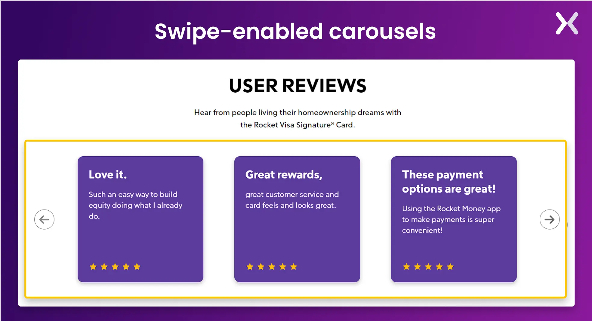 For instance, swipe-enabled carousels or hamburger menus that increase on tap are not unusual.
Forms and Inputs
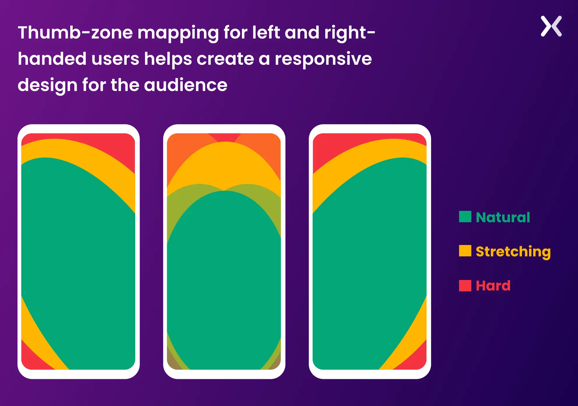
Form fields must be designed to make entering facts on touch gadgets easy. It includes offering sufficient spacing between input fields and buttons, making sure the form fields are large enough to tap, and optimizing input types for mobile (e.g., showing the number keyboard for phone number fields). By optimizing for contact, the landing page presents a simple and convenient consumer experience, particularly for mobile traffic. Here’s a heat map on how you should optimize your design for mobile taps.
5. Performance Optimization
A responsive touchdown web page should load fast on all devices, mainly on mobile telephones where users may have slower connections or confined records.
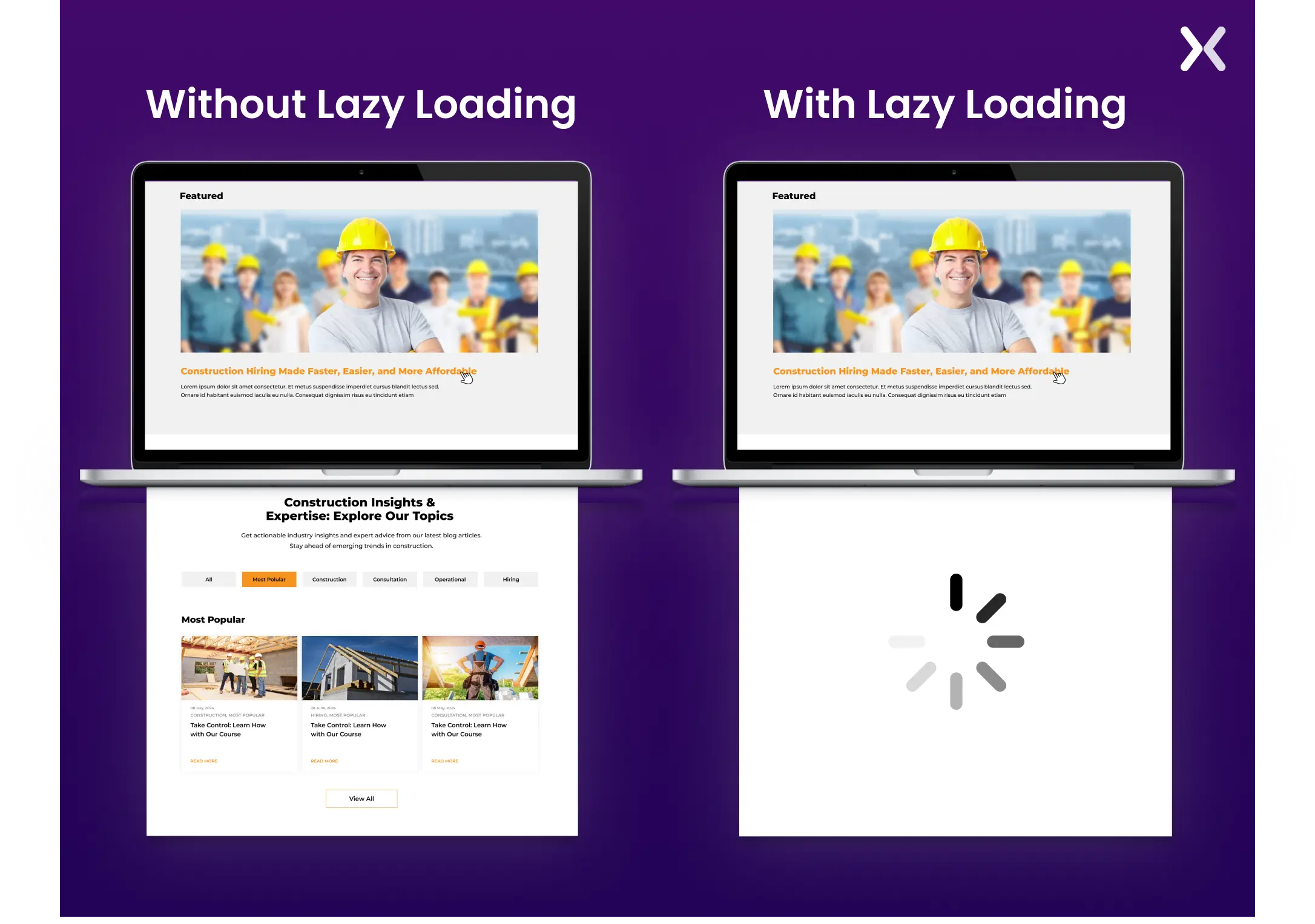
Lazy Loading
This is a method in which pictures and other media load only when visible inside the consumer’s viewport. It reduces the initial web page load time and guarantees that customers don’t need to download unnecessary resources if they don’t scroll through the page.
Minification and Compression
To reduce report length, CSS, JavaScript, and HTML files must be minified (i.e., removing unnecessary characters like whitespace). Compressing pictures, movies, and different media documents guarantees rapid load deductions.
content delivery networks (CDNs)
Using a CDN distributes content to multiple servers worldwide, improving the landing page’s velocity and performance for users in extraordinary locations.
Mobile-First Approach
In many cases, a mobile-first layout strategy is employed, where the layout is first optimized for smaller screens and then improved for larger displays.
This technique keeps the cell experience is as rapid and clean as possible, with larger screen diversifications, including improvements rather than putting off features.
 Making sure fast overall performance on mobile devices reduces bounce costs and maintains customers engaged, which is critical for conversion-focused touchdown pages.
Differences in UX for mobile and desktop
It is essential to continuously consider who you are designing a webpage for and how you expect the user to access the platform. When creating a responsive landing page, you must be mindful of a few critical mobile and desktop UX differences.
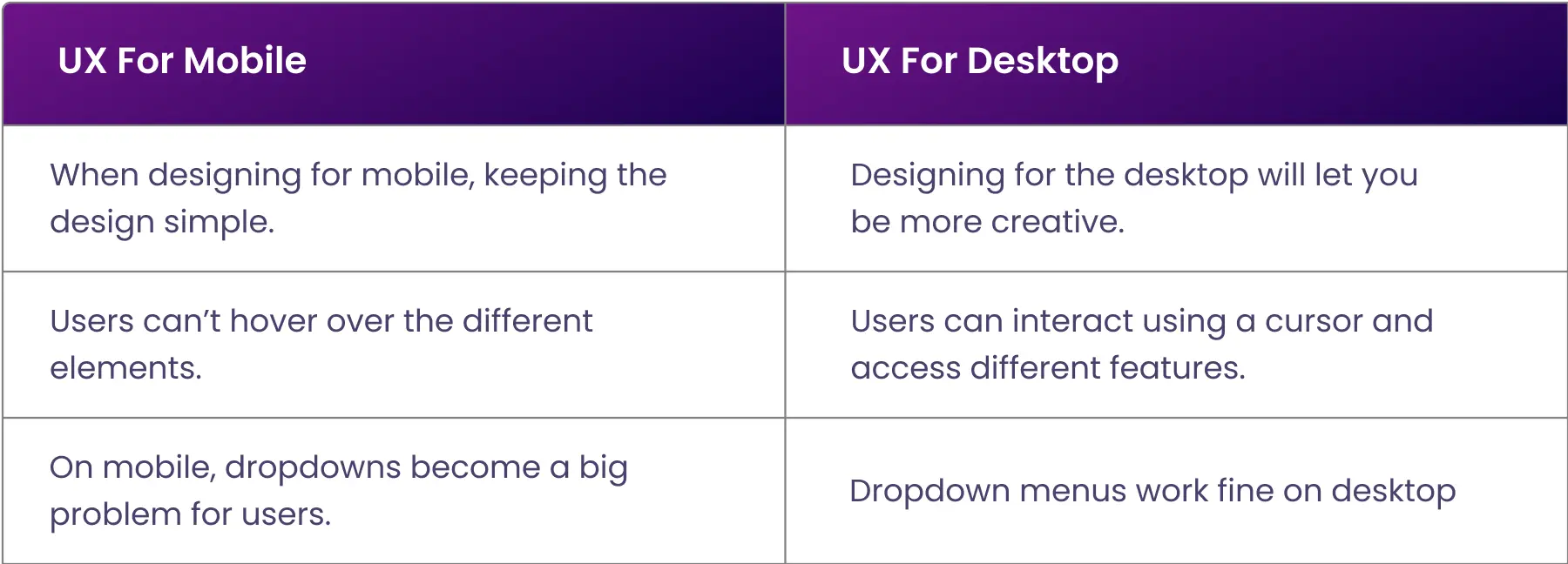
Screen size is limited
It is easy to clutter a landing page with content, visuals, and tasks that might be good for a desktop user but inconvenient for a mobile user. This is not a responsive design.
Ease of typing changes
While typing on a desktop is generally fast and easy for those with touch-typing abilities, mobile devices can make typing tiresome. This is why the excessive typing requirement on a webpage discourages visitors from filling in contact forms and completing other tasks. Checkboxes and drop-down lists create a more responsive landing page and increase the conversion chance.
Buttons are smaller
Here is something interesting: Fitts’ Law states that the smaller the target, the longer it will take for the user to move to the pointer.
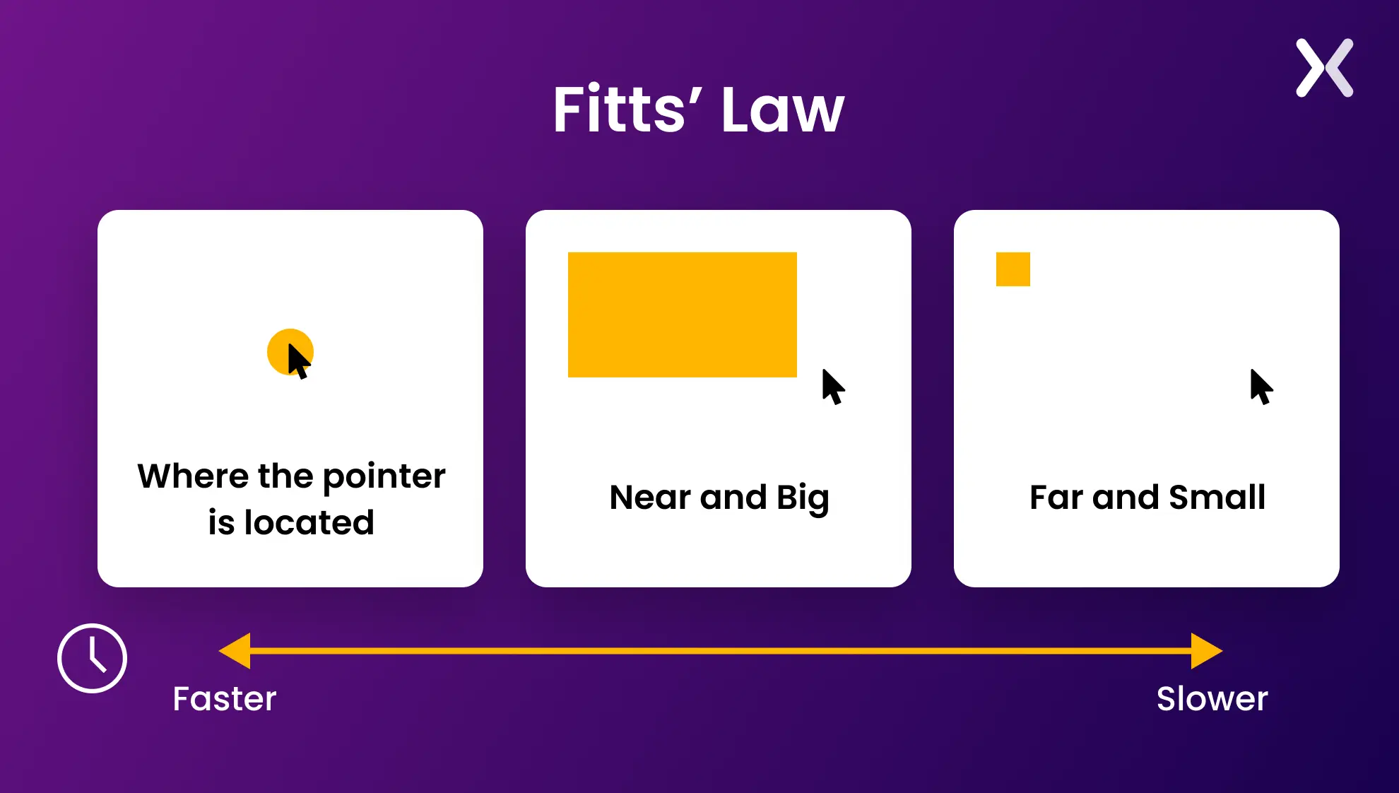 This is because they must be extra careful and attentive to hit the target accurately. So, apply finger-friendly design by optimizing buttons, selection boxes, and icons for mobile users. Using the actual size of a human finger will help avoid touch-target problems.
Image loading is slower
Reduce image dimensions and resolution to keep your website and landing pages fast. Optimizing images for the web saves processing power and limits users’ internet access costs.
Browserstack: a tool to optimize responsive landing page design
As mobile, desktop, and tablet designs evolve, creating responsive designs becomes more challenging. Understanding how your page behaves on various screens is necessary to optimizing it.
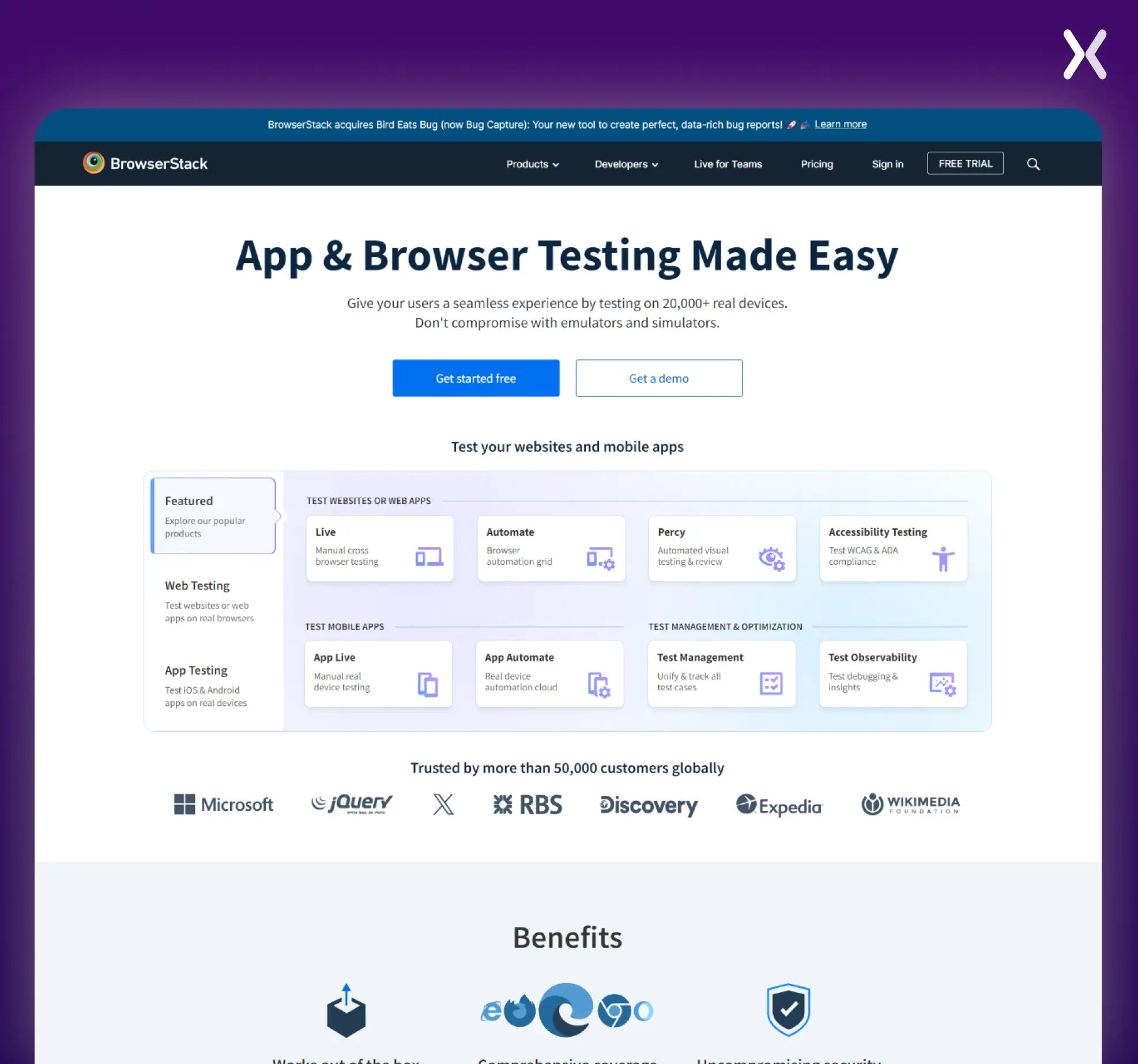 To make things easier, BrowserStack is a platform that helps test websites and mobile apps across over 3,000 real devices and browsers. It provides manual and automated testing tools, enabling teams to debug and make sure compatibility without using emulators or simulators.
Features include live cross-browser testing, mobile app testing, visual regression testing, and accessibility testing. Integrating with popular Jira, Slack, etc., BrowserStack makes it easier for teams to release error-free software faster.
To make things easier, BrowserStack is a platform that helps test websites and mobile apps across over 3,000 real devices and browsers. It provides manual and automated testing tools, enabling teams to debug and make sure compatibility without using emulators or simulators.
Features include live cross-browser testing, mobile app testing, visual regression testing, and accessibility testing. Integrating with popular Jira, Slack, etc., BrowserStack makes it easier for teams to release error-free software faster.
Is the above the fold (ATF) section important?
Ironically, the phrase “Above the fold” originates in the print industry. It refers to the space above the crease in the newspaper. In the landing page context, this applies to all the content you view before you scroll down. The ATF section is your only opportunity to grip visitors with precise content and persuade them to view the rest of your landing page. Every product is different, and every owner wants to achieve various objectives so that no universal law can be applied to every case.
 This is why it’s best to apply A/B testing and find out what attracts your audience.
Take the time to plan your ATF section and consider the following:
This is why it’s best to apply A/B testing and find out what attracts your audience.
Take the time to plan your ATF section and consider the following:
-
Powerful headline
-
Supporting sub-header
-
Benefits
-
Call-to-action
-
Social proof
Long vs short landing pages
Whether to have a long or short landing page is a critical point to consider, and you are the best person to provide the answer. You must undergo a careful process of trial and error to discover what your audience best responds to. There are two different kinds of consumers, each requiring different explanations.
-
In-depth explanations provide clarity, enabling them to develop a desire for products. They genuinely want to know how things that concern them work.
-
These users prefer adequate but minimal details and avoid lengthy explanations and paragraphs. Brief explanations give them a strong desire for products or services. However, this must not be confused with failure to provide enough information. Creating a responsive landing page is all about being aware of your audience’s behavior patterns (online and offline) and the fundamental differences regarding how websites and landing pages are viewed across multiple devices and browsers. Don’t forget, your thank you pages should be just as responsive to make sure a smooth and consistent user experience from start to finish.
Ready to build a responsive landing pages?
Creating a responsive landing page delivers a smooth user experience across all devices. By incorporating flexible layouts, adaptive media, responsive typography, touch-friendly design, and optimizing for performance. You can create a landing page that looks great and functions well, whether viewed on a desktop or a smartphone. Prioritizing responsiveness improves user engagement and improves conversion rates, making it a critical element of modern web design.
Related Articles: