Analyzing SaaS landing page examples directs you toward creating a campaign optimized for conversions. However, with countless SaaS brands and an overwhelming number of landing pages to review, it’s easy to overload your design with every tactic you encounter. This often leads to cluttered, ineffective layouts. It then becomes necessary to be selective about the brands you’re picking to take SaaS landing page inspiration from and focus on proven strategies. In this blog post, we have covered some of the most popular SaaS landing page examples from top SaaS brands and picked out the key elements they consistently use. By focusing on these time-tested components, you can create simplified and effective landing pages that prioritize clarity and results, without falling into the trap of over-complication.
11 SaaS landing pages examples from top SaaS brands
Let’s directly start by analyzing some landing pages that top SaaS brands use and what makes them unique. We’ll examine each design, explore the different elements, and explain how they work. Overall, most of the SaaS landing page examples have commendable accents and solid takeaways. For your SaaS landing page inspiration, you can use similar tactics.
Let’s go!
1. Figma
Over the years, Figma has established itself as one of the premier tools for collaborative design, helping teams to work smoothly together. This versatile SaaS platform offers a full suite of features, including prototyping, wireframing, and an extensive array of design tools to meet virtually every creative need. Their leading PPC SaaS landing pages are deliberately designed around the specific services they offer. While they maintain a consistent style and layout, each page is tailored to address distinct pain points, using strong visuals and persuasive copy to engage and match their target audience.
Common elements on Figma SaaS landing page examples
- Strong Top Fold
All three SaaS landing page examples start with a strong top fold that adheres to one of the golden rules of PPC: making sure visitors immediately know they’ve landed in the right place after clicking the ad.
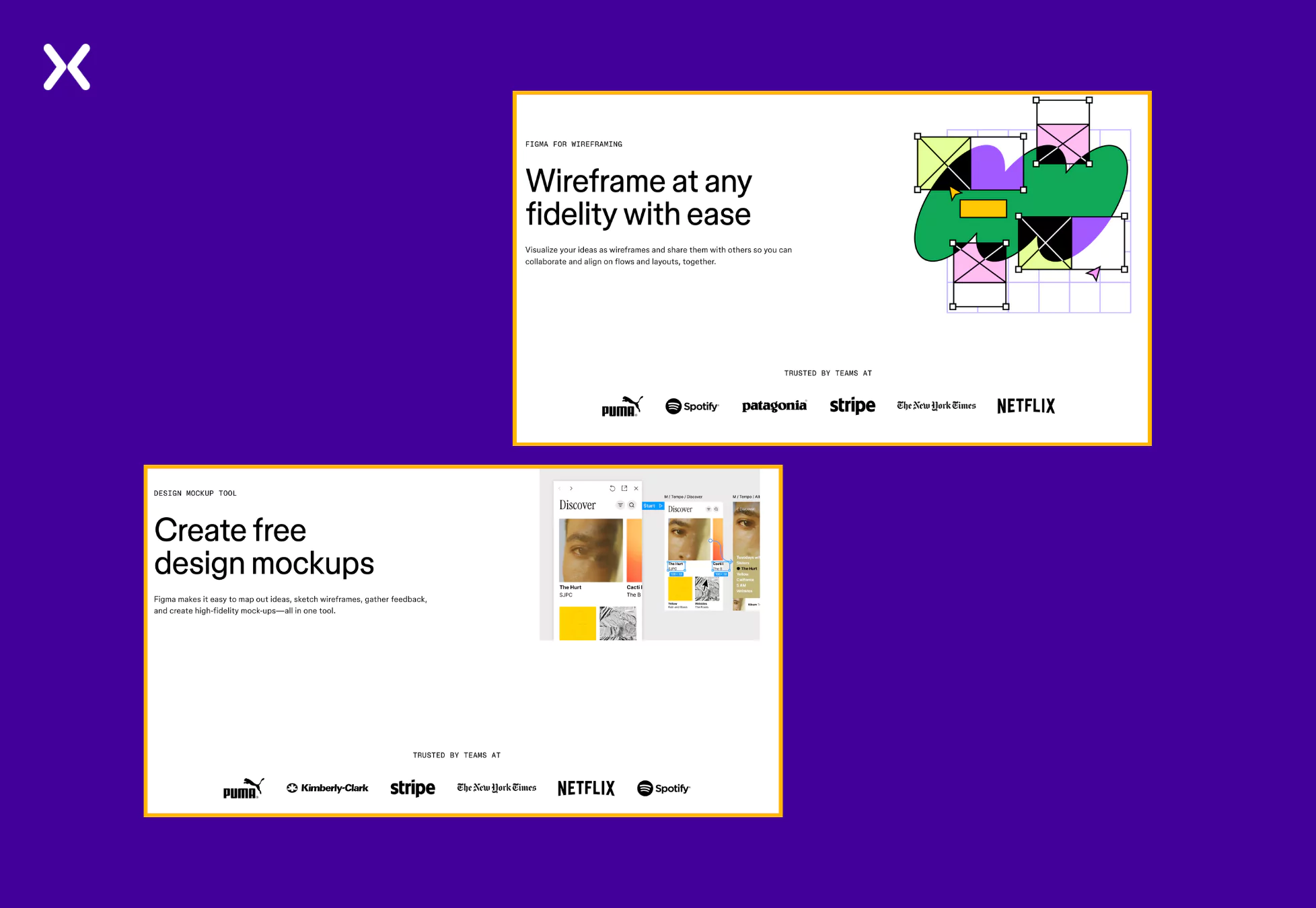 Whether the page accents a mockup, wireframe, or the tool itself, the first fold effectively introduces the promoted service, combining concise, effective copy with visually appealing elements. Each top fold concludes with a trust badge section, offering strong social proof that smoothly integrates with the page’s clean, minimalist design.
- Specific Product Visuals
We can all learn something about using product visuals from these SaaS landing page examples. The visuals aren’t random or generic. They are thoughtfully matched the services offered and avoid unnecessary repetition.
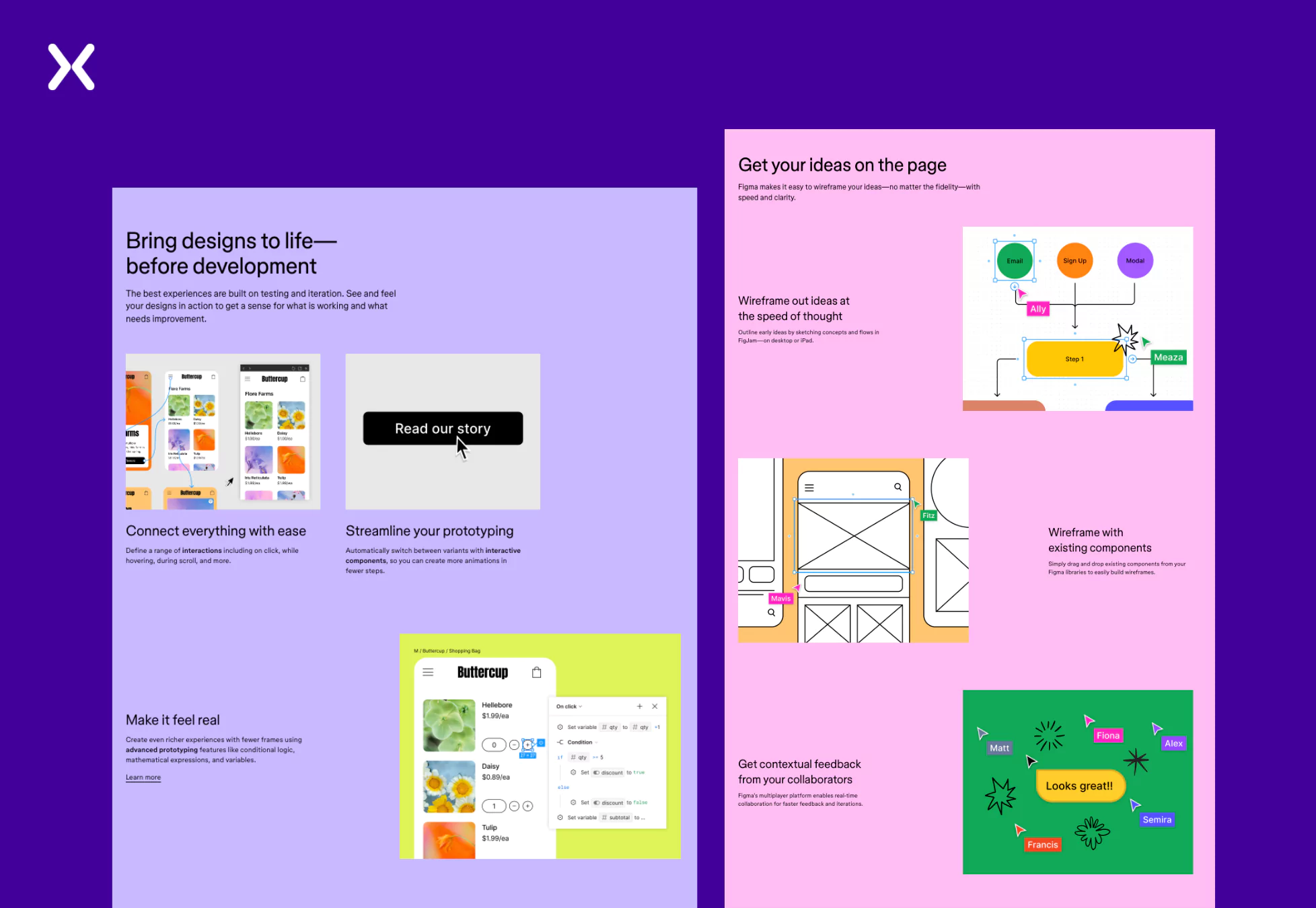 Each visual introduces a fresh perspective on the product, complementing the copy smoothly. This thoughtful approach keeps the copy concise, as the most important information is delivered visually, resulting in a clear and engaging user experience.
- Gifs Inclusion
Are you considering including a long-form video on your SaaS landing page? Instead, you can include gifs like Figma has extensively done on their landing pages.
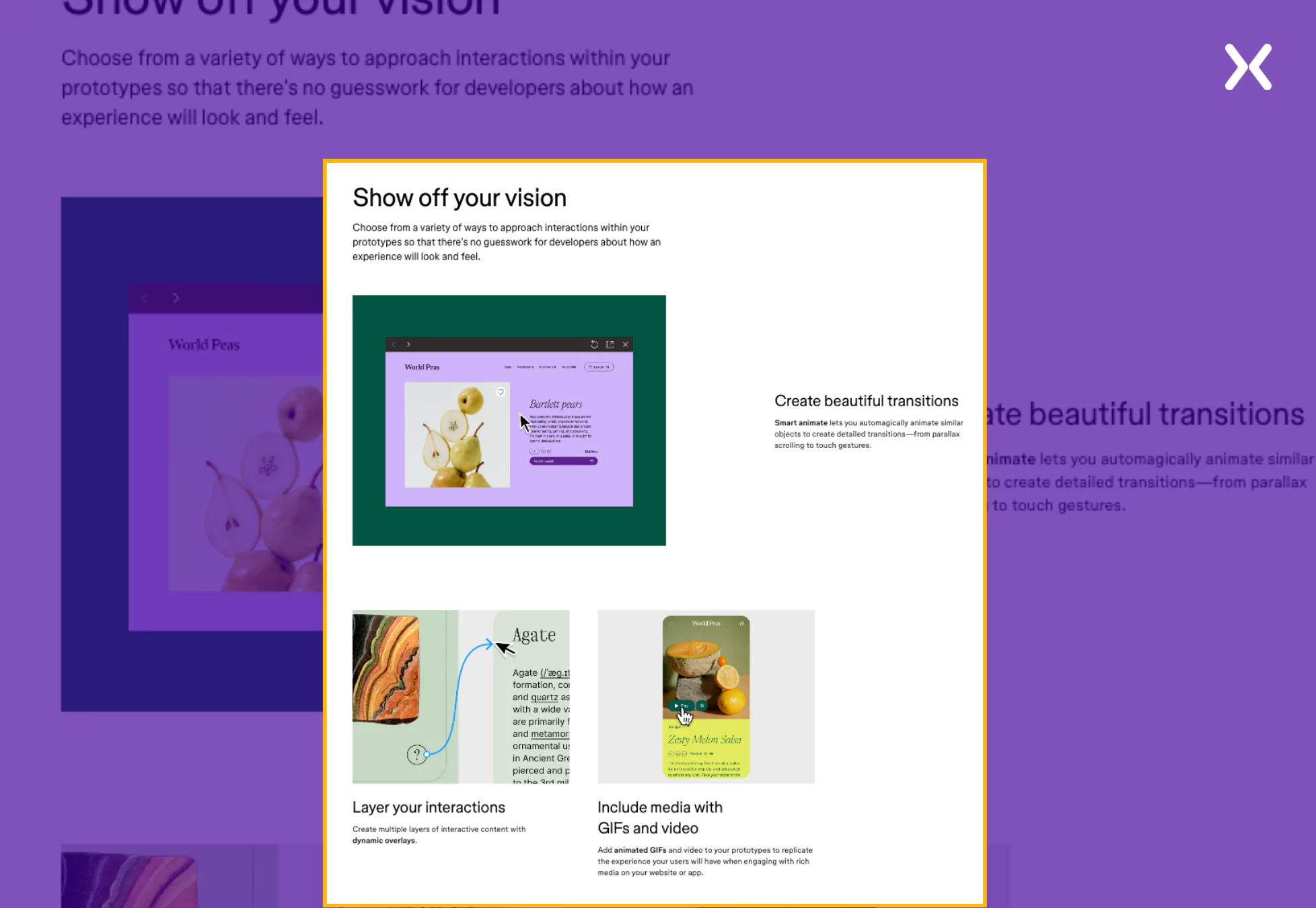 Everything necessary related to the feature in focus has been communicated through gifs with complementing imagery and copy.
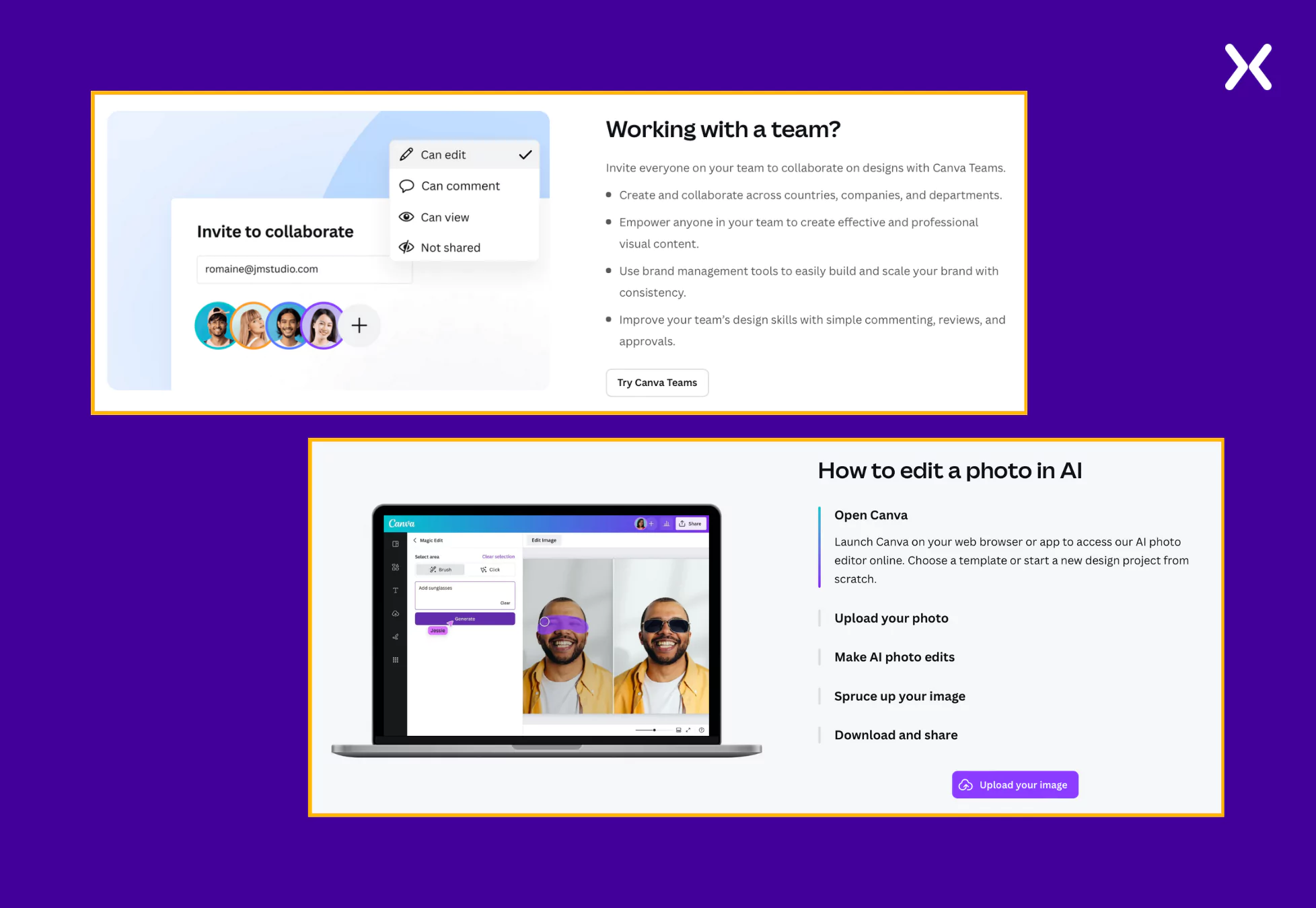
2. Canva
Canva is a user-friendly graphic design platform that allows individuals and businesses to create professional-quality designs easily. It offers a wide range of templates for social media posts, presentations, and marketing materials, making design accessible to everyone, regardless of experience. All of Canva’s landing pages are unique in style and layout. Each of Canva’s landing page examples is carefully crafted for its specific audience, making sure that every element is deliberately chosen to create maximum impact and drive engagement.
Common elements on canva SaaS landing page examples
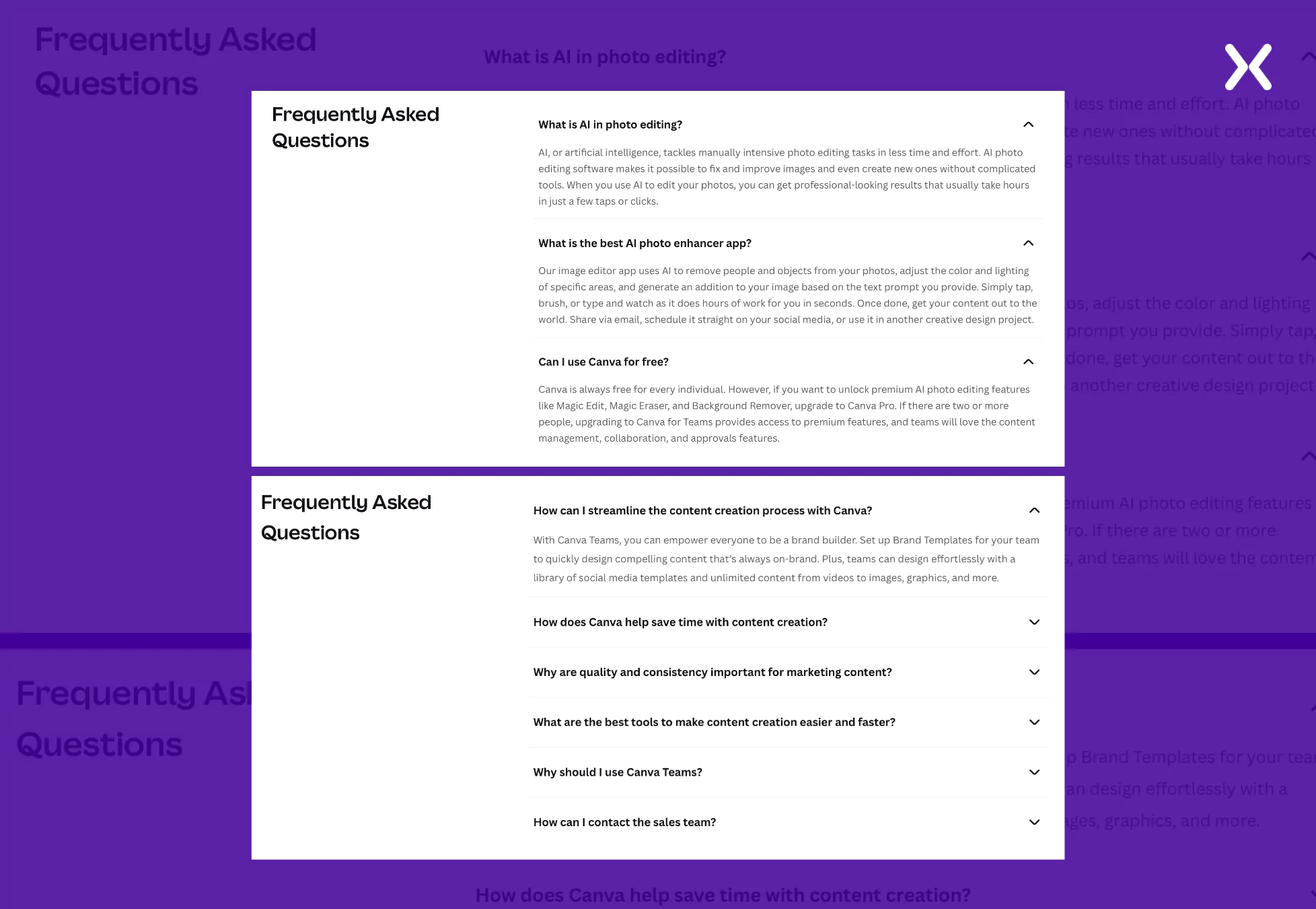
- Exhaustive FAQs
Canva put themselves in the shoes of their SaaS landing page visitor for a second and created a set of specific questions they might have after going through the landing page content. By listing these, the SaaS brand gives the viewer queries recognition and answers, which works excellently for winning over their trust.
- Creative Copy
Canva doesn’t shy away from using much text on their landing pages. With the help of good copy and complementing visuals, the SaaS makes sure every reader truly understands the benefits behind every feature and also how they can easily use it.
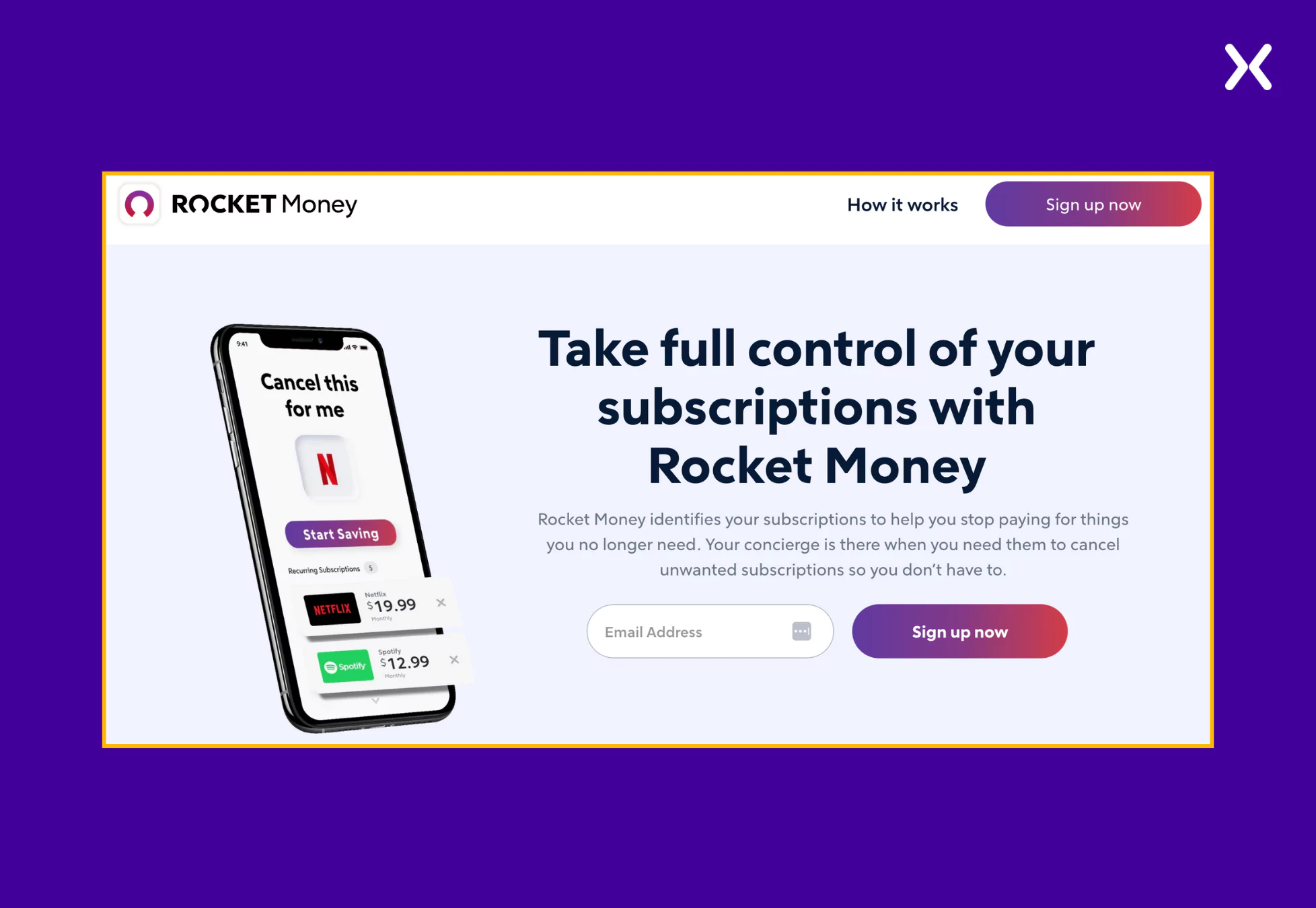
3. Rocket Money
Rocket Money is a budgeting and bill management app that helps users track and manage their money. It includes various features and tools to help users keep track of their spending, set financial goals, and pay bills on time. Most of the SaaS landing pages have been kept to the point. Their pages use kicker texts and clever copy to convey the product’s value.
Common elements on rocket money SaaS landing page examples
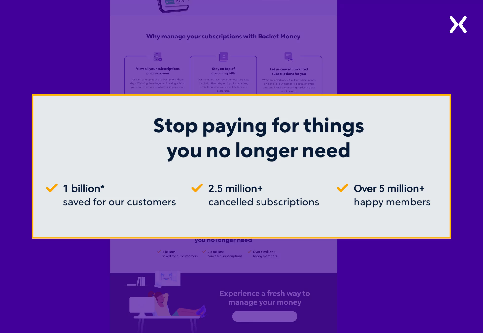
- Presents the SaaS in action
Similar to showing images of the actual application, this shows a demo before viewers have asked to have one. Showing your excellent UI/UX in full motion could help engage and convert visitors, so this should be a option.
- Quantifying Social Proof
Big numbers, strong percentages, exciting metrics. These can be impressive statements on how well your service is performing for your clients, how much their revenue has increased since implementation, etc.
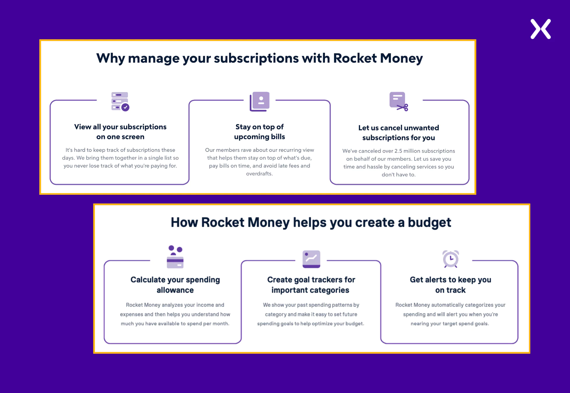
- Marking USPs
‘if you can’t explain it simply. You don’t understand it well enough’ is how the saying goes. Explaining your SaaS service in 3 / 4 steps makes it easy to digest and engages the viewer to learn more, and you will find this on most of the SaaS landing pages. The depth can follow later, after the conversion.
 Rocket Money’s landing pages share a typical design structure, with primary variations in the copy and hero images. These elements are deliberately tailored to match the target keywords of the PPC campaigns each landing page supports.
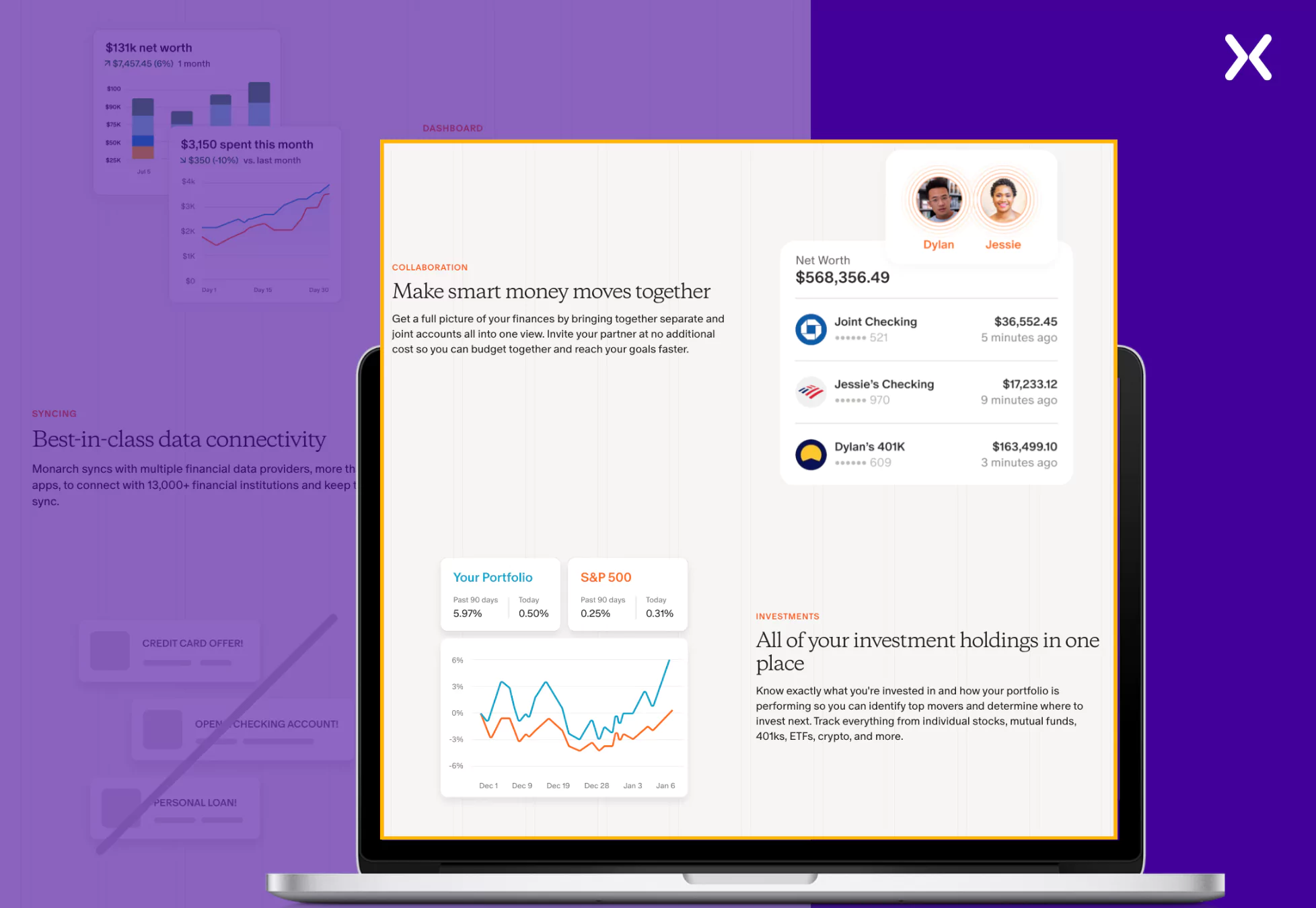
4. Monarch Money
Monarch is a powerful money management tool designed for couples, advisors, etc., providing clarity and control over their finances. It offers budgeting, tracking, and planning tools to help users gain clarity and achieve their financial goals. Interestingly, Monarch Money, a competitor of Rocket Money, follows a similar approach by reusing a consistent layout across most of its landing pages. However, it introduces subtle variations in the copy to align it with the target keyword.
Common elements on monarch money SaaS landing page examples
- Marked USPs
The USPs are marked with the help of images from the app, which present the intuitive user interface, smooth navigation, and the powerful features that set it apart from other financial management tools.
- Final CTA Banner
Monarch Money’s SaaS landing page examples feature a strong closing call-to-action (CTA) banner, a key element for driving conversions.
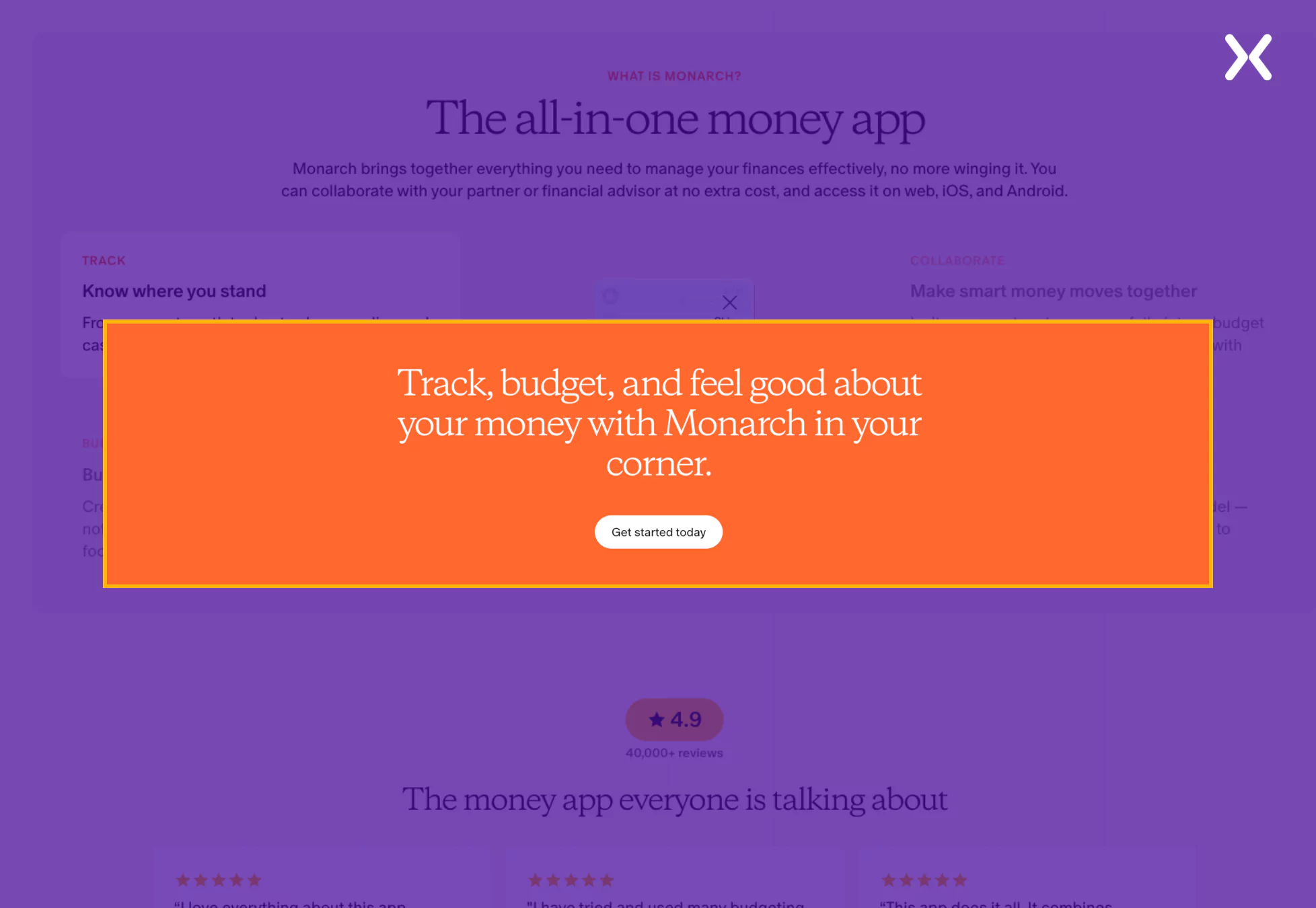 This final CTA is a clear and strong prompt, offering visitors a simple next step and making sure the landing page meets its goal of encouraging user engagement and action.
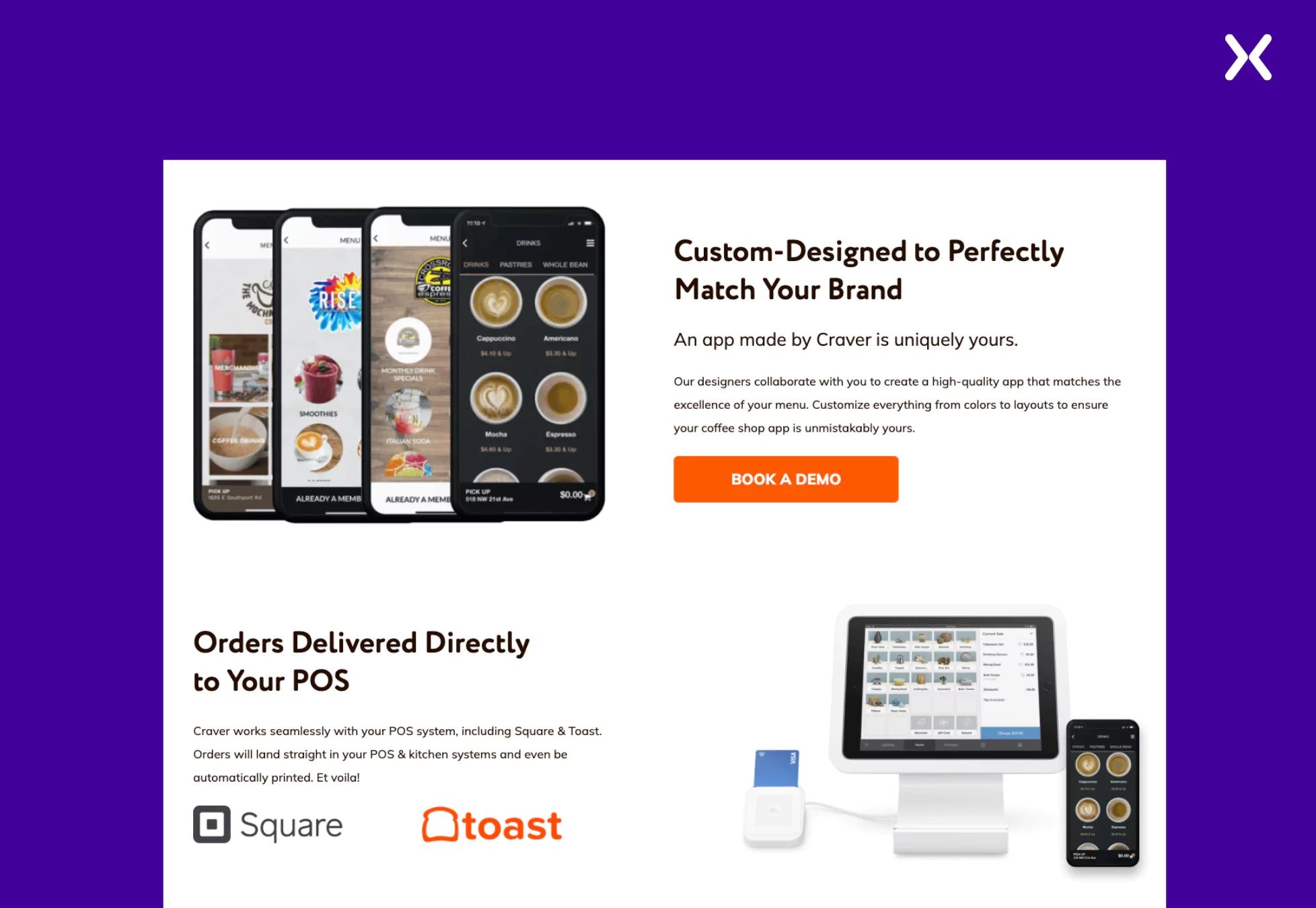
5. Craver
Craver is a mobile app platform specifically designed for restaurants. It aims to help restaurants increase customer engagement and lifetime value through an omnichannel approach, including mobile apps and online ordering. Their SaaS landing pages examples incorporates all essential elements with an exceptional layout and a engaging color palette.
Common elements on craver SaaS landing page examples
- Clear Imagery
The landing page uses clear images and icons that perfectly complement the copy and the precise look of the page. They have consistently marked their SaaS’s mobile UI/UX, presenting its intuitive design and user-friendly experience.
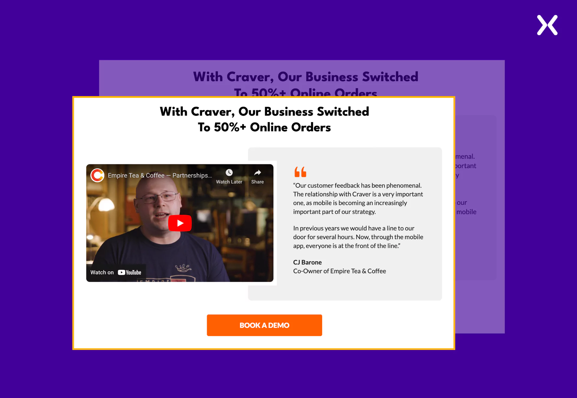
- Right Social Proof
It can sometimes be challenging to present social proof creatively, but Craver’s SaaS landing page examples does so effortlessly. They have presented all the clients they are working with while also marking the necessary USP of custom designs.
- Opt-in Checkbox
Craver has added a consent checkbox above the CTA on all their landing pages.
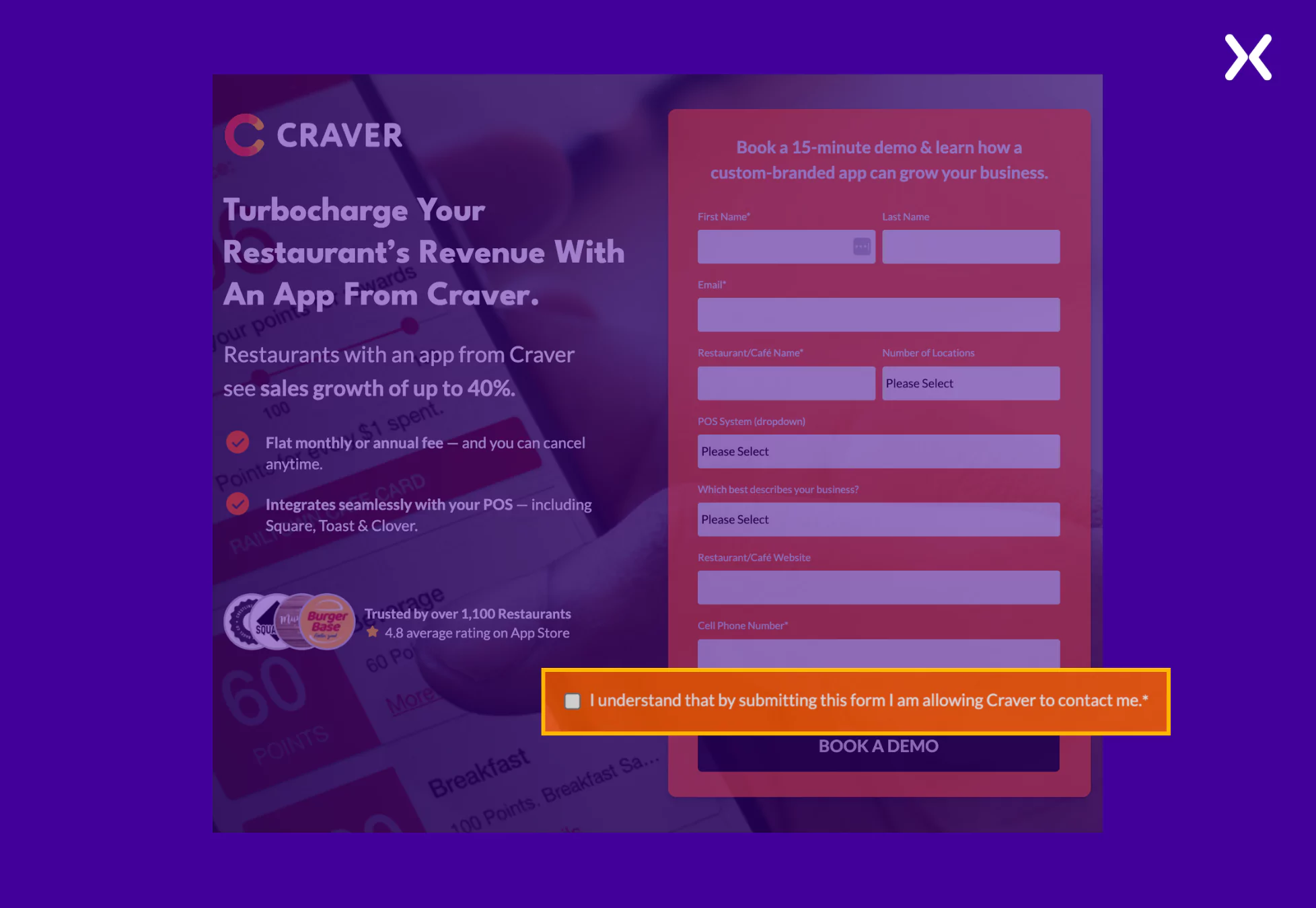 It promotes transparency, builds trust by respecting user autonomy, makes sure compliance with privacy laws, and improves credibility while building a positive user experience.
6. Monday
Monday.com is a cloud-based work operating system that helps teams manage projects, tasks, and workflows. It offers customizable boards, visual dashboards, and automation to improve collaboration and productivity. The SaaS landing page examples of Monday.com follow a consistent layout, maintaining a cohesive design across various campaigns. However, the imagery and copy are tailored to match the specific promoted service. This approach makes sure that each landing page matches the targeted audience while still using the brand’s recognizable structure and style.
Common elements on monday SaaS landing page examples
- Show Your Social Proof
Monday goes all out when sharing their social proof across their SaaS landing page examples. The necessary aspect to notice here is that they have not lumped the testimonials, trust badges, etc., into just a section of the landing pages but instead spread it across sections to increase impact.
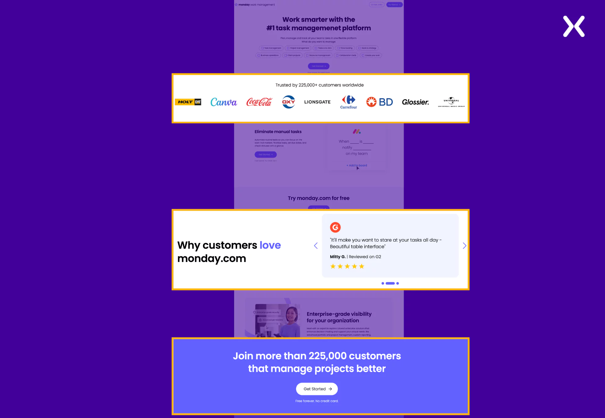
- Using Supporting Text
“Free forever. No credit card.” Right after the CTA, this phrase is designed to reassure users that the service offered is genuinely free and does not require sensitive financial information like credit card details.
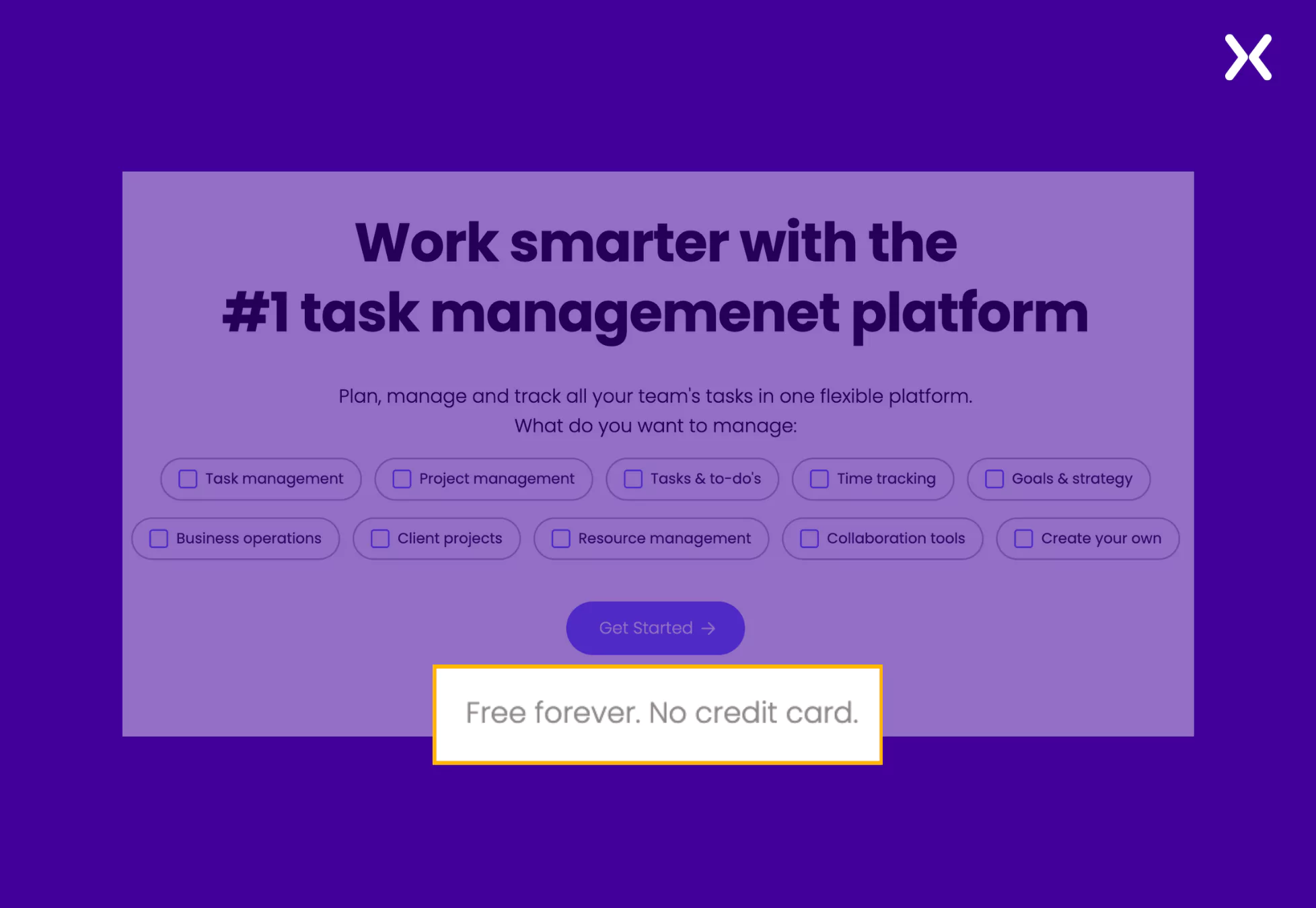 It eliminates concerns about hidden charges or automatic billing, which makes it particularly useful for encouraging first-time users to sign up and try the service without hesitation. This transparency builds trust and reduces friction in the onboarding process.
- Using Tabs
In all their SaaS landing page examples, Monday uses tabs to create more whitespace, keep the layout clean, and maintain a concise page design. This approach makes sure that every USP is marked in its own section without overwhelming the visitor or making the page excessively long, helping retain attention and improving user engagement.
7. ClickUp
ClickUp is a project management tool that helps teams stay at the top of their projects without being stuck in constant meetings. With a multitask toolbar, real-time reporting, and many other features, ClickUp has become a go-to productivity tool for teams. Just like Monday, their SaaS landing page examples are short but powerful. In all the SaaS landing page examples of ClickUp. There’s clearly a strong emphasis on messaging in the top fold of their landing pages. Each top fold is creatively designed to deliver all the essential information at a glance, making the page concise and effective. This strategic approach makes sure visitors quickly grasp the value proposition, improving user engagement while keeping the content succinct.
Common elements on ClickUp SaaS landing page examples
- Transparent AI Assistance
ClickUp clearly labels the chat as operated by an AI assistant rather than an actual human, a commendable approach for maintaining transparency. By setting clear expectations, this practice builds trust with visitors and avoids potential frustration, making sure users understand they are interacting with a bot from the start.
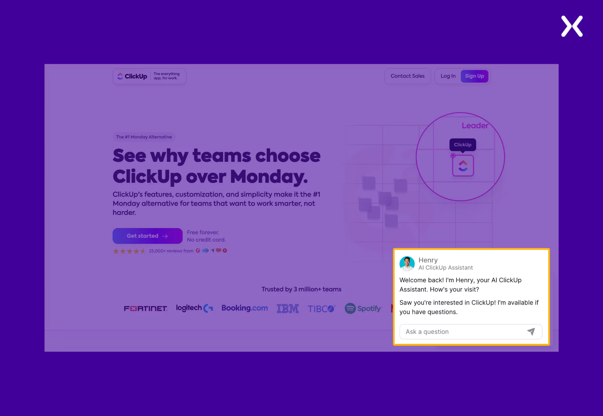
- Powerful Top Fold
This is the second time we have mentioned how a top SaaS brand focuses on its top fold and makes sure the message gets communicated in the first impressions. ClickUp deliberately places supporting text and social proof around its call-to-action (CTA) to build trust and encourage conversions.
 By incorporating bullet points in the top fold, they accent their unique selling points (USPs) in a clear, concise, and easily digestible format, making sure visitors quickly understand their value proposition.
8. Hubspot
HubSpot is a leading customer relationship management (CRM) platform that provides marketing, sales, customer service, and operations tools. Its all-in-one solution is particularly popular among small and medium-sized businesses for simplifying workflows and improving customer experiences. Most of their SaaS landing page examples adhere to a consistent formula, likely refined through extensive testing. This standardized layout is now a staple across many of their popular pages, suggesting it effectively matches their audience and drives results.
Common elements on hubspot SaaS landing page examples
- Action-Oriented CTA
Hubspot landing pages prominently feature CTAs encouraging users to “Get started free,” guiding visitors toward immediate engagement with HubSpot’s offerings. The word ‘Free’ makes the CTA even more intriguing and likely to be clicked.
- Customer Logos
All SaaS landing page examples by Hubspot display logos of well-known companies that use HubSpot, such as DoorDash and the Canadian Red Cross, serving as social proof to build trust with potential customers.
 Also, Hubspot’s SaaS landing page examples had a final CTA banner, which we also saw on Monarch Money’s landing pages.
9. Zoho
Zoho is a full suite of cloud-based business tools designed to simplify operations across marketing, sales, customer service, and more. Its user-friendly interface and customizable features make it a popular choice for managing workflows, automating processes, and driving growth efficiently.
Common elements on zoho SaaS landing page examples
- Slick Form Design
Zoho’s landing pages fashion a short design requiring only necessary details. It takes away conversion friction and encourages visitors to take quick action.
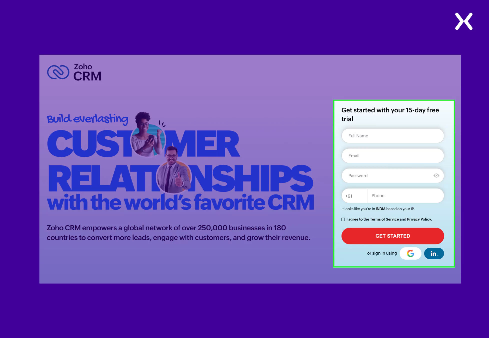
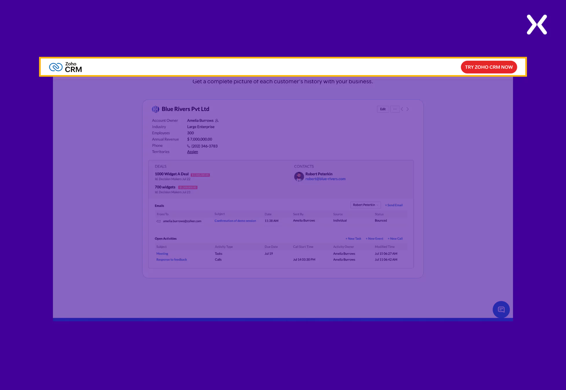
- Sticky Bar With The CTA
Indeed, you can’t put a CTA right after every landing page section. But you can use a sticky bar with the CTA, just like Zoho, to make sure visitors don’t have to search for the CTA button when they finally feel like converting.
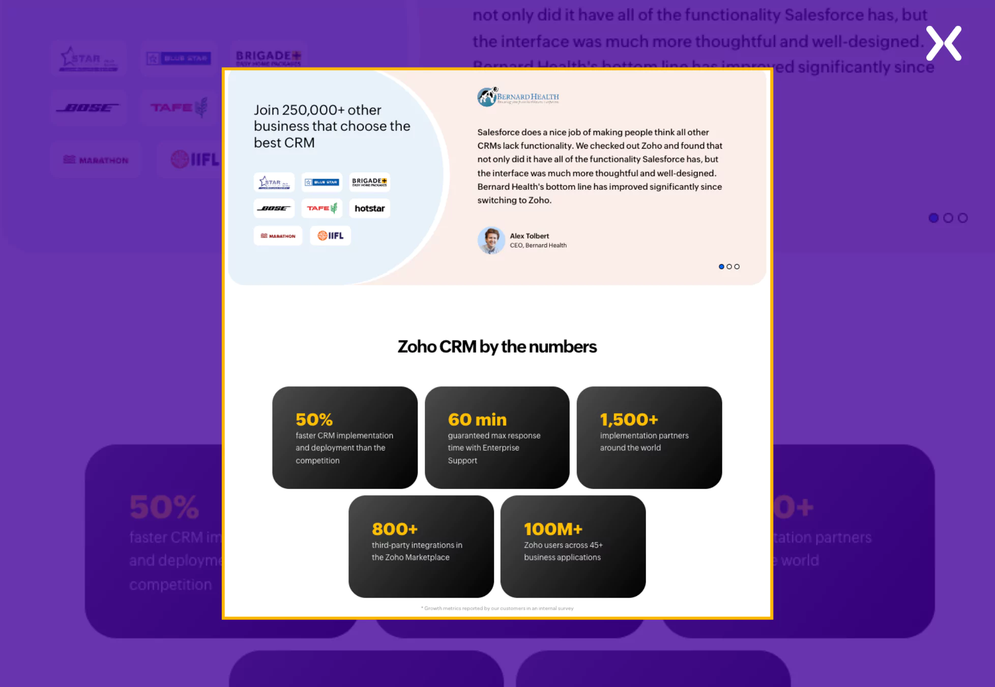
- Customer Testimonials and Trust Indicators
Each page includes testimonials or mentions of customer satisfaction, building credibility and trust with potential users.
Takeaways to remember from SaaS landing page examples:
All SaaS landing page examples are heavily optimized for conversion and user experience, be it a free trial, book a demo, subscription page, or any other SaaS page, so they are continually tested and tweaked to determine what works best for their users. Consider A/B testing different headlines, CTA button variations, or page layout variations to determine which version performs better. To understand what matches best with your audience, test out gifs, videos, and animations to find out what works best for you. Remember, however, that you should continuously optimize your SaaS landing pages for mobile and desktop devices when designing them. Other ‘No Nos’ for creating high-performing SaaS landing pages:
-
Is there hidden social proof that people are excited about your product? Sharing other buyers’ unique experiences is the best way to sell your products, so don’t keep it a secret.
-
Do not copy and paste images from the homepage or service pages without considering how they will look on the landing page. Rather than adding context to the copy, visual aids just fill the space.
-
Bad CTAs like “Learn more about the product” aren’t going to captivate viewers.
Top SaaS landing page examples common elements
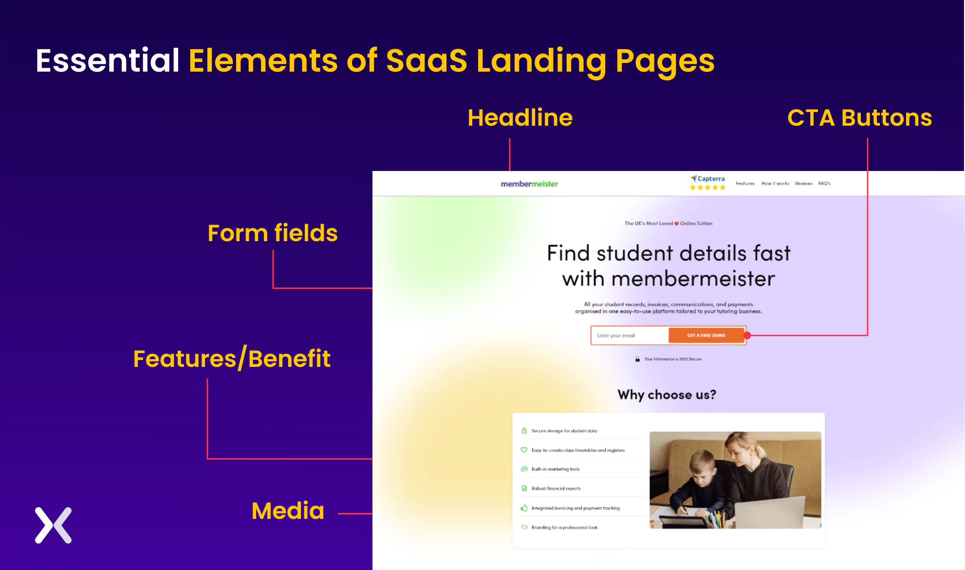
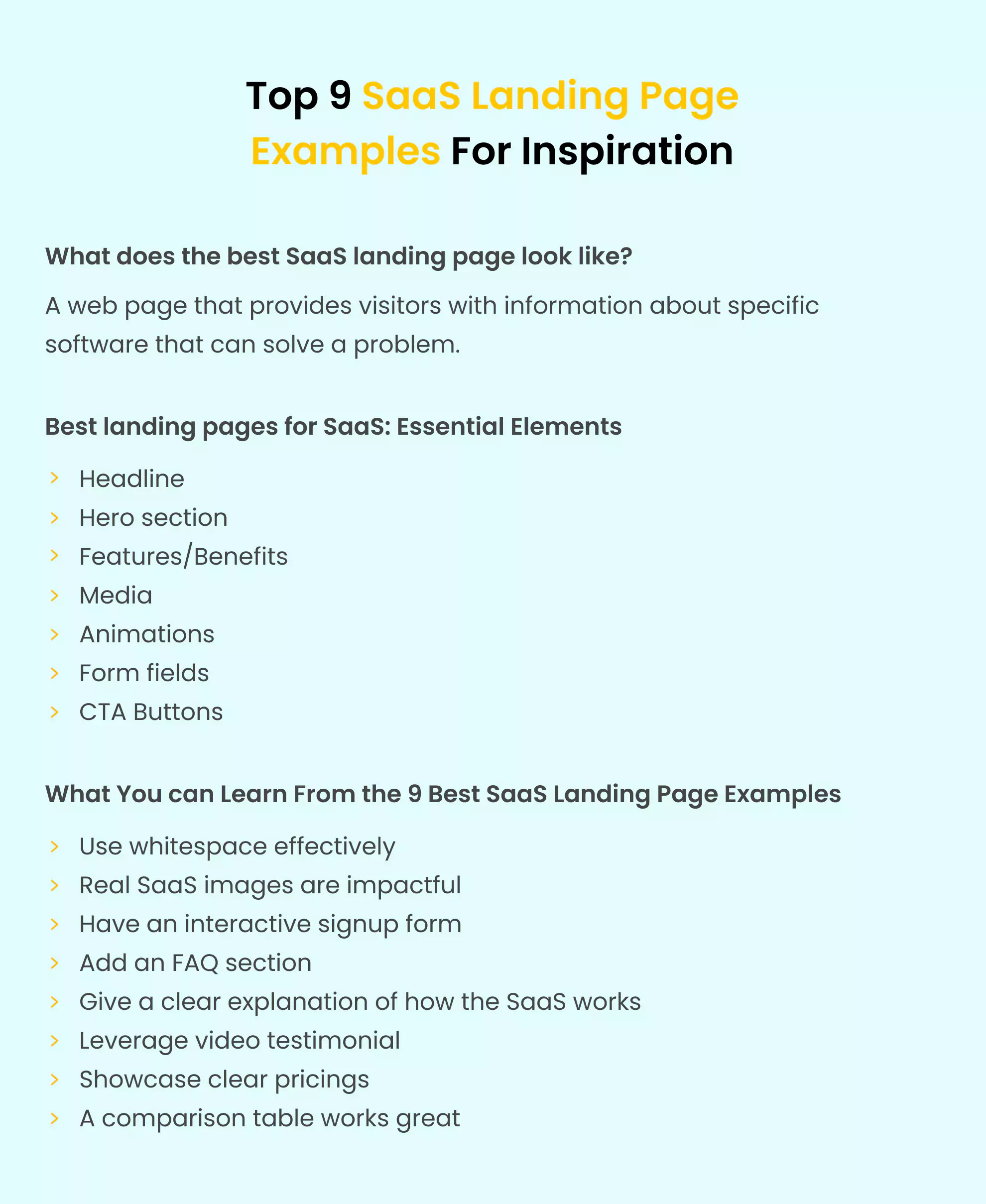
Almost all SaaS landing page examples contain the same elements. Some are more relevant to SaaS businesses than others. The top SaaS landing page without these essential elements may lack content, user experience, or conversion potential.
-
A good SaaS landing page headline should be descriptive, relevant, and catchy, and it should accurately show the benefits and features of the product.
-
The hero section should include an enticing image or video of the software product and a strong call to action (CTA) that tells the visitor what to do next. The image should be high-quality, visually appealing, and accurately show the product’s features and benefits.
-
Each SaaS product or service should have the right image supporting its unique solution on the landing page.
-
Using your SaaS’s images and gifs to tell your brand’s story can help you reach your target audience. Through interactive media, marketers can capture and hold visitors’ attention.
-
Keep the form fields as simple as possible if you plan to collect email addresses; collect only the necessary information. Later in the customer journey. You can always ask for more details.
-
Make sure your call-to-action buttons are eye-catching above and below your content. It will help target people at different points in their decision-making process. And remember, every effective SaaS landing page should end with a complementary thank you page that completes the user journey and improves the overall experience.
Take inspiration from SaaS landing page examples
From all the SaaS landing page examples discussed, it is clear that many different elements point toward creating a successful campaign. From a strong and concise headline to a clear and strong call to action, many factors can influence the effectiveness of a landing page. Studying the top SaaS landing page examples and learning from their successes makes it possible to create a landing page that effectively converts visitors into customers. Whether you want to increase sales, generate leads, or build your email list, a well-designed landing page can drive growth and success. So take the time to study the top SaaS landing page examples, analyze what makes them effective, and use that knowledge to create a landing page that works for you. As more and more SaaS brands adopt landing pages as part of their performance marketing strategy, we advise you to try them out, too.
Related Articles: