Understanding the key components of a landing page increases your chances of hitting your conversion goals on the first try. Your landing page can have many elements. However, some necessary elements make sure that your content makes the initial impact and captures visitors’ attention. Ignoring or not polishing these key components of landing page can lead to high bounce rates and doubts about the quality of your services/product. Wondering what key components push for the right results from your landing page? Here’s an article dedicated to just those elements.
Why do we create a landing page?
Marketers create a landing page to get conversions and the most out of their PPC campaigns. Conversion doesn’t necessarily have to be related to sales; it can also be prospects signing up for the newsletter, downloading a lead magnet, booking a demo, or taking a free trial. Landing pages are a great way to collect customer data and optimize the user experience. But if your key components of a landing page like a form doesn’t collect the correct information or is so long that it repels conversions. It can be a huge problem.
That’s why we’ll discuss the elements you must prioritize while creating a landing page.
What are the key components of a landing page?
Before understanding the landing page’s key components, we must settle on a similar definition of user interface (UI) and user experience (UX). UI refers to the visual elements like buttons, images, and layouts that users interact with, focusing on the look and feel of a page or product. UX is about a user’s overall experience while interacting with a product, stressing how easy and satisfying it is to achieve their goals.
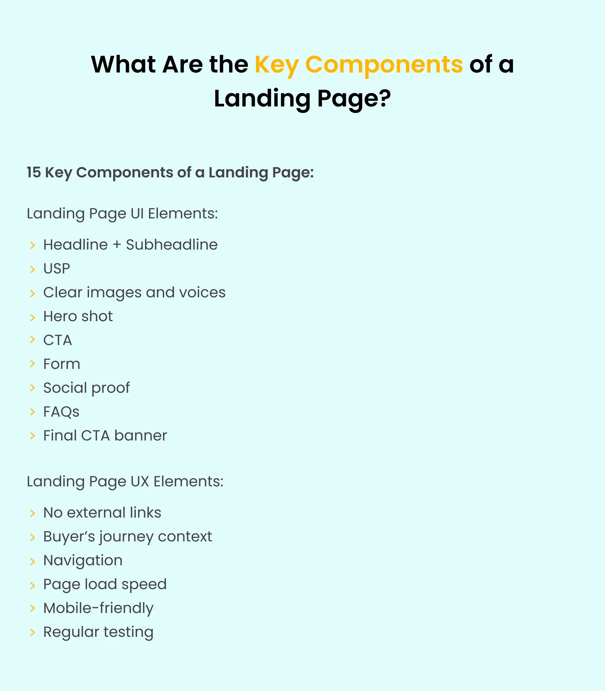
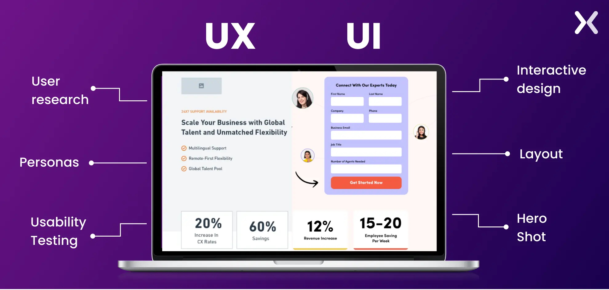 In simple terms, UI is about design, while UX is about usability and the user’s journey. Thus, it becomes essential to design landing pages from both perspectives. We have broken down key components of a landing page into two lists based on UI and UX features, which will help you focus on each side effectively. They’ll help you allocate the right resources for creating effective landing pages, and if you’re hiring someone, you’ll know exactly what to expect from them.

Necessary landing page elements for effective UI
Let’s look at the landing page components that make up its UI:
1. Headline + Subheadline
The headline is one of the first key components of a landing page that a viewer notices. Hence, your landing page needs to have a persuading and eye-catching headline. It should cover all the key aspects that educate customers about the page and develop readers’ understanding, interest, and persuasion. Here are some points that your headline should cover-
-
Get the visitor’s attention
-
Educate the visitor thoroughly about the product
-
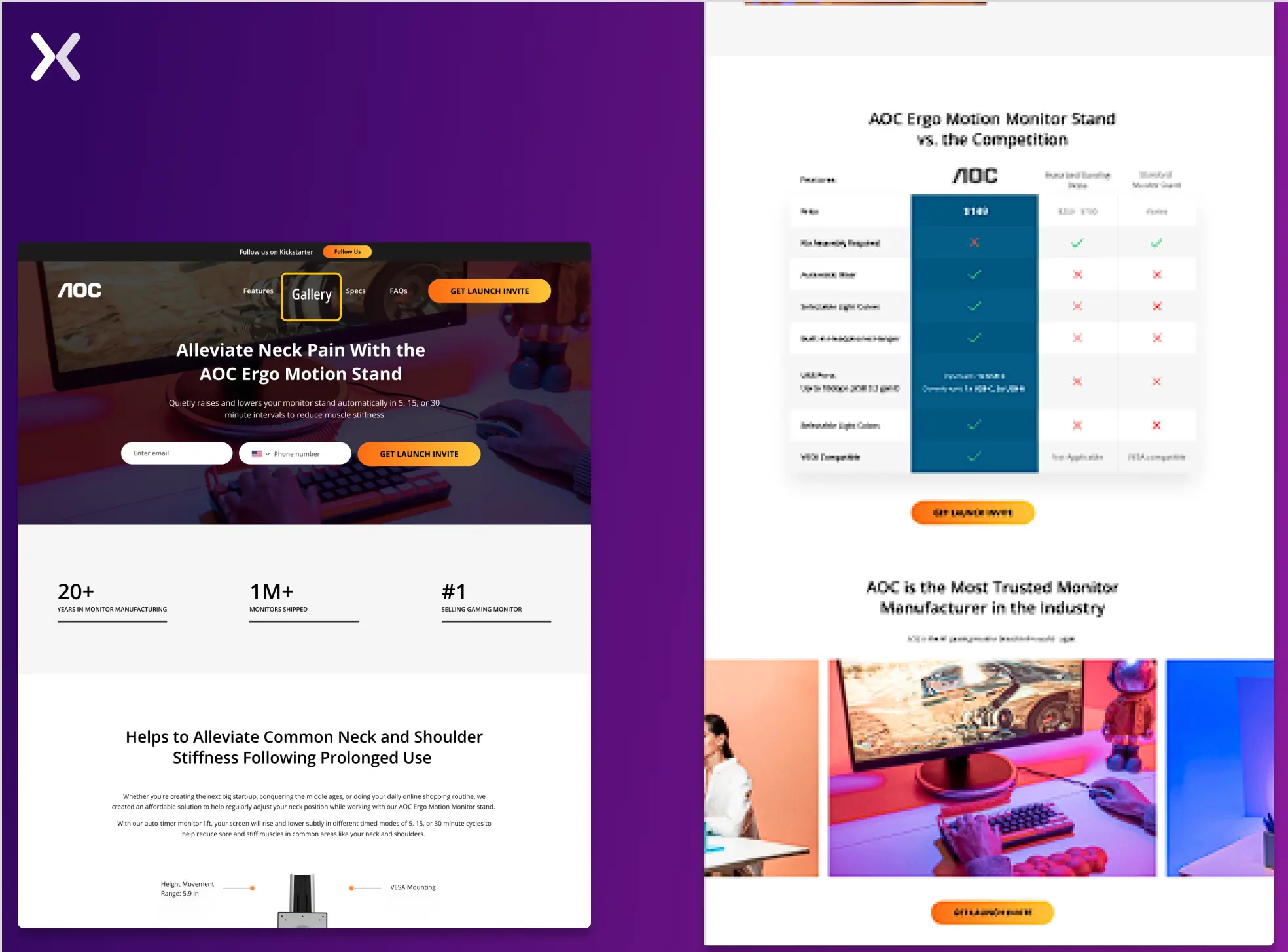
Make it short and crisp for the customer While we know you want your viewer to learn everything at once. However, it’s also essential to keep your headline short and crisp. You need a supporting headline for the main one to deliver all the necessary information. Your sub-headline should be supportive or secondary content for the primary heading of your page. You can club your headline and subheadline together in many different ways. Two of the best ones have been shared below.
 While the first landing page has a simple headline complemented by a small paragraph, the second uses bullets to make it easier for readers to go through the top of the page quickly.
2. Unique selling proposition (USP)
No matter what, your competitors can always copy your color, design, or language. However, if the landing page accents the USP that sets you apart from your competitors, then viewers would prefer your landing page over others. Your USP is one of the key components of a landing page that sets you apart, and it should be visible throughout the page to reinforce the message effectively. You can do this with visuals like videos and images, bullet points, or the most effective comparison table.
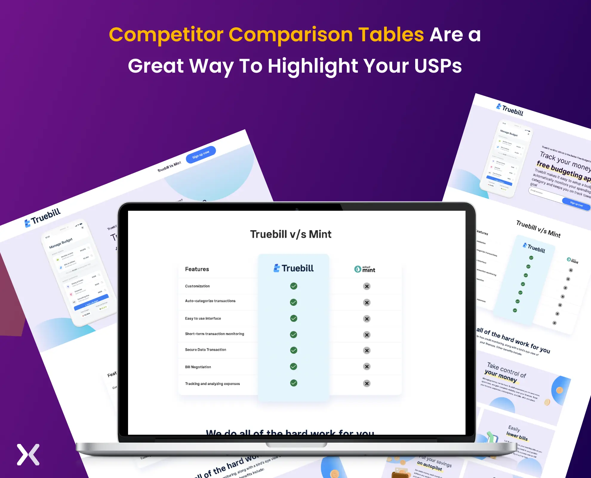 Mark this point as necessary, as it is considered one of the critical key components of a landing page.
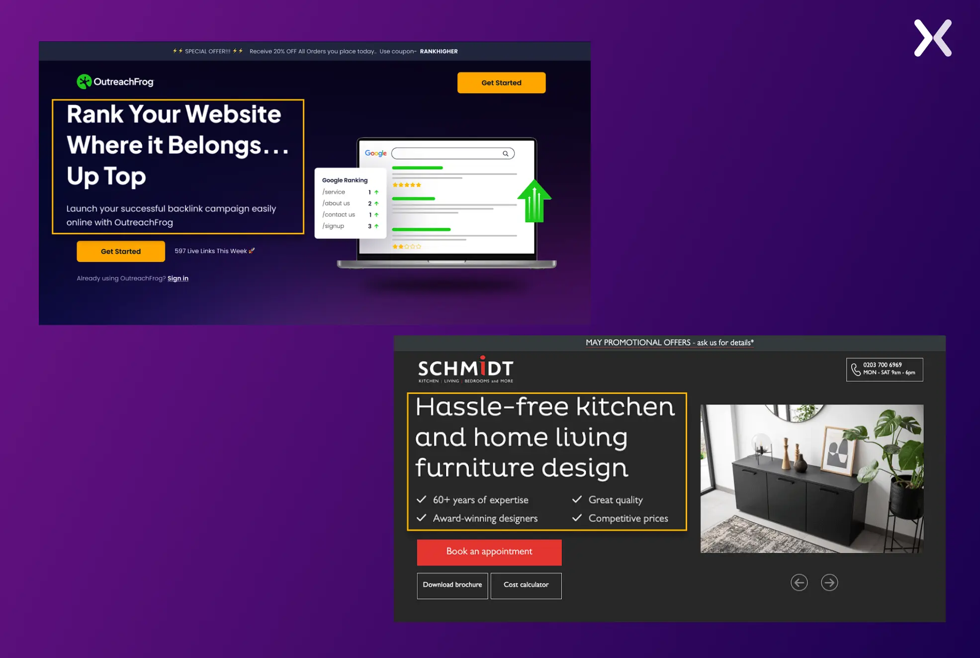
3. Clear images and videos
Customers will always understand it better when they can imagine themselves in a scenario where they are experiencing the product. That’s when an image or video plays an essential role. While text can help a customer understand the product/service, an image or video can give the visitor a more interactive experience.
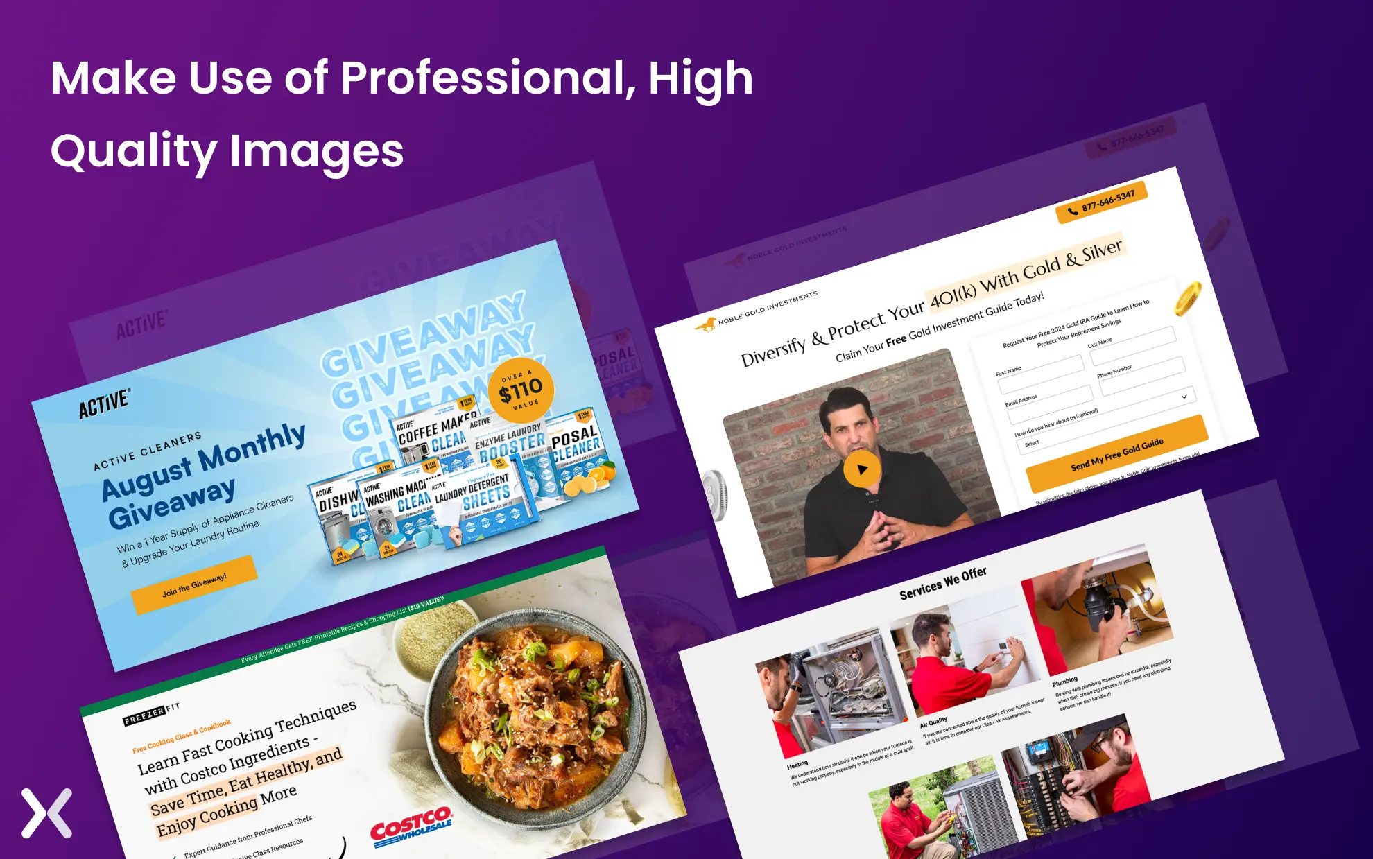 Make sure that your landing page offers straightforward navigation through images/videos. Add high-quality and appealing images. Sharing a low-quality or stock image can make a prospect disappear in seconds. Hence, try to add only natural and high-quality pictures and videos to the landing page.
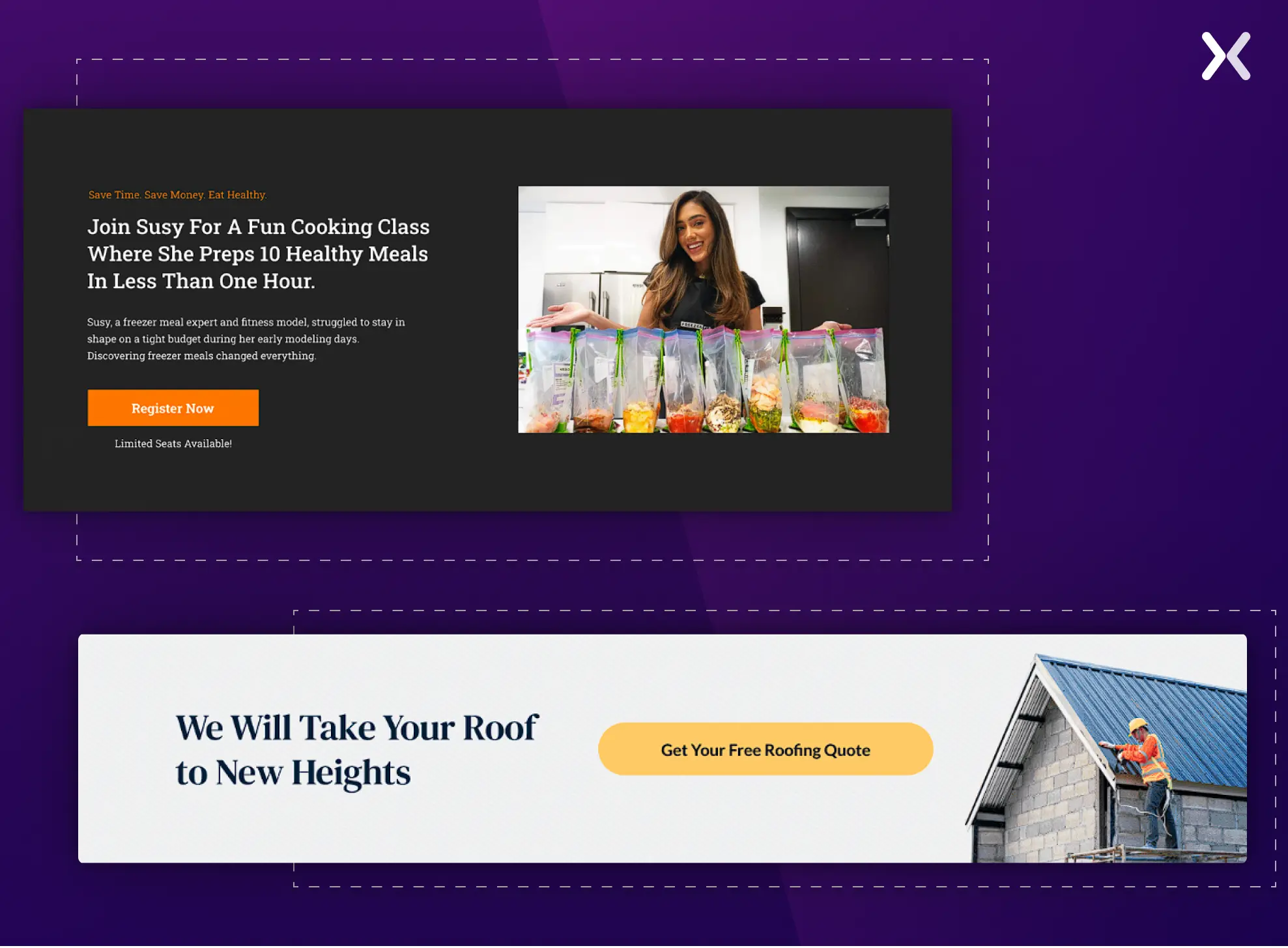
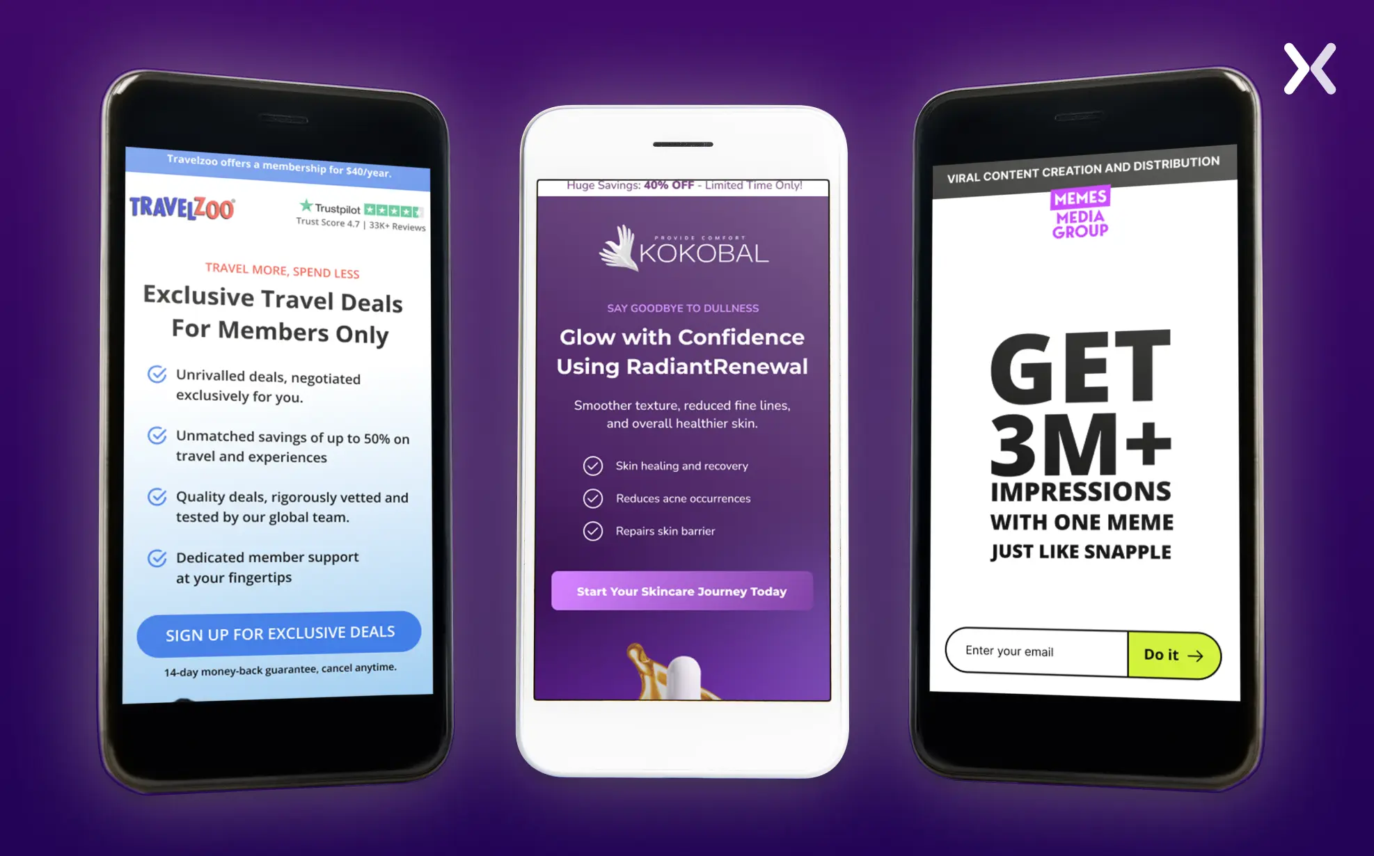
4. Hero Shot
The hero shot at the top fold of a landing page is vital for grabbing attention and setting the tone for the user experience. It needs a special mention, as it is the first thing visitors see on your page. The hero shot must instantly engage, convey the brand’s value proposition, and encourage action.
 Whether you use an image, gif, or video on your top banner. It should appear in sync with the headline and subheadline of your landing page. For example, if you have a SaaS landing page, the hero shot should be of your product, just like Rocket Money did on their landing page.
5. Call to Action
Your ultimate goal in hand-picking the landing page should be to get people to click on the call-to-action button, which is considered one of its essential elements. The design of the CTA button is necessary. Use a bold, contrasting color that stands out and grabs attention. Make sure the text is clear and action-oriented, with phrases like “Get Started” or “Sign Up Now” to prompt users to take the next step.
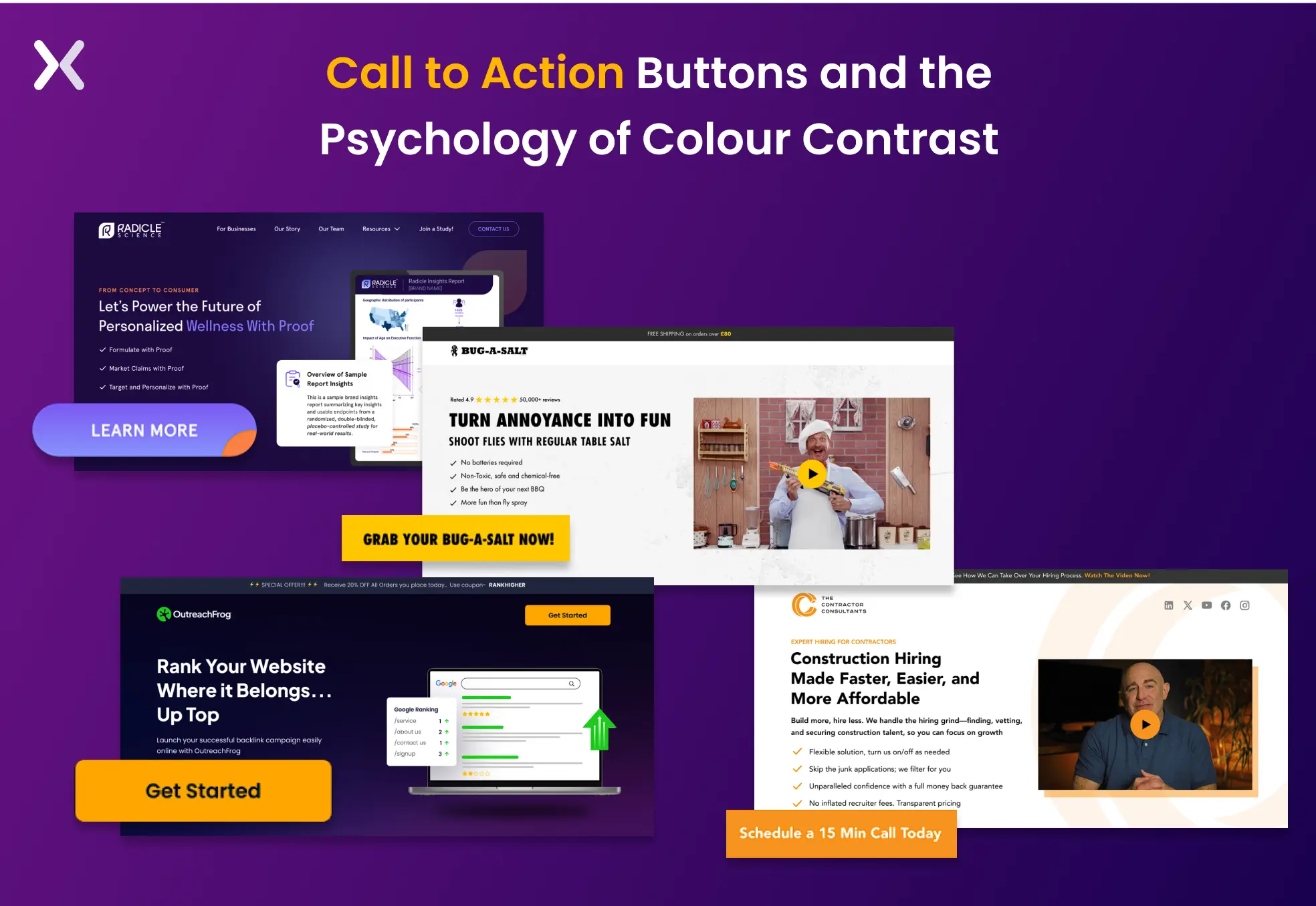 To maximize its effectiveness, make sure the CTA button is deliberately placed in multiple page sections. This approach keeps the CTA visible as users scroll, increasing the likelihood of engagement.
Placing the button in critical areas (such as within the hero shot, testimonials, and near product descriptions) makes sure it’s always accessible when users are most likely to act.
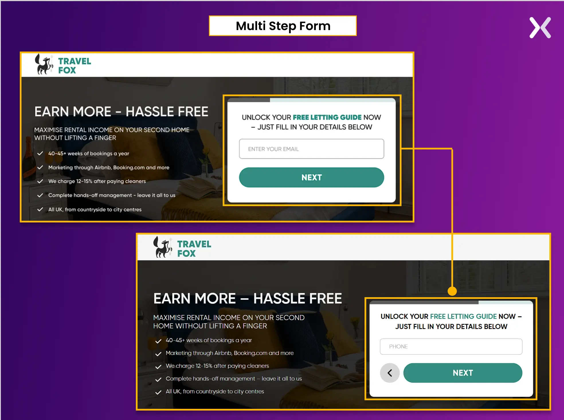
6. Form
Landing page forms are essential for capturing visitor information but must be designed with the user in mind. Keep forms short to avoid overwhelming prospects. If more information is necessary, consider using a multi-step form that breaks the process into smaller, manageable sections. Such an approach reduces friction and makes the form less daunting, increasing users’ likelihood of completing it.
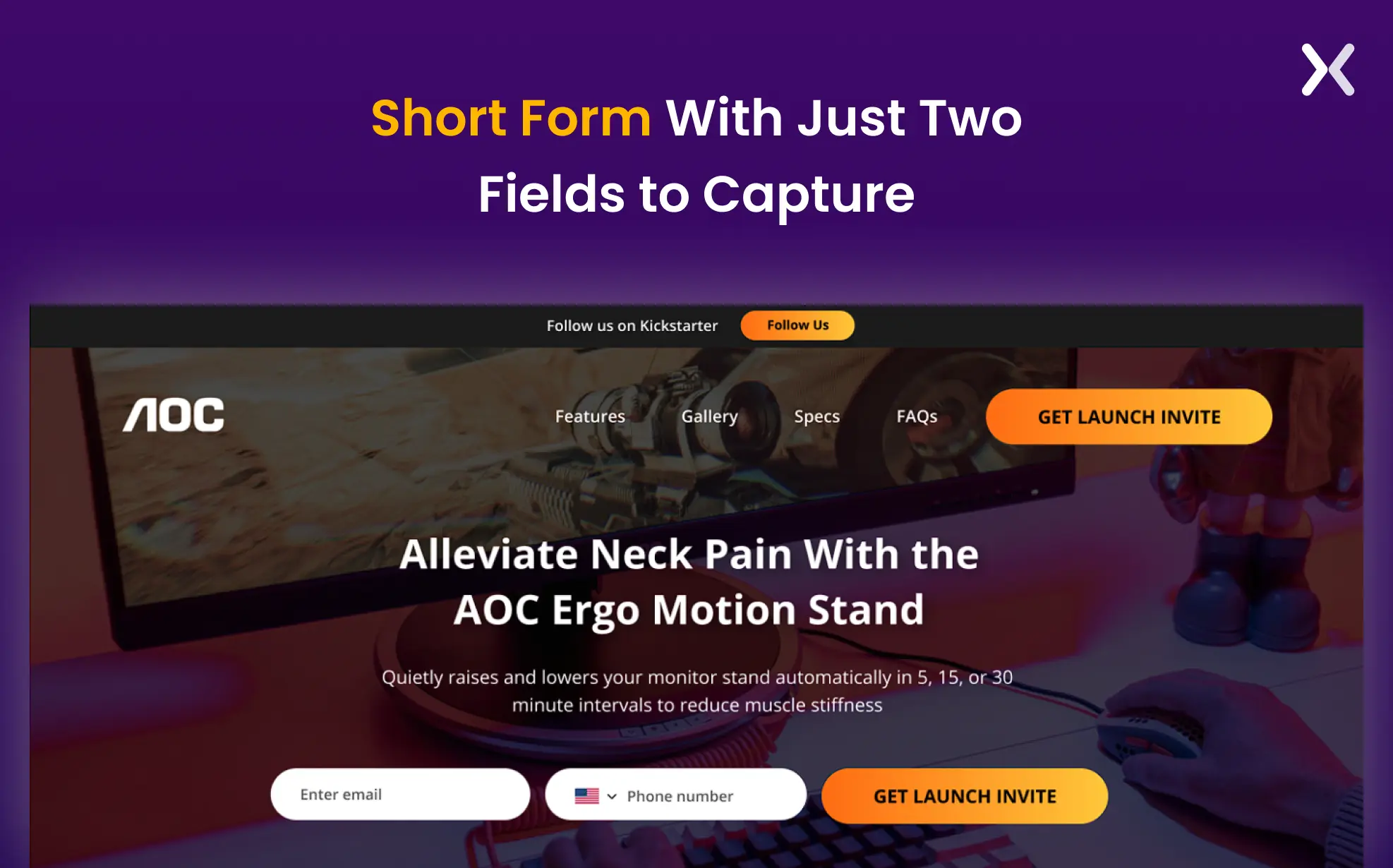 To keep your landing page design clean and uncluttered, assign the form a specific spot at the top or bottom. Since forms can be lengthy, deliberately placing them avoids clutter while making them accessible. You can use CTAs throughout the page that link directly to the form, guiding users to it smoothly.
 If you don’t want to put the form on your page. You can use click-through landing pages, where the CTA redirects to a page specially built for the form.
7. Social Proof
Social proof is essential for building trust and credibility with visitors. It reassures potential customers that your product or service is reliable and valued by others. To strengthen this trust, don’t just rely on testimonials, include trust badges, user-generated content, ratings from reputable sites like Clutch, and recently won awards. These diverse forms of social proof create a more full and convincing portrayal of your brand’s credibility.
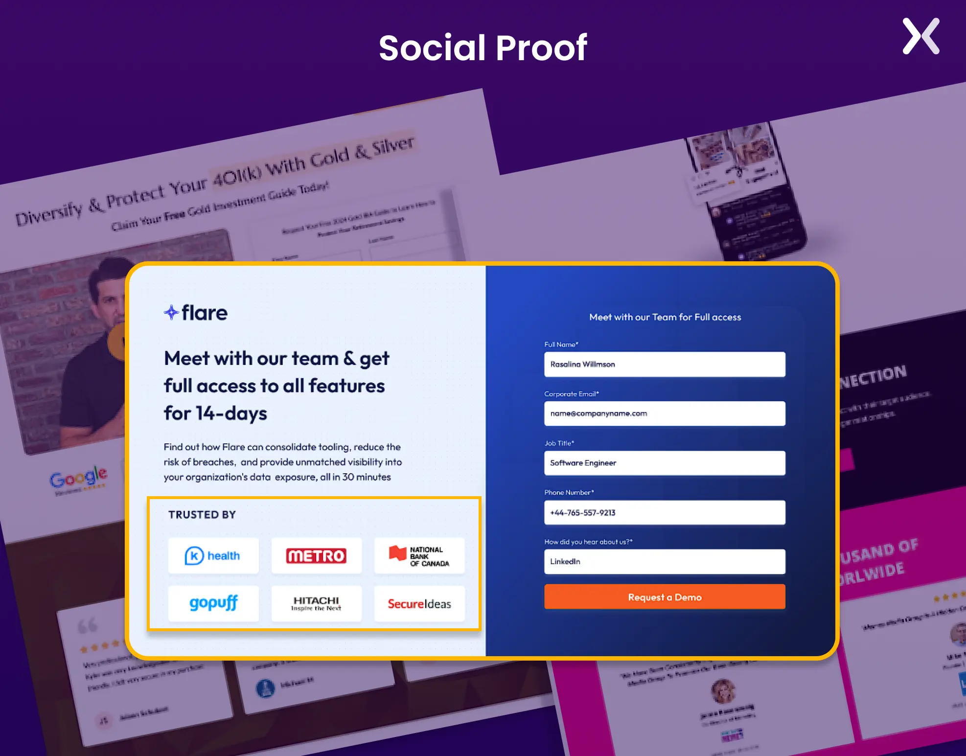 Deliberately utilizing social proof as one of the key components of a landing page can improve its impact. Position it right after the CTA above the fold to address any last-minute hesitations or near the end of your forms to encourage completion. By spreading social proof across the page, you reinforce trust at necessary decision points, making visitors more likely to convert.
8. FAQs
It’s essential to guide the customer through every step. We know you will include all the information on the landing page. However, make sure that you add a column for Frequently Asked Questions (FAQ) and share the common questions that have been frequently asked before about the product/service.
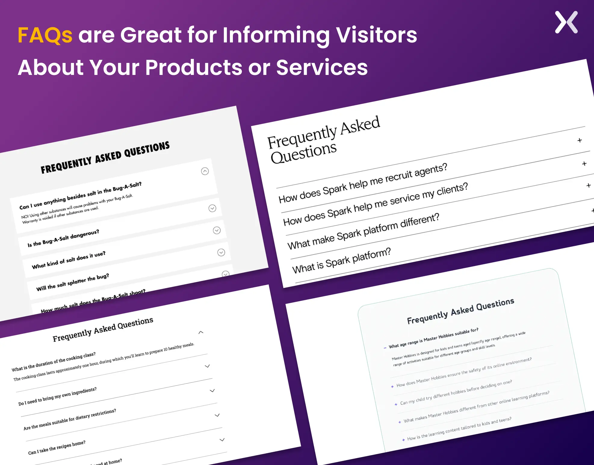 By sharing this, no aspect will be left for a customer to return with incomplete knowledge. Once the customer is done reading about the product/service in detail. You can add this column at the end of your page.
9. Final CTA banner
The final CTA banner is what you put at the end of your landing page instead of the footer. It is designed to reinforce your key message and prompt action one last time. With a strong headline, a supportive subhead, and a solid final CTA, the banner is deliberately placed to capture any remaining interest and encourage conversions.
 Many landing pages use a final CTA banner instead of a traditional footer to keep the focus on driving action. This acts as one of the key components of a landing page, making sure visitors are reminded of the core benefits and prompted to act before leaving the page.
Essential landing page elements for smooth UX
Let’s look at key components of a landing page that make up its UX:
10. No external links
The primary objective of a landing page is to keep visitors hooked so that your message can be delivered effectively. External links can disrupt this flow, tempting visitors to leave the page and explore other parts of your brand. This is particularly problematic if they arrive via a PPC ad, as you’ve invested money to bring them to that specific page.
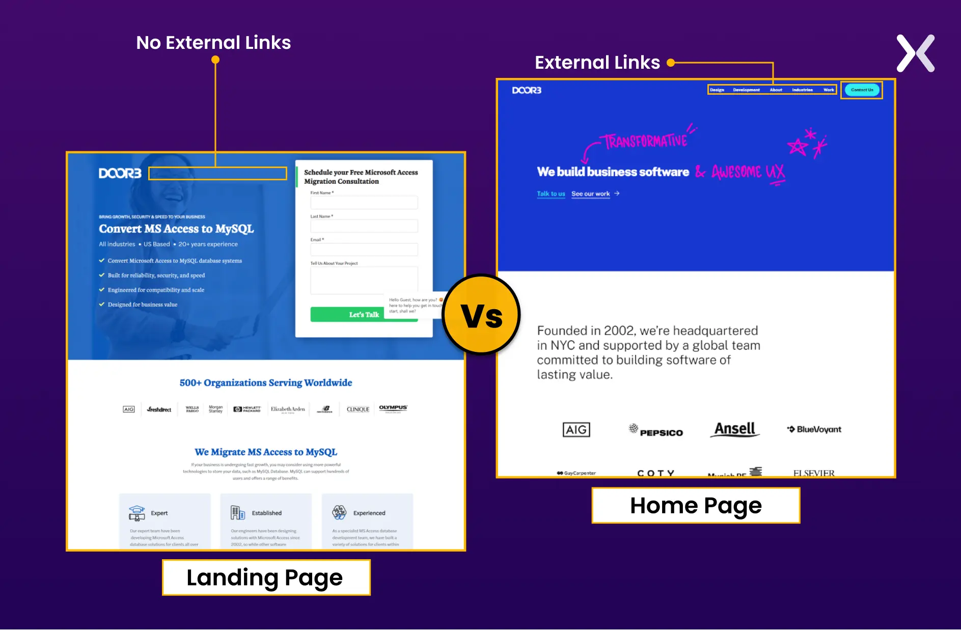 The last thing you want is for those paid clicks to lead to distractions rather than conversions. For this reason, it’s best to keep external links off your landing page, maintaining a focused and conversion-driven experience.
11. Buyer’s journey context
Understanding the buyer’s journey context is necessary when designing a landing page. It allows you to tailor your content and CTAs to match the visitor’s decision-making stage. A successful landing page should match the specific stage of the buyer’s journey, whether they are in the awareness, consideration, or decision phase. Doing so can deliver a more personalized experience that matches the visitor’s current needs and motivations.
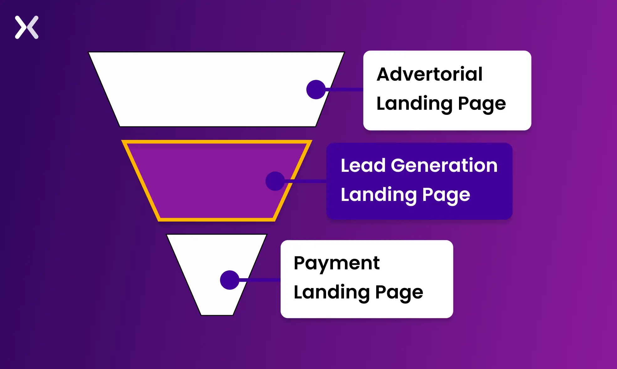 For instance, if your landing page targets users in the awareness stage, focus on providing educational content and building trust. An advertorial landing page would work great at this stage. By aligning your landing page with the buyer’s journey context, you improve user experience and significantly increase the chances of conversion by meeting visitors exactly where they are in their purchasing process.
12. Navigation
Considering the critical components of a landing page and ignoring the importance of navigation don’t go hand in hand. Your landing page must give visitors a crystal clear direction. Landing page navigation serves a different purpose than traditional website navigation. Instead of linking to other pages, it allows users to jump to various sections within the same page.
 It is helpful for long landing pages but unnecessary for shorter ones, where the content should naturally guide visitors from one section to the next. The design should provide clear cues to smoothly direct users through the page without needing extensive navigation.
13. Page load speed
If your landing page takes too long to load, you risk losing potential customers before they even have a chance to engage with your content. Slow loading times can lead to higher bounce rates, reducing the effectiveness of your landing page and ultimately hurting your conversion goals.
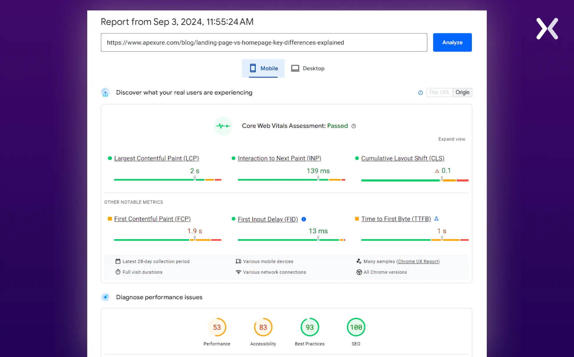 To make sure your page load speed meets user expectations, optimize images, reduce unnecessary scripts, and use browser caching. A fast-loading page keeps visitors engaged and focused on your message, allowing them to move through through the content smoothly and take the desired action.
By prioritizing page load speed, you improve the user experience and increase the likelihood that visitors will stay on your page long enough to convert.
To make sure your page load speed meets user expectations, optimize images, reduce unnecessary scripts, and use browser caching. A fast-loading page keeps visitors engaged and focused on your message, allowing them to move through through the content smoothly and take the desired action.
By prioritizing page load speed, you improve the user experience and increase the likelihood that visitors will stay on your page long enough to convert.
14. Mobile-Friendly
A mobile-friendly landing page adapts smoothly to different screen sizes, providing an optimal viewing experience whether visitors are on a smartphone, tablet, or desktop. If your landing page isn’t mobile-optimized, you risk alienating a large audience segment, leading to lost conversion opportunities. To make your landing page mobile-friendly, you need to focus on other key components of a landing page like responsive design, simplified navigation, and touch-friendly elements. The text should be easily readable without zooming, and buttons should be large enough to tap without frustration.
 By prioritizing mobile usability, you make sure that all visitors, regardless of their device, have a smooth and engaging experience. It keeps users on the page longer and increases the chances that they’ll take the desired action, whether filling out a form, signing up, or making a purchase.
15. Regular Testing
Once you align the landing page. It’s time to do the A/B testing and identify what works best for you. The testing can offer valuable analytics that can guide you in determining the changes and optimizing various key components of a landing page. Make sure that your final landing page delivers what the customer is searching for. It will also help you get conversions and collect data easily.
How should my landing page look like?
A Landing Page is also considered a one-page website that includes all the necessary information for a customer. It’s an effective way to introduce your business to new customers, serve new audiences for existing products, collect data for sales purposes, etc. The primary key components of a landing page should include a clear call-to-action for customers, pertinent information, fast loading speed, and a premium appeal. A landing page needs to share the knowledge that the customer is looking for and doesn’t spend extra time looking out for the key objectives/goals of the page.
 The main target of a landing page should be to solve a purpose or problem for the customers. This can be a basic query or helping them find a product they have been searching for a long time. Don’t forget to complete your landing page experience with a thank you page that perfectly wraps up the user journey.
What makes a landing page effective?
Including all key components on a landing page supports the success of your PPC campaign. Each element is necessary in creating an effective landing page, from an engaging CTA to optimal page speed. UI and UX considerations must work together to provide visitors with a smooth and satisfying experience. When each of your key components of a landing page are thoughtfully integrated, they improve user engagement and improve conversion rates. Making sure that every aspect of the landing page fits your brand’s goals and user expectations maximizes the return on your PPC investment and drives meaningful results.
Related Articles: