
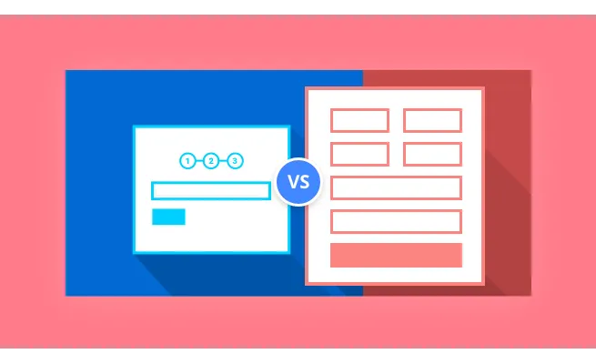
It’s not uncommon for potential leads to click away from landing pages because they’re too long or the forms ask for too much information. With multi-step forms and multi-page landing pages, you can increase your lead generation by decreasing friction and lowering the barrier to entry. When designing multi-page landing pages for financial service lead generation. It’s essential to design your form and page properly - keeping visitors engaged and making sure they’re not scared off by lengthy and intimidating forms.
Multi-step forms are just longer forms, broken up into shorter and less daunting steps. These types of forms are excellent for collecting detailed prospect information because they do it in small chunks. From the prospect’s perspective, multi-step forms lower the barrier to entry, allowing them to show interest by completing a short form - proceeding to additional fields to share more information about their business or themselves. As these requests for additional information only appear once the lead submits baseline information, multi-step forms reduce friction on landing pages. Designing your multi-page landing pages for financial service lead generation in this way can increase the user’s time on page, generate more leads and help you to gain more insight about higher qualified leads. These leads can then be nurtured through the marketing funnel.
Here’s how to use multi-page landing pages if you want to generate financial service leads.
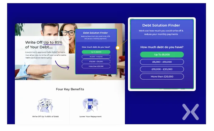
On your multi-page landing page for financial service lead generation, your form should ask questions related to your service. These questions should offer the lowest amount of threat. Make it as easy for them to begin with the form as possible.
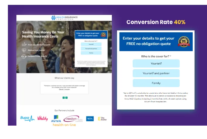
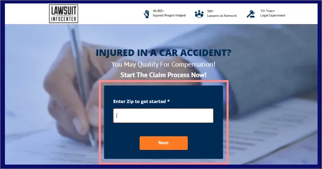 As in the example above, you could also ask innocuous questions, such as their zip code. In the above example, the visitor doesn’t need to know that the discount applies to all visitors. Some other examples of the kinds of questions you can ask include:
How many employees does your company have?
What state do you live in?
What is your time-frame?
Once the user has submitted their baseline information, the form should ask for more specifics
After completing the last of the steps, you inform the visitor that you’re putting the information together and will send it to them once that is complete. To do so, you need their contact information. At this point, they’ve come so far that they’re less likely to abandon the form when you ask for their details.
There are a few reasons that multi-page landing pages for financial service lead generation can work better than their single step counterparts. That’s why they are widely see a plenty of online insurance forms and donation forms following the same format. Multi-step forms work to increase conversions because:
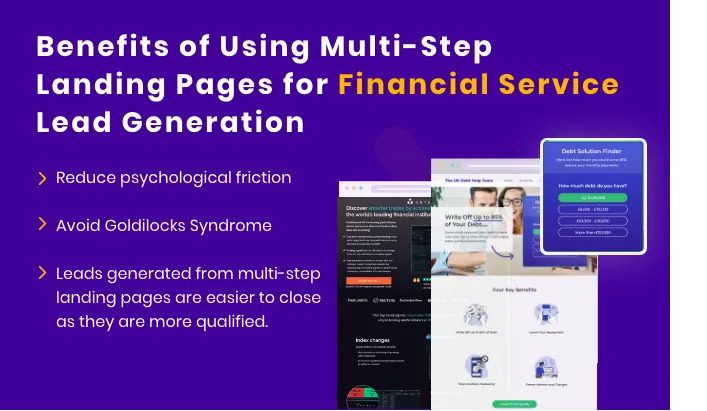
They reduce psychological friction and don’t overwhelm visitors
You can avoid Goldilocks Syndrome - the form isn’t too long, or too short.
They help you to determine a visitor’s commitment level
They kick in the endowed progress effect
Leads generated from multi-step landing pages are easier to close as they are more qualified.
Wouldn’t you feel intimidated if you had to complete a form like this? It’s the first thing a potential lead sees when they visit the NetSuite Financials’ landing page.
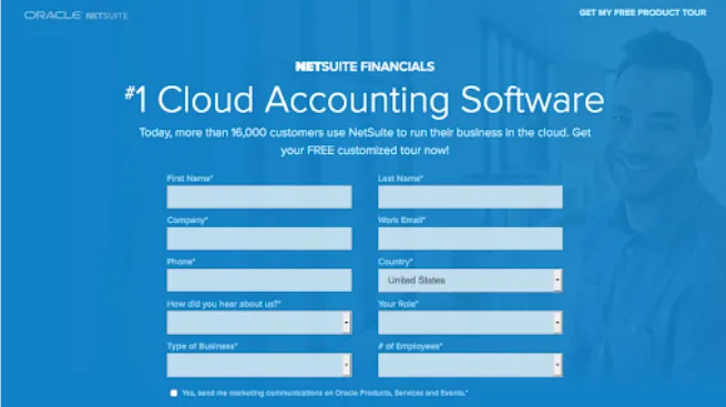 Psychological friction is inevitable when a visitor sees such a long-form on a landing page. Multi-step forms can help to combat this friction by breaking everything down into steps, so visitors aren’t required to provide huge chunks of information at once.
This helps to put visitor’s minds at ease, allowing them not to feel so overwhelmed.
Psychological friction is inevitable when a visitor sees such a long-form on a landing page. Multi-step forms can help to combat this friction by breaking everything down into steps, so visitors aren’t required to provide huge chunks of information at once.
This helps to put visitor’s minds at ease, allowing them not to feel so overwhelmed.
You’ve probably heard the story of Goldilocks and the three bears? Beds and porridge too large, too small, too hot and too cold. Goldilocks Syndrome is similar. When a form is too long, it deters prospects from completing it. Too short, and the leads aren’t as qualified. When more information than just a name and email address are required, multi-step forms strike the best balance. You can make use of more fields to collect all the information you need, but visitors aren’t overwhelmed by a page-length form.
You can determine just how committed a potential lead is when they complete out a multi-step form. Only someone who is highly committed will complete all the steps.
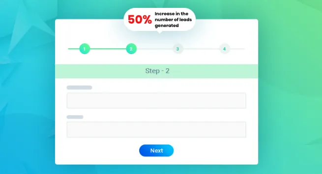
The endowed progress effect is a cognitive bias. People tend to become more committed to achieving a goal when they feel that they have already made some kind of progress toward it. When potential leads see that they are progressing toward the next step. They are more likely to complete the entire form.
Increasing your conversion rates is easy if you don’t mind damaging your lead quality at the same time. After all, how many times have you not been able to contact new leads, or get a bogus email address? When your visitors take the time to go through multi-page landing pages for financial service lead generation. There’s a good chance that they’re actually eager to hear what you have to say. In essence, these leads qualify themselves. If you use the final step of your multi-step form as a reason for users to give you their contact information, then they’ll be waiting for your email or phone call.
The following tips can help you when creating multi-step forms:
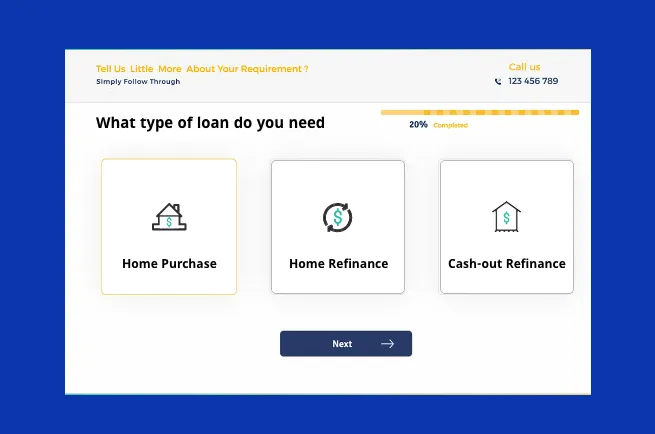
One of the best things about multi-page landing pages for financial service lead generation is that you can start with low-friction questions that engage potential leads without overwhelming them. As mentioned above, a multi-step form should ideally start with a relatively innocuous question, like “what is your goal?” Innocuous questions such as this have low-stakes and get the potential lead thinking about the benefits of your product or service.
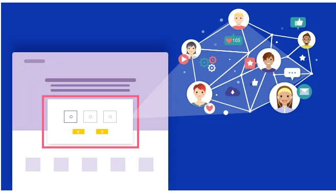
One of the biggest design problems with traditional forms and the real cause of most negative friction is typing. Most users don’t necessarily mind sharing the information, especially if it is relatively low-risk, but the way they are forced to submit this information can often be a barrier. Having to manually fill out forms can be tiresome. With longer forms, the effect is magnified, and many users subconsciously weigh-up the perceived benefit of completing the form with the time-sink required to type out all their information. Longer forms also carry the risk of the user making an error, leading to failed submission. Image selector buttons, which are a visual alternative to radio buttons, create a visually strong format perfectly optimized for mobile devices. These buttons solve one of the biggest conversion-killers on mobile devices - having to manually type all of your information on a mobile screen. Image selector buttons also create a multiple-choice dynamic and add an element on gamification. They also reduce the opportunity for errors and allow you to better segment leads as they complete your forms.
Multi-page landing pages for financial service lead generation tend to work best when only one or two questions are asked per step. By structuring forms this way, they appear less daunting and overwhelming and feel faster to progress through. The only caveat to this is that there cannot be too many steps. If you’re asking more than 10 questions, you might want to ask more questions per step to decrease the total number of steps.
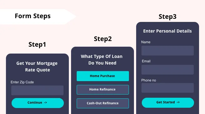
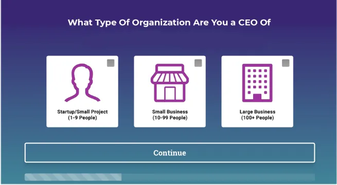
By using conditional logic, you can personalize your forms to further reduce friction, changing if and how questions are displayed depending on how previous questions were answered. In a B2B setting, for example, you may only want to find out how big a company is after finding out which industry they’re in. With multi-step forms, you can maintain a conversational tone by personalizing the experience based on the user’s previous answers. In the example below, a question in Step 2 asks them which company they are the CEO of, because they have previously answered that their position is CEO.
 For those who want to be hyper-targeted, even thank you pages can be personalized based on how users answer the questions in your forms.
Leadformly does this well. If your answers indicate that you’re an agency, you’ll be taken to a thank you page with a video describing how agencies use the platform, FAQs for agencies, etc
For those who want to be hyper-targeted, even thank you pages can be personalized based on how users answer the questions in your forms.
Leadformly does this well. If your answers indicate that you’re an agency, you’ll be taken to a thank you page with a video describing how agencies use the platform, FAQs for agencies, etc
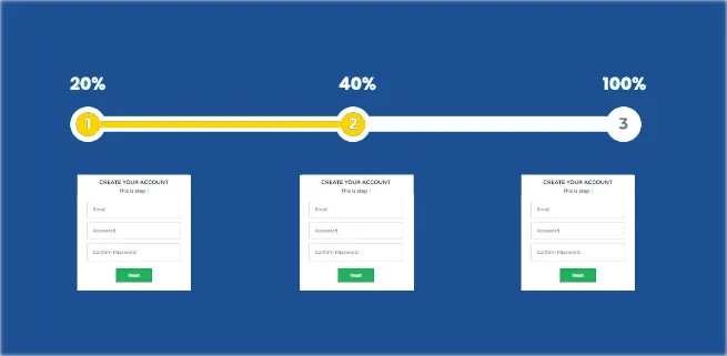
We talked about the endowed progress effect earlier - a proven bias explaining how the mind makes decisions. Someone is more likely to complete an action if there is even an illusion of progress. In a nutshell, if you tell someone that they are 20% complete with an activity, the likelihood of them completing that activity is increased. This effect was proven in a study using loyalty cards. When people bought coffee, they were given one of two loyalty cards:
One had only eight spots for stamps
One had ten spots for stamps, but two stamps were already complete
 In both situations, people had to buy the same amount of coffee to claim a free one. However, the people who received loyalty cards that had already been stamped were more likely to return to the coffee shop to buy more coffee.
If you apply this principle to multi-page landing pages for financial service lead generation, you’ll see that including a progress bar subtly implies that the user has already made some progress. Completion rate is increased in turn.
In both situations, people had to buy the same amount of coffee to claim a free one. However, the people who received loyalty cards that had already been stamped were more likely to return to the coffee shop to buy more coffee.
If you apply this principle to multi-page landing pages for financial service lead generation, you’ll see that including a progress bar subtly implies that the user has already made some progress. Completion rate is increased in turn.
Progress bars are essential when creating multi-page landing pages for financial services lead generation. Without them, users have no indication of how much time or effort they’ll have to invest in completing your form. Of course, there are many ways to show progress. While the traditional progress bar is traditional, you could also just include text that shows the percentage complete, or the number of questions still remaining. However you choose to show their progress, the important thing is to communicate the two most essential pieces of information:
Where they are right now.
How long until they’re done
One of the most effective tactics for increasing form conversion rates on multi-step landing pages is to improve the outcome for the user. Imagine that you have a form with 50, long and involved questions. Not many people would want to waste the time filling it out if all they got out of it was an ebook or access to a webinar. Now imagine that everyone who filled it out received a free Ferrari. The conversion rate would **jump to 100%** - despite the fact that nothing about the form itself had changed. This illustrates just how important the outcome of your form is. From experience, the highest form conversion rates usually come from forms which offer an instant and tangible outcome.
Crazyegg offers visitors a personalized heatmap instantly.
ComparetheMarket offers its visitors an instant quote.
BrokerNotes offers visitors an instant recommendation. You won’t always be able to provide instant value when a person submits a form, but you can always provide something tangible. You could offer anything from a consultation call to an information pack or a proposal.
The common wisdom when creating any lead generating form is not to ask for information that potential leads wouldn’t want to give you. Phone numbers are a good example. While it’s common to ask for a phone number, it is one of the leading causes of form abandonment. Obviously, not everyone is comfortable giving away their phone number and being hounded by sales people. Ideally, keep your forms simple and only ask for the information you truly need.
Related Topics:
Founder & CEO of Apexure, Waseem worked in London’s Financial Industry. He has worked on trading floors in BNP Paribas and Trafigura, developing complex business systems. Waseem loves working with Startups and combines data and design to create improved User Experiences. Read more


Drive More Sales or Leads With Conversion Focused Websites and Landing Pages
Get Started.webp)

Eleven percent of Meta ad rejections in 2026 trace back to one problem: the landing page does not...

A B2B SaaS company spends $30,000 per month on Google Ads and Meta Ads. Both campaigns drive traffic...
Get quality posts covering insights into Conversion Rate Optimisation, Landing Pages and great design
