Event landing pages can quickly become overwhelming if not designed properly. With essential details like venue information, booking forms, activity schedules, speaker bios, event timing, and more to include. It’s easy to see why. A cluttered event landing page won’t get you any bookings. To avoid a high bounce rate, you need design inspiration for event landing pages that help you understand what works for your target audience. You can create a strong event page that converts visitors into attendees by studying successful examples. So, here’s a list of the seven best event landing pages from across the internet to inspire your next event landing page design.

Before analyzing various event landing page examples, we must understand how webinar and event landing pages differ.
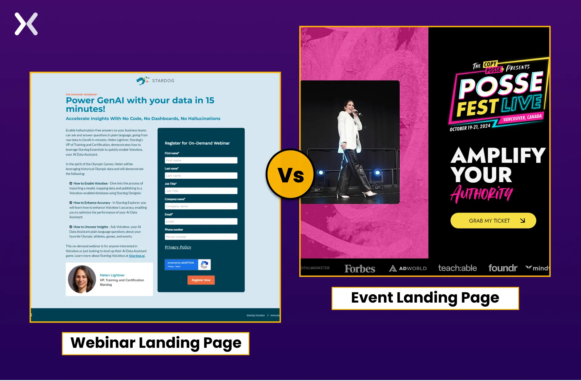 A webinar landing page can be categorized as an event landing page, but the opposite is only sometimes true.
Webinars are exclusively virtual events and may lack certain elements found in traditional event landing pages, such as physical location details, directions, and specific timing for different discussions or sessions.
A webinar landing page can be categorized as an event landing page, but the opposite is only sometimes true.
Webinars are exclusively virtual events and may lack certain elements found in traditional event landing pages, such as physical location details, directions, and specific timing for different discussions or sessions.

Hence, when creating an event page, please stick to event landing page templates and avoid webinar ones.
You can have as many event landing pages as you want, even if you don’t have a website. A standalone landing page is often all you need to promote an event, share essential info, and collect registrations. It’s a quick, effective way to build momentum without committing to a full site. Let’s try to understand how event landing pages are built with the help of examples.
Moz’s annual digital marketing event landing page is minimalistic, sharing only necessary information. The top of the page starts by marking the date and venue of the event with a CTA. This is complemented by images from previous events that give a glimpse of what to expect.
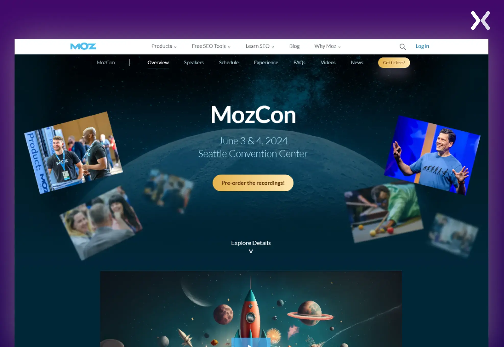 The consistent brand color scheme is spread throughout the page with quality images and a video, making the page visually appealing and reinforcing the brand identity. Key details like date, location, and agenda are presented upfront, making it easy for users to understand what the event offers.
Prominent CTAs for registration encourage immediate action. To serve different audience needs, there are in-person and virtual attendance options.
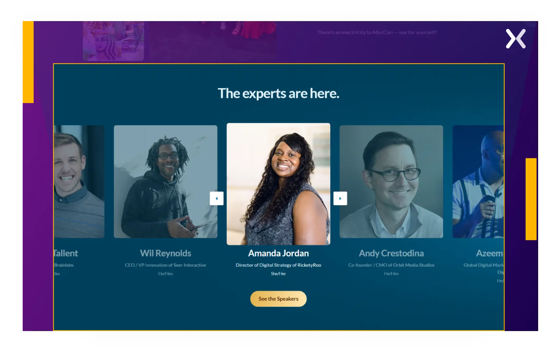
The page has a section with photos and bios of the industry experts attending the event, which adds credibility and entices potential attendees.
Testimonials on an event landing page make up some brownie points and accent past events, which help build trust and excitement.
The FAQ section addresses potential attendee questions, reducing friction in the decision-making process and improving user experience by offering clear, accessible answers.
 Interactive elements like a countdown timer would have increased urgency, and a dedicated section that presented its offerings in various digital marketing niches, such as SEO, content marketing, etc., would have improved personalization.
Overall, MozCon’s event landing page stands out for its visuals and to-the-point copy.
Interactive elements like a countdown timer would have increased urgency, and a dedicated section that presented its offerings in various digital marketing niches, such as SEO, content marketing, etc., would have improved personalization.
Overall, MozCon’s event landing page stands out for its visuals and to-the-point copy.

“One element often missing from event landing pages is a clear, compelling call to action (CTA) that stands out. To engage visitors effectively, I use images and videos that showcase the event's atmosphere and highlights. A well-placed video intro and dynamic visuals of past events can create excitement and offer a sneak peek of what attendees can expect. These elements, paired with a strong CTA, drive engagement and conversions.”
The MENA AI Summit’s event landing page has been organized smartly. Each scroll reveals more information about the event.
 Though the top fold of the page has a good heading and subhead, the hero shots could have been improved. But as we move down the page. We see better images.
One of the best parts of this page is that it accents the specific industries this summit will cover, which will help interested prospects decide whether the event is for them or not.
Though the top fold of the page has a good heading and subhead, the hero shots could have been improved. But as we move down the page. We see better images.
One of the best parts of this page is that it accents the specific industries this summit will cover, which will help interested prospects decide whether the event is for them or not.
The page has well-placed registration buttons that encourage sign-ups, and the presence of contact information enables people to make further inquiries.
This event page has a section that openly discusses sponsorships, building trust and credibility by promoting transparency.
The summit page includes a “topic to be discussed” chart that outlines all event discussion focuses and innovatively informs and engages visitors.
The venue map in the page’s footer is a practical feature that helps attendees quickly locate the event location.
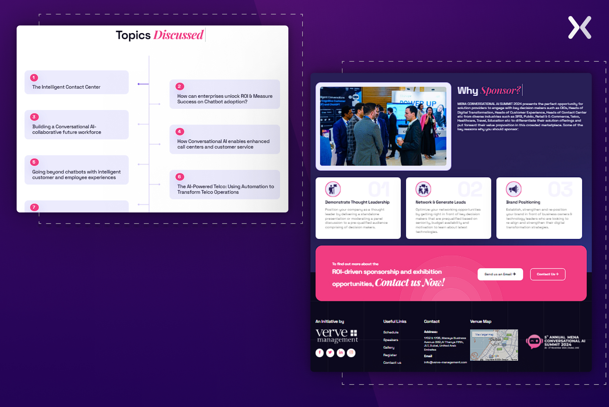 All the above features make the MENA Conversational AI Summit landing page informative, highly user-centric, and engaging.
This hackathon event landing page flaunts a futuristic design that appeals to developers and blockchain enthusiasts, its target audience.
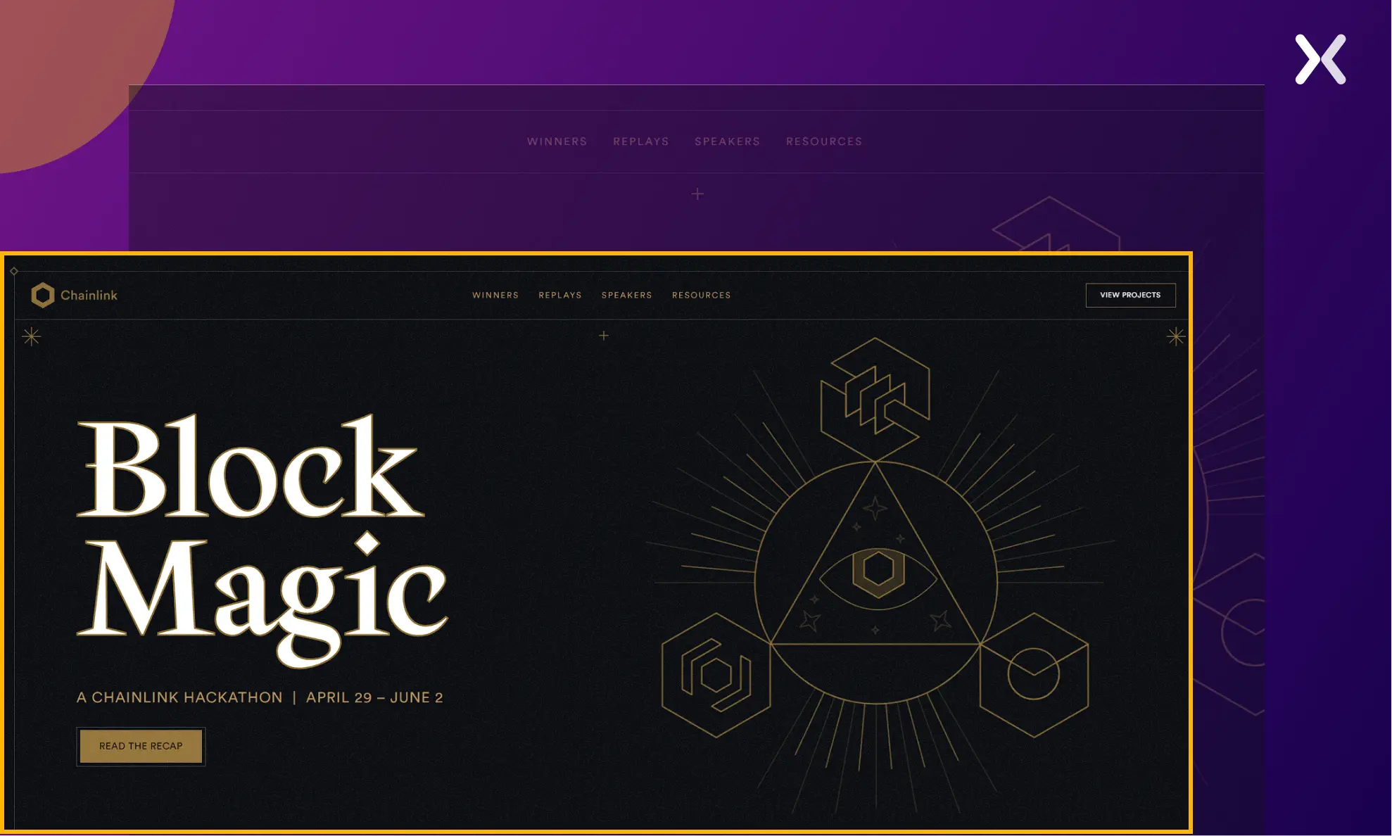 The page effectively presents the top five reasons to attend the event, stressing the unique selling points of this hackathon. It also has a well-organized section detailing the event schedule, clearly indicating which topics will be covered on specific dates and by which speakers.
The whole page is highly interactive, engaging, and fun.
One section details the rewards for winners, including significant cash prizes, career opportunities, and recognition, a motivational feature. It also stresses the long-term benefits of winning and encourages prospects to sign up.
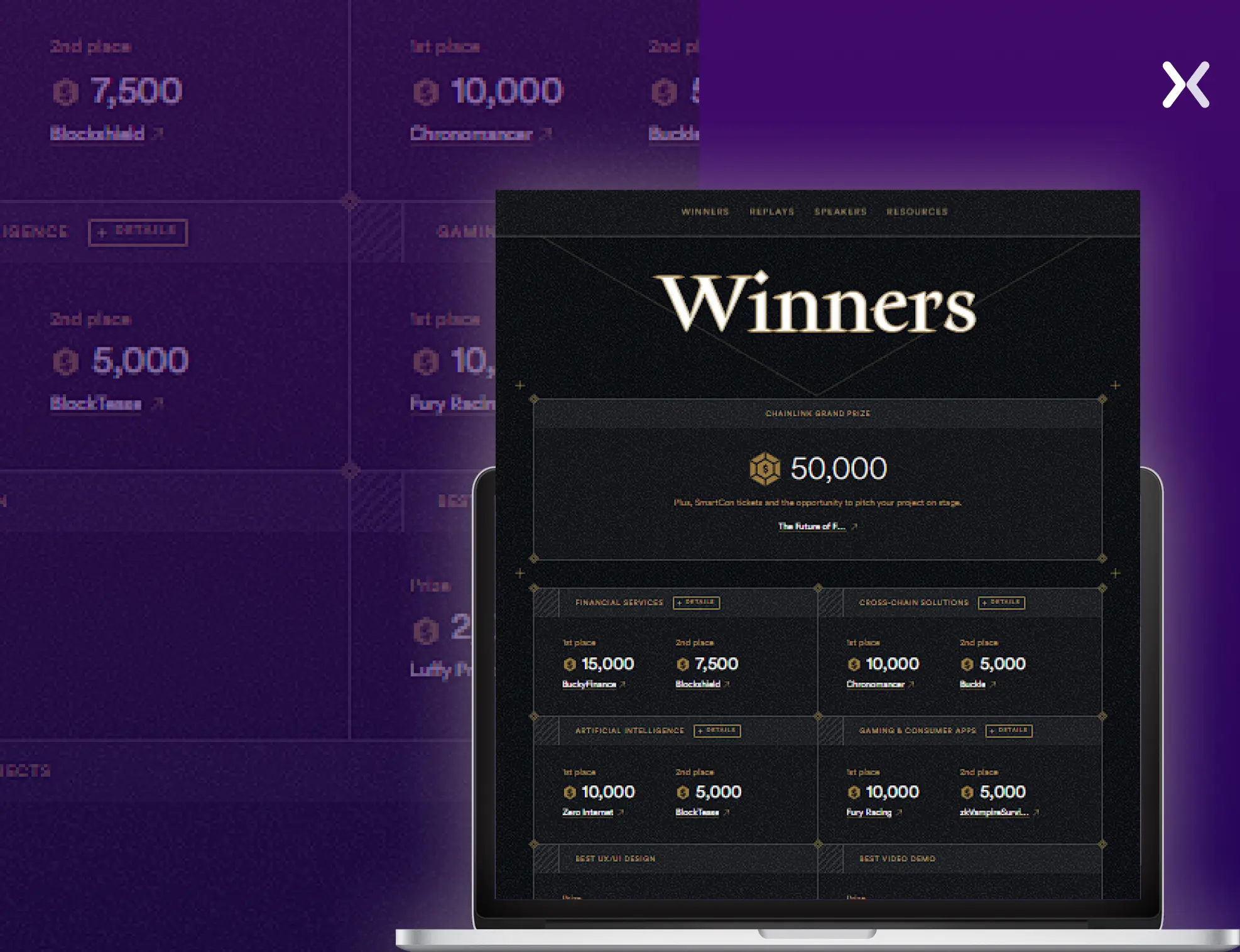
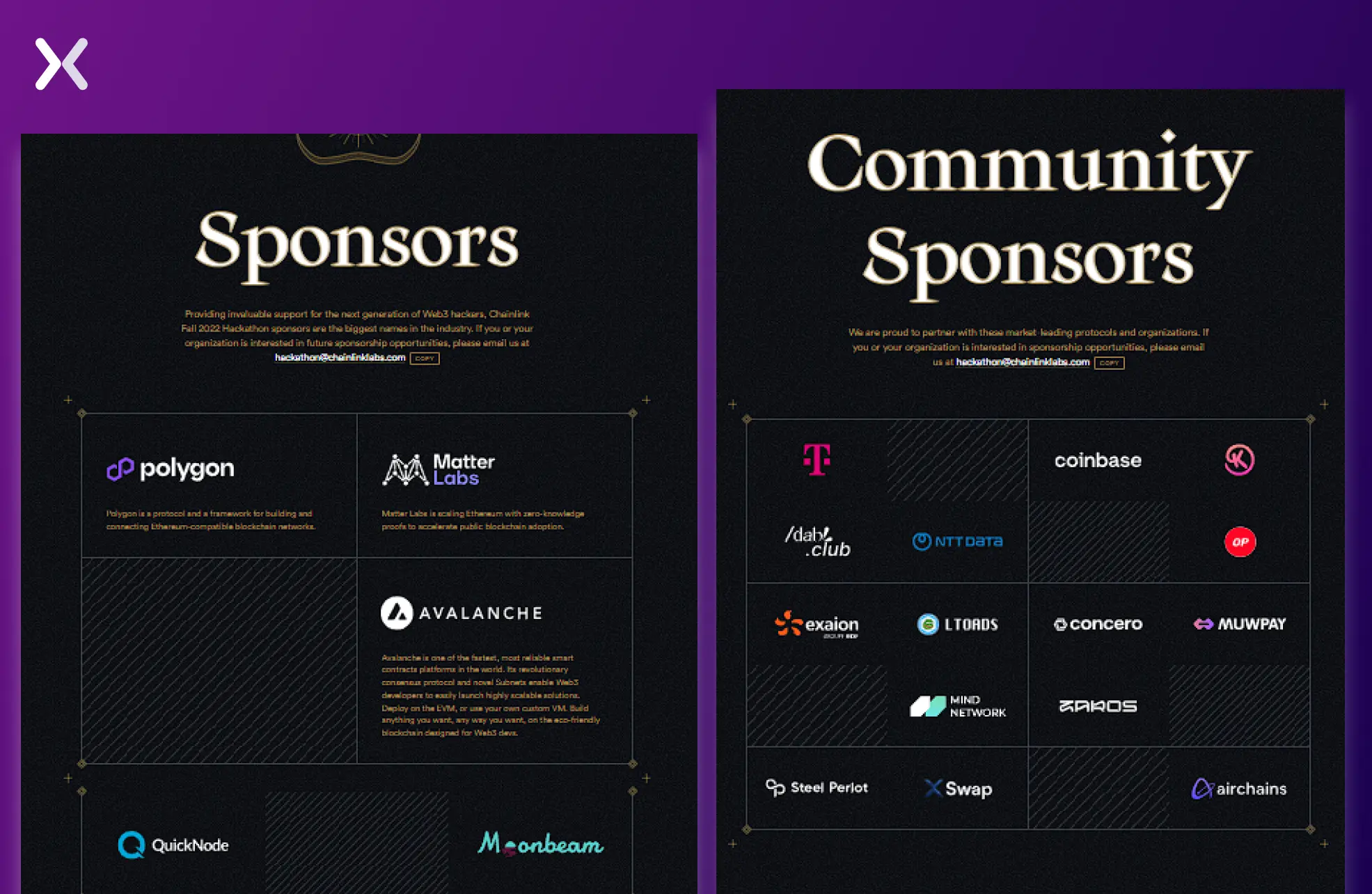 The page’s design is personalized to its prospects, making it unique.
Climbcon’s headline and subheadings make a powerful first impression, setting a solid tone throughout the page. The top section incorporates all the essential elements of an effective event landing page: a prominent CTA, a countdown timer marking special discounts, and a sticky navbar with internal links for easy navigation.
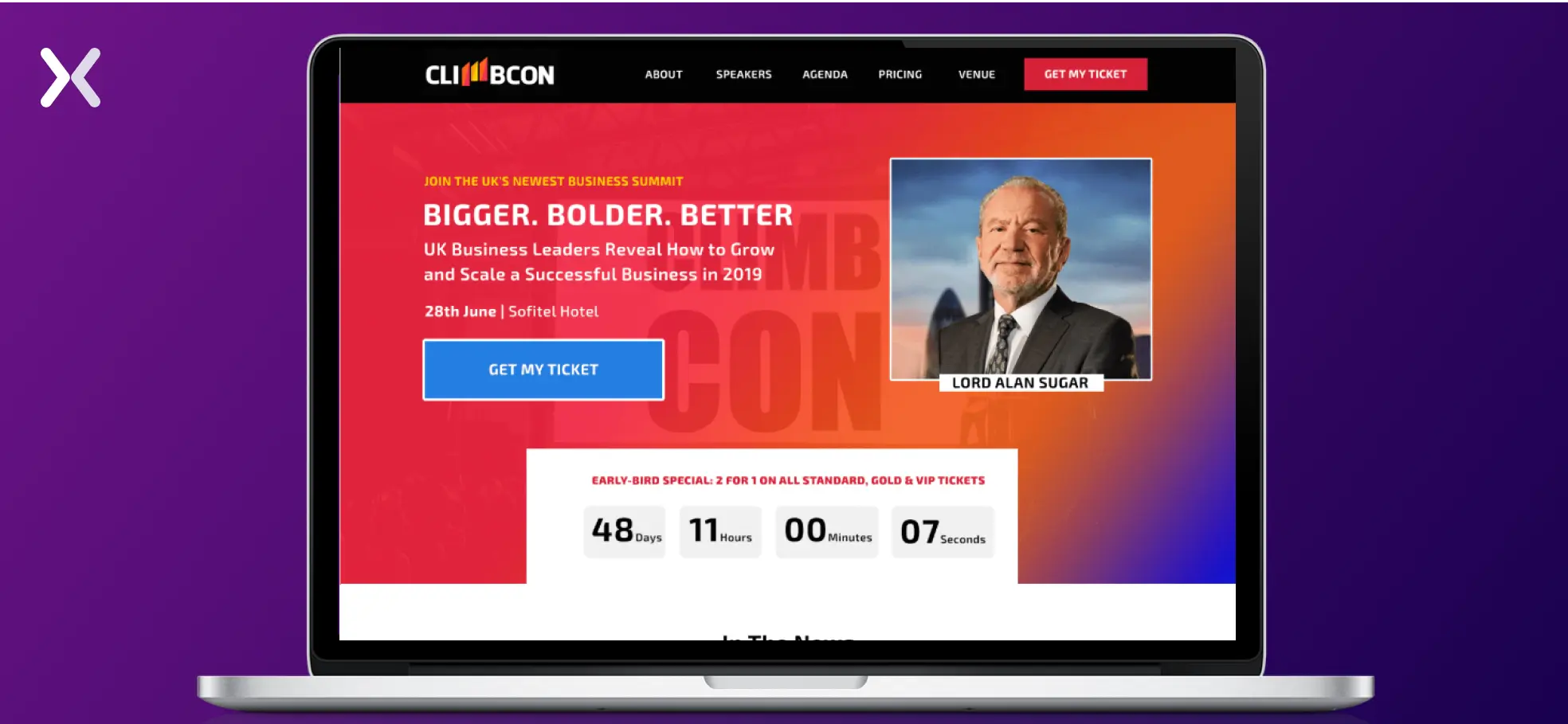 The rest of the page maintains this high standard, consistently delivering a strong and cohesive experience.
This section makes sure that everyone understands the perks associated with each ticket tier, making it easy for visitors to choose the option that best suits their needs.
Mentions in the news and testimonials are deliberately included to build credibility and build trust among visitors, reinforcing the event’s reputation.
The landing page provides a map and images of the event venue, making it easier for attendees to recognize and locate the venue.
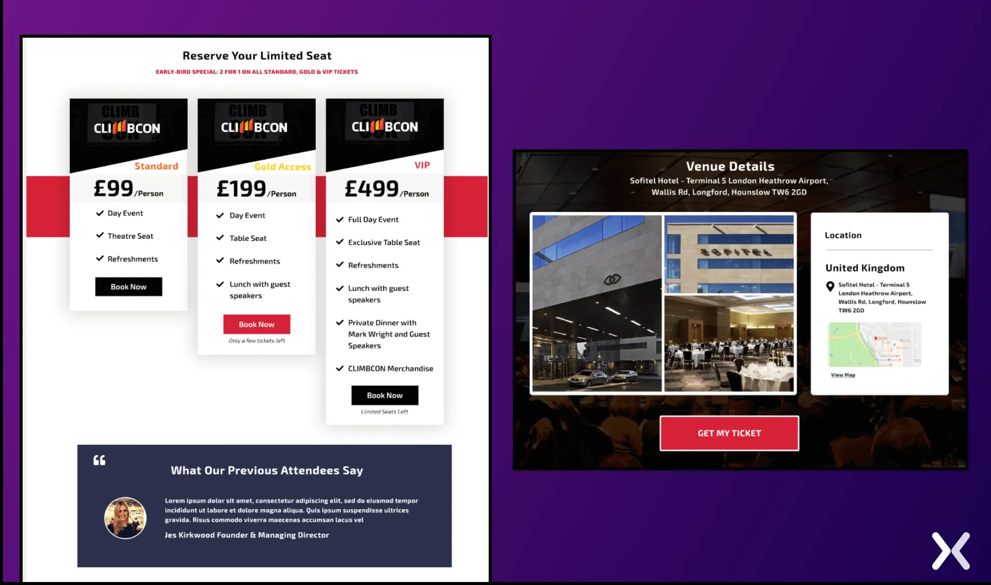 The venue details and pricing sections on this page set a high standard, making them must-replicate features for any event landing page.


Semrush’s Spotlight event page has a color scheme that deviates from Semrush’s traditional branding. The design offers a fresh and unique vibe while subtly echoing the brand’s identity, creating a distinct atmosphere for the event without losing connection to the parent brand.
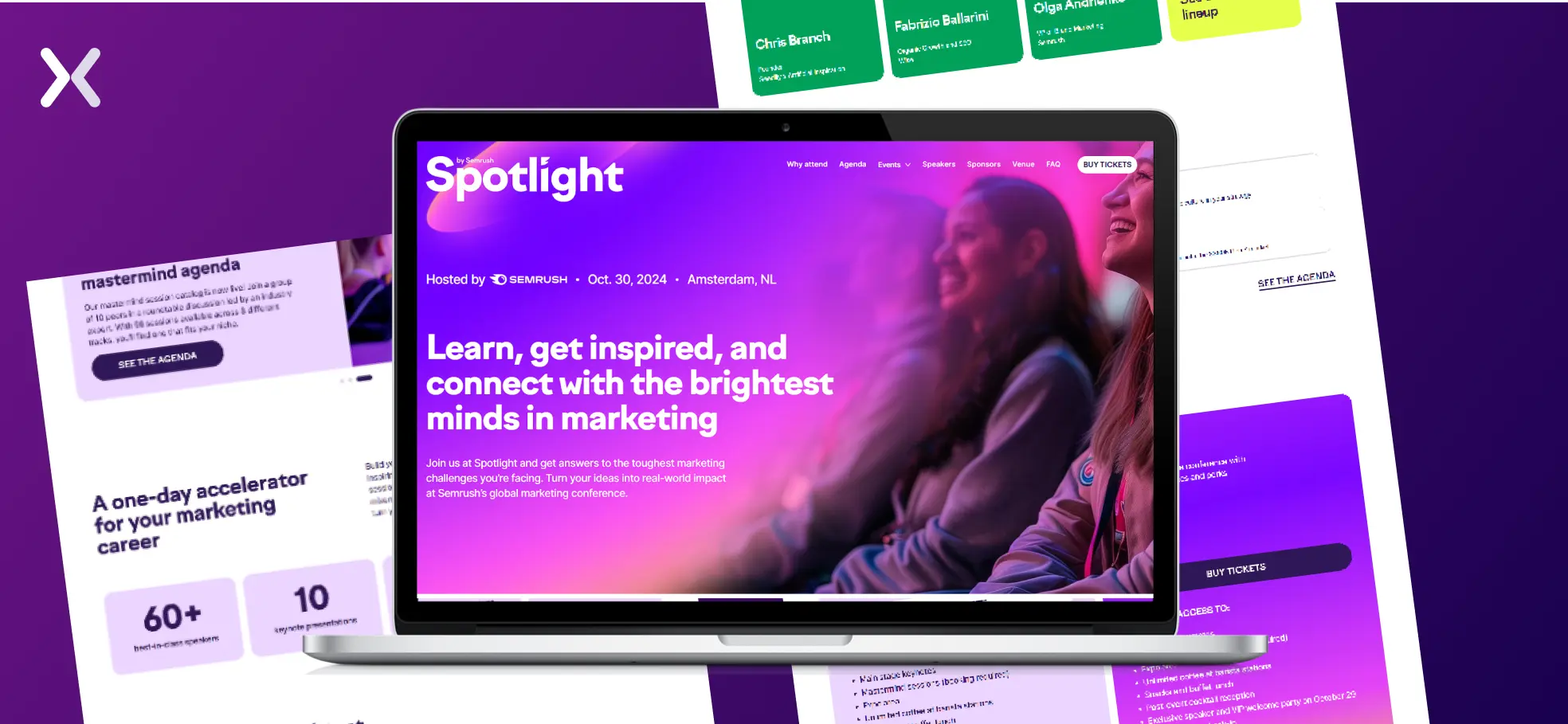
The page includes dedicated sections outlining ticket pricing and perks, with clear options for different budgets and special discount offers tailored for working professionals. This makes it easy for attendees to choose the best fit for their needs.
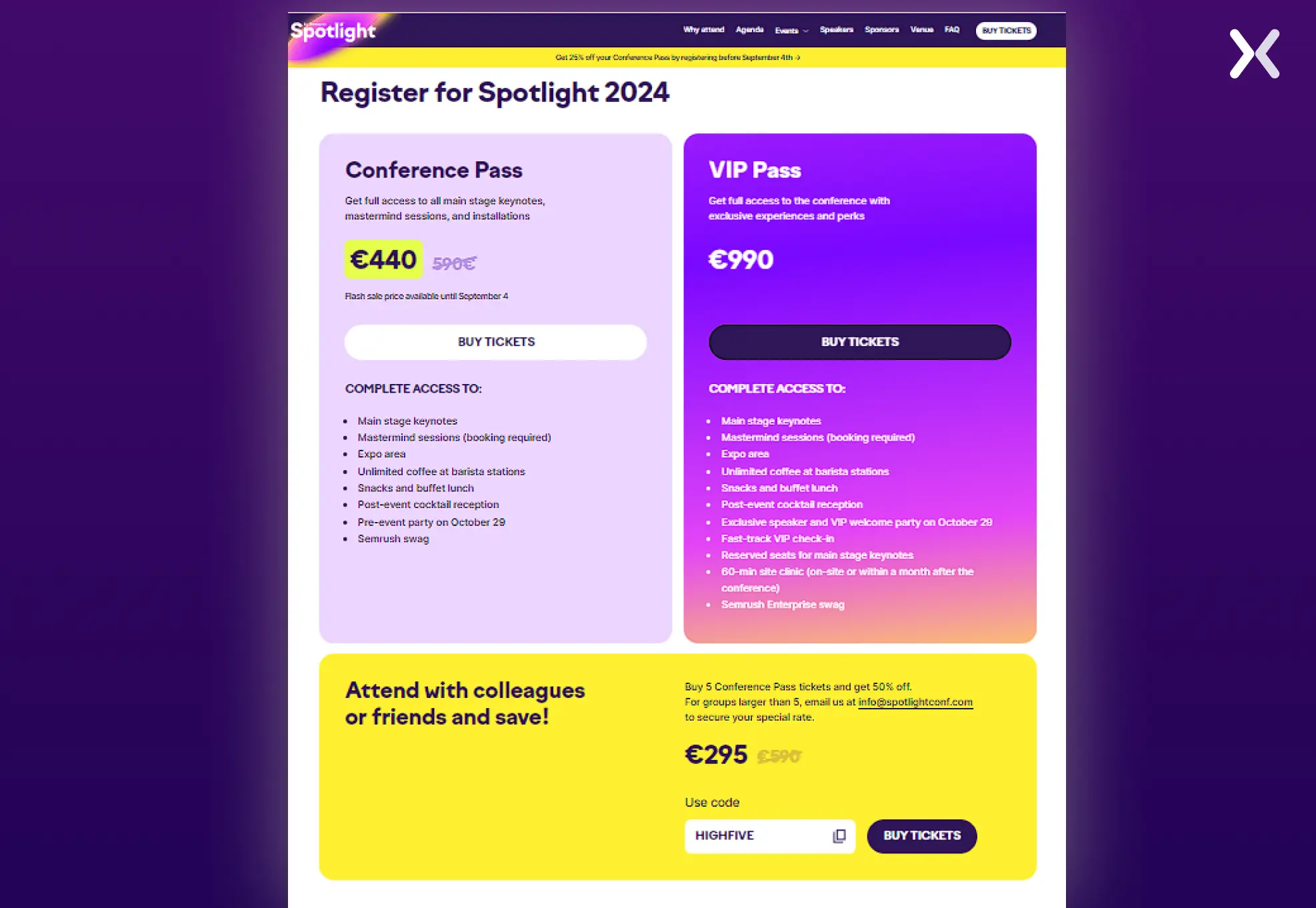
The event landing page’s high-quality images and clean design draw attention without overwhelming visitors.
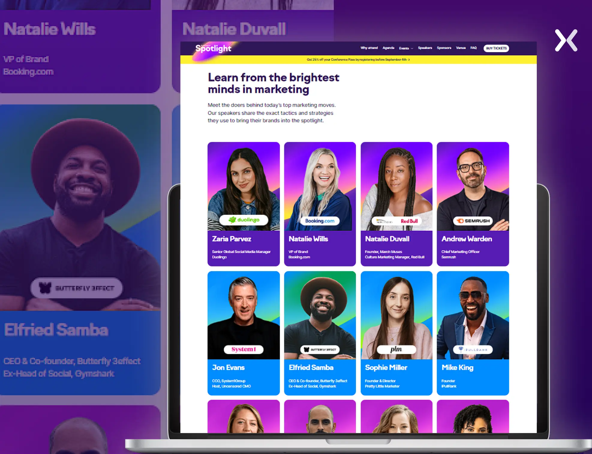
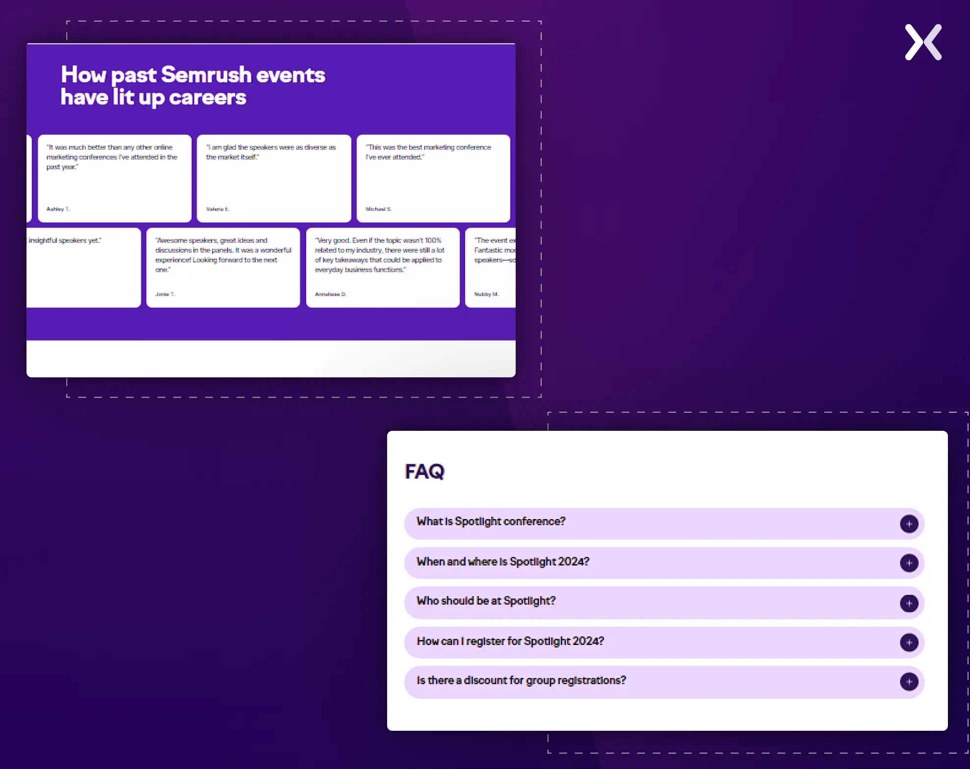
The speakers section is well-structured, presenting each speaker’s expertise alongside the brand they represent. Such thoughtful organization accents its credentials and draws attention, improving the page’s appeal and encouraging users to engage further and consider attending the event.
The event page includes an FAQs section that addresses common attendee concerns. It covers topics like registration, discounts, etc. Answering such potential questions upfront helps provide clarity and reduces barriers to registration.
This page includes many testimonials from past attendees, making it more credible and appealing.
 The page also includes a convenient CTA for booking hotels near the event venue, making it easier for international attendees to secure accommodations and making sure the location is accessible to participants from around the world.

“In integrating social proof, credibility is built in to ensure registrations. This could be including testimonials from past attendees, logos of recognized sponsors or partners, and user-generated content taken from social media. Another good avenue is to show metrics such as the number of attendees in the past, positive reviews, or awards won by the event. This creates visuals of happy attendees or influencers speaking at the event-a sense of trust and community.”
The FreezerFit event landing page excels with its straightforward approach, featuring concise copy and realistic images. While this event doesn’t focus on multiple speakers. It’s designed to engage a large audience eager to learn meal prep techniques.
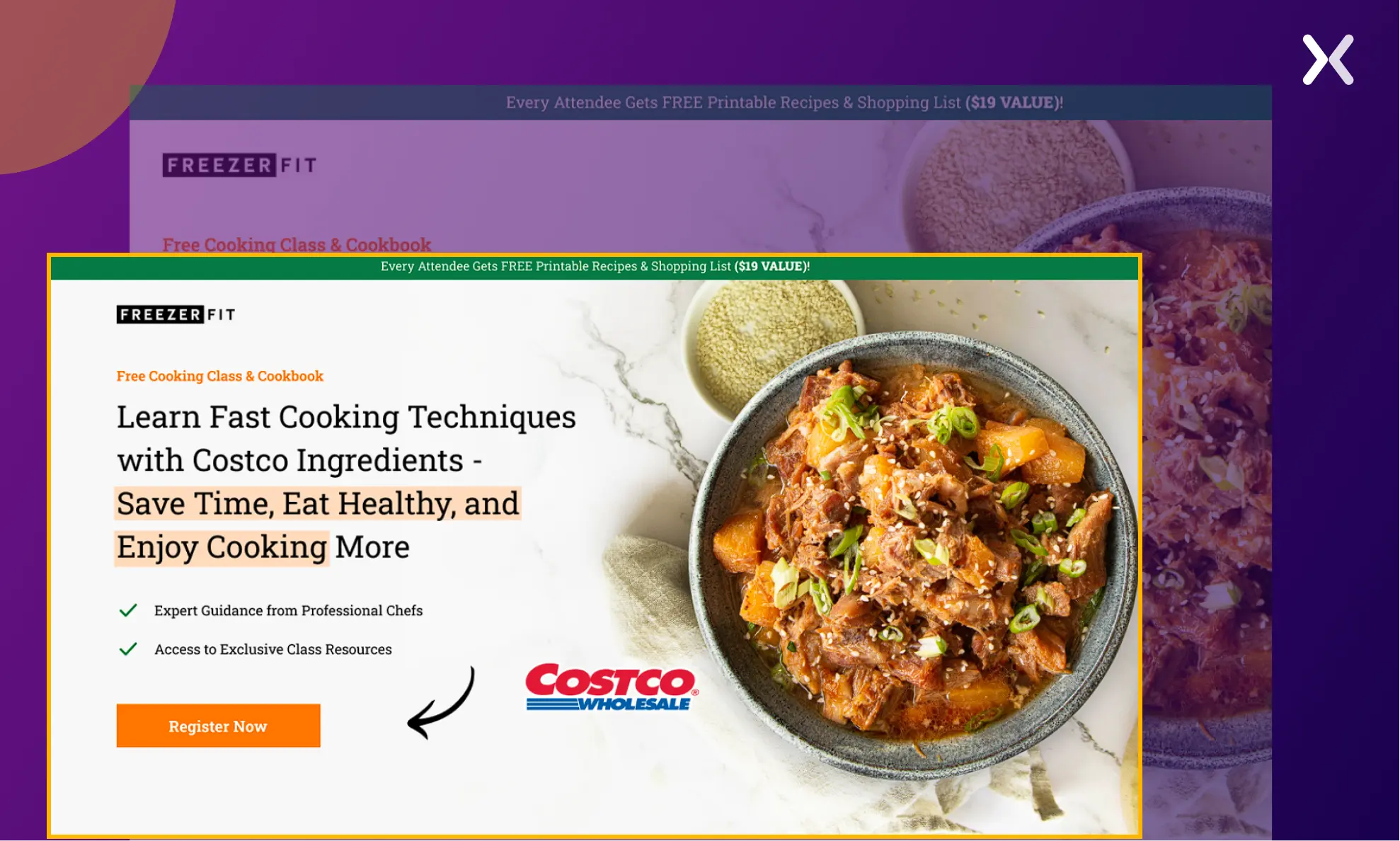 The landing page effectively accents what attendees will gain from the event, using neatly presented sections paired with relevant images. This clear presentation makes sure that potential participants understand the value they’ll receive, making it easy to see the benefits of attending.
The page has a sticky bar that prominently presents the bonus gifts each attendee will receive, stressing their value by sharing their equivalent pricing.
The page builds trust and reinforces brand credibility by including testimonials from past attendees, presenting positive experiences and brand strength.
The page offers a full FAQ section thoughtfully crafted to address common questions in a highly customized manner, making sure clarity for potential attendees.
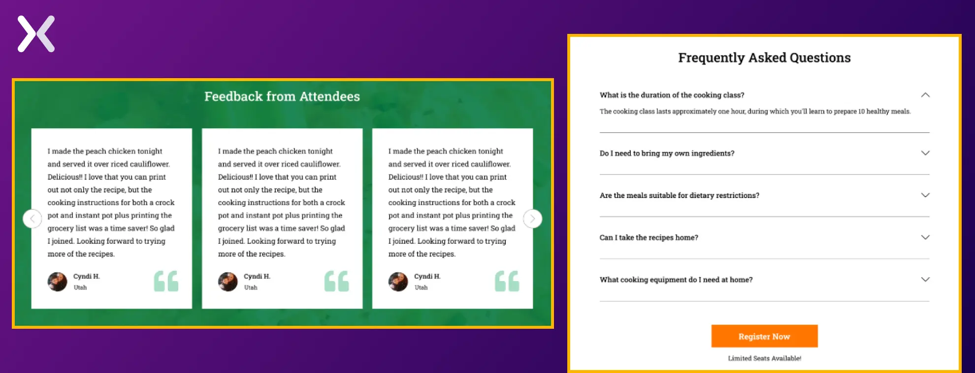
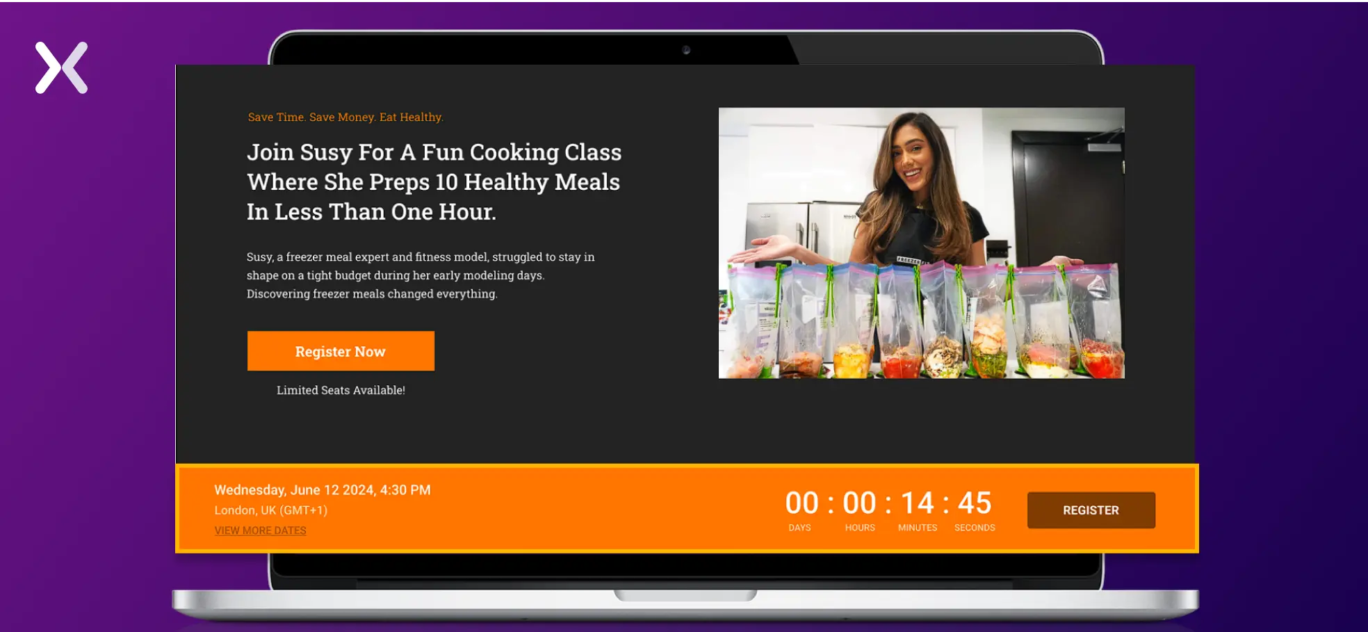 The page flaunts a solid background with well-placed social proof, such as testimonials and the speaker’s presence on prominent new channels and sites.
This event landing page makes a strong impression from the start. The above-the-fold CTA displays the starting ticket price, encouraging immediate bookings. It’s followed by a concise three-point section marking the key benefits of attending, effectively serving as the event’s unique selling proposition (USPs).
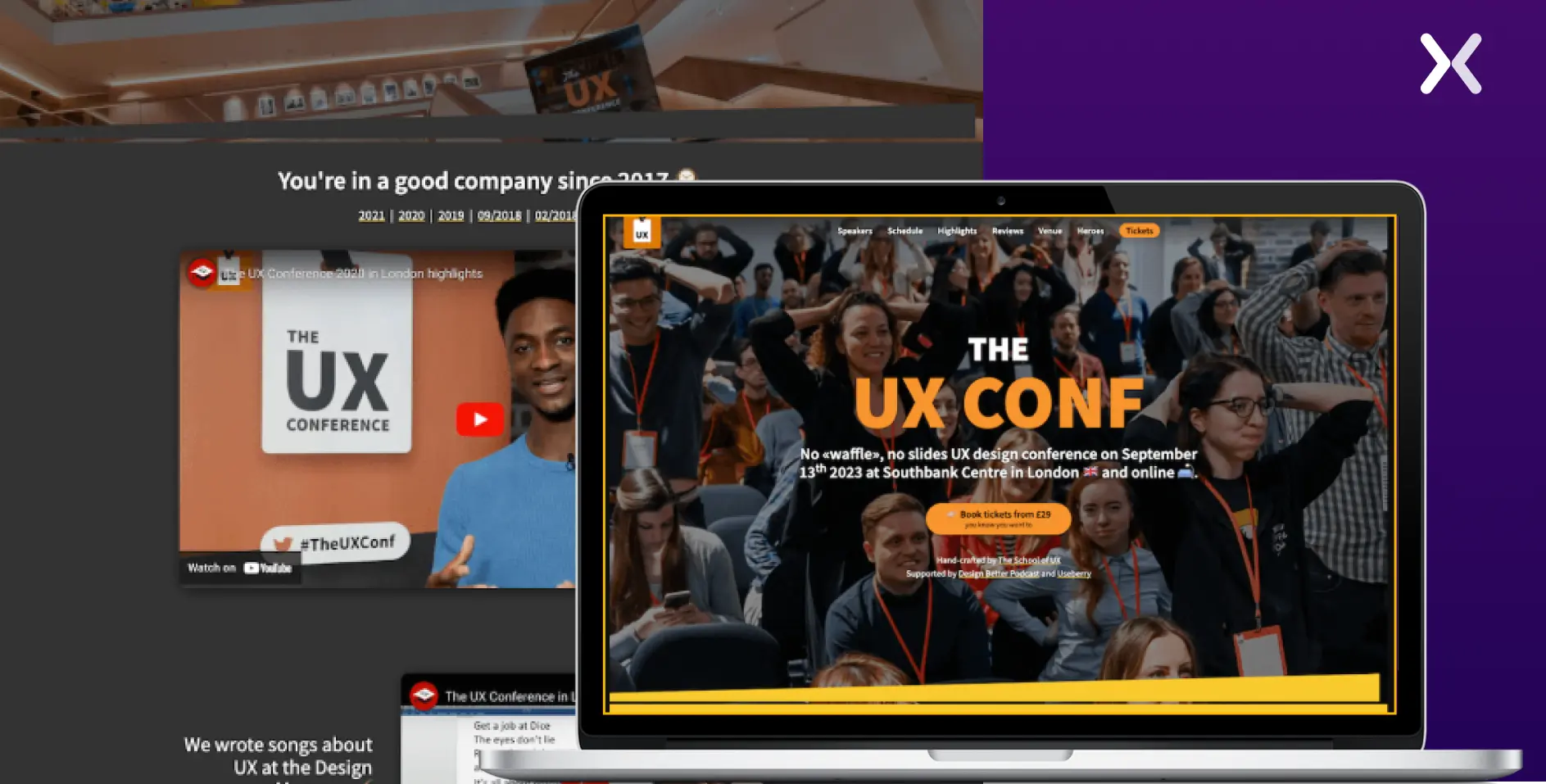 The top fold features strong copy and deliberately places each element to maximize conversions, demonstrating a well-thought-out design focused on driving action.
The layout is well-organized, with distinct sections for the event’s key aspects, such as the agenda, speaker lineup, ticket pricing, and testimonials, making it easy for users to find the information they need.
The page includes a map that provides clear directions to the event location, making it easier for attendees to plan their visit.
The phone number is conveniently placed in the footer, making sure that users can easily reach out for any queries or support.
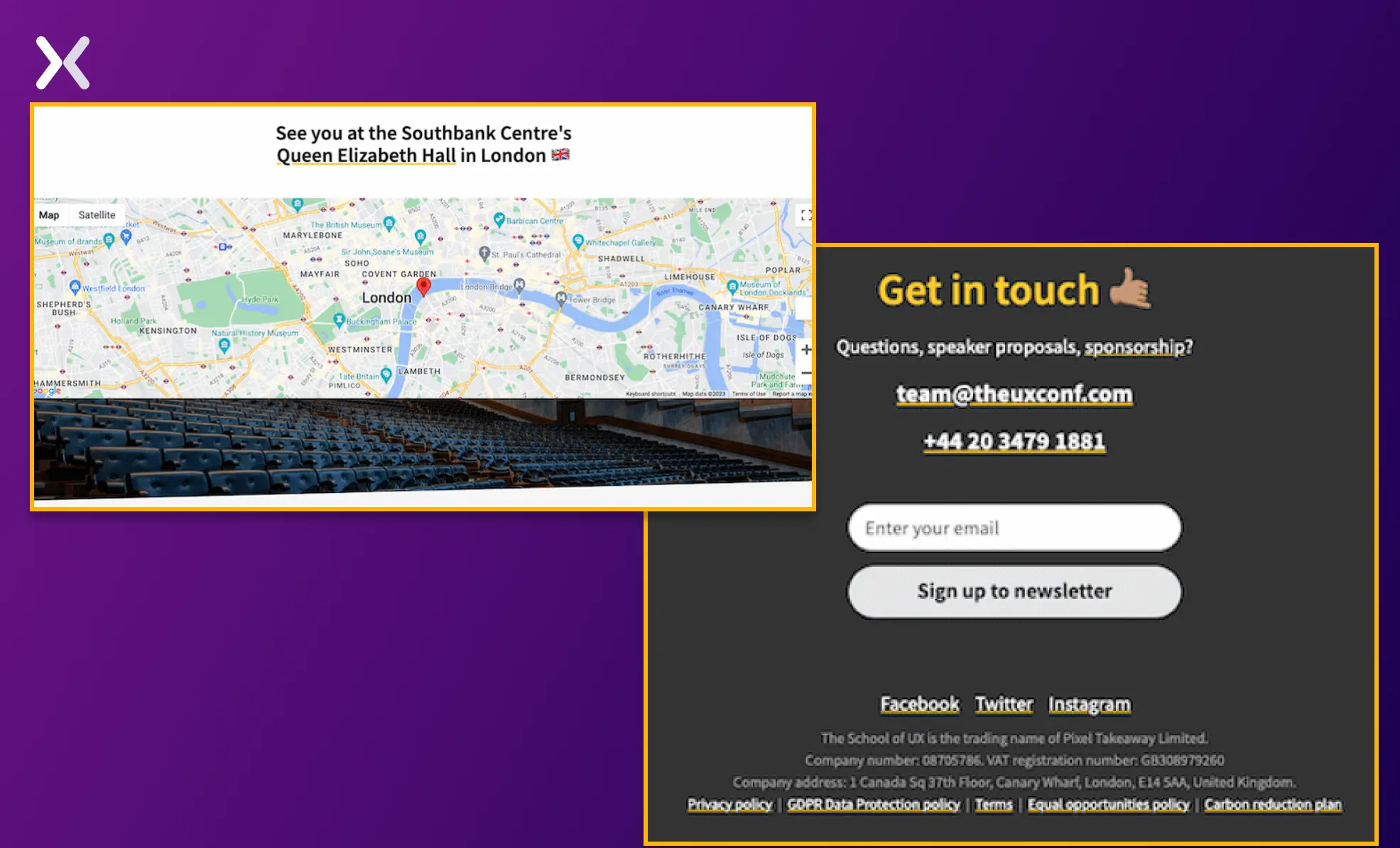 The only elements that can be added to the page are FAQs and a countdown timer.
After the event concludes, updating your landing page with event accents and sharing recorded versions of key sessions is essential.
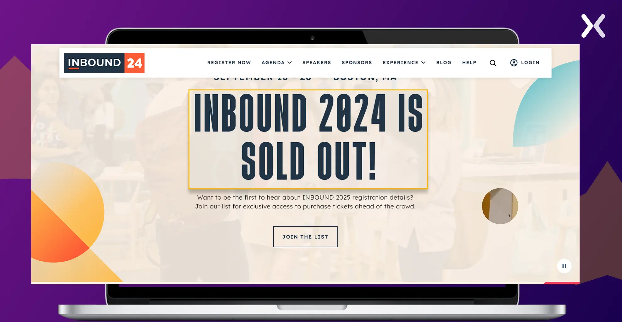 This keeps the page relevant and engages potential attendees for future events, giving them a glimpse of what they missed and what they can look forward to next time.
“To optimize an event landing page for higher conversions, highlight a strong value proposition, create scarcity, offer tiered packages, and experiment with pricing. Test both long and short-page formats to see what drives better results.”
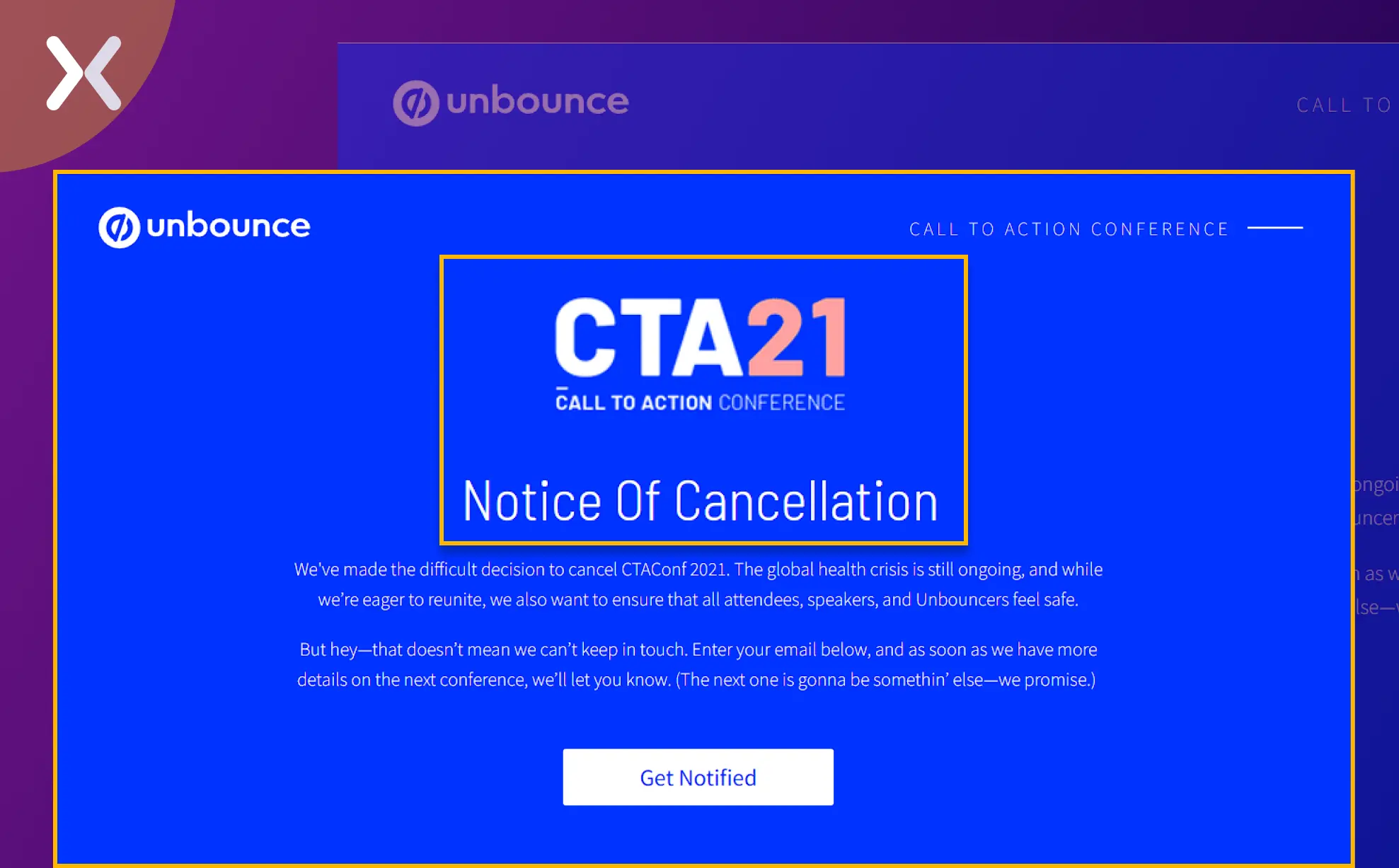
If the event is canceled, make sure that your landing page is updated accordingly. Here’s how Unbounce handled an event cancellation.
Let’s dissect Alex Cattoni’s Poose Fest landing page to understand how she created her event landing page. This long landing page has attractive imagery, icons, and a bold color palette complemented by a firm copy.
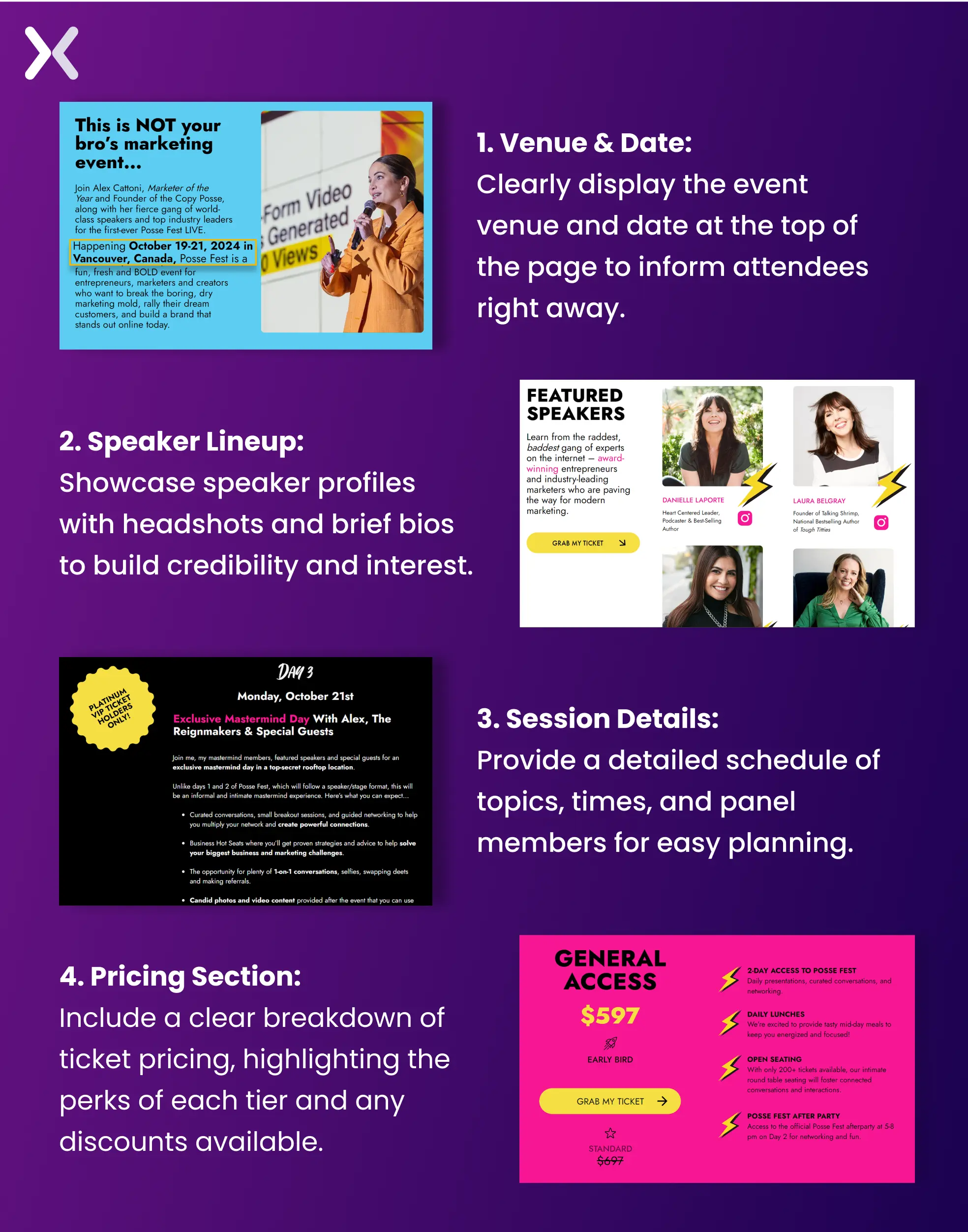 The top half of the page is filled with necessary elements like venue and date, social proof, discount offers, agenda, USPs, and information about the host.
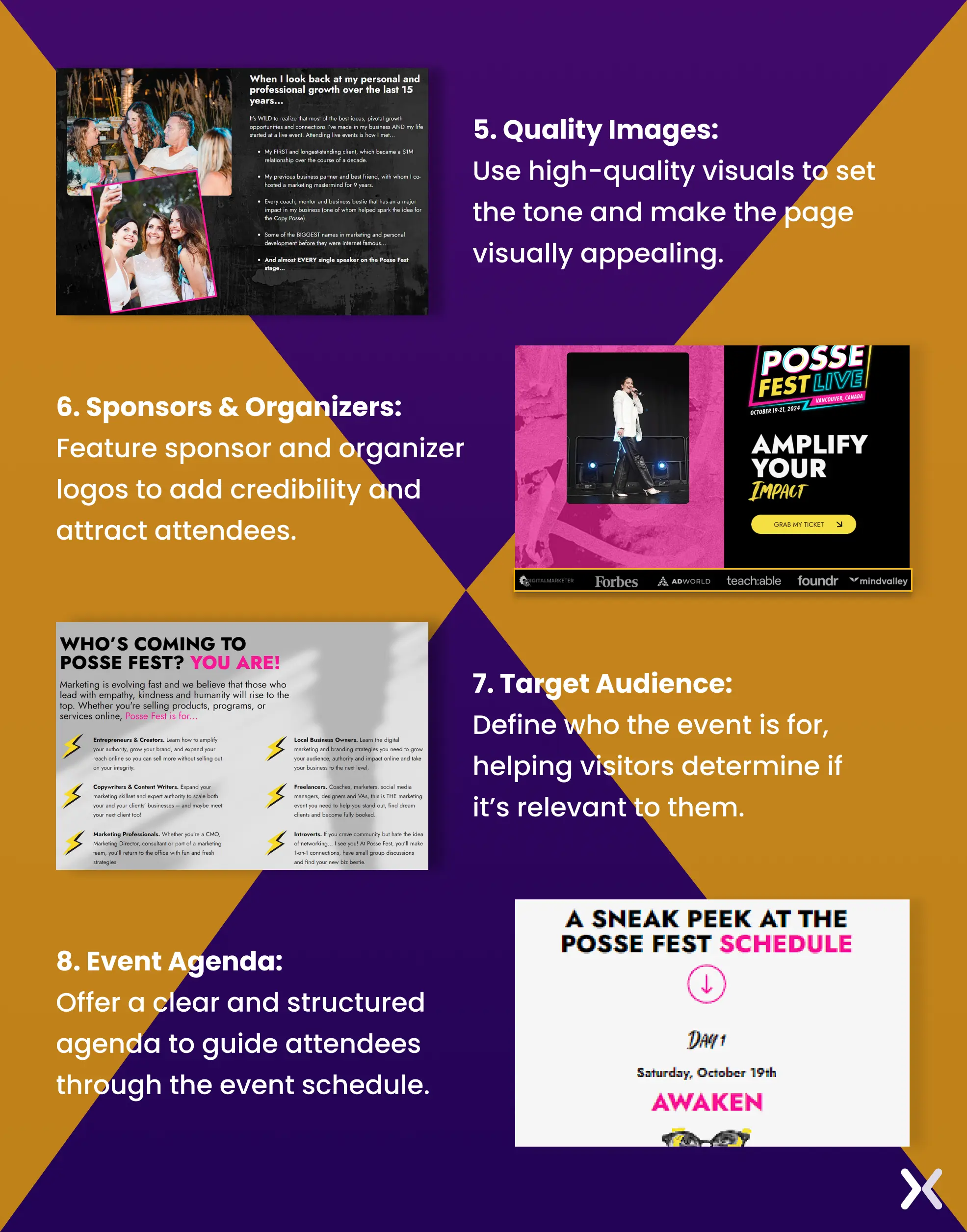 The page is woven in a story-like manner that presents how the event has the potential to impact its audience.
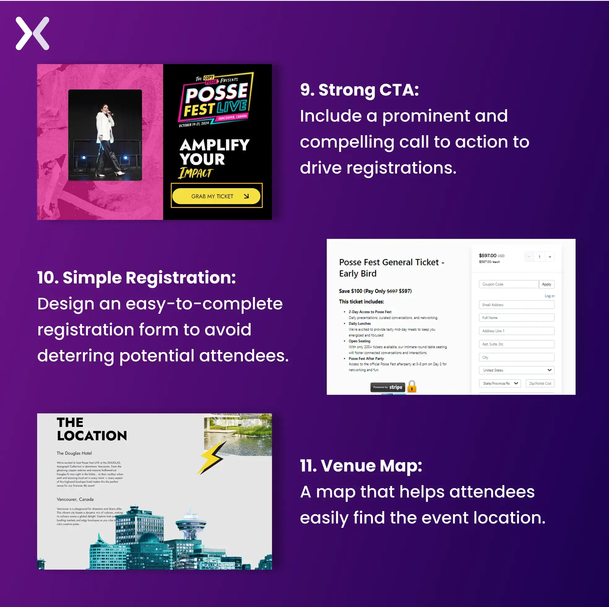 A countdown timer would have improved this page, but overall. It’s worthy of inspiration and a quick addition to your swipe files. Also, remember your URL of your event landing page needs to unique and loaded with UTMs, so it is easy to track. What else coudl make your event landing page better? A thank you page filled with all the other necessary event information or maybe a PDF to download for the same.
Creating an effective event landing page hinges on thoughtful design and strategic elements. While certain features, such as a strong speaker lineup and high-quality images, are fundamental, incorporating unique elements like contact information and interactive venue maps can set your page apart. Although not every element is mandatory for every event, the examples discussed in this article accent time-tested features that have proven successful in driving traffic and boosting conversions. By integrating these essential components into your event registration landing page and pairing it with a strong CRM system to manage sign-ups. You can increase your audience engagement and achieve higher sign-ups. Prepare your landing page with these key elements to maximize its impact and take your event to the next level.
Did you know that Apexure has 100+ blog posts on landing pages? We have shared everything, from creation to testing, analysis to optimization. Check it out before you build your landing page.
Making an event landing page on your own can be overwhelming. Get the help you need from our experts. Book a call and one of our landing page experts will contact you soon.
Check out our landing page portfolio to discover conversion-friendly landing page elements that might. Filter your industry and check which landing page design is trending.

Avoid cluttered designs, confusing navigation, and vague information. Ensure your call-to-action is prominent, the registration process is straightforward, and the page is mobile-friendly.
Related Articles:
As CEO and Founder of Apexure, Waseem Bashir's decade-old experience in building high-converting landing pages extends to collaborations with Fortune 500 leaders. From free to paid he has tried his hands on all landing page builder tools and knows just the right fit for every business. Read more


Drive More Sales or Leads With Conversion Focused Websites and Landing Pages
Get Started

Eleven percent of Meta ad rejections in 2026 trace back to one problem: the landing page does not...
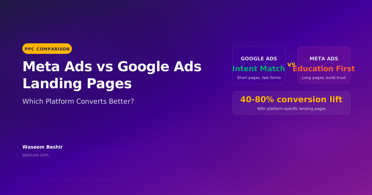
A B2B SaaS company spends $30,000 per month on Google Ads and Meta Ads. Both campaigns drive traffic...
Get quality posts covering insights into Conversion Rate Optimisation, Landing Pages and great design