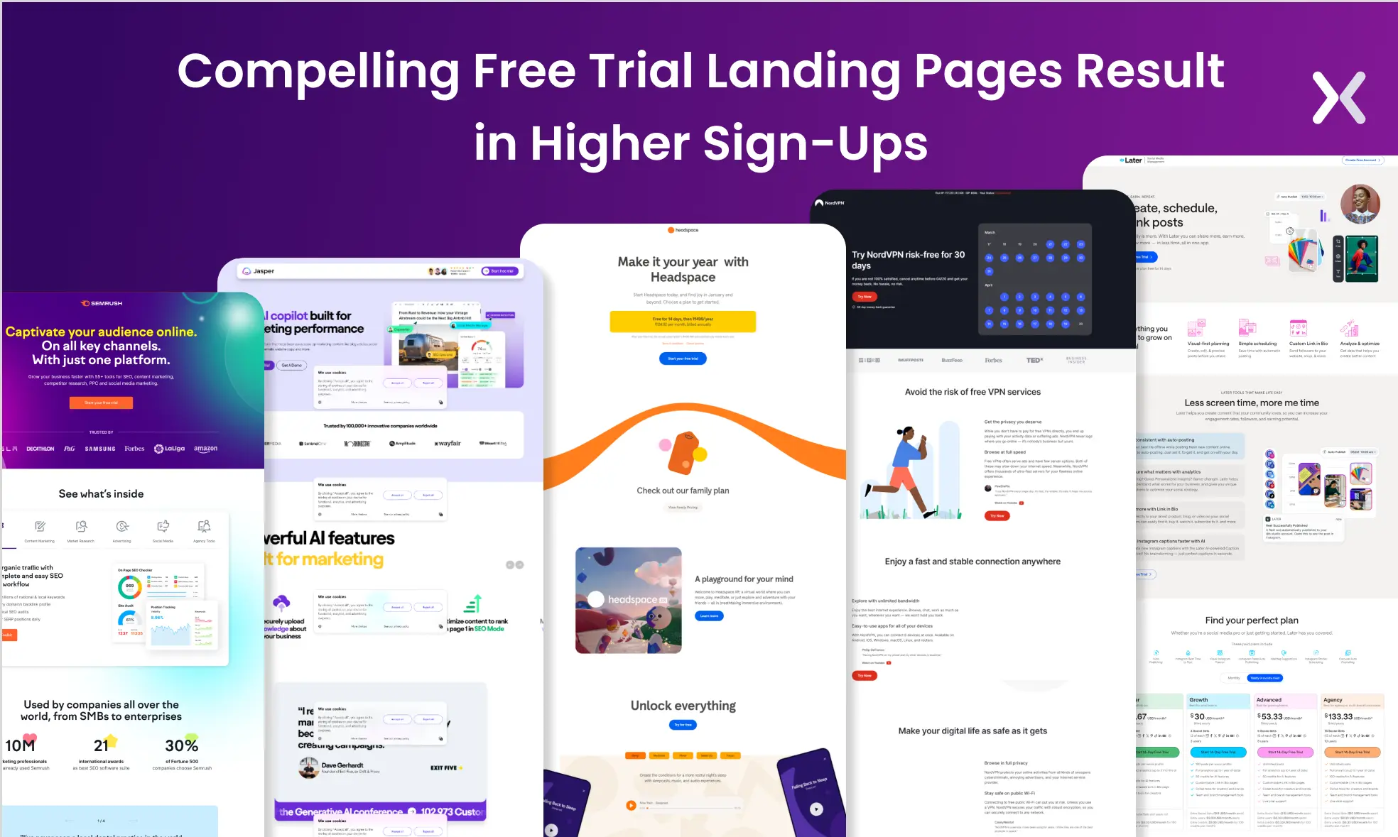
A free trial landing page is essential for introducing your product to the right audience and bringing them closer to conversion. But it’s easier said than done. While offering a free trial might sound attractive, it is necessary to remember that a company has to invest time and effort in giving the product a try. Your free trial landing page must be convincing enough to capture the potential customer’s attention. A good free trial landing page helps you get more out of your advertising spend and creates the buzz necessary for your product to grow. On the flip side- a weak landing page won’t cut it. We have gathered 15 amazing free trial landing page examples that present how it’s done. These examples can provide you with best practices and inspiration for making every element of your landing page about conversion. Let’s start from the basics.
What is a free trial landing page and its types?
Free trial landing pages are web pages built to offer a trial of a product or service free of cost. Such landing pages work best for identifying and capturing hot leads and allowing them to experience your product first-hand without much risk.
 Industries like SaaS, education, and gaming platforms use the free trial offer to its full extent.
Broadly, there are four types of free trial offers.
Industries like SaaS, education, and gaming platforms use the free trial offer to its full extent.
Broadly, there are four types of free trial offers.
-
Users can access all the product features for a limited period. For example, Unbounce offers a 14-day free trial, after which users must subscribe to keep access.
-
In this the trial is limited for a period, but the provided features are also restricted during these trials. Users can open more functionalities only by purchasing.
-
Users have indefinite access to some basic product features. To access more features or an upgrade, they would need to purchase the premium version.
-
Similar to time-based trials, dynamic trials allow users to access all the product’s features. However, at the end of the trial, users are shifted to a freemium package instead of being completely locked out of the product.
But is it really important to build a free trial landing page? Let’s find out.
11 free trial landing page examples
Let’s discuss some free trial landing page examples and understand their design.
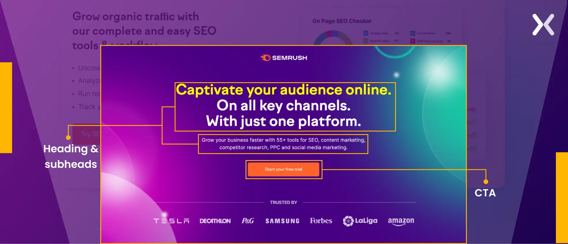
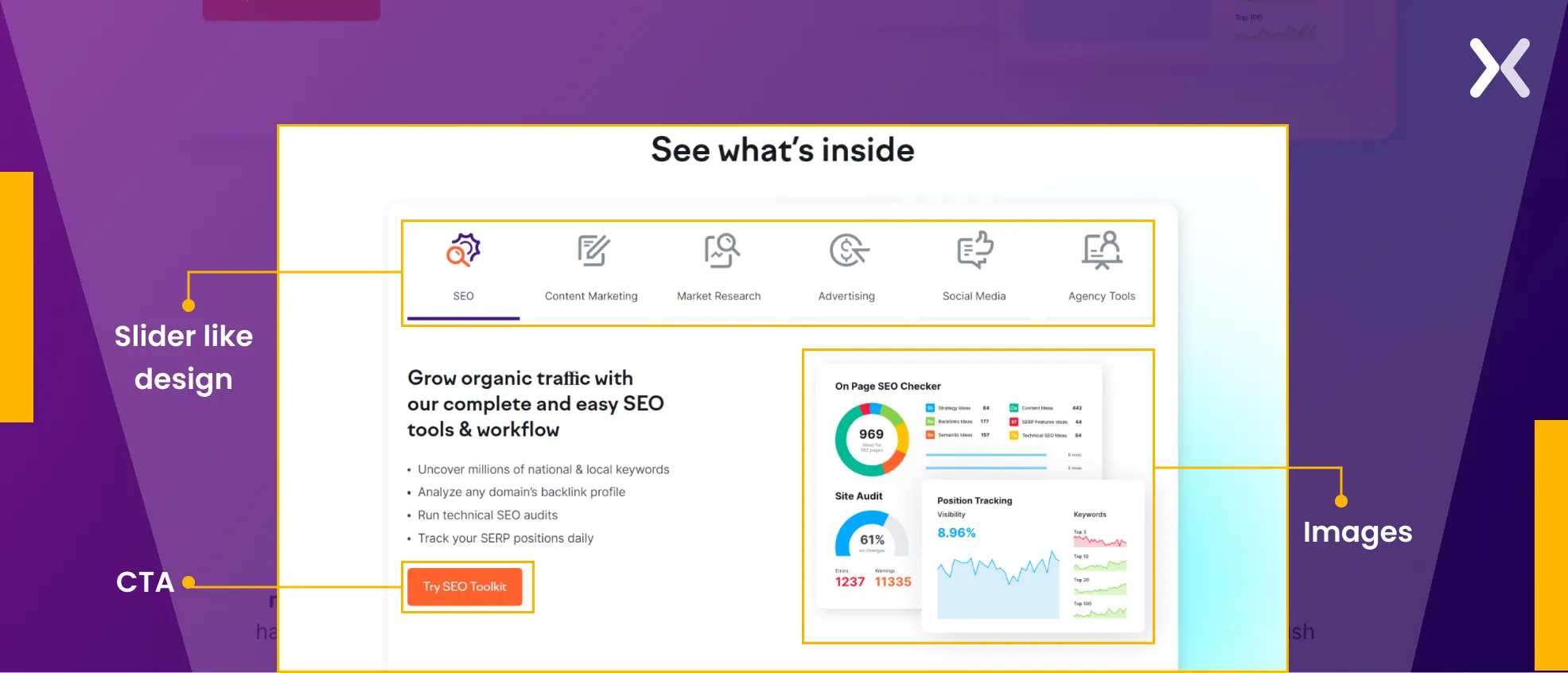
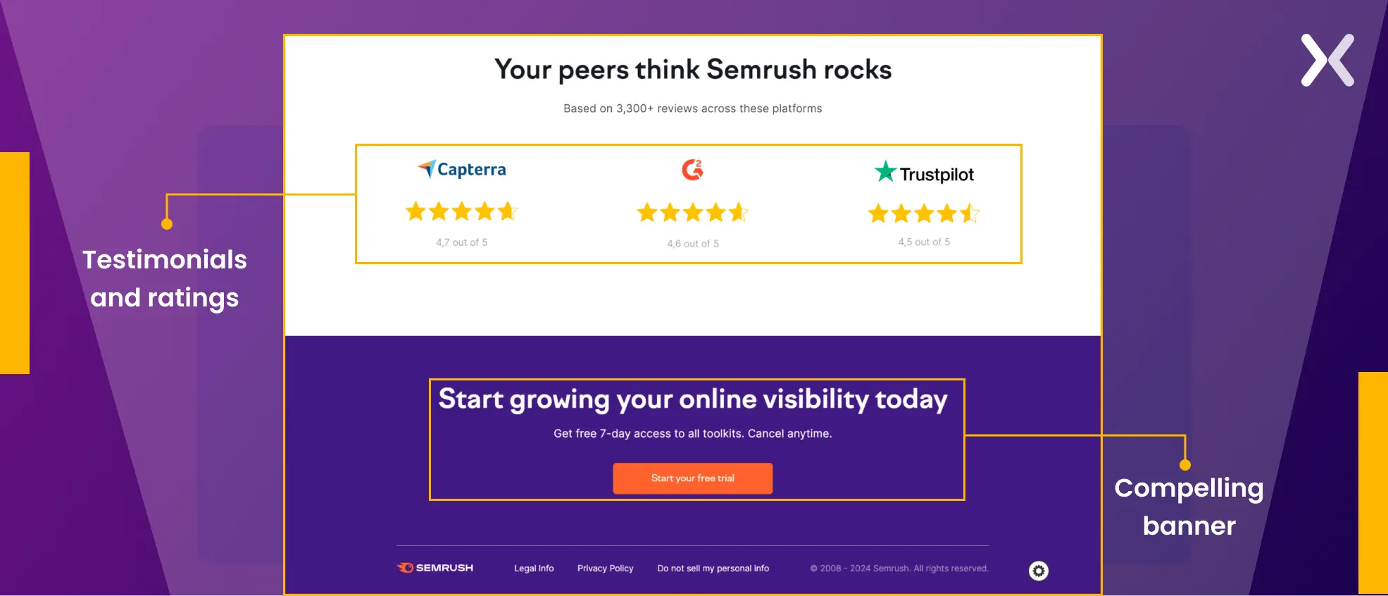
1. Semrush free trial landing page
Semrush has a engaging free trial landing page with all the elements that make up for an amazing user experience. Let’s break the landing page down to understand its various sections.
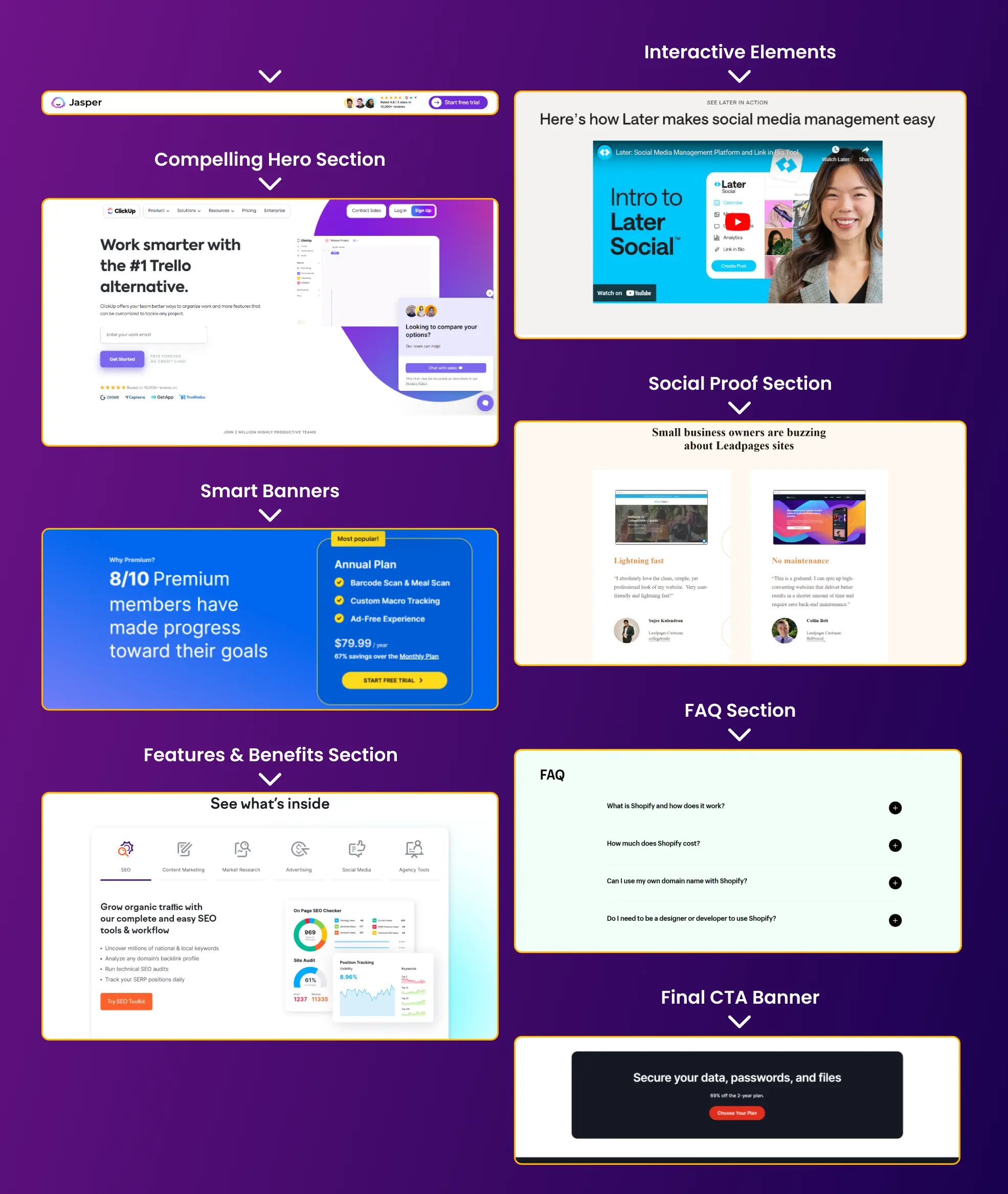
- The hero section of the Semrush trial page is clean and effective. A bold headline, supported by a clear subheading, introduces Semrush’s services. The orange CTA button stands out, and social proof from notable companies improves credibility. It’s a setup that sparks curiosity and drives clicks.
- Instead of a lengthy list, a slider-like design presents various ways Semrush assists its clients. This keeps the page concise while offering a unique user experience. Notably, images portraying Semrush in action steal the spotlight. Each slide includes a CTA directing to the free trial sign-up page, making sure accessibility for interested visitors at every turn.
- This section is dedicated to presenting social proof. It begins with quantified evidence of the product’s success, followed by testimonials and ratings, which improve its credibility. The page concludes with a strong banner encouraging visitors to explore the tool’s free trial once more.
 The page also has a sticky bar that appears after you are past the top of the fold. This bar carries the CTA throughout the page in case you need quick access to it.
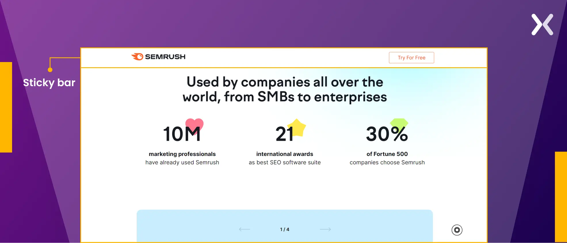 We need to also discuss theURL of this landing page (https://www.semrush.com/lp/sem-aeoy/). It is clean and clear, making it easy to recognize and track.
2. Jasper free trial landing page
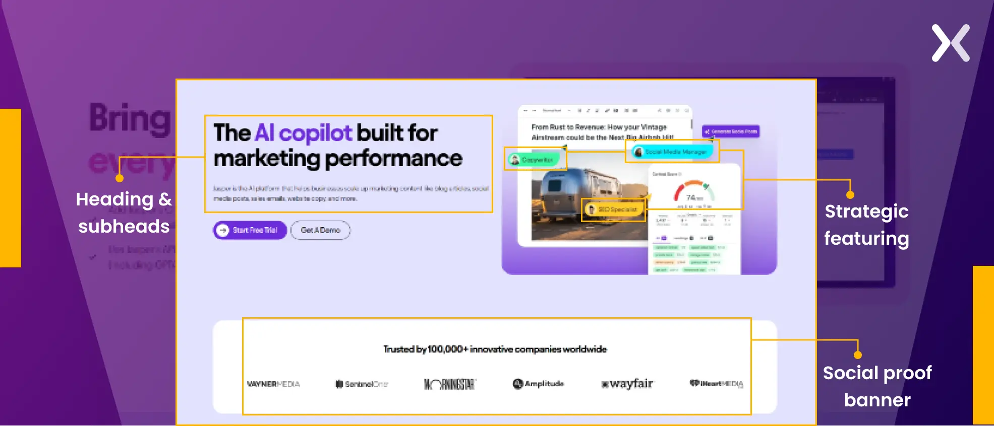
Jasper certainly has a long free trial landing page, but it is all worth it. The visuals, copy, and videos help educate the visitor while micro-converting them at the same time. Let’s take a look at its various sections:
- The header and subheader here have a copy that clearly tells what the tool is about and where you can use it with “scale up marketing content like blog articles, social media posts, sales emails, website copy, and more.” One noticeable detail in the hero image is the strategic featuring of various professional titles like “Social Media Manager,” “SEO Specialist,” and “Copywriter,” which provides clarity on the target audience for whom the tool is designed. All of this is followed by a social proof banner that features all the companies the tool is trusted and used by.
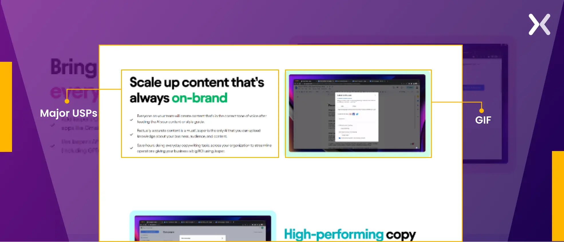
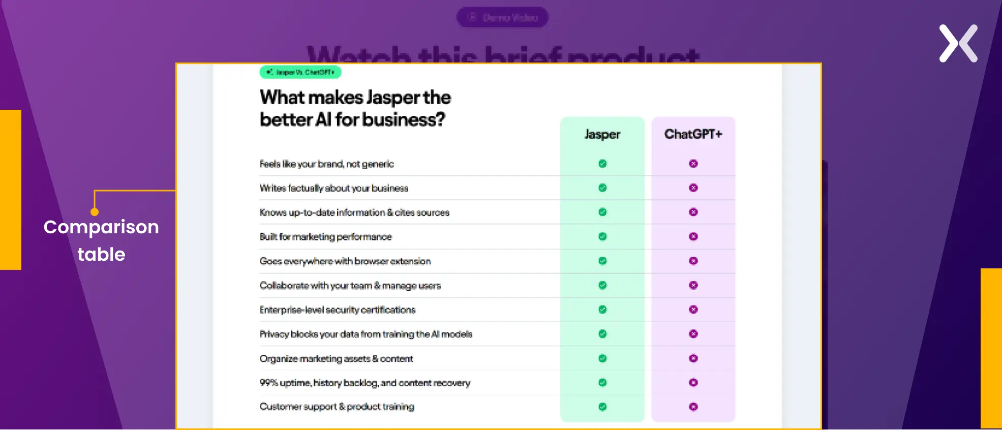
- This section accents all of Jasper’s major USPs with gifs to reinforce their value. It also has a five-minute dedicated video that gives a mini demo of how the tool works, smartly displaying how easy it is to use. The section ends with one of our favorite elements to feature on a SaaS page, a comparison table. This table takes away all your questions related to “Why Jasper and not ChatGPT?” making sure visitors that they are making the right decision.
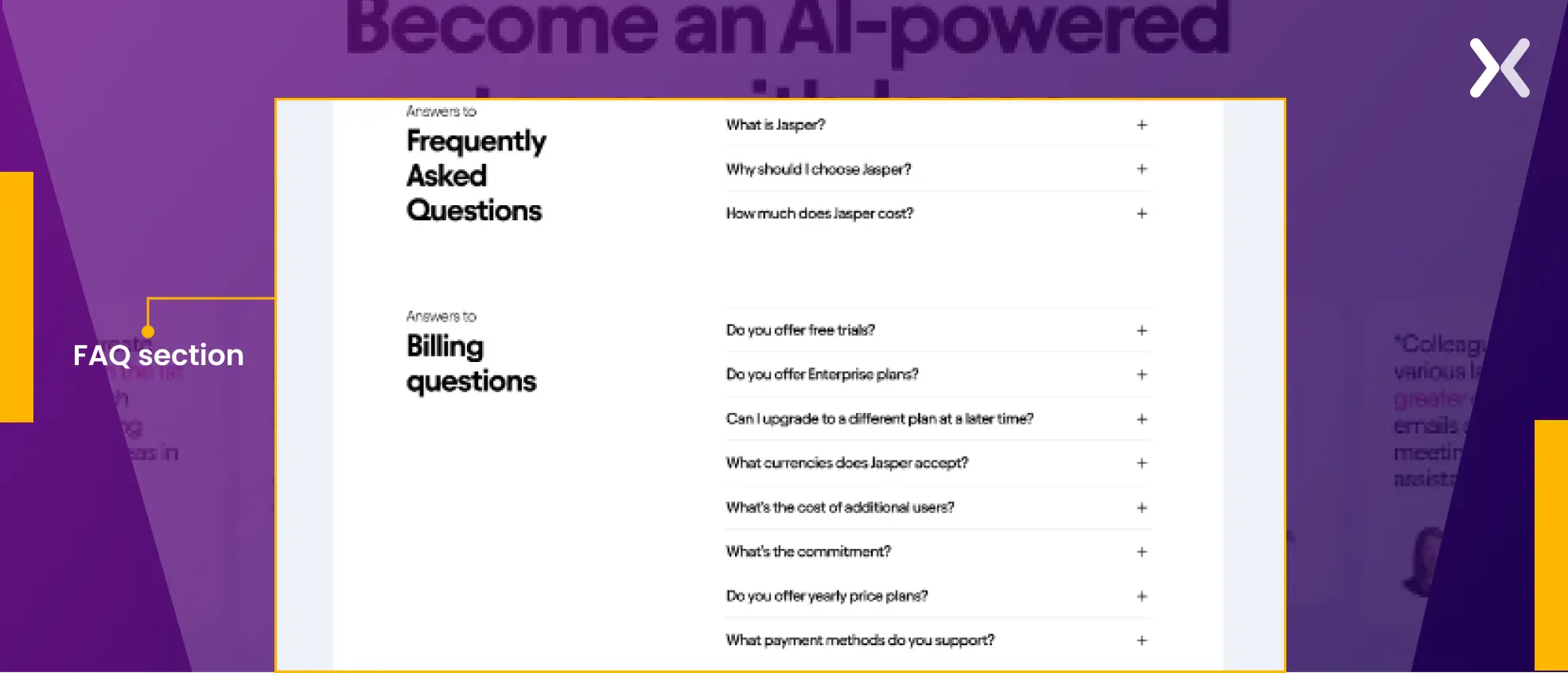
- An FAQ section at the end of a SaaS landing page is always impressive, and Jasper’s free trial page impresses. It features testimonials and their packages along with pricing to keep things transparent and win visitors’ trust, ending the section with a big banner reestablishing the primary CTA. Though the final banner looks great, it could have been shorter, given the page’s already considerable length.
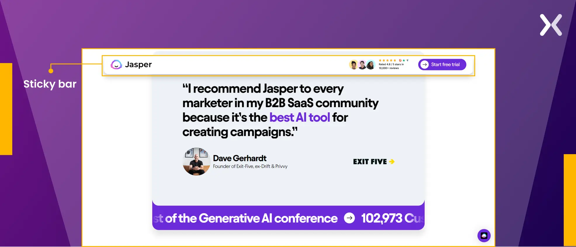
 This page also has a sticky bar at the top that moves with you throughout the page. Right next to the CTA, it features ratings of the tool on various platform, which makes for a good placement of social proof.
3. Headspace free trial landing page
Headspace’s free trial landing page is minimal and calming, synonymous with its brand. The page uses small elements to create a big impact. Before we start examining the page, we need to understand that it is a bottom-of-the-funnel page. This means most of the visitors coming to this page are already aware of Headspace, so nothing much is explained about the brand or what the tool is used for. Let’s start analyzing the page.
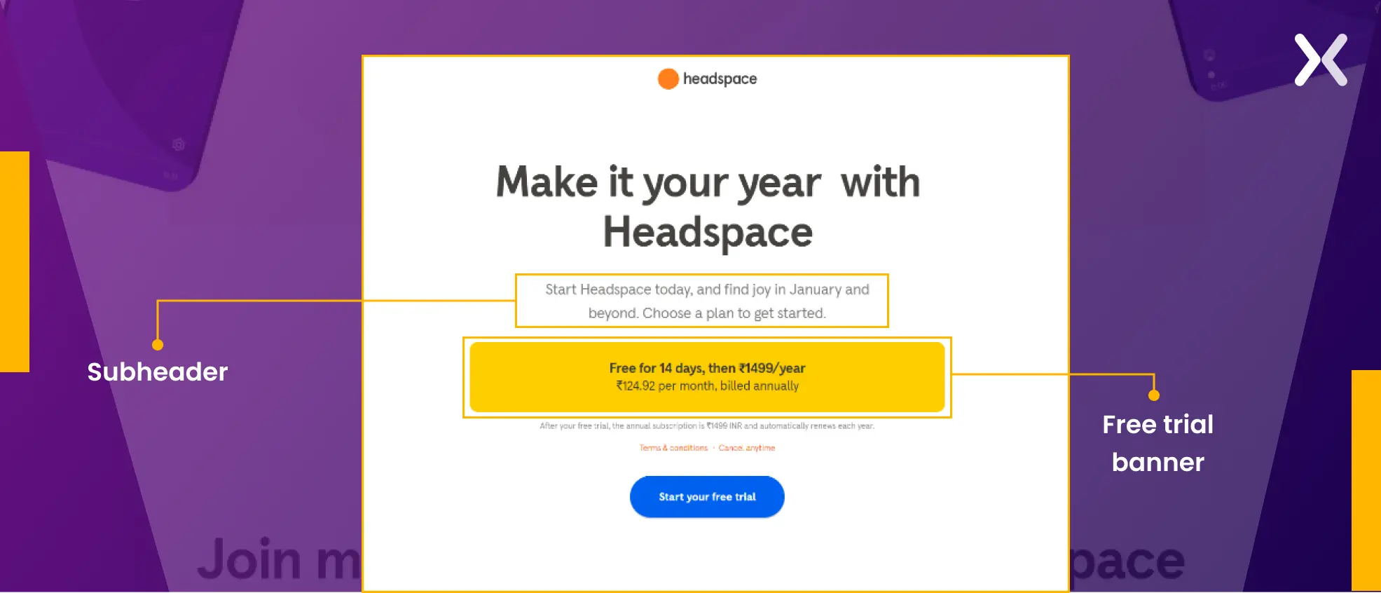
- The heading is filled with motivation and perfectly emulates the brand’s voice. Backed by a subheader, it focuses on “Starting Headspace today,” giving actionable prompts from the beginning of the page. Just before the CTA, a small banner clarifies how the free trial would work, giving visitors the correct information from the start and winning their trust.
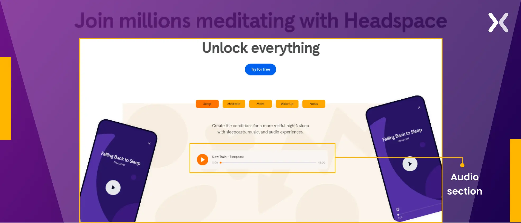
- The midsection is one of the most creative in this blog post. Instead of creating copy or visuals about how the tool works and can help its visitors, the page provides audio for various modes and moods, which you can use Headspace for. With audio options ranging from 45 to 60 minutes in the sleep and lo-fi sections, this approach effectively encourages sign-ups for the free trial.
- At the end, we have the usual testimonials, quantified social proof, and a banner that presents the app in action on the phone, which makes for a great user experience. This is complemented by a accent on its USPs and CTA.
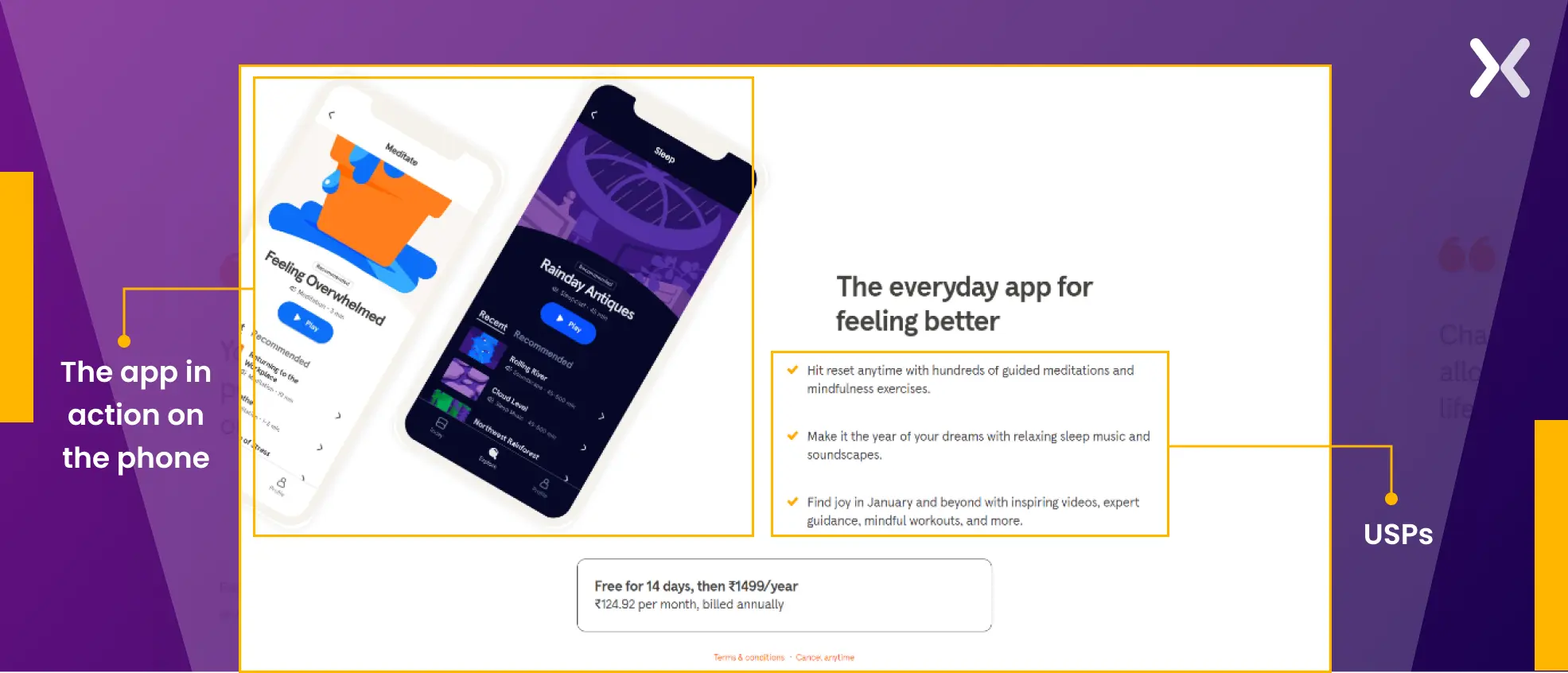 Overall the page delivers with its minimal style.
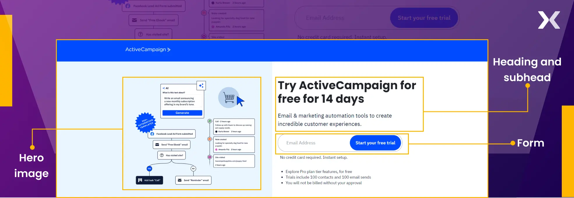
4. ActiveCampaign free trial landing page
ActiveCampaign is a marketing automation tool is has been marked as a must-try by many industry experts. Their free trial landing page presents their approach of keeping it simple yet delivering the message. This page also belongs to the bottom of the funnel and is made for people who are specifically looking for the ActiveCampaign free trial, as it ranks first in SERPs. Now, let’s break down their free trial page:
- The heading and subhead get straight to the point, as they already know the visitor is here to convert. The hero image demonstrates what the tool’s user interface looks like to familiarize the audience with it and add to the transparency. The form has just one field, which reduces conversion friction to an enormous length. If that was not all, it is also marked right below the CTA that you don’t require a credit card to sign up.
- The bottom of the page is filled with social proof. The testimonial used has been selectively picked as it represents a testimonial plus a quantifiable achievement that a client was able to get. It is followed by awards won, adding to the tool’s credibility.
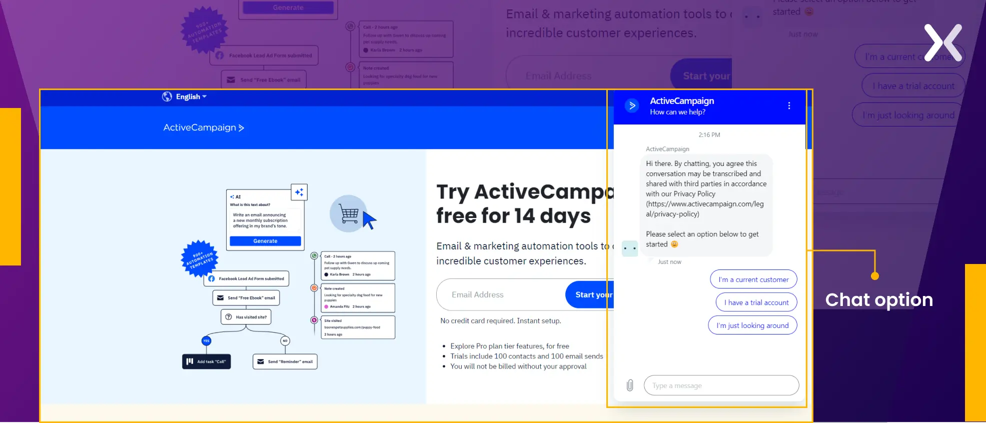
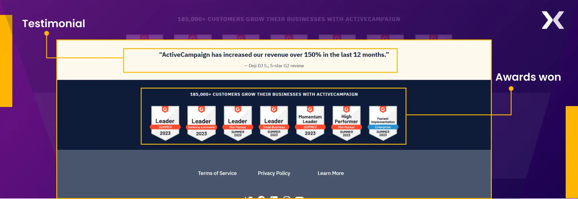 The FAQs are surely missing from the page. But what makes up for them is the chat option provided on the page, which visitors can use to ask about any last-minute doubts they might have.
5. NordVPN somewhat free trial landing page
NordVPN does not offer a traditional free trial to its visitors, but its landing page is worth noticing. It stresses its 30-day money-back guarantee. Let’s see what is on this page:
- The page’s heading mentions, “Try NordVPN risk-free,” which sets a positive tone from the start. To stress the 30-day trial period, a calendar illustrates the timeframe for accessing the tool. This is followed by a small banner of popular company logos using NordVPN.
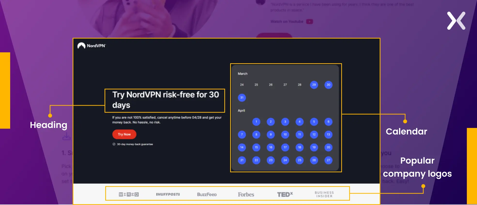
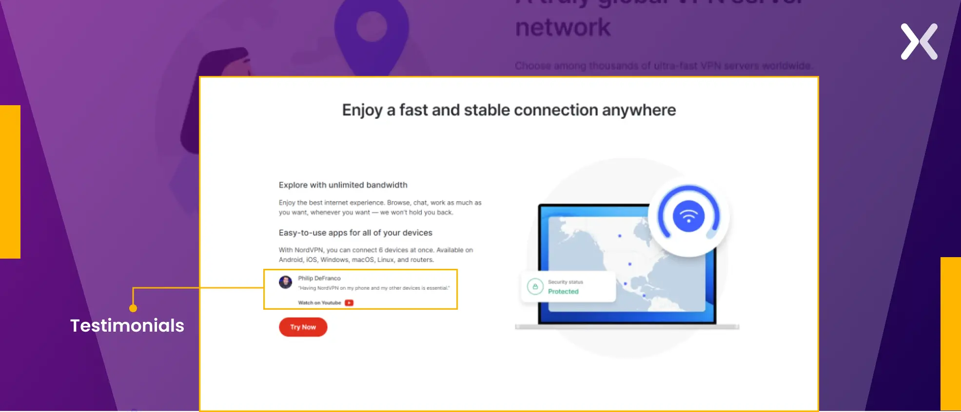
- The page is neatly divided into three segments, addressing various use cases and potential pain points that visitors might encounter. Each section features testimonials from well-known influencers, improving the product’s trustworthiness.
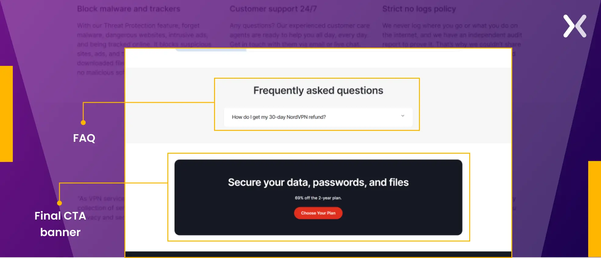
- It reasserts NordVPN’s various USPs while also marking user testimonials and other social proof. The ending section has a single but necessary FAQ at the end, followed by a final CTA banner.
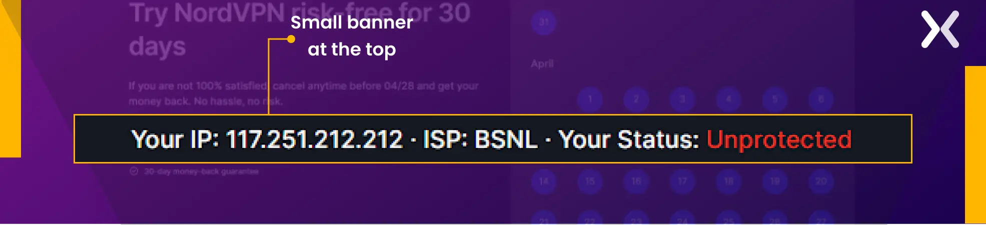
 Notably, they have a small banner at the top of the page that presents your IP address and ISP, which makes you feel insecure. However, the copy deliberately counters this by utilizing words like avoid the risk, no risk, and risk-free.
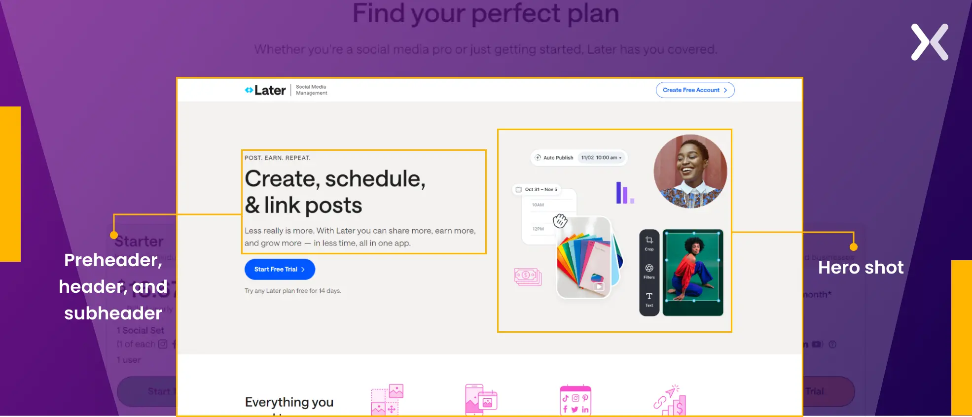
6. Later free trial landing page
Later has the perfect free trial landing page for its top-of-the-funnel audience. It introduces its product and keeps the attention by presenting its USPs. Let’s see how their page works so well.
- A preheader, header, and subheader work in coherence to introduce you to the Later tool. The hero shot accents some sneak peeks of what you can do with the tool to generate curiosity.
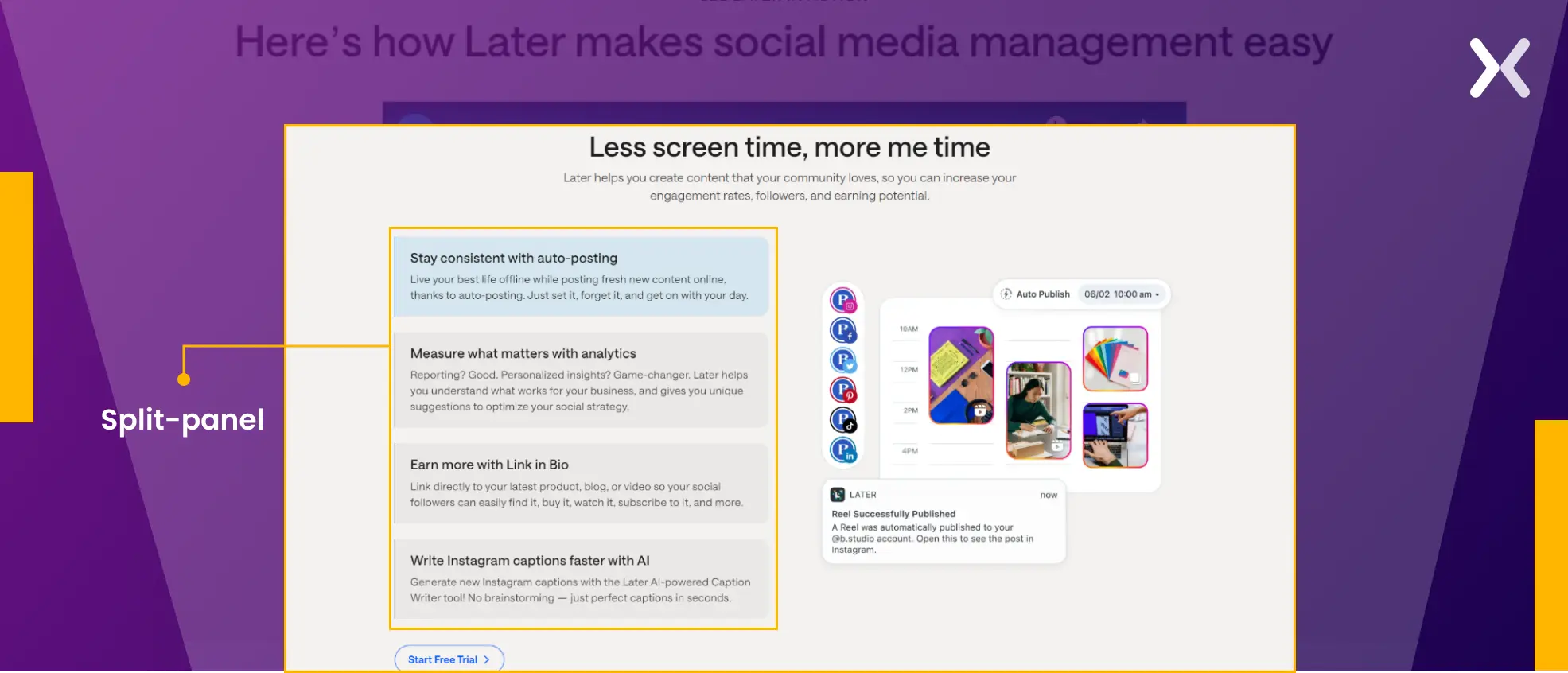
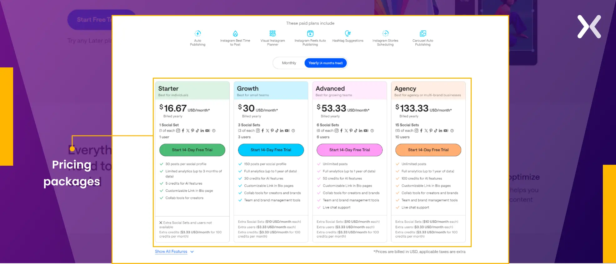
- Akin to the Semrush trial page, Later employs a split-panel design to condense content without sacrificing impact. Accompanied by strong copy and visuals, this section also presents the tool’s pricing packages, each with a clear CTA inviting users to begin a 14-day free trial.
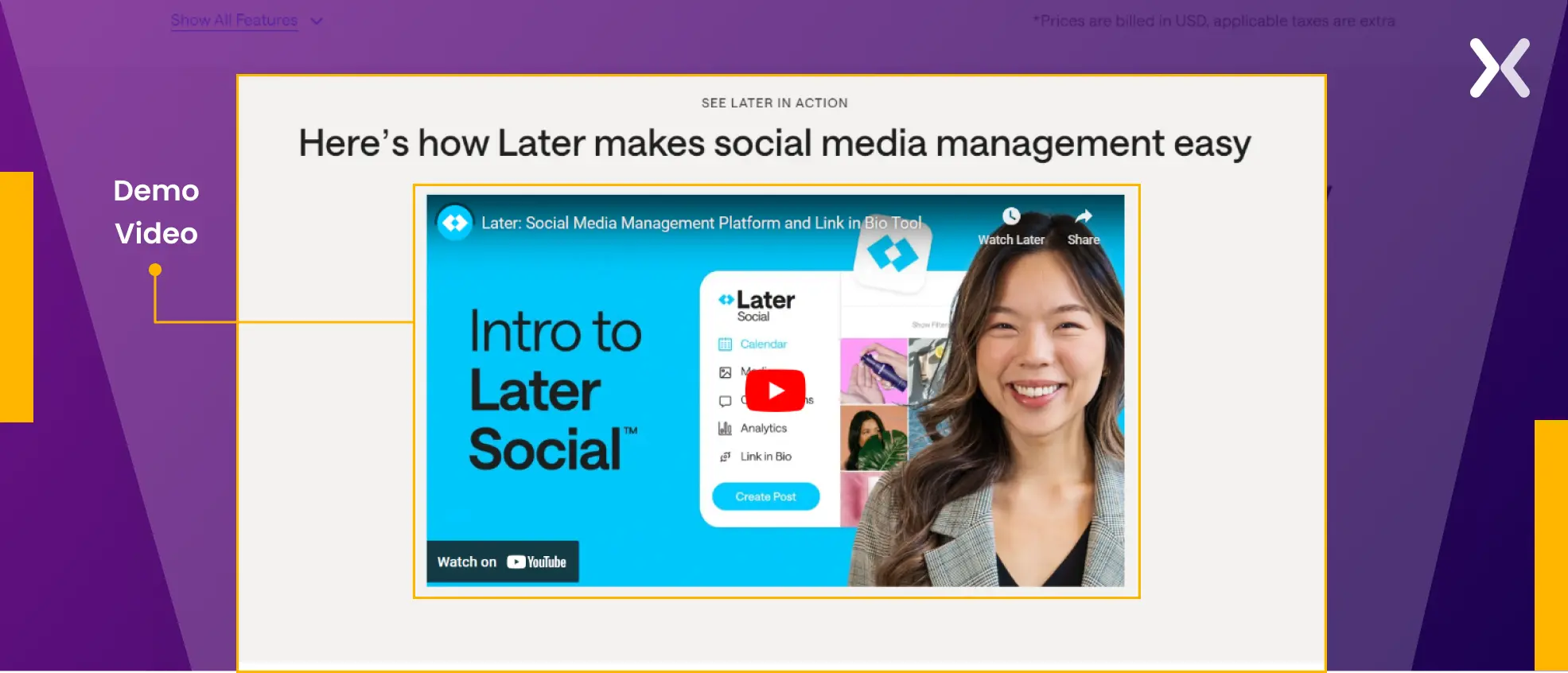
- The bottom is kept simple, with a demo video demonstrating the tool’s capabilities. It ends with a testimonial and a final CTA.
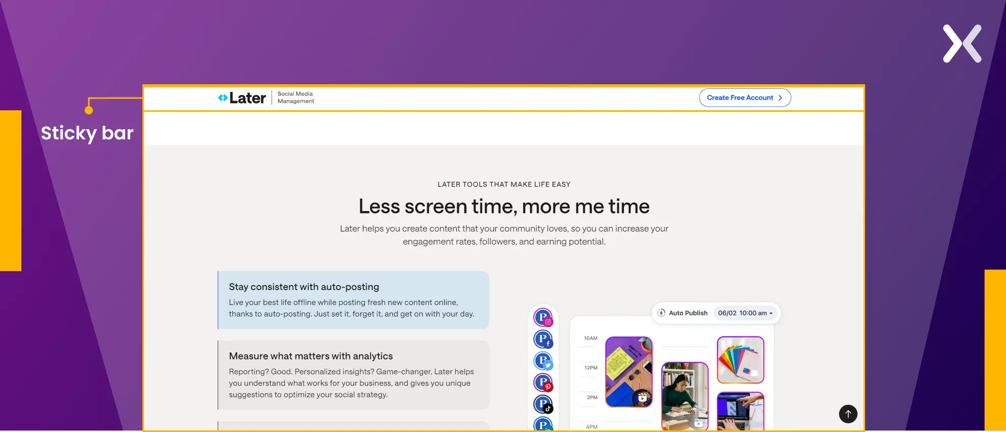
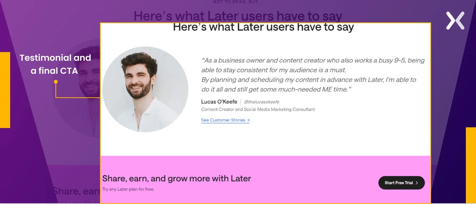 Later deliberately positions CTAs across all sections of the landing page, reinforcing the message consistently. A sticky banner with a persistent CTA accompanies users throughout their journey, making sure accessibility and driving conversions effectively.
7. Moz free trial landing page
While Moz’s free trial landing page ranks at the top of the SERP for the keyword “Moz free trial,” it adopts a distinct approach compared to ActiveCampaign. Unlike ActiveCampaign’s free trial page, which targets individuals already interested in making a purchase, Moz keeps its page inclusive for warm leads as well. How.
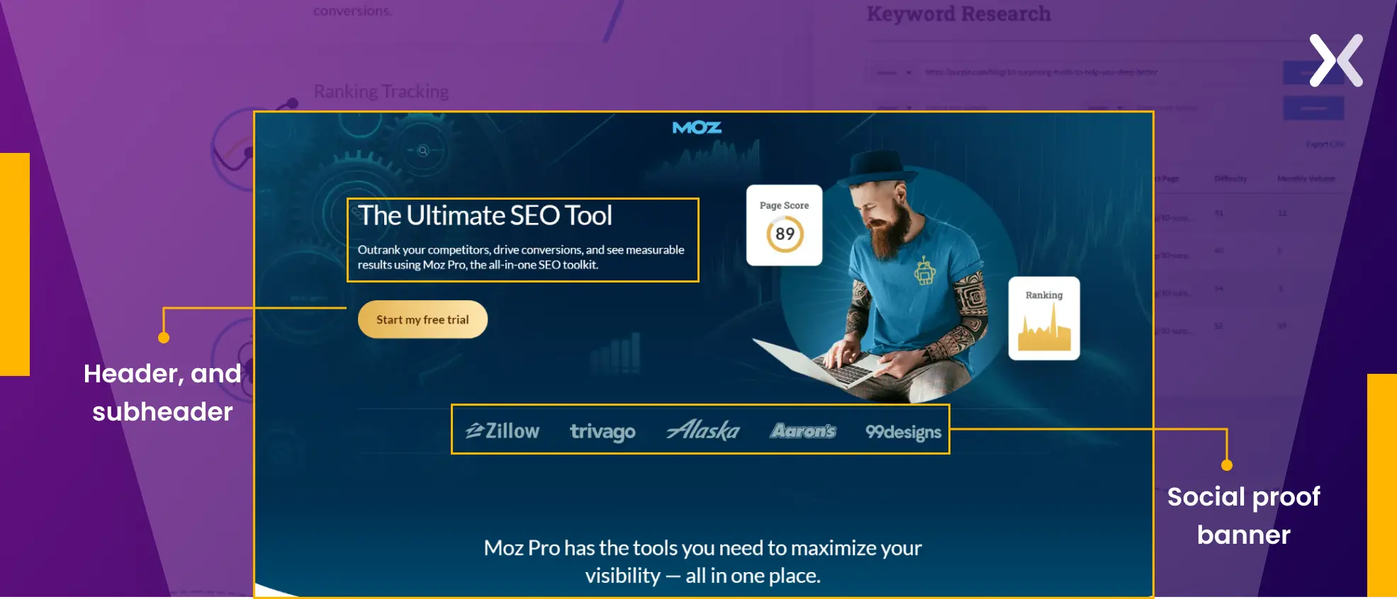
- The opening heading, “The ultimate SEO tool,” is clear in messaging and immediately tells the visitor it is built for SEO. Though the hero image could have been better, the subheader supports the heading well, along with the short social proof banner.
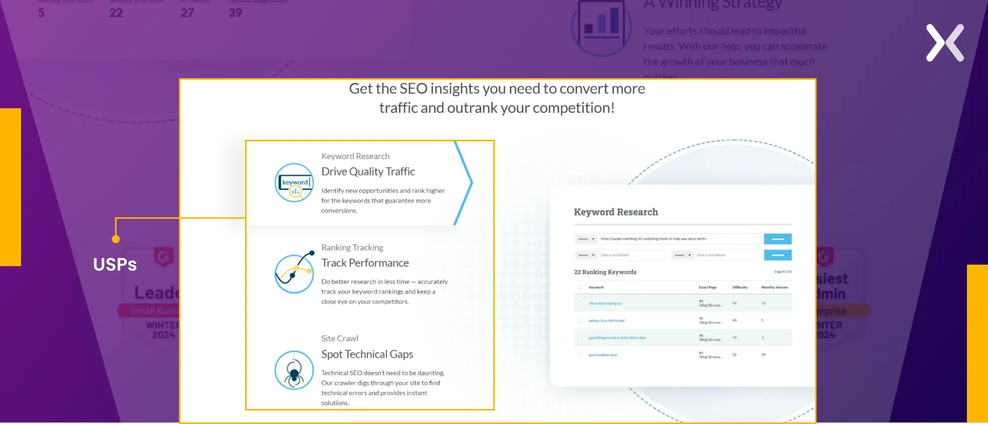
- This section has all the USPs lined up in a split panel-like design again, with images taken right from to present the tool’s interface.
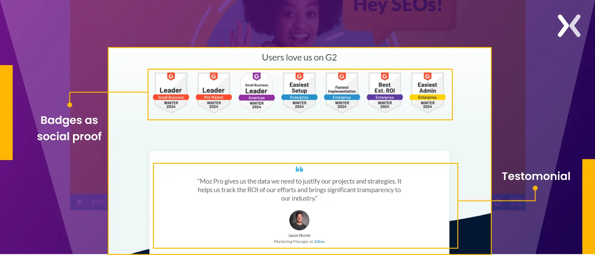
- With some interesting badges as social proof, the bottom of the page includes not a generic testimonial but one that points out a particular pain point that MOZ solves for them.
 Overall, the page is short but has all the elements that can entertain all types of visitors.
8. ClickUp free trial landing page
ClickUp’s free trial landing page also backs as a comparison landing page. It takes a direct jab at its biggest competitor Trello, which helps explore all its USPs and other features, encouraging people to try the tool. Here, the persuasive trial landing page acts as a great way to capture a competitor’s audience with the help of free access.
- This is the most well-designed hero section so far. Visitors are welcomed with a clear-cut heading that directly gets the point, with a subheader that summarizes the tool’s services.
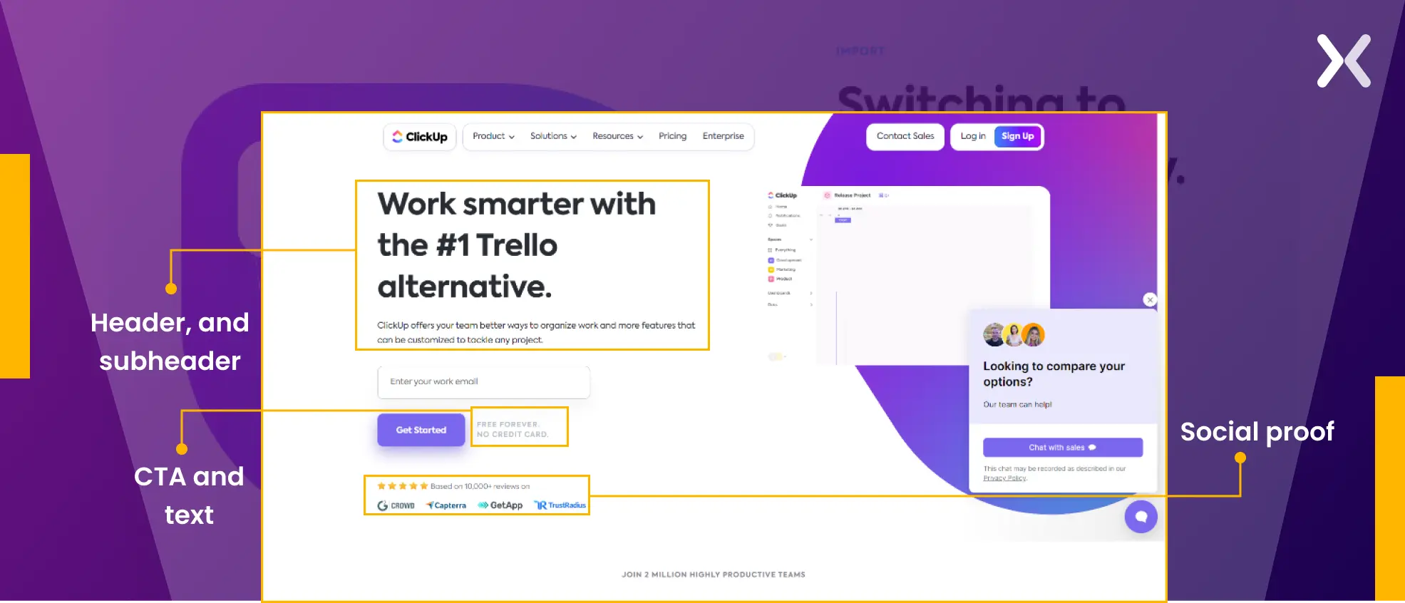 The CTA is surrounded by “No credit card required” and social proof to remove any last-minute second thoughts. The hero image gives insights into the tool’s user interface, which is always great for improving landing page UX.
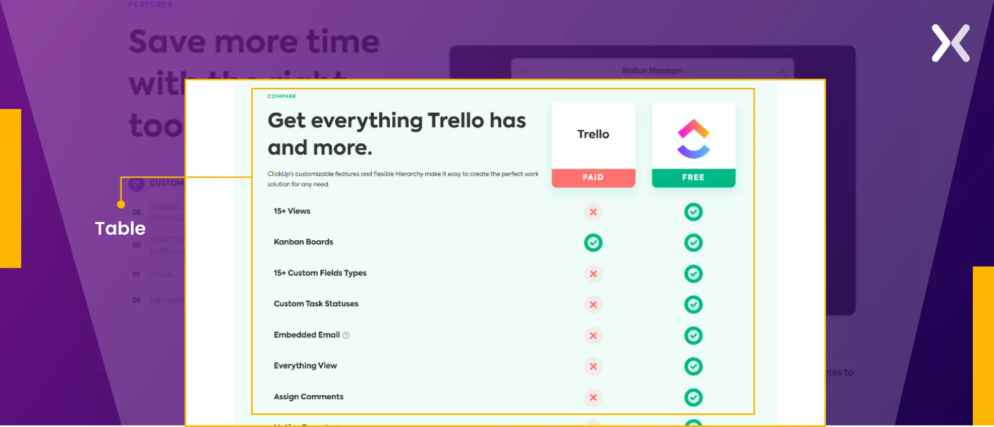
- With a solid hero section, ClickUp doesn’t waste time and directly shares a parallel between Trello’s paid services and its free services, which is a masterstroke on this page.
 There is nothing not to like about this page.
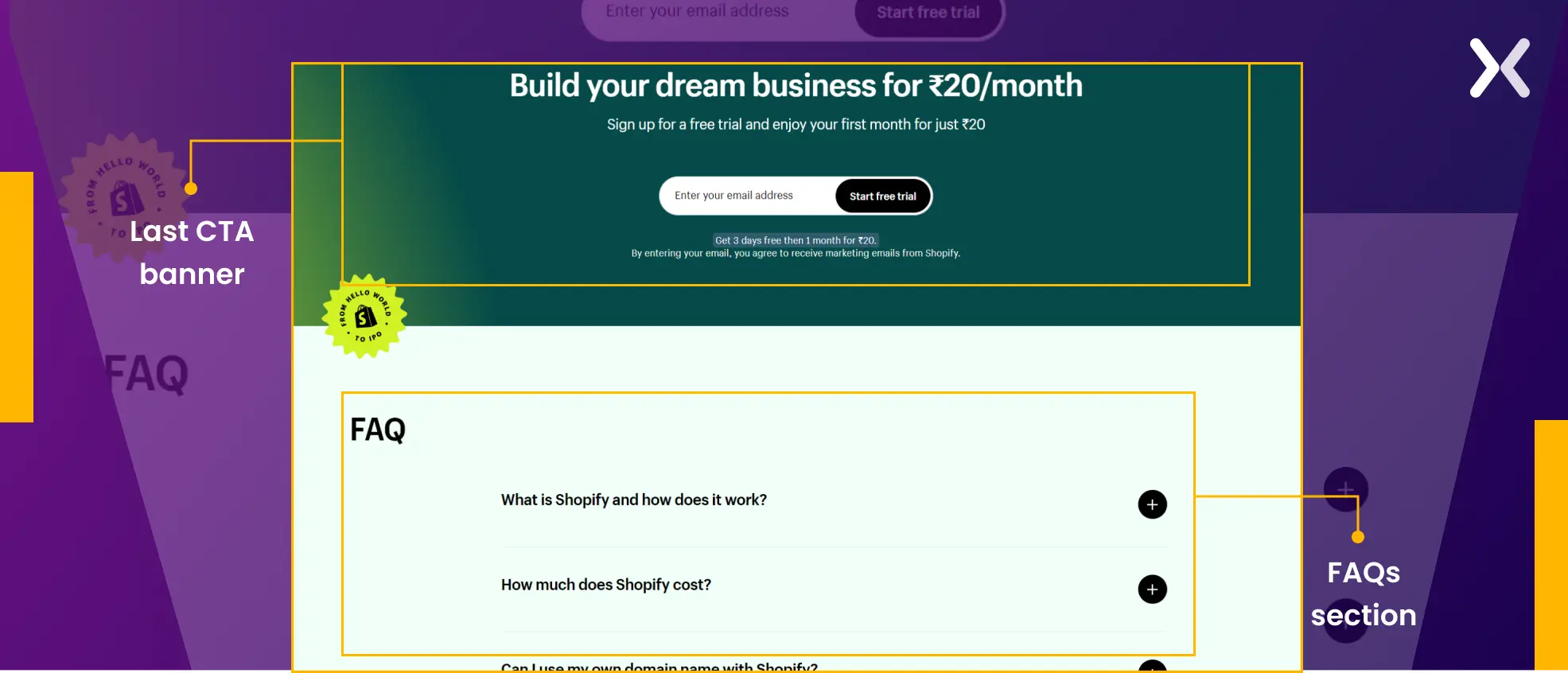
9. Shopify free trial landing page
If you are looking for a simple free trial landing page example. You can follow Shopify’s landing page. With minimal imagery and a focus on their brand palette, Shopify created an engaging experience. This page targets more middle, and bottom-of-the-funnel leads who know what Shopify is.
- Here, what catches the eye is the text below the CTA that clarifies the trial’s length and how no credit card is required.
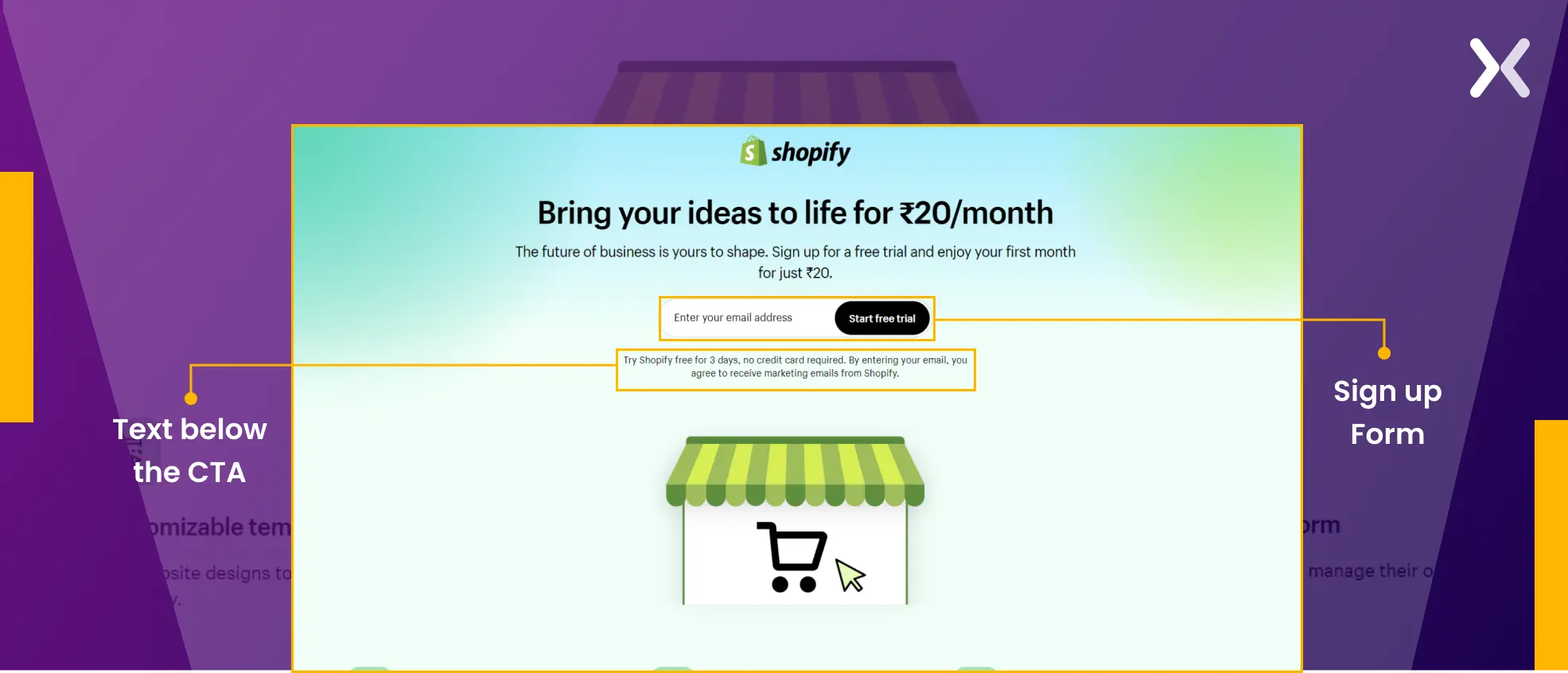 This information, right next to the CTA, along with just one form field to fill out to sign up, nudges the visitors toward conversion.
- Filled with some accents of the USPs and social proof, this section tries to win over the visitors’ confidence with minimum words but maximum punch.
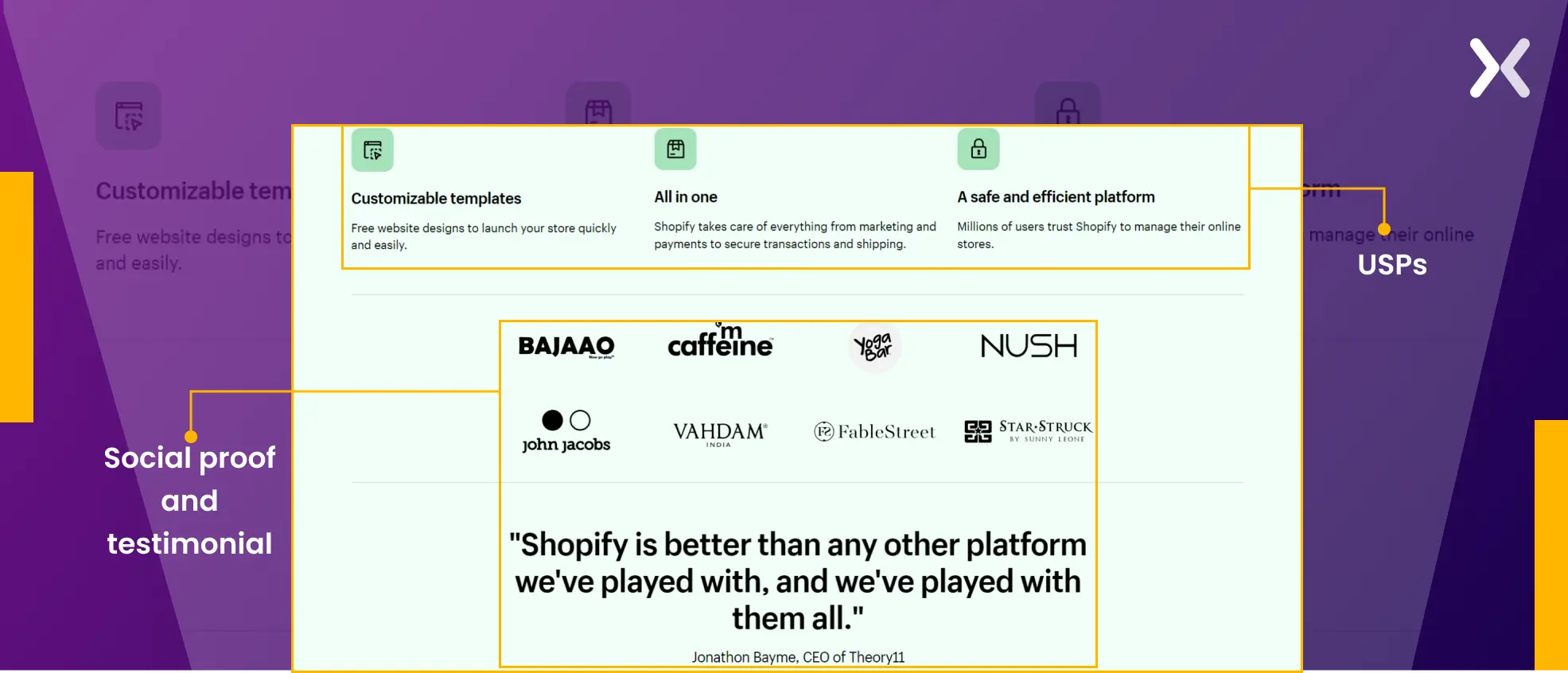
- The bottom of the page has a banner that repeats the CTA, and it ends with a detailed FAQ in place, always a mark of generating a good user experience.
 The star of this landing page is how various elements like colors, copy, and space have been used to deliver the message effectively.
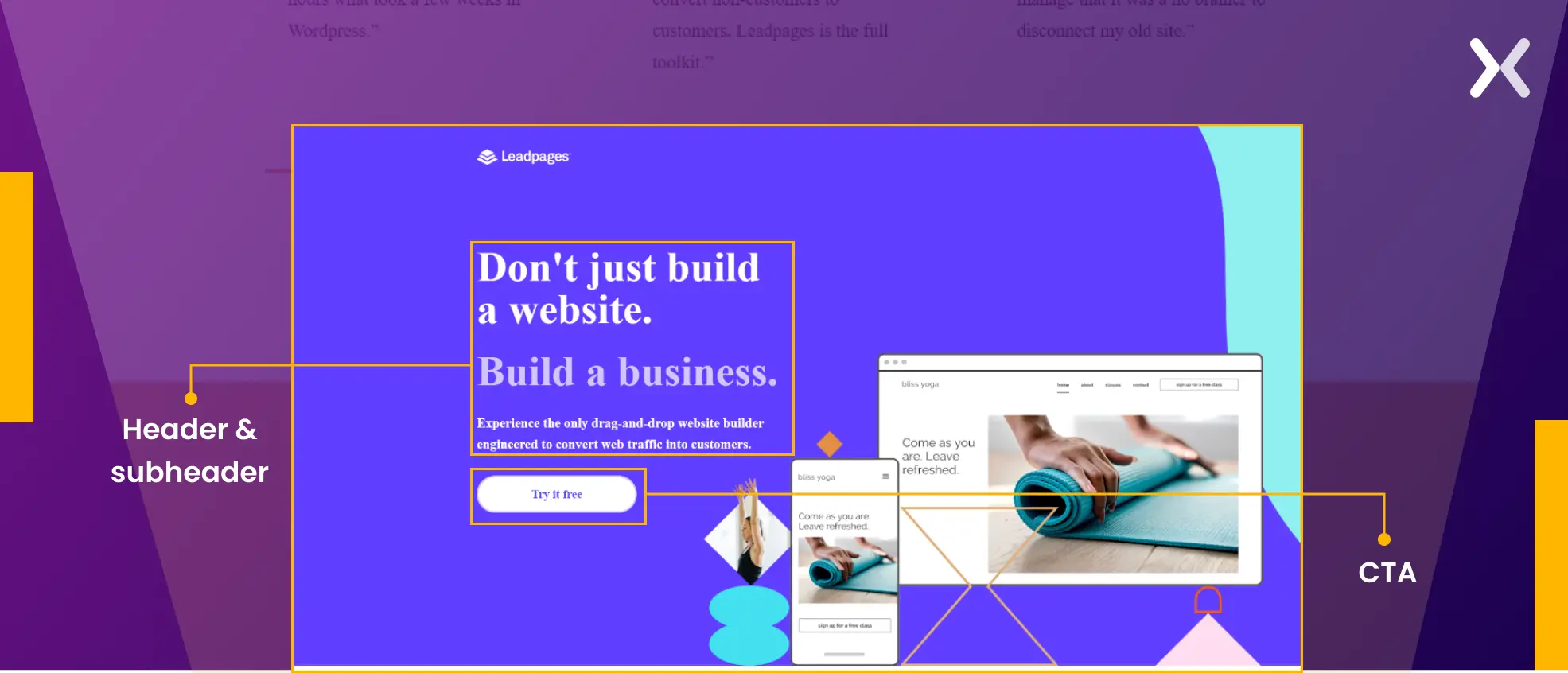
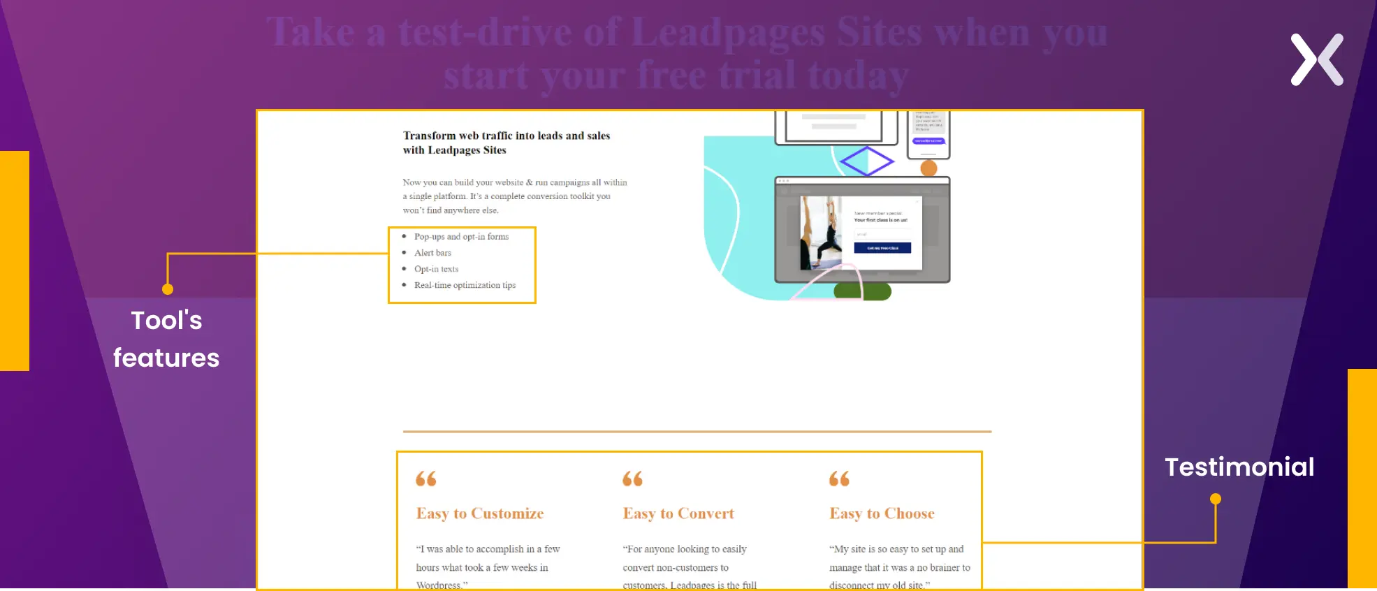
10. Leadpages free trial landing page
Leadpages trial landing page is all about subtle effects and sharing the best version of their website building tool. Let’s discuss the page:
- This section is carried by the header and subheader, which have a bold copy. They are complemented by engaging visuals and accompanied by a strong call-to-action: “Try for Free”.
- Bullet points concisely explain the tool’s features and make them easier to read. A long testimonial at the end of this section solidifies that the tool delivers as it promises.
- The start of this section has the headline “Small business owners are buzzing about Leadpages sites,” where it tries to communicate to its target audience directly. Some testimonials and reiteration of USPs later, the page ends with a final CTA.
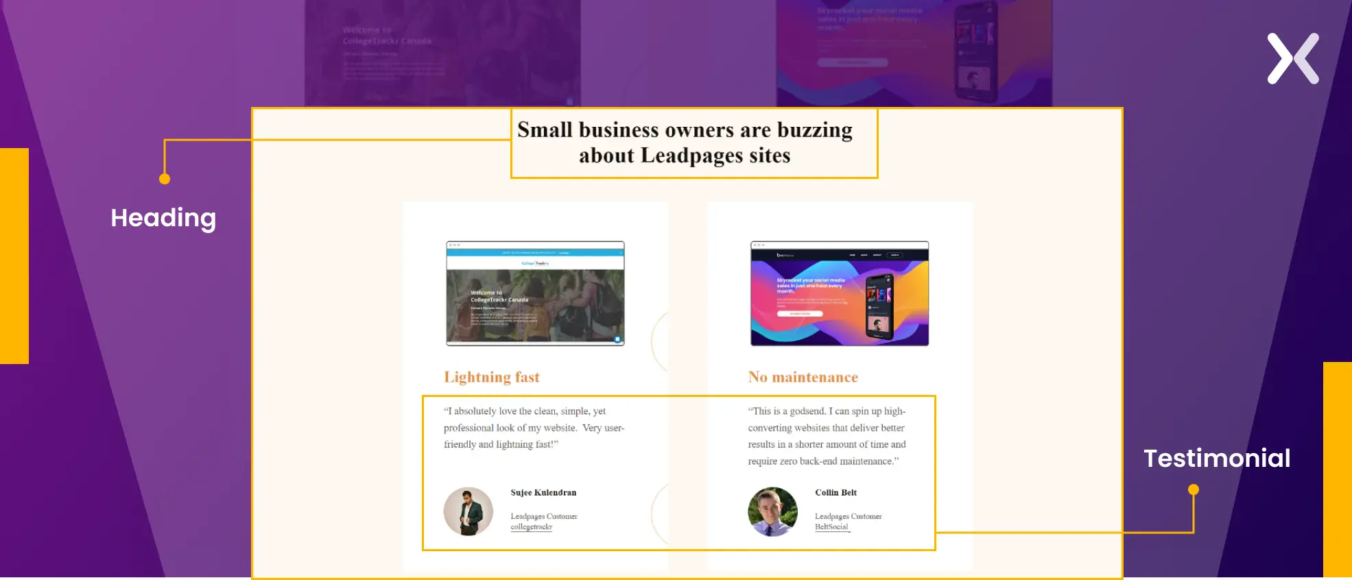 The page exhibits a unique design with a copy that is easy to read.
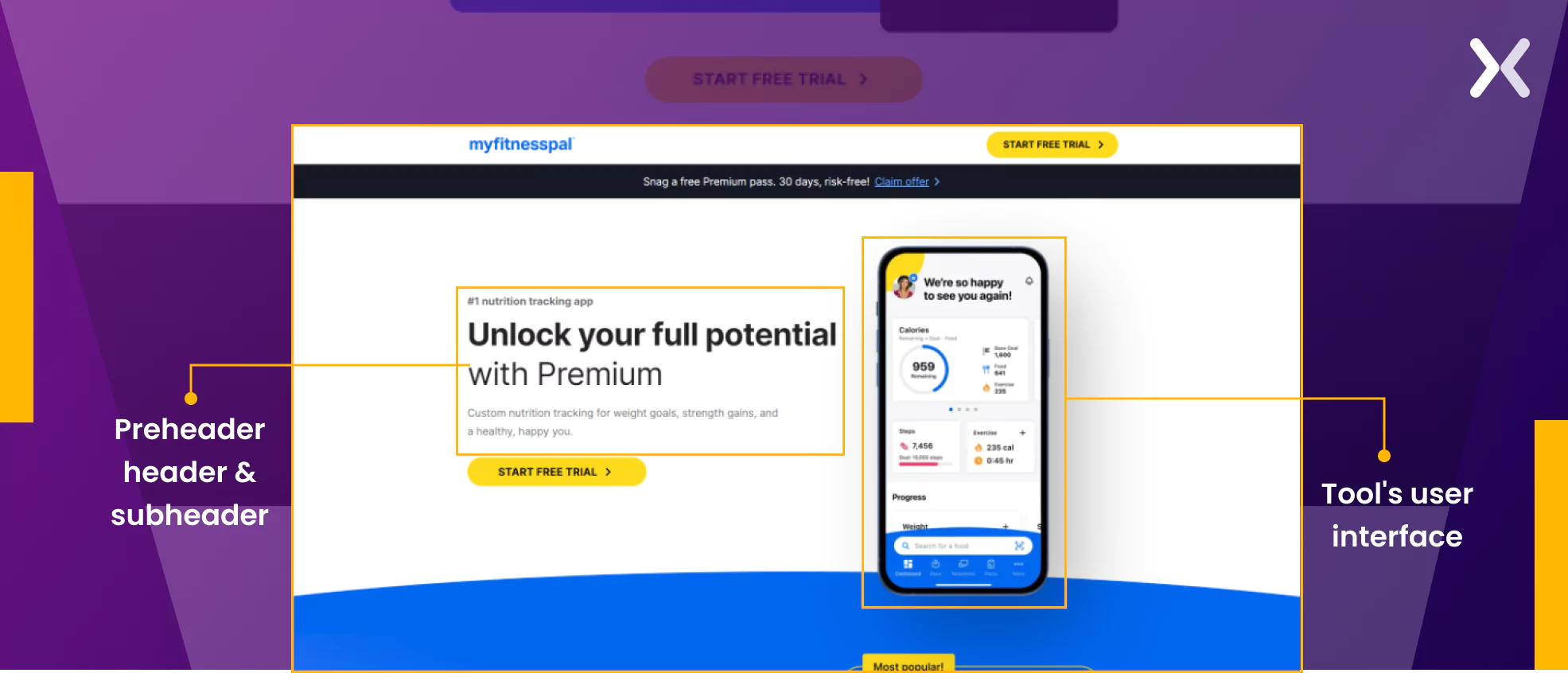
11. MyFitnessPal free trial landing page
Here’s a B2C free trial landing page by MyFitnessPal to understand how the B2C indsutry approaches free trial landing pages.
- The preheader and subheader complement the main heading effectively, as on its own. It might appear somewhat vague. The hero image prominently displays the tool’s user interface, serving as an excellent method to capture users’ interest.
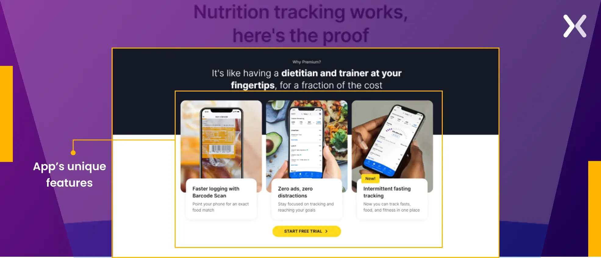
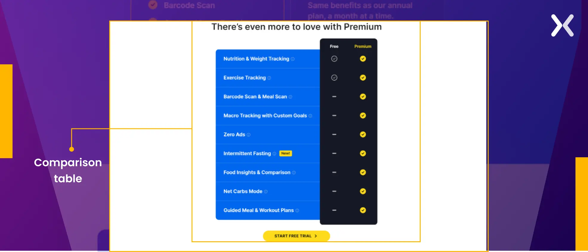
- To build on visitors’ interest, the app’s unique features are displayed using copy and contrasting images taken directly from it. A comparison table between the free and premium versions tries to encourage users to sign up for the premium trial.
- The pricing section helps visitors figure out which will be a good plan for them. It is followed up with strong testimonials and FAQs that answer some last-minute doubts.
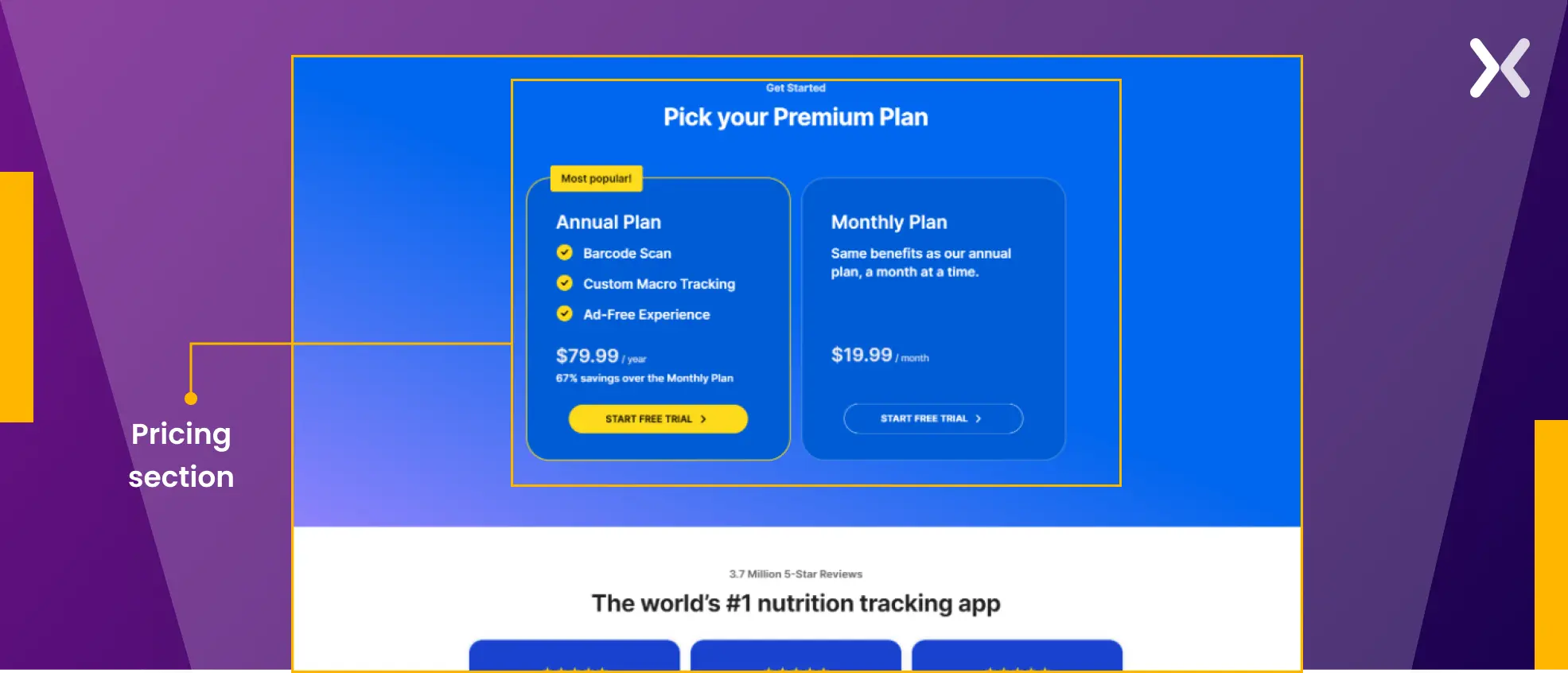 The banner employed immediately following the landing page’s hero section warrants attention due to its strong copy. It effectively addresses a common but necessary question visitors might often have: “Why premium?” Rather than listing features, it presents the answer in a concise statistical format, making it more effective.

Why create a free trial landing page?
Free product trials can help you gather user data, gain user feedback, and reduce conversion friction by actually allowing leads to try the product. But all of this clings to one critical fact, how well your free trial landing page persuades your target audience that the product is worth their time. Even when running paid ads, businesses must understand that traffic doesn’t mean conversion. For visitors to actually sign up even for a free trial, your landing page must present them the USPs your product brings to the table that sets it apart from its competitors. Using a generic website page to promote your free trial, which is filled with exit link options, be it external or internal, might not be a good idea. And that’s why a dedicated free-trial landing page is necessary as it:
-
Your landing page is the first point of contact for your visitors. This is where you make your first impressions and capture their attention.
-
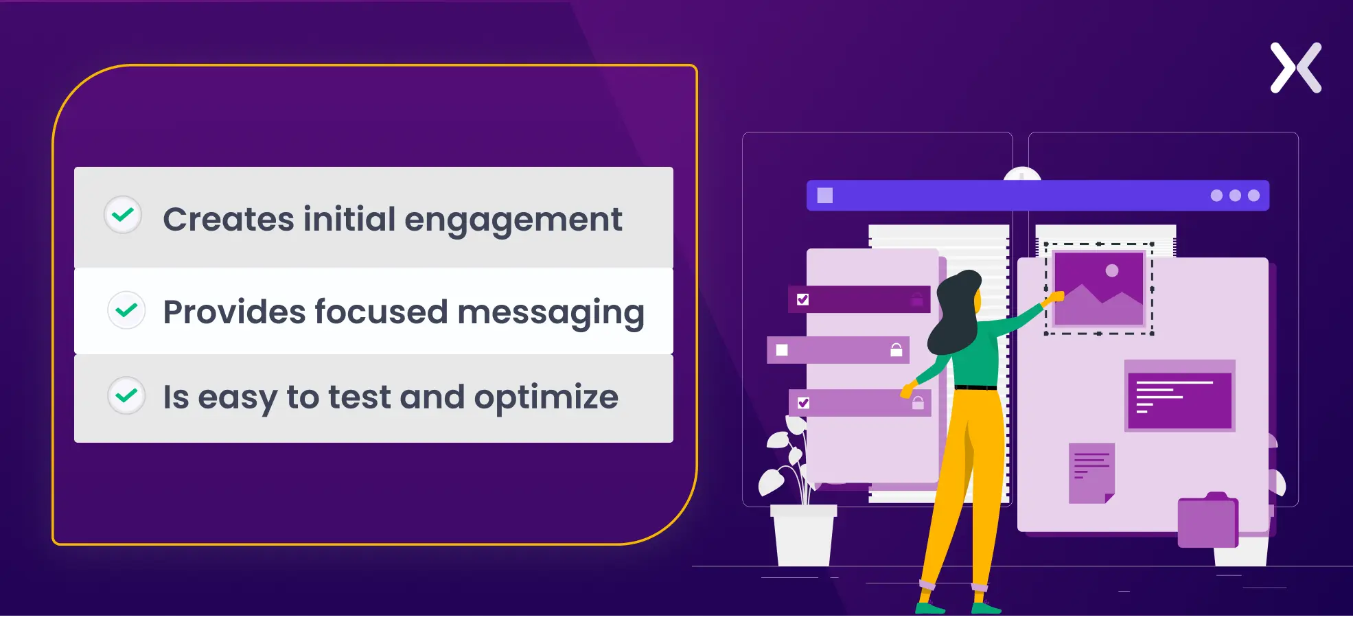
From copy to visuals, a landing page is filled with elements that focus on visitors’ pain points, prompting micro-conversions. All this ultimately adds up to the final conversion.
-
A landing page is easy to optimize, a webpage not so much. You can test headlines, CTAs, images, and even the background, to understand what makes your visitors convert.
Essential elements of a free trial landing page
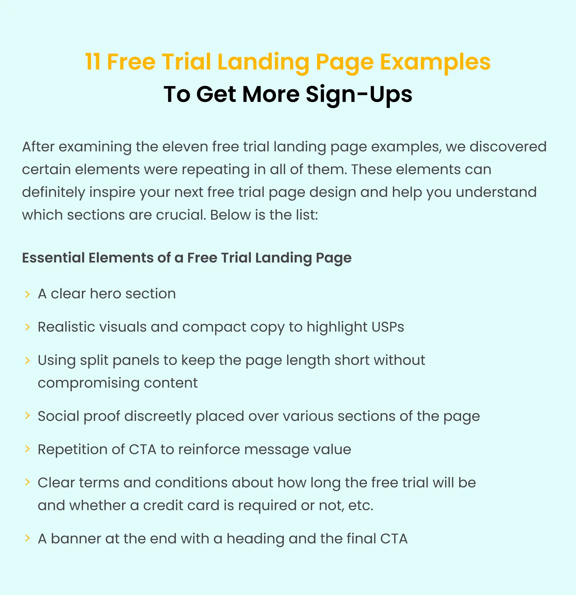
Having explored and dissected eleven free trial landing pages, let’s now outline the common elements shared among them. We will take the best elements from all the examples and hand-pick a rough free trial landing page out of them.
Another necessary tip is to add a thank you page once someone signs up for a free trial. It is a great way to show gratitude and explain what to expect next.
Should free trial landing pages be built for PPC or SEO?
Optimizing free trial pages for SEO and PPC is necessary, yet it’s essential to keep them distinct. When PPC ads direct traffic to an SEO free trial landing page, it introduces complexities in tracking and analyzing page performance and conducting effective tests. To use the full potential of a PPC free trial landing page, Apexure adopted a strategy for its client, Rocket Money.
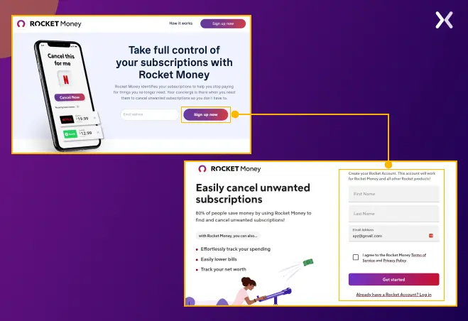 We crafted a straightforward and concise landing page featuring just one email address form field. Upon submission, visitors are smoothly redirected to a profile completion page, where their email address field is pre-filled. This simplified approach captures emails from interested visitors via a short yet effective landing page.
Optimize your free trial landing page strategy for more Sign-Ups
To create the best free trial landing page. It’s essential to draw inspiration from top-performing examples. This blog post compiles various landing pages, offering invaluable insights into the essential elements that should be incorporated into your own trial landing page. By examining successful designs, copywriting strategies, and conversion techniques, you can effectively optimize your page to maximize sign-ups.
Related Articles: