Key Takeaways
- A lead generation landing page has one job: capture visitor information in exchange for something valuable. Every element on the page should serve that goal.
- The median landing page conversion rate is 6.6% across all industries (Unbounce, Q4 2024). Cold PPC traffic converts at 2-5%; warm traffic from email or retargeting can reach 10-25%.
- Form length is the biggest single lever. Reducing fields from 7+ to 3-5 consistently lifts completions by 25-120%. Multi-step forms outperform single-step forms for complex lead capture.
- What happens after capture matters as much as the page itself. Following up within 1 hour increases conversion-to-sale rates to 53%. After 24 hours, the lead is effectively cold.
- Every example in this guide is from Apexure's own client work, not screenshots of someone else's page.
Most lead generation landing page guides show you screenshots of other people’s work and tell you to copy the headline structure. That is not very useful when you are the one building the page and staring at a blank wireframe. This guide is different. Every example below is a page we designed and built for a real client at Apexure. We know why each element is there, what it replaced, and, in many cases, what the conversion rate was before and after. That is the advantage of writing from the practitioner side rather than the tool-vendor side. We will break down 9 lead generation landing pages across SaaS, financial services, home services, and B2C, then cover the best practices we have learned from building hundreds more. At the end, we cover the part most guides skip entirely: what to do after the lead is captured.
What is a lead generation landing page?
A lead generation landing page is a standalone web page designed for one purpose: capturing visitor contact information. Unlike your homepage (which serves five different audiences and has 20 links), a lead gen page has one offer, one form, and one CTA. Everything else on the page exists to support that conversion. The exchange is simple: you offer something valuable, a demo, a free audit, a downloadable guide, a quote, and the visitor gives you their name, email, and perhaps one qualifying detail in return. That person becomes a lead in your pipeline.
The critical distinction: lead generation pages are not sales pages. They do not ask for a purchase. They ask for contact details. That means the form needs to be short, the perceived value of the offer needs to exceed the perceived cost of sharing personal information, and every friction point between the visitor and the “Submit” button needs to be removed.
9 lead generation landing page examples (from our client work)
Every example below is a page we designed and built at Apexure. We are not showing you screenshots of Salesforce or HubSpot pages. We are showing you work we actually did, and explaining the decisions behind each element.
1. PrimeSync solutions: SaaS demo request
PrimeSync needed a page that would convert mid-funnel SaaS prospects into demo requests. The challenge: their product is technical, and their audience (IT directors) needs specifics before they commit to a call.
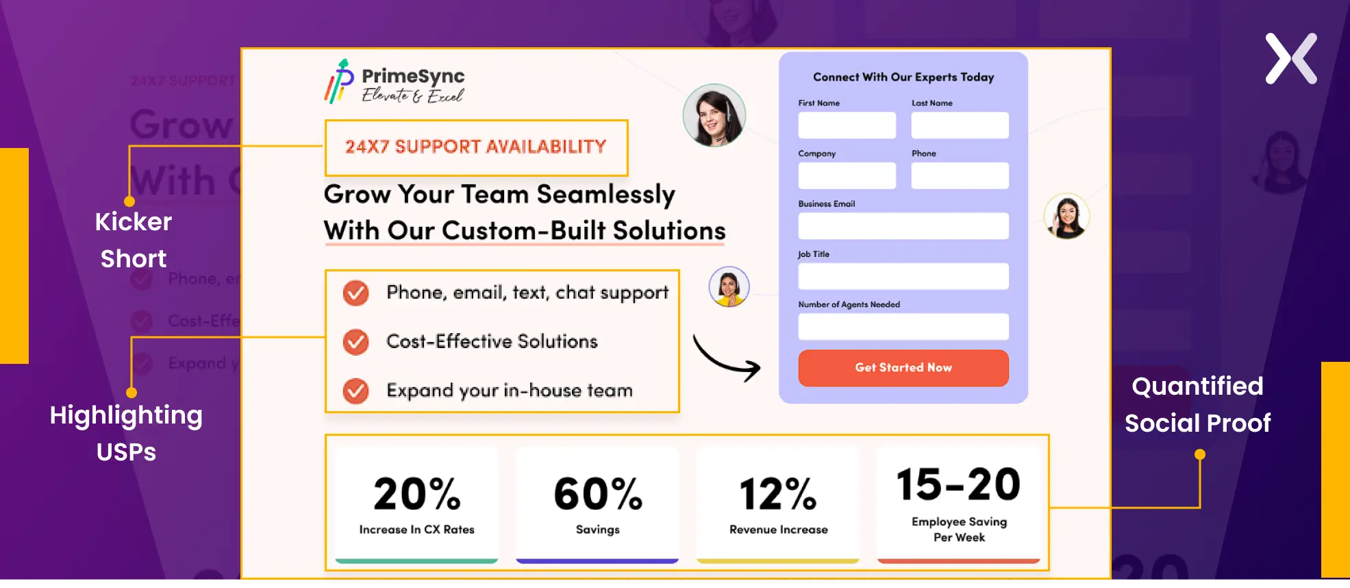
What works and why:
- Quantified social proof in the first fold. Performance statistics (“99.9% uptime,” “500+ integrations”) appear immediately, giving technical buyers the numbers they need before scrolling. This is not decorative, IT directors evaluate tools by specifications, not promises.
- Kicker text above every headline. Each section opens with a short benefit phrase (“24x7 availability,” “Remote-First Flexibility”) before the headline. This gives scan-readers the value instantly.
- Three USPs, not ten. The page accents exactly three core differentiators. We tested this against a version with seven USPs, the three-point version converted 18% higher because it was scannable instead of overwhelming.
2. Get change: SaaS lead capture
Get Change targets a specific SaaS niche, and the user-centric page structure shows that. Clean typography, clear visual hierarchy, and no wasted space.
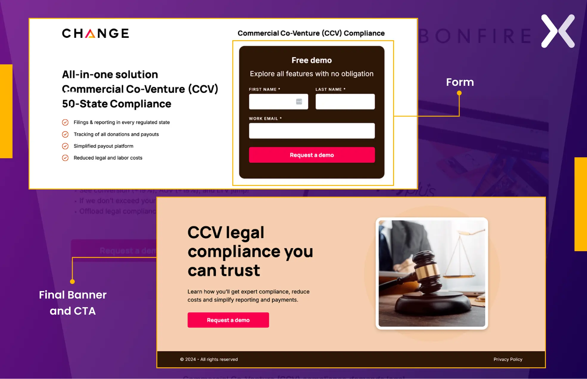
What works and why:
- Minimal form fields. The form collects only essential information, no phone number, no company size, no “How did you hear about us?” Those questions belong in the follow-up, not the first interaction.
- CTA colour contrast. The CTA button uses a colour that stands out against every section background. It does not blend in, it interrupts. We placed CTAs at three scroll depths so visitors can convert without scrolling back up.
- Final CTA banner after FAQ. Visitors who read to the bottom are high-intent. A closing banner with a direct CTA captures those who needed answers before committing.
3. Outreach frog: B2B service lead gen
Outreach Frog’s page targets business owners considering outsourced outreach. The audience needs to understand the service before they hand over their details, so the page is copy-heavy by design.
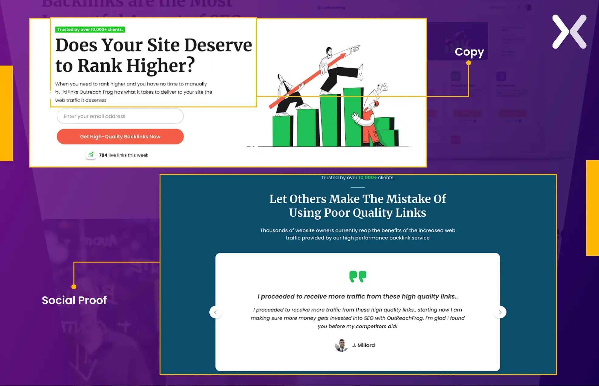
What works and why:
- Extensive copy with bullet formatting. Technical B2B services need explanation. But walls of text kill conversions. This page uses bullets, “Why us” and “What you get” sections, and clear subheadings to make 1,500+ words scannable.
- Layered social proof. The social proof section does not just list client logos, it leads with a kicker phrase that frames the proof (“Trusted by 200+ growth teams”), followed by a headline that reinforces it, followed by the evidence. This three-layer approach converts better than logos alone.
4. Craver app: SaaS demo booking
Craver’s page generates demo requests for a custom mobile app for restaurants. The audience, restaurant owners, are visual thinkers who need to see the product before committing to a conversation.
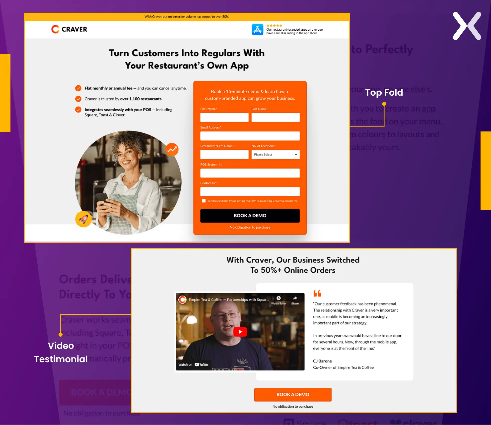
What works and why:
- Immersive hero section. The headline communicates the core benefit in one line. USPs appear as bullet points beneath it. The hero image shows the actual product, not a stock photo of someone smiling at a laptop.
- Video testimonial. For a product that is hard to explain in text, a 60-second customer video does more than 600 words. Craver’s testimonial has a real restaurant owner describing the business impact, specific, credible, and far harder for competitors to replicate.
- Intuitive layout with logical flow. Problem identification leads to solution overview leads to social proof leads to CTA. This is not accidental, it mirrors the natural decision-making sequence: “Do I have this problem? → Does this solve it? → Can I trust them? → How do I start?”
5. IMD: education lead gen (Multi-Step form)
IMD, a globally ranked business school, needed to increase MBA programme applications. The form required substantial information, name, email, current employer, years of experience, programme interest. A single-step form with all those fields would have been a conversion killer.
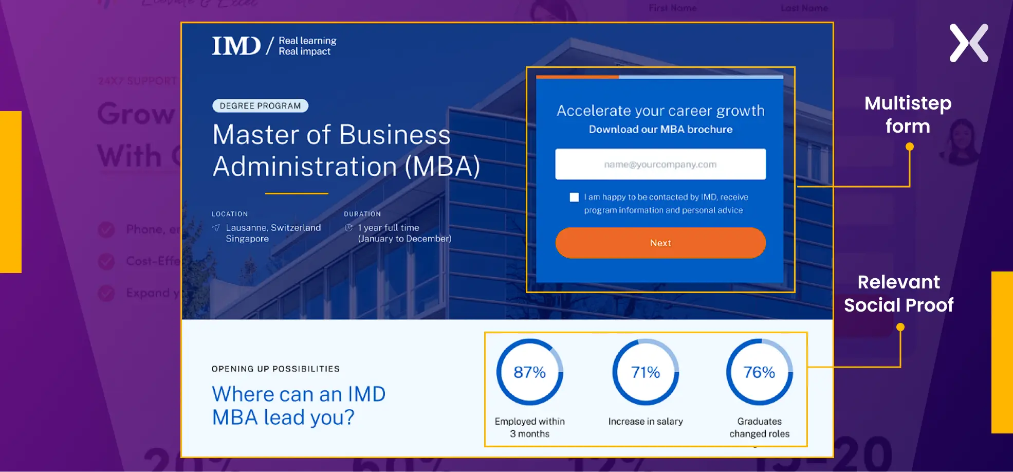
What works and why:
- Multi-step form. We broke the form into three stages: basic contact, professional background, and programme interest. Each step asks 2-3 questions. Visitors who complete step one feel psychologically committed, the “foot-in-the-door” effect, and are far more likely to finish. This single change lifted the conversion rate from 3.91% to 6.38%, a 63% improvement.
- Alumni success timeline. Instead of generic testimonials, the page shows a timeline of alumni career progressions, specific names, companies, promotions. For an MBA audience, this is the most relevant proof possible: “People like me went here and got results.”
IMD's original page had all the right content in the wrong order. Heatmap analysis showed visitors dropping off before reaching the alumni testimonials, the strongest trust signal on the page. We repositioned those testimonials above the form, introduced the multi-step form structure, and A/B tested over 6 weeks.
Result: conversion rate improved from 3.91% to 6.38%, a 63% increase in qualified MBA programme leads.
6. PosePets: B2C lead gen
PosePets targets pet owners, a highly emotional audience. The page design leans into that emotion without sacrificing conversion mechanics.
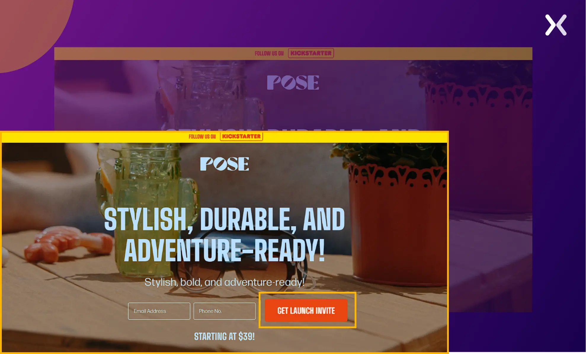
What works and why:
- Emotional design language. Bright colours, pet-themed visuals, and playful micro-animations match the audience’s emotional state. A B2B page with this design would fail, but for pet owners who make decisions based on feeling. It is exactly right.
- Strategic CTA placement. CTAs appear at multiple scroll depths, each with slightly different copy tailored to what the visitor has just read. After the gallery section: “Create Your Pet’s Portrait.” After the testimonial section: “Join 5,000+ Happy Pet Parents.”
- Interactive elements. Sliders and before/after comparisons keep visitors engaged longer, which correlates with higher conversion rates for personalised products.
7. American remodel: home services lead gen
Home remodelling is a high-consideration, high-value purchase. Visitors need extensive trust-building before they will share their contact details.
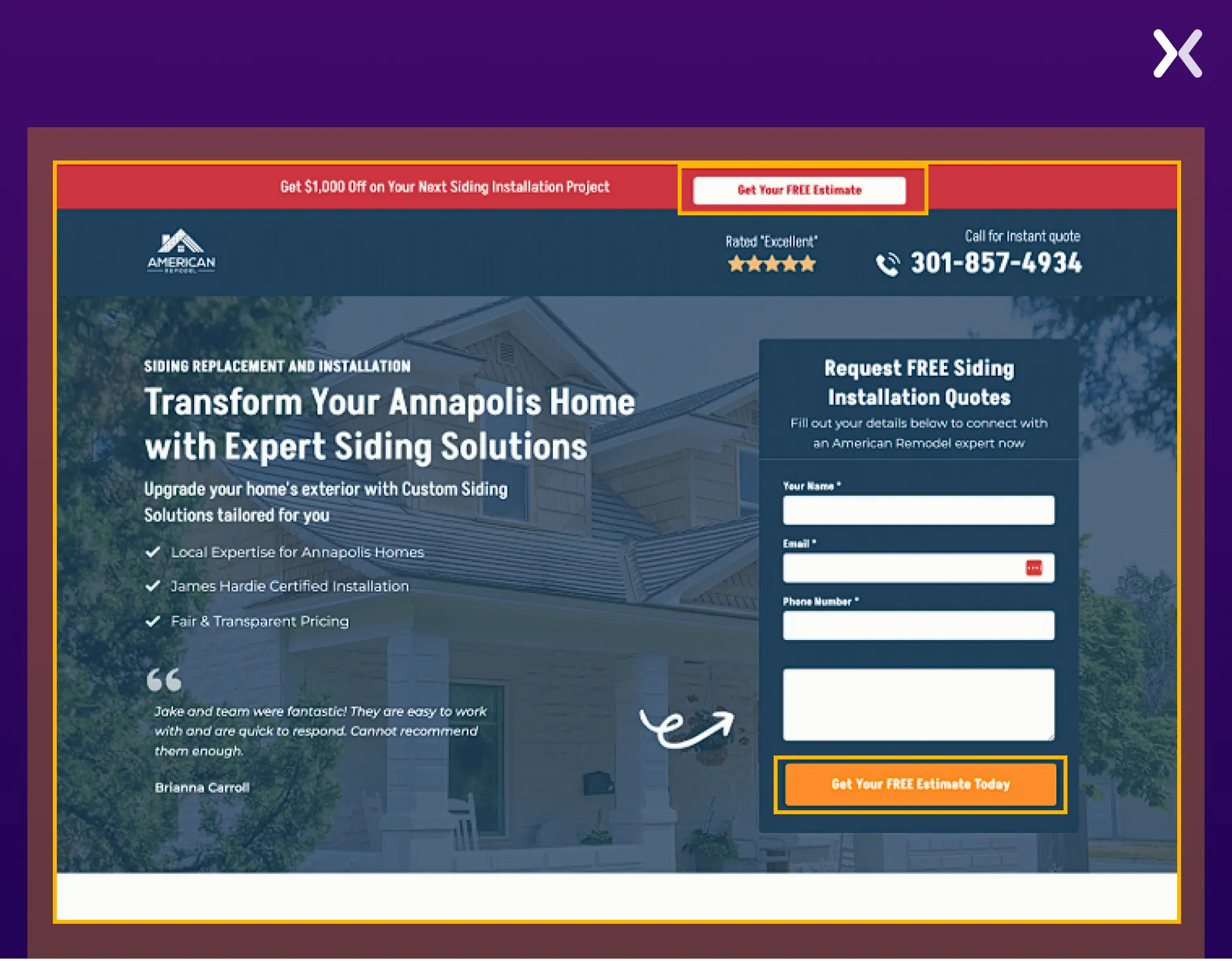
What works and why:
- Click-to-call button in the header. For home services, many prospects prefer a phone call to a form. The sticky header button makes sure it is always one tap away on mobile, where 83% of landing page traffic now comes from.
- Project photography, not stock images. Every image on this page shows actual completed remodels. Homeowners choosing a contractor need to see real work, not generic “happy family in kitchen” stock photos. The difference in perceived trust is substantial.
8. Rocket money: financial services lead gen
Financial services landing pages face a unique challenge: visitors are protective of their financial data. Trust is not a nice-to-have. It is the conversion bottleneck.
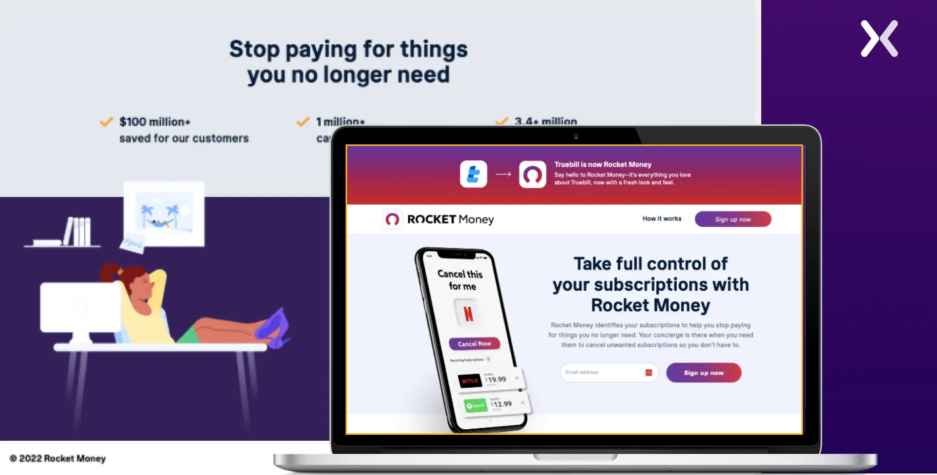
What works and why:
- Bold typography and clear value. The headline states the specific benefit, not “Manage Your Finances Better” but the concrete outcome (savings amount, time saved). Specificity converts; vagueness bounces.
- Simplified design. Financial services audiences are sceptical of flashy pages. The clean, utility-focused design signals professionalism. No animations, no parallax, no gimmicks, just clear information and a prominent sign-up button.
9. Loans4Business: B2B financial lead gen
This page targets B2B decision-makers seeking business financing. The audience is time-poor and researching multiple options simultaneously.
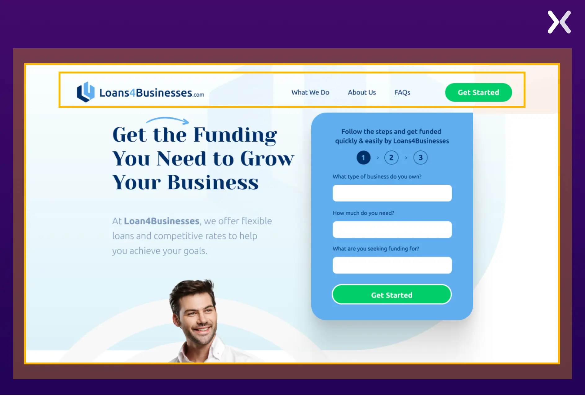
What works and why:
- Sticky navigation. For longer B2B pages, a sticky nav lets visitors jump to sections (loan types, eligibility, FAQs) without scrolling through content they do not need. This reduces friction for comparison-shoppers who are evaluating multiple lenders.
- Corporate aesthetic. The clean, professional design signals institutional reliability, exactly what a business owner wants when choosing a financing partner. The visual tone communicates “we handle large sums responsibly” before the copy says a word.
Lead generation landing page best practices
The examples above illustrate specific tactics. These best practices are the principles behind them, the patterns we see repeated across every high-converting lead gen page we build.
1. Match your message to the traffic source
The single most common conversion killer we find in landing page audits is message mismatch. A visitor clicks an ad that says “Free Marketing Audit” and lands on a page with the headline “Our Services.” That disconnect costs you 15-25% of your conversions before anyone even scrolls. The fix: your landing page headline should mirror, or at minimum closely echo, the ad copy, email CTA, or search query that brought the visitor there. For PPC campaigns, use dynamic text replacement to automatically insert the keyword into the headline.
2. Keep forms short: then qualify later
The data is unambiguous: shorter forms convert better. But there is a subtlety most guides miss. The question is not “how many fields?” but “how much perceived effort?” A form with three easy fields (name, email, company) feels less burdensome than a form with three hard fields (phone number, annual revenue, timeline). Remove high-friction fields and collect that information in the follow-up sequence.
3. Place social proof near the form
Testimonials at the top of the page build awareness. Testimonials near the form overcome last-moment objections. The placement matters. We consistently see higher conversion rates when social proof appears within one scroll of the CTA, especially short, specific quotes like “We generated 40% more leads in the first month” rather than “Great service, would recommend.”
4. Design the CTA as a benefit: not a command
“Submit” as button text reduces conversions by roughly 3% compared to benefit-oriented alternatives. “Get My Free Audit,” “Download the Guide,” “Start My Free Trial”. These tell the visitor what they receive, not what they must do. The CTA should answer the question “What do I get when I click this?”
Weak CTAs
- Submit
- Send
- Click here
- Sign up
- Learn more
Strong CTAs
- Get My Free Audit
- Download the Guide
- Start My Free Trial
- Book My Demo
- See My Results
5. Optimise for mobile first
Mobile accounts for roughly 83% of all landing page visits but converts at just 1.8%, less than half the desktop rate (3.9%). That gap is not because mobile users are less interested. It is because most lead gen pages are designed on a 27-inch monitor and then “made responsive” as an afterthought. Mobile-first means: thumb-friendly tap targets, a form that does not require horizontal scrolling, a CTA visible without scrolling past the fold, and page load under 2 seconds on 4G connections.
6. Reduce perceived risk near the form
Visitors hesitate at the form because they are weighing a trade-off: “Is what I get worth giving up my email and potentially getting sales calls?” Reduce that perceived risk with micro-copy near the form:
- “No spam. Unsubscribe anytime.”
- “We will never share your information.”
- “Free consultation, no obligation.”
- Security badges (SSL, GDPR compliant, SOC 2) These seem trivial. They measurably lift form completion rates, especially for B2B pages where the visitor’s inbox is their most guarded asset.
What happens after the lead is captured
This is the section most lead generation guides skip, and it is where most leads die. A perfectly optimised landing page means nothing if the lead sits in a CRM for 48 hours before anyone follows up.
Post-Capture Checklist
- Thank-you page with a next step: Do not just say "Thanks. We will be in touch." Give them something to do, download a resource, book a specific time, watch a case study video. The thank-you page is your first opportunity to deepen the relationship.
- Instant confirmation email: Automated, sent within 60 seconds. Confirms what they signed up for, sets expectations for next steps, and includes the promised resource if applicable.
- Follow up within 1 hour: Leads contacted within 1 hour are 7x more likely to convert than leads contacted after 24 hours. After 5 minutes, the odds of qualifying the lead drop 10x. Speed is not a nice-to-have. It is the single biggest post-capture variable.
- Lead scoring: Not all leads are equal. Score them by source (PPC vs organic vs referral), form data (company size, role, timeline), and behaviour (pages viewed, time on site). Route high-scoring leads to sales immediately; send lower-scoring leads into a nurture sequence.
- Lead quality feedback loop: Tell your marketing team (or your CRO agency) which leads became customers and which did not. Without this feedback, you are optimising for form completions, not revenue.
Watch for synthetic leads. Bot-submitted forms using real consumer data are an increasing problem in 2026, some estimates suggest 30-60% of captured leads may be synthetic. Implement CAPTCHA, honeypot fields, and lead verification to protect your pipeline quality.
Lead generation benchmarks (2026)
Benchmarks give you context. Without them, you cannot tell whether your 4% conversion rate is excellent (for cold enterprise traffic) or terrible (for warm email traffic to a free ebook).
| Metric | Benchmark | Source |
|---|---|---|
| Median conversion rate (all industries) | 6.6% | Unbounce Q4 2024 |
| B2B landing page avg. | 13.3% | First Page Sage 2026 |
| SaaS landing page avg. | 3.8% | Unbounce Q4 2024 |
| Cold PPC traffic | 2-5% | Industry composite |
| Warm / retargeting traffic | 10-25% | Industry composite |
| Form abandonment rate | ~81% | Landbot 2025 |
| MQL-to-SQL conversion | 16% (avg), 40% (top) | Data-Mania 2026 |
| Avg. Cost per lead (all channels) | $391.80 | Snov.io 2026 |
| Speed-to-lead impact | 7x better within 1 hr | Martal Group 2026 |
"We have seen growth in our lead gen volume and also better quality leads. This helps us to spend our time on opportunities where we have a better fit with the prospect's pain."
How Apexure builds lead gen landing pages
We have designed hundreds of lead generation landing pages across SaaS, healthcare, financial services, home services, and e-commerce. The process is always the same, even when the audience, offer, and industry are completely different.
Our Lead Gen Page Process
Before we design a pixel, we understand who the visitor is, where they came from, and what would make them trade their contact details. This shapes everything, headline tone, form length, proof type, and CTA copy.
We wireframe the page structure based on the visitor's decision journey, then write conversion-focused copy. The headline matches the ad. The subhead reinforces the value. The body builds trust. The form captures the lead.
In-house design and development, no outsourcing. We build on Unbounce, Instapage, WordPress, or Webflow depending on the client's stack and testing needs.
We set up conversion tracking (GA4 events, form start/completion, thank-you page), heatmaps, and session recording before launch. You cannot optimise what you do not measure.
A/B test headlines, form lengths, CTA copy, and social proof placement. Run tests to statistical significance. Roll out winners and feed learnings into the next round.
Need a Lead Generation Landing Page?
We will design, build, and optimise a landing page that turns your paid traffic into qualified leads, not just form submissions.
Book a Free Consultation →Related reading:
-
Thank You Page After Form Submission: Examples & Best Practices
-
Ways to Increase Landing Page Social Proof for More Conversions
View all sources
Average Conversion Rates for Landing Pages (Q4 2024)unbounce.com
B2B Conversion Rates By Industry (2026)firstpagesage.com
Lead Generation Statistics 2026snov.io
Lead Generation Statistics 2026martal.ca
MQL to SQL Conversion Rate Benchmarksdata-mania.com
2026 Marketing Statisticshubspot.com
Landing Page Statistics 2026landingi.com
Google: Creating Helpful Contentdevelopers.google.com