A pre-launch landing page campaign is the best way to build momentum for your upcoming products and a list of interested prospects. Between perfecting your product, planning your launch, and building buzz, creating a pre-launch landing page is often left as the last item on a huge to-do list. Yet, it’s among the most critical factors in product launch success. A well-designed pre-launch landing page helps create a solid email list of potential customers and validates interest, all before your big day. But what if you’re on a tight deadline and lack the time to create something polished? Don’t worry, you’re not alone. Many founders and entrepreneurs face the same challenge. In this post, we’ll show you how to quickly craft a strong, engaging pre-launch landing page with examples without compromising its quality or impact.
What is a Pre-Launch landing page?
A pre-launch landing page, or coming soon page, is the best way to create buzz around a new product or service you plan to launch. Often used to launch digital products. It is a brief one-pager on your website that provides a concise explanation of what your audience can expect from your new offering.
 But more importantly, a pre-launch landing page is a source of early leads. Users who land on your page are asked to share contact information, either for an incentive or simply to subscribe for updates about your upcoming launch. If you optimize your landing page for conversions, you’ll automatically set yourself up for a successful launch.
Struggling with Your Landing Page?
Tell us about your project and we'll get back to you within 24 hours.
So, why do you need a pre-launch landing page, and what are some tips for creating one?
Why do you need a Pre-Launch landing page?
When a new product is about to be launched, you naturally focus on creating buzz around it. The key here is to get as many people as possible into the top of your sales funnel. How? You can collect information from these interested parties, such as their email addresses and phone numbers, through a pre-launch landing page. This information, collected through your landing page, forms part of your pre-launch database.
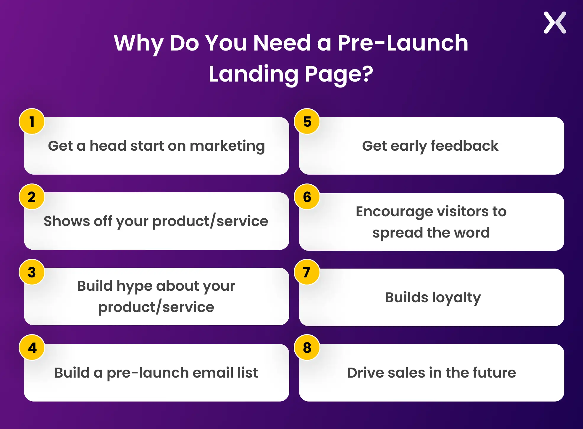 You can use social media, PPC ads, and online community platforms like Reddit and Indie Hackers to distribute your landing page among users to get your idea validated and sign up early users.
Another reason to consider utilizing pre-launch landing pages is that a one-pager is a significantly more cost efficient option than creating an entire website. It is a simple, convenient way to collect email addresses and keep potential customers up to date with your product or service launch information.
You can use social media, PPC ads, and online community platforms like Reddit and Indie Hackers to distribute your landing page among users to get your idea validated and sign up early users.
Another reason to consider utilizing pre-launch landing pages is that a one-pager is a significantly more cost efficient option than creating an entire website. It is a simple, convenient way to collect email addresses and keep potential customers up to date with your product or service launch information.
Should you create a Pre-Launch landing page before or after building your MVP?
Here’s a comparison table summarizing the advantages of creating a pre-launch landing page before and after building your MVP:
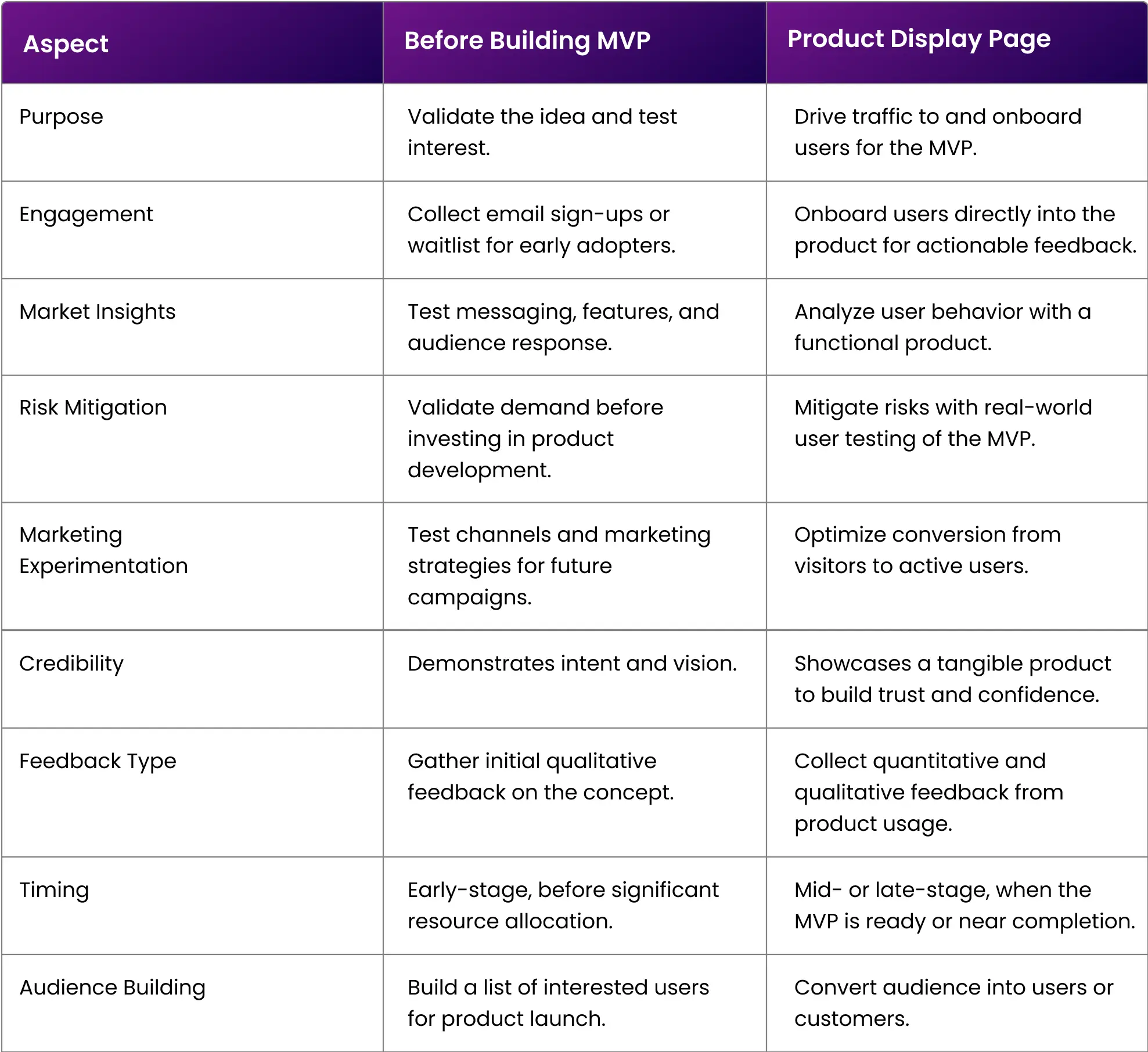 For many startups, the most effective strategy is to create a landing page before and iterate on it after the MVP is built:
-
Use the landing page to generate buzz, validate the idea, and build a waitlist.
-
Evolve the page to accent the MVP’s features, onboard users, and collect feedback. Now, let’s learn about the most necessary features of a pre-launch landing page.
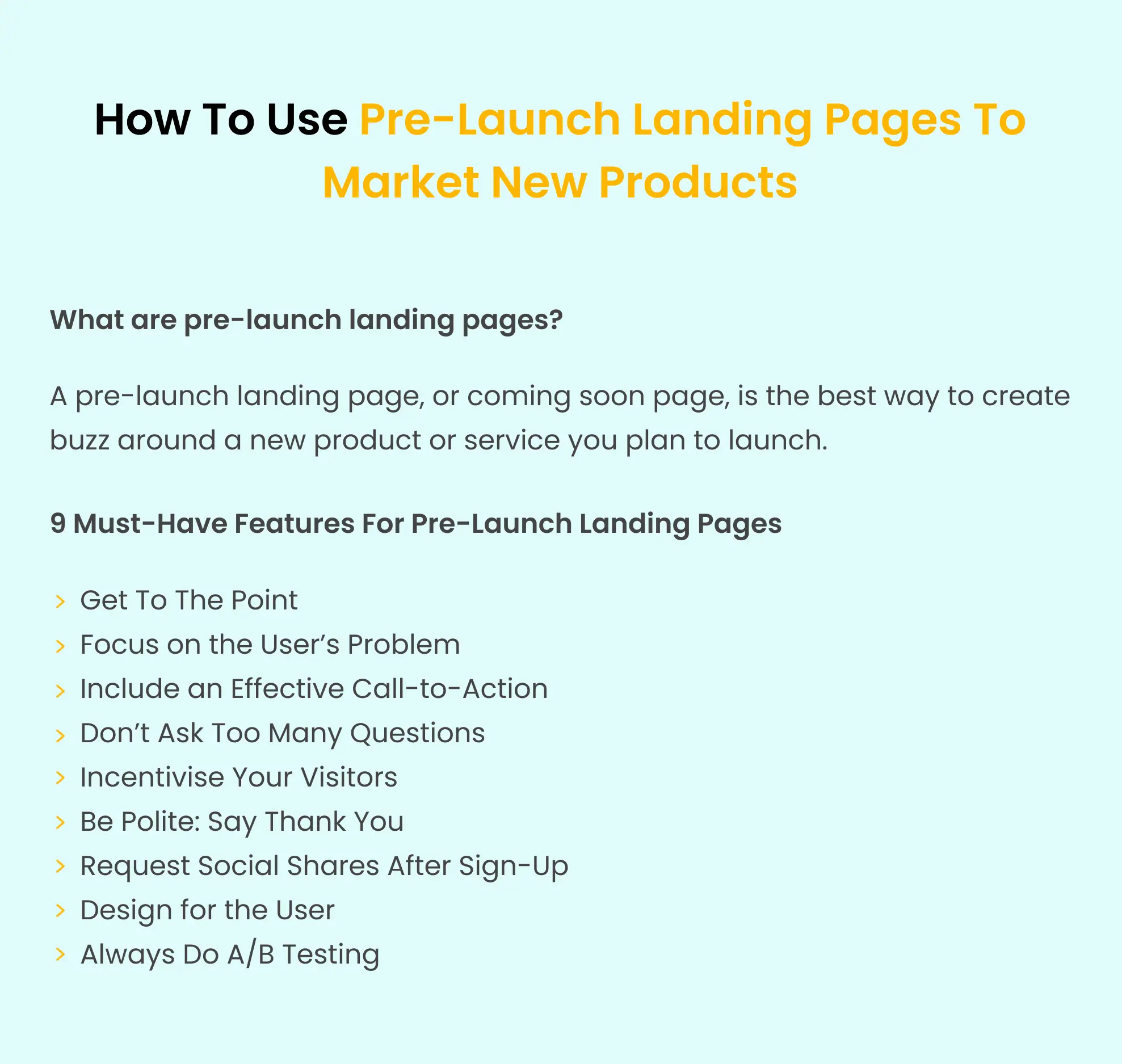
9 Must-Have features for Pre-Launch landing pages
Here are six key components your page should have to achieve its main objectives: Attracting prospects and collecting email addresses.
1. Keep your copy to the point
You may think that the way to create suspense is to hold information back. On the contrary, you should put every useful information you can on your pre-launch landing page, starting with the top fold of the page.
 Speak directly to your prospects. Describe a pain point they are experiencing and how your new product will solve it. Take the time to understand your target market and design your pre-launch landing page around the things that appeal directly to them.
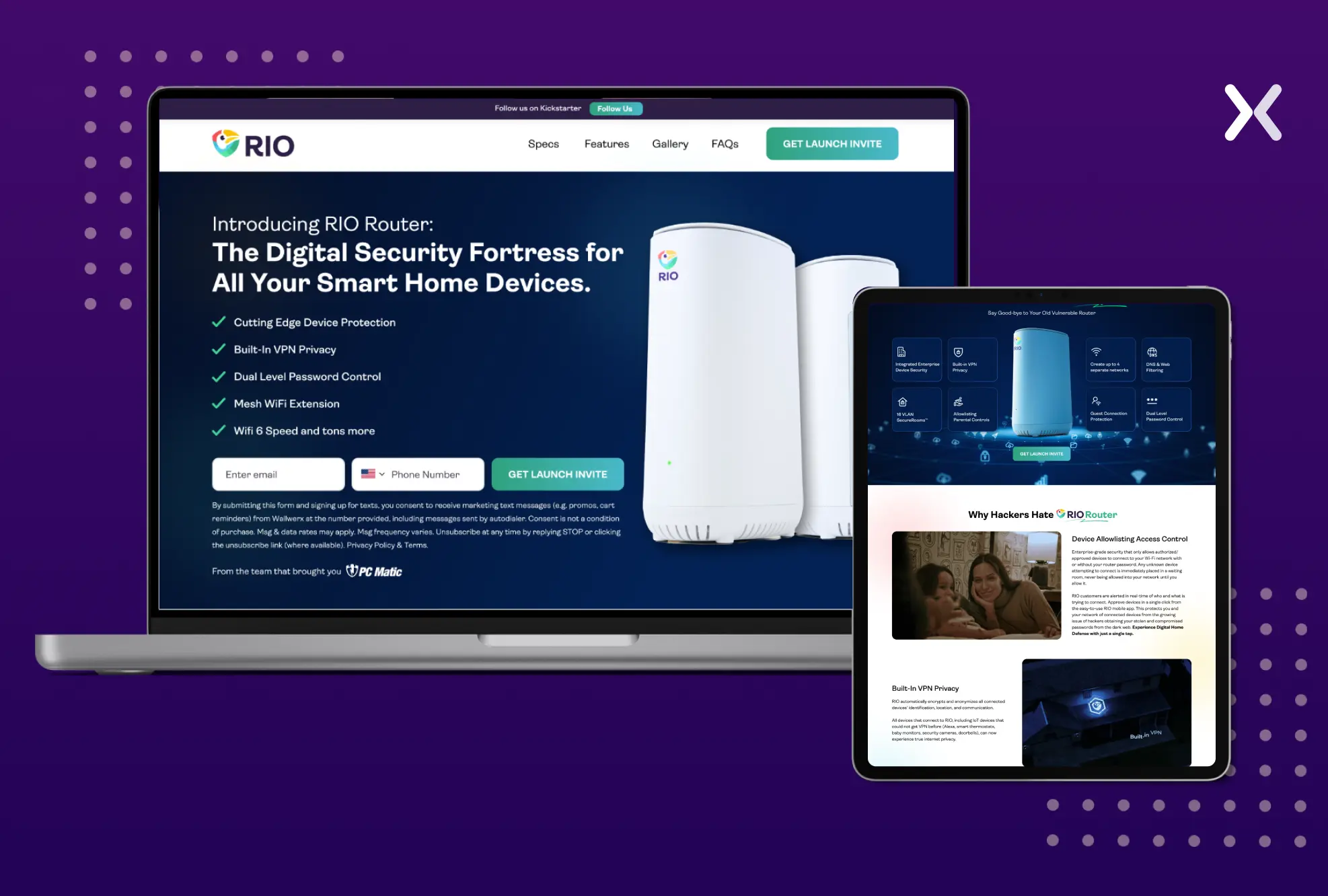
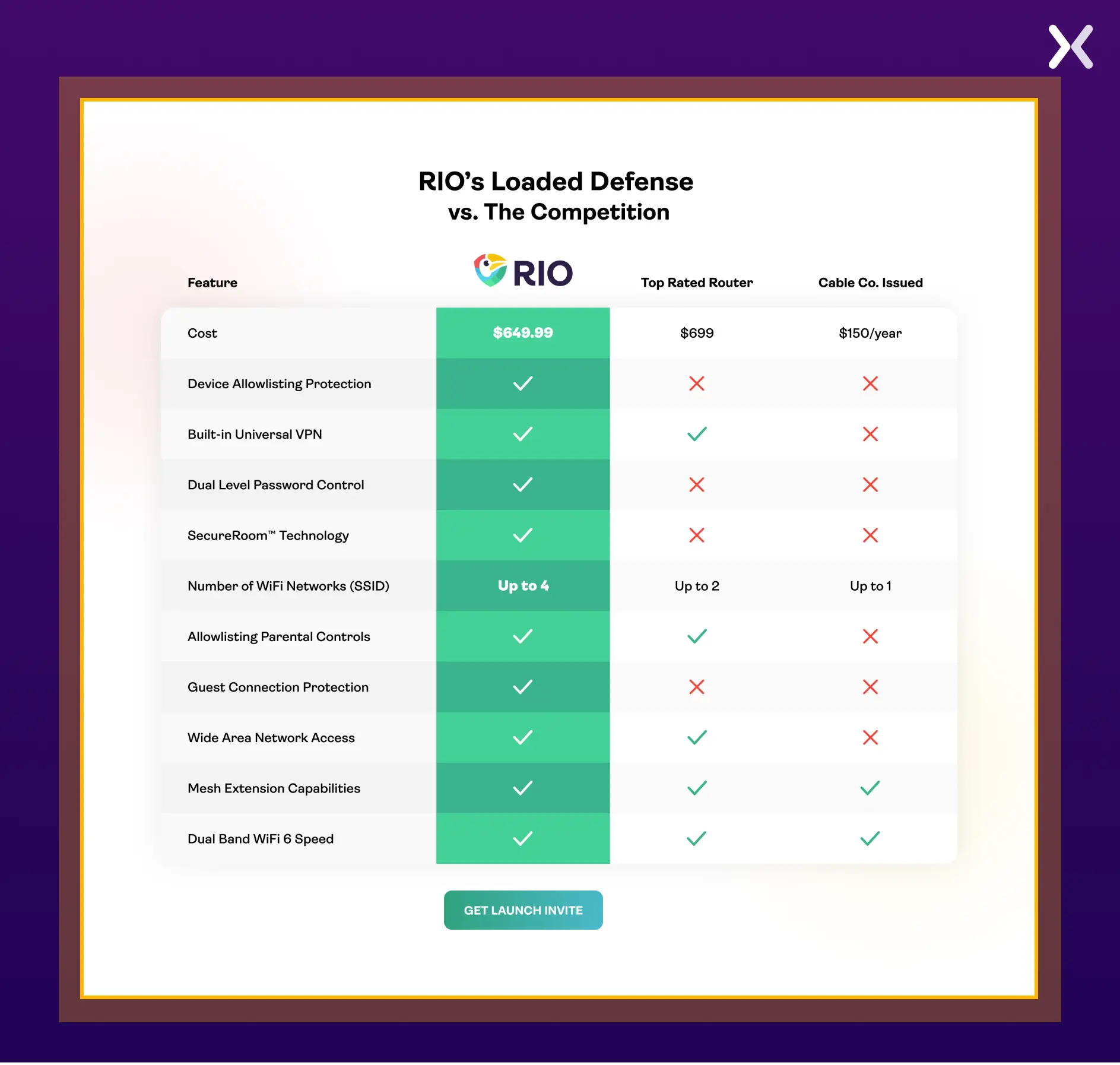
For instance, a well-designed comparison table, like the one featured on Rio Router’s prelaunch landing page, is a clever element to use. It sets you apart from competitors and grabs attention before your product hits the market.
Speak directly to your prospects. Describe a pain point they are experiencing and how your new product will solve it. Take the time to understand your target market and design your pre-launch landing page around the things that appeal directly to them.
For instance, a well-designed comparison table, like the one featured on Rio Router’s prelaunch landing page, is a clever element to use. It sets you apart from competitors and grabs attention before your product hits the market.
 Get to the point and be precise and concise. Don’t leave them guessing too much, as they might lose interest and move on to a competitor.
2. Focus on the user’s problem and how you can fix it
A visitor on your page is likely looking to solve a problem. Your pre-launch landing page should appeal to their needs and show why they should choose your product. Describe in simple terms a pain point your user is facing. Explain how your product will solve the problem. The key to getting your value proposition across is to keep it short - you don’t want to lose visitor’s interest mid-sentence.
 The right wording can make your product or service irresistible. Once users have gone through your pre-launch page, they should feel compelled to give you their details. After all, you’re the answer to their problems!
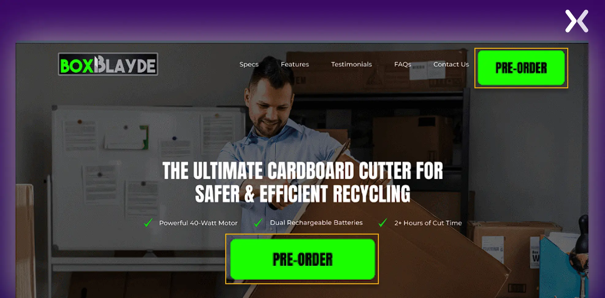
3. Include an effective Call-to-Action
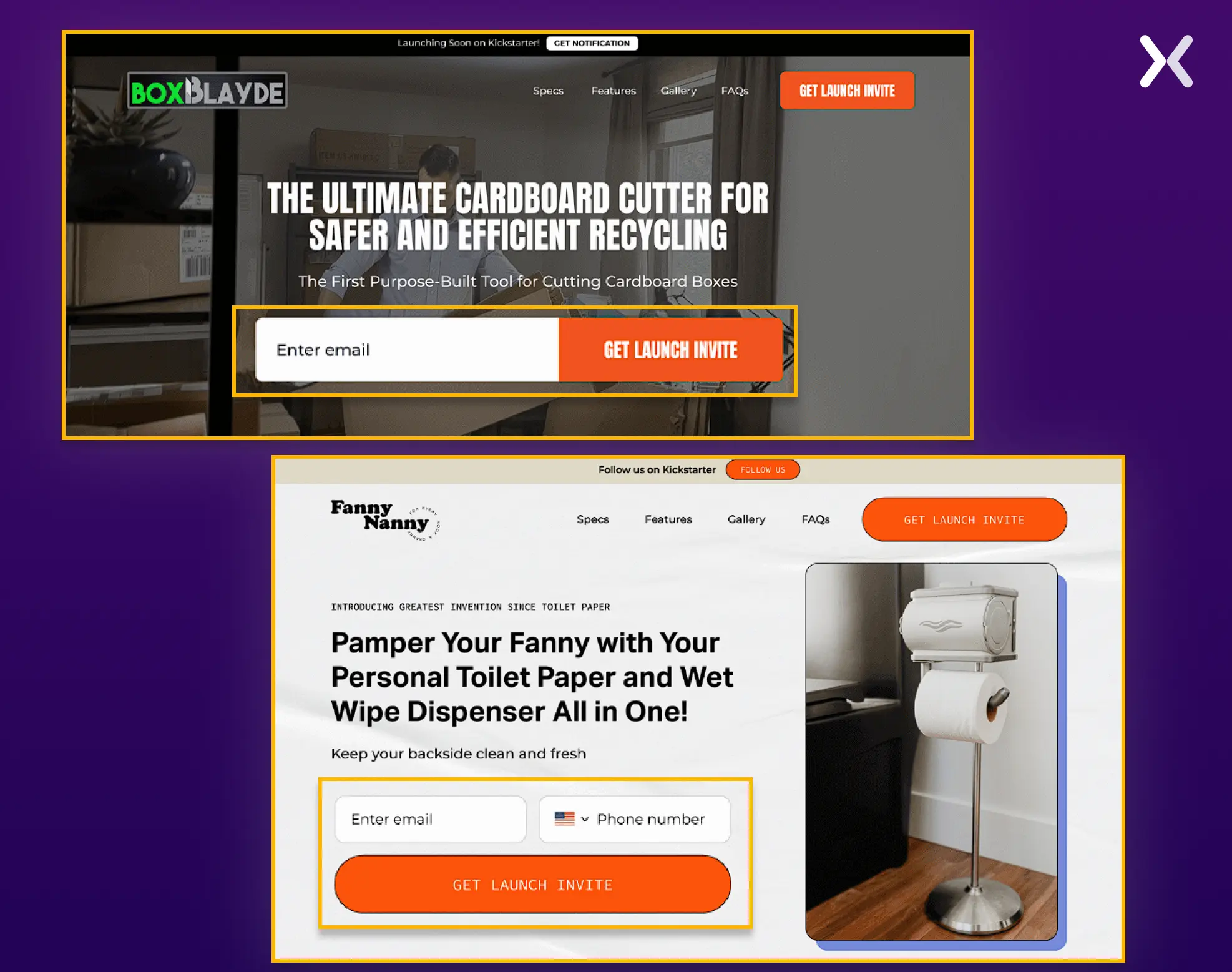
The most necessary purpose of your pre-launch landing page is to get your visitors to share their email addresses. A strong CTA increases the likelihood of turning a page visit into a lead. Here are a few dos and don’ts for a stellar CTA that converts.
-
The last thing you want to do is confuse your visitors and leave them wondering which CTA they should click. Keep it simple, and have one CTA strong them to give you their email address.
-
When visitors come to your pre-launch landing page, their eyes should instantly gravitate toward your CTA. They should not have to search for it. Your landing page should be easily scannable, and your CTA should stand out. One of the easiest ways to do this is by using big buttons and bright colors.
-
Your call-to-action button should be as close to the sign-up field as possible. This way, your visitor doesn’t need to look too far to find exactly where to take the necessary action to sign up.
-
Copy matters, and choosing your words wisely is essential. Create content that appeals to your audience’s needs. Focus on how the user will benefit to stress the urgency of signing up now. A good example is a sentence like, “Sign me up for this exclusive offer now!”
4. Don’t ask too many questions
You might be tempted to get as much information as possible from your potential client. But trust us, now is not the time. Right now, the less you ask, the better. The last thing you want is to lose leads because they feel like your forms are far too long.
 Stick to the basics. If possible, ask for your page visitors’ email addresses only. Travel company Expedia determined that removing one field from their form could generate an extra $12 million per year. As with most things, less is more regarding your pre-launch landing page.
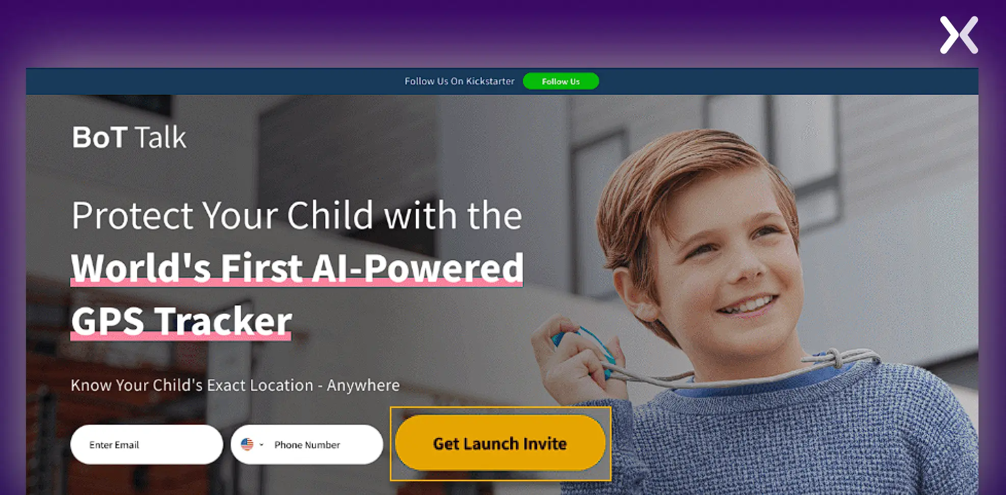
5. Incentivise your visitors
Your product should be the ultimate incentive for visitors to give you their email addresses on your pre-launch landing page. But it wouldn’t hurt to list a few additional reasons for them to click on the CTA. Motivate your audience even more with an incentive. Pre-launch incentives on a landing page could be:
-
A free trial of your product or service once you have launched it
-
A free demo call after launching
-
Access to unique content
-
Early bird discount offer For example, on the pre-launch landing page below, the CTA copy accents the incentive of reserving the product in advance, which will give a 40% discount on the final purchase.
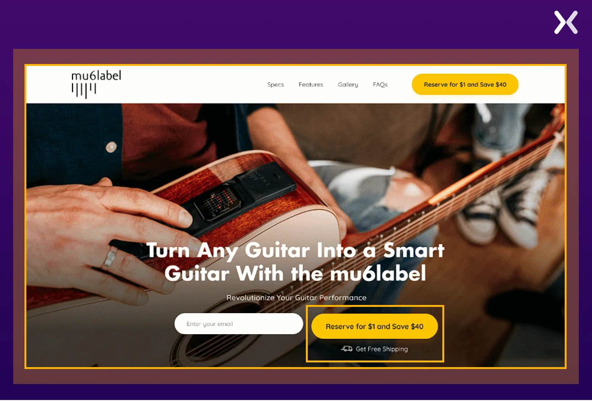 The extra incentive is the push a visitor needs to provide the information you want to collect on your pre-launch landing page.
6. Be polite: say thank you
Neglecting a thank you page is one of the biggest mistakes you can make when preparing a pre-launch landing page.
 A simple “thanks”, or lack thereof, sets a precedent for the type of treatment your page visitor can expect from you when they become your customer. Being polite may be a small gesture, but it can leave a lasting impression.
7. Request social shares after Sign-Up
Once your page visitor has given you their details on your pre-launch landing page and shown interest. You can ask them for social shares. Remember the part about being polite? This is where it comes in handy. If they feel they have had a great experience with you. They are more likely to want to share it with others. Adding an incentive to this process can also increase the number of shares you get.
8. Design your Pre-Launch landing page for the user
You must never forget that you are not designing your pre-launch landing page for yourself. Therefore, you need to do some research. The content and design of a pre-launch landing page change according to your target audience. For example, the two pre-launch landing pages below differ in design, focusing on different users.
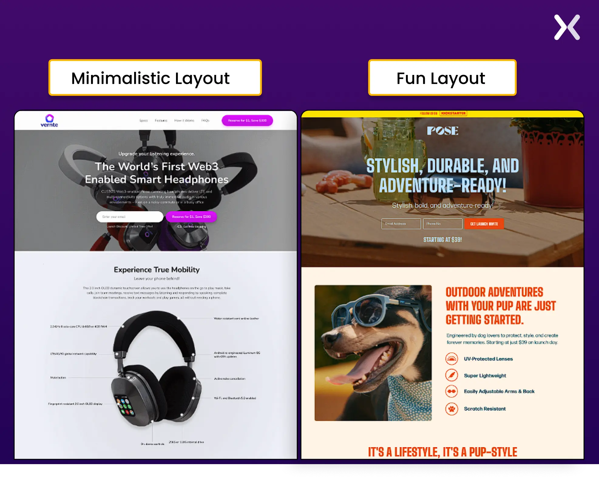 Find out what your target market is attracted to and incorporate that into your design. Your page should speak directly to your audience and show them why your product or service is their best decision.
9. Always do a/b testing
This is a critical component of the design process for your pre-launch landing page. A/B testing takes two versions of your pre-launch landing page and determines which performs better. Often, you won’t end up making changes to the entire page. For example, you might want to determine which version of a CTA button is most effective at getting more people to sign up. One essential part of this process is changing and testing only one component at a time. This will give precise results on what works and doesn’t work for each landing page element.
How to create a Pre-Launch funnel with a landing page?
Apexure recently worked with Agency 2.0, an agency specializing in Kickstarter campaigns. We collaborated with their team and built many pre-launch landing page campaigns. Let’s understand how a pre-launch landing page funnel works with the help of one of the campaigns. Here, we will focus on the product pre-launch campaign of Teds, an economical European-style smoking loafer. The Teds’ pre-launch campaign has three three stages. Each stage has a dedicated landing page.
Stage 1: main Pre-Launch landing page
The main pre-launch landing page effectively presents the product, with the copy focused on marking its USPs. For more impact, we have used engaging elements like storytelling, FAQs, and short videos.
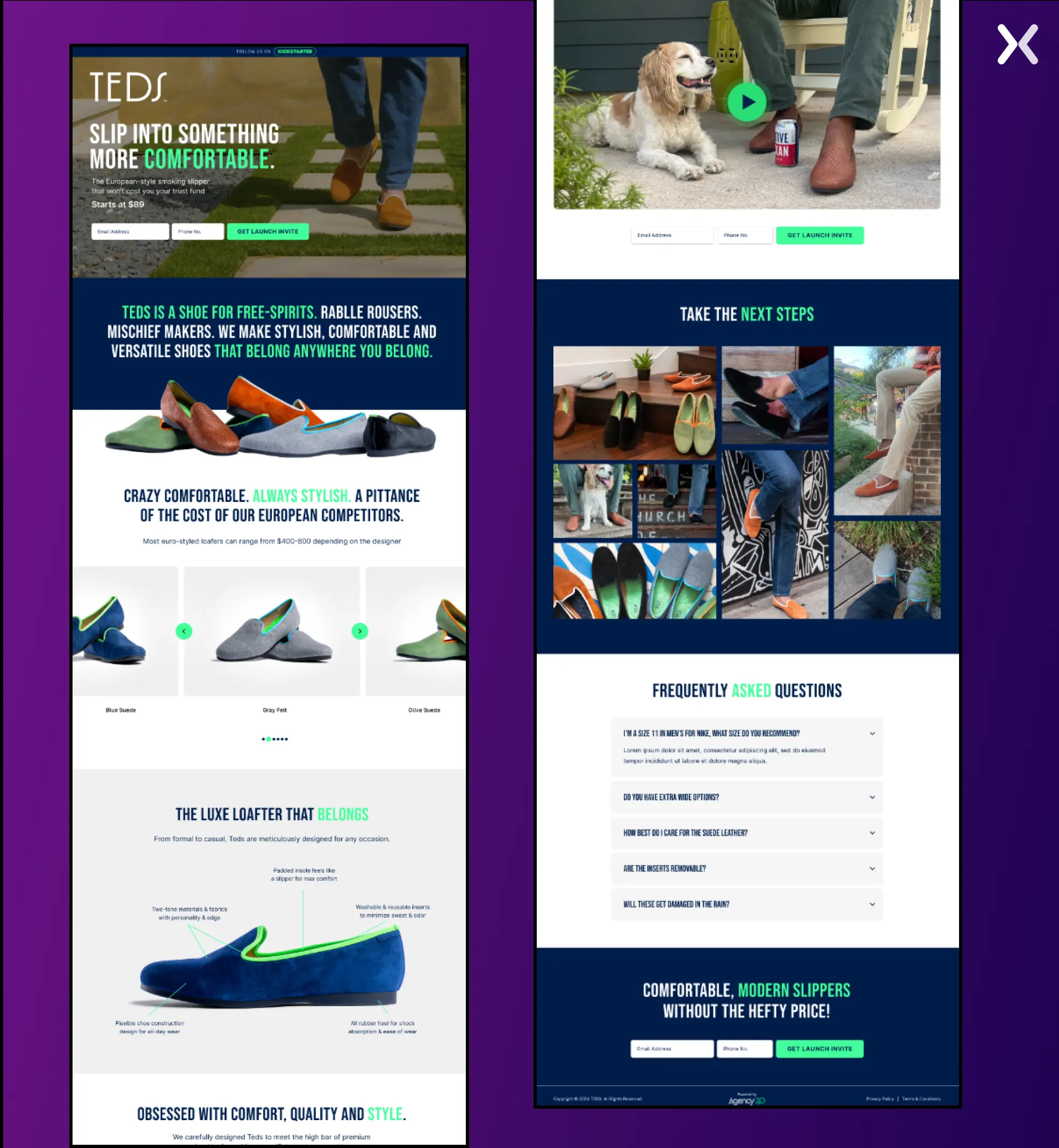 Visually, the page uses a clean, stylish design and high-quality imagery that fits the product’s sophistication. The final banner accents a limited-time deal to create a sense of urgency.
Stage 2: reservation landing page
The TEDS reservations page focuses on converting interest into action with a $1 refundable deposit for a VIP allowance. These benefits include 50% discounts, high-quality shipping, and other perks, resulting in a solid value proposition. The page stresses security and privacy, reassuring potential customers about transactions and data.
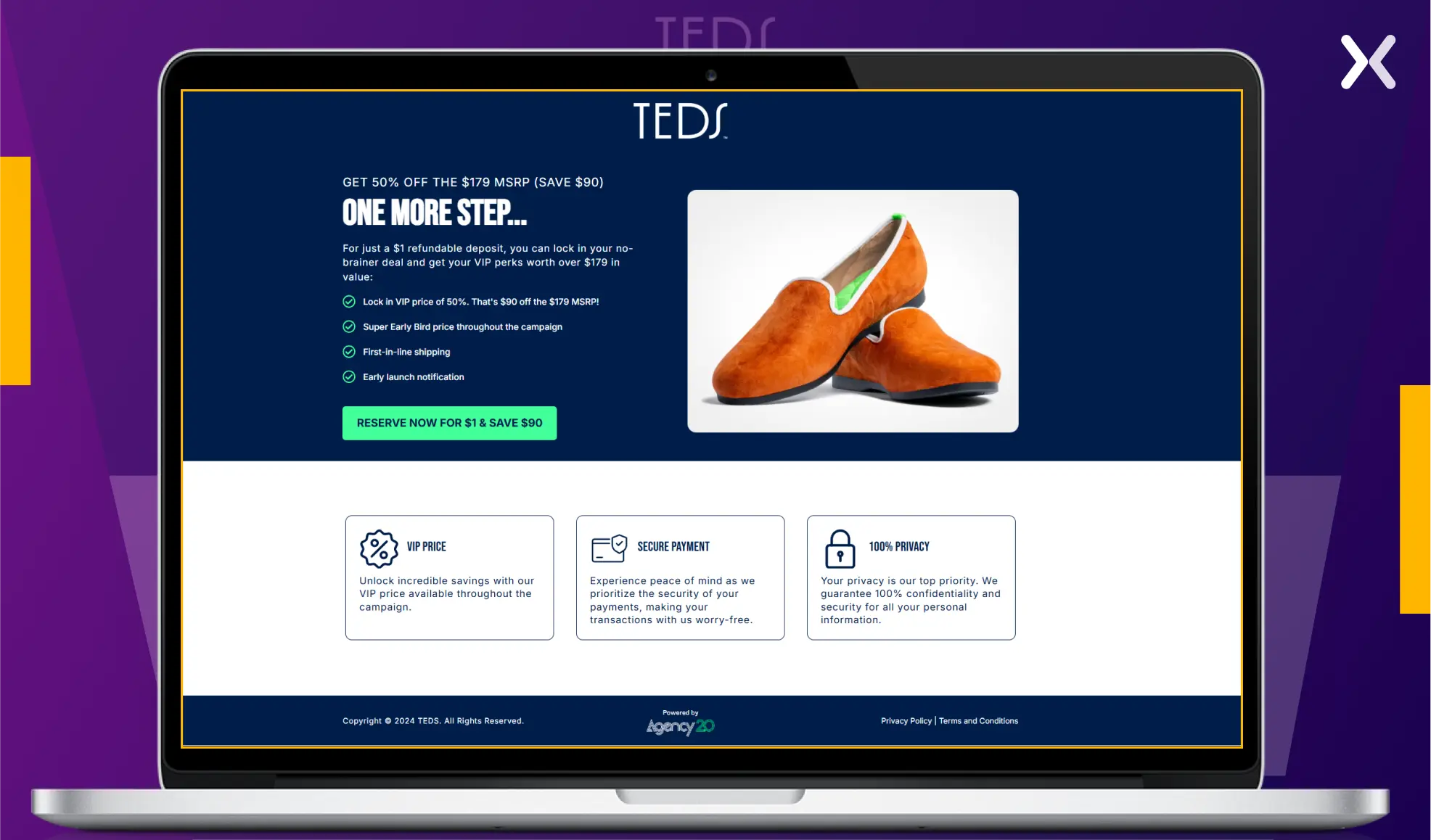 Visually, it uses a minimalist layout with bold and attention-grabbing headlines. This page effectively builds interest while lowering the commitment barrier.
Step 3: payment landing page
Once visitors are ready to commit, they are directed to a payment landing page.
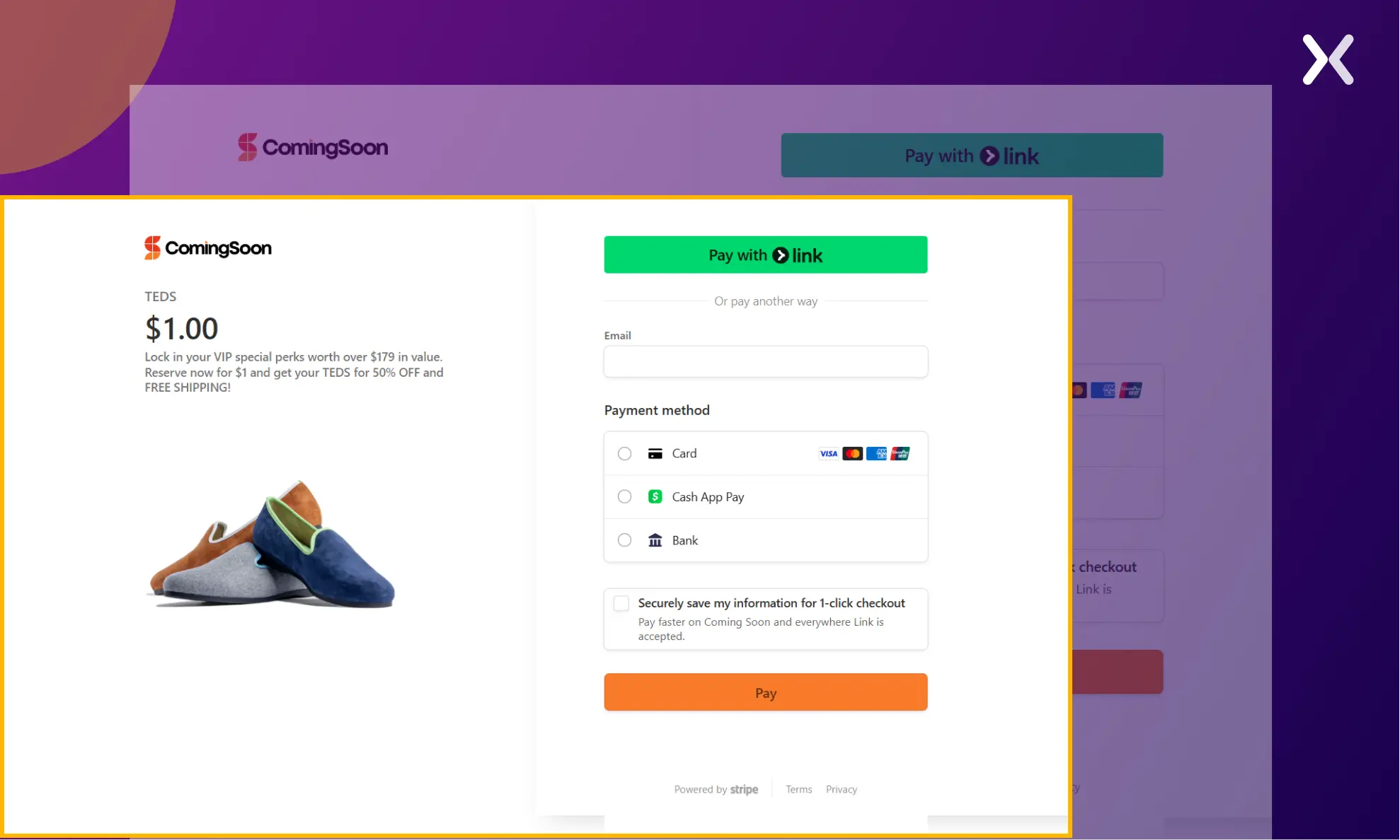 It is necessary to make sure the payment gateway works correctly and provides enough payment options. We have reiterated the offer’s value again on this page.
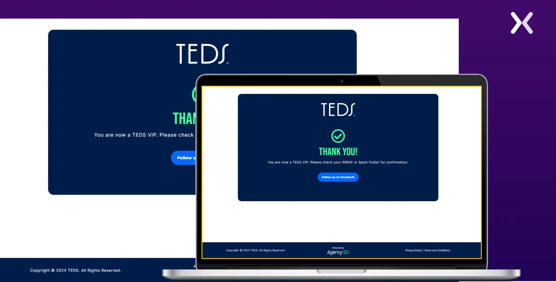
Step 4: thank you page
When the visitor has completed the payment, a thank you page shares an action point to make sure confirmation of their payment.
5 best Pre-Launch landing page examples
Let’s look at more pre-launch landing page examples. To understand the best elements in these pages, we will focus on specific elements like CTA, copy, headline, top fold of the page, etc.
1. SaaS coming soon landing page: PretaProcess
PretaProcess’s SaaS pre-launch landing page is short and straightforward. The whole page is effective, with its most strong final banner.
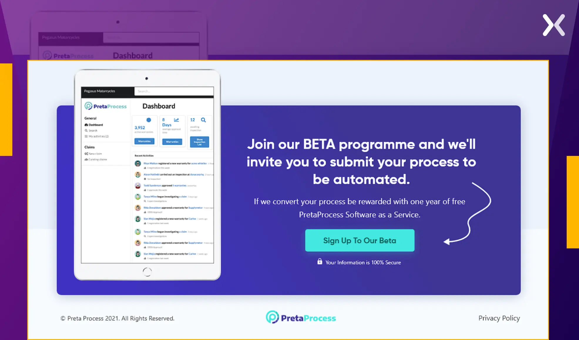 The offer and complementing dashboard image reinforce the product’s practicality through the banner. This whole section helps present to users the value of the SaaS one last time at the end of the page. Overall, it packs a persuasive punch to drive action.
With its contrasting stand-out color, the CTA button immediately draws attention, encouraging users to sign up for the beta. This landing page proves that having a final CTA banner on a pre-launch page is necessary.
The offer and complementing dashboard image reinforce the product’s practicality through the banner. This whole section helps present to users the value of the SaaS one last time at the end of the page. Overall, it packs a persuasive punch to drive action.
With its contrasting stand-out color, the CTA button immediately draws attention, encouraging users to sign up for the beta. This landing page proves that having a final CTA banner on a pre-launch page is necessary.
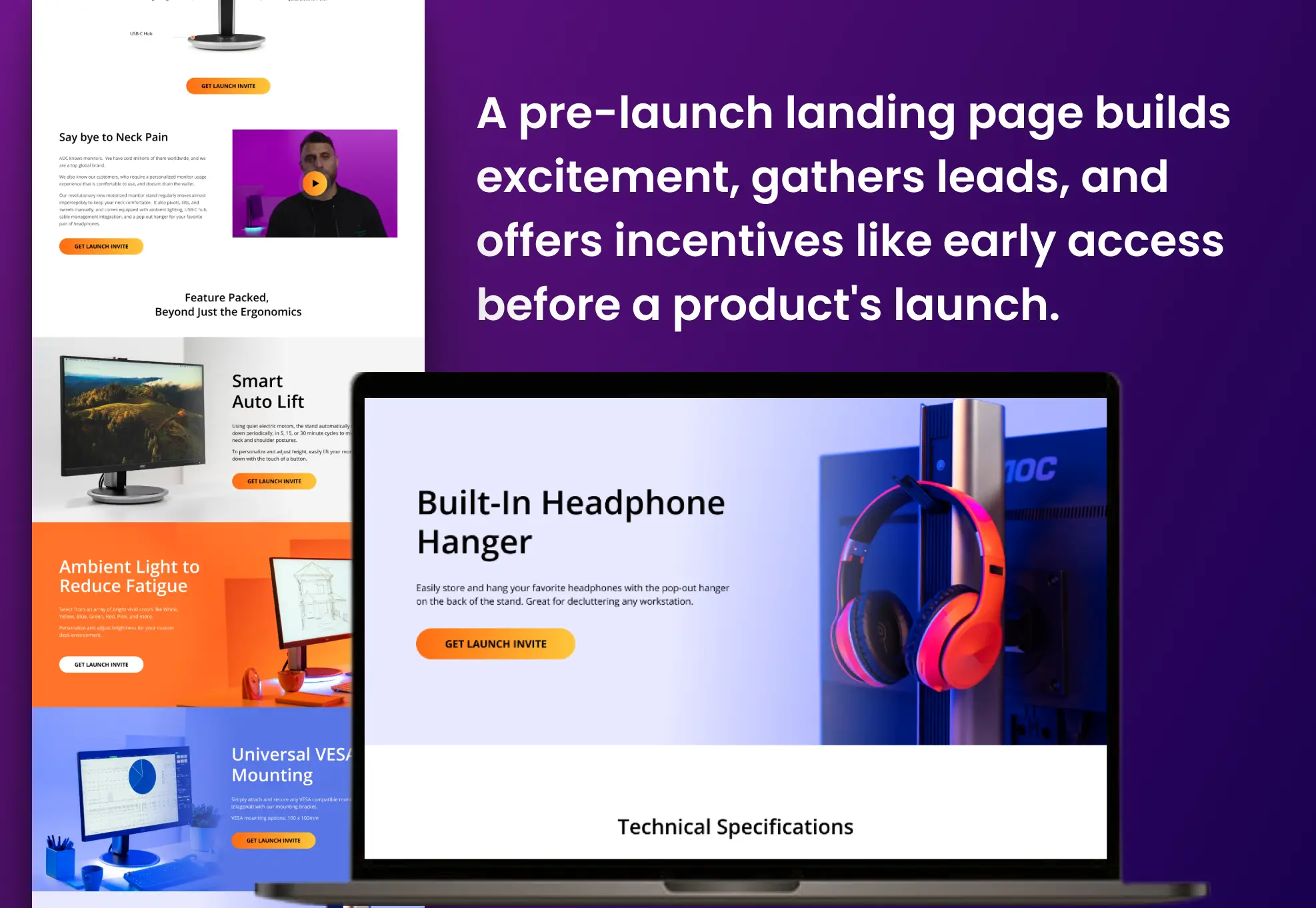
2. B2C Pre-Launch landing page: rubicon dog
Rubicon Dog has a long-form landing page on which it shares much about its product. Each section dedicatedly discusses the product’s various USPs and use cases.
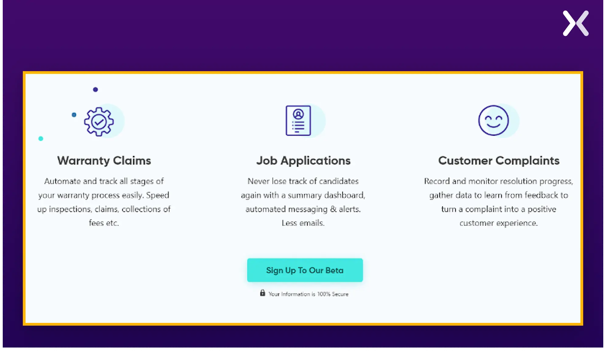
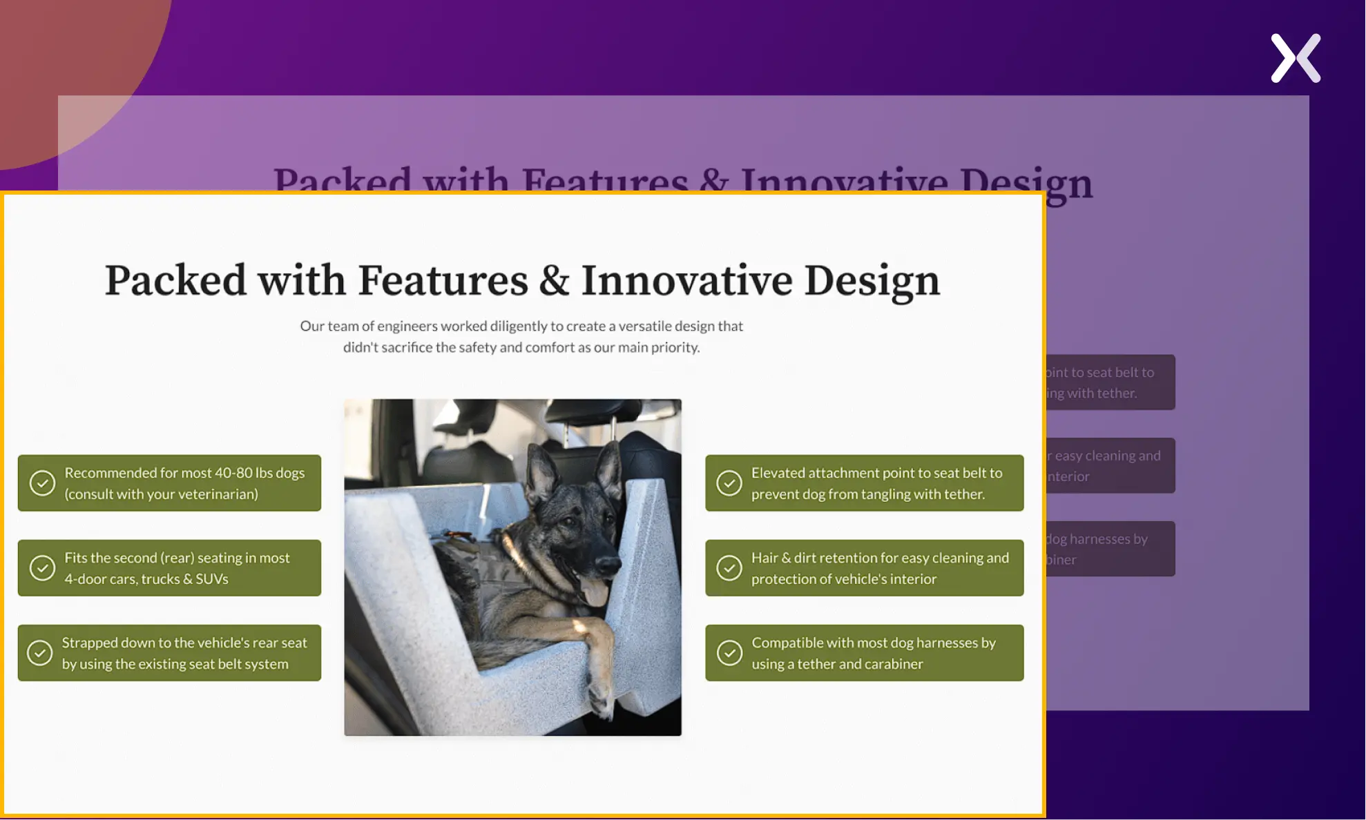 The stand-out section presents all the product’s features through short bullets presented in a visually appealing manner. In long-form pages, such sections are necessary as they help users understand essential information quickly.
3. Product Pre-Launch landing page: vernte
The Vernte pre-launch page has a minimalistic look and copy, just like its featured product. Its unique color palette makes the page pleasant to the eyes.
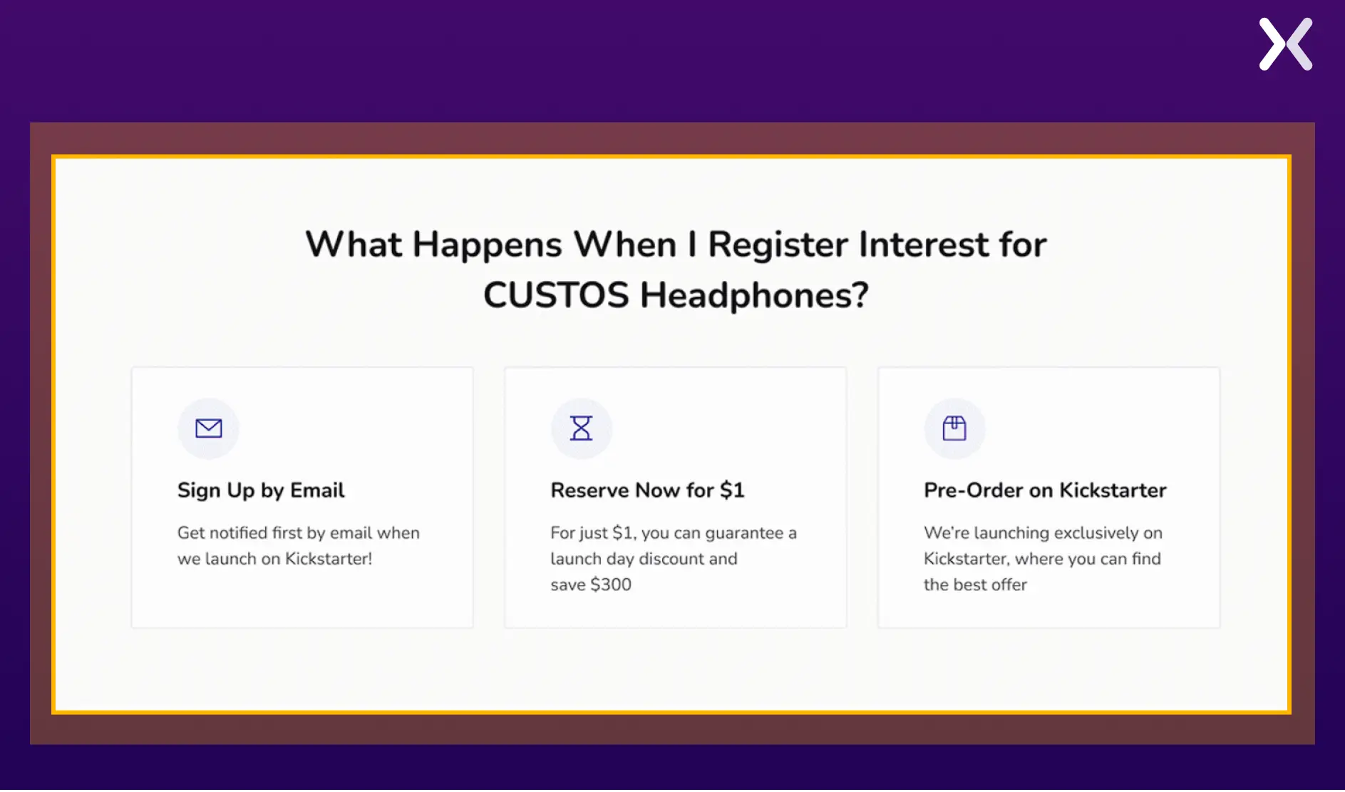 A stand-out segment on this pre-launch page is “What Happens When I Sign Up.” This section provides step-by-step insight into all the perks users receive once they sign up for the pre-launch.
4. B2C coming soon landing page: the heros journal
As intriguing is the product’s name, ‘The Heros Journal,’ as persuasive as their pre-launch landing page. Keeping the theme of the product in mind, the whole page design was done accordingly.
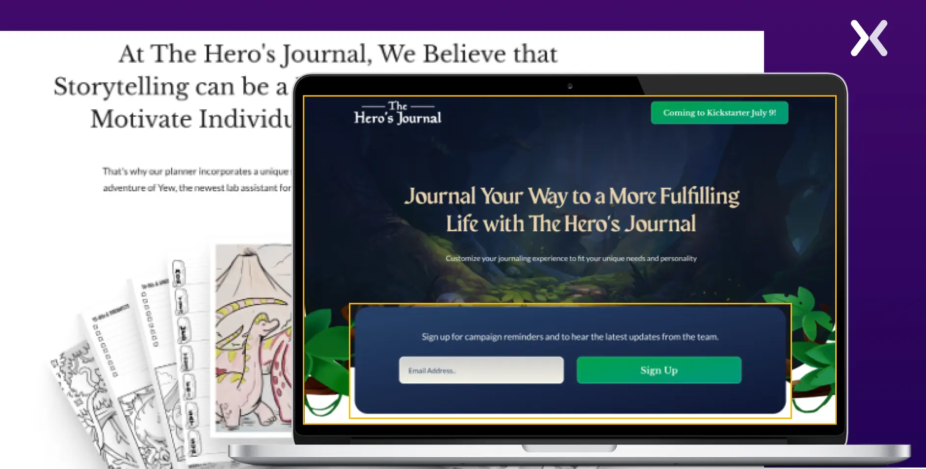 A stand-out element here is the short form with the single field at the top fold of the page. It improves the offer and reduces friction points.
5. Health tech Pre-Launch landing page: wethm
As a health tech product, a landing page must accent everything about the tech so visitors can easily grasp its concept. Wethm’s landing page communicates the product and its USPs with clarity.
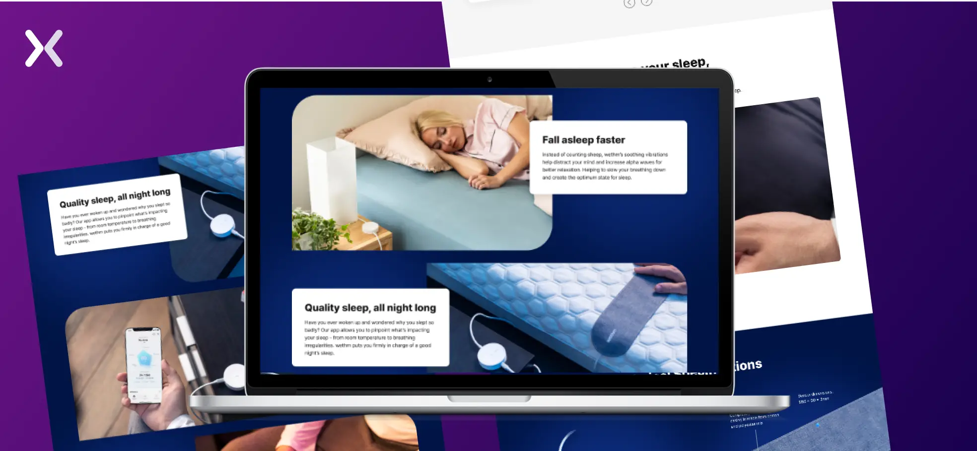 The page’s stand-out feature is the images and video, which raise the copy by presenting the device in action and creating visuals that inspire people to imagine using it in their daily lives.
Build a Pre-Launch landing page
As a business, getting clients to the top of your sales funnel is the most challenging task. This is especially true for a product that you are yet to launch. A customized pre-launch landing page is just what you need to get people interested and eager to use your product the second it’s launched.
{:id=”summary_image”}{:loading=”lazy”}
Related Articles: