Today’s digital world, having a responsive website is no longer just a nice-to-have, it’s essential. Whether you’re operating an eCommerce store, presenting a portfolio, or running a service-based business, your website must adapt smoothly across all devices. The cost for responsive web design directly impacts your site’s performance, user experience, and conversion rates. But as technology evolves, AI tools are playing an increasingly significant role in shaping these costs and making the process more efficient. Responsive web design makes sure your website provides an optimal viewing experience, whether on a mobile, tablet, or desktop, without needing to create separate versions for each device. Google continues to prioritize responsive websites in its ranking algorithms, rewarding sites that deliver a smooth, user-friendly experience across all screen sizes. This is why understanding the cost for responsive web design has become even more critical for business owners. In 2026, Core Web Vitals, Google’s set of user experience metrics that measure loading performance (interactivity, and visual stability) are more important than ever. Responsive design that meets Core Web Vitals standards not just improves your rankings on Google but also improves user satisfaction and retention. While AI tools help optimize these metrics, automating tasks like image compression, layout adjustments, and performance monitoring, human expertise is still necessary for creating an engaging, conversion-driven experience. In this guide, we’ll explore the cost for responsive web design in 2026, how AI can reduce certain costs, and what business owners can expect to pay for a site that not just looks great but also performs exceptionally. Drawing on our discovery-call insights, many clients like GoodBody and HomeJab, often come to us saying:
“We need a site that performs, not just looks pretty.”
“How do we make sure our website converts on mobile and desktop?” Our goal is to provide clarity on the budgeting process, especially when it comes to AI tools in web design. Whether you’re building a new site or updating an existing one, understanding these costs and how Core Web Vitals and AI intersect will help you make smarter, data-backed decisions for your business.
Why responsive design directly impacts conversions, SEO, and user trust
.png) Responsive web design makes sure that your website adapts smoothly to any device, whether it’s a phone, tablet, or desktop. This is essential not just for the user experience but also for SEO and conversions. In 2026, Google continues to prioritize mobile-first indexing.
From a business perspective, a non-responsive site can cause:
Responsive web design makes sure that your website adapts smoothly to any device, whether it’s a phone, tablet, or desktop. This is essential not just for the user experience but also for SEO and conversions. In 2026, Google continues to prioritize mobile-first indexing.
From a business perspective, a non-responsive site can cause:
Higher bounce rates: Users will leave quickly if the website doesn’t load properly on their device.
Poor SEO rankings: Sites that aren’t responsive rank lower in search results, affecting organic traffic.
Lost trust and credibility: Visitors expect to have a smooth experience across devices. A site that is difficult to use on mobile can significantly harm your reputation. If a website is slow, outdated, or hard to move through, you risk losing valuable leads.This is why it’s critical for business owners to understand that responsive design isn’t just a technical feature, it directly impacts lead generation, user trust, and ultimately revenue.
AI is now a big improvement in web design workflows. It doesn’t replace human designers but acts as a tool to accelerate the design process, making it more efficient and cost-effective. Tools powered by AI can:
Automate image optimization: Compressing images without compromising quality.
Suggest layout adjustments: AI analyzes user data to recommend optimal layouts and even predicts how users will interact with your site.
Test across devices: AI-powered tools can test and adjust your design automatically across different screen sizes. AI tools used for automation reduce cost but cannot replace the essential strategic decisions made by human designers.AI can save time, but your website’s strategy, your value proposition, user flow, and conversion logic still needs a human touch.
Responsive web design makes sure that your website adapts smoothly to any device, whether it’s a phone, tablet, or desktop
.png) Mobile-first vs responsive vs adaptive
Mobile-first vs responsive vs adaptive
Mobile-first: This design approach starts by designing for the smallest screen and gradually adds complexity as the screen size increases. It prioritizes mobile users by default, which is essential since over 50% of global web traffic is mobile.
Responsive design: A responsive layout dynamically adapts based on the screen size, making it ideal for sites that need to look great on multiple devices.
Adaptive design: Unlike responsive design, adaptive layouts involve multiple pre-defined layouts for different screen sizes (mobile, tablet, desktop). It provides a tailored experience but is less flexible than responsive.
With the rise of foldable phones and smart TV integration, the environment of responsive design is more complex than ever. To account for these devices, businesses need fluid layouts, not just resizing elements. AI tools help accelerate the process by automatically detecting issues across devices, offering solutions, and allowing designers to focus on strategy. However, businesses need to plan for future-proofing: it is about designing for today’s devices, but also anticipating new screen types and user expectations.
Google’s mobile-first indexing means it ranks responsive websites higher, as they offer a better user experience. A non-responsive site, however, is often penalized. For instance, a desktop-only site that doesn’t work well on mobile:
Loads slowly: Mobile users don’t have the bandwidth or patience to deal with slow websites. Google penalizes websites with poor load speeds.
Has poor navigation: Text or buttons that are too small to click, or images that are cut off, make it hard for users to engage with your content.
Hurts SEO rankings: If a website isn’t responsive, Google will rank it lower in search results, making it harder for potential customers to find you online.
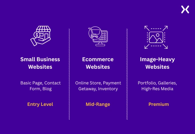 Typical ranges for small business, ecommerce, and image-heavy websites
Pricing for responsive websites varies based on complexity, with AI tools potentially lowering the time but not always drastically reducing costs:
Typical ranges for small business, ecommerce, and image-heavy websites
Pricing for responsive websites varies based on complexity, with AI tools potentially lowering the time but not always drastically reducing costs:
Small Business Website (5-10 pages): $5,000 - $9,000. Simple layouts with minimal customization.
Ecommerce Website (product-based, larger catalog): $12,000 - $18,000+
Features like filtering, product displays, and integrations push up the price.
AI tools might assist with product categorisation, image tagging, and automated testing.
Image-heavy websites (photographers, visual brands): $8,000 - $14,000+ The need for high-resolution images, custom galleries, and UX optimizations makes these sites more expensive. AI tools can help with image compression and layout suggestions but don’t replace the human design layer.
AI tools are fantastic for automation, such as compressing images, detecting responsiveness issues, or conducting performance audits. However, the underlying strategy and user experience are still the responsibility of skilled designers and marketers.
For image-heavy websites, responsive web design is inherently more complex. For large image galleries or product display sites, performance becomes a critical factor. Image optimization is one of the biggest hidden costs. AI tools can help by compressing large images without compromising quality. However, custom layouts and high-quality visuals require careful attention to balance image quality with page load speed.
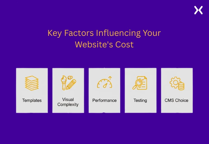
Each unique page, such as the homepage, product pages, or service pages requires its own responsive layout. The more page types you have, the higher the cost due to increased development time.
For image-heavy sites, compression, resolution settings, and mobile optimization all add time and cost.
A responsive website needs fast load times, particularly for image-heavy sites. Google’s Core Web Vitals will penalize slow sites, which is why AI-driven tools are increasingly used to optimize performance. Websites that prioritize speed are more likely to convert, but they come at a premium.
Multi-device testing increases costs. AI tools can significantly reduce manual testing by simulating dozens of devices. However, for optimal results, human oversight is still needed.
WordPress, Webflow, Shopify, and custom CMS each come with varying costs, flexibility, and developer expertise requirements.Websites that require additional integrations and app subscriptions, tend to cost more.
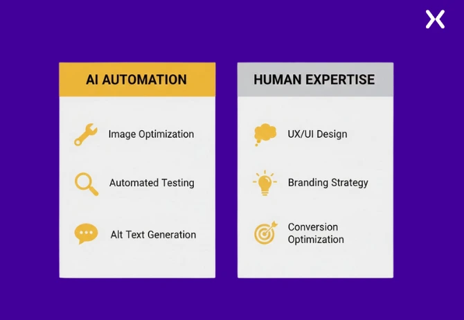 AI can lower cost in areas like:
Batch image optimization
Basic layout testing across devices
Automating alt text, microcopy But AI cannot replace:
Branding and strategic design
Human oversight on user journeys
Conversion‑driven design decisions
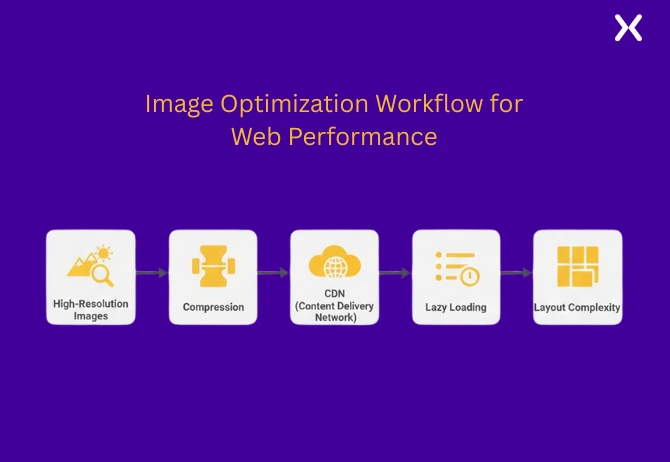
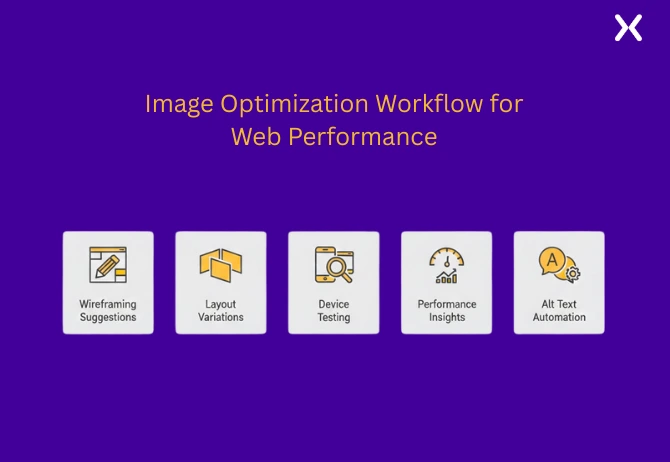
High‑quality images need to be optimized for performance across mobile, tablet, and desktop. AI tools like ImageOptim and TinyPNG can automatically compress images to reduce page load time without sacrificing quality.
Utilizing a Content Delivery Network (CDN) makes sure that large image files are delivered quickly regardless of location. Lazy loading allows images to load as users scroll, speeding up initial load times.
These layouts require additional CSS/JS coding and complex breakpoint management to make sure your images adapt to various screen sizes. AI tools that simulate multiple screen sizes save time but are not a substitute for human design.
AI tools can analyze multiple images in bulk and apply consistent color grading to match brand aesthetics, making sure a unified look across large image sets.
Business owners frequently underestimate the time required for cross-device testing, image file management, and complex layouts. These factors are often hidden costs that add significant complexity.
AI tools speed up tasks like image optimization, content testing, and layout variations. However, design decisions, especially related to conversions and branding, remain human responsibilities.
AI can suggest layout variations and draft wireframes based on user behavior data.
AI-driven tools like BrowserStack or Lighthouse automatically identify responsiveness issues.
AI tools can analyze your site’s load times and suggest improvements, pinpointing issues in image sizes or unoptimized scripts.
AI tools like Copy.ai can quickly generate alt text and microcopy for accessibility, reducing manual effort.
While AI accelerates the process and reduces design hours, the overall cost remains mainly influenced by design strategy and custom features. AI can reduces costs by 10-20%, but human expertise is essential for quality assurance and strategic decision-making.
Costs like CDN and SSL certificates are often hidden costs. Business owners should account for recurring hosting and performance-related expenses.
Routine maintenance, security patches, and design updates cost businesses $200-$500/month. AI tools might help with automated updates.
Tracking performance via tools like Google Analytics, Lighthouse, or GTmetrix is a recurring cost.
AI tools such as PageSpeed Insights or Uptime Robot proactively monitor website performance, alerting you to issues before they affect users.
Apexure’s research-first approach means we analyze your business goals and user needs before jumping into design. This makes sure AI tools like Lighthouse or Figma’s auto-layouts are time-saving assistants, not shortcuts.
We use AI tools for layout analysis, speed optimizations, and testing, but all design and conversion decisions come from human experts.
Apexure’s human-led process makes sure that even if AI tools suggest a layout change, we review it for usability, performance, and conversion alignment.
Ask about AI integration:
How is AI used in your workflow?
What tools will you employ for image optimization and layout testing?
How many revisions and testing rounds will there be?
Underpriced: No AI testing or optimization tools mentioned.
Overpriced: Vague scope with no breakdown of deliverables.
AI accelerates processes but doesn’t replace strategy, CRO, or branding decisions. Your responsive website isn’t just a cost; it’s an investment that drives long-term growth. Get a transparent quote for your responsive website project today.
Did you know that Apexure has 100+ blog posts on web design, including responsive design best practices? From planning to launch, performance optimization to Core Web Vitals, we’ve shared everything you need to know to build a website that not only looks great but performs flawlessly. Check it out before you start your next website project!
Designing a responsive website on your own can be a lengthy process, especially if you’re aiming for high-quality performance, AI optimization, and conversion rate improvements. Skip the trial and error and get expert help! Book a call with one of our design experts, and we’ll ensure your site meets the latest standards for speed, user experience, and SEO optimization.
Responsive design is just the beginning. Your site could be missing elements that optimize performance or increase conversions. Explore our responsive web design portfolio to see how we’ve helped businesses like yours with conversion-friendly design elements. Filter by your industry to discover trending designs and see what works for sites similar to yours.
Yes, AI reduces time for tasks like image optimization, responsiveness checks, and performance audits. However, human review and strategy still add significant value, particularly when it comes to brand voice, UX design, and conversion rate optimization.
As CEO and Founder of Apexure, Waseem Bashir's decade-old experience in building high-converting landing pages extends to collaborations with Fortune 500 leaders. From free to paid he has tried his hands on all landing page builder tools and knows just the right fit for every business. Read more


Eleven percent of Meta ad rejections in 2026 trace back to one problem: the landing page does not...

A B2B SaaS company spends $30,000 per month on Google Ads and Meta Ads. Both campaigns drive traffic...
Get quality posts covering insights into Conversion Rate Optimisation, Landing Pages and great design