CRO breakdown of Truebill's subscription cancellation app — product mockup hero, three-benefit architecture, and a minimal-friction sign-up conversion strategy.
What is ConvertScore™? ConvertScore™ is Apexure's proprietary landing page performance metric. We evaluate every page across four dimensions — Copy & Messaging, Layout & Hierarchy, Trust & Social Proof, and CTA & Conversion Path — to produce a single score out of 100.

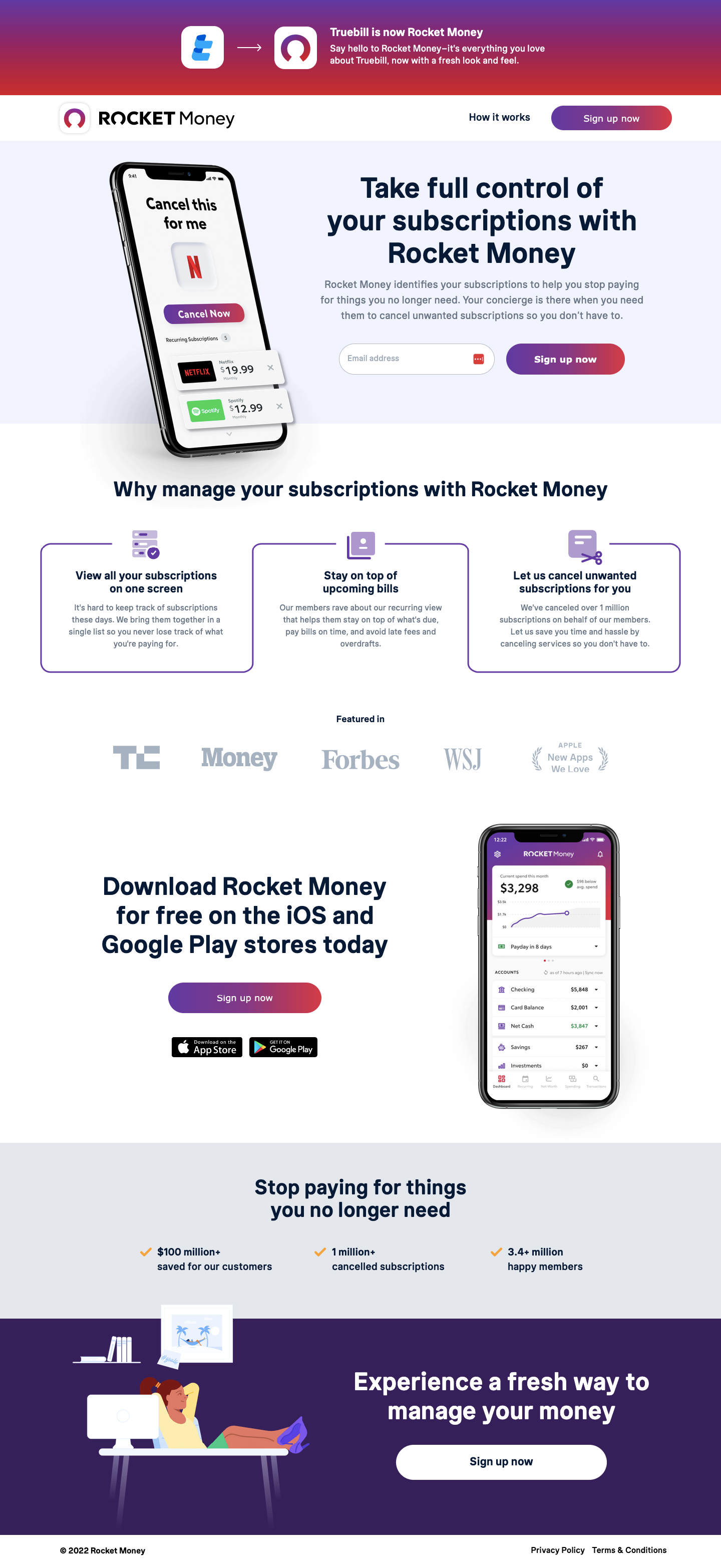
Truebill (now Rocket Money) built its growth on one insight: people are paying for subscriptions they’ve forgotten about and can’t easily cancel. The page addresses this problem in the most direct way possible: show the app, show the problem it solves, and make signing up require one action.
There are no animations, no testimonial carousels, no explainer videos in the hero. Just the app interface, showing recognisable subscription logos with a cancel button, and a clear headline. “Manage and cancel your subscriptions with a tap.” The entire value proposition in nine words.
shows the Truebill interface with subscription logos for Disney+, HBO Max, Netflix, YouTube, and Spotify prominently displayed, each with easy-access controls. This selection of subscription brands is deliberate. They’re the ones virtually every visitor recognises from their own bill. Seeing your own subscriptions in someone else’s app is an immediate “oh. That’s me” moment.
is the most persuasive design element on the page. It’s not describing the cancellation feature. It’s showing it in the interface, at the exact scale and position where a user would tap it. Product demos in the hero convert better than feature descriptions because they’re concrete rather than abstract.
projects calm trustworthiness appropriate for a product handling sensitive financial data. Aggressive or high-energy colour schemes would trigger anxiety in the context of subscription and financial management. The blue palette signals reliability, accuracy, and institutional competence.
use clean icons and brief functional descriptions rather than marketing language. “View all your subscriptions on one screen” is a feature statement, not a benefit statement, and this is the right call for a utility app. Users who understand what the app does convert better than users who’ve been sold on vague lifestyle promises.
TechCrunch (Money, Forbes, WSJ, App Store “Best Apps” badge) is positioned directly below the three feature cards, after the visitor has understood the product’s function but before they’ve been asked to sign up. The sequence is correct: understand the product → trust the product → take action.
The page has two CTAs: one in the hero (inline email + "Sign up now" button) and one after the feature cards (standalone "Sign up now" button). The repetition isn't redundancy, it's placement strategy. Visitors who convert in the hero are convinced by the product demo. Visitors who convert after the cards are convinced by the feature detail. Both conversion moments are served without disrupting the page flow.
Fintech app trust is built on two foundations: institutional endorsement (press logos, App Store features) and data security reassurance. The Truebill page handles institutional endorsement excellently. TechCrunch, Forbes, WSJ, Money Magazine are the editorial gold standard for fintech credibility. The App Store “Best Apps” badge adds platform-level vetting. This combination creates a multi-layered trust stack that addresses the financial data concern before it’s verbalised.

"The trust bar for a fintech app connecting to your bank accounts is high, and it should be. Press logos at this level (WSJ, Forbes) are an effective shortcut because they signal editorial due diligence. A journalist at the Wall Street Journal reviewed this product and recommended it. That endorsement does more trust work than any security badge or privacy policy link."
Read more about how we approach fintech page design in our guide to Landing Page Form Design Best Practices.
The navigation keeps "How it works" and "Sign up now" visible without being overwhelming. For a short, focused page like this, a persistent nav CTA means the sign-up action is always one click away regardless of scroll position. This reduces the mental effort required to act on conversion intent.
The page is a model of restraint. The hero is a product demo. The middle section is three functional benefits. The trust section is press logos. The CTA is one email field. No modal, no countdown timer, no pop-up. The strategy is: make the product immediately comprehensible, establish credibility quickly, and make signing up require the minimum possible effort. That’s the entirety of the conversion architecture, and it works.
"This page demonstrates something I try to impress on every client: the relationship between page length and conversion is not linear. Truebill's page is short, perhaps 600px tall on a standard screen without scrolling, and it converts at scale. The discipline to not add more is often harder than adding more. This page earned that discipline."
The subscription management use case is mobile-native, users are cancelling subscriptions from the same device where those subscriptions live. The page was designed to be functional on a phone screen: the app mockup scales elegantly, the feature cards stack vertically without losing clarity, and the email capture field with blue CTA button is thumb-reachable within the first scroll.
A short page is a fast page. With minimal assets, one app mockup image, two or three icons, a logo strip, the Truebill page loads near-instantly. Fast load time is a conversion multiplier for any page; for a fintech app targeting people who want quick solutions to their subscription mess. It's a particularly strong alignment between product promise and page experience.
Three priority improvements:
This page scores 88 out of 100. The product-as-hero approach is executed with discipline and confidence, and the three-card benefits section maps the product’s value to distinct user motivations effectively. The press logo bar is exemplary fintech trust-building. Points are held back by the absence of a quantified savings claim, the page tells users they can manage subscriptions but doesn’t tell them how much the average user saves, and by the missing data security statement near the sign-up form.
Browse our full collection of landing page examples to see how we apply these principles across industries.
This principle influences visitor behaviour and supports the page's conversion goal.
People follow the actions of others. Testimonials, reviews, and client logos build trust and reduce hesitation.
This principle influences visitor behaviour and supports the page's conversion goal.
People feel losses more strongly than gains. Framing around what they will miss motivates action.
The Truebill hero shows the actual app screen, subscription icons (Disney+, HBO Max, Netflix, Spotify) with a 'Cancel this for me' button prominent in the interface. This is a product demo in the hero, not a photo shoot. For a utility app whose value is immediate and functional, showing the product working is more persuasive than showing someone happy about saving money. The interface screenshot answers 'how does it work?' before the visitor has formed the question.
The three cards, 'View all your subscriptions on one screen', 'Stay on top of upcoming bills', 'Let us cancel unwanted subscriptions for you', map to the three stages of the user journey: awareness, monitoring, action. Each card represents a distinct value proposition that appeals to a different motivation. Some visitors come for the visibility; others come for the bill tracking; others specifically want cancellation assistance. Three cards, three audiences, one page.
Press logos in fintech do more than signal credibility, they signal safety. A visitor considering giving an app access to their financial data needs assurance that this isn't a phishing operation. TechCrunch, Forbes, and WSJ editorial coverage is incompatible with a scam product. The media logos provide a background check that the visitor doesn't have to do themselves. In fintech, this category of trust signal is non-negotiable.
The inline email field with a blue 'Sign up now' button removes one interaction from the conversion path. A modal-based sign-up requires a click to open the modal, another click to confirm intent, then form completion. An inline form goes directly from intent to action. For a free sign-up with no financial commitment, every additional interaction is friction that reduces conversion rate. Inline capture consistently outperforms modal capture for free registration flows.
Other CRO breakdowns from our lookbook
We design high-converting landing pages for B2B and B2C brands. Let's talk about yours.
Get a Free Consultation Or browse more examples →
Founder & CEO of Apexure, Waseem worked in London's Financial Industry. He has worked on trading floors in BNP Paribas and Trafigura, developing complex business systems. Waseem loves working with Startups and combines data and design to create improved User Experiences.
Get quality posts covering insights into Conversion Rate Optimisation, Landing Pages and great design


"Truebill is one of the cleanest fintech landing pages I've seen because it commits entirely to showing the product doing the thing. There's no soft focus lifestyle photography, no abstract illustration of financial wellness. The app screen IS the pitch. That confidence, trusting the product demo to convert, is the right call when the product UI is intuitive and the problem is universally relatable."