CRO breakdown of Nama Bank's Islamic digital banking waitlist page. Expert analysis of faith-aligned fintech positioning, mobile app UI trust strategy, and waitlist CRO by Apexure.
What is ConvertScore™? ConvertScore™ is Apexure's proprietary landing page performance metric. We evaluate every page across four dimensions — Copy & Messaging, Layout & Hierarchy, Trust & Social Proof, and CTA & Conversion Path — to produce a single score out of 100.

Nama Bank is entering a market where Muslim consumers have been historically underserved by conventional banking. The opportunity is real, but so is the scepticism. Fintech products targeting faith communities often promise alignment but deliver generic products with a rebrand.
The page needed to communicate two things simultaneously: that the product is genuinely Sharia-aligned (this isn’t just a marketing claim), and that it works as well as any mainstream digital banking app. The waitlist framing resolves the timing challenge. The bank isn’t fully live yet, but the page builds anticipation and captures early community intent.
The palette works on two levels. Green carries both Islamic cultural significance and the universal fintech signal of financial health. The cream softens the page away from the cold corporate blues of conventional banking and signals that Nama Bank is a different kind of institution. The palette choice tells the story before the copy does.
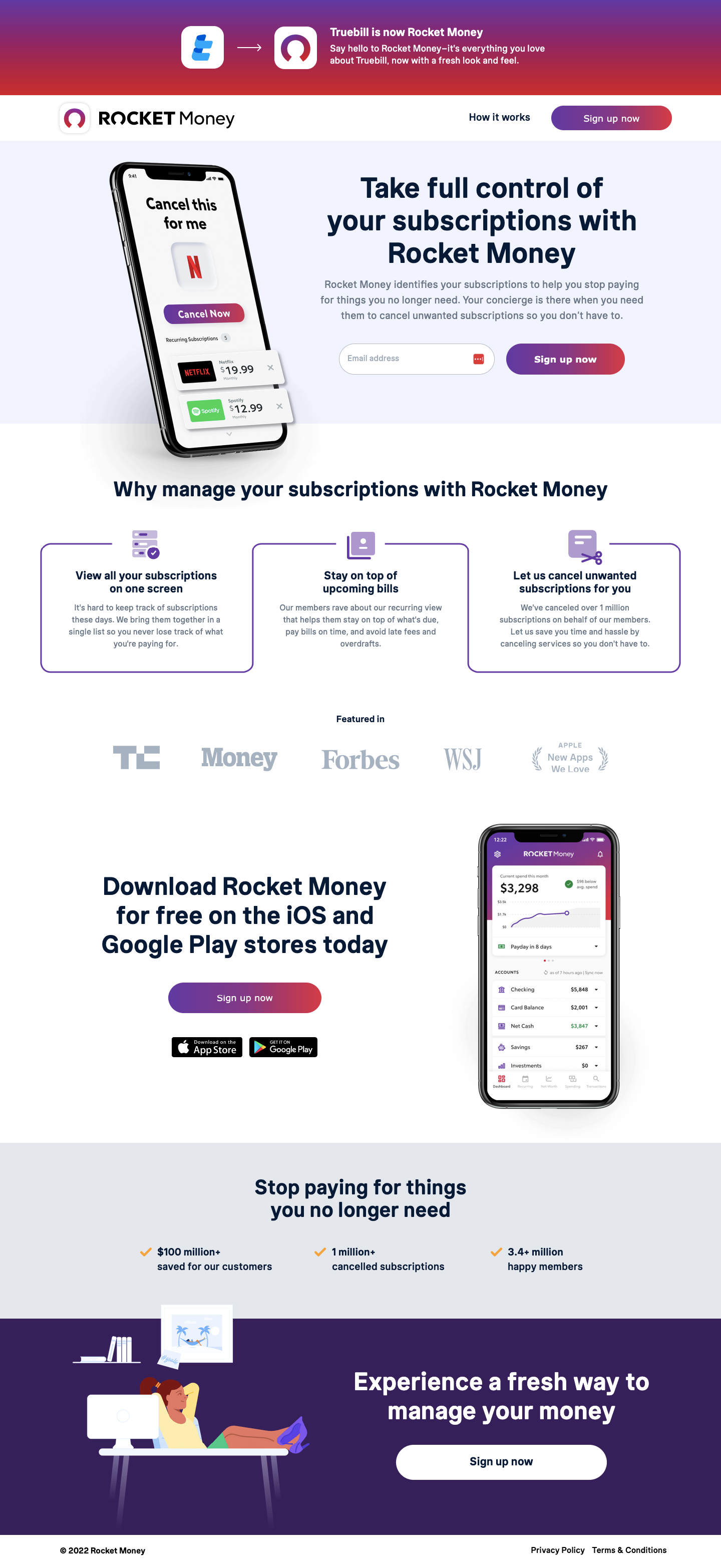
“Pay anyone the fast, fee-free way” and “Travel with ease” are structured as benefit statements with supporting mobile app screenshots. Each section does the same job: take a use case the visitor recognises from their daily life and show Nama Bank solving it elegantly. The app UI screenshots are real, showing the payment success state and travel spending dashboard. Proof that the product exists and works.
This is the most culturally specific trust signal on the page. It isn’t accidental photography. It’s a deliberate statement that Nama Bank was designed for this community. Visitors who see themselves represented in a banking product page are more likely to trust that the product’s values match theirs.
The mid-page CTA section frames the waitlist as an opportunity, not a delay. The word ‘first’ creates exclusivity. ‘Future of banking’ creates aspiration. Together they make joining the waitlist feel like getting in early on something significant rather than waiting for something uncertain.
The FAQ addresses the most anticipated questions about Islamic banking compliance and product mechanics. In a category where visitors may need to explain the product to family members who’ll share the account, an FAQ that covers the core questions serves both the individual visitor and the household decision-making unit.
Waitlist pages for fintech products are an underused conversion format. They capture intent before the product is ready, build an early user base who feel ownership over the product, and create genuine social proof ("1,000 people already waiting") before a single account is opened. The waitlist converts better than a standard sign-up precisely because it feels lower-commitment, and that community, once built, provides the social proof for the full launch.
Nama Bank’s trust architecture is community and product-centred. Visual representation (Muslim community members in photography) communicates genuine cultural match. Real app UI screenshots (payment confirmation screen, travel dashboard) prove the product exists and is functional. Fee-free positioning (“no overdrafts, no monthly fees” visible on the card mockup) removes the financial anxiety that drives conventional banking distrust. FAQ transparency answers the ‘is this actually Sharia-compliant?’ question directly.

"In faith-based financial products, trust has a higher bar. Conventional fintech trust signals (security badges, encryption icons) are necessary but not sufficient. You need to show community understanding. That means real people from the community in the photography, real Islamic scholars or certifications cited, and real transparency about how the product works. Anything less reads as performative."
Read more about how we approach trust signals in our guide to Ways To Increase Landing Page Social Proof.
The physical card mockup in the hero (showing "no overdrafts, no monthly fees" directly on the card) is more persuasive than any copy about fee-free banking. The visitor reads the promise on the product itself. That visual placement of the key benefit on the actual card makes the claim feel baked in rather than advertised. Baked-in promises feel more credible than advertised ones.
The waitlist conversion is built around the “JOIN THE WAITING LIST” CTA, which appears mid-page after two complete feature sections. This placement catches visitors after they’ve been given enough evidence of the product’s utility (the payment feature, the travel feature) but before content fatigue sets in. The demo section at the bottom provides a secondary conversion path for visitors who want to see the product before committing even to a waiting list.
"For pre-launch products, the CTA isn't asking for money. It's asking for interest. That's a much lower-friction ask, which means you can place it earlier in the page and repeat it more often without creating pressure. The repeat CTA on a waitlist page should feel like a natural reminder, not a hard sell."
Unbounce gave us the flexibility to structure the waitlist form, feature sections, and FAQ precisely as needed without the constraints of a generic fintech template. The A/B testing capability let us test waitlist copy variants (“Be first” versus “Take control”) without developer involvement.
The Muslim community skews young and mobile-first in digital banking behaviour. Every section was designed to read cleanly at mobile width, with app screenshots rendering at a scale that shows the UI clearly without requiring zoom. The waitlist CTA is always accessible without scrolling back to the top.
The app UI mockup graphics were built as CSS-styled components rather than image files wherever possible, keeping the page weight low. Financial product pages need to load fast because visitors comparing banking options will move quickly between competitors. A slow Nama Bank page sends them straight to the next option.
Three changes would meaningfully improve this page’s performance.
Sharia certification or scholar endorsement. A visible citation from an Islamic finance scholar or Sharia supervisory board (even a single quoted line) would directly address the core trust question for devout visitors. Faith-based financial products that show formal religious oversight convert significantly better than those that imply it.
Waitlist counter. “Join 3,400 people already waiting” near the CTA creates social proof at the exact moment of decision. It answers the implicit question “is anyone else interested in this?” with a number that validates the choice.
Video walkthrough. A 60-second screen recording of the app in action (showing a payment being made and confirmed in real time) would resolve more objections than any feature section can. For a digital banking product, showing the product working is the most powerful form of trust available before sign-up.
The cultural representation and fee-free positioning are genuinely differentiated. The waitlist framing is smart for a pre-launch product. The score shows the gap between the promise of faith-aligned banking and the absence of formal religious certification or community social proof on the page. Two elements that would significantly lift conversion in this audience.
Browse our full collection of landing page examples to see how we apply these principles across industries. Building a fintech product for an underserved community? Talk to our team.
Controlling what visitors see first, second, and third guides them toward the conversion goal.
People follow the actions of others. Testimonials, reviews, and client logos build trust and reduce hesitation.
Eye-tracking shows people scan pages in an F-shape. Placing key content along this path increases engagement.
Simpler pages convert better. Reducing visual noise, breaking forms into steps, and clear copy lower mental effort.
People trust credible experts. Certifications, awards, media mentions, and expert endorsements boost credibility.
Nama Bank is a digital banking platform built around Islamic financial principles, fee-free peer payments, travel spending, and product purchases made through a mobile-first interface. It's designed for Muslim consumers who want a modern banking experience that fits Sharia values. The waitlist model positions it as a sought-after launch rather than a generic sign-up, creating early community around the product.
A waitlist CTA, 'Join the Waiting List', does two things a standard sign-up cannot. It creates perceived demand: the product is so anticipated that access must be queued. And it reduces the commitment anxiety of signing up for something unproven, joining a waitlist feels like expressing interest, not making a commitment. For an early-stage fintech, this is often the highest-converting CTA strategy because it captures intent without requiring the visitor to trust a product they haven't yet used.
Representation in product photography is a trust signal. When visitors see themselves, their identity, their appearance, their lifestyle, showed in the page, they read the product as designed for them. Nama Bank's use of a Muslim woman in the hero and mid-page sections communicates: 'this bank was built for our community, not adapted for it.' That distinction matters enormously for a faith-based financial product where cultural alignment is part of the value proposition.
Leading with practical use cases makes the product immediately legible to any visitor. Not every prospect will arrive understanding the mechanics of Islamic finance, but everyone understands 'pay friends and family instantly, from within Iraq or outside.' The faith alignment is implicit in the brand name and design; the page earns credibility first by showing everyday utility. Once the visitor understands what the app does practically, the Sharia-compliant underpinning becomes a differentiator rather than a barrier.
Other CRO breakdowns from our lookbook
We design high-converting landing pages for B2B and B2C brands. Let's talk about yours.
Get a Free Consultation Or browse more examples →
Founder & CEO of Apexure, Waseem worked in London's Financial Industry. He has worked on trading floors in BNP Paribas and Trafigura, developing complex business systems. Waseem loves working with Startups and combines data and design to create improved User Experiences.
Get quality posts covering insights into Conversion Rate Optimisation, Landing Pages and great design


"When you're building a product for a community that has been let down by incumbents, the page has to communicate belonging before it communicates features. Muslim consumers looking at a banking page know the difference between a bank that was built for them and one that slapped some branding on a generic product. You show that in the photography and copy, not just in the product specs."