CRO breakdown of Rocket Money's fintech subscription management app landing page. Expert analysis of the social proof metrics, media logos, and app download conversion strategy by Apexure.
What is ConvertScore™? ConvertScore™ is Apexure's proprietary landing page performance metric. We evaluate every page across four dimensions — Copy & Messaging, Layout & Hierarchy, Trust & Social Proof, and CTA & Conversion Path — to produce a single score out of 100.
Rocket Money’s landing page solves a specific problem with fintech app downloads: visitors are sceptical about granting access to their financial data. The page addresses that scepticism systematically, with scale proof ($100M saved), editorial validation (TechCrunch, Forbes, WSJ), and a clear, simple feature explanation, before asking for the download. By the time the visitor reaches the App Store or Google Play button, they’ve been given five separate reasons to trust.
A deliberate brand choice for a financial product. Purple carries associations of intelligence, creativity, and premium positioning. It’s unusual enough in fintech to be distinctive without being alarming. The white background and purple accents create a clean, modern interface that reads as ‘tech company’ rather than ‘bank,’ which is precisely the positioning Rocket Money wants in a category where traditional financial brands feel bureaucratic.
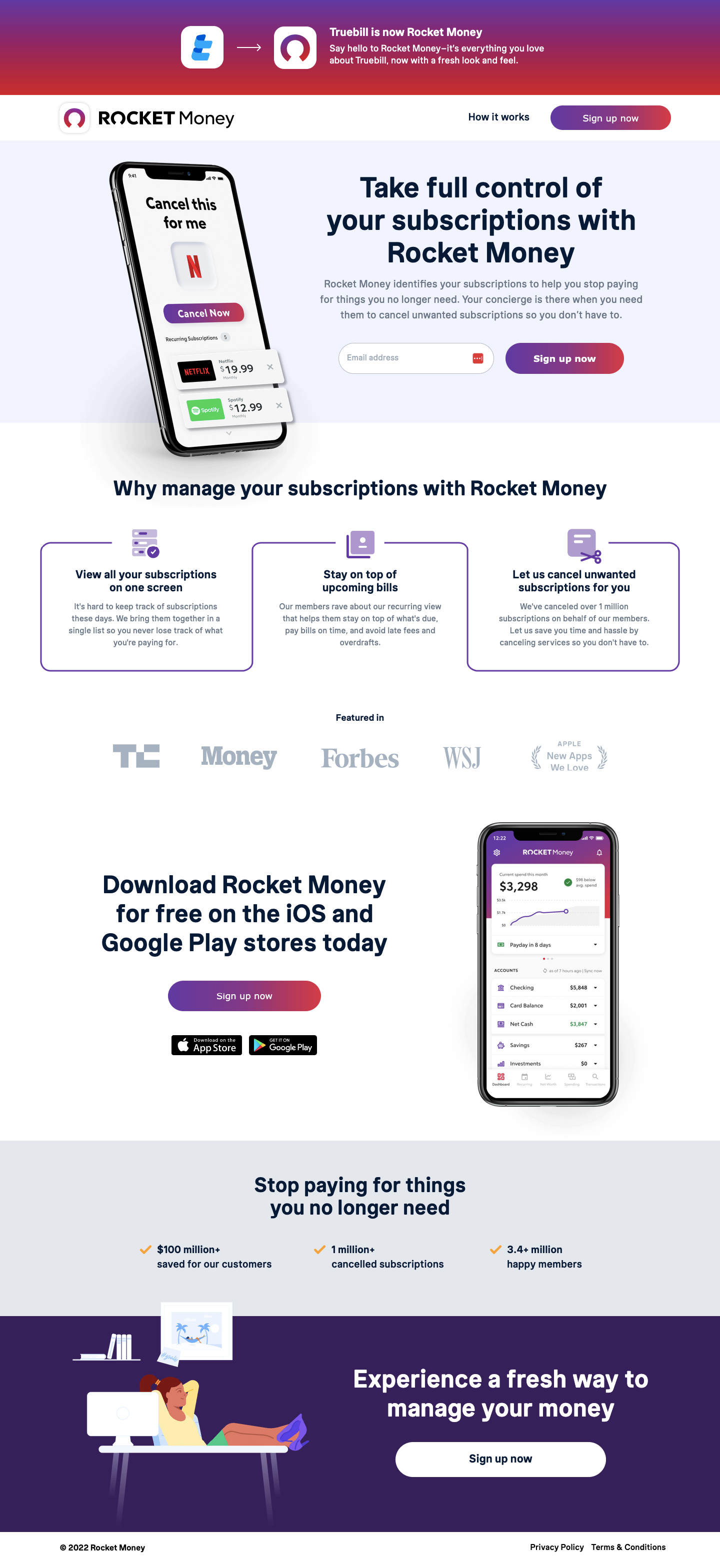
The mockup shows a real-looking account dashboard ($3,296 net worth, $2,440 cash, $856 investments, $498 savings) with subscription entries visible beneath. This transparency is a conversion mechanism: it shows the visitor what their own account would look like inside the app, making the benefit tangible rather than theoretical. Visitors who see a familiar financial picture (subscriptions, varying balances) identify with the interface immediately.
The blocks use parallel structure (“View,” “Stay,” “Let us”) that creates a scanning rhythm. Each block is short enough to read in five seconds and specific enough to be genuinely descriptive. “Let us cancel unwanted subscriptions on behalf of our members” isn’t just convenient. It removes a task the visitor knows they’ve been avoiding, which creates immediate emotional motivation.
The bottom section ("Stop paying for things you no longer need") reframes the app's value proposition from 'money management tool' to 'money recovery tool.' This is a meaningfully more emotional frame. Visitors don't feel they're setting up admin software; they feel they're reclaiming money that's been quietly leaking from their account. Loss aversion is a more powerful motivator than gain framing for this exact use case.
The three metrics ($100 million+ saved, 1 million+ cancelled subscriptions, 3.4 million+ happy members) appear in a horizontal bar directly beneath the feature blocks. This placement is precise: after the visitor understands what the app does, these numbers validate that it actually works at scale. The progression from understanding to validation to download is the right conversion sequence.
iOS and Google Play buttons with a single ‘Sign up now’ button above creates a three-option CTA set that covers every device combination without creating confusion. The hierarchy is clear: web sign-up is primary, mobile download is secondary, and both are equally accessible.
Rocket Money deploys trust at three distinct moments in the page’s scroll. At the top, the $100M saved figure and 3.4M members statistic establish scale and legitimacy immediately. In the middle, media logos from TechCrunch, Money, Forbes, WSJ, and Apple indicate editorial coverage from platforms visitors trust. At the bottom, the ‘Experience a fresh way to manage your money’ CTA section reframes the ask as a positive change rather than a product trial. Together these create a trust arc that moves the visitor from scepticism to confidence across a single page visit.

"'3.4 million happy members' is doing specific psychological work. It's not 3.4 million users or 3.4 million downloads. It's 3.4 million happy members. The word 'happy' is the persuasive element here, not the number. It implies post-purchase satisfaction, which addresses the visitor's primary fear: 'what if I download this and it doesn't help?' The number gives scale; the adjective gives the emotional reassurance."
The page is intentionally short: three sections and a footer. This brevity is a conversion feature, not a limitation. An app download page that requires fifteen scrolls to reach the download button is asking too much of the visitor. Rocket Money's two-scroll structure keeps the download CTA always within reach, and the compact format signals that the product itself is straightforward and quick to use.
The page deploys a ‘free’ framing throughout. The product is free to download, with premium features available. This removes the financial risk objection before it forms. The visitor doesn’t need to evaluate cost-benefit; they need only evaluate whether the time investment of downloading and setting up the app is worth it. By making that time investment feel minimal (the interface looks simple, the setup looks quick), the page reduces the one remaining friction point.
Short pages convert better than long pages for impulse-accessible products like free app downloads, provided the short page answers the trust questions completely. Rocket Money's two-scroll page does this because it has a high density of trust signals relative to its length. The challenge isn't persuading visitors. It's resolving doubt fast enough that they act before the page ends.
An interactive element (“The average person has 8 forgotten subscriptions totalling $47/month. Check yours free.”) would create a personal stake before the download, converting visitors who are on the fence into motivated sign-ups.
A single five-star review with a specific savings amount (“$210 saved in my first month”) next to the download button would provide last-moment social validation from a peer rather than a media publication.
The page doesn’t explain what premium features cost or what they include. Visitors who want to understand the full product before downloading will abandon here. A single-line explainer (“Free tier includes X. Premium is $X/month and includes Y”) would prevent this leak.
This page scores 88 out of 100. The scale proof metrics are excellent, the ‘loss aversion’ framing at the bottom of the page is sophisticated, and the brevity-as-feature approach is correctly calibrated for a free app download. What holds it from a higher score is the absence of user reviews with specific dollar outcomes near the CTA, no interactive personalisation element, and a premium tier that is undefined. Addressing those two things would push this into the low 90s.
Browse our full collection of landing page examples or contact us to discuss app download conversion strategy for your fintech product.
People follow the actions of others. Testimonials, reviews, and client logos build trust and reduce hesitation.
The first piece of information shapes all subsequent judgements. Price comparisons and headline stats set expectations.
People trust credible experts. Certifications, awards, media mentions, and expert endorsements boost credibility.
People feel losses more strongly than gains. Framing around what they will miss motivates action.
Controlling what visitors see first, second, and third guides them toward the conversion goal.
The $100M saved figure converts because it makes an abstract benefit, 'we help you manage subscriptions', into a concrete, scale-validated outcome. Visitors can do the maths: if Rocket Money has saved $100M across its users, they're looking at meaningful savings per person. This anchors the perceived value of the free app before the visitor has to think about whether it's worth downloading.
The three feature blocks, 'View all your subscriptions on one screen,' 'Stay on top of upcoming bills,' 'Let us cancel unwanted subscriptions for you', are written from the user's perspective, not the product's. This 'you-framing' is more conversion-effective than feature-centric copy because it activates the visitor's self-interest. 'Let us cancel for you' is doing more than describing a feature, it's promising relief from a task the visitor finds annoying.
Media logos on a consumer fintech app page are editorial endorsements that the app itself cannot self-claim. When TechCrunch and Forbes appear as 'Featured In' references, the implied message is: 'respected journalists have evaluated this product and found it worth covering.' For a financial app where the visitor is about to grant access to their bank accounts, third-party editorial coverage reduces the perceived risk of trusting the product.
We'd focus on making the money-saving benefit as tangible as possible at the moment of download decision. An interactive element, 'How many subscriptions do you have? [select] → you're probably paying an average of $47/month in forgotten subscriptions', would personalise the value proposition and create a specific dollar-figure motivation. [Talk to our team](/contact-us/) about conversion strategy for your fintech app page.
Other CRO breakdowns from our lookbook
We design high-converting landing pages for B2B and B2C brands. Let's talk about yours.
Get a Free Consultation Or browse more examples →
Founder & CEO of Apexure, Waseem worked in London's Financial Industry. He has worked on trading floors in BNP Paribas and Trafigura, developing complex business systems. Waseem loves working with Startups and combines data and design to create improved User Experiences.
Get quality posts covering insights into Conversion Rate Optimisation, Landing Pages and great design


"Fintech app pages need to earn the right to access someone's financial data. That's a much higher trust bar than a typical app download. The page that systematically dismantles each layer of financial scepticism ('is this real?', 'does it work?', 'can I trust them with my accounts?') before asking for the download is the one that converts. Rocket Money's page does this in under two scrolls."