CRO breakdown of YKard's UK digital membership card checkout page. Design analysis and conversion insights by Apexure.
What is ConvertScore™? ConvertScore™ is Apexure's proprietary landing page performance metric. We evaluate every page across four dimensions — Copy & Messaging, Layout & Hierarchy, Trust & Social Proof, and CTA & Conversion Path — to produce a single score out of 100.

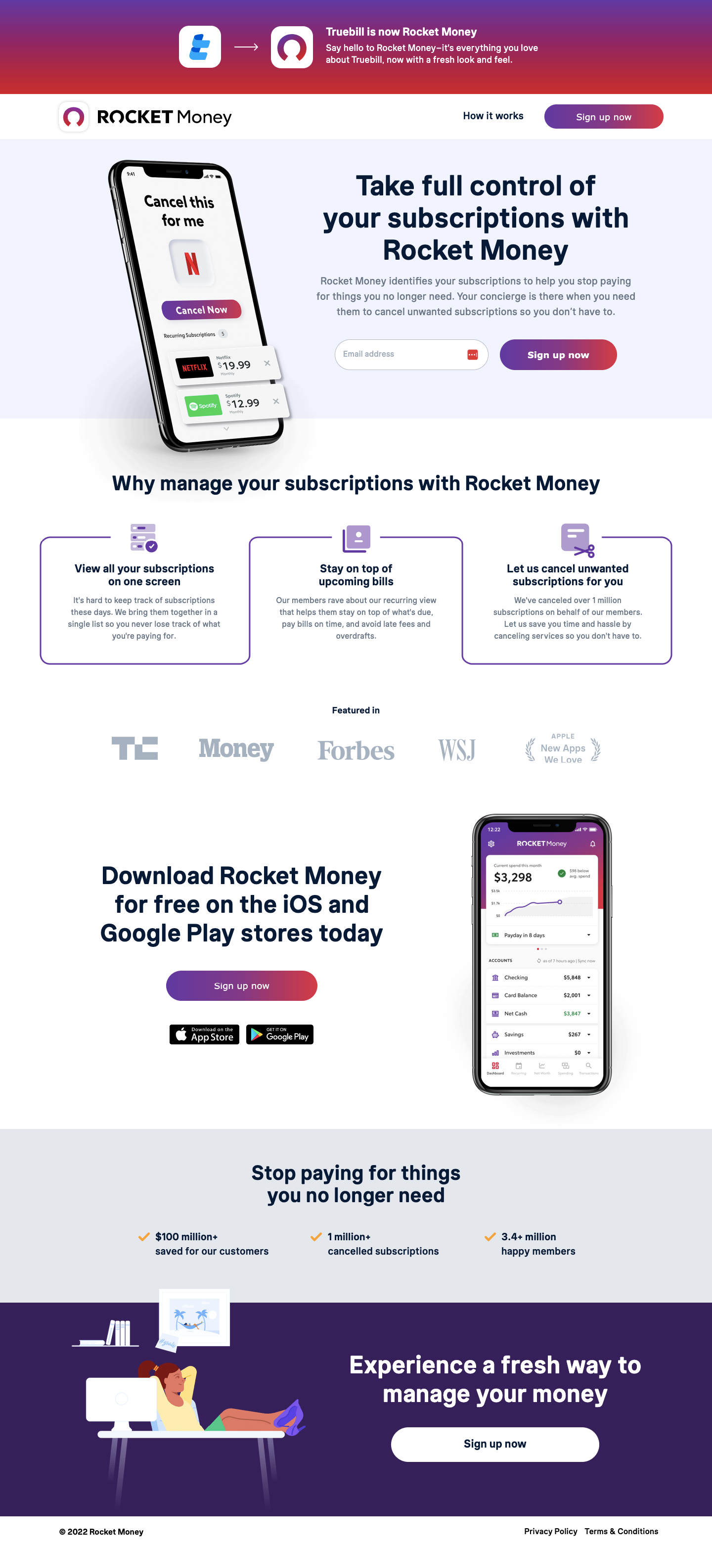
YKard offers a UK digital mastercard that gives 4% cashback at over 150 participating merchants, with a free trial and a £15 credit for new members. The checkout page is where the decision has already been made, the visitor has said “yes.” The only job is not to undo that yes with friction, confusion, or doubt.
This makes checkout optimisation different from landing page optimisation: you’re not persuading, you’re preserving.
The gold card graphic is the page’s most important visual element. The physical card, “GET £15 CREDITED ON YOUR CARD” in large type, makes the digital product tangible. Financial products that feel abstract are harder to commit to than ones with a visual representation. The card graphic creates a sense of owning something before the trial even starts.
The countdown timer, “06 Hours 48 Minutes 22 Seconds”, is positioned immediately below the headline offer. The key design decision is the copy beneath it: “Don’t wait! This offer is gone after midnight tonight.” The timer and the headline work together to establish both the urgency (timer) and the consequence of waiting (copy). Without the explanatory copy, a timer alone reads as a dark pattern. With it, it’s a transparent deadline.
The partner logos, PayByPhone (Morrisons, Gopuff, JustPark) appear near the top of the offer column. These aren’t just credibility logos; they’re the answer to “where can I actually use this card?” A visitor who regularly uses Morrisons or JustPark is immediately motivated by the cashback opportunity at a place they already spend money.
The side-by-side layout, offer information on the left, checkout form on the right, is the canonical checkout design for a reason. It keeps the offer visible while the visitor is entering their payment details. If the visitor has to scroll to remember what they’re signing up for, they lose confidence. Keeping offer and form simultaneously visible removes that confidence gap.
The PCI DSS and Secure payment badges appear adjacent to the card fields. This placement is deliberate: trust signals need to be at the exact point of maximum anxiety, which is the moment of entering card details. Badges at the bottom of the page are irrelevant; badges next to the card fields are essential.
The terms copy at the bottom of the page is transparent about the trial mechanics: free for 3 days, £6 charged if not cancelled, then £9/month. This level of transparency is not legally required beyond the minimum. It's strategically chosen. Visitors who understand the terms exactly are more likely to convert AND less likely to dispute the charge if they forget to cancel. Transparency reduces both abandonment and chargebacks.
YKard’s checkout trust is built through three layers that address the fintech-specific concerns. Payment security is addressed by PCI DSS and Secure badges adjacent to the card field. Service legitimacy is addressed by the partner logos showing established UK brands. Trial risk is addressed by the explicit and prominent cancellation terms. Together they answer: is this safe? Is this real? What’s the worst that can happen?

"On a financial checkout, the trust signals that matter most are the ones that address the visitor's worst-case scenario. For a subscription product, that's 'I'll be charged and not be able to cancel.' Addressing that fear explicitly and prominently, before the visitor has to ask, converts better than any feature benefit you can add to the same page."
Read more about trust in fintech pages in our guide to Ways To Increase Landing Page Social Proof.
The "I love this!, so easy to redeem the £15!" Trustpilot snippet above the form is positioned at the exact decision point. A quick social proof moment right before the visitor enters their card details reminds them that other people have done this. It was easy, and it worked. It functions as a final confidence signal at the moment of maximum hesitation.
YKard’s conversion model is free trial to subscription, the visitor commits card details for a free trial, experiencing the cashback benefit, and either cancels or becomes a paying member. The CTA “Get £15 and Start Trial” leads with the benefit (£15 credit) rather than the product (start trial). The visitor feels they’re gaining something rather than signing up for something, a small language distinction that makes a real conversion rate difference.
"Every checkout button should lead with what the visitor gets, not what they're doing. 'Start Free Trial' tells the visitor about a process. 'Get £15 and Start Trial' tells the visitor about a benefit. These are the same action, but the second framing activates the reward centre of the brain before the commitment centre. The ordering matters."
"Apexure genuinely stands out in a crowded field of web agencies. The team is quick to respond, professional in every interaction, and always brings ideas that move the needle. Our experience has been consistently smooth: clear communication, deadlines kept, and a real focus on delivering results that matter."
WordPress handles the checkout page as part of the broader YKard marketing site, with the payment form integrating via a third-party payment processor. This keeps the checkout experience on-domain (better for trust and brand consistency) while delegating the actual payment processing to a PCI-compliant infrastructure.
Over 40% of YKard’s visitors arrive on mobile. On mobile, the checkout form is the entire screen, the offer summary collapses to a sticky header showing the £15 offer and the countdown timer. The card field is formatted with appropriate keyboard types (numeric keypad for card number, date picker for expiry) to minimise input friction. Apple Pay and Google Pay appear as priority payment options for mobile visitors.
We run speed tests on every page we build because a slow landing page is a leaking bucket. You can spend thousands driving traffic, but every additional second of load time costs conversions. We treat PageSpeed results as a to-do list, not just a score.
Three improvements for the next iteration:
YKard scores 86 on our ConvertScore framework. The checkout layout is clean and the transparency of trial terms is genuinely differentiated. The primary gaps are the absence of one-tap payment options (particularly for mobile), and the opportunity to make the cashback value more concrete and personalised before the form.
Browse our full collection of landing page examples or read our guide to Ways To Increase Landing Page Social Proof.
Limited availability increases perceived value. Countdown timers, limited spots, and exclusive offers drive urgency.
People feel losses more strongly than gains. Framing around what they will miss motivates action.
People follow the actions of others. Testimonials, reviews, and client logos build trust and reduce hesitation.
People trust credible experts. Certifications, awards, media mentions, and expert endorsements boost credibility.
Fintech checkout pages need to earn trust at the moment money changes hands. The visitor who's reached the checkout has already decided they want the product, the page's job is to confirm that this payment is safe and that the offer is exactly as described. PCI DSS badges, clear terms, and a prominent refund or cancellation policy address the three main checkout abandonment triggers: 'Is this secure?', 'Did I read the terms correctly?', and 'What if I change my mind?'
Countdown timers at checkout work when the scarcity is real. YKard's offer, a £15 credit within the first 3 days of the trial, genuinely has a time constraint because the credit is tied to the trial period. Showing a live countdown makes the cost of waiting tangible: the visitor knows exactly what they lose by closing the tab and coming back tomorrow. Manufactured urgency that doesn't show a real constraint is quickly identified and damages trust.
Each additional field on a payment form increases abandonment. Research consistently shows that checkout forms with 6+ fields have 20–30% higher abandonment than forms with 4 fields. For a trial that costs nothing for the first 3 days, the form should capture only what's needed to start the trial: name, card details, and email for account creation. Every additional qualification question belongs in the onboarding flow, not the checkout.
This is the primary objection for any free-trial-to-subscription fintech product. The page needs to state the trial terms, the cancellation method, and the post-trial charge explicitly and prominently, not buried in small print. A proactive, clear cancellation policy actually improves conversion rates for free trials because it removes the fear that prevents sign-up. Transparency here builds the trust that transparency on price can sometimes undermine.
Other CRO breakdowns from our lookbook
We design high-converting landing pages for B2B and B2C brands. Let's talk about yours.
Get a Free Consultation Or browse more examples →
Founder & CEO of Apexure, Waseem worked in London's Financial Industry. He has worked on trading floors in BNP Paribas and Trafigura, developing complex business systems. Waseem loves working with Startups and combines data and design to create improved User Experiences.
Get quality posts covering insights into Conversion Rate Optimisation, Landing Pages and great design


"Checkout abandonment is the most expensive conversion problem a business can have, because the visitor has already decided to buy. Every percentage point of checkout abandonment is a lost customer who raised their hand and then changed their mind. Reduce friction, be transparent about terms, and make the trust signals unavoidable. That's the checkout playbook."