CRO breakdown of Growth Studio's interim startup accelerator landing page. Expert analysis of founder recruitment positioning, social proof, and conversion strategy by Apexure.
What is ConvertScore™? ConvertScore™ is Apexure's proprietary landing page performance metric. We evaluate every page across four dimensions — Copy & Messaging, Layout & Hierarchy, Trust & Social Proof, and CTA & Conversion Path — to produce a single score out of 100.
Growth Studio needed an interim landing page to maintain application momentum during a period of website development or programme transition. The challenge of an interim page is communicating enough programme credibility and founder value to justify application effort, without the full narrative infrastructure that a complete accelerator site provides.
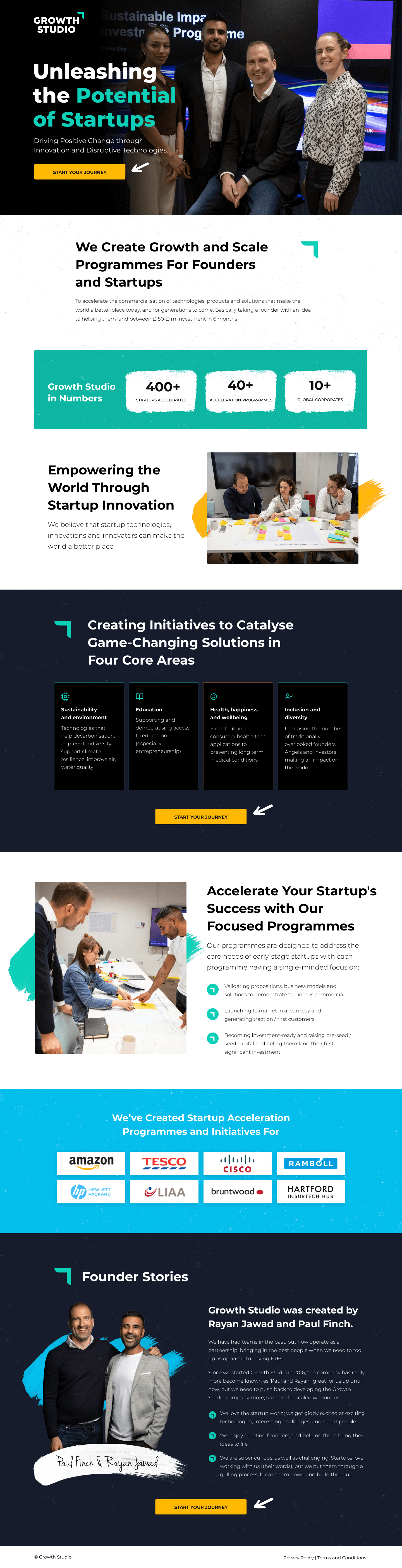
The page needed to convert ambitious founders with minimal copy and maximum credibility signal density, using a dark, premium aesthetic to signal programme quality before any programme detail was described.
The hero with the ‘Unleashing the Potential of Startups’ headline in large white typography establishes the programme’s positioning and visual identity before any detail is given. Dark backgrounds communicate premium and serious. The headline’s action word (‘Unleashing’) positions Growth Studio as a force multiplier for founder capability, not a training programme that teaches founders what they’re missing.
On an interim page the counter carries more weight per word than any other element. In the absence of an extensive mentor roster, alumni case studies, or programme detail sections, the portfolio number is the primary credibility anchor. It communicates that Growth Studio is an established programme with a proven track record, not a new entrant asking founders to take a risk.
The CTA creates high contrast against the dark navy background, making the conversion action immediately identifiable in a design that is otherwise restrained. The CTA’s prominence signals that the page was built with a specific purpose: application capture, not information delivery.
The section provides condensed information about the programme’s key value components (capital, mentorship, network, and programme support) in a format that communicates depth without requiring long-form reading. Icons are appropriate for interim pages because they provide comprehension value at minimal reading cost.
Throughout the page the language (‘change-makers’, ‘potential’, ‘unleashing’) creates an aspirational identity alignment for the target applicant. Founders who see themselves as change-makers building meaningful companies recognise the programme language as designed for them specifically.
An interim page is a trust test as much as a conversion tool. If the page communicates credibility through its design quality and social proof density (despite not being a full-featured programme site) it signals that Growth Studio is a programme that invests in its presentation as much as its operations. Founders are evaluating the programme's professionalism at every touchpoint, including how well the organisation maintains its web presence during transitions.
A well-designed interim page signals that Growth Studio treats its brand consistently. Founders notice when organisations let their web presence degrade during transitions. It implies operational inconsistency.
400+ supported startups provides credibility without requiring case studies. The number implies experience, infrastructure, and a network that first-time applicants specifically need.
Keeping the dark navy / yellow brand palette on an interim page communicates that the brand identity is intentional and stable, not just a one-time production choice. Consistent visual identity across all page states builds brand confidence.

"The dark premium aesthetic on this page is doing positioning work at zero copy cost. When a founder arrives and sees the same visual language as Y Combinator, Sequoia, or other premium VC-adjacent brands, the programme quality inference happens before any programme detail is read. Design language is market positioning at the speed of perception."
Read more about how we approach accelerator programme conversion in our guide to Landing Page Examples.
The 'Apply Now' CTA on an interim page works precisely because it respects the visitor's intelligence. There's no pretence that the page is full. It's a holding page, and any informed founder knows it. The page says 'we're between things, but the programme is real and applications are open.' Founders who apply from an interim page are typically higher-intent than those who apply after reading a full programme site, because they applied despite incomplete information.
The application CTA is the page’s singular focus. The information provided (positioning statement, portfolio size, and programme summary) gives motivated founders enough to decide to apply. The page doesn’t attempt to close the application decision; it creates the minimum confidence required for a serious founder to invest application effort.
For founders who want more detail before applying, a ‘Learn more’ link or contact option provides a lower-commitment entry point that captures interest without requiring immediate application commitment.
"Interim pages for competitive programmes should actively resist the temptation to apologise for being incomplete. A confident interim page says 'here's what matters, here's how to apply', which is exactly the right signal to send to founders who are evaluating dozens of programmes. The ability to communicate clearly with minimal information is itself a programme quality signal."
WordPress handles interim page deployment quickly, a single page can be live in hours when using the existing theme infrastructure. For a programme that may need to update the page with cohort dates, application deadline changes, or portfolio milestone updates during the interim period, WordPress’s CMS access gives the team direct control without developer dependency.
Founders evaluate accelerator programmes between meetings, during conferences, and in transit. The dark design is well-suited to mobile reading in varied lighting conditions. The ‘Apply Now’ CTA is accessible without scrolling on mobile, and the programme summary section stacks vertically without losing the icon/text pairing that makes it scannable.
An interim page built for rapid deployment should load near-instantly. The dark design requires no hero photography. CSS generates the background. Icon elements are inline SVGs. Typography uses system fonts for the body. These constraints are actually performance advantages: an interim page that loads in under a second communicates technical competence even before the programme's own technical credentials are described.
Three improvements to maximise application capture during the interim period:
Even an interim page should surface the next available application deadline. A countdown creates urgency that converts interested-but-procrastinating founders who might delay until the full site launches, potentially missing the cohort.
Even on an interim page, one row of recognisable portfolio companies is worth more than the portfolio number alone. Visual proof of real companies the founder might aspire to join creates immediate aspirational identity alignment.
Founders who aren’t ready to apply but are genuinely interested can opt into the launch notification. This captures demand that would otherwise be lost when the interim page transitions to the full site.
Growth Studio’s interim page shows how to maintain application momentum through a programme transition period using premium design, portfolio scale proof, and a focused single-CTA architecture that converts high-intent founders without requiring a complete programme narrative.
Browse our full collection of landing page examples to see how we apply these principles across industries. For methodology, read our guide to Landing Page Call to Action Tips.
People trust credible experts. Certifications, awards, media mentions, and expert endorsements boost credibility.
People follow the actions of others. Testimonials, reviews, and client logos build trust and reduce hesitation.
Controlling what visitors see first, second, and third guides them toward the conversion goal.
Simpler pages convert better. Reducing visual noise, breaking forms into steps, and clear copy lower mental effort.
An interim landing page captures founder interest during a transition period (between programme cycles, during website rebuilds, or while the full programme page is under development). The interim page needs to maintain application momentum without the full narrative infrastructure of a complete programme site. It prioritises the core value claim, the portfolio proof, and the application CTA. Everything else can wait for the full page. Interim pages should be evaluated on applications captured, not on completeness.
'Unleashing' implies that the potential already exists within the startup. It just needs release. This framing is deliberately founder-respectful: it says 'we see what's already in you' rather than 'we'll fix what's wrong with you.' For ambitious founders who are sensitive to being evaluated or corrected, this language positions Growth Studio as a capability enabler rather than a startup school. The difference matters for recruiting high-calibre founders who have options.
On a full programme page, portfolio proof is one section among many. On an interim page, it carries disproportionate weight because it's one of the few credibility signals present. The portfolio number anchors the programme's scale and track record in a single data point that requires no surrounding context to understand. For a founder evaluating whether this programme is worth applying to, '400+ startups supported' is the most efficient credibility signal per word available.
The dark navy background communicates gravitas and ambition without relying on supporting photography or complex design elements, which is appropriate for an interim page where production resources are limited. Yellow accents create high-contrast CTAs and flag key claims without requiring a full design system. The combination works at minimal production cost while communicating premium positioning. For interim pages that need to perform despite limited design build time, this palette delivers credibility efficiently.
Other CRO breakdowns from our lookbook
We design high-converting landing pages for B2B and B2C brands. Let's talk about yours.
Get a Free Consultation Or browse more examples →
Founder & CEO of Apexure, Waseem worked in London's Financial Industry. He has worked on trading floors in BNP Paribas and Trafigura, developing complex business systems. Waseem loves working with Startups and combines data and design to create improved User Experiences.
Get quality posts covering insights into Conversion Rate Optimisation, Landing Pages and great design


"Interim pages are a specific design discipline. You're building with constraints: limited content, limited production time, limited programme detail available. The instinct is to pack in as much as possible. The right instinct is the opposite: strip to the three things the founder absolutely needs to decide to apply. For an accelerator, that's: is this real and serious (portfolio size), is it for founders like me (positioning), and how do I apply (CTA)."