CRO breakdown of Growth Studio's startup accelerator landing page. Expert analysis of dark navy design, bold yellow CTAs, and conversion strategy for attracting change-maker founders by Apexure.
What is ConvertScore™? ConvertScore™ is Apexure's proprietary landing page performance metric. We evaluate every page across four dimensions — Copy & Messaging, Layout & Hierarchy, Trust & Social Proof, and CTA & Conversion Path — to produce a single score out of 100.
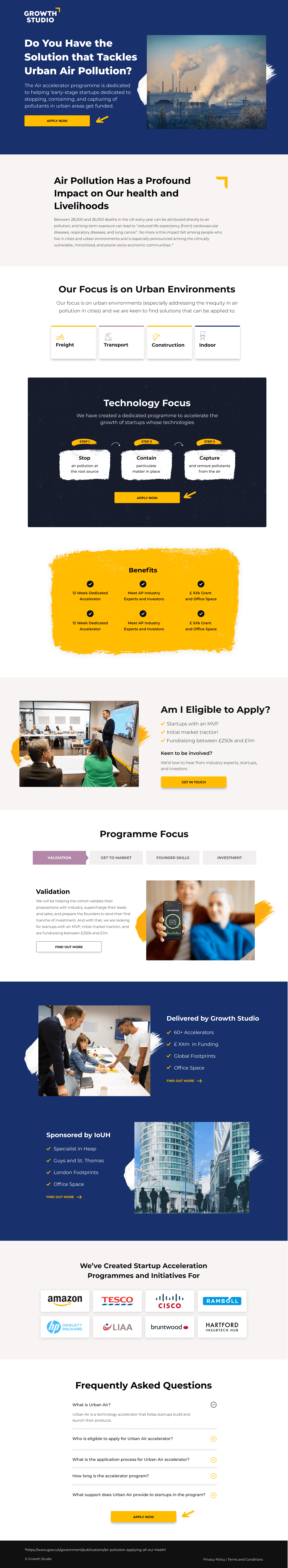
Growth Studio runs a startup accelerator programme targeting early-stage founders who are building companies with genuine commercial potential and social impact ambition. With hundreds of accelerator programmes competing for the same pool of ambitious founders, the page needed to communicate a distinctive positioning: not just what the programme offers, but what kind of founders it’s designed for.
The conversion goal was application submission from founders who were a genuine fit for the programme’s stage requirements, market focus, and network model.
The palette creates a premium, confident visual identity that communicates Growth Studio is selective rather than inclusive. Dark backgrounds in accelerator design signal seriousness and ambition, appropriate for a programme that wants founders who are committed, not casual explorers.
The headline functions as a mission statement and audience filter at once. The market size figure communicates commercial ambition. The ‘Change-Makers’ designation communicates purpose alignment. Founders who don’t identify with both will self-select out, which is exactly the right filter.
The counter provides the scale proof that first-time applicants need to justify committing to the programme. A portfolio of hundreds of companies implies active alumni networks, proven selection criteria, and a track record of programme delivery that new programmes cannot offer.
The section covers the practical value components: capital, mentorship, network access, programme infrastructure, and post-cohort support. For founders evaluating multiple programmes, the specific benefits list answers ‘what do I actually get?’ before they decide whether to invest application effort.
The CTA creates strong visual contrast against the dark navy background, making sure the conversion action is immediately identifiable at every scroll depth. The CTA copy is active and direct. It doesn’t soften the commitment implied by application.
The alumni portfolio section (showing logos of companies that have gone through the programme) is the accelerator equivalent of case studies. For a founder, seeing recognisable startup names in the alumni list answers 'do companies like mine succeed here?' Aspirational portfolio companies create identity-based motivation: 'I want my company to be on that list.' That aspiration converts hesitant applicants into motivated ones.
400+ companies validates that the programme infrastructure, mentorship network, and selection process have worked at scale across diverse company types.
Recognisable portfolio companies in the founder’s adjacent sector create peer proof that the programme works for real startups, not just pitch deck exercises.
Named mentors with credible backgrounds (operators, investors, domain experts) show that the programme’s knowledge network is real and accessible, addressing the ‘is the mentorship actually valuable?’ concern that experienced founders carry.

"The mentor network is often the strongest conversion lever for accelerator pages, and the most under-used. Founders who've been burned by mentorship-light programmes are specifically evaluating whether the mentors are operators who've built things or advisors who give generic strategic advice. Named mentors with specific domain backgrounds convert founders who are sophisticated enough to evaluate the difference."
Read more about how we approach B2B programme conversion in our guide to Landing Page Examples.
Dark design with high-contrast CTAs communicates selectivity. In a market where most accelerators use approachable, welcoming design to maximise applications, Growth Studio's premium aesthetic sends the opposite signal: this programme is for serious founders, and the bar is high. That exclusivity perception paradoxically increases application motivation for exactly the founders the programme wants: those who respond to challenge rather than accessibility.
The application CTA is the page’s single conversion action. The page doesn’t offer an email capture, a brochure download, or a ‘learn more’ secondary action. It routes all motivated visitors toward the application, which fits a programme that benefits from higher-quality over higher-volume applicants.
The application link appears in the hero, in the programme benefits section, and at the page’s close, giving founders multiple natural points to convert when their confidence and clarity peak.
"Single-CTA pages work better for high-commitment conversions like accelerator applications because they remove the option to defer. When the only action available is 'Apply Now', founders who aren't ready self-select out while founders who are ready take the action without distraction. Giving people an 'I'll read more later' option just delays the decision and rarely results in a return visit."
WordPress supports the editorial depth required for an accelerator page: detailed programme structure, mentor profiles, alumni case studies, and ongoing programme updates. For a programme that runs multiple cohorts per year, WordPress’s content management flexibility makes it straightforward to update cohort dates, application deadlines, and portfolio additions without developer involvement.
Founders research programmes across multiple sessions and devices. The mobile experience prioritises the hero positioning statement and the alumni portfolio proof, which are the two sections that most quickly communicate whether the programme is worth a full evaluation. The application CTA is accessible from the top of the mobile viewport without requiring scroll.
Dark design is performance-friendly. Dark backgrounds are generated via CSS without heavy image assets. The portfolio logo grid uses optimised SVG files rather than PNGs, keeping the heavy social proof section lightweight. Icon elements use inline SVGs throughout, removing icon-font loading delay on first visit.
Three improvements to increase application quality and volume:
A three-question self-assessment (‘What stage is your company at?’, ‘Which sector?’, ‘What are you hoping to gain?’) makes sure applicants know whether they’re a genuine fit before starting the full application, improving completion rates and cohort alignment.
A named founder quote (‘Growth Studio’s network opened three commercial partnerships in our first six months’) is more persuasive than programme feature descriptions because it quantifies the programme’s value in concrete founder outcomes.
A visible deadline with a days-remaining counter creates time pressure that motivates founders who are interested but delaying. Cohort scarcity is genuine in accelerator programmes. Deadline urgency is honest and effective.
Growth Studio’s accelerator page shows how to attract the right founder cohort through purposeful visual identity, bold positioning language, and portfolio-scale credibility. The dark aesthetic, selective tone, and direct application CTA work together to recruit ambitious founders without diluting the programme with misaligned applicants.
Browse our full collection of landing page examples to see how we apply these principles across industries. For methodology, read our guide to Landing Page Call to Action Tips.
People trust credible experts. Certifications, awards, media mentions, and expert endorsements boost credibility.
People follow the actions of others. Testimonials, reviews, and client logos build trust and reduce hesitation.
Controlling what visitors see first, second, and third guides them toward the conversion goal.
Simpler pages convert better. Reducing visual noise, breaking forms into steps, and clear copy lower mental effort.
Accelerator pages are recruiting pitches, not product pages. The audience (early-stage founders) is evaluating whether to give up equity and time in exchange for capital, mentorship, and network access. The page must answer 'why Growth Studio over the thirty other programmes I could apply to?' before it explains what the programme contains. Differentiation argument comes before programme description, because the founder has already decided they want acceleration. They're deciding where to seek it.
The '€90' figure anchors the programme in a specific market size claim that implies the startups being backed have genuine commercial scale potential. 'Change-Makers' signals that Growth Studio selects founders who are building solutions to meaningful problems, not just venture-scalable businesses. The combination communicates: we back big-mission, big-market founders. For ambitious founders who identify as change-makers, that positioning is a self-selection filter that makes the right candidates feel understood.
Portfolio scale is the primary trust signal for accelerator programmes. A first-time founder evaluating Growth Studio needs evidence that the programme has a track record of working, not just good intentions. '400+ startups' signals that the network, the methodology, and the infrastructure have been tested at scale. For a founder committing months of their startup's critical early phase, knowing the programme has successfully supported hundreds of companies before them significantly reduces the adoption risk.
Accelerator applications are high-commitment conversions. Founders are submitting their startup, their team, and often their equity for evaluation. The CTA should signal quality over accessibility: 'Apply Now' rather than 'Sign Up' or 'Learn More'. The application form should be preceded by enough programme detail to make sure applicants are genuinely matched the programme's focus and stage requirements. Self-selection improves cohort quality without additional screening effort.
Other CRO breakdowns from our lookbook
We design high-converting landing pages for B2B and B2C brands. Let's talk about yours.
Get a Free Consultation Or browse more examples →
Founder & CEO of Apexure, Waseem worked in London's Financial Industry. He has worked on trading floors in BNP Paribas and Trafigura, developing complex business systems. Waseem loves working with Startups and combines data and design to create improved User Experiences.
Get quality posts covering insights into Conversion Rate Optimisation, Landing Pages and great design


"Accelerator pages are in an unusual position: they want applications, but only from the right founders. A page that converts unqualified applicants creates more work for the selection team without improving cohort quality. The design and copy on this page are filtering as much as they're recruiting. The dark, serious aesthetic and the 'change-makers' language are deliberately self-selecting for a specific founder type."