CRO breakdown of Zero Waste UAE's sustainable product store landing page. Design analysis and conversion insights by Apexure.
What is ConvertScore™? ConvertScore™ is Apexure's proprietary landing page performance metric. We evaluate every page across four dimensions — Copy & Messaging, Layout & Hierarchy, Trust & Social Proof, and CTA & Conversion Path — to produce a single score out of 100.
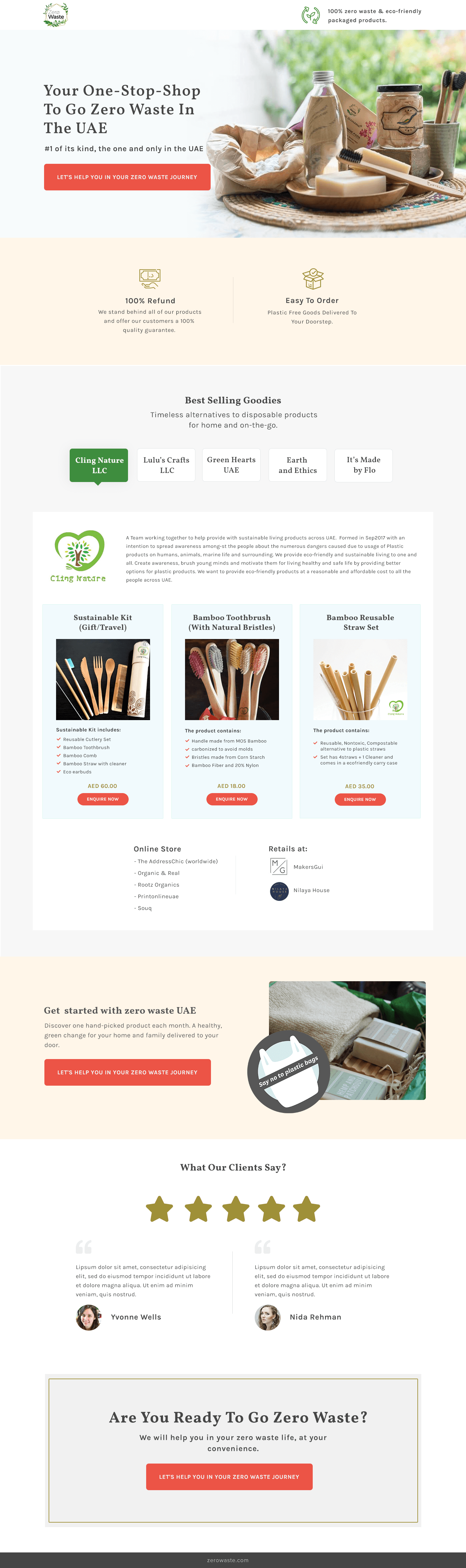
Zero Waste is positioned as the “#1 of its kind, the one and only in the UAE”. A market-defining claim that sets the brand apart from generic sustainable product sellers. Their audience is UAE consumers who want to reduce plastic waste but face a fragmented and unfamiliar product category.
The challenge is two-fold. First, convincing someone that sustainable living is achievable for them specifically. Then helping them find the right first products. This is a browse-to-click-through page, not a direct checkout. The page’s job is to spark enough motivation and confidence that the visitor takes the next step.
Warm earth tones, bamboo products arranged on a rattan placemat with soft plant bokeh. The photography does the emotional work before the visitor reads a single word. The warm beige and green palette isn’t accidental. It signals the natural, low-waste world the visitor wants to inhabit. Cold blue or grey ecommerce aesthetics would undermine the brand proposition entirely. The photography makes the visitor feel the product category before they evaluate it.
The headline is doing three jobs simultaneously. It establishes category leadership (one-stop-shop), frames the value proposition (go zero waste), and localises it (in the UAE). The geographic specificity matters because it pre-qualifies the audience and activates local identity. A visitor who lives in the UAE reads “in the UAE” as a signal that this brand understands their context: delivery timelines, product availability, and local lifestyle.
These appear immediately below the hero to handle the first two objections a new visitor to a sustainable marketplace typically has: “What if the product doesn’t work for me?” and “Is this going to be difficult to move through and receive?” They aren’t feature points. They’re objection neutralisers placed exactly where objection anxiety begins, before any product browsing starts.
Cling Nature LLC, Lulu’s Crafts LLC, Green Hearts UAE, Earth and Ethics. It’s Made by Flo. The tab structure transforms the page from a single-brand store into a hand-picked marketplace. Each tab is a brand promise. Visitors who click into Cling Nature are interested in a specific mission (UAE sustainable living awareness), while those browsing Earth and Ethics have different value priorities. Letting visitors self-select by vendor respects their existing brand knowledge and reduces the cognitive friction of choosing between similar-looking products.
This is the page’s most important conversion mechanism. Each product card lists not just the product name but the component materials: “Bristles made from Corn Starch,” “Handle made from MOS Bamboo,” “Reusable, Nontoxic, Compostable alternative to plastic straws.” This level of ingredient transparency converts eco-conscious buyers who need to verify the environmental credentials of each item before purchasing. A photo alone is insufficient for this audience.
The "Get started with zero waste UAE" mid-page section (showing a hand-picked monthly product set with the CTA) converts differently from the product grid above it. The product grid serves the browser. The starter kit section serves the undecided visitor who wants to begin but doesn't know where to start. Two different conversion moments, each for a different stage of visitor motivation.
The page builds trust through three mechanisms specific to a mission-driven sustainability brand.
Brand mission transparency comes first. The Cling Nature company description explains the founding story, the UAE focus, and the “affordable cost to all people” commitment. A visitor who understands why the brand exists is more likely to buy from it.
Five-star review display in the “What Our Clients Say?” section provides third-party validation from named reviewers with photos. Yvonne Wells and Nida Rehman are real people, not initials.
Retail and online store listings (MakersSui, Ntaya House, plus online channels) prove the brand has physical presence and legitimate distribution. Important in a market where new sustainable brands come and go quickly.

"For a new category like zero waste products in the UAE, the brand story does more conversion work than any feature list. Visitors who understand that this company was founded in September 2017 specifically to address plastic waste in the UAE are buying into a mission, not just purchasing a toothbrush. Origin stories that are specific and verifiable build trust that generic 'eco-friendly' marketing copy never can."
Read more about trust-building for ecommerce pages in our guide to Ways To Increase Landing Page Social Proof.
The closing "Are You Ready To Go Zero Waste?" section restates the identity invitation rather than repeating product features. By the time the visitor reaches the bottom, they've browsed products and read brand stories. The closing CTA doesn't say "shop now". It says "let's help you in your zero waste journey", framing the click as beginning a supported transition, not making a transaction.
This is a click-through page. It’s the visitor’s first destination before reaching product detail pages or the full shop. The page is structured as a progressive motivation build: hero establishes identity appeal → benefit icons neutralise first objections → vendor tabs establish marketplace credibility → product grid with specs creates browsing momentum → closing CTA converts the motivated visitor. Each section hands the visitor to the next with increasing purchase intent.
"Ecommerce pages for mission-driven brands need a dual conversion path. One for the visitor who knows what they want (product grid → detail page) and one for the visitor who shares the values but doesn't know where to start (starter kit → guided purchase). Serving only one of these paths means abandoning half your traffic."
WordPress gives Zero Waste editorial control over a page that needs frequent updates as new vendor brands are added and seasonal product ranges change. The vendor tab structure is CMS-editable, allowing the team to onboard new sustainability brands without developer involvement. The product cards with their detailed specifications can be updated to show new certifications or ingredient sources as the product range evolves.
A majority of Zero Waste’s visitors arrive on mobile. Sustainability product discovery frequently happens on social platforms and through mobile-first sustainability communities in the UAE. On mobile, the vendor tabs collapse into a scrollable horizontal selector, and each product card is full-width with the specification checklist formatted for easy reading without zooming. The photography is cropped to emphasise the product against the natural background textures that the brand identity relies on.
We run speed tests on every page we build because a slow landing page is a leaking bucket. You can spend thousands driving traffic, but every additional second of load time costs conversions. We treat PageSpeed results as a to-do list, not just a score.
Three improvements for the next iteration.
AED pricing visible on product cards. Adding prices (the page shows AED values further down the scroll but not on the first-visible product cards) would reduce the click-through needed to understand cost, and allow price-sensitive visitors to self-qualify before clicking into product detail pages.
UAE delivery timeline in the hero. “Plastic-free goods delivered to your doorstep” is the benefit. Adding “in 2–3 days across the UAE” makes it concrete and removes the “but will it actually arrive quickly?” friction that affects UAE ecommerce specifically.
Monthly subscription starter kit prominently positioned. The “discover one hand-picked product each month” starter kit concept is buried mid-page. Moving it closer to the fold as a marked offer would convert first-time visitors who are motivated but overwhelmed by choice. The subscription model also creates recurring revenue that a single purchase does not.
Zero Waste UAE scores 78 on our ConvertScore framework. The natural photography and identity-led messaging are genuinely strong for a sustainability brand, and the vendor tab structure creates a marketplace feel that justifies browsing. The gap to a higher score is primarily the absence of visible pricing on product cards, the missing delivery timeline specifics for UAE customers, and the fact that the testimonial section uses placeholder lorem ipsum copy rather than real customer experiences. That’s the most visible trust gap on the page.
Browse our full collection of landing page examples or read our guide to Landing Page Call to Action Tips.
This principle influences visitor behaviour and supports the page's conversion goal.
People follow the actions of others. Testimonials, reviews, and client logos build trust and reduce hesitation.
Simpler pages convert better. Reducing visual noise, breaking forms into steps, and clear copy lower mental effort.
This principle influences visitor behaviour and supports the page's conversion goal.
The UAE is an emerging market for sustainable living, 'zero waste' is still an education-and-conversion challenge, not just a comparison-and-purchase decision. The page needs to first answer 'why should I bother?' before it asks for a click. The best eco product pages lead with the identity shift the visitor wants, 'I want to live more sustainably', and then provide the path. The UAE-specific framing ('the one and only in the UAE') also activates national pride and novelty, which accelerates early-adopter purchasing decisions.
Multi-vendor tabs, showing brands like Cling Nature, Lulu's Crafts, Green Hearts UAE, solve the trust problem for sustainability products. A single-brand eco store requires the visitor to trust the brand. A hand-picked multi-vendor store implies curation, which implies expertise. The visitor isn't just buying a bamboo toothbrush, they're buying from a trusted curator who has selected the best option. Each vendor tab also functions as a secondary proof point: the visitor who recognises one vendor's name brings that trust to the entire marketplace.
Sustainable product buyers are motivated partly by values, they need to confirm the product actually delivers on its environmental promise before purchasing. A bamboo toothbrush buyer wants to know the bristle material (is it natural or synthetic?), the handle sourcing, and the disposal method. Listing 'Bristles made from Corn Starch' and 'Handle made from MOS Bamboo' converts better than a lifestyle photo alone because it completes the values verification the eco-conscious buyer requires. Specificity creates confidence.
A sustainable ecommerce landing page takes 2–3 weeks. The most important investment is in the product presentation, eco products need both beautiful photography and detailed ingredient/material specifics. We also work on the messaging hierarchy: leading with identity and mission before transitioning to catalogue browsing, because a mission-driven visitor who understands what the brand stands for converts at higher rates than one who lands directly on a product grid.
Other CRO breakdowns from our lookbook
We design high-converting landing pages for B2B and B2C brands. Let's talk about yours.
Get a Free Consultation Or browse more examples →
Founder & CEO of Apexure, Waseem worked in London's Financial Industry. He has worked on trading floors in BNP Paribas and Trafigura, developing complex business systems. Waseem loves working with Startups and combines data and design to create improved User Experiences.
Get quality posts covering insights into Conversion Rate Optimisation, Landing Pages and great design


"Sustainability purchases are identity decisions as much as product decisions. When someone buys a bamboo toothbrush. They're also saying something about who they are. Pages that acknowledge this identity dimension and speak to it directly convert significantly better than pages that lead with price or product features."