CRO breakdown of Halal Dining Club's dark-luxe restaurant discovery landing page. Expert analysis of design decisions, photography, and conversion strategy by Apexure.
What is ConvertScore™? ConvertScore™ is Apexure's proprietary landing page performance metric. We evaluate every page across four dimensions — Copy & Messaging, Layout & Hierarchy, Trust & Social Proof, and CTA & Conversion Path — to produce a single score out of 100.
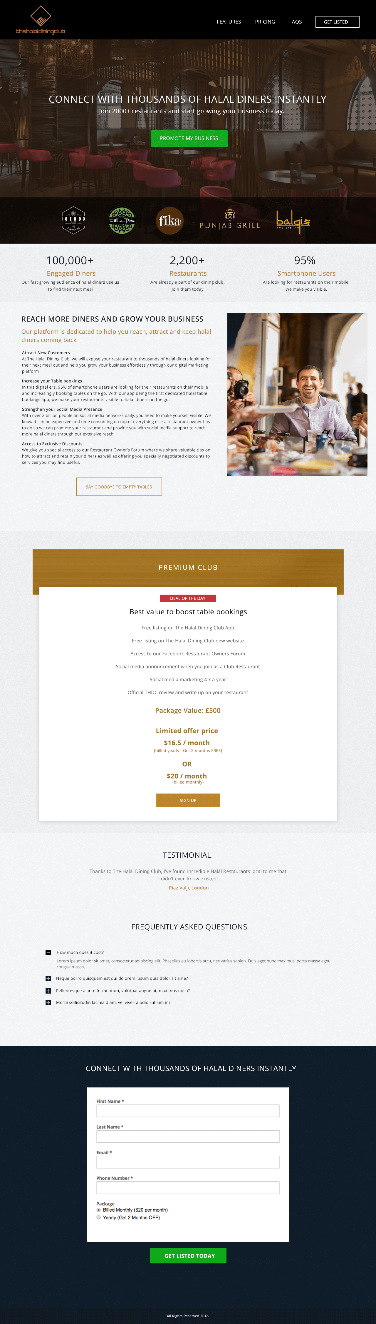
Halal Dining Club built a community-driven platform for Muslim diners looking for verified halal restaurants that also deliver premium dining experiences. The challenge wasn’t finding the audience. It was communicating that this platform offered something meaningfully different from basic halal restaurant listings.
The page needed to convert first-time visitors into community members by demonstrating the quality and editorial curation that distinguishes Halal Dining Club from a generic directory.
The dark full-width hero with premium food photography creates an immediate contrast with the functional, utility-first design most food directories use. The hero says ‘this is where you come to be inspired about food’ rather than ‘this is where you search for restaurants.’ That tone shift attracts a different, and more valuable, user than a search-first interface would.
The editorial content sections, Latest Posts and Chef Interviews, position the platform as a food media property, not just a directory. For a community-driven product, editorial content is the proof of curation. When visitors see chef interviews and food writing, they understand the platform is maintained by people who care about food quality, not just compliance tags.
The ‘Latest Posts’ grid with food photography thumbnails gives visitors a reason to explore before they decide whether to sign up. Editorial content discovery creates engagement that pushes visitors deeper into the site, and deeper-engaged visitors convert at significantly higher rates than passive ones.
The slider format for featured restaurants or editorial features keeps the above-the-fold content active without requiring additional vertical space. For a platform with a growing catalogue of content, a slider communicates depth and ongoing freshness rather than a static, finished product.
The chef interview format is one of the most effective trust mechanisms for a restaurant discovery platform. When a chef agrees to be interviewed. It signals that respected professionals in the industry take the platform seriously. For diners, knowing that chefs engage with the platform adds credibility that no amount of user reviews can match. Industry endorsement from within the restaurant community validates the platform's quality standard from the supply side.
Premium food photography signals curatorial standards. If the platform photographs food at this level, visitors infer that its restaurant selection operates at the same standard.
Chef interviews demonstrate that culinary professionals choose to engage with the platform. This supply-side credibility validates the platform for the demand side.
A maintained stream of posts and interviews signals an active, invested team rather than an abandoned directory. Freshness of content is a proxy for platform health.

"Community platforms succeed or fail on perceived aliveness. If the latest post was six months ago, the visitor assumes the platform is dying. Halal Dining Club's page needed to communicate continuous activity and curation, which is exactly what the Latest Posts and Chef Interviews sections do. Editorial freshness is its own form of social proof."
Read more about how we approach community platform conversion in our guide to Landing Page Examples.
Dark-on-dark typography with carefully chosen accent colours keeps the page readable without competing with the food photography. When the visual hierarchy gives maximum attention to the photography, the food does the selling, and food photography is more persuasive than any copy claim about quality. The design's restraint is itself a quality signal.
The community sign-up approach relies on converting visitors who’ve already experienced the content quality. Rather than asking for email capture upfront, the page lets visitors explore restaurant features and chef interviews first, then presents membership as a natural continuation of the experience they’ve already enjoyed.
The ‘Explore Restaurants’ CTA is a low-commitment entry point, it invites browsing rather than commitment, which reduces the initial friction and puts the platform’s quality on display before asking for anything in return.
"For community platforms, the content is the conversion tool. The more the visitor engages with the editorial content, the higher their likelihood of signing up. This page is built to maximise content engagement before it asks for anything, which is the right sequencing for a platform that sells curation and community, not a transaction."
WordPress suits an editorial-first platform like Halal Dining Club because the CMS is built around content management at scale. The blog architecture, post categories, and custom post types for chef interviews and restaurant listings give the team full control over curation without developer dependency for routine publishing.
Food discovery is a predominantly mobile behaviour, people plan dining experiences on their phones between other activities. The photography grid is optimised for mobile viewports with portrait-format images that look compelling on smartphone screens. The slider is touch-navigable with swipe gestures rather than requiring button taps.
Food photography at high resolution is the page's most important asset and its heaviest load. All images are were WebP with responsive sizing, mobile visitors receive appropriately scaled images rather than desktop originals. Lazy loading below the fold makes sure the hero image loads immediately while grid thumbnails load on demand.
Three improvements to increase community sign-up rate:
Halal Dining Club’s page demonstrates how premium visual design and editorial content can position a niche community platform above generic directory competitors. The dark luxe aesthetic and chef interview format communicate curation standards before a feature list is needed.
Browse our full collection of landing page examples to see how we apply these principles across industries. For methodology, read our guide to Landing Page Call to Action Tips.
Controlling what visitors see first, second, and third guides them toward the conversion goal.
People follow the actions of others. Testimonials, reviews, and client logos build trust and reduce hesitation.
Colours trigger emotional responses. Strategic use of contrast and brand colours guides attention to CTAs.
Simpler pages convert better. Reducing visual noise, breaking forms into steps, and clear copy lower mental effort.
Dark design in food and hospitality communicates premium positioning and evening dining, the occasions where the highest-margin experiences happen. Halal Dining Club isn't targeting fast food discovery; it's targeting special occasion dining among a community that values both religious compliance and exceptional food quality. The dark palette signals that this is a hand-picked platform, not a generic aggregator. Design is positioning before a word is read.
Restaurant discovery is a desire-driven search. The visitor isn't looking for a specification, they're looking for a feeling. Full-width food photography creates sensory desire that menu descriptions can't replicate. When a dish photograph creates an immediate 'I want that' response, the visitor becomes receptive to the platform's offer. For a platform that exists to connect people to dining experiences, food photography is the product demo.
Community platforms need to sell membership identity, not just product utility. Halal Dining Club's page communicates that joining means access to a hand-picked group of people who share the same dining values, not just a list of restaurants. The editorial tone, the chef interview format, and the 'Latest Posts' section position the platform as a content destination, not a search tool. This distinction matters: community members are more loyal, more engaged, and more likely to refer others than transactional users.
For a dining discovery platform, the most effective lead magnet is exclusive access to hand-picked content that isn't available without signing up. A 'Hidden Gems' restaurant list, early access to chef interviews, or a members-only dining guide gives the visitor a concrete, immediate reason to provide their email. The lead magnet should match the platform's editorial positioning, hand-picked, premium, and community-specific, rather than a generic discount or freebie.
Other CRO breakdowns from our lookbook
We design high-converting landing pages for B2B and B2C brands. Let's talk about yours.
Get a Free Consultation Or browse more examples →
Founder & CEO of Apexure, Waseem worked in London's Financial Industry. He has worked on trading floors in BNP Paribas and Trafigura, developing complex business systems. Waseem loves working with Startups and combines data and design to create improved User Experiences.
Get quality posts covering insights into Conversion Rate Optimisation, Landing Pages and great design


"The dark background on this page isn't just a style choice. It's a market positioning statement. Halal Dining Club is saying: we are not the same as every other halal food listing site. The elevated aesthetic attracts users who want a premium experience, not just compliance verification. Design does the audience filtering before the copy ever kicks in."