CRO breakdown of Buyora's consumer order refund service landing page built in Webflow. Expert conversion analysis by Apexure.
What is ConvertScore™? ConvertScore™ is Apexure's proprietary landing page performance metric. We evaluate every page across four dimensions — Copy & Messaging, Layout & Hierarchy, Trust & Social Proof, and CTA & Conversion Path — to produce a single score out of 100.
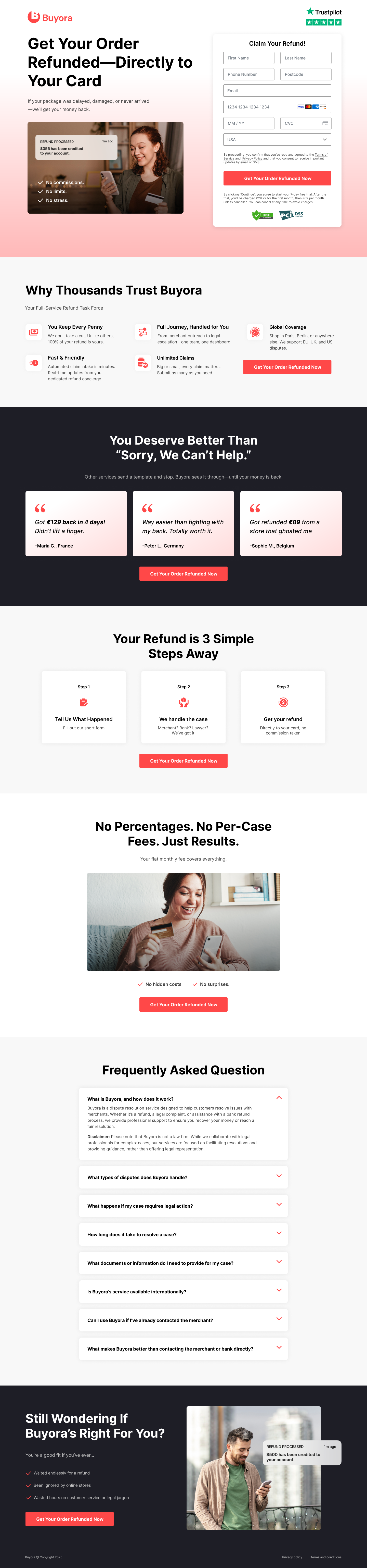
Someone who arrives on Buyora’s page isn’t in a rational research mindset. They’re annoyed. They ordered something that never arrived, got damaged in transit, or was refused a refund by a merchant who should have processed one. The emotional state is a combination of frustration, powerlessness, and low-grade suspicion that nothing will actually work.
The headline, “Get Your Order Refunded, Directly to Your Card”, is perfectly calibrated to that emotional state. It doesn’t explain the service mechanism. It doesn’t mention disputes or legal processes. It states the outcome the visitor wants, with a detail (directly to your card) that makes it tangible and specific. Within three seconds, the visitor knows exactly what Buyora does and whether it’s relevant to their situation.
The sub-headline, “If your package was stolen, damaged, or never arrived, you’ll get your money back”, names the three most common consumer grievances in order of emotional intensity. It reads like someone who understands exactly what happened to you. That recognition is itself a conversion tool: a visitor who feels understood is far more likely to take the next step than one who has to translate their situation into service terminology.
The inline claim form sits in the top right of the hero, visible without scrolling. For a visitor who arrives with a specific grievance and a desire to resolve it, the form being immediately accessible removes the cognitive step of “now I need to find where to start.” First name, last name, email, phone, and a brief description, five fields that qualify without exhausting. The warm coral “Get Your Order Refunded Now” button reinforces the outcome-focused headline rather than using generic copy.
This mid-page section is the most distinct conversion element on the page. The dark background creates a visual break that signals a tone shift, from informational to empathetic. The headline names the exact response these consumers have encountered from retailers and couriers, and frames Buyora as the antidote. Three testimonials sit below it, each with a specific refund amount: “Got £129 back in 4 days”, “Way easier than fighting with my bank. Totally worth it”, “Got refunded €89 from a store that ghosted me.” Together they demonstrate range (different amounts, different merchants) and speed, which are the two variables a prospective claimant cares most about.
The flat-fee positioning mid-page handles the most common reason a consumer doesn’t pursue a legitimate claim: the belief that the process will cost more in time and money than the refund is worth. By stating explicitly that Buyora takes no percentage and charges no per-case fee, this section converts cost-hesitant visitors who might otherwise assume the service charges a commission on any recovered amount. The “Just Results” phrasing shifts the value proposition to pure outcome, a powerful frame for a service that is literally measured by whether money comes back.
The three-step section (Tell Us What Happened, We Handle the Case, Get Your Refund) serves the visitor’s “but how does this actually work?” question. Disputes and refund claims have a reputation for being complicated and time-consuming. Presenting the process as three clearly bounded steps removes that complexity from the decision. The visitor doesn’t need to understand the dispute mechanism. They need to know they’ll be told what to do and that someone else handles the hard part.
The "Still Wondering If Buyora's Right For You?" closing section uses a self-qualification checklist approach, bullet points describing situations Buyora is designed for, alongside a phone notification showing "€850 has been credited to your account." This lets the visitor match their own situation to the service scope before starting a claim, which means the leads the form captures are better pre-qualified and more likely to convert to resolved cases.
The Trustpilot stars visible in the top right of the hero immediately signals that real customers have reviewed this service and rated it positively. For a consumer services brand that most visitors encounter for the first time, third-party review platforms carry more credibility than any self-authored claim.
The refund amounts in the testimonials (£129, €89) are a financial reference frame. A visitor wondering “is this worth pursuing?” now has real numbers to compare against their own situation. The variety of currencies (GBP and EUR) also signals international coverage, which matters for the “Is Buyora’s service available internationally?” FAQ question this page explicitly answers.
The FAQ accordion addresses the precise questions a sceptical consumer asks before submitting a claim: what types of dispute are handled, what happens if legal action is needed, how long cases take, what documents are required, and whether Buyora can help if the merchant has already been contacted. Each answered question removes a potential reason not to start.

"Consumer dispute services need to answer one question above all others on their landing pages: 'Will this work for my specific situation?' The FAQ section and the self-qualification checklist at the bottom both serve that question. A visitor who finds their situation described explicitly (whether a stolen package, an international merchant, or a bank dispute) is a visitor who has just confirmed the service is relevant to them. That confirmation is the last step before form completion."
The CTA, “Get Your Order Refunded Now”, appears in the hero form, after the testimonials section, and in the closing banner. Each placement catches a visitor at a different decision point. The form-in-hero catches visitors who arrive ready to start. The post-testimonial CTA catches visitors persuaded by seeing others’ refund amounts. The closing CTA catches visitors who needed to read the full FAQ before committing.
The warm coral colour is consistent across all CTAs and creates strong visual contrast against both the white page background and the dark mid-page section. CTA colour consistency is important on a page this length, it trains the visitor’s eye to recognise the action element at every scroll depth.
Displaying specific refund amounts rather than percentages in the testimonials is a deliberate choice. Percentages require mental maths that most visitors won't do. Amounts like "£129 back in 4 days" are immediately meaningful, the visitor knows whether that's more or less than what they're owed, which creates an instant frame of reference for the value of starting a claim.
A real-time or near-real-time counter, “2,847 claims successfully resolved this month”, would create urgency and social proof simultaneously. It signals both scale and ongoing activity, which addresses the common doubt that a claims service is dormant or slow.
A two-question pre-qualification widget (“What type of issue did you have?” with options: undelivered order, damaged item, refused refund) would segment visitors before they fill in the full form, making the experience feel personalised and reducing the form abandonment that comes from uncertainty about whether one qualifies.
“Average refund credited in 6 days” placed near the hero CTA would address the “how long will this take?” question before the visitor has to scroll to the FAQ to find it. Speed is one of the two primary anxieties for a consumer claims visitor, surfacing it early removes a reason to hesitate at the form.
Buyora scores 85 because the page does the core job of consumer services conversion exceptionally well: it leads with the emotional outcome, validates with specific financial evidence, removes the fee anxiety, demystifies the process, and handles FAQ objections at the close. The warm palette and prominent Trustpilot badge create a credible, trustworthy aesthetic. The score sits at 85 rather than higher because there’s no real-time social proof signal, the eligibility pre-qualification step is absent, and the speed-to-resolution metric isn’t surfaced above the fold where it would do the most conversion work.
Browse more consumer services examples in our landing page examples gallery. For related reading, see our guide to lead generation landing page design.
People feel losses more strongly than gains. Framing around what they will miss motivates action.
People follow the actions of others. Testimonials, reviews, and client logos build trust and reduce hesitation.
People trust credible experts. Certifications, awards, media mentions, and expert endorsements boost credibility.
Giving something valuable first (free guide, tool, audit) creates an obligation to reciprocate.
This principle influences visitor behaviour and supports the page's conversion goal.
Consumer claims pages have a unique conversion active: the visitor already has a grievance, they've been wronged by a retailer or delivery company, and they're looking for validation that something can be done about it. The page needs to do two things quickly: confirm that their type of dispute is handleable, and remove the friction of getting started. Buyora achieves this by leading with the outcome ('Get Your Order Refunded, Directly to Your Card'), showing a simple claim form immediately, and providing specific refund amounts in testimonials that make the outcome feel real and achievable.
Specific monetary figures in testimonials create a cognitive anchor that general satisfaction statements cannot. 'Got £129 back in 4 days' gives a visitor two pieces of useful information: the amount they might recover and the timeframe they can expect. A visitor who has £80 unresolved with a retailer will read that and think 'that's comparable to my situation.' General testimonials like 'great service!' provide warmth but no useful reference points. For a service where the outcome is inherently financial, financial specificity is the strongest testimonial format.
The 'No Percentages. No Per-Case Fees. Just Results.' statement mid-page removes the primary financial hesitation for a consumer weighing whether to use a claims service. Many competitors charge success fees or case fees that eat into the refund. Positioning as fee-free changes the decision frame from 'is the refund worth the cost of claiming?' to 'I have nothing to lose by trying.' That shift in framing consistently improves form completion rates, because it removes all financial risk from the first action.
Consumer claims forms should capture enough information to qualify the case without creating enough friction to abandon. Buyora's hero form, first name, last name, email, phone, and what happened, is the correct balance. It's long enough to feel like a real assessment process (which builds confidence that the service is legitimate), but short enough that a frustrated consumer who just wants to start won't give up halfway. The key field is 'What Happened', it gives the visitor a sense of agency and begins the case-building process, which increases their commitment to completing the claim.
Other CRO breakdowns from our lookbook
We design high-converting landing pages for B2B and B2C brands. Let's talk about yours.
Get a Free Consultation Or browse more examples →
Founder & CEO of Apexure, Waseem worked in London's Financial Industry. He has worked on trading floors in BNP Paribas and Trafigura, developing complex business systems. Waseem loves working with Startups and combines data and design to create improved User Experiences.
Get quality posts covering insights into Conversion Rate Optimisation, Landing Pages and great design


"Consumer services that help people recover money have a conversion advantage that most services don't: the visitor already wants the outcome. The page doesn't need to create desire. It needs to remove doubt. Everything on this page is structured to answer the question 'but will it actually work for me?' rather than 'why would I want this?'"