CRO breakdown of AOC's monitor product launch landing page built in WordPress. Expert conversion analysis by Apexure.
What is ConvertScore™? ConvertScore™ is Apexure's proprietary landing page performance metric. We evaluate every page across four dimensions — Copy & Messaging, Layout & Hierarchy, Trust & Social Proof, and CTA & Conversion Path — to produce a single score out of 100.

A monitor is a purchasing decision that involves both rational and emotional factors. The rational buyer wants specifications: 100Hz refresh rate, WQHD resolution, USB-C connectivity, tilt/swivel adjustability. But the purchase decision is also emotional. This is the screen that will define a workspace for the next three to five years. The page has to earn the emotional buy-in before the spec comparison seals the deal.
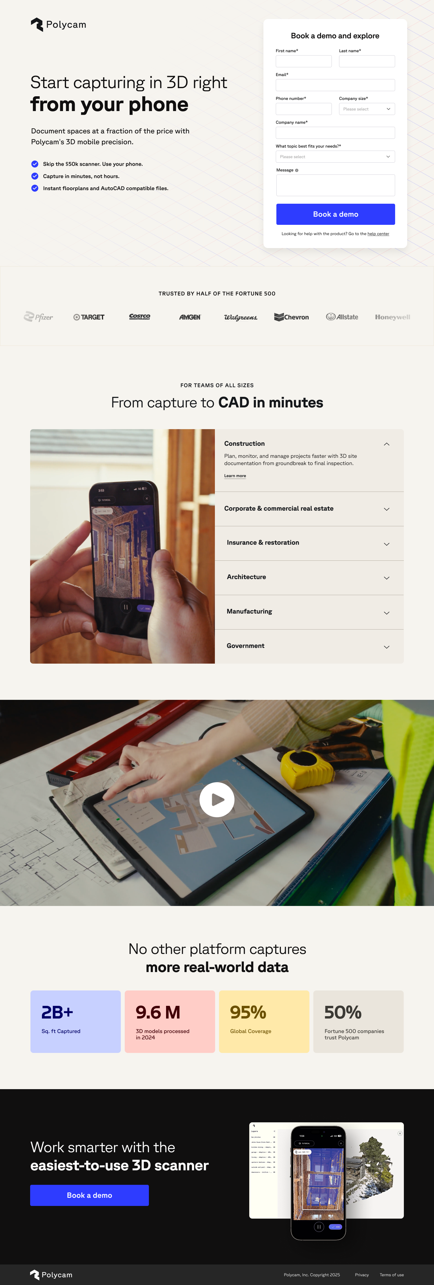
The AOC page handles this through visual storytelling. The hero shows the monitor in a dark, premium workspace context, not a clinical white-background product shot, but a real desk environment with ambient lighting. The product looks like something you’d want at your desk, not something you’d evaluate in a catalogue. That visual aspiration is what separates a product page from a product launch experience.
The page then systematically delivers every specification concern a monitor buyer would have, in the order they matter to the target audience (remote workers and gaming professionals), ending with the comparison table that makes the purchase decision feel validated rather than impulsive.
The dark-toned hero showing the AOC monitor in a real desk environment (with RGB peripherals visible and professional-grade equipment surrounding it) targets the product’s positioning squarely at remote professionals and serious gamers. The stats bar (22+ awards, 140+ countries, 60 years) immediately below the hero establishes the brand’s authority without interrupting the visual momentum.
Monitor research pages have high scan rates. Visitors are looking for their specific feature (adaptive sync, response time, connectivity) before reading. The icon-led feature sections (Smart Auto Lift, Ambient Light Sensor, Built-In Headphone Hanger, Universal VESA Mounting) organise the product’s differentiating features in a visually scannable format that lets the visitor quickly locate what matters to them and then read deeper on that feature.
A significant but rarely addressed conversion barrier for monitor buyers is the fear of complicated setup. Showing a simplified three-step installation process (unbox, connect, adjust) signals that this is a product that works out of the box. This removes the friction of imagining a frustrating setup process that delays the purchase decision.
The side-by-side comparison against competitor models, organised by the specifications that matter most to the target audience, positions AOC favourably on the dimensions the brand has chosen to feature. This is controlled comparison: AOC selects which competitors to include and which specs to compare. The result is a table that feels objective but is strategically constructed.
The "Perfect for Lap Night Sessions" positioning section (with imagery of the monitor being used in low-light conditions) speaks to a specific use case (late-night work or gaming) that many competitors don't address. Use-case specificity creates a direct match with a segment of the audience that feels seen by the product.
60 years in business, 22+ awards, 140+ countries. These are not marketing numbers. They’re brand foundation indicators that signal AOC’s longevity and global scale to a visitor who may be comparing against cheaper, newer competitors.
When a brand is willing to show itself directly alongside competitors, it implies confidence in the comparison. That willingness to be compared (even in a controlled format) signals the product can withstand scrutiny.
The FAQ addresses questions like “Will this monitor work with my setup?” which are real pre-purchase blockers for tech buyers. Answering them on-page reduces the need to search for answers elsewhere, keeping visitors in the conversion funnel.

"Tech product FAQs are often overlooked as a conversion tool. In reality, for a considered purchase like a monitor, the FAQ section is where many buyers make their final decision. Answering the right questions on-page (compatibility, warranty, return policy) removes the last barriers without requiring a support call."
The primary CTA “Order Now” appears consistently in the sticky header and at multiple scroll points. The language is direct and purchase-ready, appropriate for a product launch page where the audience has already shown high intent by seeking out the launch page. There’s no qualification step needed; visitors here are buyers, not researchers.
The page includes a “Be the First in Line” early access hook, which creates mild exclusivity and urgency for launch-window visitors.
WordPress was chosen for its integration with AOC’s existing content infrastructure and its flexibility for the image-heavy product gallery sections. Custom page template removes navigation to maintain purchase focus.
Gaming peripheral and monitor research is increasingly mobile-first, with buyers researching on their phone while at their current desk. The hero product image scales to full-width on mobile, the feature icon grid stacks cleanly, and the comparison table horizontally scrolls to stay useful without forcing layout changes.
Product launch pages with multiple hero-quality images can easily tip 3MB+ page weight. We implemented next-gen image formats, responsive image srcsets, and lazy loading for all below-fold product images to keep fast initial load while delivering the visual quality the product demands.
Our data since then shows that displaying a crossed-out “competitor price” alongside the AOC price (even when the saving is modest) creates anchoring that lifts purchase intent. A launch-period discount timer would layer urgency onto that anchoring.
Real setup photos from early adopters, integrated via a social feed or submitted gallery, would add authentic social proof that product photography cannot provide. Buyers trust peer setups more than brand photography.
Visitors landing on a monitor launch page are often in setup mode. They may also need a stand, hub, or accessories. A bundle offer near the CTA increases average order value and reduces the number of separate purchase decisions.
The page scores 81 because the visual product presentation and feature organisation are genuinely strong, and the comparison table is a smart conversion tool. It falls short of 85+ because the navigation is present (creating exit paths), the CTA placement could be more frequent in the long scroll, and the page lacks urgency mechanisms appropriate for a launch window. The product itself is well-served by this page, but the purchase architecture has room to be tightened.
Browse our full collection of landing page examples to see how we apply these principles across industries. For related reading, see our guide on product landing page design.
Controlling what visitors see first, second, and third guides them toward the conversion goal.
This principle influences visitor behaviour and supports the page's conversion goal.
People follow the actions of others. Testimonials, reviews, and client logos build trust and reduce hesitation.
The first piece of information shapes all subsequent judgements. Price comparisons and headline stats set expectations.
Monitor buyers are specification-driven. They arrive with a shortlist of requirements (resolution, refresh rate, panel type, connectivity) and evaluate each product against those criteria. The most effective monitor pages lead with a stunning hero visual of the product, then systematically address every specification concern before presenting the price. Comparison tables against competing models and competitor price anchoring both significantly lift conversion.
A product launch page creates focused attention on a single product at a moment of highest visibility. Rather than sending launch traffic to the standard product page (which competes with the full catalogue) a dedicated page lets AOC control the narrative, emphasise the product's differentiating features, and create a cohesive launch experience that a category page cannot deliver.
Tech buyers research thoroughly and compare multiple options. A comparison table that shows AOC's monitor against alternatives does two things: it pre-empts the research the visitor would do anyway, and it lets AOC choose the comparison frame (pointing to the dimensions where they win). Visitors who see a well-constructed comparison table are less likely to leave and compare on third-party sites.
A product launch page with gallery, comparison table, and video integration typically takes 2–3 weeks from brief to launch. We cover product positioning strategy, wireframe, visual design, WordPress build, and our 37-point QA checklist.
Other CRO breakdowns from our lookbook
We design high-converting landing pages for B2B and B2C brands. Let's talk about yours.
Get a Free Consultation Or browse more examples →
Founder & CEO of Apexure, Waseem worked in London's Financial Industry. He has worked on trading floors in BNP Paribas and Trafigura, developing complex business systems. Waseem loves working with Startups and combines data and design to create improved User Experiences.
Get quality posts covering insights into Conversion Rate Optimisation, Landing Pages and great design


"Tech product pages often make the mistake of leading with specs in a table format. Specs come second. Vision comes first. If someone doesn't want the product emotionally, no specification list will sell it. The hero image of a product in a beautiful, aspirational environment is doing the hardest conversion work on the page."