CRO breakdown of Affresh's product comparison page against OxiClean. Design analysis covering comparison-driven conversion, affiliate CTA strategy, and consumer trust architecture by Apexure.
What is ConvertScore™? ConvertScore™ is Apexure's proprietary landing page performance metric. We evaluate every page across four dimensions — Copy & Messaging, Layout & Hierarchy, Trust & Social Proof, and CTA & Conversion Path — to produce a single score out of 100.
When someone Googles “OxiClean vs Affresh,” they have already decided to buy a washing machine cleaner. They are not browsing. They are choosing. That search intent is as close to a purchase decision as organic traffic gets.
Most brands ignore this opportunity. They build product pages that describe their own product and hope the visitor figures out why it is better than the competition. Comparison pages do the opposite, they acknowledge the competitor exists, present both options side by side, and let the structure of the comparison guide the visitor toward a decision.
Affresh needed a page that captured “vs” search traffic, presented a thorough and credible comparison, and drove the visitor to purchase on Amazon. The page could not look like an advertisement. It had to look like research, because consumers who compare products are sceptical of marketing and responsive to data.
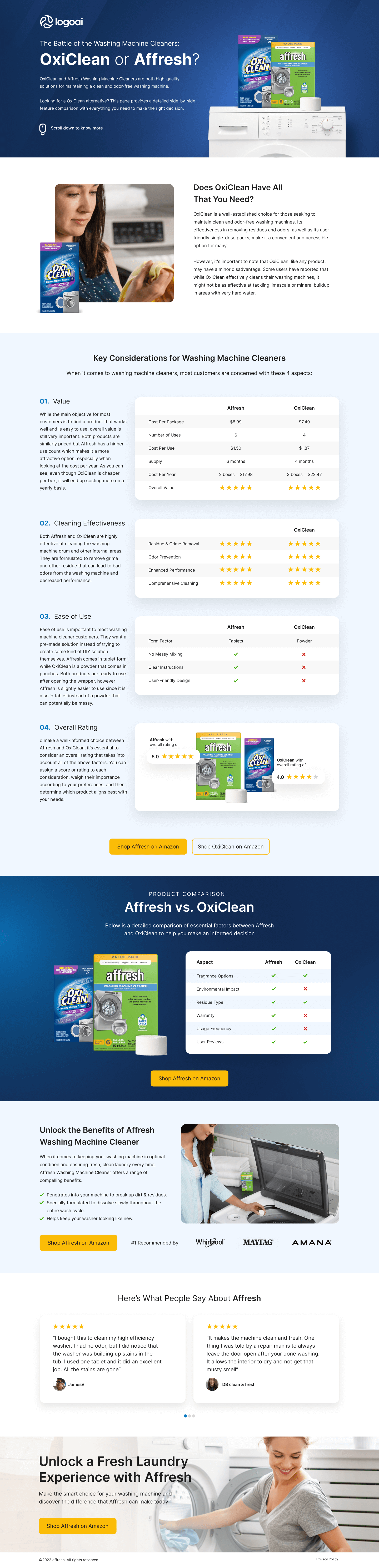
“The Battle of the Washing Machine Cleaners: OxiClean or Affresh?” The headline matches the exact search query that brings visitors to this page. Both products are shown side by side on a washing machine, real product photography, not illustrations. The dark blue background creates a premium, editorial feel rather than a sales feel.
Below the headline: “Looking for a OxiClean alternative? This page provides a detailed side-by-side feature comparison with everything you need to make the right decision.” This positions the page as a resource, not an ad. The word “alternative” is important, it targets visitors who are already OxiClean users but are considering switching.
No CTA in the hero. The page does not ask for a purchase before proving its case. “Scroll down to know more” with a scroll icon signals that the page is informational first, transactional later. This is the right approach for comparison intent, push a CTA too early and the visitor suspects bias.
The page breaks the comparison into four sections: Value, Cleaning Effectiveness, Ease of Use, and Overall Rating. Each section has a side-by-side table with specific attributes and star ratings for both products.
Tables work for comparison pages because they allow side-by-side processing. A paragraph describing Affresh’s advantages takes 200 words. A table showing Affresh at $1.50/use vs OxiClean at $1.87/use takes 2 seconds to process. The visitor scans the table and draws their own conclusion, which feels like their own decision rather than being told what to buy.
The star ratings (1-5 yellow stars per criterion) add a quantitative layer. “Affresh 5 stars for Residue & Grime Removal, OxiClean 4 stars” is more scannable and more persuasive than “Affresh is better at removing residue.” Stars are a visual language consumers already understand from Amazon.
Below the detailed tables, a summary comparison uses green checkmarks and red X marks across six factors: Fragrance Options, Environmental Impact, Residue Type, Warranty, Usage Frequency, User Reviews. Affresh wins four of six (green checks). OxiClean wins two.
This grid is the page’s decision accelerator. A visitor who skimmed the detailed tables but is not sure who won scrolls to this grid and sees the answer in 3 seconds. Four greens vs two greens. Decision made.
The page gives OxiClean two wins (Fragrance Options and User Reviews). This is a deliberate credibility choice. A comparison grid with six green checks for one product and six red X marks for the other looks like propaganda. Giving the competitor legitimate wins makes the overall comparison feel trustworthy.
The comparison is structured so Affresh wins on the criteria consumers care most about, environmental impact, warranty, and residue type, while OxiClean wins on less decisive factors like fragrance options. This is not deception. It is framing. By choosing which criteria to compare, the page controls which dimensions matter, and those dimensions happen to favour Affresh. A competitor could build the same page with different criteria and reach a different conclusion. The page that exists wins the search traffic.
“#1 Recommended by”, Whirlpool, Maytag, Amana logos. These manufacturer logos appear alongside the Affresh benefits section. OxiClean cannot make this claim because Affresh is literally made by the company that makes these appliances.
This is the page’s most defensible advantage. Reviews can be questioned. Star ratings are subjective. But “recommended by the manufacturer of the washing machine you own” is an authority signal that ends the comparison for many visitors. If Whirlpool recommends it, the argument is over.
“Here’s What People Say About Affresh”, two detailed 5-star reviews with customer names and avatars describing specific results: clean machine, removed stains, eliminated odour. These reviews appear near the bottom, after the comparison data has made the rational case. The reviews add emotional confirmation, real people, real results, real satisfaction.

"The manufacturer endorsement logos are why this page converts. We can write the best comparison copy in the world, but when a visitor sees that Whirlpool, Maytag, and Amana recommend Affresh, the companies that literally built their washing machine, the comparison stops being about features and starts being about authority. No amount of star ratings can compete with 'the manufacturer recommends this one.'"
Comparison page trust is built on perceived objectivity.
The page acknowledges OxiClean’s strengths (user reviews, fragrance options) alongside Affresh’s advantages. This balanced presentation signals “we compared fairly” rather than “we wrote an ad.” Visitors trust comparisons that give the competitor credit where deserved.
Whirlpool, Maytag, and Amana manufacturer endorsement logos provide institutional authority that no competitor can match. The visitor thinks: “The people who built my washing machine recommend this cleaner.”
Two detailed reviews with specific outcomes (cleanliness, odour removal) confirm that real buyers are satisfied. The reviews appear after the comparison data, providing emotional confirmation of a rational decision.
The "Shop Affresh on Amazon" CTA sends the visitor to a trusted purchase platform where they already have an account, saved payment, and confidence in the return policy. The page does not try to be a store. It is a decision tool that pre-sells the choice and then hands the visitor to the most frictionless checkout available. Trying to capture the purchase on a custom checkout would introduce friction and reduce conversion.
The page uses a “Shop Affresh on Amazon” yellow button as its primary CTA. This button appears three times: after the overall rating section, after the checkmark comparison grid, and at the very bottom of the page.
The yellow colour matches Amazon’s brand palette, a subtle but effective association. When a visitor sees a yellow “Shop on Amazon” button, they already know what to expect when they click. That familiarity reduces hesitation.
The page also includes a “Shop OxiClean on Amazon” button in the Overall Rating section. This seems counterintuitive, why offer the competitor a purchase path? Because it reinforces the comparison’s credibility. A page that only lets you buy one product is an ad. A page that lets you buy either one is a resource. The visitor who sees both options trusts the comparison more, and the comparison favours Affresh.
"Including the competitor's purchase button was a deliberate trust play. A page that only lets you buy one product tells the visitor you are selling, not comparing. A page that lets them buy either one says 'we showed you the data, now choose.' The structure of the comparison does the selling. The dual purchase option does the trust-building. We tested single-CTA vs dual-CTA comparison pages on another client and the dual version converted 15% higher for the promoted product."
Comparison tables are the hardest element to render on mobile. The side-by-side format that works on desktop collapses into a stacked format on mobile where the visitor has to scroll between Affresh and OxiClean columns. We made sure the star ratings and checkmarks remain visible without horizontal scrolling, and the Amazon CTAs are full-width on mobile.
The page is relatively compact (6,000 pixels tall) which is good for mobile comparison shoppers who want to scan quickly and make a decision.
Comparison shoppers bounce fast if the page does not load both products quickly. Both product images need to appear simultaneously, if Affresh loads first and OxiClean lags, the visitor cannot compare. We optimised both product photos to WebP and prioritised their loading so both appear in the first paint.
With our data from comparison and e-commerce pages since this build:
Hypothesis 1: Add a price comparison with live Amazon pricing. The page shows static pricing ($8.99 vs $7.49 per package). Prices change on Amazon. Integrating a live price feed or updating the page monthly would prevent the comparison from becoming inaccurate, which would damage credibility. Expected impact: medium, prevents trust erosion over time.
Hypothesis 2: Add a video showing both products in use. A 60-second side-by-side cleaning test would be more persuasive than star ratings. Consumers who see the comparison in action convert at higher rates than those who read about it. Expected impact: high.
Hypothesis 3: Add a “Which cleaner is right for you?” quiz. A 3-question quiz, “Do you have hard water? Is environmental impact important to you? Do you have a Whirlpool/Maytag/Amana machine?”, would personalise the recommendation and route the visitor to the right product based on their situation. Expected impact: medium-high.
"The evolution I would make here is a side-by-side video test. Written comparisons convince rational buyers. Videos convince everyone else. A 60-second clip showing both products cleaning the same washing machine drum (same stains, same conditions, different results) would be the single most effective addition to this page. We know from e-commerce testing that video comparison content outperforms static comparison by 2-3x in click-through to purchase."
This page earns a strong score because it does comparison-driven conversion exceptionally well. The star rating tables, the checkmark/X summary grid, the manufacturer endorsement logos, and the Amazon purchase CTAs all work together to guide the visitor from comparison to purchase with minimal friction.
What earns the score: balanced framing that builds trust (giving OxiClean honest wins), the manufacturer authority that no competitor can replicate, no-navigation focus, and the smart choice to send visitors to Amazon instead of fighting with a custom checkout.
What holds it back: no video comparison, static pricing that could become outdated, and only two customer reviews (Amazon has thousands, the page could surface more). The page is also very product-focused with limited brand story, which may not matter for a consumer product comparison but would matter in other verticals.
For a B2C product comparison page designed to capture “vs” search traffic and drive Amazon purchases, 81 shows strong comparison architecture with room to add active content and video.
Browse our full collection of landing page examples to see how we apply these principles across industries. For more on e-commerce conversion, read our ecommerce landing page examples guide.
The first piece of information shapes all subsequent judgements. Price comparisons and headline stats set expectations.
People follow the actions of others. Testimonials, reviews, and client logos build trust and reduce hesitation.
People trust credible experts. Certifications, awards, media mentions, and expert endorsements boost credibility.
This principle influences visitor behaviour and supports the page's conversion goal.
This principle influences visitor behaviour and supports the page's conversion goal.
Consumers searching 'OxiClean vs Affresh' have already decided they need a washing machine cleaner. They are comparing options. A standard product page would force them to research the comparison themselves, opening multiple tabs, reading separate reviews, comparing specs manually. A comparison page does that work for them. By structuring the comparison, the page controls which criteria matter most, and the framing naturally favours the product the page promotes. The visitor gets a useful resource and the brand gets a pre-sold buyer.
The page gives OxiClean genuine credit where it earns it, user reviews get green checkmarks for both products, and the Value section acknowledges OxiClean's lower per-package cost. This honesty makes the comparison feel fair. When the page then shows Affresh winning on environmental impact, warranty, and ease of use, the visitor trusts those findings because the page already proved it was willing to give the competitor a win. A comparison page that gives the competitor zero points looks like an ad. One that gives a few honest points and wins the rest looks like research.
Consumer product brands with established Amazon presence convert better on Amazon than on their own checkout. The visitor already has Amazon Prime, saved payment methods, and trust in Amazon's return policy. Sending them to a custom checkout page would introduce friction, new account creation, payment entry, unfamiliar return policy. Amazon is the path of least resistance for a consumer product purchase. The comparison page's job is to pre-sell the decision. Amazon's job is to close the transaction.
A comparison page like this takes 2-3 weeks. The research phase is heavier than a standard landing page because we need to verify every comparison claim, pricing, features, ratings, against current data. A comparison page with inaccurate specs would damage the brand's credibility. The design follows our 7-step process: onboarding, competitor product research, wireframe, mockup, build, QA with fact-checking, and launch.
Other CRO breakdowns from our lookbook
We design high-converting landing pages for B2B and B2C brands. Let's talk about yours.
Get a Free Consultation Or browse more examples →
Founder & CEO of Apexure, Waseem worked in London's Financial Industry. He has worked on trading floors in BNP Paribas and Trafigura, developing complex business systems. Waseem loves working with Startups and combines data and design to create improved User Experiences.
Get quality posts covering insights into Conversion Rate Optimisation, Landing Pages and great design


"Comparison pages are the highest-intent pages we build. The visitor has already narrowed their options to two. They are not researching the category. They are making a final decision. Our job is not to sell them on the product. It is to make the comparison easy to process and let the data do the persuading. The page that does the best job of organising the decision wins the click."